A data warehouse dashboard is the business-facing layer that turns centralized, modeled data into decisions. For IT managers, analytics leaders, finance teams, and operations directors, its value is straightforward: it replaces fragmented spreadsheets, conflicting KPI definitions, and delayed reporting with one governed view of performance.
If your teams are asking why revenue in finance does not match revenue in sales, why yesterday’s report changed today, or why dashboards are slow and no one trusts them, the issue is rarely just visualization. The issue is usually architecture, metric governance, and delivery discipline. A strong data warehouse dashboard solves all three.
What a data warehouse dashboard is and why it matters
A data warehouse dashboard is a visual interface built on top of a central data warehouse. It presents curated KPIs, trends, comparisons, and drill-down views so business users can act on trusted data without querying raw tables.
In plain language, the dashboard is the final mile of your analytics stack. The warehouse stores and organizes data from systems like ERP, CRM, finance, ecommerce, support, and spreadsheets. The dashboard transforms that centralized data into decision-ready views for leaders and teams.
This matters because centralized data alone does not create business value. Value appears when the right people can see the right numbers, in the right format, at the right time.
How dashboards differ from reports, ad hoc analysis, and monitoring tools
A data warehouse dashboard is often confused with other analytics assets, but each serves a different purpose:
- Raw reports show rows, tables, or fixed-format summaries. They are useful for record-level review, compliance, or exports, but less effective for fast executive decisions.
- Ad hoc analysis is exploratory. Analysts use it to answer new questions, test hypotheses, and find root causes.
- Operational monitoring tools focus on live system states, alerts, and event streams, often for application or infrastructure health.
- Data warehouse dashboards sit between strategy and action. They standardize KPI tracking, summarize performance, and support drill-down into business issues.
The key distinction is governance. A dashboard built on the warehouse should reflect approved business definitions, not one-off calculations living in isolated spreadsheets.
Who uses a data warehouse dashboard
A mature data warehouse dashboard serves multiple audiences, each with different needs:
- Executives: high-level revenue, margin, growth, and forecast views
- Finance teams: profitability, cash flow, variance, and budgeting performance
- Operations leaders: throughput, SLA adherence, inventory, and service delivery
- Sales teams: pipeline, win rates, bookings, and account performance
- Marketing teams: campaign ROI, lead conversion, CAC, and channel efficiency
- Customer success and support: retention, ticket volume, response time, and churn risk
- Analysts: drill-down access, segmentation, and exception analysis
The most effective dashboards are not one-size-fits-all. They are role-based, governed, and designed around business actions.
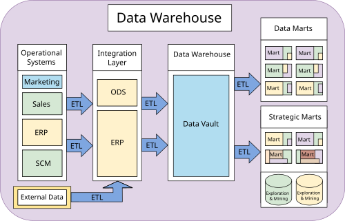
Core architecture behind a data warehouse dashboard
A reliable data warehouse dashboard depends on much more than a BI front end. It rests on a full stack that moves data from source systems to trusted metrics on screen.
Key layers in the stack
Most enterprise-grade dashboard architectures include these layers:
- Data source layer: ERP, CRM, accounting systems, marketing tools, support platforms, spreadsheets, APIs, and external data
- Ingestion layer: ETL or ELT pipelines that collect, sync, and move data into the analytics environment
- Storage layer: the cloud or on-prem data warehouse where centralized data lives
- Transformation layer: modeling logic that cleans, joins, aggregates, and standardizes raw data
- Semantic layer: approved metric definitions, business rules, dimensions, and naming conventions
- Visualization layer: the dashboard interface where end users consume KPIs and insights
- Application layer: alerts, mobile access, automated distribution, and embedded analytics for decision workflows
When these layers are well designed, teams stop arguing over definitions and start discussing action. That is the business impact of governed architecture.
Key metrics architecture teams should govern
For a data warehouse dashboard to be trusted, these core elements must be defined and managed:
- Metric definition consistency: One agreed formula for each KPI so finance, sales, and operations see the same number.
- Data freshness: How current the data is, based on refresh schedules or streaming logic.
- Completeness: Whether expected records and fields have arrived for the reporting period.
- Lineage: The traceable path from dashboard metric back to source systems and transformations.
- Access control: Role-based permissions that determine who can view, edit, or distribute dashboard content.
- Performance latency: How quickly the dashboard loads and queries return results.
- Drill-down logic: The governed path from summary KPI to transaction, region, product, or customer detail.
- Ownership: A named team or stakeholder responsible for maintaining each dashboard and metric domain.
These are not technical extras. They are the foundation of trust.
How dashboard data flows from source to screen
The typical data flow looks like this:
- Data is extracted from systems such as CRM, ERP, billing, support, ecommerce, or files.
- Data is ingested through scheduled or event-driven pipelines.
- Data is cleaned and standardized to handle nulls, duplicates, type mismatches, and naming inconsistencies.
- Data is modeled into analytics-ready tables, often with fact and dimension structures or layered warehouse zones.
- Business rules are applied so KPIs like revenue, margin, churn, or fulfillment rate match agreed definitions.
- Queries are executed by the BI or dashboard layer against warehouse tables, aggregates, or semantic models.
- Metrics are visualized as scorecards, charts, tables, filters, and drill-down views for end users.
This source-to-screen chain is where many dashboard initiatives fail. If upstream logic is weak, the front-end design cannot fix it.
Batch refreshes vs. near-real-time updates
Not every data warehouse dashboard needs second-by-second updates. Choosing the right refresh model depends on the decision cycle.
Batch refresh is best when:
- Data changes on a daily or hourly basis
- Teams review scheduled reports or executive scorecards
- Cost control matters more than instant visibility
- Source systems do not expose event streams
Near-real-time updates are best when:
- Teams need rapid operational visibility
- SLA breaches, order flow, or support queues require immediate response
- Agencies or multi-client teams must monitor changing performance throughout the day
- Business value justifies the added architectural complexity
For most organizations, the right answer is mixed cadence: executive views may refresh daily, while operational dashboards refresh every few minutes.
Common tools and platform choices
A modern data warehouse dashboard stack often includes a blend of tools:
- Warehouse platforms: Snowflake, BigQuery, Redshift, Databricks, SQL Server, and similar platforms
- Transformation tools: dbt, SQL-based modeling frameworks, or internal transformation pipelines
- Orchestration tools: Airflow, Dagster, native schedulers, or cloud workflow services
- BI and dashboard tools: enterprise BI platforms, embedded analytics tools, and dashboard builders
- Data integration tools: connectors, ELT pipelines, API ingestion, and synchronization services
If a business is starting from scratch, the priority is simplicity: choose fewer tools, define KPI ownership early, and avoid over-engineering.
If a business is improving an existing setup, the priority is usually standardization: reduce duplicated metrics, improve refresh reliability, and consolidate dashboard sprawl.
KPIs and metrics a data warehouse dashboard should include
A high-value data warehouse dashboard should not be packed with every metric available. It should present the metrics that reflect business outcomes, operational health, and data trust.
Executive and company-level KPIs
These are the metrics leadership teams expect to see consistently:
- Revenue: Top-line sales performance over time
- Gross margin: Profitability after direct costs
- Operating margin: Efficiency after operating expenses
- Growth rate: Period-over-period or year-over-year expansion
- Customer retention: Ability to keep customers over time
- Churn rate: Customer or revenue loss rate
- Forecast accuracy: How actual performance compares with projections
- Cash flow indicators: Liquidity and financial stability
- Average order value or contract value: Deal quality and monetization strength
- Return on investment: Efficiency of strategic initiatives or spend categories
For enterprise environments, executive dashboards should show targets, actuals, variances, and trend context on the same page.
Operational and departmental metrics
Departmental dashboards should connect daily activity to business outcomes.
Sales metrics
- Pipeline coverage
- Win rate
- Sales cycle length
- Bookings
- Quota attainment
- Lead-to-opportunity conversion
Marketing metrics
- Campaign performance
- Customer acquisition cost
- Cost per lead
- Marketing-sourced pipeline
- Return on ad spend
- Conversion by channel
Customer support metrics
- Ticket volume
- First response time
- Resolution time
- Backlog
- CSAT or NPS
- Escalation rate
Operations and supply chain metrics
- Inventory turnover
- Fill rate
- On-time delivery
- Order cycle time
- Throughput
- Back-order rate
Service delivery metrics
- SLA attainment
- Utilization rate
- Project margin
- Delivery backlog
- Rework rate
- Client health score
The rule is simple: every metric should support a decision. If a team cannot explain what action a KPI should trigger, it likely does not belong on the dashboard.
Data quality and trust indicators
This is the most overlooked part of a data warehouse dashboard, and one of the most important. If teams rely on the same dashboard for decisions, they need proof that the data is reliable.
Key Metrics (KPIs) for data trust
- Freshness: Time since the last successful data update
- Completeness: Percentage of expected records loaded
- Accuracy checks: Validation of totals, reconciliations, and rule-based thresholds
- Anomaly alerts: Detection of unexpected spikes, drops, or pattern breaks
- Schema stability: Tracking source structure changes that may break models
- Metric definition consistency: Confirmation that approved formulas are being used across views
- Pipeline success rate: Reliability of ingestion and transformation jobs
- Dashboard query performance: Speed of dashboard load and interaction
Metadata and governance matter because dashboards become shared operational language. Without documented definitions, lineage, update frequency, and ownership, even attractive dashboards create confusion.
Business use cases across teams and industries
A data warehouse dashboard is not limited to executive reporting. It supports a broad range of business scenarios, especially when teams need one trusted view across systems, regions, or clients.
Enterprise decision-making and visualization
Large organizations use data warehouse dashboards to align leadership around common performance signals. This is especially valuable when business units operate across different regions, products, or subsidiaries.
Typical enterprise use cases include:
- Standardized KPI reporting across business units
- Board and executive performance scorecards
- Regional revenue and margin comparisons
- Financial, sales, and operations alignment in monthly reviews
- Exception-based management with threshold alerts
- Drill-down from group-level metrics into business-unit performance
In practice, this reduces manual presentation work, shortens review cycles, and improves accountability.
Multi-client and real-time visibility scenarios
Some organizations need dashboards that go beyond internal reporting. Agencies, logistics providers, SaaS firms, and service businesses often manage many clients, accounts, or locations at once.
Common scenarios include:
- Agencies: live campaign dashboards by client, channel, and region
- Logistics providers: shipment status, fulfillment performance, and SLA adherence across multiple sites
- SaaS companies: customer usage, retention risk, support trends, and account health
- Field service businesses: technician utilization, open work orders, response times, and service quality
- Franchise or multi-location operations: sales, staffing, inventory, and local performance rollups
These scenarios often require near-real-time visibility, role-based access, and client-specific views. They also demand strong governance so one platform can support many stakeholders without exposing the wrong data.
Common examples for growing businesses
For growing companies, the data warehouse dashboard is often the first step toward a real analytics foundation. Common early-stage use cases include:
- Budgeting and variance tracking: compare actuals to plan by department or cost center
- Sales tracking: monitor pipeline, bookings, and rep performance
- Operations planning: track workload, fulfillment, staffing, or inventory capacity
- Customer reporting: provide account managers and customers with performance summaries
- Leadership scorecards: centralize business health metrics in one dashboard
These dashboards help companies move from reactive reporting to proactive management. Even a modest dashboard can save hours of manual work if the KPI logic is consistent and the refresh process is automated.
Best practices for building and improving dashboards
A high-performing data warehouse dashboard is not just technically correct. It is usable, trusted, and maintained over time.
How to design for clarity and adoption
Good dashboard design starts with the audience, not the chart type.
Best practices from a consultant’s playbook
-
Build role-specific views first
Create separate executive, manager, and analyst views instead of forcing every user into one page. This improves adoption and reduces clutter. -
Define every KPI in business language
Add clear metric labels, definitions, and context. Users should know exactly what “gross margin,” “active customer,” or “on-time delivery” means. -
Design a drill-down path before building visuals
Start with summary KPIs, then map how users will investigate exceptions by region, product, customer, rep, or transaction. -
Use visual hierarchy to direct attention
Put headline KPIs at the top, trends in the middle, and diagnostic detail below. Highlight exceptions, not decoration. -
Link metrics to action thresholds
A dashboard should tell users when to investigate, escalate, or intervene. Static numbers without action logic lead to passive viewing.
Governance, performance, and maintenance
Even a well-designed dashboard fails if governance is weak.
Critical operating practices include:
- Access controls: enforce row-level, role-based, and domain-based permissions
- Refresh schedules: align update frequency with actual decision needs
- Testing: validate calculations, filters, and edge cases before release
- Documentation: maintain metric definitions, lineage notes, and owner details
- Lifecycle ownership: assign responsibility for support, updates, and retirement
- Performance optimization: reduce slow queries with aggregation, caching, and modeling improvements
- Change management: communicate KPI logic changes before users discover them in production
A dashboard is a product, not a one-time deliverable. It needs ownership and ongoing care.
Common mistakes to avoid
These mistakes consistently undermine dashboard value:
- Putting too many metrics on one page
- Mixing strategic and operational views without clear separation
- Using inconsistent KPI logic across teams
- Ignoring data freshness and completeness indicators
- Building slow dashboards on poorly modeled queries
- Failing to document metric definitions
- Launching dashboards without stakeholder training
- Creating dashboards that show problems but not next actions
If the dashboard does not help a user decide what to do next, it is only reporting, not decision support.
How to choose the right approach for your business
The right data warehouse dashboard approach depends on your business goals, data maturity, internal skills, and reporting complexity.
Start by asking these questions:
- What decisions should the dashboard improve?
- Which KPIs must be standardized across teams?
- How many data sources need to be integrated?
- Do users need daily summaries, near-real-time visibility, or both?
- Does your team have strong data engineering and BI capacity?
- Are you solving for internal reporting, customer-facing analytics, or both?
- How important are governance, security, and auditability?
When to use off-the-shelf BI dashboards, custom builds, or phased rollout
Use off-the-shelf BI dashboards when:
- Requirements are relatively standard
- Speed matters more than deep customization
- Teams need quick wins
- Internal development capacity is limited
Use custom builds when:
- You need complex workflows, embedded analytics, or specialized UX
- Security and tenant-level access are highly specific
- You have internal engineering and analytics capacity to maintain the stack
Use a phased rollout when:
- KPI definitions are not yet mature
- Data sources are still fragmented
- Different teams have different readiness levels
- You need to prove adoption and business value before scaling
A phased rollout is often the best enterprise strategy. Start with one business domain, stabilize the definitions, then expand.
Practical checklist for planning next steps
Use this checklist to plan a successful data warehouse dashboard initiative:
- Clarify the business objective
- Identify priority users and decisions
- List required source systems
- Define KPI formulas and owners
- Set refresh frequency by use case
- Choose the warehouse, transformation, and dashboard stack
- Document access and governance rules
- Design drill-down paths
- Test for trust, performance, and usability
- Assign long-term dashboard ownership
From methodology to execution: build smarter with FineReport
At this point, the pattern should be clear: a strong data warehouse dashboard requires data integration, modeling, governance, role-based design, and dependable delivery. Building this manually is complex; use FineReport to utilize ready-made templates and automate this entire workflow.
FineReport is a strong fit for organizations that need enterprise-grade dashboards, fixed-format reporting, KPI scorecards, mobile delivery, scheduled distribution, and management-ready visualization in one platform. It helps teams turn warehouse data into dashboards that are easier to publish, govern, and scale across departments.
For businesses building or upgrading a data warehouse dashboard, FineReport enables you to:
- Connect dashboard delivery to centralized warehouse data
- Standardize KPI presentation for management and departmental use
- Use ready-made templates to accelerate executive and operational dashboard rollout
- Support drill-down analysis, scheduled reports, and mobile access
- Reduce manual reporting effort and improve consistency across the organization
In practical terms, this means less time stitching together disconnected tools and more time delivering a trusted analytics layer the business will actually use. If your goal is to move from raw warehouse data to repeatable decision workflows, FineReport is the faster and more scalable path.
FAQs
A data warehouse dashboard turns centralized warehouse data into trusted, decision-ready KPIs and visual insights. Its main purpose is to give business users a consistent view of performance without relying on raw tables or disconnected spreadsheets.
A regular report usually presents fixed tables or summaries, while a data warehouse dashboard is interactive, KPI-focused, and built for ongoing monitoring and drill-down analysis. It also depends more heavily on governed metric definitions and shared business logic.
Teams should track both business KPIs and trust-related metrics such as data freshness, completeness, lineage, dashboard load speed, and access permissions. The exact mix depends on the audience, such as executives, finance, operations, or sales.
Trust usually breaks down when KPI definitions are inconsistent, data refreshes are unclear, dashboards perform poorly, or users cannot trace numbers back to source systems. In most cases, the root problem is weak architecture or governance rather than the charts themselves.
Yes, but only if the underlying ingestion, transformation, and serving layers are designed for low-latency updates. A dashboard can refresh in near real time when the warehouse architecture supports fast pipelines and responsive query performance.


The Author
Yida Yin
FanRuan Industry Solutions Expert
Related Articles

How to Build an Investment Portfolio Reporting Dashboard for Executives: KPIs, Benchmarks, and Drill-Down Views
Investment portfolio reporting for executives is not about showing every holding, transaction, and chart your investment team can produce. It is about giving CEOs, CFOs, CIOs, boards, and investment committees a fast, re
Yida YIn
Jun 25, 2026

12 KPI Reporting Examples for Executive Dashboards: What to Show in Weekly, Monthly, and Quarterly Reviews
Executive leaders do not need more data. They need decision ready $1 examples that match how often they review the business and what actions they are expected to take. A weekly $1 should surface fast moving risks and per
Yida YIn
Jun 25, 2026

How to Build a Digital Marketing Reports Dashboard: Executive Examples, KPIs, and Templates
A $1 is the control layer that helps executives and marketing leaders turn scattered channel data into fast, confident decisions. If you are a CEO, CMO, operations director, or marketing analytics lead, the real problem
Yida Yin
May 07, 2026