You often encounter histograms and bar graphs when working with data visualization in Malaysia. A histogram displays the distribution of continuous data by grouping values into intervals, making it ideal for identifying patterns like normal distributions or spotting outliers. In contrast, a bar graph represents categorical data, allowing you to compare frequencies or proportions across distinct categories in Malaysia. The key difference between histogram vs bar graph lies in their data focus—continuous for histograms and categorical for bar graphs. Both tools simplify complex datasets, helping you uncover insights quickly and make informed decisions in Malaysia.
Key Takeaways
- Histograms show continuous data by grouping numbers into ranges. They are great for spotting trends and unusual values.
- Bar graphs display categorical data, making it easy to compare groups like sales or survey answers.
- FineBI helps you make histograms and bar graphs easily in Malaysia. Its simple tools let you create custom visuals without trouble.
- Pick the right graph based on your data type. Use histogams for data spreads and bar graphs for group comparisons.
- FineBI’s interactive tools, like filters and drill-downs, help you explore data and find more details in Malaysia.
Histogram vs Bar Graph: Bar Graphs in Data Visualization
Bar graphs are one of the most versatile types of data visualizations. They allow you to compare values across categories in Malaysia by representing them as rectangular bars. The length of each bar corresponds to the value it represents, making it easy to identify trends and differences at a glance. Let’s explore the different types of bar charts and their unique applications.
Types of Bar Graphs
Parallel Bar Chart
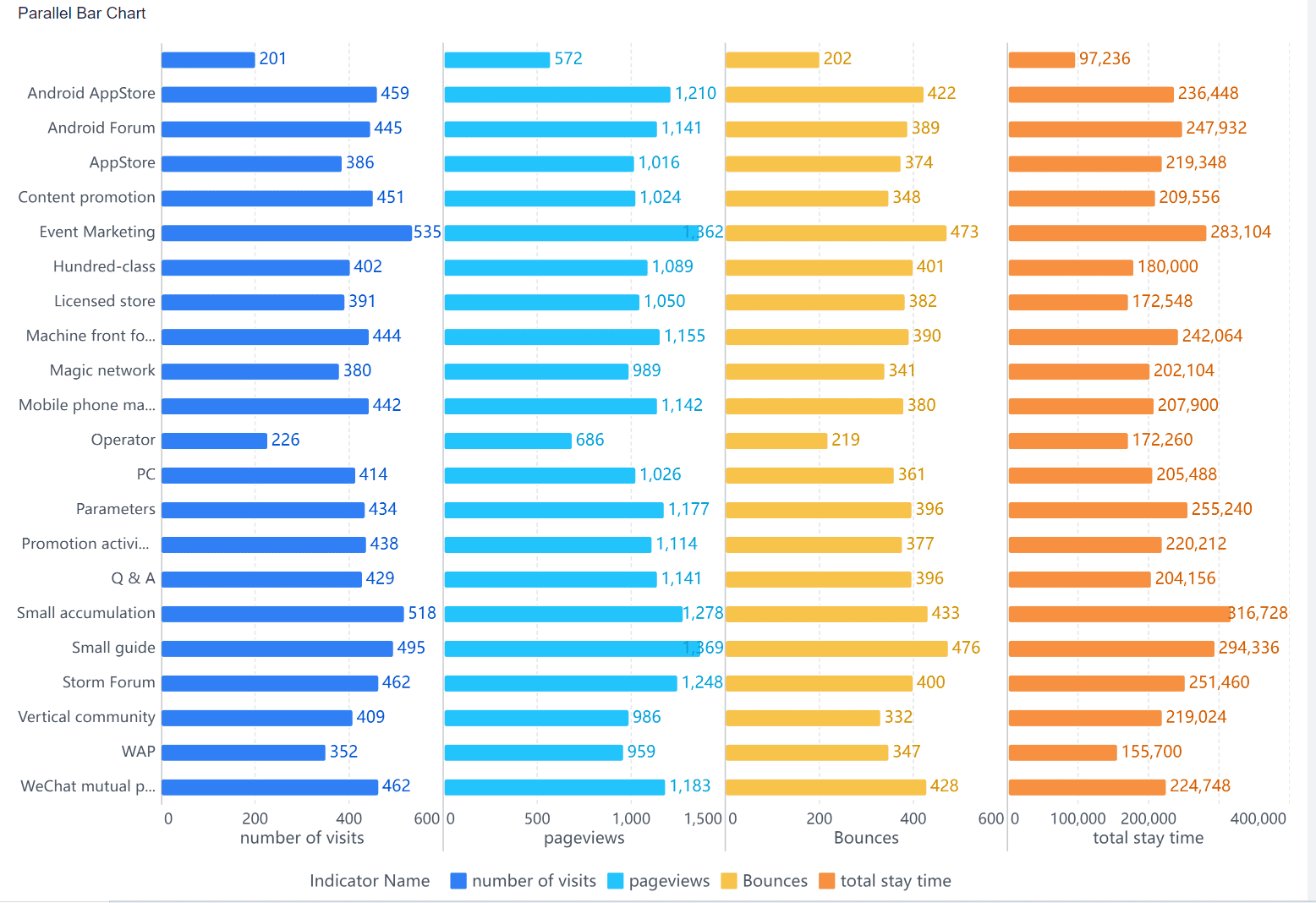
A parallel bar chart displays multiple bars side by side for each category. This format helps you compare two or more variables simultaneously. For instance, you can use it to analyze quarterly sales of different products within the same year in Malaysia.
Contrast Column Chart
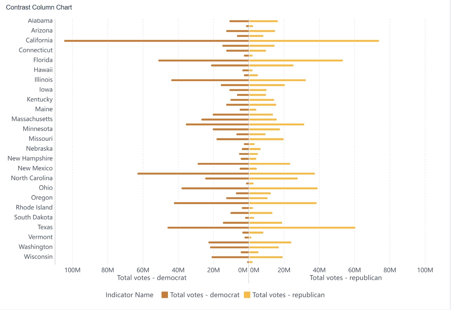
A contrast column chart uses bars of varying colors or patterns to highlight differences between categories. This type is ideal for visualizing data like monthly revenue across regions, where you want to emphasize contrasts.
Multi-Series Percentage Stacked Bar Chart
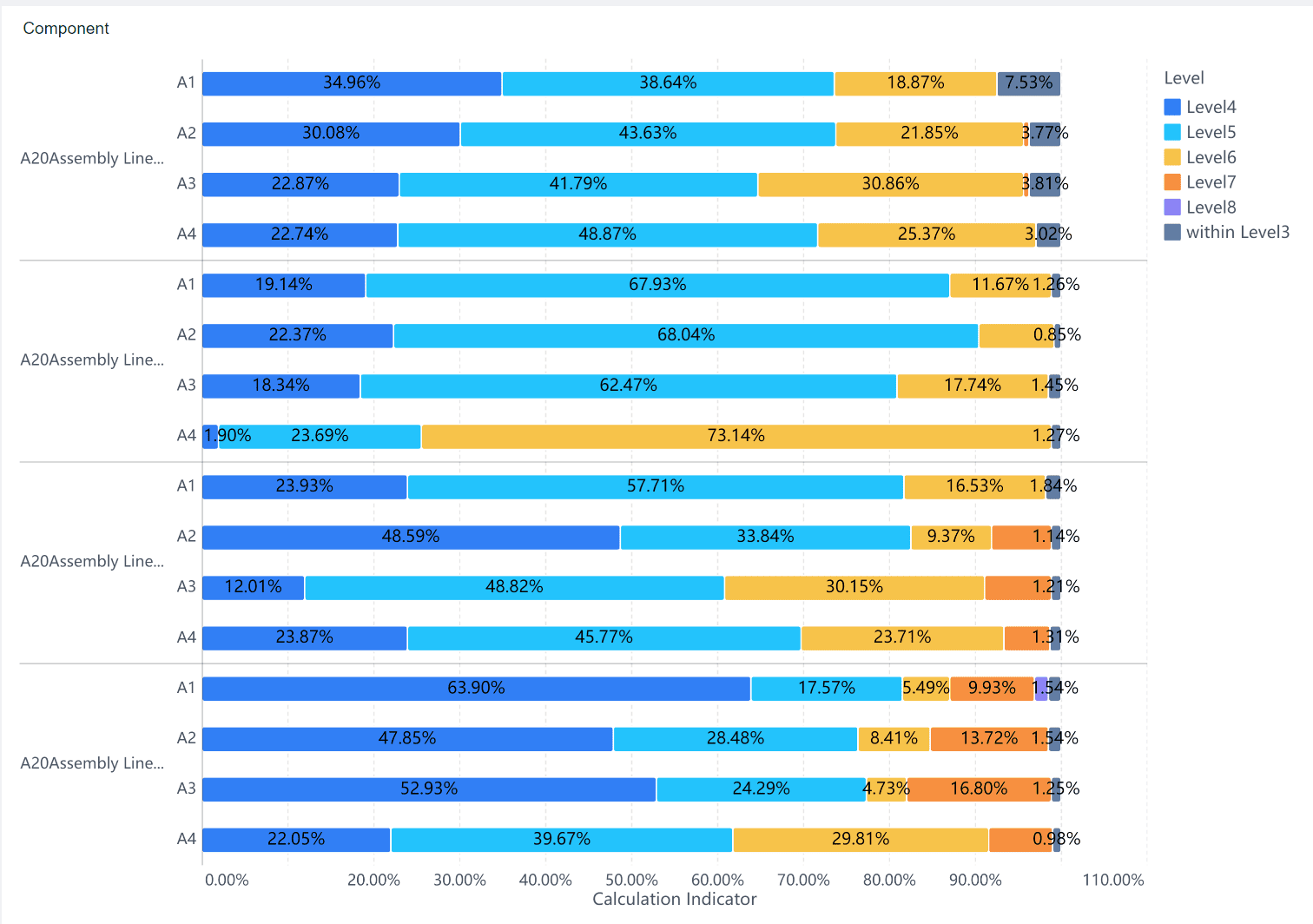
This chart stacks bars on top of each other, showing proportions as percentages of a total. It’s perfect for visualizing data like market share distribution among competitors over time.
Common Applications of Bar Graphs
Bar graphs are widely used across industries due to their simplicity and effectiveness. You might encounter them in:
- Business Analytics: Analyzing sales data and tracking key performance indicators.
- Market Research: Presenting survey results and customer feedback.
- Education: Displaying student growth and academic performance.
- Public Health: Visualizing disease prevalence and vaccination rates.
- Social Media Analytics: Measuring user engagement and demographics.
How FineBI Simplifies Bar Graph Creation
FineBI makes creating bar graphs effortless, even for beginners. Its drag-and-drop interface allows you to design customized bar charts without coding in Malaysia. You can connect to various data sources, including relational databases and Excel files, to generate real-time visualizations. FineBI also supports over 60 chart types, including parallel bar charts and stacked bar graphs, giving you the flexibility to choose the best format for your data in Malaysia.
With FineBI, you can enhance your bar graph with interactive features like drill-downs and filters. These tools let you explore your data in greater depth, uncovering insights that static charts might miss. Whether you’re tracking sales performance or analyzing social media metrics, FineBI ensures your bar graphs are both visually appealing and highly informative in Malaysia.

Histogram vs Bar Graph: Histograms for Data Visualization
Characteristics of Histograms
A histogram is a powerful tool for visualizing the distribution of numerical data. It organizes data into intervals, or bins, and represents the frequency of values within each bin using vertical bars. Unlike bar graphs, histograms have no gaps between bars, emphasizing the continuity of the data. Each bin corresponds to a range of values, making it easier to identify patterns, such as clusters or outliers.
Histograms are particularly useful for understanding data density. For example, the total area of a histogram can be normalized to 1 when used for probability density, providing insights into the likelihood of different outcomes. This makes histograms an essential tool for analyzing quantitative data distributions.
Key features of histograms include:
- Grouping values into consecutive bins along the x-axis.
- Representing the frequency of data points with bar heights.
- Highlighting the density and shape of the data distribution.
Common Applications of Histograms
Histograms play a vital role in various industries, helping professionals uncover trends and make informed decisions. Some common applications include:
- Healthcare: Analyze patient data, such as blood pressure or cholesterol levels, to identify health patterns.
- Quality Control: Monitor product defects and improve manufacturing processes.
- Education: Understand student performance by examining test score distributions.
- Environmental Science: Study temperature variations or pollution levels to assess environmental changes.
These examples demonstrate how histograms simplify complex datasets, making them indispensable in data visualization.
Using FineBI for Advanced Histogram Analysis
FineBI takes histogram analysis to the next level by offering advanced features and user-friendly tools. Its drag-and-drop interface allows you to create customized histograms effortlessly. You can connect to multiple data sources, including relational databases and big data platforms, to generate real-time visualizations in Malaysia.
FineBI also provides interactive capabilities, such as drill-downs and dynamic filtering, enabling you to explore your data in greater depth. For instance, you can analyze customer purchase patterns or track production quality trends with precision. With over 60 chart types available, FineBI ensures your histograms are not only accurate but also visually engaging in Malaysia.
By leveraging FineBI, you can transform raw data into actionable insights, enhancing your decision-making process and improving outcomes across various domains in Malaysia.
Histogram vs Bar Graph: Key Differences
Data Type: Continuous vs. Categorical
The most fundamental difference between histograms and bar graphs lies in the type of data they represent. A histogram visualizes data distribution for continuous variables. It groups numerical data into intervals, or bins, and shows how frequently values fall within each range. For example, you might use a histogram to analyze the distribution of exam scores in a class in Malaysia.
In contrast, a bar graph focuses on categorical data representation. It compares distinct categories, such as product types or age groups, by displaying their values as separate bars. For instance, you could use a bar graph to compare the sales of different product categories in a store in Malaysia.
Here’s a quick comparison to help you understand:
| Aspect | Bar Graphs | Histograms |
|---|---|---|
| Data Type | Categorical data (e.g., product types, age groups) | Quantitative data (e.g., exam scores, income ranges) |
| Axis Interpretation | Vertical axis shows amounts related to categories | Vertical axis shows frequency counts within intervals |
| Frequency Representation | Can represent absolute or relative frequencies | Must show absolute or relative frequencies |
By understanding this distinction, you can choose the right graphical representation of data for your analysis in Malaysia.
Visual Design: Bar Spacing and Axis Labels
The visual design of histograms and bar graphs also sets them apart. In a histogram, the bars touch each other, emphasizing the continuity of the data. This design highlights the flow between intervals, making it easier to identify patterns in data distribution. On the other hand, bar graphs have spaces between the bars. This spacing reinforces the idea that the categories are distinct and unrelated.
When designing either type of graph, you should follow key principles to ensure clarity:
| Design Principle | Description |
|---|---|
| Consistent Intervals | Use equal bin widths in histograms to avoid misrepresenting trends. |
| Proper Labeling | Add clear titles and units to both axes for accurate interpretation. |
| Descriptive Titles | Ensure the title explains what the graph represents. |
| Data Annotations | Highlight key points to draw attention to trends or anomalies. |
For example, if you’re creating a histogram of customer purchase amounts, consistent bin widths will ensure the data isn’t misleading. Similarly, a bar graph comparing regional sales should have clear labels for each region to avoid confusion in Malaysia.
Interpretation and Use Cases
The way you interpret histograms and bar graphs depends on their purpose. A histogram helps you understand the shape and spread of a dataset. You can use it to identify clusters, gaps, or outliers in data distribution. For example, a histogram of daily temperatures might reveal whether the weather follows a normal distribution.
Bar graphs, however, are better suited for comparing values across categories. They allow you to quickly spot the highest or lowest values in Malaysia. For instance, a bar graph showing monthly revenue by region can help you identify which region performs best in Malaysia.
Here’s a summary of their typical use cases:
| Purpose and Use Cases | Bar Graphs | Histograms |
|---|---|---|
| Compare amounts | Compare values across distinct categories | Not applicable |
| Describe distributions | Not applicable | Analyze shapes and tendencies in data |
| Highlight trends | Identify trends in categorical data representation | Spot patterns in continuous data |
By understanding these differences, you can select the right tool for your analysis. Whether you need to compare categories or explore data distribution, both histograms and bar graphs offer unique advantages in Malaysia.
Histogram vs Bar Graph: Choosing the Right Tool
Factors to Consider in Data Visualization
Selecting the right visualization tool requires careful consideration of several factors. Each tool offers unique features that cater to specific needs, making it essential to align your choice with your data type, audience in Malaysia, and objectives.
Here are key factors to evaluate:
- Scalability: Ensure the tool can handle your data volume and complexity as your needs grow. Tools like Tableau and Power BI excel in scalability, making them ideal for large datasets.
- Cloud vs. On-Premise: Decide whether you need a cloud-based solution for flexibility or an on-premise tool for enhanced security.
- Data Integration: Look for tools that support diverse data sources, such as SQL databases, APIs, and CSV files. This ensures seamless integration across systems.
- Visualization Options: Choose a tool that offers a variety of chart types, including bar graphs, pie charts, and heatmaps, to match your data characteristics.
- Ease of Use: Prioritize tools with intuitive interfaces, like Power BI, to simplify the learning curve for users.
- Real-Time Visualization: Opt for tools that provide live dashboards with low latency to keep your insights up-to-date.
| Factor | Example Tools |
|---|---|
| Scalability | Tableau, Power BI, Apache Superset, Kibana |
| Cloud vs. On-Premise | Cloud-based vs. On-premise solutions |
| Data Integration | SQL, NoSQL, APIs, CSV, JSON |
| Visualization Options | Bar charts, pie charts, heatmaps |
| Ease of Use | Power BI, Tableau |
| Real-Time Visualization | Live dashboards, low latency |
Understanding your audience in Malaysia is equally important. Tailor your visualization style to their knowledge level and demographic. For example, column and bar charts work well for comparing categories, while line graphs are better for tracking trends over time. Pie charts effectively break down datasets into segments, making them ideal for presentations.
Avoiding Common Mistakes
Even the best visualization tools can fall short if used incorrectly. Avoid these common pitfalls to ensure your visualizations are effective:
- Hiding Critical Data: Important data points often get overlooked, limiting the insights your audience in Malaysia can gain. Always highlight key information.
- Misuse of Color: Colors play a vital role in categorizing data. Poor color choices can confuse viewers and lead to misinterpretation. Use consistent and meaningful color schemes.
- 3D Charts: While visually appealing, 3D charts can distort data and make interpretation difficult. Stick to 2D visuals for clarity.
| Category | Description |
|---|---|
| Cognitive | Errors related to how users perceive and interpret visual information. |
| Emotional | Mistakes that arise from the emotional responses of users to visual elements. |
| Social | Pitfalls that occur due to social influences on how data is presented and interpreted. |
💡 Tip: Avoid cluttering your charts with excessive details. Simplicity enhances readability and ensures your audience in Malaysia focuses on the insights rather than the design.
Leveraging FanRuan’s FineBI for Effective Visualizations
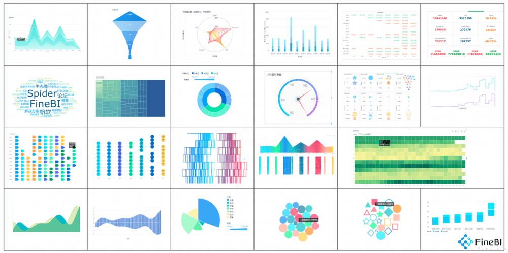
FineBI stands out as a powerful tool for creating impactful visualizations. Its user-friendly interface simplifies the process, allowing you to design charts and dashboards with ease. Whether you’re working with bar graphs, pie charts, or histograms, FineBI offers a wide range of visualization options to suit your needs in Malaysia.

Histogram vs Bar Graph
Key features include:
- Tailored Analysis Scenarios: FineBI provides customized analysis models for industries like retail, healthcare, and finance, ensuring relevance and usability.
- Built-in Calculation Formulas: You can perform complex data calculations without writing SQL code, streamlining your workflow.
- Visualization Methods: With over 60 chart types available, FineBI enhances data communication and storytelling.
- Classic Data Analysis Models: FineBI supports models like KANO and RFM, helping businesses uncover valuable insights.
| Feature/Benefit | Description |
|---|---|
| Tailored Analysis Scenarios | FineBI provides customized analysis scenarios for various industries, enhancing relevance and usability. |
| User-Friendly Interface | The platform is designed for ease of use, allowing users to navigate and utilize its features effectively. |
| Visualization Methods | Offers a variety of visualization options (e.g., pie charts, bar graphs) that improve data communication. |
| Built-in Calculation Formulas | Reduces the need for complex SQL coding, streamlining the data processing workflow. |
| Classic Data Analysis Models | Supports various models (e.g., KANO, RFM) that provide valuable insights for businesses. |
FineBI also excels in real-time visualization. Its live dashboards allow you to monitor metrics as they update, ensuring your decisions are based on the latest data. By leveraging FineBI, you can transform raw data into actionable insights, empowering your organization to make informed decisions and achieve better outcomes in Malaysia.
Histogram vs Bar Graph: Enhancing Data Visualization
Advanced Techniques for Customization
Customizing your data visualizations can significantly improve their effectiveness. Advanced techniques like interactive dashboards and tailored visualizations allow you to explore data dynamically and uncover deeper insights in Malaysia. For example, a retail chain used interactive dashboards to monitor inventory and sales performance, leading to a 20% increase in quarterly sales. Similarly, healthcare providers have leveraged dashboards to track patient outcomes, resulting in improved care quality and reduced costs.
You can also enhance your visualizations by employing advanced techniques such as network graphs for complex data relationships or dynamic filtering for real-time analysis. These methods not only make your data more accessible but also improve decision-making accuracy. Whether you’re analyzing financial risks or monitoring production quality, customization ensures your visualizations align with your specific goals in Malaysia.
| Technique | Example | Measurable Impact |
|---|---|---|
| Interactive Dashboards | A retail chain used dashboards to track inventory and sales performance. | 20% improvement in sales over a quarter. |
| Advanced Visualization Techniques | A financial institution used network graphs for risk monitoring. | Improved risk prediction accuracy. |
| Interactive Dashboard in Healthcare | A hospital tracked patient outcomes with a dashboard. | Improved patient outcomes and reduced costs. |
Improving Data Storytelling with FineBI
FineBI empowers you to transform raw data into compelling stories. Its user-friendly interface simplifies the creation of interactive dashboards, enabling you to visualize trends and patterns effectively. With over 60 chart types, FineBI offers flexibility in presenting your data, whether through histograms, bar graphs, or pie charts.
Interactive dashboards in FineBI enhance storytelling by allowing you to drill down into specific metrics and filter data dynamically. For instance, you can track customer purchase behavior or analyze regional sales performance with precision. These features help you present data in a way that resonates with your audience, making complex datasets easier to understand.
FineBI also supports real-time data visualization, ensuring your insights remain up-to-date. By integrating predictive analytics and anomaly detection, FineBI enables you to highlight key trends and outliers, adding depth to your narratives. Whether you’re presenting to stakeholders in Malaysia or conducting internal analyses, FineBI ensures your data stories are both engaging and impactful.
The Role of FanRuan in Modern Data Visualization
FanRuan plays a pivotal role in advancing modern data visualization practices. Its solutions, including FineBI, offer robust features that cater to diverse industries. Real-time data visualization allows you to monitor critical metrics dynamically, while comprehensive analysis tools help you dive deep into datasets for informed decision-making in Malaysia.
FanRuan’s platforms integrate seamlessly with existing systems, streamlining workflows and enhancing productivity. For example, secure access controls ensure sensitive data remains protected, while predictive analytics provide actionable insights for strategic planning. These features make FanRuan a trusted partner for organizations seeking to optimize their data visualization tools.
| Feature | Description |
|---|---|
| Real-time Data Visualization | Monitor critical metrics and performance indicators with dynamic charts and graphs. |
| Comprehensive Analysis | Dive deep into investment portfolios, transaction data, and risk assessments for informed decision-making. |
| Actionable Insights | Empower decision-makers with insights from predictive analytics, trend analysis, and anomaly detection. |
| Secure Access Controls | Implement robust security measures to safeguard sensitive data and restrict access to authorized personnel only. |
| Seamless Integration | Easily integrate the dashboard into existing systems for streamlined supervision workflows. |
FanRuan’s commitment to innovation ensures its tools remain at the forefront of data visualization technology. By leveraging its solutions, you can elevate your data analysis capabilities and drive better outcomes across your organization in Malaysia.
Histograms and bar graphs serve distinct purposes in data visualization. Histograms excel at analyzing continuous data and uncovering patterns, while bar graphs effectively compare discrete categories.
📊 Key Advantages:
- Histograms reveal data distribution and density, helping identify ranges and outliers.
- Bar graphs highlight differences between groups, showcasing survey results or product sales.
| Visualization Type | Advantage |
|---|---|
| Histograms | Ideal for visualizing continuous ranges like income levels or age frequencies. |
| Bar Graphs | Perfect for comparing distinct categories, such as survey preferences or sales performance. |
FineBI simplifies the creation of these visualizations, empowering you to transform raw data into actionable insights. Explore its features to elevate your data storytelling and decision-making in Malaysia.
Click the banner below to try FineBI for free and empower your enterprise to transform data into productivity!
Continue Reading About Histogram and Bar Graph
Bar Chart vs Histogram Differences Explained
How to Use Histogram Maker for Clear Data Visualization
How to Make Histogram in Excel Step by Step
How to make a pie of pie chart or bar of pie chart?


FAQ

The Author
Lewis
Senior Data Analyst at FanRuan
Related Articles

What Recruiters Look for in a Data Analysis Portfolio: 10 Criteria to Score Yours Fast
A $1 is not judged like a school assignment. It is judged like a hiring shortcut. Recruiters, hiring managers, and analytics leads use it to answer one question fast: Can this person solve business problems with data in
Lewis Chou
May 29, 2026

What Is Data Analytics Consulting? Beginner’s Guide to Services, Deliverables, and Business Value
$1 helps organizations turn raw data into decisions they can trust. For many business leaders, the challenge is not a lack of data. It is a lack of clarity. Reports conflict, teams track different KPIs, dashboards are un
Lewis Chou
Jun 03, 2026

Data Analyst Job Description [+2026 Guide]: Compare Responsibilities, Skills, and Salary by Industry
A strong $1 does more than list tasks. It defines how a company turns raw data into business decisions, which teams the analyst supports, and what measurable outcomes the role is expected to influence. For employers, tha
Lewis Chou
Jun 02, 2026