Executives do not need more data. They need a fast, trustworthy view of performance that helps them decide where to act next. If you are asking how do you make a dashboard in Excel for executive KPI reporting, the answer is not just about charts and formatting. It starts with choosing the right metrics, structuring reliable data, and presenting signals leaders can understand in seconds.
For IT managers, finance leaders, operations directors, and analysts, the pain points are familiar: too many metrics, inconsistent definitions, manual reporting cycles, and dashboards that look polished but fail to support decisions. A strong Excel dashboard solves this by turning fragmented reports into a concise executive control panel.
 Click To Try The Dashboard
How Do You Make a Dashboard in Excel for Executive KPI Reporting?
To build an executive KPI dashboard in Excel, define the audience, clarify reporting goals, choose a small set of strategic KPIs, organize clean source data, calculate metrics in a separate layer, design a simple layout, add light interactivity, and establish a repeatable update process.
This scenario works best when you first answer three questions:
- Who is the dashboard for? CEO, CFO, COO, business unit leaders, or regional heads
- What decisions should it support? Budget shifts, staffing changes, pricing action, risk escalation, or operational correction
- How often will it be used? Weekly, monthly, quarterly, or year-to-date review cycles
An executive dashboard should focus on the few KPIs that matter most. That usually means performance indicators tied to:
- Revenue
- Profitability
- Growth
- Efficiency
- Customer performance
- Risk exposure
Just as important, decide what action leaders should be able to take after reviewing it. If a metric does not trigger a question, a discussion, or a decision, it likely does not belong on the dashboard.
Finally, establish a clear update cadence. A dashboard that is not refreshed consistently loses credibility fast. Executive reporting only works when leadership trusts the numbers.
The Core Framework: Key Metrics (KPIs) for Executive Excel Dashboards
Before you build anything in Excel, define the KPI structure. This is where many teams fail. They start with visual design before they agree on metric logic.
Key Metrics (KPIs)
- Revenue
- Total sales for the reporting period. Used to track top-line growth and commercial momentum.
- Gross Margin
- Revenue minus cost of goods sold, shown as value or percentage. Indicates profitability quality.
- Operating Profit
- Profit after operating expenses. Helps executives assess business health beyond sales volume.
- Growth Rate
- Percentage increase or decrease over prior period. Shows performance direction and pace.
- Budget Variance
- Difference between actual results and plan. Identifies overperformance or underperformance.
- Forecast Accuracy
- Measures how closely projected results match actuals. Useful for planning confidence.
- Customer Retention
- Percentage of customers retained over time. Signals stability and long-term value.
- Cycle Time
- Time required to complete a process or deliver output. Tracks operational efficiency.
- Utilization Rate
- Degree to which people, assets, or capacity are used. Helps identify waste or bottlenecks.
- Risk or Exception Count
- Number of critical incidents, compliance issues, or unresolved exceptions. Supports executive risk oversight.
Core Elements every executive dashboard should include
- Current value
- The latest KPI result
- Target
- The expected benchmark or planned result
- Variance
- The gap between actual and target
- Trend
- Movement over time, usually monthly or quarterly
- Status
- Visual signal such as on track, at risk, or off track
- Time period
- Monthly, quarterly, year-to-date, or rolling 12 months
- Business filter
- Segment, region, product line, or department view
This structure helps your dashboard answer the executive question behind every report: Are we performing as expected, where are the gaps, and what needs action now?
Step 1: Identify the KPIs executives actually need
Focus on strategic metrics, not operational clutter
The first step in how do you make a dashboard in Excel is deciding what belongs on it. Executives need strategic indicators, not an overflow of operational detail.
Choose a small set of KPIs tied directly to business outcomes such as:
- Revenue growth
- Margin performance
- Cost efficiency
- Customer retention
- Delivery performance
- Risk management
A useful rule is this: if a metric does not support a business objective or decision, remove it. Executive dashboards should be selective by design.
Good executive KPI selection usually means:
- 5 to 10 headline metrics
- A clear owner for each metric
- A standard business definition
- A defined action if performance changes
Set targets, thresholds, and reporting periods
Raw numbers alone do not guide leadership. Every KPI needs context.
Define:
- Target values for expected performance
- Thresholds for on track, at risk, and off track status
- Reporting periods such as monthly, quarterly, and year-to-date
For example:
- Revenue growth above 8% = on track
- Revenue growth between 5% and 8% = at risk
- Revenue growth below 5% = off track
Standardized reporting periods prevent confusion and make comparison easier across meetings and business units.
Step 2: Organize and clean the source data
Bring all data into a consistent structure
If your source data is messy, the dashboard will be unreliable. Excel can absolutely support executive reporting, but only when the underlying data is structured properly.
Use a clean tabular format:
- One column for one field
- One row for one record
- No merged cells in source data
- No blank rows within the dataset
- Consistent headers across all records
Convert source ranges into Excel Tables. This is one of the simplest and most valuable best practices because Tables:
- Expand automatically when new rows are added
- Keep formulas consistent
- Make structured references easier to manage
- Work well with PivotTables, charts, and slicers
Check accuracy before building visuals
Executives will challenge a dashboard the moment a number looks wrong. That is why data validation comes before visual design.
Check for:
- Duplicate entries
- Missing values
- Inconsistent date formats
- Mixed currency formats
- Incorrect category labels
- Broken formulas
- Totals that do not reconcile with official reports
Before you build any chart, confirm the source systems, formulas, and totals match the finance or operational reports leadership already trusts.
Step 3: Build the calculation layer behind the dashboard
Create summary metrics and trend calculations
An effective Excel dashboard should not calculate everything directly inside charts or visual objects. Create a separate calculation layer that summarizes the data clearly.
You can use:
- Formulas for KPI cards, ratios, growth rates, and variance logic
- PivotTables for grouped summaries by period, region, product, or business unit
- Helper tables for chart-ready structures and trend analysis
Typical calculations include:
- Total revenue
- Average sales per account
- Quarter-over-quarter growth
- Actual vs target variance
- Year-to-date totals
- Rolling averages
- Percentage contribution by business segment
This structure is cleaner when divided into separate sheets:
- Raw Data
- Calculations
- Dashboard
That separation makes the workbook easier to troubleshoot and far easier to maintain.
Keep the logic easy to audit
Complexity kills trust. If your workbook depends on nested formulas nobody understands, maintenance becomes risky.
To keep the model auditable:
- Label assumptions clearly
- Use consistent formula patterns
- Avoid unnecessary complexity
- Document KPI definitions
- Use named ranges or structured references
- Include control checks where totals can be validated quickly
A dashboard should still work if another analyst has to inherit it next quarter.
Step 4: Design a dashboard layout executives can scan fast
Put the most important information at the top
Executive dashboards are read in seconds, not minutes. Your layout should surface the highest-priority insights first.
Place at the top:
- Headline KPIs
- Current period status
- Major changes from the previous period
- Alerts or exceptions requiring attention
Then organize the rest of the dashboard into sections such as:
- Financial metrics
- Operational metrics
- Customer metrics
- People or workforce metrics
- Risk indicators
This gives leaders a clear reading path and reduces cognitive overload.
Use simple visuals that highlight movement
When teams ask how do you make a dashboard in Excel, they often overfocus on chart variety. In executive reporting, simple visuals perform best.
Use a small set of proven visual elements:
- KPI cards for top-line values
- Bar charts for comparisons across units or categories
- Line charts for trends over time
- Sparklines for compact movement signals
- Conditional formatting for status highlighting
Avoid decorative charts that slow interpretation. A dashboard is not a presentation slide. It is a decision tool.
Best practice design rules:
- Limit the color palette
- Use red, amber, and green carefully
- Keep labels short
- Reduce chart junk
- Maintain consistent scales where comparison matters
Step 5: Add interactivity without making it complicated
Use filters and controls thoughtfully
Executives value flexibility, but they do not want a dashboard that requires too much clicking.
Excel interactivity should be light and purposeful. Useful controls include:
- Slicers for business unit, region, product, or owner
- Drop-down lists for scenario or category selection
- Timeline filters for date navigation
The key is to make sure the default view already answers the most common executive questions. Filters should refine the analysis, not rescue a weak dashboard design.
Test usability with a real reporting scenario
Before rollout, test the dashboard exactly as an executive would use it.
Ask:
- Can someone spot a performance issue in under 10 seconds?
- Is the top insight obvious without explanation?
- Do the filters improve understanding or create friction?
- Are labels readable in a meeting room or on a laptop?
- Can the user move from KPI to trend to decision quickly?
Remove anything that creates noise:
- Extra clicks
- Crowded legends
- Tiny labels
- Duplicate charts
- Unnecessary tabs
Step 6: Finalize, automate, and maintain the dashboard
Prepare the dashboard for recurring executive reporting
A one-time dashboard is not enough. Executive KPI reporting needs a repeatable operating process.
Before launch:
- Lock key formulas
- Protect presentation areas
- Standardize workbook naming
- Document the refresh steps
- Confirm user access and ownership
- Test month-end or quarter-end update workflows
Then define a repeatable process for every reporting cycle:
- Load new source data
- Refresh Tables, formulas, and PivotTables
- Validate totals against official reports
- Review outliers and formatting
- Publish the executive version
This protects both speed and trust.
Review performance and improve over time
The best dashboards evolve. Executive priorities change, and the dashboard should change with them.
Create a lightweight feedback loop:
- Ask executives which metrics they use most
- Remove charts no one references
- Add context where questions recur
- Refine KPI definitions if confusion appears
- Adjust layout based on usage patterns
This continuous improvement cycle keeps the dashboard relevant instead of static.
3 to 5 actionable best practices from a consultant’s perspective
If you want an executive KPI dashboard that gets used, not ignored, follow these practical steps.
1. Start with the decision, not the data
Define what leaders must decide after reviewing the dashboard. Budget shifts? Resource reallocation? Risk escalation? Build backward from those use cases.
2. Cap the top layer at a few critical KPIs
Executives should not have to hunt for the signal. Keep the first screen focused on the highest-value indicators and push detail into supporting tabs if needed.
3. Create a separate data, logic, and presentation structure
Never mix raw data, formulas, and charts in one cluttered sheet. Separate layers improve reliability, auditing, and handover.
4. Standardize status logic
Use one agreed set of thresholds for on track, at risk, and off track. Inconsistent KPI status rules create confusion and erode confidence.
5. Build for maintenance from day one
Assume another analyst will update the file later. Use clean naming, simple formulas, documented assumptions, and a repeatable refresh checklist.
Common mistakes to avoid when building an executive KPI dashboard in Excel
Even technically correct dashboards can fail if they are not designed for executive consumption.
Avoid these common mistakes:
- Including too many metrics on one screen
- More information does not mean more clarity.
- Mixing raw data and presentation elements in the same area
- This increases errors and makes updates harder.
- Using decorative charts that make interpretation harder
- Complex visuals often hide the actual insight.
- Skipping validation
- If the numbers do not reconcile with trusted reports, adoption will collapse.
- Overloading the dashboard with filters
- Too much interactivity creates friction instead of value.
- Ignoring mobile or meeting-room readability
- If labels cannot be read quickly, the dashboard will not support live decisions.
Conclusion: Turn Excel into a clear executive reporting tool
If you are still asking how do you make a dashboard in Excel, the short answer is this: start with business priorities, structure the data carefully, build auditable calculations, and present only what leaders need to act on.
A strong executive KPI dashboard in Excel should be:
- Trusted
- Simple
- Decision-focused
- Easy to update
- Aligned with strategic goals
Excel can absolutely serve as an executive reporting tool, especially for teams that need flexibility and speed. But building this manually is complex as reporting requirements scale across departments, time periods, and business units.
Build Faster and Scale Smarter with FineBI
At some point, manual Excel dashboard management becomes difficult to sustain. Data sources multiply, refresh cycles tighten, and version control starts consuming too much analyst time.
That is where FineBI becomes the smarter option.
Instead of building and maintaining every calculation, visual, and workflow manually, use FineBI to utilize ready-made templates and automate this entire workflow. It enables teams to:
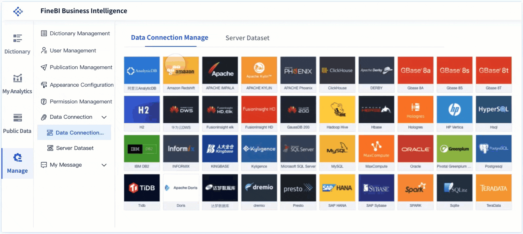
- Connect multiple data sources more efficiently
- Standardize KPI definitions across the business
- Use prebuilt dashboard templates for executive reporting
- Automate refresh processes and reduce manual effort
- Deliver interactive, scalable dashboards with better governance
For organizations moving beyond one-off spreadsheets, FineBI helps turn executive reporting into a reliable, repeatable analytics process. The result is faster insight delivery, stronger trust in the numbers, and more time spent on decisions instead of spreadsheet maintenance.
FAQs
An executive dashboard should focus on 5 to 10 strategic KPIs such as revenue, margin, growth, budget variance, customer retention, efficiency, and risk. Each metric should connect directly to a business decision and have a clear definition, target, and owner.
Start with the audience, the decisions they need to make, and the few metrics that matter most. Then show current value, target, variance, trend, and status so leaders can understand performance quickly.
The update cadence should match the reporting need, such as weekly, monthly, or quarterly. Consistent refresh schedules are important because executives will only trust the dashboard if the data stays current.
Keep source data in a clean table with one row per record and one column per field. Avoid messy layouts and separate raw data, calculations, and dashboard views to make the file easier to maintain and audit.
Yes, Excel can work well for executive KPI reporting when the data is structured, the formulas are reliable, and the dashboard stays focused on strategic metrics. It is most effective for concise reporting rather than overly complex, enterprise-scale analysis.


The Author
Yida YIn
FanRuan Industry Solutions Expert
Related Articles

Portfolio Reporting for PMOs: 9 Executive Metrics Every Weekly Portfolio Dashboard Should Include
Weekly portfolio reporting should help executives answer three questions fast: Are we delivering the right initiatives, are we putting outcomes at risk, and what decisions need leadership this week? For PMOs, that means
Yida Yin
Jul 01, 2026

How to Build an Investment Portfolio Reporting Dashboard for Executives: KPIs, Benchmarks, and Drill-Down Views
Investment portfolio reporting for executives is not about showing every holding, transaction, and chart your investment team can produce. It is about giving CEOs, CFOs, CIOs, boards, and investment committees a fast, re
Yida YIn
Jun 25, 2026

12 KPI Reporting Examples for Executive Dashboards: What to Show in Weekly, Monthly, and Quarterly Reviews
Executive leaders do not need more data. They need decision ready $1 examples that match how often they review the business and what actions they are expected to take. A weekly $1 should surface fast moving risks and per
Yida YIn
Jun 25, 2026