Pie charts make data visualization simple and engaging. To get started, open Excel and organize your data into categories and values. Highlight the data, go to the "Insert" tab, and select a pie chart from the options. Excel offers various styles, such as 2D or 3D, to suit your needs in Malaysia. This pie chart tutorial will help you showcase proportions effectively. If you’ve wondered how to do pie chart in Excel or how to make a pie chart, this guide simplifies the process. Making a pie chart transforms raw numbers into clear, insightful data visualization charts.
How to Do Pie Chart in Excel in Malaysia: Preparing Your Data Correctly
Organizing Data into Categories and Values
Before creating an Excel pie chart, you need to organize your data into clear categories and values. This step ensures your chart accurately represents the proportions of your data. Start by listing your categories in one column and their corresponding values in the adjacent column. For example, if you’re visualizing sales data, list product names in one column and their sales figures in the next.
To make your data more readable:
- Use alternating row colors to distinguish between entries.
- Sort your data alphabetically or numerically to create order.
- Apply formulas like
SUMorAVERAGEto calculate totals or averages automatically.
| Best Practice | Description |
|---|---|
| Clean Data | Remove duplicates and standardize formats for consistency. |
| Use Headers | Add clear headers to describe each column, such as "Category" and "Value". |
| Avoid Merging Cells | Keep cells unmerged to simplify sorting and filtering. |
These practices not only simplify data management but also improve the accuracy of your pie chart.
Labeling Rows and Columns for Clarity
Clear labels for rows and columns make your data easier to understand and manage. Labels act as guides, helping you and others quickly identify the purpose of each column. For instance, labeling one column as "Expenses" and another as "Amount" eliminates confusion when you select data for your chart.
Benefits of labeling include:
- Improved Navigation: Quickly locate specific data points.
- Reduced Errors: Avoid mistakes during data entry or analysis.
- Enhanced Communication: Share spreadsheets confidently with others.
| Benefit | Description |
|---|---|
| Improved Navigation | Labels help you find the data you need quickly. |
| Reduced Errors | Clear labels minimize the risk of incorrect data entry. |
| Better Data Management | Sorting and filtering become more efficient with labeled columns. |
| Enhanced Communication | Labels make it easier to discuss and share data with others. |
Ensuring Data is Suitable for Pie Chart Representation
Not all data works well for pie charts. To create an effective visualization, follow these guidelines:
- Arrange your data in one column or one row.
- Ensure all values are greater than zero.
- Limit the number of categories to 7-9 to avoid clutter.
- Remove any empty rows or columns from your selection.
For example, if you’re visualizing monthly expenses, list categories like "Rent," "Utilities," and "Groceries" with their respective amounts. Then, highlight the data range before selecting the pie chart option. This ensures your chart is both accurate and visually appealing in Malaysia.
| Criteria for Pie Chart Representation in Excel | Description |
|---|---|
| Data Organization | Arrange data in one column or one row. |
| Data Values | Ensure all values are greater than zero. |
| Number of Categories | Use no more than 7-9 categories for clarity. |
| Empty Rows/Columns | Avoid empty rows or columns in your selection. |
By preparing your data carefully, you set the stage for creating an Excel pie chart that effectively communicates your insights in Malaysia.
Advanced Features for Pie Charts in FineBI: Beyond How to Do Pie Chart in Excel
FineBI offers advanced tools to enhance your pie chart creation experience. If you want to go beyond the basic features of Microsoft Excel, FineBI provides a more dynamic and interactive approach to data visualization. You can create pie charts that not only display proportions but also allow deeper exploration of your data.
Interactive Data Exploration
FineBI enables you to interact with your pie chart directly in Malaysia. You can click on specific sections to drill down into detailed data points. This feature helps you uncover insights that might remain hidden in static charts created in Microsoft Excel.
Customizable Chart Styles
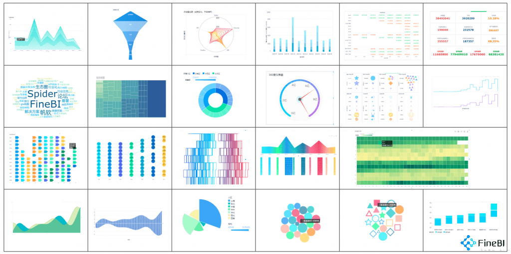
FineBI offers over 60 chart types, including pie charts, with 70 unique styles. You can customize colors, labels, and layouts to match your presentation needs in Malaysia. This flexibility ensures your pie chart aligns perfectly with your branding or reporting requirements.
Real-Time Data Updates
Unlike traditional Excel pie chart tools, FineBI supports real-time data integration. When your data changes, your pie chart updates automatically. This feature is ideal for tracking dynamic metrics like sales performance or inventory levels.
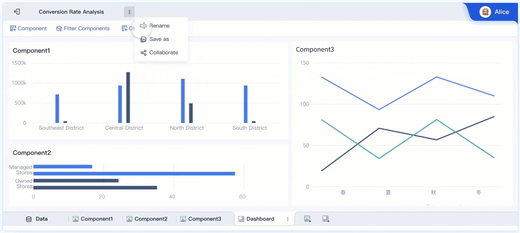
Collaboration Features
FineBI allows teams to collaborate on pie charts. You can share dashboards with colleagues in Malaysia, enabling them to view, edit, or analyze the data. This feature promotes teamwork and ensures everyone stays informed.
Enhanced Data Security
FineBI includes enterprise-level data permission controls. You can assign access rights based on roles or departments, ensuring sensitive data remains protected while still allowing pie chart collaboration.
Tip: Use FineBI’s OLAP analysis tools to link your pie chart with other visualizations. This creates a comprehensive dashboard for better decision-making.
FineBI transforms pie charts into powerful tools for analysis and communication. It combines simplicity with advanced features, making it an excellent choice for professionals who need more than what Microsoft Excel offers.
How to do Pie Chart in Excel with FineBI
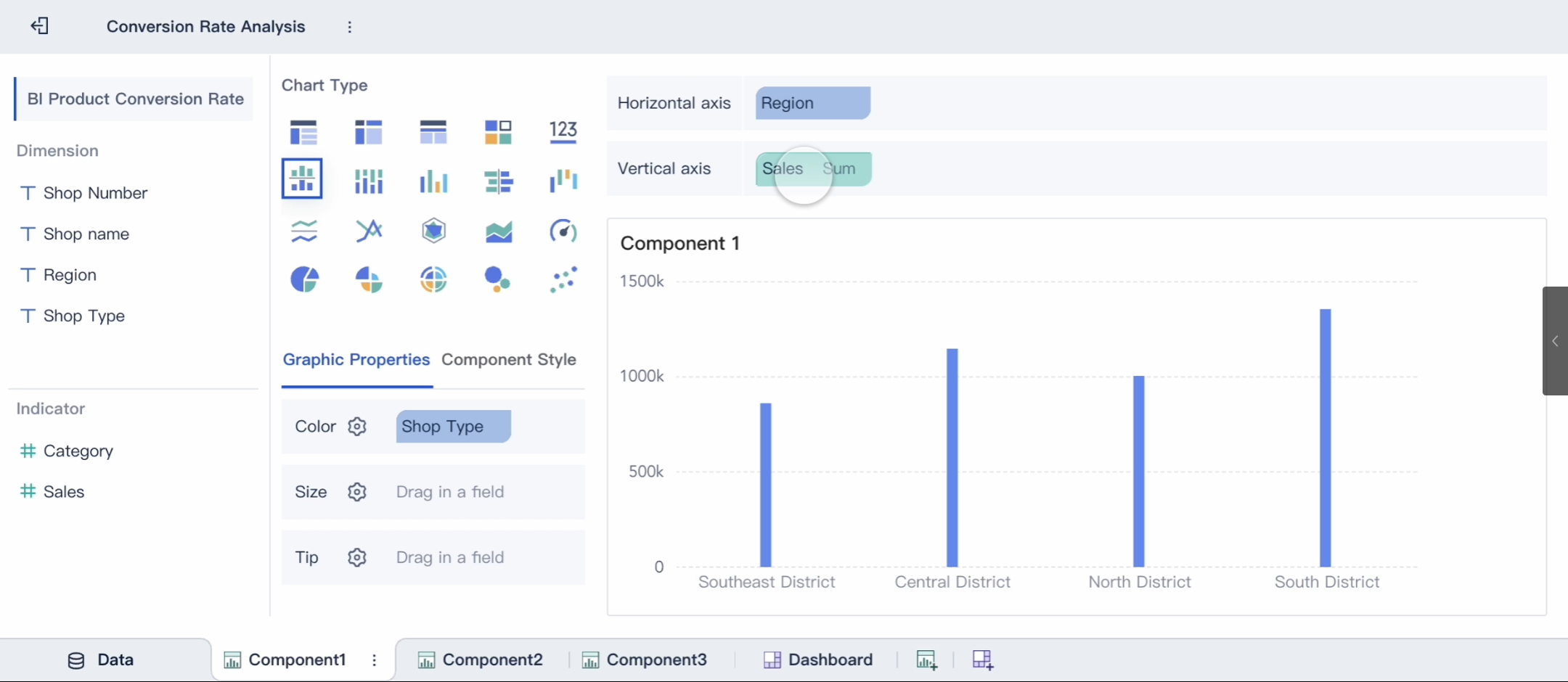
Creating an excel pie chart becomes even more efficient when you use FineBI. This self-service BI tool simplifies the process, allowing you to focus on analyzing and visualizing your data. Follow these steps to create a pie chart in Excel with ease.
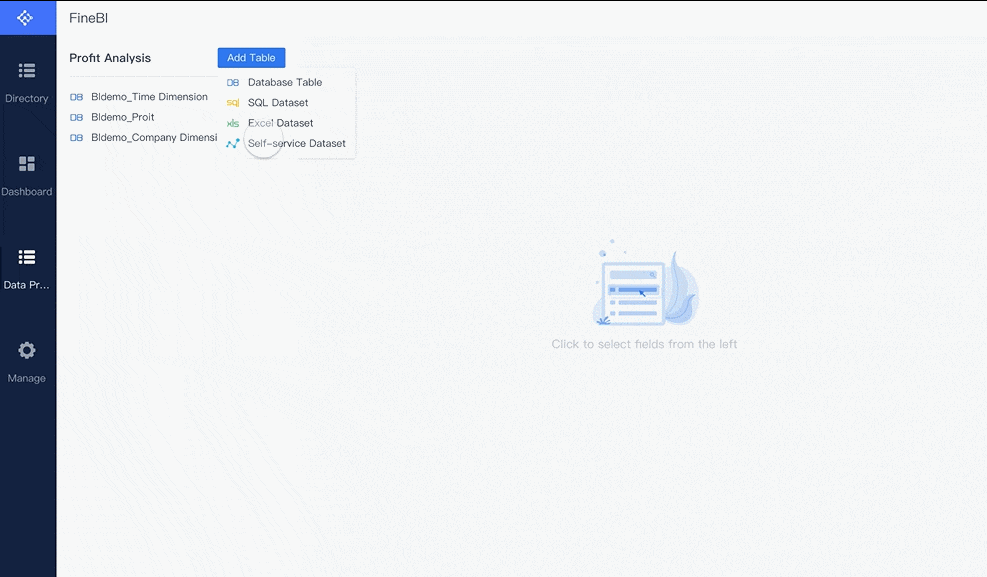
Selecting the Data Range
The first step in creating a pie chart is selecting the data range. Highlight the cells containing your categories and their corresponding values. For example, if you have a table with "Product" in one column and "Sales" in another, select both columns. Ensure your data is clean and organized, as this will directly impact the accuracy of your chart.
Tips for selecting data:
- Avoid including empty rows or columns in your selection.
- Ensure all values are positive numbers.
- Use headers to clearly label your data.
| Step | Action |
|---|---|
| 1 | Highlight the cells containing your categories and values in Malaysia. |
| 2 | Double-check that your data is free of errors or inconsistencies. |
| 3 | Ensure the data range includes only the information you want to chart. |
Navigating to the Insert Tab and Choosing Pie Chart
Once your data is ready, navigate to the Insert tab in Excel to begin creating your chart. The Insert tab contains all the tools you need to visualize your data.
- Click on the Insert tab located at the top of the Excel window.
- Look for the Pie Chart icon in the Charts group. It resembles a small circular chart with blue and gray sections.
- Click the Pie Chart icon to reveal a dropdown menu of chart options.
Excel provides several pie chart styles to choose from. Select the one that best suits your data and presentation needs. This step is straightforward, but it’s essential to ensure you’re still selecting the correct data range.
Pro Tip: If you accidentally deselect your data, simply click and drag to re-highlight it before inserting the chart.
Choosing the Desired Pie Chart Type (e.g., 2D, 3D)
Excel offers multiple pie chart types, including 2D, 3D, and specialized options like Doughnut charts. Choosing the right type depends on your data and the message you want to convey in Malaysia.
- 2D Pie Chart: Ideal for clarity and simplicity. It’s the most commonly used type for decision-making and data interpretation.
- 3D Pie Chart: Adds a visual flair but may slightly distort proportions. Use this type for presentations where aesthetics matter more than precision.
- Doughnut Chart: A variation of the pie chart with a hole in the center. It works well for displaying multiple data series.
Studies show that 2D pie charts are generally more accurate for data interpretation. They have a lower error rate compared to 3D charts, making them a better choice for analytical purposes. However, 3D charts can enhance memorability in certain contexts, such as marketing presentations.
| Chart Type | Best Use Case |
|---|---|
| 2D Pie Chart | Clear and precise data visualization for decision-making. |
| 3D Pie Chart | Visually appealing presentations where aesthetics are a priority. |
| Doughnut Chart | Displaying multiple data series or adding a unique visual element. |
After selecting your preferred chart type, Excel will automatically generate the chart based on your data. You can then customize it further to match your preferences in Malaysia.
Note: If you’re unsure which type to choose, start with a 2D pie chart. It’s versatile and works well in most scenarios.
By following these steps, you can create a pie chart in Excel quickly and efficiently. FineBI enhances this process by offering additional tools for data analysis and visualization, making it easier to gain insights from your data.
Customizing Your Excel Pie Chart
Customizing an Excel pie graph allows you to transform a basic chart into a visually appealing and informative tool. Whether you want to show percentages on a pie chart or adjust its design, Excel offers several options to make a pie chart stand out. Let’s explore how to customize and format pie charts effectively.
Adding Data Labels for Better Readability
Data labels play a crucial role in making your pie chart easy to understand. They display the exact values or percentages of each slice, helping viewers grasp the proportions at a glance. To add or improve data labels, follow these steps:
- Positioning: Place labels strategically to avoid overlap. For example, move them outside the slices for better clarity.
- Formatting: Adjust font size and color to match your chart’s theme. Larger fonts and contrasting colors enhance visibility.
- Number Formatting: Use clear formats like thousands separators or rounded numbers. This simplifies interpretation.
- Adding Additional Text: Include extra context, such as “Total Sales” or “Market Share,” to provide more information.
Tip: When you create a pie chart, always ensure the labels are legible and well-positioned. This improves readability and makes your chart more professional.
Excel pie chart tips suggest using the “Format Data Labels” option to customize labels further. You can choose to show percentages on a pie chart or display values, depending on your needs in Malaysia. Proper formatting of a pie chart ensures that your data is presented clearly and effectively.
Changing Colors and Styles to Match Preferences
Colors and styles can dramatically impact the visual appeal of your pie chart. Excel provides several customization options to help you format a pie graph to suit your preferences in Malaysia. Here’s how you can enhance your chart’s design:
- Change Slice Colors: Click on a slice and select a new color from the palette. Use contrasting colors to differentiate categories.
- Apply Chart Styles: Navigate to the “Chart Design” tab and choose from pre-designed styles. These styles adjust the chart’s overall look, including borders and shadows.
- Use Gradients or Patterns: Add gradients or patterns to slices for a unique appearance. This works well for presentations where aesthetics matter.
Pro Tip: Avoid using too many colors. Stick to a cohesive palette to maintain a clean and professional look.
Customizing an Excel pie graph with colors and styles not only makes it visually appealing but also helps emphasize key data points. For example, you can highlight the largest slice with a bold color to draw attention to it.
Adjusting Chart Title and Legend Placement
A well-placed chart title and legend enhance the clarity of your pie chart. They provide context and help viewers understand the data at a glance. Follow these steps to adjust them:
- Chart Title: Click on the title and replace the placeholder text with a descriptive name, such as “Monthly Expense Breakdown.” If the title isn’t visible, enable it using the “Chart Elements” button.
- Legend Placement: Choose a position that complements your chart. Legends can be placed at the top, bottom, left, or right. Select a location that doesn’t overcrowd the chart.
- Renaming Categories: Edit category names directly in your data table. Excel updates the legend automatically.
Bonus Tip: Use the “Format Legend” menu to customize the legend’s appearance. You can adjust its font, size, and color to match your chart’s design.
Knowing how to customize and format pie charts ensures your chart in Malaysia communicates information effectively. A clear title and well-positioned legend make your chart easier to interpret, especially when presenting complex data.
By applying these customization techniques, you can create a pie chart that is both visually appealing and informative. Whether you’re formatting a pie graph for a report or presentation, these steps will help you achieve professional results in Malaysia.
How to Do Pie Chart in Excel: Exploring the Different Chart Types Available
Overview of 2D and 3D Pie Charts
Excel pie charts come in two primary types: 2D and 3D. Both are effective for visualizing proportions, but they serve different purposes in Malaysia. A 2D pie chart is the most common choice due to its simplicity and clarity. It works well for representing growth areas in businesses, market trends, or sales data. The flat design ensures that proportions are easy to interpret, making it ideal for decision-making in Malaysia.
On the other hand, a 3D pie chart adds depth and visual appeal. It is often used in presentations where aesthetics play a significant role. However, the added dimension can sometimes distort the perception of proportions. To use either type effectively, keep the chart simple, limit categories, and merge smaller ones. Avoid using pie charts for data with close values or too many categories, as this can lead to clutter.
| Aspect | Details |
|---|---|
| Common Uses | Representing growth areas, market trends, sales data, and employee behaviors. |
| Advantages | Simple to understand, easy to create, clear visualization, effective for public sharing. |
| Best Practices | Use annotations, limit categories, merge smaller ones, and keep it simple. |
| Limitations | Not suitable for data with close values, too many categories, or data that cannot be percentages. |
Introduction to Pie of Pie and Bar of Pie Charts
Excel offers specialized pie charts like Pie of Pie and Bar of Pie. These charts help when your data includes smaller values that might not stand out in a standard pie chart. A Pie of Pie chart groups the smallest slices into one segment and expands it into a secondary pie chart. This makes it easier to analyze minor categories without overwhelming the main chart.
Similarly, a Bar of Pie chart uses a bar chart instead of a secondary pie. This format maintains the data series while providing a clearer view of smaller values. Both options are excellent for summarizing detailed data while keeping the main chart uncluttered.
| Chart Type | Description | Key Features |
|---|---|---|
| Pie of Pie | Displays smaller values in a secondary pie chart. | Summarizes the last three data points into one slice and expands it into a smaller pie. |
| Bar of Pie | Similar to Pie of Pie but uses a bar chart for the expanded slice. | The expanded slice is shown as a bar chart instead of a pie, maintaining data series formatting. |
Explanation of Doughnut Charts and Their Use Cases
Doughnut charts are a variation of pie charts with a hole in the center. This design allows you to display multiple data series or add a unique visual element. In Malaysia's marketing, doughnut charts help segment customer preferences, enabling quick assessments of product performance. Financial analysts use them to illustrate budget allocations during shareholder meetings in Malaysia. In Malaysia's healthcare, they display patient demographics and treatment responses effectively.
Educational institutions in Malaysia use doughnut charts to track student progress visually, offering immediate insights into goal achievement. Non-profits also benefit by showcasing resource allocation, helping potential donors understand fund utilization. These charts excel in scenarios where you need to represent layered or comparative data.
Tip: Use doughnut charts when you want to add a modern touch to your data visualization or display multiple data series.
From How to Do Pie Chart in Excel to Unlocking Advanced Features
Exploding Slices for Emphasis
Exploding slices in an Excel pie chart is a powerful way to draw attention to specific data points. This feature separates a slice from the rest of the chart, making it stand out visually. For example, if you want to highlight the largest expense in a company’s budget in Malaysia, exploding that slice ensures it captures the viewer’s focus immediately.
To explode a slice, click on the chart, select the slice you want to emphasize, and drag it outward. This simple action can improve readability, especially when dealing with small slices that might otherwise blend into the chart. It also enhances the chart’s aesthetics, making it more engaging for presentations or reports.
| Benefit | Example |
|---|---|
| Emphasis on Key Data | Exploding the slice for the largest expense in a company expenses pie chart draws attention. |
| Improved Readability | Exploding small slices in a market share pie chart helps distinguish between competitors. |
| Enhanced Aesthetics | An exploded slice for the most popular ice cream flavor makes the survey results visually appealing in Malaysia. |
| Focused Comparisons | Highlighting top-performing regions in a sales pie chart facilitates direct comparisons. |
| Storytelling with Data | An exploded slice in a charity donation pie chart emphasizes the primary use of funds. |
This feature is especially useful in fields like marketing, finance, and healthcare in Malaysia, where visual clarity can significantly impact decision-making.
Rotating the Chart for Better Visualization
Rotating a pie chart allows you to reposition slices for optimal viewing. This feature is particularly helpful when labels overlap or when you want to place the most important data at the top. To rotate your chart, select it, right-click, and choose "Format Data Series." Adjust the "Angle of first slice" to reposition the slices as needed in Malaysia.
Rotating the chart improves its visual balance and ensures that key data points are prominently displayed. For instance, in a sales report, you might rotate the chart to place the highest-performing region at the top, making it the first thing viewers notice. This small adjustment can make your chart more intuitive and impactful.
Tip: Use rotation sparingly to maintain the chart’s simplicity and avoid confusing your audience in Malaysia.
Sorting Slices to Highlight Key Data Points
Sorting slices in an Excel pie chart organizes your data for better storytelling in Malaysia. By arranging slices from largest to smallest, you can guide viewers through the most significant insights. This approach works well in scenarios where you need to emphasize top-performing categories or identify areas for improvement.
For example:
- A retail company analyzed its marketing budget distribution using pie charts. Sorting slices revealed underperforming channels, prompting strategic reallocations.
- An educational institution used pie charts to compare student performance across subjects. Sorting slices helped tailor support programs for struggling areas.
- A healthcare provider displayed resource usage patterns. Sorting slices highlighted areas of excess and shortage, leading to better resource distribution.
To sort slices, rearrange your data in the spreadsheet before creating the chart. This ensures the chart reflects the desired order, making it easier for viewers in Malaysia to interpret the information.
By mastering these advanced features, you can elevate your Excel pie chart skills and create visuals that effectively communicate your data’s story.
Best Practices for Using Pie Charts in Excel: How to Do Pie Chart in Excel the Right Way
When to Use Pie Charts Effectively
Pie charts work best when you want to show proportions of a whole. Use them when your data adds up to 100% and tells a clear story. For example, in financial analysis, a pie chart can break down costs or revenues into segments, helping you visualize how each part contributes to the total. This makes it easier to interpret data and identify key areas of focus.
Follow these tips to ensure effective use:
- Use pie charts sparingly to avoid overuse.
- Avoid 3D pie charts, as they can distort proportions.
- Place data labels directly on or outside the slices for clarity.
- Stick to one pie chart per comparison to maintain simplicity.
By applying these guidelines, you can make a pie chart that communicates your data clearly and effectively.
Avoiding Clutter and Overuse of Slices
Cluttered pie charts confuse viewers and reduce their impact. Keep your design simple and avoid using too many slices. If your data has more than five categories, consider combining smaller ones into an "Other" category or using a bar chart instead. This approach ensures your chart remains easy to read.
Here are some tips to avoid clutter:
- Use contrasting colors to highlight key data points.
- Avoid complex designs like 3D or exploding pie charts.
- Label slices clearly with concise titles and units.
For example, if you’re visualizing market share, focus on the top competitors and group smaller players together. This keeps your chart clean and emphasizes the most important insights in Malaysia.
Ensuring Accurate Representation of Proportions
Accuracy is critical when creating a pie chart. Each slice must represent a proportion of the whole, and the total should always equal 100%. Double-check your data to ensure no overlapping percentages or errors. Use only one table of data at a time to maintain clarity.
| Key Point | Description |
|---|---|
| Proportions | Slices must add up to 100%. |
| Minimum Values | At least two distinct values are required. |
| Data Presentation | Present one dataset per chart for simplicity. |
A pie chart visually represents data as wedges, with each wedge reflecting the count or value of a category. For example, if you’re showing monthly expenses, ensure the total matches your budget in Malaysia. This guarantees your chart accurately reflects the data and avoids misleading interpretations.
By following these best practices, you can create an excel pie chart that is both visually appealing and informative.
Creating a pie chart in Excel is straightforward when you follow the right steps. Start by organizing your data into categories and values. Use the Insert tab to select your preferred chart type, such as a 2D or 3D pie chart. Customize it by adding data labels, adjusting colors, and positioning the title and legend for clarity. Keep your chart simple and avoid clutter to ensure it communicates effectively.
Pie charts work best with fewer than 10 categories, as this enhances readability and avoids confusion. Experiment with different styles and features to find what suits your data. Practicing these techniques will help you master how to do pie chart in Excel and create visuals that make your data stand out.
Tip: Use pie charts for clear, proportional data representation. Avoid using them for overlapping or continuous data to maintain accuracy.
| Key Insight | Description |
|---|---|
| Effective Data Selection | Pie charts are most effective with fewer than 10 categories to avoid clutter. |
| Clarity and Simplicity | Keeping the chart simple enhances readability and understanding. |
| Avoiding Complexity | Pie charts should not be used for continuous or overlapping data to prevent confusion. |
By practicing these steps, you can create an Excel pie chart that transforms raw data into meaningful insights in Malaysia.
Click the banner below to try FineBI for free and empower your enterprise to transform data into productivity!

Continue Reading About Pie Chart
How to make a pie of pie chart or bar of pie chart?


FAQ

The Author
Lewis
Senior Data Analyst at FanRuan
Related Articles

10 Good Data Visualization Examples by Use Case: Sales, Surveys, Finance & Time-Series
If you are searching for $1 , you likely do not need another gallery of pretty charts. You need examples that help sales leaders hit targets, finance teams explain variance, operations managers monitor change, and analys
Yida Yin
Jun 15, 2026

12 Best Data Visualization Tools for 2026: Features, Pricing, Pros and Cons
$1 are software platforms that turn raw data into charts, dashboards, maps, and interactive visual stories for analysis and decision making. 12 best data visualization tools for 2026 at a glance
Lewis Chou
Apr 23, 2026

Top 8 Data Visualization softwares You Should Try in 2026
Compare the top 8 data visualization software for 2026, including FineReport, Tableau, Power BI, and more to find the best fit for your business needs.
Lewis
Mar 19, 2026