Presenting data effectively is essential for clear communication and impactful decision-making, especially in the realm of data presentation. When you transform raw data into visual formats, it becomes easier to interpret and act upon. For example, 65% of HR teams rely on analytics and visualization to make informed decisions. Simplicity, clarity, and relevance are key principles that ensure your visuals convey the right message without overwhelming your audience.
Data presentation also enhances engagement and understanding. Studies show that learners are 55% more likely to engage with content when visuals are included, and visuals can improve retention rates by up to 65%. By using visual tools, you can simplify complex information and make it accessible to everyone.

Data visualization transforms overwhelming datasets into clear, visual representations of information. This process makes it easier for you to grasp intricate patterns and trends. For instance, during the COVID-19 pandemic, interactive dashboards displayed real-time infection rates and recoveries. These tools simplified complex health data, enabling governments and citizens to make informed decisions quickly.
In agriculture, tools like Climate FieldView use visualization to show soil health and crop performance. Farmers can analyze this information to optimize their yields. By presenting data visually, you can break down complicated concepts into digestible insights, making them accessible to a broader audience.

Effective data visualization empowers you to make faster, more accurate decisions. Interactive visuals, such as dashboards, allow you to explore data insights in real time. Companies like Uber and Airbnb rely on these tools to monitor operations and adjust strategies instantly. A McKinsey study revealed that organizations using data visualization improve decision-making speed by up to six times.
A recent survey by Tableau found that 58% of professionals believe interactive visuals enhance their understanding of data.
Industries like healthcare, finance, and transportation benefit significantly from data-driven decision-making. For example, stock market analysis tools visualize trends, helping investors make timely choices. By leveraging visualization, you can uncover actionable insights and drive better outcomes.
Visual elements like infographics and charts capture attention more effectively than plain text. Studies show that people retain 65% of information when presented visually, compared to just 10% from text alone. This makes data visualization a powerful tool for communication.
Consider how sports teams use performance analysis dashboards. These visuals engage coaches and players by presenting data in an intuitive format. Similarly, educational platforms use infographics to track student progress, making learning more interactive. By incorporating visuals, you can boost engagement and ensure your audience remembers key information.
Selecting the correct chart type is essential for effective visual data representation. Different visualization methods serve unique purposes, so you must match the chart to the data and the message you want to convey. For example, scatter charts work well for identifying relationships or outliers, while line charts excel at showing trends over time. Pie charts and donut charts are ideal for illustrating parts of a whole, but avoid using too many segments to prevent clutter.
Here’s a quick guide to help you choose:
| Chart Type | Best For |
|---|---|
| Scatter Chart | Relationships, correlation analysis, outliers. |
| Line Chart | Trends over time, comparing multiple data series. |
| Column Chart | Comparing categories, ranking items. |
| Pie Chart | Showing proportions, simple data sets. |
| Area Chart | Trends over time, parts-to-whole relationships. |
Simplicity is the cornerstone of creating effective visualizations. Overloading visuals with data or using overly complex graphical representations can confuse your audience. For instance, crisscrossing lines in graphs or random color assignments create visual noise, making it hard to focus on key insights.
To maintain clarity, limit the number of elements in your visual representation. Use clean layouts and consistent color schemes. Avoid unnecessary embellishments like 3D effects, which can distort the data. A clear narrative should guide your audience through the information, ensuring they understand the main message.
Understanding your target audience is crucial for creating impactful visualizations. Consider their level of expertise and the context in which they will view your data. For example, a technical audience may prefer detailed graphs, while a general audience might benefit from simpler visuals like bar charts or infographics.
Tailor your visual representation to address their needs and preferences. If accessibility is a concern, ensure your visuals are colorblind-friendly and include descriptive labels. Tools like FineReport and FineVis by Fanruan offer customizable templates that help you create visuals suited to diverse audiences. These tools also support interactive dashboards, enhancing engagement and comprehension.
By focusing on your audience, you can deliver information that resonates and drives action.
Tableau stands out as one of the most powerful data visualization tools available today. Its features make it a favorite among professionals who need to turn raw data into meaningful insights. You can create informative dashboards that combine multiple visual elements, making it easier to present complex information. Tableau supports a wide range of data sources, from local files to cloud-based databases, giving you flexibility in how you work with data.
One of Tableau’s strengths lies in its ability to connect with both live and in-memory data. This means you can analyze real-time information or work offline, depending on your needs. Security is another key feature, with robust authentication mechanisms ensuring your data stays protected. Collaboration becomes seamless with Tableau, as it allows you to share dashboards easily with your team.

For advanced users, Tableau offers tools like trend lines, predictive analysis, and the Ask Data feature, which lets you query data using natural language. Its mobile version ensures you can access your dashboards on the go, while its mapping capabilities add another layer of depth to your visualizations. Whether you’re a beginner or an expert, Tableau provides everything you need to create impactful data visualizations.
Power BI, developed by Microsoft, is another excellent tool for creating data visualizations. It is particularly popular among businesses due to its integration with other Microsoft products like Excel and Azure. With Power BI, you can build interactive dashboards that update in real time, helping you monitor key metrics and make informed decisions.
This tool excels in its ability to handle large datasets. You can connect to various data sources, including databases, cloud services, and even APIs. Additionally, its AI-powered features, such as natural language queries and automated insights, simplify the process of uncovering trends and patterns in your data.

Power BI also emphasizes collaboration. You can share dashboards with your team and embed them into apps or websites. Its affordability and scalability make it a great choice for organizations of all sizes.
Microsoft Excel remains a classic choice for data visualization. While it may not have the advanced features of Tableau or Power BI, it is widely accessible and easy to use. Excel allows you to create a variety of charts, graphs, and pivot tables to represent your data visually.
One of Excel’s strengths is its versatility. You can use it for simple tasks like creating bar charts or more complex ones like building dynamic dashboards. Its integration with other Microsoft tools makes it a convenient option for professionals already using the Office suite.
Excel also supports basic data analysis functions, such as filtering, sorting, and conditional formatting. These features help you highlight key information and make your visualizations more impactful. While it may not replace specialized tools, Excel remains a reliable option for quick and straightforward data visualization tasks.
FineReport and FineVis by Fanruan offer powerful solutions for data presentation. These tools stand out for their ability to integrate data from multiple sources, eliminating silos and ensuring seamless analysis. Their Excel-like design makes them user-friendly, allowing you to create visualizations with minimal effort. Whether you're a beginner or an experienced user, you can quickly adapt to their intuitive interface.

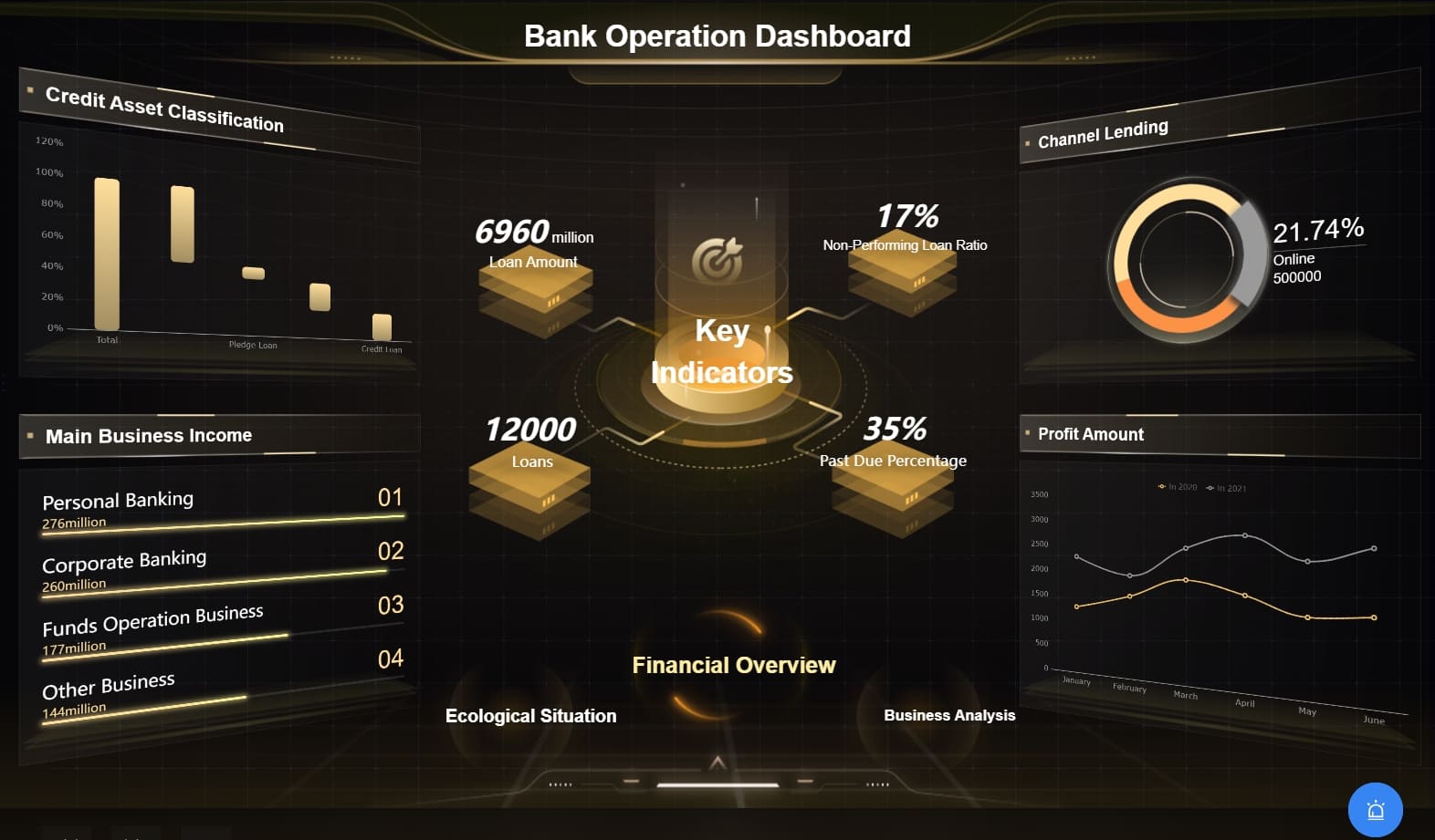
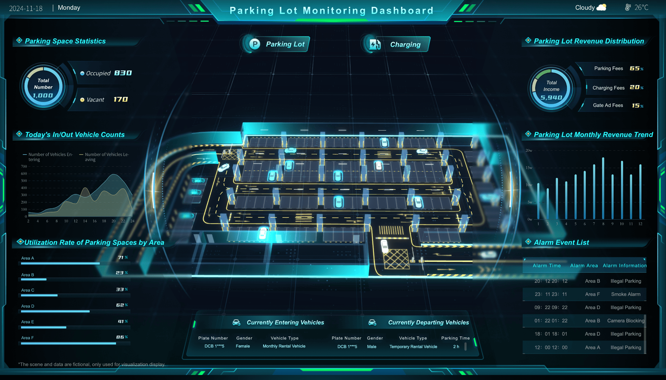
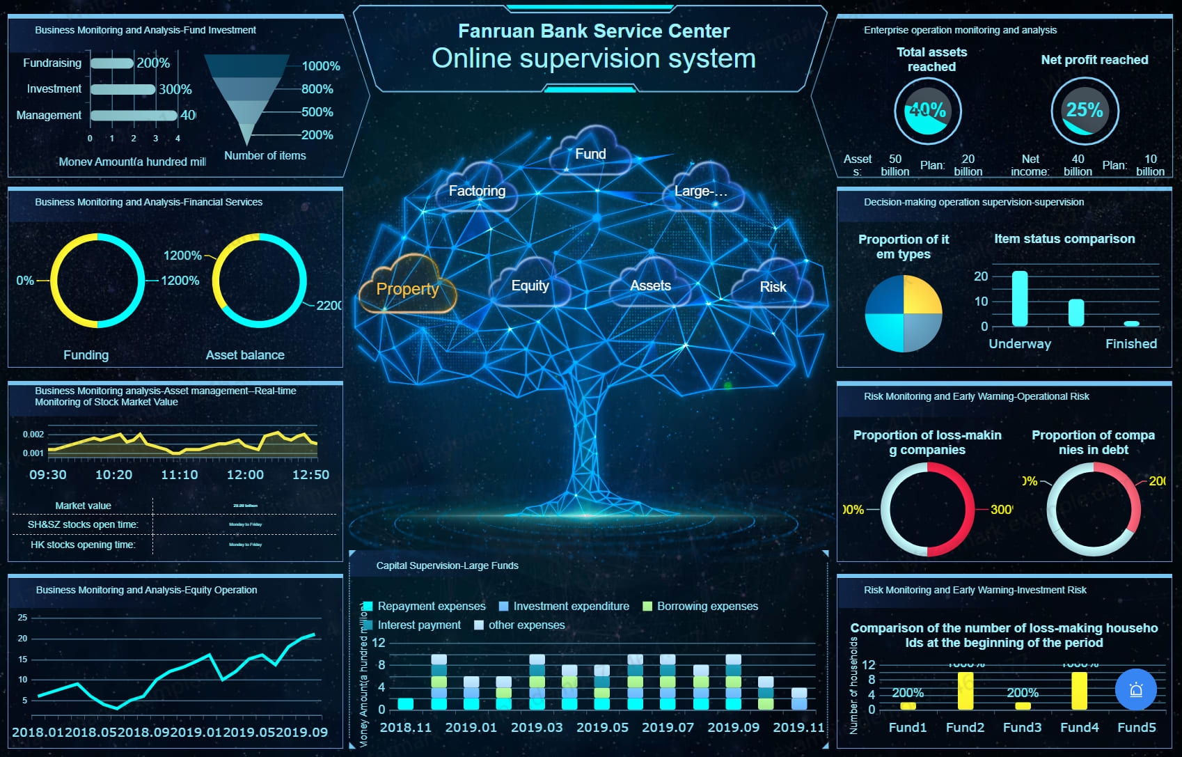
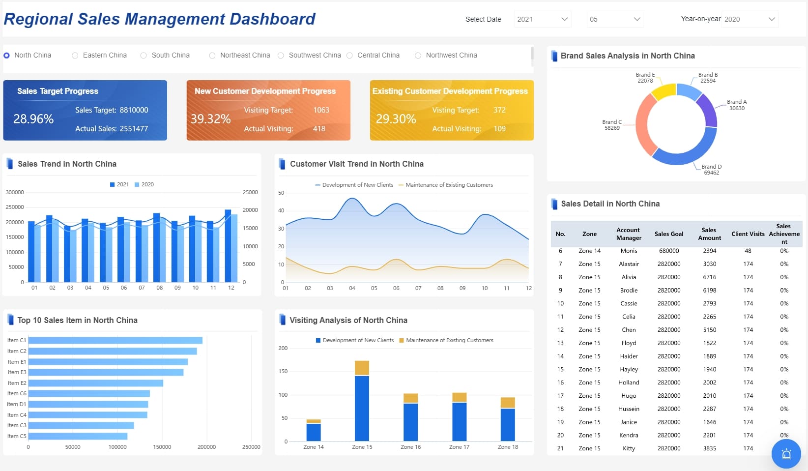
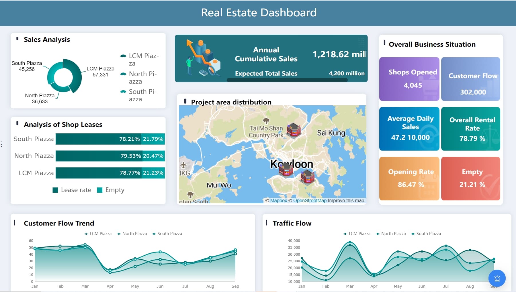
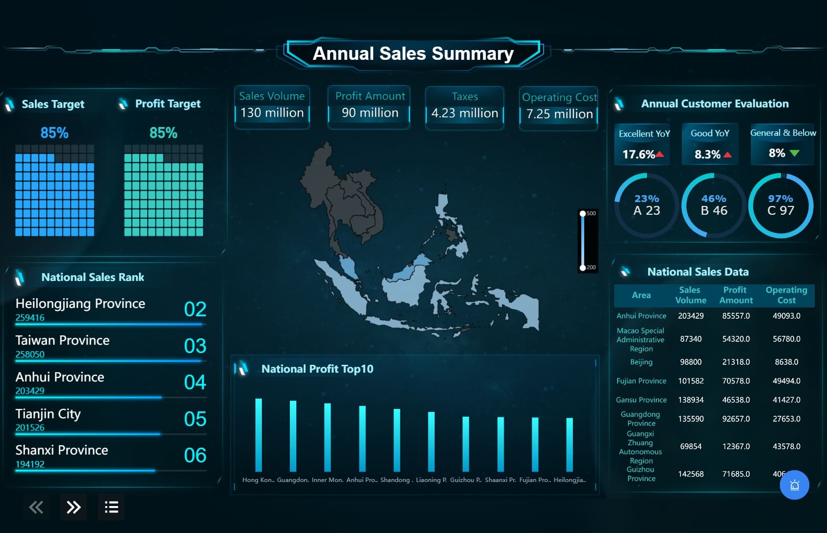
FineReport provides various report modes to meet different needs. You can generate detailed reports, interactive dashboards, or even large-scale visual displays. Its multi-terminal support ensures your data presentation looks great on PCs, mobile devices, or LED video walls. This flexibility makes it ideal for businesses that require consistent visuals across platforms.
You can try it out in the demo model below:
FineVis complements FineReport by offering advanced visualization capabilities. It supports data input, parameter querying, and in-depth analysis. These features allow you to explore your data and uncover actionable insights. With FineVis, you can create dynamic dashboards that engage your audience and enhance decision-making.
| Feature Description | Details |
|---|---|
| Data Integration | Integrates data from multiple sources to resolve data silos. |
| User-Friendly Design | Excel-like design with a minimal learning curve. |
| Analysis Capabilities | Offers data input, parameter querying, and analysis capabilities. |
| Report Modes | Provides various report modes to meet different requirements. |
| Multi-Terminal Support | Supports data presentation on PC, mobile, and LED video walls. |
By leveraging these tools, you can elevate your data presentation and deliver impactful insights.
While popular tools like Tableau and Power BI dominate the market, several lesser-known options can enhance your data presentation. These tools provide unique ways to visualize and communicate information effectively:
Exploring these alternatives can help you find the right tool for your specific needs. Each option offers distinct advantages, enabling you to tailor your data presentation to your audience and objectives.

Color plays a vital role in data visualization. It influences how you comprehend, engage with, and retain information. When used strategically, colors can direct attention, encode meaning, and communicate relationships effectively. For example, warm colors like red and orange can highlight critical data points, while cooler tones like blue and green can represent stability or growth. This approach helps you guide your audience's focus and evoke the desired emotional response.
Colors also improve accessibility and recall. By using distinct hues for different categories, you make it easier for viewers to group and interpret data. For instance, in a sales dashboard, assigning unique colors to product categories can simplify comparisons. However, avoid overloading your visuals with too many colors, as this can create confusion. Tools like FineVis by Fanruan allow you to customize color schemes, ensuring your visualizations remain clear and impactful.
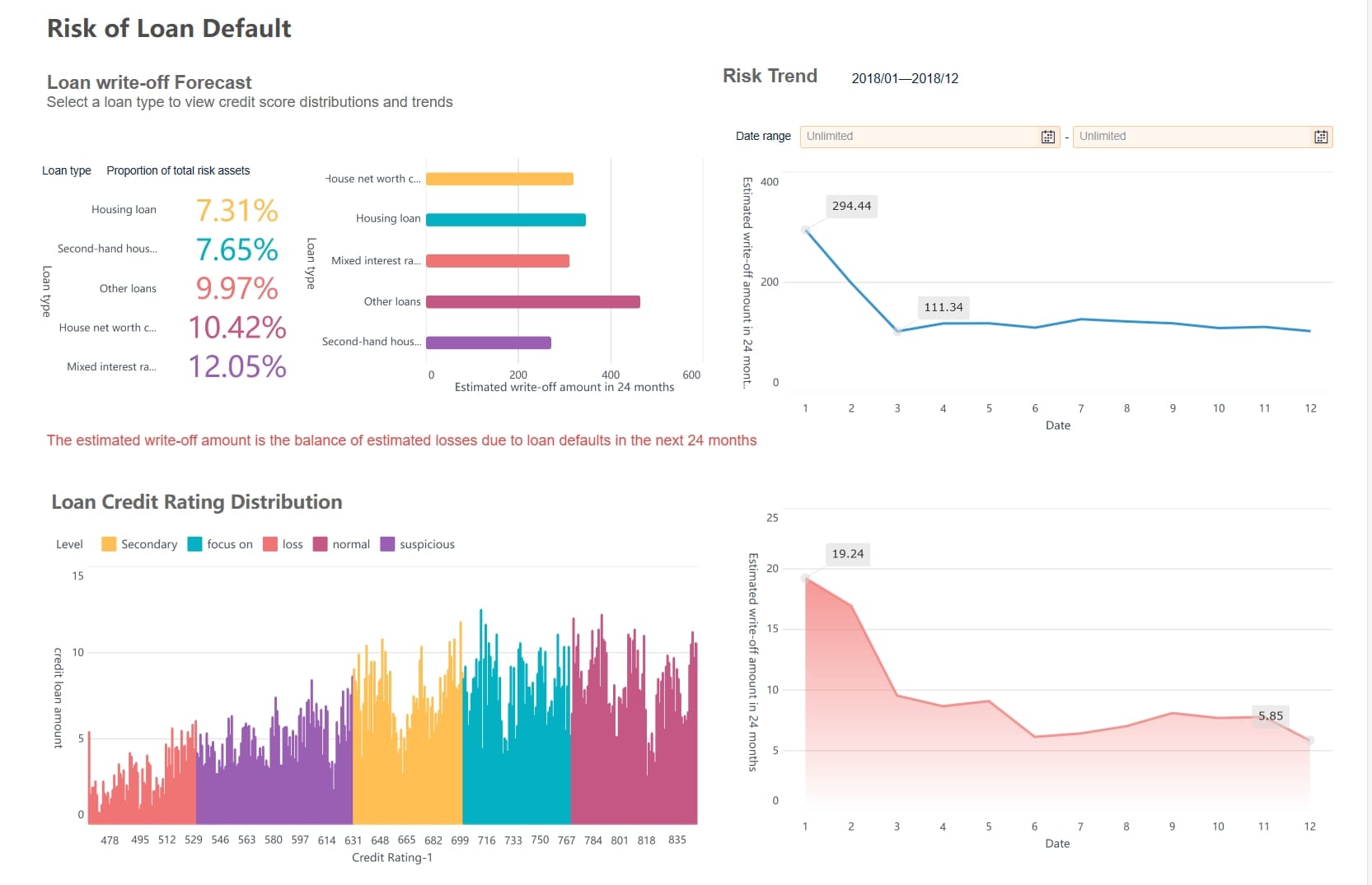
Annotations and labels are essential for making your data visualizations more understandable. They help you spotlight critical trends, explain anomalies, and clarify complex information. For instance, adding a label to a sudden spike in a line chart can instantly inform viewers about the cause, such as a seasonal sale or a market shift. This technique ensures your audience grasps the story behind the data without needing additional explanations.
Strategically placed annotations guide your audience through the visualization in a logical sequence. For example, in a performance analysis dashboard, annotations can highlight key metrics like revenue growth or customer retention rates. This approach not only simplifies interpretation but also enhances engagement. FineReport offers advanced annotation features, enabling you to add context to your visuals seamlessly.
Accessibility is a crucial aspect of effective data visualization. To ensure your visuals are inclusive, use sufficient color contrast between data points and the background. This improves readability for individuals with visual impairments. Additionally, avoid relying solely on color to convey information. Incorporate textures or patterns as alternative indicators to make your data accessible to a broader audience.
Interactive elements should be operable via keyboard, and charts must remain readable when resized. Providing alt text for simple charts and text summaries for complex visualizations ensures everyone can understand your data. Tools like FineVis and FineReport excel in creating accessible dashboards, offering features like customizable layouts and multi-terminal support. These capabilities help you deliver inclusive and impactful data visualizations.
When you overload visuals with too much data, the message becomes unclear. Instead of helping your audience, it overwhelms them. For example, pie charts with too many segments confuse viewers, especially when similar colors are used for adjacent slices. Line graphs with excessive data series clutter the display, making it hard to identify key trends. Heatmaps with poor color scales and excessive data points also fail to communicate effectively.
| Example Type | Issues Identified | Suggestions for Improvement |
|---|---|---|
| Confusing Pie Charts | Too many segments make it hard to read; similar colors for adjacent slices cause confusion. | Limit segments to 5-7; use contrasting colors and label slices directly. |
| Overloaded Line Graphs | Too many lines clutter the graph, making it hard to focus on key trends. | Highlight important trends; simplify by reducing data series; use distinct colors and line styles. |
| Unreadable Heatmaps | Poor color scales and excessive data points make it difficult to distinguish data. | Use clear color scales; add legends; limit data density by clustering or summarizing. |
| Too Much Data in One Chart | Overcrowding a chart with data leads to information overload and obscures the key message. | Break data into multiple charts; highlight only the most relevant data points. |
Tools like FineReport and FineVis simplify this process. They allow you to break down complex datasets into multiple charts or dashboards, ensuring clarity and focus.
Misleading graphics distort the truth and lead to incorrect conclusions. For instance, manipulating the y-axis scale can exaggerate or downplay trends. Using 3D effects in bar charts can make data points appear larger or smaller than they are. These tactics confuse your audience and reduce trust in your presentation.
To avoid this, always maintain honesty in your visuals. Use consistent scales and avoid unnecessary embellishments. FineVis by Fanruan offers templates that ensure accurate and clear data representation, helping you build trust with your audience.
Visualizations without context leave your audience puzzled. A chart without a timeframe, data source, or annotations feels incomplete. For example, a graph showing a sudden spike in sales might seem impressive, but without context, viewers won’t know if it’s due to a seasonal promotion or a long-term trend.
A chart without context can feel like a story missing its plot, making viewers curious about its message. When visualizations lack context—such as timeframes, data sources, or annotations—they leave viewers with unanswered questions. The absence of explanatory text or references makes it hard for the audience to grasp the significance of the data.
Always provide context to your visuals. Add annotations, labels, and clear legends to guide your audience. Tools like FineReport make this easy by allowing you to include detailed explanations and interactive elements in your dashboards.
You can try it out in the FineReport demo model below:
Artificial intelligence (AI) and machine learning (ML) are transforming how you approach data visualization. These technologies enable tools to analyze vast datasets, identify patterns, and generate insights automatically. For example, Explo uses AI to provide advanced analytics and visualization through text prompts, while Google Sheets integrates ML features like "Explore" for natural language queries. These innovations simplify your workflow and make it easier to uncover trends without requiring deep technical expertise.
AI also enhances predictive capabilities. By analyzing historical data, it can forecast future trends, helping you make proactive decisions. Tools like FineReport and FineVis leverage AI to create dynamic, automated reports that adapt to changing data. This ensures your visualizations remain relevant and actionable.
| Tool | Features |
|---|---|
| Explo | Advanced analytics, data blending, modeling, visualization, AI insights via text prompts. |
| Google Sheets | Integrates machine learning features like 'Explore' for natural language data analysis and visualization. |
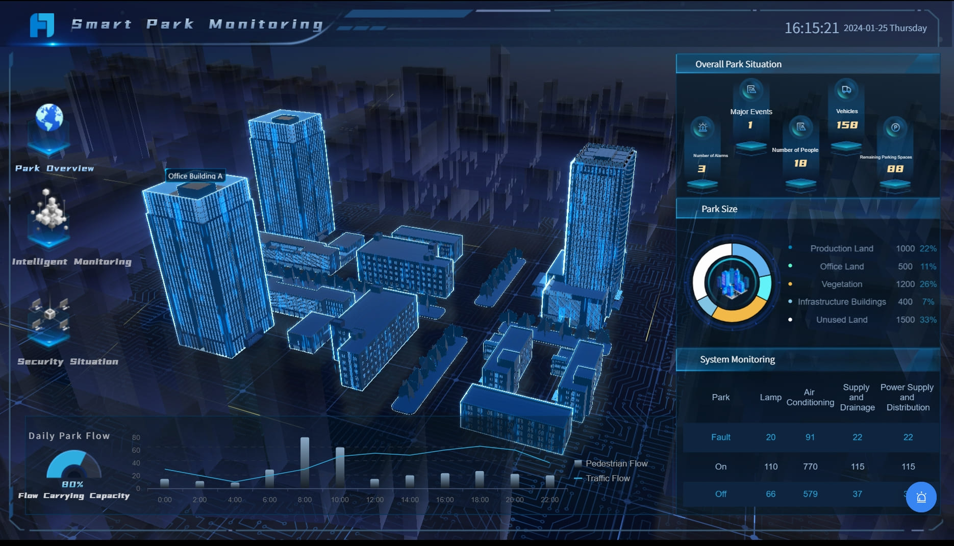
Interactive dashboards and real-time visualizations are becoming essential in industries like healthcare, finance, and education. These tools allow you to explore data dynamically, uncovering insights as they emerge. For instance, in healthcare, geographical maps and time series charts track infection hotspots and trends over time. In business, sales funnels and heat maps visualize customer journeys and regional performance. These visualizations help you monitor key metrics and respond quickly to changes.
Fanruan's FineReport excels in creating interactive dashboards that update in real time. Its multi-terminal support ensures your data looks great on any device, from PCs to mobile screens. This flexibility makes it easier for you to share insights with your team and stakeholders.
| Industry | Visualization Type | Key Features |
|---|---|---|
| Health | Geographical Maps | Displaying infection hotspots |
| Business | Sales Funnels | Visualizing the customer journey from awareness to purchase |
| Finance | Candlestick Charts | Showing the open, high, low, and close prices of stocks |
| Sports | Heat Maps | Showing player movement and positioning during games |
| Education | Dashboards | Tracking grades, attendance, and engagement metrics |
Efforts to enhance inclusivity also include developing guidelines for accessible design and enabling users with disabilities to create and manipulate visualizations. By prioritizing accessibility, you ensure your data reaches a broader audience and drives meaningful action.
Augmented reality (AR) and virtual reality (VR) are revolutionizing how you interact with data. These technologies create immersive environments where you can explore complex datasets in ways that traditional tools cannot match. By integrating AR and VR into data visualization, you gain the ability to view and manipulate information in three-dimensional spaces, making patterns and relationships easier to understand.
AR has practical applications in fields like healthcare. Surgeons can use AR headsets to overlay medical imaging data during operations, improving precision. Medical training also benefits from AR, as it provides immersive simulations for practicing procedures. For patients, AR transforms complex medical information into interactive 3D visualizations, making it easier to understand diagnoses and treatments. In physical therapy, AR gamifies exercises and offers real-time feedback, enhancing engagement and recovery outcomes.
In finance, AR simplifies the presentation of intricate financial data. It allows you to visualize trends and projections intuitively. Private equity professionals can use AR to virtually explore target companies, while insurance adjusters can assess damage remotely through AR tools. These applications save time and improve decision-making efficiency. For customer engagement, AR creates interactive experiences that make financial products more accessible and appealing.

The collaborative potential of AR and VR is another game-changer. These technologies enable real-time teamwork, allowing multiple users to interact with the same dataset simultaneously, regardless of location. This fosters effective brainstorming and decision-making. The immersive nature of AR and VR also lets you interact with data dynamically, helping you understand complex relationships and variables. This leads to more informed decisions based on immediate feedback.
Fanruan’s tools, such as FineReport, In particular, one of its key modules, FineVis, are well-positioned to support AR and VR integration. Their advanced visualization capabilities and multi-terminal support ensure seamless data presentation across platforms. By leveraging these tools, you can elevate your data visualization strategies and stay ahead in a rapidly evolving technological landscape.
Effective data presentation transforms raw information into actionable insights, enabling clear communication and better decision-making. Studies show that visual representations can enhance retention rates by up to 65%, making visualization a critical tool for conveying complex ideas. Tools like FineReport by Fanruan simplify this process with features like interactive dashboards and multi-terminal support, ensuring your visuals are both impactful and accessible.
To excel in data presentation, focus on simplicity, clarity, and relevance. Use appropriate colors, maintain a clean layout, and choose the right chart type to highlight key trends. Interactive elements, such as those offered by FineVis, can further engage your audience and foster deeper understanding. By applying these strategies, you can create a visual summary of data that resonates with your audience and drives meaningful action.
Click the banner below to also experience FineBI for free and empower your enterprise to convert data into productivity!
Why Care About Data Platforms? Find Out Here!
Understanding Descriptive Analytics: What It Is and How It Works
Step-by-Step Guide to Setting Up a Data Analytics Framework
Write a Killer Visual Analysis Essay in 2025!

The Author
Lewis
Senior Data Analyst at FanRuan
Related Articles
Data Analyst Dashboard: A Scenario-Based Guide to KPI Views That Drive Better Business Decisions
Learn how data analyst dashboards turn raw data into actionable KPI views for operational, analytical, and strategic decisions. Drive better business outcomes.
Lewis Chou
May 03, 2026

Self-Service Analytics Defined and Why You Need It
Self-service analytics lets you analyze data without IT help, empowering faster, data-driven decisions and boosting agility for your business.
Lewis
Jan 04, 2026
Best Self-Service Tools for Analytics You Should Know
See which self-service tools for analytics let business users access data, build dashboards, and make decisions faster—no IT help needed.
Lewis
Dec 29, 2025


