Business Intelligence
How to Build a P&L Dashboard for Enterprise Finance Teams: Metrics, Data Model, and Governance
Lewis Chou
May 11, 2026
A P&L Dashboard is not just a prettier income statement. For enterprise finance teams, it is the operational layer that turns fragmented actuals, budget files, forecasts, and subsidiary reports into a trusted decision system. If your CFO is asking why EBITDA missed plan, your FP&A team is manually stitching Excel exports, and regional finance leads are debating definitions instead of discussing actions, the problem is not reporting volume. It is reporting design.
A well-built P&L Dashboard helps enterprise finance teams answer three things fast: what happened, why it happened, and where to act next. The business value is straightforward: faster close cycles, more consistent variance analysis, better accountability, and less dependence on manual spreadsheet reconciliation.
All dashboards in this article were generated by FineBI.
What a P&L Dashboard should help enterprise finance teams answer
At the enterprise level, a P&L Dashboard should answer the core questions leadership asks every month, quarter, and forecast cycle. It must show whether performance is on track, where variance is emerging, and which business units, products, or regions are driving the gap.
Finance leaders typically want clarity across the full profit and loss structure:
- Is revenue ahead or behind plan?
- Is gross margin compressing due to price, mix, or cost inflation?
- Are operating expenses scaling appropriately with growth?
- Is EBITDA improving through operating leverage or being diluted?
- Is net income affected by one-time adjustments, tax impacts, or financing costs?
A strong dashboard also needs to reflect how different finance personas work with the same P&L data.
Primary users of an enterprise P&L Dashboard
Different roles need different levels of abstraction and control:
- CFOs need a concise executive summary with enterprise-wide KPIs, major variances, and trend direction.
- Controllers need confidence in reconciled numbers, close status, and policy-aligned definitions.
- FP&A teams need flexible variance analysis, scenario comparisons, and drill-down capability.
- Regional finance leads need entity, geography, and ownership views to isolate local performance drivers.
- Department finance managers need cost center and departmental views tied to accountability.
Executive summary views vs drill-down views
A common failure in dashboard design is trying to satisfy executives and analysts on one crowded screen. Enterprise finance teams should separate views by decision level:
- Executive summary views should focus on KPI cards, waterfall-style variance highlights, high-level trends, and top contributors to change.
- Drill-down views should support account-level, entity-level, product-level, and transaction-level analysis for root cause investigation.
- Variance analysis views should allow users to move from consolidated results to the exact departments, accounts, or segments responsible for unfavorable performance.
The best design principle is simple: executives should see the answer in seconds; analysts should be able to prove it in minutes.
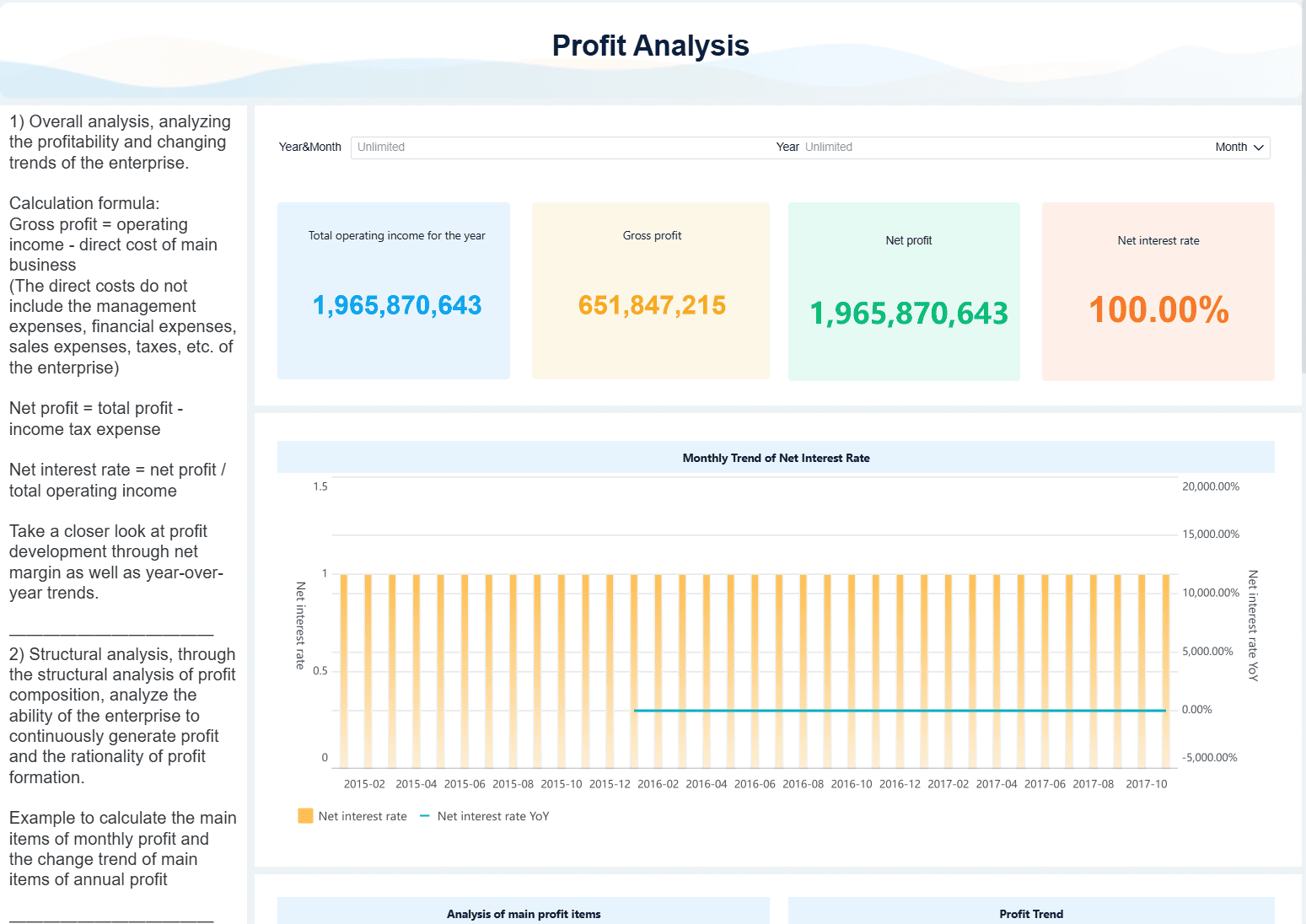
Core metrics and views to include in a P&L Dashboard
A high-performing P&L Dashboard needs more than totals. It needs a structured set of KPIs and views that support comparison, explanation, and action.
Key Metrics (KPIs)
Below are the core metrics enterprise finance teams should include:
- Revenue: Total recognized income for the selected period, entity, and reporting scope.
- Revenue Variance to Budget: Difference between actual revenue and approved budget, shown in both amount and percentage.
- Revenue Variance to Forecast: Difference between actual revenue and latest forecast, useful for in-period course correction.
- Gross Profit: Revenue minus cost of goods sold or direct costs.
- Gross Margin %: Gross profit divided by revenue; a critical indicator of pricing power and cost efficiency.
- Operating Expenses (OpEx): Selling, general, administrative, R&D, and other operating costs.
- OpEx Ratio: Operating expenses as a percentage of revenue.
- EBITDA: Earnings before interest, taxes, depreciation, and amortization; often used as a core operating performance metric.
- EBITDA Margin %: EBITDA divided by revenue to measure profitability efficiency.
- Net Income: Final profitability after all operating and non-operating items.
- Actual vs Prior Period: Comparison to last month, last quarter, or last year for directional context.
- Year-over-Year Growth %: Measures growth or decline against the same period in the prior year.
- Contribution by Segment: Share of revenue, margin, or profit generated by a business unit, product line, region, or channel.
- Operating Leverage: Relationship between revenue growth and expense growth to assess scalability.
- Trailing 12-Month Performance: Rolling view that smooths seasonality and improves trend analysis.
Revenue, margin, and cost structure metrics
The dashboard should support side-by-side comparisons across:
- Actuals
- Budget
- Forecast
- Prior period
- Year-over-year
This comparison logic is essential because enterprise decision-making depends on more than one baseline. A revenue shortfall versus budget may still look strong year over year. EBITDA may beat prior year but miss forecast because hiring accelerated faster than expected.
The dashboard should also break down revenue and costs across the dimensions finance teams actually manage:
- Entity
- Business unit
- Product line
- Geography
- Channel
- Department
- Cost center
This enables segment-level insight such as which regions are protecting margin, which product lines are diluting profitability, and whether cost growth is concentrated in shared services or operating functions.
A mature P&L Dashboard should also surface structural indicators:
- Gross margin trend
- Contribution margin by segment
- Fixed vs variable cost behavior
- Operating leverage movement over time
These views help finance move from reporting outcomes to interpreting business mechanics.
Variance and trend analysis views
Variance analysis is the heart of the dashboard. Every enterprise finance team needs to see both:
- Absolute variance: the dollar or currency value of the gap
- Percentage variance: the scale of the gap relative to plan or forecast
Use consistent time logic across monthly, quarterly, year-to-date, and trailing views. Inconsistent calendar handling is one of the fastest ways to lose trust in financial reporting.
Trend views should include:
- Monthly trend lines
- Quarterly rollups
- Trailing 12-month trends
- Year-to-date comparisons
- Scenario toggles for actual, budget, and forecast
The dashboard should then allow drill-down from an unfavorable number into its drivers. For example:
- EBITDA misses plan.
- User drills into OpEx variance.
- Variance is isolated to one region.
- Region drill shows overspend in headcount and contractor accounts.
- Transaction detail confirms timing and ownership.
That workflow is what transforms a dashboard from a static report into an operating tool.
Executive and manager-level reporting needs
Leadership wants a compact performance narrative. Managers need accountability views. A good P&L Dashboard does both without duplicating logic.
For executives, include:
- KPI summary cards
- Major budget and forecast variances
- Margin trend visuals
- Top positive and negative contributors
- Commentary snapshots
For finance managers, include:
- Department views
- Cost center accountability
- Ownership rollups
- Detailed account breakdowns
- Transaction-level access where appropriate
Commentary fields and review workflows are especially useful during close and monthly business reviews. They shorten the cycle between number publication and management explanation. Instead of asking teams to update separate slide decks, commentary can live beside the metric being reviewed.
Designing the right data model for consolidated P&L Dashboard
Most enterprise P&L Dashboard failures are data model failures. If actuals, budget, and forecast live in separate structures with inconsistent dimensions, your visuals may look polished, but your analysis will break under real use.
The right model must support consolidation, traceability, and flexible slicing without sacrificing control.
Standardize source data and chart of accounts mapping
Enterprise finance data rarely starts in one place. Actuals may come from multiple ERPs, budget from a planning platform, forecast from spreadsheets, and subsidiary results from local systems. Before dashboard design, normalize those inputs into a common model.
Key requirements include:
- Standardizing source formats across ERP, planning, and subsidiary systems
- Mapping local accounts to a global chart of accounts
- Defining a consistent reporting hierarchy for revenue, COGS, OpEx, EBITDA, and net income
- Applying rules for currency conversion
- Handling intercompany eliminations
- Supporting consolidation across legal entities and management entities
Without this standardization, consolidated reporting becomes a recurring manual exercise rather than a repeatable system.
Build dimensions that support flexible analysis
A P&L Dashboard must be built on dimensions that finance users can filter, drill, and regroup without rebuilding logic every month.
Essential dimensions include:
- Time
- Entity
- Department
- Product
- Geography
- Scenario
- Account
- Channel
- Customer segment where relevant
The model should preserve both summary structures and transactional detail. This matters because trust often depends on traceability. If a regional finance lead cannot move from a consolidated expense number to the underlying journal or transaction population, adoption will stall.
Use hierarchies to support movement between views, such as:
- Enterprise > Region > Entity
- Revenue > Product family > Product line
- OpEx > Department > Cost center > Account
- Year > Quarter > Month
These hierarchies make drill-down intuitive and reduce rework in dashboard design.
Connect actuals, budget, and forecast in one structure
Many organizations maintain actuals, budget, and forecast in separate logic layers, which creates constant reconciliation issues. The better approach is to unify them in one scenario-aware structure.
That structure should:
- Align actuals, budget, and forecast to the same dimensional model
- Allow direct comparisons by period, segment, and account
- Support rolling forecasts and periodic planning updates
- Preserve historical versions where needed
- Enable a consolidated P&L and forecast view across the organization
This is especially important in enterprises where planning assumptions change throughout the year. You want to add new forecast versions without rewriting historical reports or breaking prior-period comparisons.
Governance, controls, and definitions that keep the P&L dashboard trusted
A P&L Dashboard is only useful if finance trusts it more than the spreadsheet alternative. That trust comes from governance, not visualization.
Metric definitions and reporting policies
Finance teams must define each metric in business terms and calculation terms. Shared definitions prevent the most common enterprise reporting problem: different teams using the same label for different math.
At minimum, document definitions for:
- Revenue
- Gross profit
- Gross margin %
- Operating expense
- EBITDA
- Net income
Also document:
- Adjustment policies
- One-time item treatment
- Reclassification logic
- Scenario version rules
- Consolidation assumptions
- Timing conventions for reporting periods
Version control is critical. If EBITDA logic changes, users should know what changed, when it changed, and which reports are affected. This is how you create a stable financial data language across the enterprise.
Data quality, access, and review controls
Governance must also include operational controls before the dashboard is published.
Best-practice controls include:
- Completeness checks to confirm all entities and periods are loaded
- Reconciliation checks between dashboard totals and financial statements
- Cross-report validation for connected metrics and balances
- Sign-off workflows before executive publication
- Audit trails for refreshes, overrides, and commentary edits
- Role-based access control by entity, region, department, or account sensitivity
For enterprise teams, access design matters as much as data design. A controller may need full legal-entity visibility, while a department manager should only see their cost center view. Granular permissioning protects confidentiality without creating parallel shadow reports.
Implementation tips, reporting templates, and practical rollout steps
A successful P&L Dashboard rollout is usually phased, not big-bang. Start with a clear scope, validate trust, then expand.
Dashboard layout and usability best practices
Keep the first layer concise. Enterprise users should not have to hunt for the story.
Use this layout pattern:
- Top summary row with KPI cards for revenue, gross margin, EBITDA, and net income
- Variance section showing actual vs budget and actual vs forecast
- Trend section with monthly or trailing charts
- Breakdown section for segment contribution
- Drill-through section for account and transaction detail
Practical usability rules:
- Keep filters intuitive and limited to meaningful dimensions
- Use one consistent time selector across the dashboard
- Preserve the same metric definitions across all tabs
- Avoid excessive chart variety
- Use color sparingly, especially for favorable vs unfavorable variance
Reporting templates and example outputs
Enterprise finance teams usually need several standard outputs from the same model. Define templates early so the dashboard becomes part of the reporting operating model, not just an analytics side project.
Typical templates include:
- Monthly leadership review: enterprise summary, major variances, margin trends, and commentary
- Quarterly board-ready summary: simplified KPI narrative, trend context, and strategic performance drivers
- Finance manager view: department or cost center level P&L with ownership accountability
- Operating review pack: region, entity, product, and channel contribution analysis
Spreadsheet outputs can still be useful in specific cases, especially for offline review, regulatory formatting, or ad hoc schedules. But they should be generated from the governed model, not rebuilt manually from raw extracts.
Phased rollout and tool considerations
As a consultant, I recommend a four-step rollout path:
1. Start with a minimum viable dashboard
Launch for one legal entity or business unit first. Prove the metric logic, data refresh process, and user workflow before scaling.
2. Standardize the core finance model
Align chart of accounts mapping, scenario structures, hierarchies, and time logic. This is the foundation for consolidation.
3. Add forecast integration and governance workflows
Once actuals and budget are stable, connect rolling forecast data, commentary, review status, and sign-off controls.
4. Expand to enterprise-wide consolidation
Scale to group-level reporting with intercompany eliminations, multi-entity views, regional access rules, and management reporting packs.
When should a team use BI tools versus build a profit and loss dashboard in Excel? The answer is practical:
- Use Excel for one-off analysis, quick scenario testing, and analyst-owned ad hoc work.
- Use BI when reporting must be repeatable, governed, refreshable, drillable, and shared across stakeholders.
Excel is a tool. BI is an operating capability. Enterprise finance teams usually need both, but they should not use spreadsheets as the long-term system for consolidated P&L reporting.
Build the methodology once, then automate it with FineBI
The framework above is the right way to build a trusted P&L Dashboard: define the business questions, standardize the metrics, model the data correctly, apply governance, and roll out in phases. But building this manually is complex. It requires data integration across systems, finance-ready dimensional modeling, consistent KPI definitions, drill-down capability, controlled access, and ongoing maintenance as reporting needs evolve.
That is exactly where FineBI becomes the practical solution.
Instead of stitching together spreadsheets, custom SQL, and one-off visual layers, finance teams can use FineBI to build governed, interactive P&L reporting on a unified analytics foundation. It supports multi-source integration, self-service analysis, OLAP-style drill-down, role-based access, and dashboard delivery that works for both executives and finance managers.
More importantly for enterprise adoption, building this manually is complex; use FineBI to utilize ready-made templates and automate this entire workflow.
 Get Ready-to-Use Dashboard Templates in Fine Gallery
With FineBI, teams can:
- Accelerate dashboard deployment with ready-made finance templates
- Connect actuals, budget, and forecast into one analysis experience
- Support drill-down from summary KPIs to detailed records
- Standardize KPI definitions and reporting logic across the organization
- Enable finance commentary, sharing, and recurring reporting workflows
- Reduce manual monthly reporting effort while improving consistency and trust
If your current process depends on manual exports, disconnected budget files, and last-minute reconciliation before every review meeting, the opportunity is clear. A well-implemented P&L Dashboard can turn finance from a reporting function into a decision engine. FineBI helps you get there faster, with less manual complexity and far more scalability.
FAQs
It should include core profitability metrics such as revenue, gross margin, operating expenses, EBITDA, and net income, along with comparisons to budget, forecast, prior period, and year over year. It should also support views by entity, business unit, product, geography, and department.
A traditional income statement is mainly a static financial report, while a P&L dashboard is built for analysis and action. It adds trend views, variance analysis, drill-down capability, and governance so finance teams can quickly explain what changed and why.
CFOs usually need an executive summary with top KPIs and major variances, while FP&A teams and controllers need deeper drill-downs for reconciliation and root cause analysis. Regional and department finance leaders also need filtered views tied to their scope of accountability.
Trust comes from a clear data model, standardized metric definitions, reconciled actuals, and strong governance over data ownership and refresh logic. Without those controls, teams often spend more time debating numbers than making decisions.
The most useful comparisons are actual versus budget, actual versus forecast, actual versus prior period, and year-over-year performance. Together, these views help finance teams separate temporary movement from meaningful operational change.


The Author
Lewis Chou
Senior Data Analyst at FanRuan
Related Articles

Environmental Reporting Software Comparison: ESG Platforms vs BI Reporting Tools for Enterprise Teams
Environmental $1 helps enterprises collect, manage, analyze, and present environmental data such as emissions, energy, water, waste, and related sustainability metrics. If you are evaluating this category, you are likely
Yida Yin
Jul 02, 2026

Best Ad Hoc Reporting Tools in 2026: Pros, Cons, Pricing, and Best Use Cases
$1 tools are designed to help business users answer specific questions on demand instead of waiting for a scheduled report or a custom build from IT. If your team needs to quickly check why sales dipped, compare regional
Yida Yin
Jul 02, 2026

Best KPI Reporting Software for 2026: 10 Tools Compared for Dashboards, Reports, and KPI Tracking
If you are searching for kpi $1 , you are likely trying to solve one of three problems: you need a better way to track business performance, you want clearer dashboards and reports for stakeholders, or you need a platfor
Yida Yin
Jun 29, 2026