Yes, you can create a profit and loss dashboard from scratch, even if you are new to business intelligence. A profit and loss dashboard gives you a clear view of your company’s income and expenses, which helps you make smarter financial decisions. Unlike traditional spreadsheets that require manual entry and often lead to delays or errors, dashboards update automatically and provide real-time insights. FineBI from FanRuan connects directly to your financial systems and automates the tracking of key metrics like Gross Profit Margin and OPEX Variance. This approach lets you drill down into cost drivers instantly, protecting your bottom line and giving you the confidence to act on accurate data.
A profit and loss dashboard gives you a clear, visual summary of your company’s financial performance. You see how much money comes in, where it goes, and what remains as profit. This tool organizes your income and expenses into easy-to-read charts and tables. You do not have to rely on manual Excel entries, which often cause delays and make it hard to spot hidden costs. Instead, you get real-time updates that help you stay on top of your finances.
A typical profit and loss dashboard includes these main components:
FineBI connects directly to your ERP and financial systems. You can automate the tracking of key metrics like Gross Profit Margin and OPEX Variance. This means you always have up-to-date numbers and can drill down into cost drivers with just a few clicks.
You need more than just totals to make smart decisions. A profit and loss dashboard helps you organize operations and monitor cash flows. It simplifies tracking of finance KPIs, so you can get quick insights and act fast. You see your income, expenses, and profits over time, which makes it easier to spot trends and improve profitability.
Here is how a profit and loss dashboard stands out compared to other financial dashboards:
| Metric | Description |
|---|---|
| Revenue | Breakdown of income from various streams for detailed analysis. |
| Operating Expenses | Categorized costs for better expense management. |
| Net Profit | Profit after all items, showing overall financial health. |
| Net Income | Amount left after all expenses, taxes, and dividends. |
| Net Operating Income (NOI) | Income from core operations, useful for measuring efficiency. |
| Cost of Goods Sold | Shows profit from sales after production costs. |
When you use a profit and loss dashboard, you can:
With FineBI, you move from reactive reporting to proactive financial management. You gain the power to make informed decisions and protect your bottom line.
Manual Excel entries often slow down your profit and loss reporting. You may face delays, hidden cost leaks, and errors that make it hard to trust your numbers. Experts recommend automating the tracking of key metrics like Gross Profit Margin and OPEX Variance. FineBI helps you solve these problems by connecting directly to your ERP and financial systems. You get real-time integration, dynamic income statements, and instant drill-down into cost drivers.
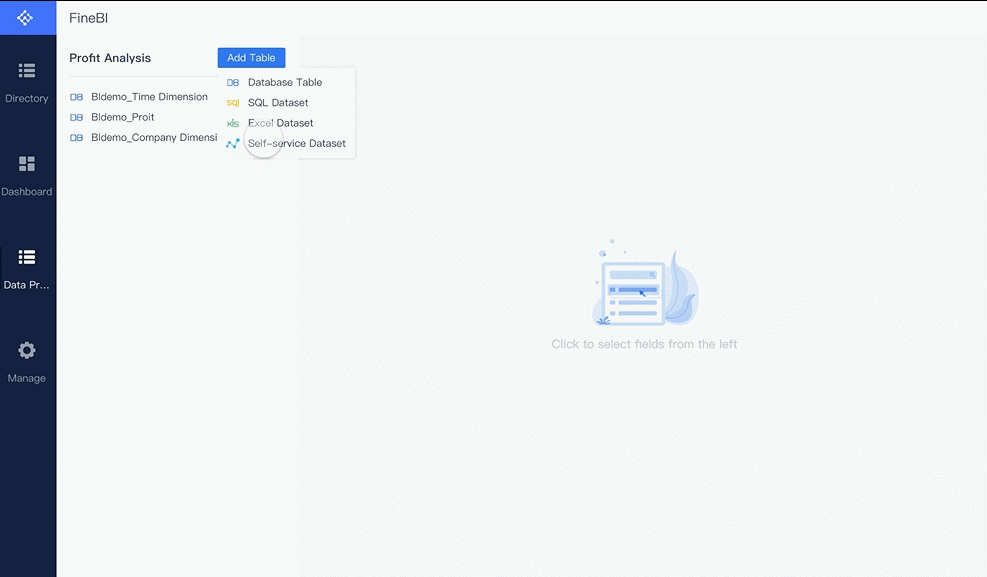
You can set up your p&l sheet in FineBI by following a few simple steps:
FineBI supports many data sources, so you can bring together information from different systems for a complete financial view.

When you prepare your data for analysis, you may face some common challenges:
| Challenge | Description |
|---|---|
| Invalid data values | Misspellings, typos, duplicates, and outliers can lead to faulty analysis. |
| Name and address standardization | Inconsistent names and addresses make it hard to see the full picture. |
| Inconsistent data across systems | Data may look correct in one place but not match up when combined with other sources. |
| Missing or incomplete data | Blank or missing fields can hurt your analysis and cause compliance issues. |
To get the best results, follow these best practices for cleaning and transforming your financial data:

By following these steps, you can trust your data and focus on making smart financial decisions with FineBI.

When you build a profit and loss statement in FineBI, you start by organizing your income and expenses into clear categories. This structure helps you see where your money comes from and where it goes. You can use a template to make this process easier. A well-designed template for a profit and loss statement usually follows a standard order. You begin with income at the top, then subtract the cost of goods sold to find your gross profit. Next, you list your operating expenses and other costs. This approach gives you a clear p&l summary and helps you track your financial health.
Here is a typical way to organize your categories:
You can use these categories as a template in FineBI. Each category becomes a field in your profit and loss dashboard. You can customize the template to match your business needs. For example, you might add extra lines for specific types of income or expenses. FineBI lets you pull data from your ERP or accounting system, so you do not have to enter numbers by hand. This saves time and reduces errors.
A profit and loss statement built this way gives you a p&l summary that is easy to read. You see your total income, your total expenses, and your net profit or loss. You can also break down your income and expenses by product, region, or time period. This helps you spot trends and make better decisions.
Tip: Use a template that matches your business model. This makes it easier to compare results over time and across departments.
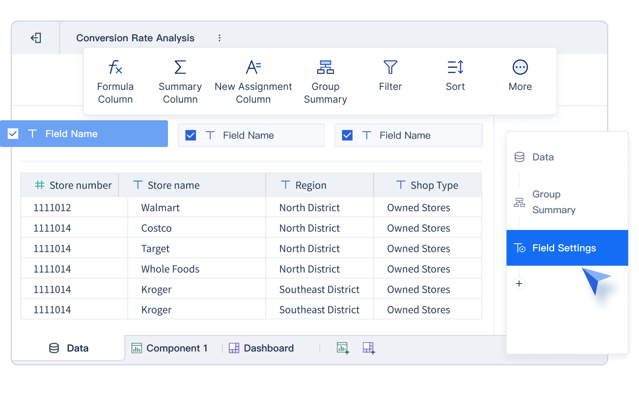
FineBI helps you automate the calculations in your profit and loss statement. You do not need to write complex formulas or worry about making mistakes. The platform provides built-in functions and templates that handle the math for you. You can create new calculation fields to aggregate income and expenses, calculate proportions, and generate a real-time p&l summary.
Here is a table showing some common functions you can use in FineBI:
| Function | Description | Example |
|---|---|---|
| IF | Returns one value if a condition is true and another if it is false. | IF(SIGN(profit)=1, profit, 0) |
| SIGN | Shows if a number is positive, negative, or zero. | SIGN(profit) |
You can use these functions to build custom fields in your template. For example, you might want to show only positive profit values or flag any loss that needs attention. FineBI lets you set up these calculations once, and then it updates them automatically as new data comes in.
When you automate your profit and loss calculations, you make your reporting faster and more accurate. FineBI keeps your original data safe while using calculated values for your dashboard. You do not have to worry about manual errors or missing updates. The system checks data types, sets access limits, and manages memory to keep your calculations correct. Administrators can adjust these settings to fit your needs, which helps prevent mistakes and keeps your profit and loss statement reliable.

Note: FineBI’s real-time connection to your financial systems means your profit and loss dashboard always shows the latest numbers. You can drill down into income and expenses to find the source of any profit or loss.
By using FineBI, you move beyond manual Excel templates and unlock the power of automated analytics. You get a dynamic profit and loss statement that updates instantly. You can track gross profit margin, OPEX variance, and other key metrics across multiple dimensions. This approach helps you protect your bottom line and gives you confidence in your financial decisions.
A financial statement analysis dashboard helps you see your company’s financial health at a glance. You can move beyond static spreadsheets and manual Excel entries. FineBI gives you the tools to create an effective financial dashboard that updates in real time. You can use interactive charts, flexible layouts, and smart templates to make your data clear and actionable.
You can bring your financial statement analysis dashboard to life with interactive charts. FineBI’s drag-and-drop interface makes this process simple. You do not need to write code or worry about complex formulas. You can select the right chart type for each metric and use a template to speed up your work.
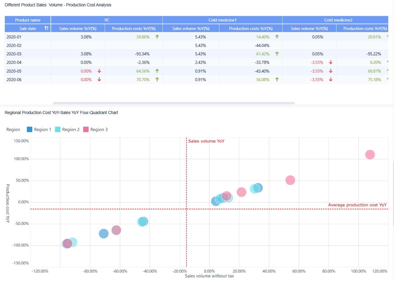
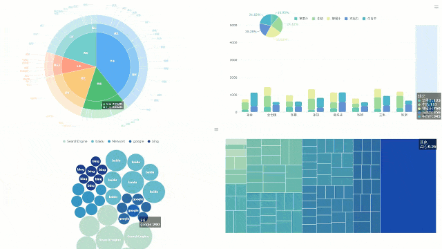
Here are some of the most effective chart types for a financial statement analysis dashboard:
| Chart Type | Description |
|---|---|
| Pie Chart | Provides an intuitive presentation of proportional relationships, ideal for visualizing sales data. |
| Custom Chart | Allows for the combination of multiple graphics, such as column and line charts, for enhanced clarity. |
You can use a pie chart to show how different expenses contribute to your total costs. You can use a custom chart to compare revenue and profit trends over time. FineBI lets you save your favorite chart settings as a template. This means you can reuse your best designs for new reports or share them with your team.
Interactive visualizations offer many benefits for your financial statement analysis dashboard. You can see real-time insights, simplify complex data, and plan for different scenarios. The table below shows how these features help you make better decisions:
| Benefit | Explanation |
|---|---|
| Real-time insights | Interactive visualizations provide up-to-date information, enabling timely decision-making. |
| Simplifying complex data | They make it easier to interpret large datasets, revealing insights that might be missed otherwise. |
| Dynamic scenario planning | Financial leaders can test various scenarios quickly, refining strategies based on current data. |
You can customize your analysis to fit your needs. You can choose different visualization types based on your goals. This flexibility makes your financial statement analysis dashboard more useful and satisfying.
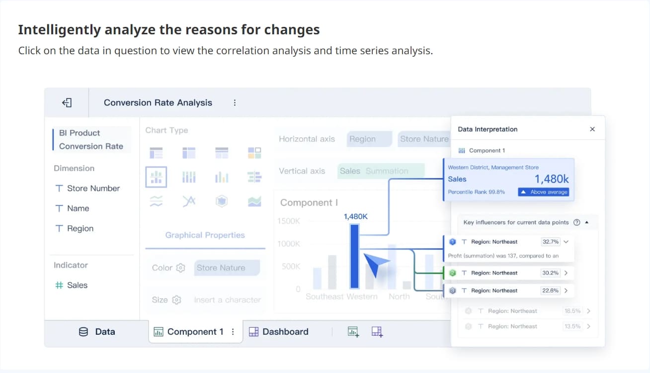
FineBI’s drag-and-drop features help you build your financial statement analysis dashboard quickly. You can add tables, charts, and widgets with a few clicks. You can use a template to organize your income statement, expense breakdown, or profit margin analysis. You can link components so that when you click on one chart, related charts update automatically. This makes it easy to drill down into cost drivers and spot trends.
Tip: Save your most-used chart setups as a template. This saves time and keeps your financial statement analysis dashboard consistent.
A clear layout makes your financial statement analysis dashboard easy to read and understand. FineBI gives you several layout options to match your business needs. You can use a template to start, then adjust the layout for your audience.
FineBI offers two main layout types for your financial statement analysis dashboard:
| Layout Type | Description |
|---|---|
| Grid Layout | Supports vertical stretching, divides the plane into cells, maintains component proportions on resize. |
| Free Layout | Allows free positioning and sizing of components, adjustable stacking order after setting hover. |

You can use grid layout to keep your charts and tables organized. This layout works well for dashboards that need to look good on any device. You can use free layout if you want more control over where each component appears. This is helpful when you want to highlight key metrics or create a unique look for your financial statement analysis dashboard.
FineBI’s dashboard design features make your financial statement analysis dashboard flexible and powerful. Here are some key features you can use:
| Feature | Description |
|---|---|
| Multi-screen self-adaptation | Dashboards adapt to various devices like tablets, mobile phones, and large screens. |
| Abundant visual elements | Offers a wide range of visual components such as tables, charts, and widgets. |
| Multiple layout types | Includes adaptive layout, absolute layout, and Tab layout options. |
| Component reuse | Allows for quick creation of dashboards by reusing components. |
| Component linkage | Enables auto-refresh of linked components when one is clicked. |
| Data monitoring and timed refresh | Updates front-end data in real-time based on back-end changes. |
| Auto carousel | Supports carousel display of different charts and Tab pages in one location. |
You can use a template to set up your financial statement analysis dashboard for different teams or departments. For example, you might create a template for sales, another for operations, and a third for executive review. Each template can have its own layout, chart types, and filters.
Note: A well-designed template helps you create an effective financial dashboard that is easy to update and share.
You can also use templates to standardize your financial statement analysis dashboard across your organization. This makes it easier for everyone to understand the numbers and act on them. You can set up templates for monthly reviews, quarterly reports, or annual summaries. FineBI lets you adjust these templates as your business grows or your needs change.
When you use FineBI, you move away from manual Excel entries and static reports. You get a financial statement analysis dashboard that updates in real time. You can drill down into cost drivers, track gross profit margin, and monitor OPEX variance with precision. You protect your bottom line and gain confidence in your financial decisions.
Tip: Review your template regularly to make sure it matches your current business needs. Update your financial statement analysis dashboard as your company grows.
By using FineBI’s drag-and-drop tools, interactive charts, and flexible templates, you can create a financial statement analysis dashboard that is clear, actionable, and always up to date.
You want your profit and loss dashboard to always show the latest numbers. FineBI makes this easy by letting you automate data refresh and updates. You can set up your dashboard to update at regular intervals, so you never have to worry about old data. For example, you can schedule updates every hour, day, or even use custom settings for more control. This keeps your profit and loss information accurate and helps you track your business finances in real time.
To automate updates in FineBI, follow these steps:
You can also use FineBI’s built-in scheduling options. Choose from simple intervals like minutes or hours, or set detailed schedules using Cron expressions. This flexibility means you can track your business finances without manual effort.
| Execution Frequency | Description |
|---|---|
| Only Execute Once | Runs the update one time after the set start time. |
| Execute Repeatedly | Updates at set intervals (minutes, hours, days, weeks). |
| Set Detailed Frequency | Allows for custom intervals, even down to specific days/months. |
| Set Expression | Use Cron expressions for advanced scheduling. |
Tip: Automating updates helps you spot profit trends and loss risks quickly, so you can act before small issues grow.
When you design a profit and loss dashboard, you may face some common mistakes. These can make it harder to track your business finances and understand your profit or loss. Here are some mistakes to watch for:
| Mistake | Description |
|---|---|
| Excessive detail | Too much information can hide important profit numbers and loss signals. |
| Poor choice of measures | Wrong metrics can lead to confusion about profit and loss performance. |
| Inappropriate display | The wrong chart type can make profit or loss data hard to read. |
| Lack of clarity | Messy layouts can make profit and loss results unclear. |
| Cluttering with decoration | Extra graphics can distract from key profit and loss insights. |
Other issues include unnecessary complexity, hard-to-read fonts, and missing context. To avoid these, focus on key KPIs, use clear visuals, and match each chart to the data. Always check your data quality before building your dashboard. Keep your template simple and logical, so you can track your business finances with confidence.
If you run into setup errors in FineBI, check for disk space, user permissions, and installation package completeness. Make sure your server is running and network settings are correct. These steps help you avoid downtime and keep your profit and loss dashboard running smoothly.
Note: A well-designed profit and loss dashboard helps you protect your bottom line and make smart decisions for your business.
You can create a profit and loss dashboard in FineBI by connecting your data, preparing it for analysis, building clear categories, automating calculations, and designing interactive visuals. This process is simple and accessible, even if you are new to business intelligence. Real-time access to your profit and loss data helps you make better decisions, spot trends, and manage risks quickly. Start building your dashboard today to unlock data-driven insights and improve your financial results.
Ready to gain real-time visibility into your profitability? Click the banner below to start your FREE trial of FineBI and modernize your P&L reporting today!
What Does the Motive Dashboard Do?
Draft Dashboard Review - Is It the Ultimate DFS Tool?
What Makes an AR Dashboard Essential for Modern Finance Team

The Author
Lewis
Senior Data Analyst at FanRuan
Related Articles
Payment Analytics Dashboard: 12 KPIs Every Operations Leader Should Track to Cut Revenue Leakage
Losing revenue to declines? Discover 12 essential KPIs to track in your payment analytics dashboard to stop leakage and manage disputes.
Lewis Chou
May 05, 2026

SOC Dashboard Explained: 12 Essential KPIs, Views, and Workflows Security Teams Use
Learn about SOC dashboards, the 12 essential KPIs for security teams, and how they centralize alerts and workflows for faster threat detection and response.
Lewis Chou
May 05, 2026

EMR Dashboard Guide: 12 Metrics to Track for Faster Clinical and Operational Decisions
Learn the 12 essential EMR dashboard metrics to track for faster clinical and operational decisions, improving patient flow and revenue cycle management.
Lewis Chou
May 05, 2026


