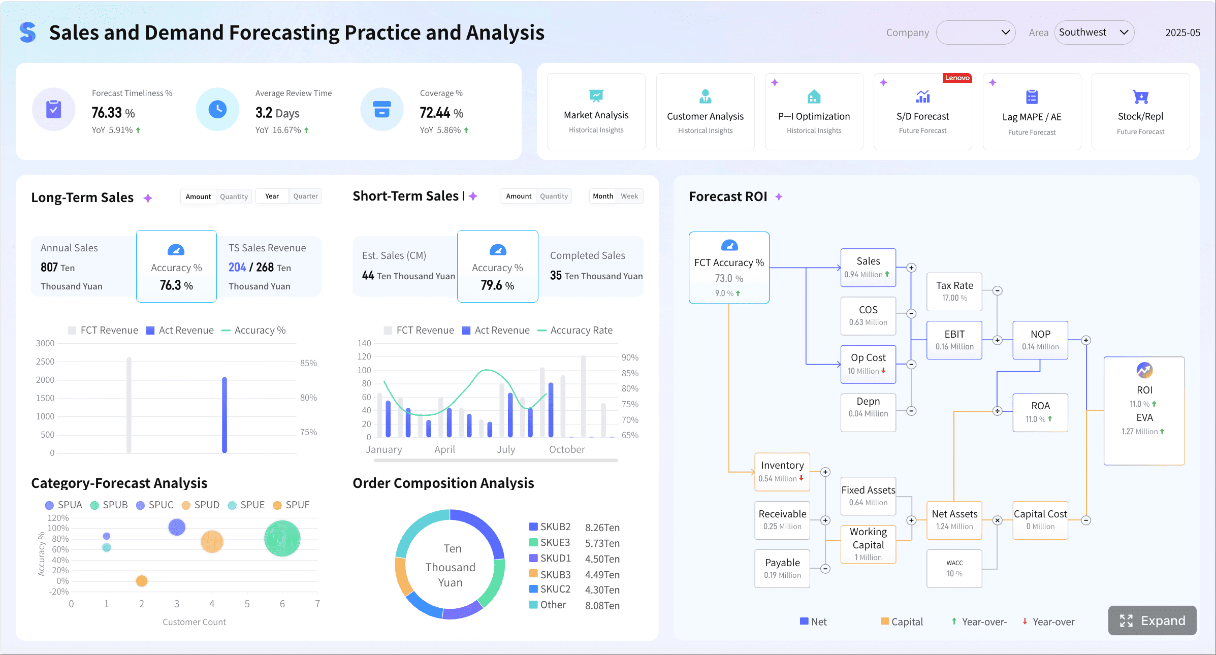
A retail analytics dashboard is not just a reporting screen. For enterprise retail teams, it is the daily control tower for revenue, inventory, customer demand, fulfillment, and campaign performance across stores, ecommerce, marketplaces, and service operations.
If you lead retail operations, merchandising, ecommerce, or regional performance, the pain is familiar: data lives in separate systems, yesterday’s results arrive late, teams argue over KPI definitions, and issues like stockouts or conversion drops are spotted after margin is already lost. A well-structured daily dashboard fixes that. It gives decision-makers one trusted view of what changed, why it matters, and where to act first.
In omnichannel retail, daily visibility matters because demand shifts fast. Promotions distort channel mix. Marketplace sales surge while store traffic softens. Inventory may look healthy overall while key SKUs are unavailable in high-demand regions. Without a unified dashboard, teams react slowly and inconsistently.
All the dashboards in this article are created by dashboard software: FineBI
What a retail analytics dashboard should do for omnichannel sales teams
An enterprise-grade retail analytics dashboard should provide a single daily view of performance across:
- Physical stores
- Ecommerce sites
- Marketplaces
- Mobile commerce
- Inventory systems
- Fulfillment operations
- Customer service and returns workflows
Its job is to reduce decision latency. Instead of waiting for manually assembled spreadsheets or static daily reports, teams should be able to open one dashboard and immediately understand whether the business is on pace, where risks are building, and which teams need to respond.
For example, a conversion dip on the website may look like a marketing problem. But when the dashboard also shows a spike in out-of-stocks, slow page speed, or delayed fulfillment messaging, the root cause becomes clearer. That is the business value: not more charts, but faster operational clarity.
Why daily visibility matters
Daily visibility supports four critical enterprise outcomes:
- Revenue protection: Catch sudden sales slowdowns before weekly reporting hides the issue.
- Inventory control: Spot low availability, overstocks, and backorder exposure early.
- Demand sensing: Identify channel, region, or product-level shifts as they emerge.
- Campaign accountability: See whether promotions are driving profitable growth or just discount-led volume.
Many retail organizations still rely on fragmented reports assembled by analysts every morning. That process is slow, labor-intensive, and vulnerable to human error. A dashboard should automate that workflow so teams can focus on diagnosis and action, not report assembly.
Reporting view vs operational dashboard vs executive summary
These formats are often confused, but they serve different purposes.
Reporting view
A reporting view is historical and detailed. It is designed for analysis, reconciliation, and periodic review. It answers, “What happened?”
Operational dashboard
An operational dashboard is the most important daily tool. It is current, alert-driven, and action-oriented. It answers, “What needs attention right now?”
Executive summary
An executive summary is compact and directional. It highlights headline KPIs, major exceptions, and business implications. It answers, “Is the business on track, and where are the biggest risks or opportunities?”
A mature retail organization usually needs all three, but the daily operating rhythm should center on the operational dashboard.
The 12 daily metrics enterprise teams should track
The most effective retail dashboards balance commercial, operational, and customer metrics. They should not overwhelm users with dozens of vanity indicators. They should focus on a concise set of measures that directly support pricing, replenishment, promotion, staffing, and service decisions.
Key Metrics (KPIs)
Below are the 12 daily KPIs every enterprise omnichannel retail team should track:
- 1. Total Sales: Gross sales generated across all channels for the day.
- 2. Day-over-Day Sales Change: Percentage increase or decrease versus the prior day.
- 3. Sales vs Target: Actual revenue compared with daily or period pacing targets.
- 4. Sessions or Traffic: Total visits to digital properties or measurable store traffic proxies.
- 5. Conversion Rate: Percentage of visits that turn into completed purchases.
- 6. Cart Abandonment Rate: Share of carts initiated but not converted into orders.
- 7. Traffic Source Quality: Performance of channels such as paid search, email, social, organic, or affiliates based on conversion and revenue contribution.
- 8. Average Order Value (AOV): Average revenue per order, useful for pricing and bundling analysis.
- 9. Units per Transaction (UPT): Average number of items purchased per order or basket.
- 10. Stock Availability / In-Stock Rate: Share of products available for sale where demand exists.
- 11. Fulfillment and Cancellation Performance: Shipping speed, order processing, and cancellation rates that affect customer experience and margin.
- 12. Return and Retention Performance: Return rate, repeat purchase behavior, and promotion-driven customer quality.
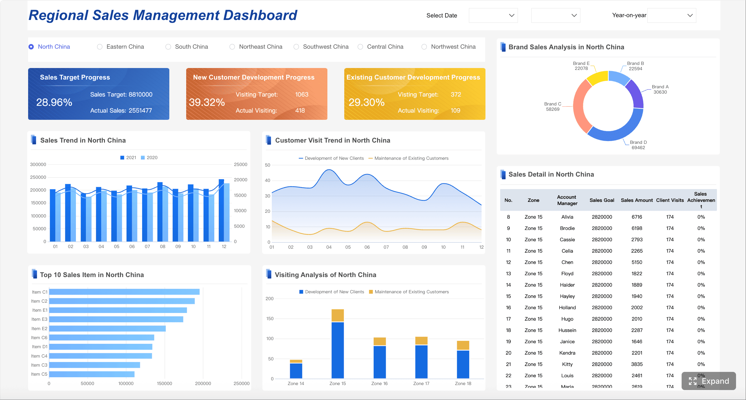
Revenue and sales trend
Revenue is still the first question leadership asks each morning. But “total sales” alone is not enough. Teams need trend context and target pacing by channel.
A strong daily revenue section should show:
- Total sales for yesterday and today-to-date
- Day-over-day percentage change
- Pace against daily, weekly, and monthly targets
- Channel contribution from stores, ecommerce, and marketplaces
- Regional or store cluster variance where relevant
This view helps leaders quickly answer whether a revenue change is broad-based or isolated. If ecommerce is up but marketplaces are down, the response is different than a network-wide slowdown.
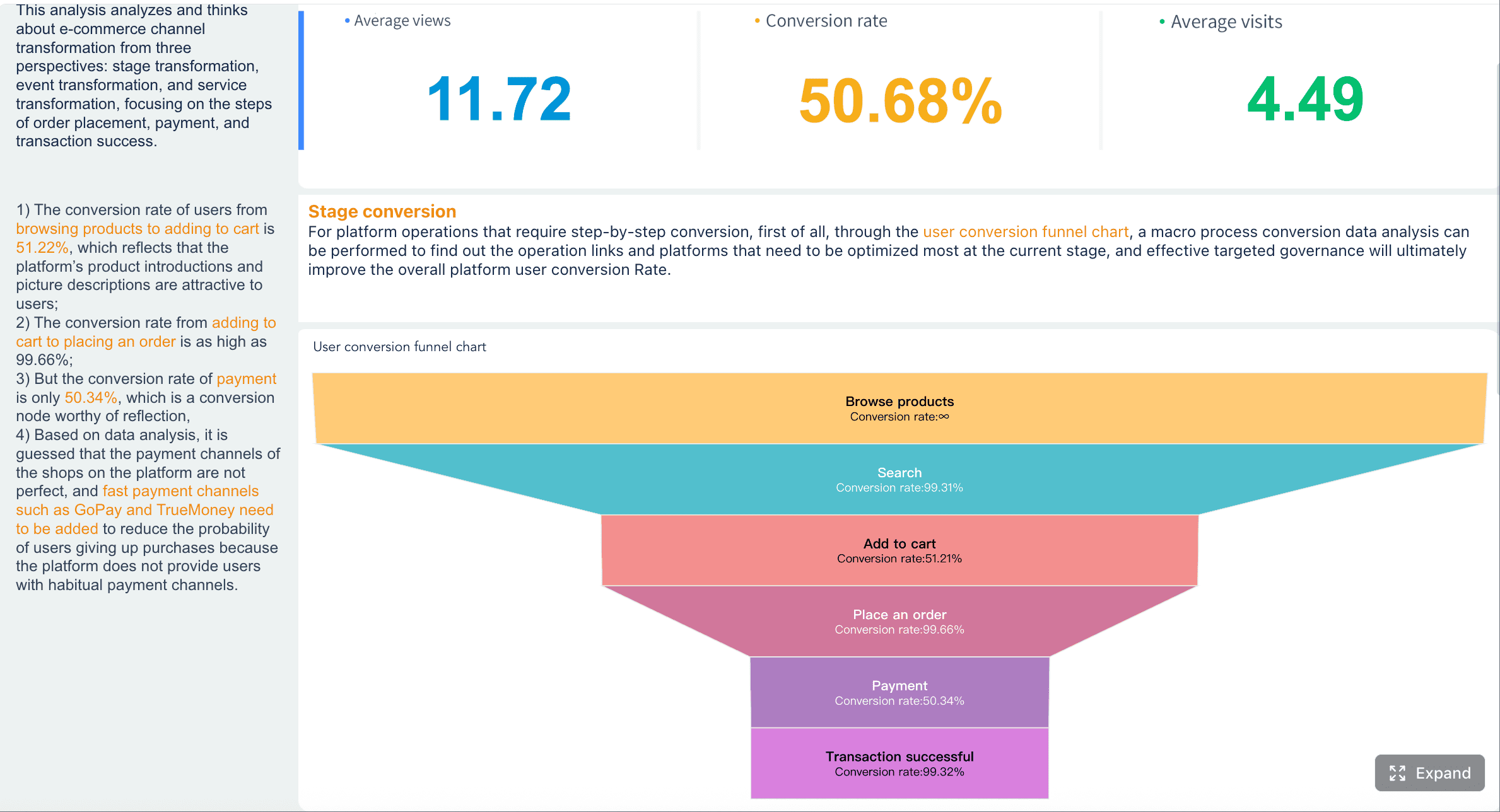
Conversion and traffic quality
Retail teams often overreact to revenue changes without checking whether the issue starts with traffic, on-site behavior, or traffic quality.
Daily monitoring should include:
- Sessions or traffic volume
- Conversion rate
- Cart adds and cart abandonment
- Checkout completion behavior
- Traffic source quality by channel or campaign
A rise in traffic with flat sales usually indicates quality issues, weak landing pages, pricing friction, or stock constraints. A drop in conversion with normal traffic may point to product page issues, slow fulfillment promises, promotion confusion, or operational breakdowns.
This is where a retail analytics dashboard becomes a decision system rather than a report archive. It connects demand generation to sales outcomes.
Average order value and units per transaction
AOV and UPT reveal whether the business is growing through more orders, bigger baskets, or both. These are daily indicators of pricing power and merchandising quality.
Track these measures to identify:
- Successful product bundling
- Effective cross-sell or upsell placements
- Promotion structures that increase basket size
- Trade-down behavior during discount-heavy periods
- Regional or channel-specific pricing opportunities
For example, if conversion is steady but AOV drops sharply, margin risk may be building even while top-line revenue looks stable.
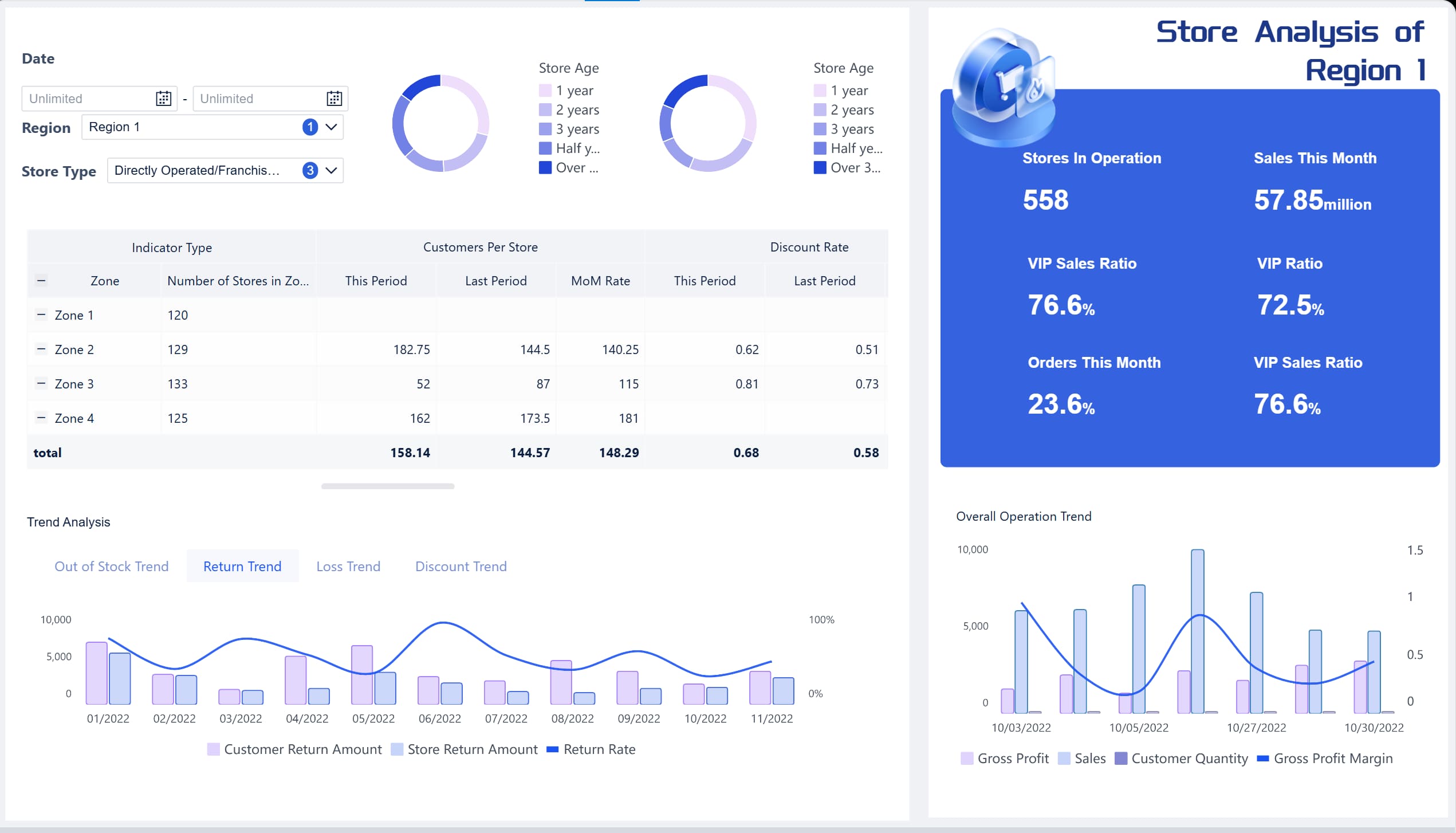
Inventory, fulfillment, and returns
Retail profit is protected or destroyed here. Daily revenue visibility means little if the business is selling products it cannot fulfill efficiently or is generating a high volume of avoidable returns.
Your dashboard should include:
- In-stock rate or stock availability
- Sell-through rate
- Backorder count or percentage
- Fulfillment speed
- Cancellation rate
- Return rate
These metrics help teams catch issues before they cascade. An out-of-stock spike can depress conversion. Shipping delays can increase cancellations. High returns may signal product quality, content accuracy, size issues, or misleading promotions.
Retention, repeat purchase, and promotion performance
Daily dashboards should not focus only on yesterday’s orders. Enterprise retailers need to connect short-term sales to long-term customer value.
Include:
- Repeat purchase rate
- Active customer retention trend
- Promotion redemption performance
- Revenue from discounted vs full-price orders
- Repeat customer conversion after campaign exposure
This helps prevent a common mistake: celebrating a sales spike that was driven by margin-eroding discounts and low-quality customer acquisition.
How to structure the dashboard for faster data decisions
A dashboard fails when it tries to serve everyone with the same view. Enterprise retail teams need different levels of detail, but they must all work from standardized definitions.
Build views by audience
Structure the dashboard into role-based views so each team sees metrics they can act on immediately.
Executive view
Focus on:
- Total sales
- Target attainment
- Channel mix
- Major exceptions
- Margin-sensitive risks such as stockouts, delays, and return spikes
Regional view
Focus on:
- Region and store cluster performance
- Store ranking
- Local demand shifts
- Staffing and service implications
- Regional inventory issues
Channel view
Focus on:
- Ecommerce vs marketplace vs store performance
- Traffic quality
- Conversion
- AOV
- Campaign efficiency
Merchandising view
Focus on:
- Category and SKU performance
- Sell-through
- markdown dependence
- Basket attachment
- low availability on top-demand products
Operations view
Focus on:
- Fulfillment backlog
- Shipping SLA adherence
- cancellation rate
- return rate
- customer service response issues
This design principle drives adoption because users do not waste time filtering through irrelevant data.
Use comparisons that add context
Raw values rarely tell the full story. Every major KPI should include comparative context such as:
- Day-over-day
- Week-over-week
- Year-over-year
- Variance to target
- Variance to forecast
These comparisons make it easier to distinguish normal seasonality from meaningful performance changes. They also reduce overreaction to one-day noise.
Prioritize alerts and exceptions
A good dashboard should surface problems proactively, not force users to hunt for them.
Priority alerts should flag:
- Unusual conversion drops
- Out-of-stock spikes in high-demand SKUs
- Shipping delays
- Cancellation surges
- Return anomalies
- Promotion underperformance
- Customer service slowdowns affecting customer experience
This is especially important in enterprise retail environments where key exceptions can be buried under a large volume of data. Daily users should know within seconds what changed and where to drill down.
Standardize definitions and refresh cadence
Trust is the foundation of dashboard adoption. If ecommerce defines “sales” differently than finance or stores define “available inventory” differently than supply chain, the dashboard becomes a political battleground.
Standardize the following:
- KPI names
- Calculation logic
- Data sources
- Channel mapping rules
- Refresh frequency
- Ownership by department
A practical KPI governance model should document every critical metric and make those definitions visible to users. This creates one shared business language and reduces debate during daily reviews.
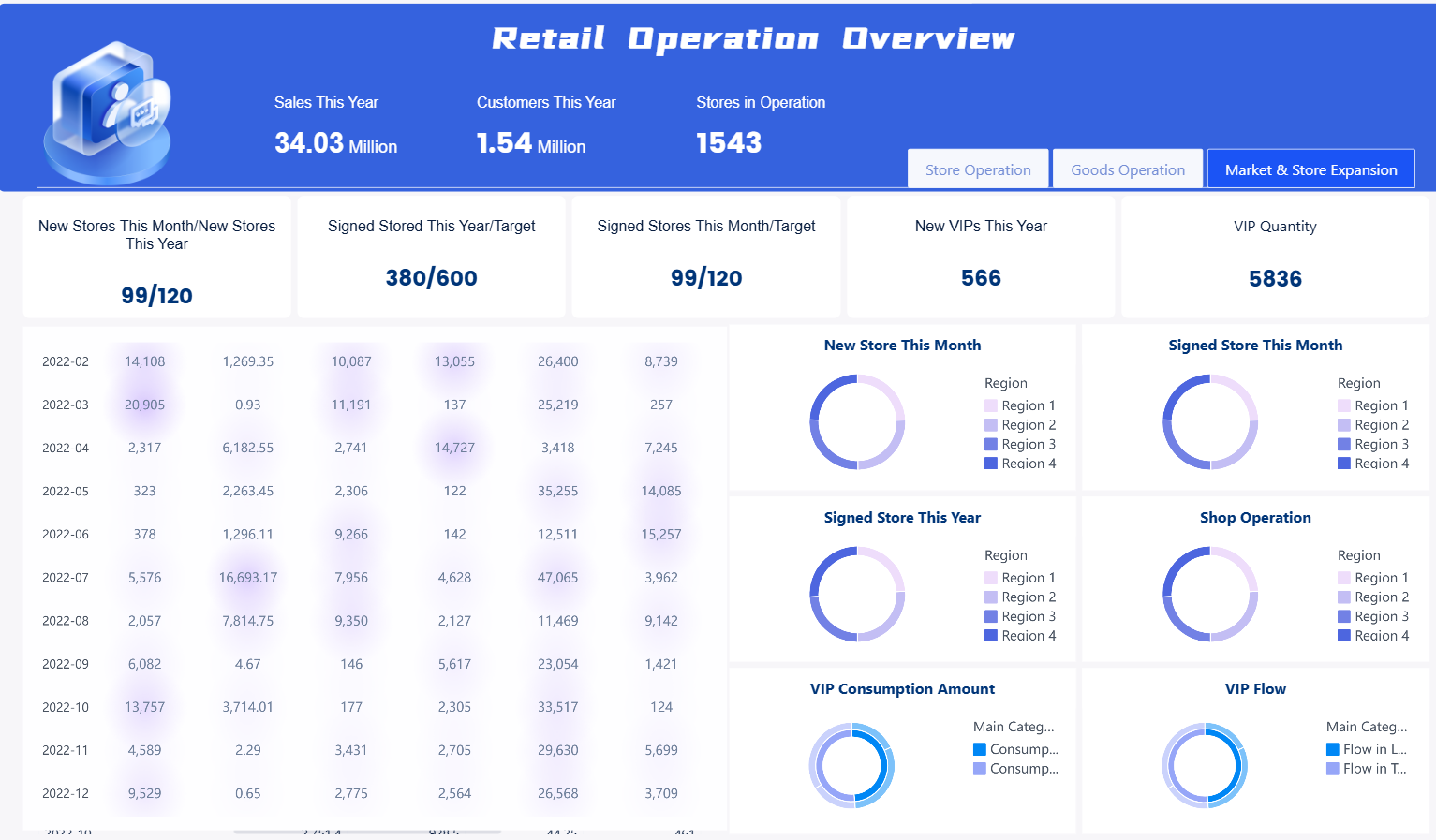
Retail analytics dashboard examples and templates to learn from
Enterprises should not start from a blank page unless they have highly unusual requirements. Proven dashboard patterns accelerate adoption and reduce design errors.
Common dashboard patterns used in enterprise retail
The most practical layouts include:
Executive scorecard
A top-row KPI summary with variance indicators, followed by channel trend charts and a short exception panel. Best for daily leadership review.
Channel performance dashboard
A side-by-side comparison of stores, ecommerce, app, and marketplaces with conversion, revenue, AOV, and target pacing. Best for commercial teams.
Inventory monitoring dashboard
A supply-focused layout showing stock availability, low-stock alerts, sell-through, aging inventory, and replenishment risk. Best for merchandising and planning.
Campaign tracking dashboard
A marketing and trade performance layout showing traffic, ROAS-adjacent commercial output, conversion, promo sales share, and post-campaign repeat behavior. Best for growth teams.
What strong retail performance dashboards have in common
The best retail dashboards share a few design traits:
- Clear visual hierarchy
- Limited KPI count per screen
- Simple charts over decorative complexity
- Filters that reflect real business workflows
- Action-oriented summaries and exception callouts
- Drill paths from headline KPI to root cause
Strong adoption comes from usability, not chart variety. Teams return to dashboards that help them make faster decisions with less explanation.
Template and BI tool considerations
A retail analytics dashboard template can dramatically reduce implementation time when:
- KPI requirements are already well understood
- The business wants fast time to value
- Core use cases are common across channels or regions
- Teams need a repeatable operating model
A custom build is better when:
- Business logic is highly specific
- Channel models are unusually complex
- Stakeholders require deep workflow integration
- Advanced role-based access and drill-through paths are critical
In practice, many enterprises benefit from a hybrid approach: start with proven templates for core views, then customize by role, region, or product line.
Lessons from building a dashboard at scale
After enough retail implementations, the same pitfalls appear repeatedly:
Fragmented data sources
Store POS, ecommerce platforms, marketplaces, ad platforms, WMS, and customer service tools often use different IDs, calendars, and hierarchies. Without integration discipline, the dashboard becomes inconsistent.
Inconsistent KPIs
If teams use different definitions for sales, returns, or stock availability, executive trust collapses quickly.
Overcomplicated visual design
Too many charts, tabs, or filters create friction. Users stop opening the dashboard and go back to spreadsheets.
No alerting logic
A dashboard without exception management forces manual monitoring and slows response time.
No ownership model
If no one owns threshold setting, metric governance, and action follow-up, the dashboard becomes informative but operationally weak.
How enterprise teams can use daily insights to improve performance
The value of a dashboard is not the interface. It is the decisions it enables every day.
Turn dashboard signals into decisions
Each metric should map to a business action. Examples:
- Sales below target: adjust campaign spend, pricing, or product placement
- Conversion drop: review traffic quality, stock levels, checkout friction, and service messaging
- AOV decline: test bundles, cross-sell logic, or price-pack architecture
- Out-of-stock spike: trigger replenishment review or allocation changes
- Shipping delays: reroute fulfillment, prioritize backlog, or adjust customer communications
- Return increase: inspect product content, quality issues, sizing guidance, or fraud patterns
This is where many organizations underperform. They build a retail analytics dashboard but do not define the operational playbook behind each signal.
Create a repeatable daily operating rhythm
A practical daily review process should be short, structured, and owned.
Recommended daily rhythm
- Pre-meeting distribution: Push a concise business summary before the morning standup so leaders arrive informed.
- Five-minute KPI scan: Review headline sales, conversion, AOV, stock, fulfillment, and return metrics.
- Exception review: Focus only on threshold breaches and abnormal movement.
- Owner assignment: Assign each issue to a named person or team.
- Follow-up tracking: Record action, expected outcome, and next review time.
This model prevents meetings from turning into passive reporting sessions. It keeps the team focused on action and accountability.
Measure dashboard success over time
You should evaluate the dashboard itself as an operational asset. The right success metrics include:
- Adoption rate by user group
- Frequency of daily use
- Time from issue detection to action
- Forecast accuracy improvement
- Reduction in manual reporting time
- Decrease in stockout or fulfillment-related losses
- Improvement in promotion effectiveness
- Faster executive decision cycles
If the dashboard is not improving decision speed or business outcomes, redesign it. Usage data and stakeholder feedback should guide ongoing refinement.
Build the workflow faster with retail analytics dashboard
Building this manually is complex; use FineBI to utilize ready-made templates and automate this entire workflow.
For enterprise retail teams, the hard part is not deciding which metrics matter. The hard part is unifying data from stores, ecommerce platforms, marketplaces, inventory systems, and operational tools into one trusted, daily decision layer. That requires data integration, standardized KPI definitions, role-based dashboards, mobile access, and consistent refresh logic.
FineBI helps simplify that process by enabling teams to:

- Connect and unify multi-source retail data
- Build standardized KPI models and governed metric definitions
- Create role-based dashboard views for executives, regional leaders, merchandising, and operations
- Use dashboard templates to accelerate deployment
- Support self-service analysis without overwhelming business users
- Share dashboards across web and mobile for daily review
- Package dashboards into reusable analysis applications for broader adoption
For organizations trying to manage omnichannel complexity at scale, this matters. Instead of relying on analysts to manually assemble daily sales files, teams can automate recurring performance views, distribute trusted dashboards faster, and make it easier for business users to explore root causes without waiting in line for support.
In short, a modern retail analytics dashboard should do more than display numbers. It should help enterprise teams move from fragmented reporting to a repeatable, data-driven operating rhythm. FineBI is the practical enabler for that shift—combining templates, self-service analysis, visual dashboards, and scalable governance in one workflow.
If your enterprise retail team needs one daily source of truth across revenue, conversion, inventory, fulfillment, and retention, start with the 12 metrics above, structure the dashboard by audience, and operationalize follow-up. Then use FineBI to shorten implementation time and turn the dashboard into a system your teams actually use every day.
FAQs
It is a unified dashboard that shows daily performance across stores, ecommerce, marketplaces, inventory, and fulfillment in one place. Its main purpose is to help teams spot issues quickly and act before revenue or margin is lost.
The most important daily metrics usually include total sales, sales change, sales versus target, traffic, conversion rate, average order value, units per transaction, in-stock rate, fulfillment performance, cancellations, returns, and retention. These KPIs balance revenue, operations, and customer outcomes.
Daily visibility helps teams catch sudden shifts in demand, stock availability, and channel performance before they become larger problems. It also reduces delays caused by manual reporting and improves alignment across departments.
An operational dashboard is designed for immediate action and highlights what needs attention right now. A reporting view is more historical and detailed, while an executive summary focuses on top-level business status and major risks.
By combining sales, inventory, and order data in one view, the dashboard makes it easier to detect low stock, regional shortages, shipping delays, and rising cancellations early. This allows teams to adjust replenishment, allocation, or service operations faster.


The Author
Yida Yin
FanRuan Industry Solutions Expert
Related Articles
Retail Business Dashboard: 12 Essential KPIs Every Operations Director Should Track
Discover the 12 essential KPIs every retail operations director should track on their retail business dashboard for sales, inventory, labor, and customer performance.
Yida Yin
May 09, 2026
What Is Retention Rate and How to Calculate It for Business Success
What is retention rate? Understand its meaning, importance, and learn how to calculate retention rate to boost business success and employee stability.
Lewis
Aug 01, 2025

Master Break Even Chart for Better Business Decisions
Use a break even chart to pinpoint when your business turns profitable, set sales targets, and make informed decisions for better financial planning.
Lewis
Aug 01, 2025