A retail business dashboard should help an operations director answer three questions fast: What is happening right now, where is performance off track, and what action should store or regional teams take next. If your retail data lives across POS, inventory systems, labor schedules, ecommerce platforms, and spreadsheets, decision-making slows down, reporting becomes manual, and store issues surface too late.
For operations leaders, the value is straightforward: a well-structured dashboard turns scattered retail data into daily operational control. It reduces time spent building reports, improves consistency in KPI definitions, and helps teams move from reactive troubleshooting to proactive performance management.
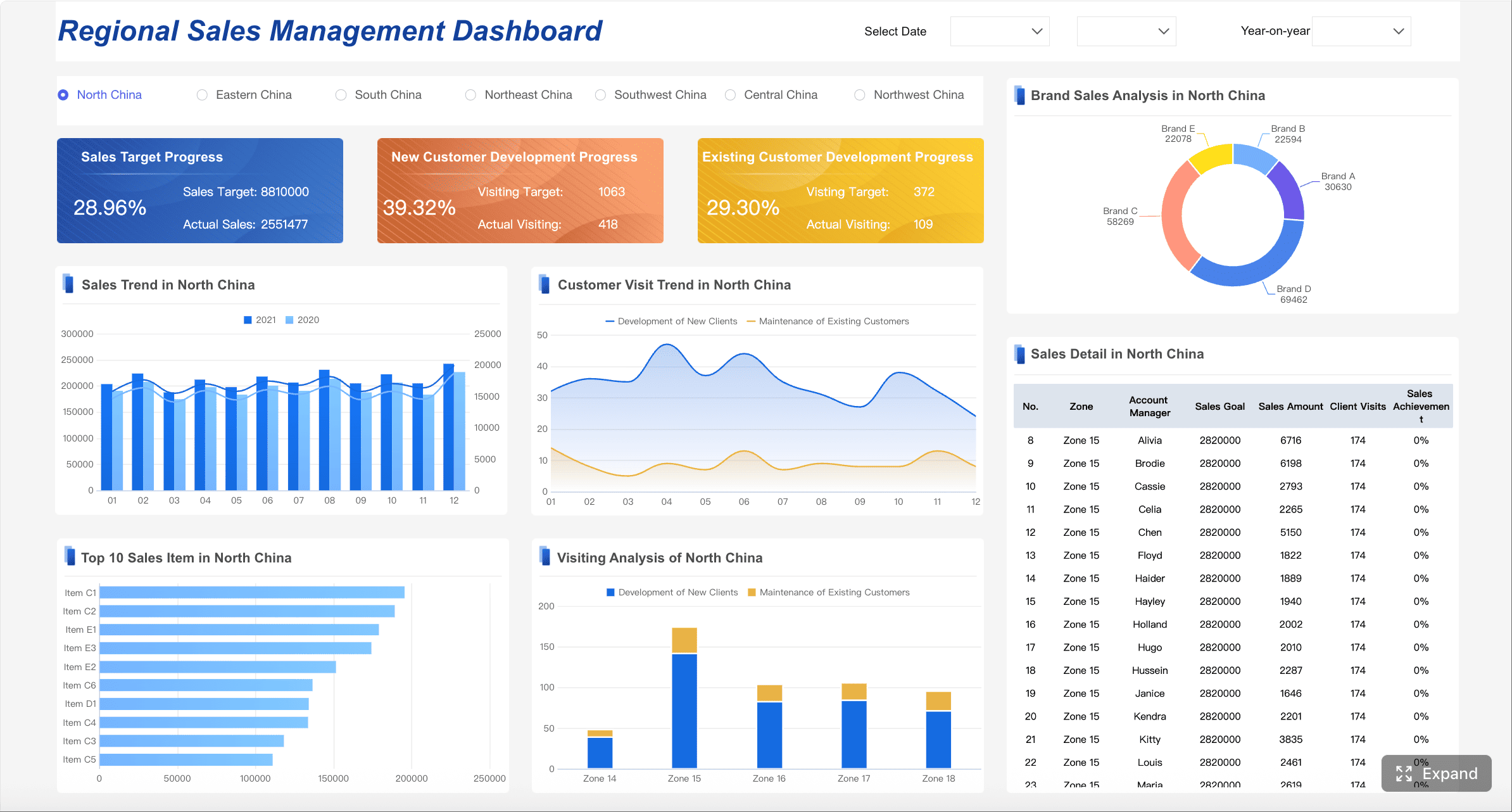
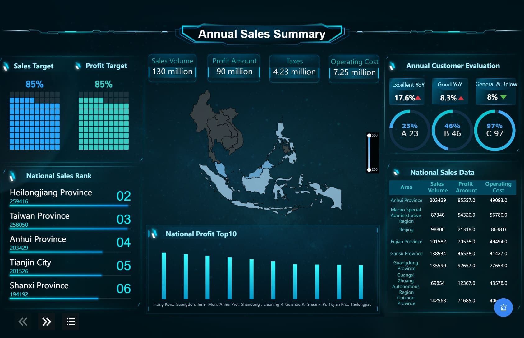
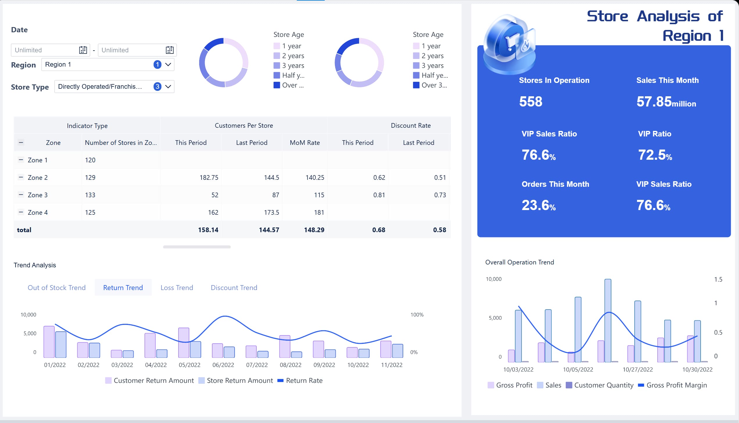
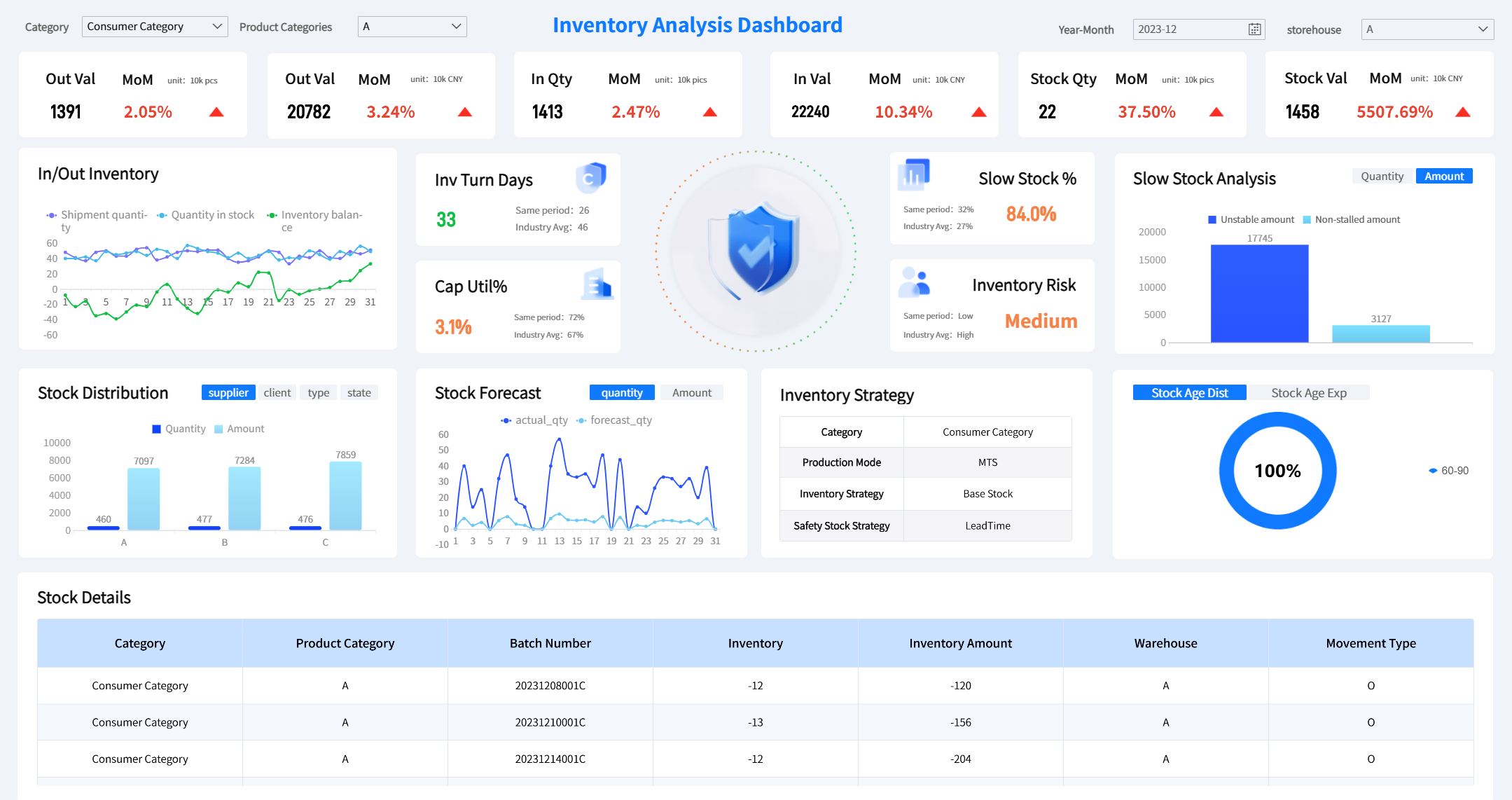
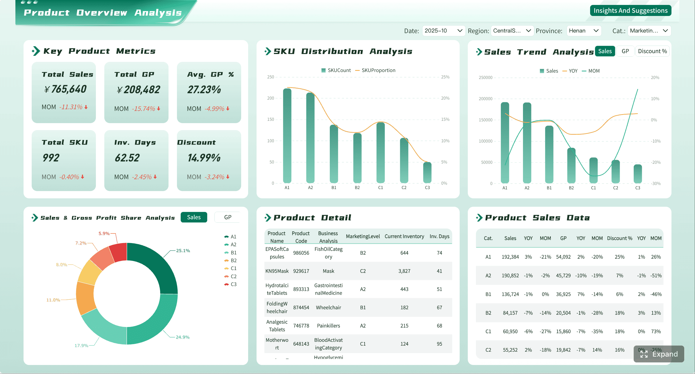
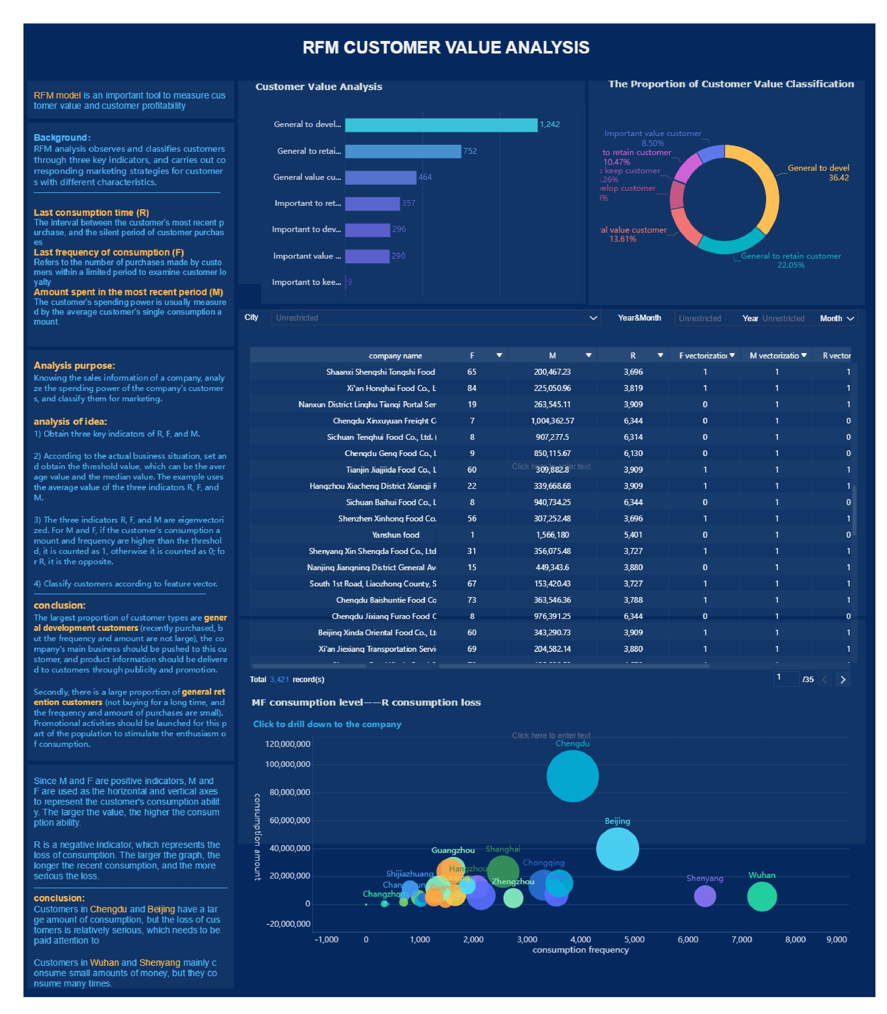
All the dashboards in this article are created by dashboard software: FineBI
What a retail business dashboard should help an operations director see at a glance
A strong retail business dashboard is not a collection of charts. It is a decision system. It should help operations directors oversee stores, regions, product categories, and channels without losing sight of what needs intervention today.
The dashboard should support decisions such as:
- Which stores are underperforming against target today
- Whether margin pressure is coming from discounting, mix, or shrink
- Which categories are overstocked, understocked, or slowing in sell-through
- Whether labor deployment matches customer traffic and revenue patterns
- Which regions or channels need immediate support, coaching, or inventory rebalancing
The core decisions a dashboard should support across stores, regions, and channels
An operations director rarely manages one location in isolation. They manage a network. That means the dashboard must make comparisons easy across:
- Stores: To identify local execution issues
- Regions: To distinguish isolated problems from broader market patterns
- Channels: To compare in-store, ecommerce, and omnichannel performance
- Categories: To uncover assortment and merchandising opportunities
- Time periods: To separate one-day volatility from structural change
A useful dashboard should allow leaders to move from a company-wide view to a store-specific root cause in a few clicks.
Why a clear KPI hierarchy matters more than adding more charts
Many retail dashboards fail because they display too much information without showing what matters most. More charts do not create more clarity. A KPI hierarchy does.
Start with top-level outcome metrics such as sales, margin, and inventory health. Then connect them to operational drivers such as conversion, stockouts, labor productivity, and returns. This structure helps leaders understand not only what changed, but why.
The difference between monitoring daily performance and spotting longer-term operational trends
Daily dashboard monitoring is about immediate control. It helps teams respond to issues like stockouts, underperforming stores, labor inefficiency, or unusual return spikes.
Longer-term trend analysis is different. It reveals whether conversion is steadily falling, whether margin erosion is structural, or whether inventory turnover is improving after a process change. Your dashboard should support both.
A practical approach is to separate:
- Daily action metrics: Metrics requiring immediate response
- Weekly management metrics: Metrics used for trend review and team accountability
- Monthly strategic metrics: Metrics tied to planning, budgeting, and operating model changes
The 12 essential KPIs to include in Retail Business Dashboard
The best retail business dashboard balances commercial performance, operational efficiency, and customer experience. These 12 KPIs create that balance.
Key Metrics (KPIs)
- Total Sales by Store, Region, and Channel: Measures revenue performance across locations and sales channels.
- Like-for-Like Sales Growth: Tracks sales growth in comparable stores over time, excluding new or closed locations.
- Average Transaction Value (ATV): Shows the average amount spent per transaction.
- Units Per Transaction (UPT): Measures how many items customers buy in each purchase.
- Gross Margin Percentage: Indicates how much revenue remains after cost of goods sold.
- Inventory Turnover: Shows how efficiently inventory is sold and replenished over a period.
- Sell-Through Rate: Measures the percentage of received inventory sold within a given timeframe.
- Labor Cost as a Percentage of Sales: Tracks how much of revenue is consumed by labor expense.
- Sales Per Labor Hour: Measures labor productivity against sales output.
- Conversion Rate: Shows the percentage of store visitors who make a purchase.
- Basket Size: Tracks the number of items or value per customer basket.
- Stockout Rate: Measures how often items are unavailable when customers want to buy them.
- Return Rate: Tracks the percentage of sold items returned by customers.
- Shrink: Measures inventory loss due to theft, damage, or administrative error.
Sales and revenue performance
Sales metrics are still the backbone of the dashboard, but operations leaders need them segmented and contextualized.
Total sales by store, region, and channel
This metric shows where revenue is being generated and where it is falling short. It should be available by:
- Store
- Region
- Product category
- Channel
- Day, week, month, and year-to-date
Without this segmentation, leaders cannot tell whether a drop is isolated to one district, one format, or the whole business.
Like-for-like sales growth
Like-for-like sales growth removes the noise caused by new store openings or closures. It gives a cleaner view of operational performance in existing stores.
For operations directors, this is critical when judging store execution, promotional effectiveness, and whether operational changes are improving underlying store productivity.
Average transaction value and units per transaction
These two metrics explain how customers are spending.
- Average transaction value tells you whether customers are spending more or less per visit.
- Units per transaction shows whether basket-building tactics are working.
If sales are flat but ATV is rising while transaction count falls, you are facing a different operational issue than if traffic is strong but baskets are shrinking.
Margin and inventory health
Revenue without margin discipline creates false confidence. Inventory without movement ties up cash and increases markdown risk.
Gross margin percentage
Gross margin percentage helps operations leaders spot whether profit pressure is caused by:
- Excessive discounting
- Unfavorable product mix
- Supplier cost changes
- Shrink or loss
- Poor sell-through forcing markdowns
It should be tracked at store, category, and channel level. A store hitting sales target but missing margin target is not truly performing.
Inventory turnover
Inventory turnover shows how efficiently stock converts into sales. Low turnover may signal overbuying, weak assortment, poor local demand alignment, or ineffective replenishment.
High turnover can be healthy, but only if it does not come with elevated stockout rates. That is why inventory metrics should never be viewed in isolation.
Sell-through rate
Sell-through rate tells you how quickly inventory is moving after receipt. It is one of the clearest indicators of assortment fit and promotional effectiveness.
For example:
- High sell-through + healthy margin = strong product-market fit
- Low sell-through + rising stock on hand = replenishment or assortment issue
- High sell-through + high stockouts = missed demand and lost revenue
Store operations and labor efficiency
Store operations metrics reveal whether execution on the floor is aligned with demand.
Labor cost as a percentage of sales
This metric helps determine whether labor deployment is sustainable. If labor cost rises faster than sales, stores may be overstaffed, underproductive, or facing scheduling inefficiencies.
It is especially useful when reviewed against traffic and conversion. Labor cost alone does not tell the full story.
Sales per labor hour
Sales per labor hour is one of the strongest measures of frontline productivity. It helps operations leaders assess whether staffing levels match customer demand by daypart, store format, and region.
This KPI is useful for:
- Workforce planning
- Shift optimization
- Comparing high-performing and low-performing stores
- Identifying coaching opportunities for store managers
Conversion rate
Conversion rate links customer traffic to sales outcomes. If traffic is strong but conversion is weak, the issue may be store execution, availability, service quality, or merchandising.
This metric becomes even more powerful when paired with:
- Labor hour coverage
- Stockout rate
- Queue time or service responsiveness
- Promotion periods
Customer experience and loss prevention
Retail performance is not only about selling. It is also about fulfilling demand, protecting margin, and reducing avoidable leakage.
Basket size
Basket size indicates how effectively stores are driving cross-sell and upsell behavior. It can be measured by item count, value, or both.
If conversion is steady but basket size declines, store teams may need stronger merchandising support, product adjacency changes, or targeted selling behaviors.
Stockout rate
Stockout rate is one of the most actionable retail KPIs because it directly affects sales, customer satisfaction, and brand perception.
A rising stockout rate may point to:
- Poor replenishment logic
- Demand forecasting gaps
- Distribution delays
- Inaccurate inventory visibility
- Local execution problems in shelf availability
Operations directors should monitor this daily, especially for high-volume and promotional items.
Return rate and shrink
These metrics protect profitability.
- Return rate can reveal quality problems, misleading product presentation, or fulfillment errors.
- Shrink exposes inventory loss from theft, damage, process failure, or counting inaccuracies.
A dashboard should make both visible because margin losses often come from these hidden leakage points rather than headline sales declines.
How to structure the retail business dashboard for faster decisions
A dashboard becomes useful when it reduces time to insight. Structure matters as much as metric selection.
Put the most time-sensitive metrics at the top
The top section should answer one question: what needs action today?
Place daily decision metrics first, such as:
- Total sales vs target
- Gross margin vs target
- Stockout rate
- Labor cost %
- Sales per labor hour
- Conversion rate
- Return spikes
- Shrink anomalies
Use thresholds, color-coded exceptions, and alert logic to surface outliers immediately. This ensures data finds the operator, rather than forcing operators to search through multiple views.
Highlight the KPIs that need action today versus metrics for weekly review
Not all metrics deserve the same visual priority. Daily metrics should sit at the top with clear status indicators. Weekly and monthly trend metrics can appear lower or within separate tabs.
A practical layout is:
- Top layer: Today’s exceptions
- Middle layer: This week’s trends and rankings
- Bottom layer: Root-cause analysis and historical views
Use alerts and thresholds to surface exceptions quickly
Threshold-based alerts help teams react faster to operational risk. For example:
- Stockout rate above target
- Conversion rate below store benchmark
- Labor cost % outside approved range
- Return rate spike after campaign launch
- Shrink increase beyond acceptable variance
The point is not to create more alerts. It is to create fewer, more actionable alerts.
Segment performance views in practical ways
The dashboard should let operations directors compare performance in the ways they actually manage the business.
Compare stores, regions, product categories, and channels
Useful segmentation includes:
- Store-by-store ranking
- Region comparison
- Category contribution and margin view
- Channel splits for store, ecommerce, and omnichannel
- Store format comparison such as flagship, mall, outlet, or convenience
This allows leaders to distinguish a local issue from a structural one.
Make it easy to filter by date range, campaign, and store format
Filtering is not just a convenience feature. It is essential for diagnosis. Operations teams need to isolate performance by:
- Date range
- Promotion or campaign period
- Store format
- District manager
- Category
- Product brand
- Channel
If filters are hard to use or inconsistent, people revert to offline analysis and the dashboard loses trust.
Balance summary views with drill-down detail
Executives need snapshots. Operators need causes. A high-performing retail business dashboard supports both.
Start with executive snapshots, then allow deeper investigation into root causes
Begin with summary cards, rankings, and trend charts. Then enable drill-down into:
- Store
- Region
- Product category
- SKU
- Time of day
- Team or labor schedule
- Return reason
- Inventory aging bucket
This creates a workflow: detect the issue, investigate the cause, decide the action.
Keep charts consistent so trends and outliers are easy to interpret
Use consistent chart types, color rules, and time comparisons across the dashboard. If one chart shows sales variance in red for negative movement and another uses red for a different meaning, interpretation slows down and trust falls.
Common dashboard mistakes that make retail data less useful
Even the right KPIs lose value if the dashboard is poorly designed or operationally disconnected.
Tracking too many metrics without clear ownership
If everything is measured, nothing is managed. Every KPI should have:
- A clear business definition
- A responsible owner
- A review frequency
- A related action path
Focus on metrics tied directly to operational decisions. If no one can act on a metric, it does not belong on the main dashboard.
Mixing lagging indicators with action metrics poorly
Lagging indicators tell you what happened. Action metrics help explain why and what to do next.
For example:
- Sales decline is lagging
- Conversion drop is a leading operational clue
- Stockout increase is an actionable driver
- Labor misalignment may be a controllable cause
The best dashboard pairs outcomes with the operational levers behind them.
Ignoring data quality and reporting cadence
Retail dashboards fail when KPI definitions differ by team, data refresh timing is unclear, or source systems conflict. Before scaling the dashboard, standardize:
- Metric names
- Calculation logic
- Source systems
- Refresh frequency
- Ownership by department
This creates a common data language and reduces debate over numbers during reviews.
How operations directors can turn KPI tracking into action
Tracking metrics is not the end goal. The real goal is better operational execution.
Build a review rhythm for daily, weekly, and monthly decisions
A dashboard becomes effective when it is embedded into management routines.
Use a review rhythm such as:
- Daily review: Check exceptions in sales, stockouts, labor productivity, and returns.
- Weekly review: Compare stores and regions, identify recurring underperformance, and assign corrective actions.
- Monthly review: Evaluate structural trends in margin, inventory productivity, and network-wide operating efficiency.
This rhythm keeps teams focused on both immediate control and longer-term improvement.
Use the dashboard to guide coaching and store support
The dashboard should not only identify poor performers. It should reveal why they are underperforming.
For example:
- A store with low conversion but good traffic may need floor execution coaching
- A store with high stockouts may need replenishment support
- A store with rising labor cost % but flat sales may need scheduling redesign
- A store with elevated returns may need product or service issue investigation
This makes the dashboard a tool for targeted intervention rather than generalized pressure.
Evolve the dashboard as business priorities change
Retail priorities shift. Expansion, omnichannel growth, private-label mix, inflation, or margin pressure can all change which KPIs matter most.
Operations directors should revisit the dashboard quarterly and ask:
- Which KPIs still drive decisions?
- Which metrics no longer influence action?
- Which new risks need monitoring?
- Are store, region, and channel comparisons still relevant to the current operating model?
A dashboard should evolve with the business, not become a static report no one questions.
Building a scalable retail business dashboard with FineBI
Building this manually is complex; use FineBI to utilize ready-made templates and automate this entire workflow.

A modern retail business dashboard requires more than visualization. It needs data integration across POS, ERP, inventory, ecommerce, and labor systems. It needs standardized KPI logic, interactive drill-down, alerting, mobile access, and automated reporting. Doing this with spreadsheets or disconnected reporting tools creates high maintenance costs, inconsistent numbers, and slow decision cycles.
FineBI helps operations directors and retail leadership teams move faster by enabling:
- Unified data access: Connect retail data sources into a consistent analytics environment
- Standardized KPI systems: Define calculation logic, update frequency, and ownership once
- Interactive dashboards: Build executive snapshots with drill-down into stores, categories, and channels
- Self-service analysis: Let business users explore issues without waiting on analysts or IT
- Automated reporting: Push daily and monthly performance summaries automatically
- Exception monitoring: Surface anomalies and threshold breaches before they become revenue or margin problems
- Reusable dashboard templates: Scale retail reporting across business units with less manual effort
- Mobile access: Give regional and store leaders visibility wherever decisions happen
For enterprise retail teams, this matters because manual reporting is slow, repetitive, and error-prone. FineBI turns dashboarding into an operational system: one that supports daily store management, weekly regional reviews, and monthly executive planning with the same trusted data foundation.
If your current retail business dashboard still depends on manual exports, static spreadsheets, or fragmented reporting, the bottleneck is not data volume. It is decision infrastructure. FineBI provides the faster path: ready-made dashboard capabilities, reusable logic, and automation that help retail operations leaders spend less time compiling numbers and more time improving store performance.
FAQs
It should surface the most important outcome metrics first, such as sales, margin, inventory health, and labor efficiency. From there, users should be able to drill into stores, regions, channels, and categories to find root causes quickly.
The most useful KPIs usually include total sales, like-for-like sales growth, gross margin, inventory turnover, sell-through rate, labor cost as a percentage of sales, conversion rate, stockout rate, returns, and shrink. These metrics balance revenue, efficiency, and customer experience.
Daily review helps teams react to immediate issues like stockouts, labor mismatches, or weak store performance. Weekly and monthly reviews are better for spotting trends, measuring accountability, and making planning decisions.
A KPI hierarchy helps leaders connect top-level results to the operational drivers behind them. Instead of showing too many disconnected charts, it makes it easier to understand what changed and what action to take next.
It speeds up decision-making by bringing data from POS, inventory, labor, and ecommerce systems into one view. That helps operations teams spot underperforming stores earlier, respond faster, and manage performance more consistently across locations.


The Author
Yida Yin
FanRuan Industry Solutions Expert
Related Articles
Retail Analytics Dashboard for Omnichannel Sales: 12 Daily Metrics Enterprise Teams Should Track
Discover the 12 essential daily metrics enterprise retail teams must track on an omnichannel analytics dashboard for revenue, inventory, and customer performance.
Yida Yin
May 09, 2026
What Is Retention Rate and How to Calculate It for Business Success
What is retention rate? Understand its meaning, importance, and learn how to calculate retention rate to boost business success and employee stability.
Lewis
Aug 01, 2025

Master Break Even Chart for Better Business Decisions
Use a break even chart to pinpoint when your business turns profitable, set sales targets, and make informed decisions for better financial planning.
Lewis
Aug 01, 2025