A sales dashboard is a visual tool that tracks and displays key sales metrics in real time. If you want to boost your team’s results, choosing the right sales performance dashboard can make all the difference. Take a look at how dashboards impact productivity:
| Dashboard Type | Benefit |
|---|---|
| Sales Activities Dashboard | Shows how reps spend time and which actions drive results. |
| Time-Tracking Sales Dashboard | Highlights time spent on activities, revealing inefficiencies. |
| Real-Time CRM Dashboards | Delivers up-to-the-minute insights into team performance. |
- Dashboards give you data for smarter decisions.
- You spot trends, coach better, and see who’s excelling.
Think about your current sales tracking. Are you getting the insights you need? FineReport helps you turn data into action.
Sales Performance Dashboard Essentials
What Is a Sales Performance Dashboard?
A sales dashboard is a visual tool that brings together your most important sales metrics, giving you a real-time snapshot of your team’s progress toward sales goals, pipeline health, and overall performance—all in one place, so you can make smarter decisions faster.
When you use a sales performance dashboard, you get more than just numbers on a screen. You see the story behind your sales analytics. These dashboards pull in data from different sources and show you what matters most. Here are the core features you’ll find in effective dashboards:
| Core Feature | Description |
|---|---|
| Real-time tracking | Visualizes key sales metrics to enhance decision-making and productivity. |
| KPI consolidation | Integrates metrics like revenue, pipeline health, conversion rates, and quota attainment. |
| Customizable views | Tailors the dashboard for different users, such as sales reps and executives. |
| Essential KPIs | Focuses on 5–7 key metrics to ensure clarity and avoid information overload. |
| Visual storytelling | Provides tailored insights for various stakeholders, highlighting trends and risks. |
You can track revenue, activities, conversions, customer health, and pipeline movement—all in one dashboard. FineReport makes this easy with drag-and-drop design and templates you can customize for your team.
Why Sales Dashboards Matter for Revenue
Sales performance dashboards help you hit your sales goals by giving you instant visibility into what’s working and what’s not. You can spot top-performing products, see which reps are crushing their targets, and find out where deals get stuck. With real-time sales analytics, you can adjust your strategy on the fly.
Here’s how these dashboards drive revenue growth:
- They show you up-to-the-minute sales performance.
- You can identify high-performing products and track customer retention.
- Dashboards help you align your team’s activities with your revenue goals.
- They improve forecasting and keep everyone accountable.
FineReport takes this to the next level. You get real-time reporting, customizable templates, and an interface that anyone can use—no coding needed. This means you spend less time building reports and more time closing deals.
Choosing the Right Sales Dashboard for Your Team
Key Selection Criteria
Picking the right sales dashboard can feel overwhelming, but you can simplify the process by focusing on a few key factors. Start by thinking about who will use the dashboard and what they need to see. Do you want a quick daily snapshot or a deep dive into trends? Here’s a handy table to help you compare:
| Criteria | Description |
|---|---|
| Target Audience | Who will use the dashboard and what do they need? |
| Frequency of Viewing | How often will your team check the dashboard? |
| Volume of Data | Does the dashboard show just the essentials or lots of details? |
| Type of Charts | Are you using bar charts, line graphs, or something more advanced? |
| Purpose | What is the main goal—tracking, forecasting, or motivating your team? |
FineReport stands out because you can customize dashboards for any team, connect to almost any data source, and design reports with a simple drag-and-drop interface. You don’t need to code, and you can even access dashboards on your phone. This flexibility means you get exactly what you need, when you need it.
Tip: Define your most important sales metrics and KPIs first. Then, check where your data lives and how often you’ll review it. This helps you avoid information overload and keeps your dashboard focused.
Aligning Dashboards with Roles
Not every team member needs the same dashboard. Sales reps, managers, and executives all look for different insights. Here’s how you can match dashboards to each role:
| Type of Dashboard | Focus Area |
|---|---|
| Sales Representatives | Individual performance metrics and daily activities |
| Managers and Executives | Team performance, trends, and strategic insights |
- Sales reps want to track their own numbers and daily tasks.
- Managers need to see how the whole team is doing and spot coaching opportunities.
- Executives look for big-picture trends and forecasts.
When you use FineReport, you can easily create dashboards for each role. You can set up permissions so everyone sees only what matters to them. This keeps your team focused and helps everyone work toward the same goals.

12 Sales Dashboard Examples to Boost Revenue
A sales dashboard is a visual tool that brings together your most important sales data, helping you track progress, spot trends, and make smarter decisions—all in one place, so you can boost sales performance and drive growth.
1.Sales Rep Activity Dashboard
You want to know what your sales reps do every day. The sales rep activity dashboard tracks calls, emails, meetings, and demos. This dashboard helps you see which activities lead to results. You can spot high performers and find gaps in engagement. When you use this dashboard, you make sure your team stays consistent and focused on the right actions.
| Metric | Description |
|---|---|
| Number of Calls Made | Tracks outreach efforts and call quality. |
| Emails Sent | Monitors email volume and response rates. |
| Meetings Scheduled | Measures meeting-to-deal conversion rates. |
| Demos/Proposals Submitted | Shows engagement with qualified leads. |
FineReport lets you build this dashboard with drag-and-drop tools. You can access it on your phone, so you always know what’s happening. This approach boosts sales productivity and helps you coach your team for better results.

2.Sales Pipeline Dashboard
The sales pipeline dashboard gives you a clear view of every deal in progress. You see open opportunities, deal sizes, and where each prospect sits in the pipeline. This dashboard helps you find bottlenecks and focus on deals that matter most. Sales managers use it to spot which activities close deals, while reps can zero in on tasks that move opportunities forward.
| KPI | Description |
|---|---|
| Total pipeline | Shows the health of your sales pipeline. |
| Open opportunities | Counts potential deals available. |
| Average deal size | Reveals typical deal value. |
| Opportunities by stage | Tracks progress through sales stages. |
| Opportunities marked at risk | Flags deals needing attention. |
With FineReport, you can visualize your pipeline in real time and drill down into each stage. This dashboard encourages healthy competition and keeps everyone focused on sales growth.
3.Sales Manager Performance Dashboard
If you lead a team, you need a dashboard that shows the big picture. The sales manager performance dashboard tracks total pipeline value, open opportunities, average deal size, sales cycle length, and win rate. You get live visibility into your team’s progress and can make quick decisions to keep deals moving.
| Metric | Description |
|---|---|
| Total Pipeline Value | Reveals revenue potential. |
| Number of Open Opportunities | Shows sales activity and possible revenue. |
| Average Deal Size | Helps forecast revenue and measure efficiency. |
| Sales Cycle Length | Measures how fast deals close. |
| Win Rate | Shows how effective your sales process is. |
FineReport’s dashboards make it easy to coach your team. You can focus on the sales kpis that matter most and help your reps improve their performance.
4.Executive Sales Summary Dashboard
Executives want a high-level view. The executive sales summary dashboard brings together real-time revenue tracking, pipeline visualization, geographic heatmaps, and trend analysis. You can compare sales rep performance, spot trends, and plan ahead with predictive forecasting.
| Feature | Benefit |
|---|---|
| Real-Time Revenue Tracking | See progress and spot shortfalls fast. |
| Sales Pipeline Visualization | Find bottlenecks in the sales process. |
| Geographic Performance Heatmaps | Pinpoint strong and weak regions. |
| Sales Rep Performance Comparisons | Manage performance and reward top reps. |
| Trend Analysis With Predictive Forecasting | Plan ahead and allocate resources efficiently. |
| Customer Acquisition Cost Metrics | Optimize marketing spend and ROI. |
| Deal Velocity Indicators | Track how fast deals move through the pipeline. |
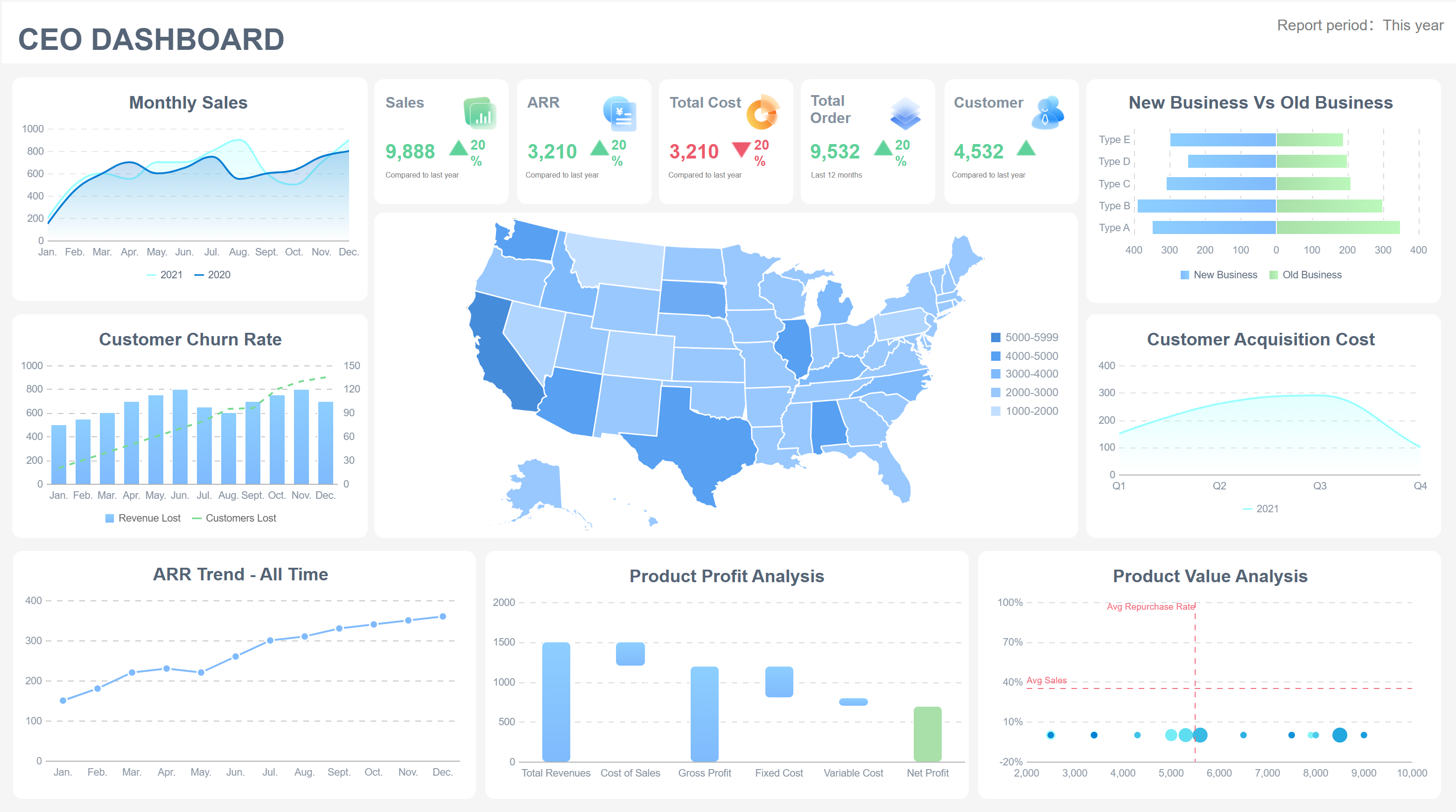
FineReport’s 3D dashboards and mobile access make it easy for executives to get insights anywhere. You can make strategic decisions that drive sales growth.
5.Lead Conversion Dashboard
You want to know how well your team turns leads into customers. The lead conversion dashboard tracks lead conversion rate, lead-to-sale rate, and lead-to-opportunity rate. You can see which sources bring the best leads and where you lose prospects.
| Metric Name | Description | Calculation Example |
|---|---|---|
| Lead Conversion Rate | Measures how well you turn visitors into leads. | (Number of Leads / Total Visitors) * 100% |
| Lead-to-Sale Conversion Rate | Shows how many leads become customers. | (Number of Converted Leads / Total Leads) * 100% |
| Lead-to-Opportunity Conversion Rate | Tracks leads that become opportunities. | (Leads Converted to Opportunities / Total Leads) * 100% |
FineReport’s sales conversion rate dashboard helps you spot trends and improve your sales kpis. You can adjust your strategy to boost sales performance and revenue.
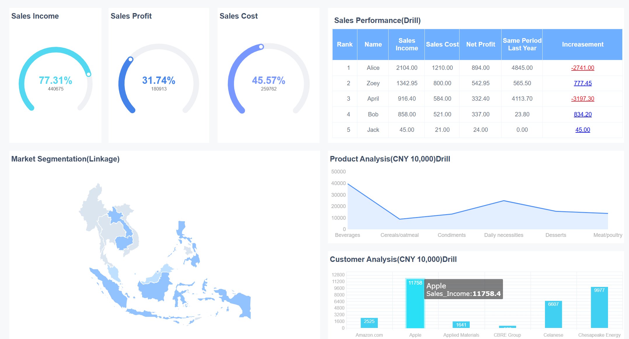
6.Regional Sales Dashboard
The regional sales dashboard helps you compare performance across territories. You can see which regions bring in the most sales, where opportunities are strongest, and where you need to invest more resources.
| Evidence Type | Description |
|---|---|
| Identify high-performing regions | Monitor opportunities and leads by stage in each region. |
| Allocate resources effectively | Compare lead volume and quality across areas. |
| Spot trends early | Detect shifts in customer behavior or market conditions. |
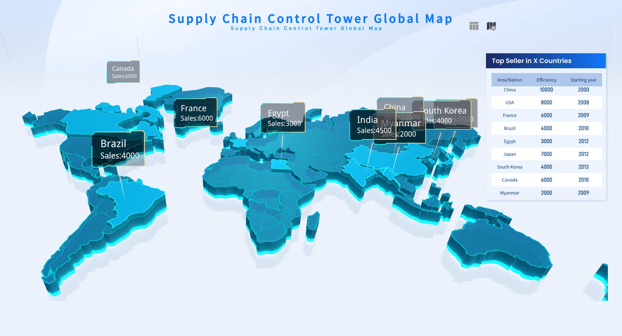
FineReport’s dashboards let you visualize this data with maps and charts. You can quickly spot trends and make decisions that drive sales growth in every region.
7.Product Performance Dashboard
You need to know which products drive revenue. The product performance dashboard tracks conversion rates, churn rates, customer lifetime value, and user engagement. You can see which products perform best and where to focus your efforts.
| Metric | Importance |
|---|---|
| Real-time data | Understand customer preferences and market changes. |
| User engagement | See how well your product meets user needs. |
| Conversion rates | Track how many users become paying customers. |
| Retention rates | Measure how well you keep customers. |
| Customer feedback | Get insights into user satisfaction. |
FineReport’s sales dashboard examples let you customize metrics and integrate data from multiple sources. You can optimize your product strategy and boost sales opportunities.
8.Customer Acquisition Dashboard
The customer acquisition dashboard tracks how you gain new customers. You can analyze acquisition by region, campaign ROI, and spend efficiency. This dashboard helps you spot growth opportunities and balance speed with efficiency.
| Metric Type | Description |
|---|---|
| Geographic Acquisition Analysis | See which regions bring in the most new customers. |
| Campaign ROI and Spend Efficiency | Track marketing spend against results. |
FineReport’s dashboards visualize this data, making it easy to spot trends and adjust your strategy for better sales growth.
9.Sales Forecast Dashboard
You want to predict future sales. The sales forecast dashboard uses methods like regression analysis, time series forecasting, and AI-powered models. You can see how likely you are to hit your targets and plan resources accordingly.
| Forecasting Method | Description |
|---|---|
| Regression Analysis | Uses historical data to predict future sales. |
| Time Series Forecasting | Finds patterns and trends over time. |
| AI-Powered Forecasting | Uses machine learning for more accurate predictions. |
| Opportunity Stage Forecasting | Predicts deal closures based on pipeline stage. |
| Weighted Forecast Planning | Assigns probabilities to each stage for better forecasts. |
| Lead-Driven Forecasting | Focuses on lead quality and quantity. |
FineReport’s sales kpi dashboard gives you real-time forecasts and helps you make data-driven decisions.
10.Quota Attainment Dashboard
The quota attainment dashboard tracks how close your team is to hitting targets. You can monitor individual and team performance, give feedback, and reward success. This dashboard creates transparency and motivates your team.
| Benefit | Description |
|---|---|
| Monitor and track performance | Review metrics to find areas for improvement. |
| Provide feedback and coaching | Help salespeople overcome challenges. |
| Incentivize and reward success | Reward reps for hitting quotas. |
| Foster competition | Motivate the team with friendly competition. |
| Create transparency | Make quick, data-driven decisions. |
FineReport’s dashboards automate tracking and make it easy to share results with your team. You can boost sales productivity and keep everyone focused on sales growth.
11.Win/Loss Dashboard
You want to know why you win or lose deals. The win/loss dashboard gives you transparency and real-time insights. You can see patterns, act on feedback, and improve your sales process.
| Benefit | Description |
|---|---|
| Transparency | Everyone sees the same data and works toward the same goals. |
| Focus on Improvement | Get immediate insights to fix problems. |
| Real-time Decision-making | Respond quickly to new challenges or competitors. |
FineReport’s sales opportunity dashboard lets you analyze this data and make changes that improve your win rate.
12.Sales Cycle Dashboard
The sales cycle dashboard tracks how long it takes to close deals. You can see where delays happen and find ways to speed up the process. Shorter sales cycles mean faster revenue and more predictable results.
- Visualizing the average sales cycle length helps you spot inefficiencies.
- Monitoring this KPI lets you streamline your process.
- Optimizing the sales cycle helps you close deals faster and allocate resources better.
FineReport’s sales dashboard examples let you track this data in real time. You can set goals, monitor progress, and drive sales performance.
Real-World Impact: Companies like BOE use dashboards built with FineReport to unify data, standardize metrics, and boost operational efficiency. In manufacturing, sales opportunity dashboards help teams spot trends, compare performance across factories, and drive continuous improvement. With FineReport, you get mobile dashboards, 3D visualizations, and seamless data integration—everything you need to turn insights into action.
Implementing Sales Performance Dashboards with FineReport
Setup and Customization Best Practices
Getting started with FineReport is simple. You can connect your data sources, drag and drop charts, and build dashboards that fit your team’s needs. FineReport offers a variety of visualization techniques to help you tell your sales story. Here’s a quick look at some options:
| Visualization Technique | Description | Best Use Case |
|---|---|---|
| Bullet Map | Shows rich data in a compact, linear format | Tracking KPIs and targets |
| Flowchart | Visualizes business processes for better understanding | Sales process optimization |
| Dynamic Water Balloon | Displays progress as a percentage | Quota attainment and goals |
| Scrolling Report Graph | Updates data dynamically for large screens | Real-time sales monitoring |
| Mini Figure | Offers a quick view of trends | Spotting sales spikes or dips |
| Combination Chart | Merges bar and pie charts for deeper insights | Comparing sales metrics |
You can also customize dashboards for different roles and automate content delivery. FineReport’s mobile access lets you check dashboards on your phone or tablet, so you never miss an update.
Training and Adoption Tips
To help your team get the most from your dashboards, focus on hands-on learning and teamwork. Here are some effective training methods:
| Training Method | How It Helps Your Team |
|---|---|
| Hands-on practice | Lets users solve real problems and build confidence |
| Collaboration and sharing | Encourages teamwork and knowledge sharing |
| Simplified content | Keeps training clear and avoids overwhelming new users |
| Interactive activities | Boosts engagement and helps users remember key features |
| Skip lengthy manuals | Uses visuals and real examples for faster learning |
You can also integrate dashboards with your CRM to centralize data and reduce manual entry errors. Track adoption by setting KPIs and using dashboards to monitor usage patterns.
Measuring Dashboard Success
You want to know if your dashboards are making a difference. FineReport makes it easy to track success with clear KPIs and automated updates. Here’s how you can measure impact:
| KPI Type | What It Shows |
|---|---|
| High-level Status | Gives executives a quick overview |
| Deal-based Dashboards | Lets reps track their own deals and progress |
Automation pulls data directly into your dashboards, so you always see the latest numbers. When you monitor sales performance, you turn data into action and keep your team aligned with revenue goals.
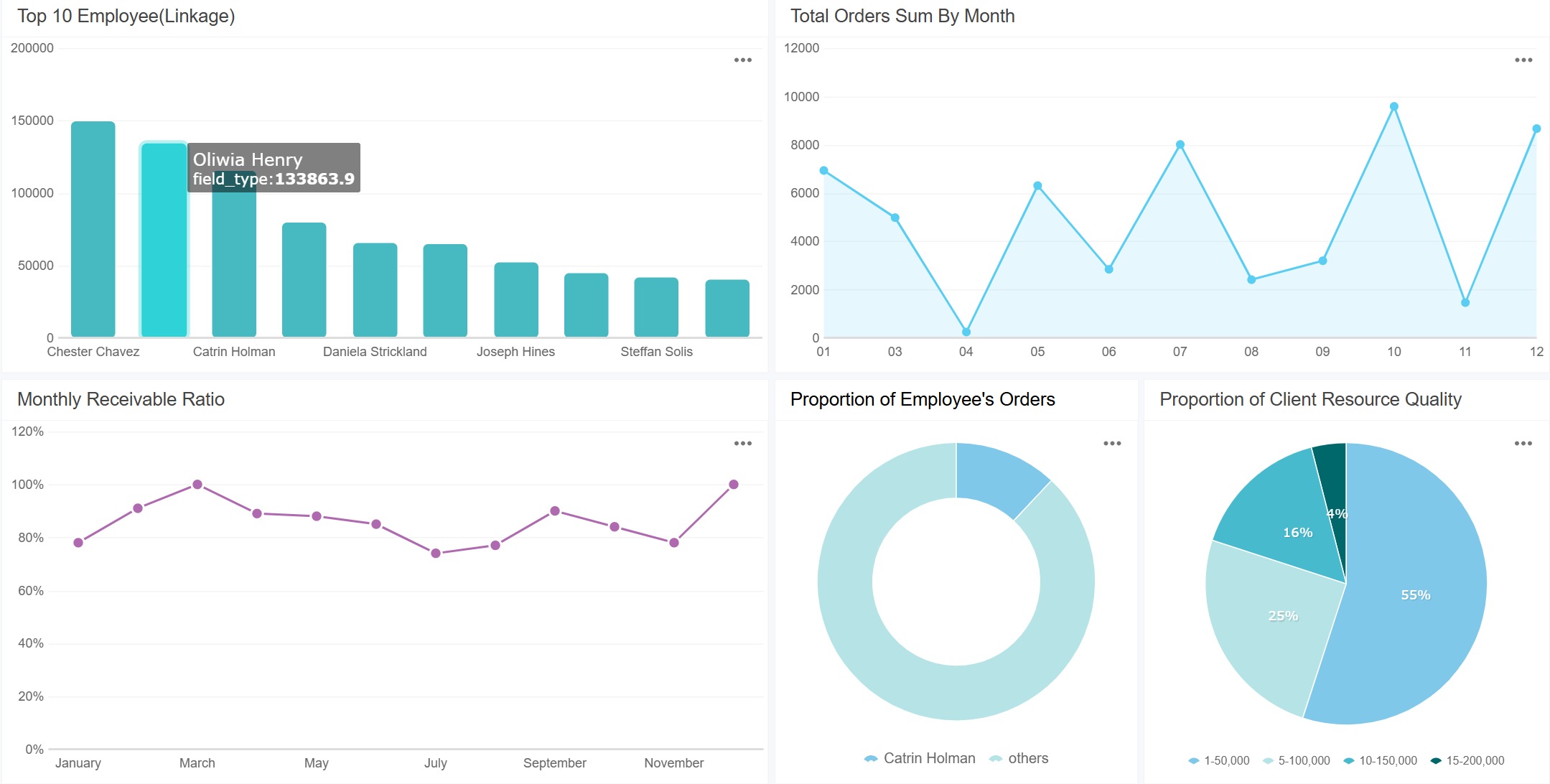
Sales Activities Dashboard for Continuous Improvement
A sales dashboard is a visual tool that shows your team’s key sales metrics in real time, helping you track progress and make quick decisions.
Sales Activities Dashboard for Continuous Improvement
Tracking Daily Sales Activities
You want to know what drives results for your sales team. Tracking daily actions helps you spot patterns and improve performance. When you use a sales activities dashboard, you see exactly how your reps spend their time. You can check which activities lead to more deals and which ones need attention.
Here are some important metrics to track every day:
| Metric | Description |
|---|---|
| Number of calls made | The total number of outbound calls made by sales reps in a given period. |
| Email open rates | Measures the percentage of sent emails that are opened by prospects. |
| Email response rate | The percentage of sent emails that receive a response from prospects. |
| Meetings booked | The total number of meetings scheduled with prospects. |
FineReport makes it easy to monitor these metrics. You can set up dashboards that update in real time. This helps you coach your team and keep everyone focused on the right actions.
Leveraging Data for Ongoing Growth
You want your team to keep improving. The sales activities dashboard gives you a clear view of what works and what doesn’t. When you see all your data in one place, you make better decisions and help your team grow.
Check out how using data from your dashboard helps you:
| Advantage | Explanation |
|---|---|
| Holistic view of key sales data | Provides a comprehensive overview of sales processes, helping identify what works and what doesn’t. |
| Free up time to focus on selling | Reduces manual processes, allowing sales reps to concentrate on selling activities. |
| Centralized data for informed decisions | Ensures reliable data is accessible in one place, facilitating better decision-making. |
| Common KPIs and goals | Promotes transparency in performance metrics, aligning team efforts towards shared objectives. |
FineReport supports continuous improvement by letting you review and adjust your sales process. In manufacturing, teams use the PDCA cycle—Plan, Do, Check, Act—to optimize sales management. You can apply this method with your dashboard, making small changes and tracking results. Over time, you build a stronger, more efficient sales team.
A sales dashboard gives you a real-time view of your team’s key sales metrics in one place. When you use dashboards, you make smarter decisions and drive revenue growth.
- Teams that simplify metrics see decision-making speed up by 30%.
- Dashboards turn raw data into insights, helping you spot trends and improve sales.
Think of it like a pilot’s cockpit—quick, clear, and always in control.
Try FineReport to build your own dashboard and unlock the power of data-driven sales.
Continue Reading About Sales Performance Dashboard
What Is Sales Revenue and Why Is It Important for Businesses
Sales Dashboard Software Comparison for Businesses
Top 10 Sales Dashboard Examples to Elevate Your Team in 2026
Top 10 Best Sales Dashboards for 2026
How Business Intelligence Sales Solutions Help Exceed Target


FAQ

The Author
Lewis
Senior Data Analyst at FanRuan
Related Articles

How to Build an Investment Portfolio Reporting Dashboard for Executives: KPIs, Benchmarks, and Drill-Down Views
Investment portfolio reporting for executives is not about showing every holding, transaction, and chart your investment team can produce. It is about giving CEOs, CFOs, CIOs, boards, and investment committees a fast, re
Yida YIn
Jun 25, 2026

12 KPI Reporting Examples for Executive Dashboards: What to Show in Weekly, Monthly, and Quarterly Reviews
Executive leaders do not need more data. They need decision ready $1 examples that match how often they review the business and what actions they are expected to take. A weekly $1 should surface fast moving risks and per
Yida YIn
Jun 25, 2026

How to Build a Digital Marketing Reports Dashboard: Executive Examples, KPIs, and Templates
A $1 is the control layer that helps executives and marketing leaders turn scattered channel data into fast, confident decisions. If you are a CEO, CMO, operations director, or marketing analytics lead, the real problem
Yida Yin
May 07, 2026