A supply and demand graph helps you visualize how supply and demand interact in any market. You see the supply curve show how much producers want to sell at different prices, while the demand curve reveals how much buyers want at those same prices. When supply increases, the supply curve shifts, and you notice changes in the market. When demand rises, the demand curve shifts, and the market responds. Every point on the supply and demand graph tells you something about supply, demand, and price. In business, you use supply and demand graphs to make decisions about pricing, production, and inventory.
Supply and demand graphs are not just for classrooms. You find them in business meetings and dashboards because they help you spot trends quickly. Many educational programs, like introductory economics courses, use supply and demand graphs to teach how markets work and how prices form. Today, tools likeFineBIfromFanRuan make it simple to analyze these graphs. With FineBI, you can:
Analyze supply and demand data in real time for faster business decisions
Combine supply and demand data from different sources to get a complete view
Use mobile access to check supply and demand insights wherever you are
With these tools, you can explore supply and demand changes, track how supply and demand curves shift, and understand the impact on your business. A supply and demand graph becomes a powerful tool when you have the right data and visualization platform.
Supply and Demand Graph Basics
What Is Supply and Demand?
You see the terms supply and demand in every economics textbook. Supply means the amount of a good or service that producers are willing to offer at each price. Demand means the amount of a good or service that consumers are willing and able to buy at each price. The law of demand says that when the price goes up, people buy less. When the price drops, people buy more. The demand curve shows this relationship as a downward slope. On the other hand, the law of supply says that when the price rises, producers want to sell more. When the price falls, they supply less. The supply curve slopes upward. These two forces shape every market. You use a supply and demand graph to see how they interact and to find the price where buyers and sellers agree.
The Mechanics of the Supply and Demand Graph: Market Equilibrium vs. Disequilibrium
To successfully utilize a supply and demand graph for business strategy, leaders must understand how the intersection of these two curves dictates market survival.
Market Equilibrium: This is the golden intersection where the supply curve and demand curve meet. At this point, the quantity of goods supplied matches the quantity demanded exactly, establishing the Equilibrium Price. In a perfectly efficient market, there is neither waste nor unfulfilled customer frustration.
Market Surplus (Supply > Demand): When a business sets its prices higher than the equilibrium point, the quantity supplied outpaces market appetite, resulting in an inventory surplus. This leads to increased holding costs and forces damaging clearance markdowns.
Market Shortage (Demand > Supply): Conversely, if prices are set too low, customer eagerness outstrips stock availability. This creates a shortage, leaving easy revenue on the table and driving frustrated buyers straight to competitors.
Supply and Demand Graph Components
A supply and demand chart has several key parts. You need to know these to read any supply and demand diagram:
The vertical axis shows price.
The horizontal axis shows quantity.
The demand curve slopes downward from left to right. It shows how much buyers want at each price.
The supply curve slopes upward from left to right. It shows how much sellers offer at each price.
The point where the supply curve and demand curve cross is the market equilibrium. Here, the quantity supplied equals the quantity demanded.
Shifts in the supply curve or demand curve show changes in the market, like new technology or changing consumer tastes.
Tip: Always check that the axes are labeled and the curves are clear. This helps you avoid confusion when you look at a supply and demand chart.
Reading the Supply and Demand Graph
You can read a supply and demand graph by following a few simple steps:
Gather your data. Make a table with prices, quantities demanded, and quantities supplied.
Draw your axes. Label the vertical axis as Price and the horizontal axis as Quantity.
Plot the demand points and connect them to form the demand curve. It should slope downward.
Plot the supply points and connect them to form the supply curve. It should slope upward.
Find the intersection. This is the equilibrium point, showing the market price and quantity.
Use colors or different line styles to tell the curves apart.
Remember, a movement along a curve means a price change. A shift of the curve means something else changed, like income or technology.
Practice with real data to get better at reading any supply and demand chart.
You can use tools like FineBI by FanRuan to make this process easier. FineBI lets you drag and drop your data to create a supply and demand diagram in seconds. You can combine data from different sources, update your charts in real time, and share your findings with your team. This helps you spot trends and make better decisions in your business.
A supply and demand graph, a supply and demand chart, or a supply and demand diagram all help you see these relationships clearly. When you usedata visualization tools like FineBI, you can turn complex data into easy-to-read charts. This helps you understand your market, forecast trends, and make decisions that keep your business ahead.
Supply and Demand Graph: Market Equilibrium Explained
The Equilibrium Point
When you look at a supply and demand graph, you see the point where the supply and demand curves cross. This intersection is called the equilibrium. At this spot, the quantity of goods that producers want to sell matches exactly with the quantity that consumers want to buy. You call this balance the market equilibrium. The price at this point is the equilibrium price, and the amount traded is the equilibrium quantity.
If you set the price higher than the equilibrium, you get a surplus. Producers supply more than buyers want, so goods pile up. Sellers then lower prices to clear out the extra stock. If you set the price below equilibrium, you get a shortage. Buyers want more than producers supply, so products run out quickly. This pushes prices up. These forces keep moving the market toward equilibrium.
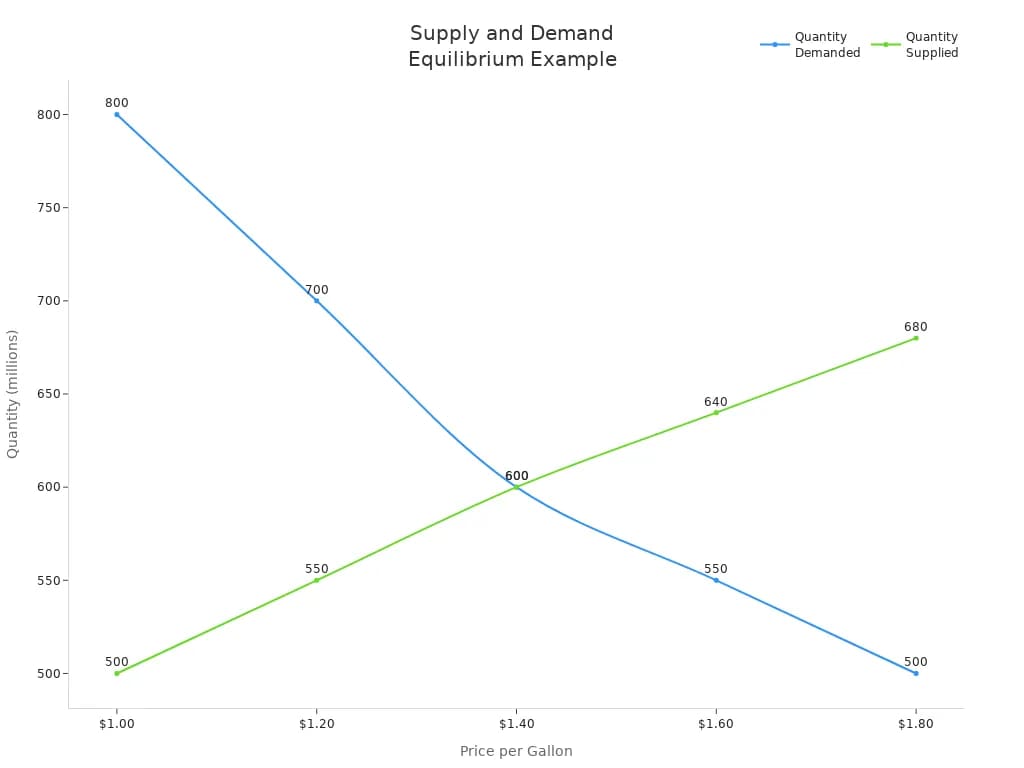
Let’s look at a real-world example. In the gasoline market, the equilibrium price is $1.40 per gallon. At this price, both the quantity supplied and the quantity demanded are 600 million gallons. If the price rises above $1.40, you see a surplus. If the price drops below $1.40, you see a shortage. The table below shows how this works:
Price (per gallon)
Quantity Demanded (millions)
Quantity Supplied (millions)
$1.00
800
500
$1.20
700
550
$1.40 (Equilibrium)
600
600
$1.60
550
640
$1.80
500
680
You can also see this relationship in the following chart:
This graph makes it easy to spot the equilibrium. You see how the market moves toward this point, no matter where the price starts.
Tip: In a perfectly competitive market, equilibrium happens when many buyers and sellers interact freely, and everyone has the same information.
Shifts in Supply or Demand
Markets do not stay the same forever. You often see the equilibrium change when outside factors shift the supply or demand. When the supply curve moves, it means producers can offer more or less at every price. When the demand curve moves, it means buyers want more or less at every price.
Common reasons for shifts include:
Technological advancements, like new production methods that increase supply
Changes in the number of sellers in the market
Variations in input costs, such as raw materials or labor
Expectations about future prices or market conditions
For example, when hydraulic fracturing (fracking) technology improved in North America, oil producers could supply much more oil. This shift in supply caused oil prices to fall sharply, which also changed the equilibrium in the oil market. You can see similar effects in other industries when new competitors enter or when input costs rise or fall.
When the supply curve shifts right (increases), you get a new equilibrium with a lower price and higher quantity. When the demand curve shifts right (increases), you get a new equilibrium with a higher price and higher quantity. The opposite happens if supply or demand decreases.
Note: You can useFineBI dashboards to track these changes in real time. FineBI lets you visualize how shifts in supply or demand affect market equilibrium. In manufacturing or supply chain management, you can monitor inventory, production, and sales data. This helps you respond quickly to changes and keep your business running smoothly.
By understanding how equilibrium works and how shifts in supply or demand change the market, you can make better decisions. You can set prices, plan production, and manage inventory with confidence. FineBI gives you the tools to see these changes as they happen, so you always stay ahead in your market.
Real-World Uses in Business of Supply and Demand Graph
Supply Chain and Manufacturing
You use supply and demand graphs every day in manufacturing, procurement, and inventory management. These graphs help you see how much product to make, when to order materials, and how to avoid shortages or excess stock. In a real case, a modular bathroom pod manufacturer improved efficiency by mapping supply and demand with operations science tools. The team used production system optimization to track throughput, cycle time, and inventory. By analyzing supply and demand, they found bottlenecks and set the right inventory levels. This led to better scheduling and fewer delays.
Many companies use supply and demand data to forecast needs and adjust quickly. For example, big data helps you predict demand by looking at past sales and current trends. Real-time tracking systems show you where your supply is at any moment, so you can avoid running out or having too much. Companies like General Electric use digital twins to simulate supply and demand scenarios, reducing waste and improving throughput. Amazon uses predictive analytics to keep the right amount of supply on hand, making sure demand is always met. These strategies help you respond to changes in the market and keep your business running smoothly.
Tip: Update your supply and demand analysis often. Some businesses do this daily, while others review weekly or monthly. Frequent updates help you react fast to market changes and keep your supply chain efficient.
How Modern BI Automates Supply and Demand Curves
For decades, plotting a supply and demand graph was a manual, retrospective process done via complex Excel spreadsheets and macro scripts. By the time the data was compiled, market conditions had already shifted.
Modern enterprises bypass this delay by connecting their ERP, CRM, and inventory databases directly to automated business intelligence tools like FineBI. Instead of drawing static theoretical lines, these systems offer:
Real-Time Curve Adjustments: Watch your demand and supply curves shift dynamically on an interactive dashboard as live checkout data and incoming supplier invoices feed into the system.
Automated Anomaly Detection: When external variables (such as shipping delays or sudden viral market trends) cause a sudden shift in the supply curve, the BI tool automatically updates your operational graphs and alerts procurement teams.
Algorithmic Pricing Optimization: Let data drive your bottom line. Sophisticated BI models cross-reference live inventory metrics with consumer buying velocity to mathematically pin down the optimal equilibrium price day by day, maximizing your profit margins.
Data Visualization with FineBI
You can make better decisions when you see your supply and demand data clearly. FineBI gives you powerful tools to visualize this information. With interactive dashboards, you can spot trends in supply and demand quickly. Self-service analytics let you explore data on your own, without waiting for IT support. Real-time data visualization means you get instant feedback as the market shifts.
FineBI connects to many data sources, so you always have the latest supply and demand numbers. You can use drag-and-drop features to build reports and dashboards that show how supply and demand interact in your market. Predictive analytics in FineBI help you forecast demand and plan your supply, reducing the risk of stockouts or overstocking.
When you integrate supply and demand analysis into your business intelligence workflow, you gain a complete view of your operations. This helps you find inefficiencies, optimize inventory, and improve supply chain performance. Companies that usebusiness intelligence tools like FineBI report better decision-making, higher productivity, and cost savings. You move from reacting to problems to planning ahead, staying competitive in any market.
Revolutionizing the Supply & Demand Graph with AI Data Assistant
In the real business world, market variables change in the blink of an eye. Manually plotting data onto a supply and demand graph using traditional spreadsheets is often too slow to guide immediate pricing or inventory decisions.
To bridge this gap, modern enterprises are turning to Dora—FanRuan’s advanced AI-powered data assistant designed to democratize business intelligence.
Instead of writing complex SQL queries or fighting with chart builders, Dora allows supply chain managers, procurement leaders, and sales teams to interact with their live database using natural language.
Instant Graph Generation: Simply ask, "Dora, generate a supply and demand graph for our electronics category based on last quarter’s sales and inventory data," and watch a beautifully calibrated visual appear in seconds.
Conversational Root-Cause Analysis: If your graph shows a sudden shift in the demand curve, you can delve deeper without leaving the chat interface: "Dora, what external factors caused the demand curve to shift right in May?" The AI will instantly cross-reference promotion data, seasonal trends, and regional performance to give you a definitive narrative.
AI-Generated Pricing Recommendations: Let AI find your optimal equilibrium point. By asking, "Based on the current supply curve constraints, what is the best equilibrium price to maximize our Q3 margins?" Dora leverages built-in predictive algorithms to mathematically pinpoint your strategic sweet spot. By integrating Dora into your analytics workflow, the static supply and demand graph evolves from a theoretical classroom concept into an interactive, real-time decision engine.
Elasticity measures how much one economic variable responds when another changes. In the context of supply and demand, elasticity tells you how sensitive buyers and sellers are to price changes. You calculate elasticity as the percentage change in one variable divided by the percentage change in another. For example, price elasticity of demand shows how much the quantity demanded changes when the price changes. If a small price increase causes a big drop in demand, you say demand is elastic. If demand hardly changes, it is inelastic.
On a supply and demand graph, elasticity affects the slope of the curves. A flatter demand curve means buyers react strongly to price changes, showing high elasticity. A steeper demand curve means buyers do not change their behavior much, showing low elasticity. The same idea applies to the supply curve. When you look at products like luxury goods or airline tickets, you see high elasticity. People buy less when prices rise. For basic goods, like salt, demand is less elastic because people need them no matter the price.
Product Category
Price Elasticity Type
Consumer Behavior and Demand Response
Luxury Goods
High Elasticity
Demand decreases when prices rise as consumers delay purchases or seek alternatives; demand increases when prices fall.
Airline Tickets
High Elasticity
Demand fluctuates with price; consumers may postpone travel or choose other transport if prices rise.
Fast Food
High Elasticity
Demand sensitive to price; consumers switch to home cooking or cheaper options if prices increase.
OTT Platforms
High Elasticity
Consumers switch subscriptions based on price and content availability.
Furniture & Décor
High Elasticity
Consumers compare prices and quality; demand drops if prices rise relative to alternatives.
Understanding elasticity helps you predict how changes in price will affect both supply and demand, which is key for setting prices and planning production.
External Influences
Many outside factors can shift supply or demand in a market. These factors can move the curves left or right, changing the equilibrium price and quantity. You often see these shifts when governments change policies, when new technology appears, or when global events happen.
External Factor Category
Description
Examples of Impact on Supply or Demand
Political
Government actions like trade or tax policy
Stimulus programs, new taxes, or tariffs can change supply or demand.
Economic
Changes in the economy
Inflation or unemployment can reduce demand or increase supply costs.
Social
Shifts in population or behavior
More people working from home can change demand for office supplies.
Technological
New inventions or processes
Automation can increase supply by lowering costs.
Environmental
Natural events or health crises
Pandemics can reduce supply by closing factories or change demand for certain goods.
Legal
New laws or regulations
Health and safety rules can increase production costs, shifting supply.
Note: Taxes and regulations usually increase production costs, shifting the supply curve to the left. Subsidies or new technology can lower costs, shifting supply to the right. Sometimes, taxes on products like cigarettes aim to reduce demand by making them more expensive.
You need to watch these external influences because they can quickly change the balance between supply and demand. By tracking these changes, you can adjust your business strategy and stay ahead of market shifts.
Understanding supply and demand gives you a strong foundation for business success. You can set prices, manage inventory, and plan production by tracking how supply and demand interact. FineBI from FanRuan lets you visualize supply and demand, making it easier to spot trends and act quickly.
Business Insight
Explanation
Price setting
You adjust supply and demand to avoid shortages or excess stock.
Equilibrium price
You match supply with demand for efficient planning.
Demand elasticity
You see how demand changes with price, guiding your supply decisions.
External factors
You respond to shifts in supply or demand from outside events.
Market response
You adapt supply and demand to stay ahead of changes.
Use templates and regular updates to keep your supply and demand analysis accurate.
Collaborate with your team to improve supply and demand forecasting.
Apply these insights to your business for better results.
Mastering supply and demand analysis helps you make smarter decisions and build a resilient business.
Click the banner below to try FineBI for free and empower your enterprise to transform data into productivity!
Smarter product, pricing, and inventory management across retail sectors.
FAQ
What does a supply and demand graph show you?
A supply and demand graph shows how much of a product you can supply at different prices and how much buyers want at those prices. You see where supply meets demand, which helps you find the best price and quantity.
How do shifts in supply affect the market?
When supply increases, you see the supply curve move to the right. This usually lowers the price and raises the quantity available. If supply decreases, the curve shifts left, causing higher prices and less quantity in the market.
Why is understanding supply important for your business?
You need to track supply to avoid shortages or excess inventory. By watching supply trends, you can adjust production, set better prices, and meet customer demand more effectively. This helps your business stay competitive and profitable.
Can data visualization tools help you analyze supply and demand?
Yes, data visualization tools like FineBI let you see supply and demand changes in real time. You can spot trends, track supply shifts, and make quick decisions. These tools help you understand the balance between supply and demand in your market.