Looking for the best data visualization tools in 2026? Here are seven you should check out:
- FineReport
- Tableau
- Microsoft Power BI
- Google Looker Studio
- Qlik Sense
- Domo
- Sisense
- Zoho Analytics
You want software that stands out for innovation, ease of use, integration, pricing, and real-time data support. Most companies now use data visualization software, with adoption rates soaring thanks to low-code platforms and advanced features. Each industry has unique needs, so picking the right tool can make a big difference in how you see and use your data.
Data Visualization Software Comparison
Choosing the right data visualization software can feel overwhelming. You want a tool that fits your business, works with your data, and helps you see results fast. Let’s break down how the top seven data visualization tools stack up in 2026.
Use Case Overview
Each tool shines in different areas. FineReport stands out for enterprise reporting and real-time dashboards. Tableau and Power BI work well for interactive analytics and business intelligence. Google Looker Studio is great for marketing and web analytics. Qlik Sense and Sisense focus on self-service analytics, while Domo offers cloud-based dashboards for fast insights.
Key Features
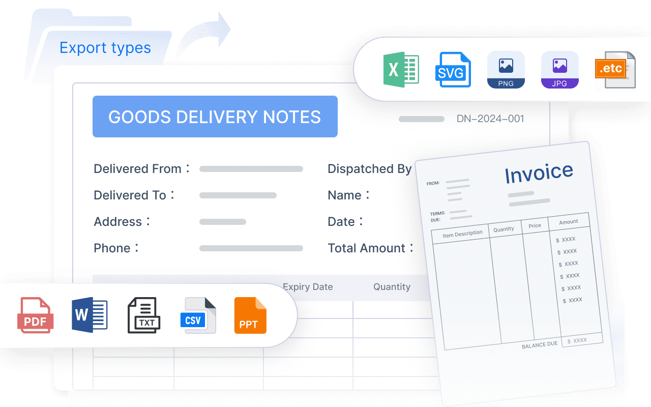
You’ll notice some tools make it easy to get started, while others need more technical skills. FineReport gives you an intuitive interface, so you can create reports without much training. It lets you batch import data from Excel and even handle historical data, which saves time. You also get robust reporting and seamless data integration. Other tools may offer strong analytics, but sometimes they limit how you bring in or customize your data.
Here’s a quick comparison to help you decide:
| Tool | Best For | Ease of Use | Standout Features | Pricing | Real-Time Data Support |
|---|---|---|---|---|---|
| FineReport | Enterprise reporting, real-time dashboards | Very easy | Seamless integration, batch Excel import, flexible customization | Mid-range | Yes |
| Tableau | Interactive analytics | Moderate | Advanced visualizations, strong community | High | Yes |
| Power BI | Business intelligence | Easy | Microsoft integration, affordable | Low-Mid | Yes |
| Looker Studio | Marketing/web analytics | Easy | Google ecosystem, easy sharing | Free | Limited |
| Qlik Sense | Self-service analytics | Moderate | Associative data model, in-memory processing | High | Yes |
| Domo | Cloud dashboards | Easy | Cloud-native, fast deployment | High | Yes |
| Sisense | Embedded analytics | Moderate | Customizable, strong embedding options | High | Yes |
Pricing
Pricing can vary a lot. Some data visualization software, like Looker Studio, is free for basic use. Others, such as Tableau, Domo, and Sisense, come with higher price tags but offer advanced features. FineReport sits in the mid-range, giving you enterprise-level capabilities without breaking the bank. Power BI is also budget-friendly, especially if you already use Microsoft products.
Tip: Always check for free trials. You can test the software before you commit.
You have many choices for data visualization tools. Think about your team’s needs, your data sources, and your budget. The right software will help you turn numbers into clear, actionable insights.
Best Data Visualization Software for 2026
Choosing the best data visualization software can feel like a big decision. You want tools that help you see your data clearly, make smart choices, and keep up with the latest trends. Let’s look at the top options for 2026 and see what makes each one special.
1.FineReport by FanRuan
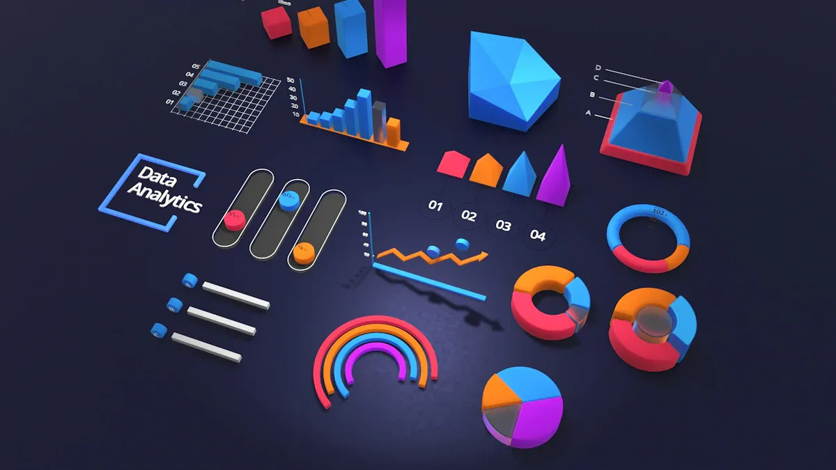
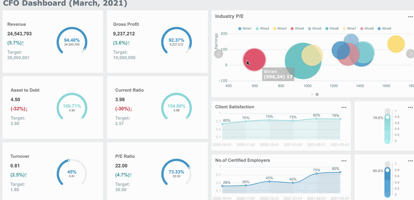
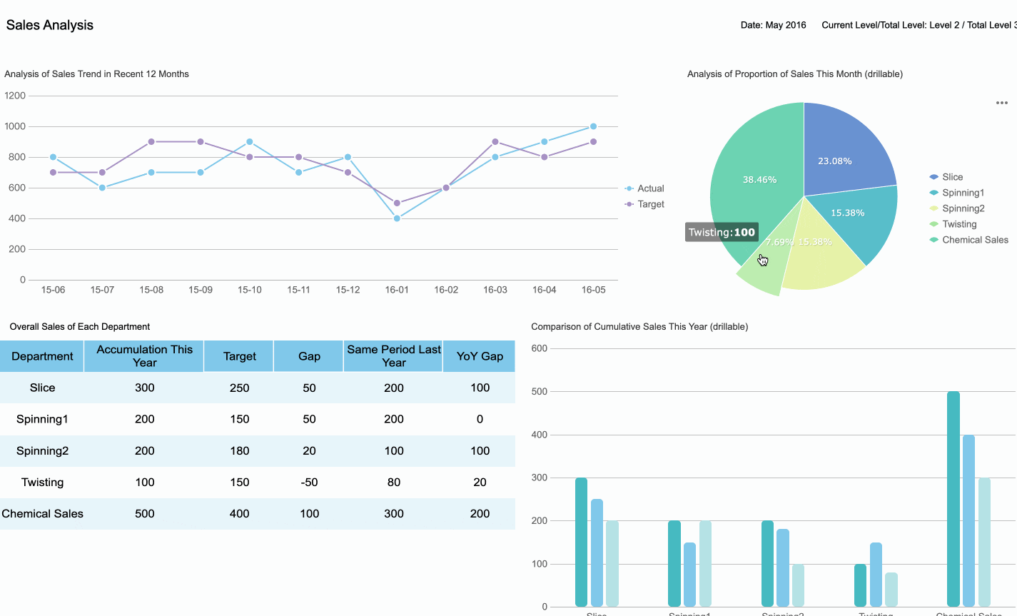
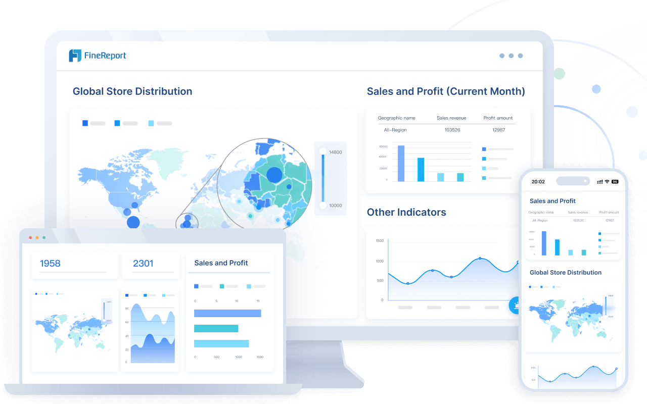
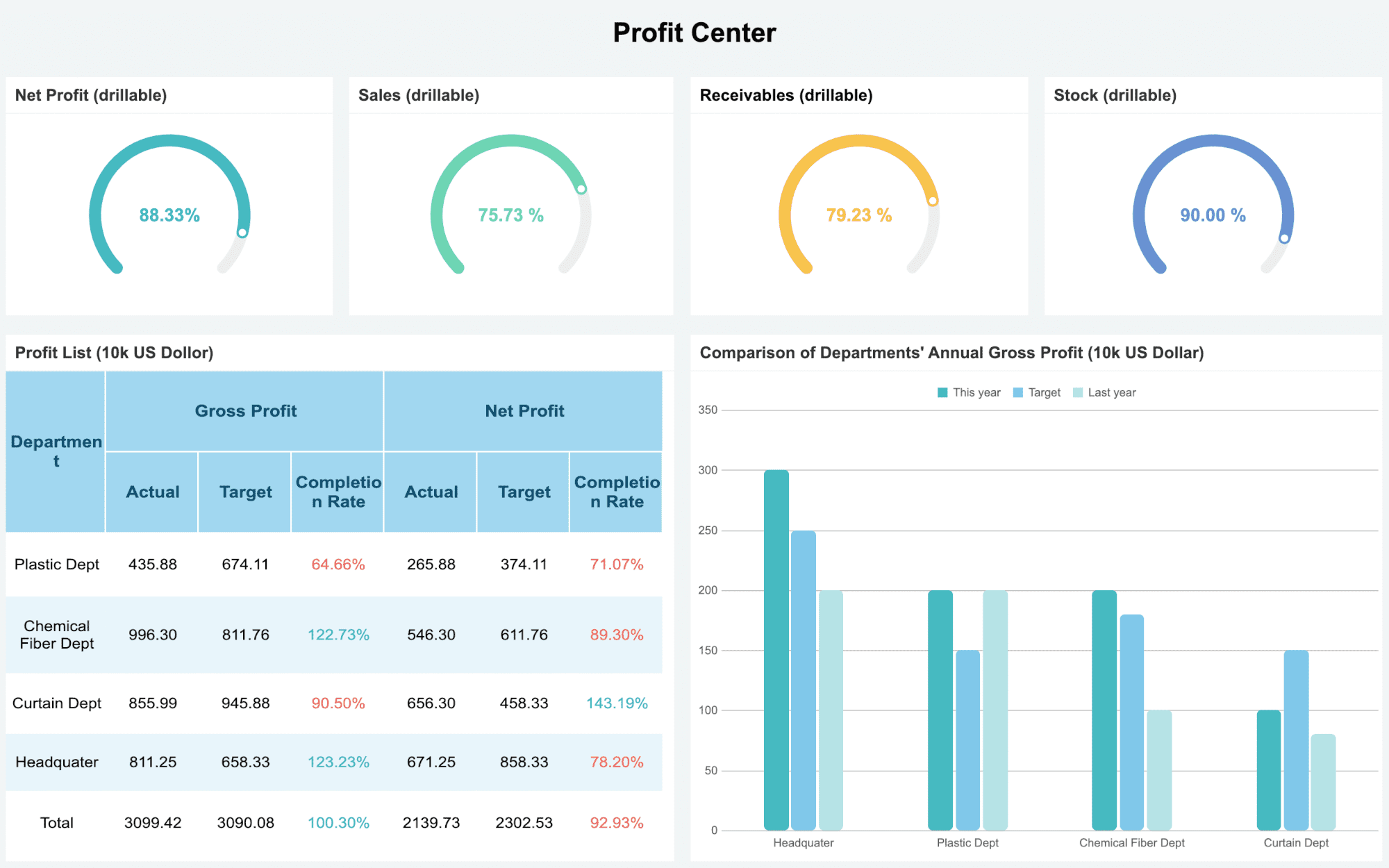
If you need enterprise-level reporting and real-time dashboards, FineReport by FanRuan should be at the top of your list. This platform gives you a smooth, user-friendly experience, even if you’re not a tech expert. You can connect to almost any data source, create interactive charts, and build dynamic 3D dashboards. FineReport stands out for its real-time data visualization capabilities, making it easy to spot trends and act fast.
Website: https://www.fanruan.com/en/finereport
Here’s what you’ll love about FineReport:
- FineVis lets you tell stories with your data using interactive charts and 3D visuals.
- FineBI helps you connect, analyze, and share data, so your whole team can make better decisions.
- You get customizable dashboards that work for everyone, from beginners to advanced users.
- The platform supports ai-powered data visualization, helping you uncover deeper data insights.
FineReport is a top choice for companies that want the best data visualization software for business intelligence, reporting, and real-time analytics.

2.Tableau
Tableau keeps its spot as one of the best data visualization software options in 2026. It’s known for powerful analytics and beautiful visuals. This year, Tableau introduced some game-changing features:
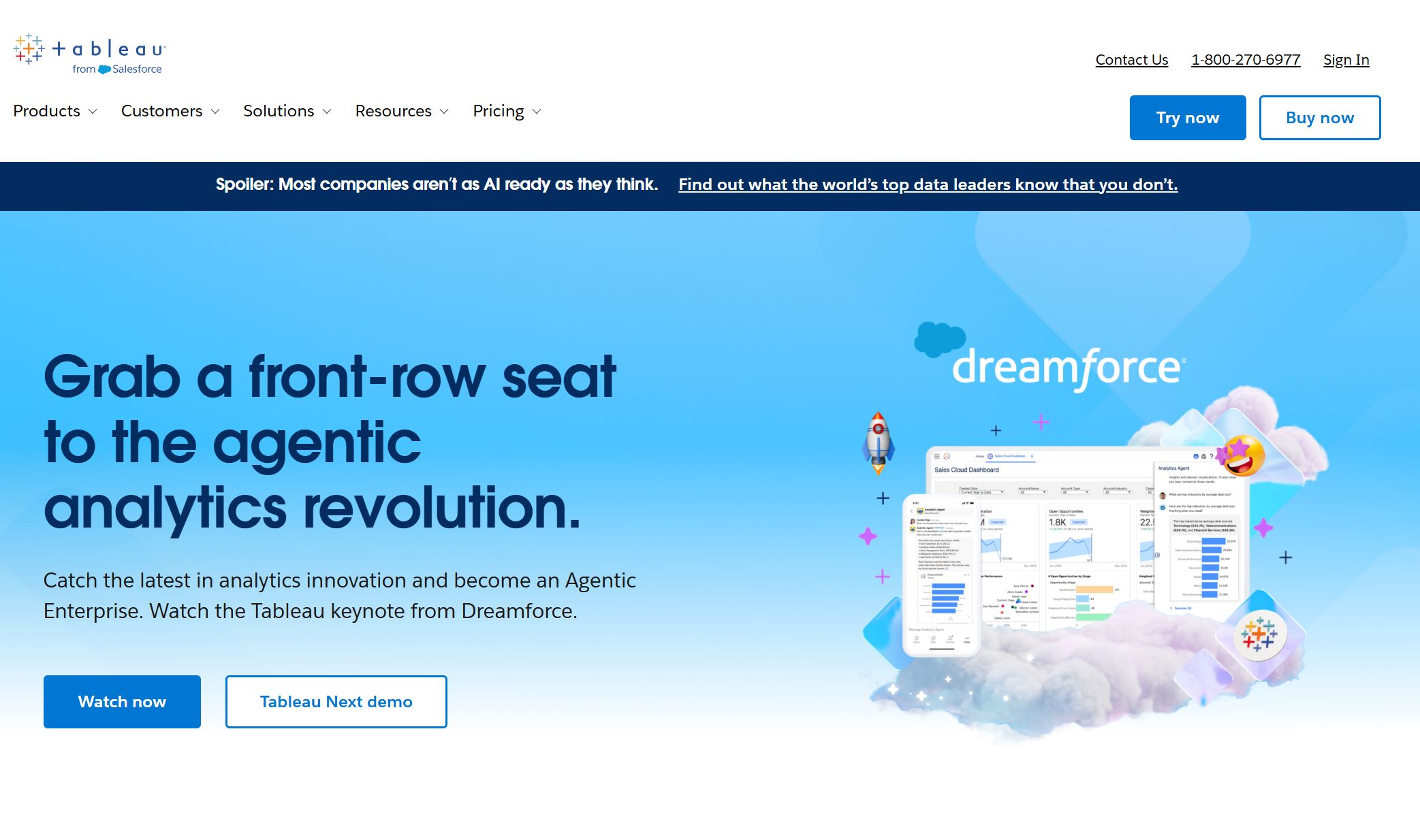
Website: https://www.tableau.com/
| Feature | Description |
|---|---|
| Tableau Next | Agentic analytics platform with generative AI and automation. |
| Agentic Analytics | Lets you and AI agents access and act on data in real time. |
| The Open Data Layer | Connects to any data source for instant insights. |
| AI Semantic Layer | Harmonizes data across departments for consistency. |
| Modern Visualizations | Share and reuse visual assets through marketplaces. |
| Integrated Action Layer | Access insights across platforms for better decisions. |
| Unified Product Portfolio | Keeps all Tableau products working together. |
| In-Database Processing | Prepares data right in the database for speed. |
| Custom Python Scripts | Embed Python in Tableau Cloud for advanced calculations. |
| Output to Google Drive | Save datasets directly to Google Drive. |
| Semantic Connector | Integrates Salesforce Data Cloud models into Tableau. |
| Published Data Sources | Use existing Tableau sources in semantic models without migration. |
Tableau’s ai-powered data visualization and seamless integration make it a favorite for teams that want to push the limits of business intelligence.
3.Microsoft Power BI
Microsoft Power BI is a go-to for many large organizations. It’s easy to use, budget-friendly, and packed with features for real-time data visualization. Power BI connects with Microsoft Fabric, so you can pull in data from many sources and see up-to-the-minute results.
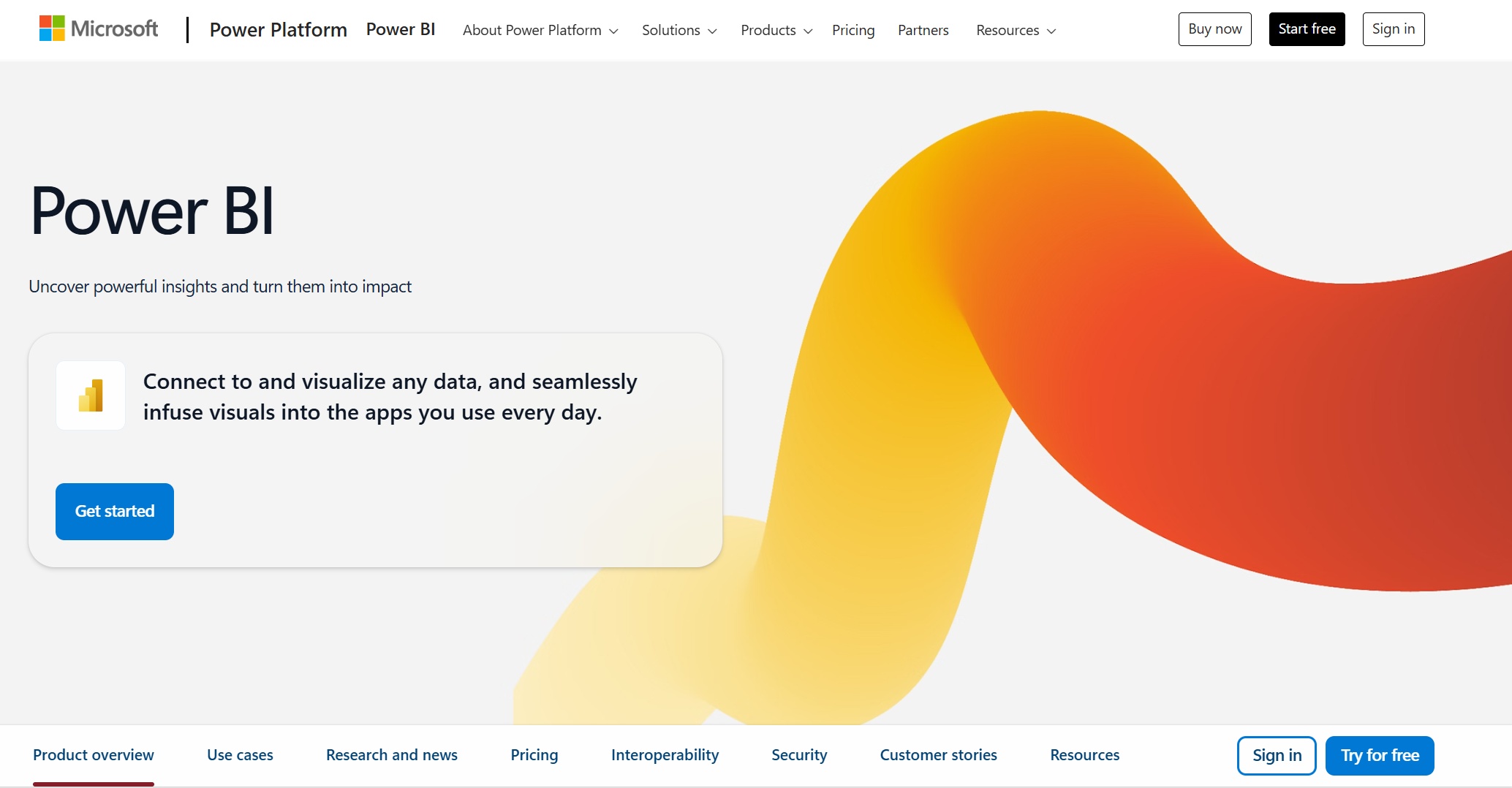
Website: https://www.microsoft.com/en-us/power-platform/products/power-bi
| Feature | Description |
|---|---|
| Enhanced Data Modeling | Manage and analyze huge datasets in real time. |
| Integration with Microsoft Fabric | Connects data sources for instant insights. |
| Direct Action from Dashboards | Take action right from your dashboards. |
| Advanced Visualization Options | New visuals and customizations for dynamic presentations. |
| Real-time Data Access | Direct Lake gives you instant data without waiting for refreshes. |
Many companies, like Lumen Technologies and Make-A-Wish Foundation, use Power BI to save time and get real-time data insights. If you want the best data visualization software for business intelligence and ai-powered data visualization, Power BI is a strong pick.
4.Google Looker Studio
Google Looker Studio is a cloud-based tool that makes it easy to connect to lots of data sources. You can use over 1,200 connectors, including Google’s own stable options like GA4, Google Ads, Sheets, and BigQuery. Looker Studio is great for marketing, web analytics, and anyone who wants to blend data from different places.

Website: https://lookerstudio.google.com/navigation/reporting
- Looker Studio supports 1,212 data sources, with 24 stable Google Connectors.
- You can blend data sources, but setup needs care for best results.
- High scalability and near-real-time analytics come from BigQuery.
- Unified data modeling with LookML gives you a single source of truth.
- Advanced ML and AI features are available through Vertex AI.
If you want affordable, cloud-based data visualization software with strong ai-powered data visualization, Looker Studio is a smart choice.
5.Qlik Sense
Qlik Sense is all about self-service analytics and dynamic data exploration. You don’t need to be a data scientist to find hidden connections in your data. Qlik’s associative engine lets you explore relationships that other tools might miss.
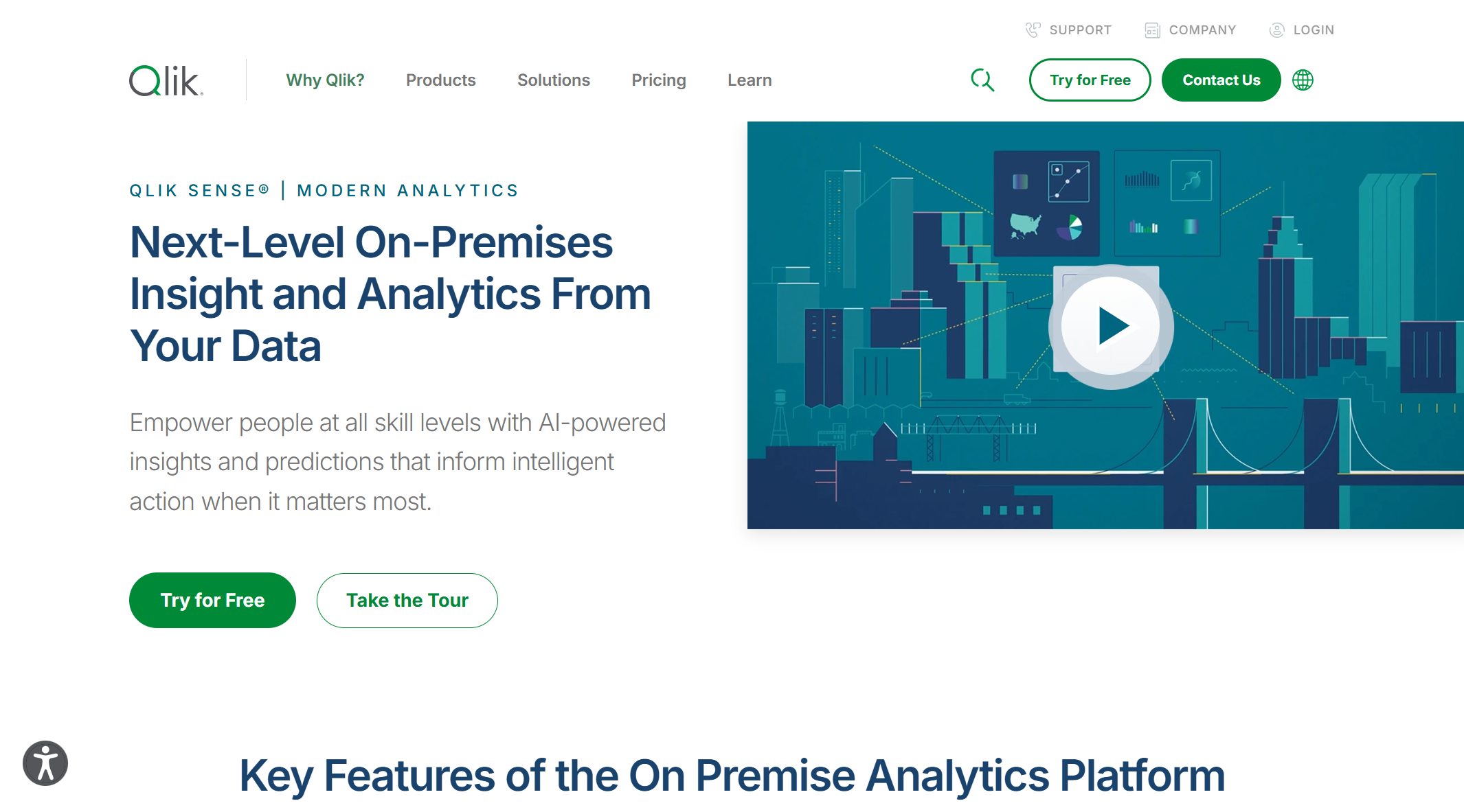
Website: https://www.qlik.com/us/products/qlik-sense
| Feature | Description |
|---|---|
| Associative engine | Reveals hidden connections in your data. |
| Self-service analytics | Lets anyone generate insights without IT help. |
| Dynamic exploration | Explore data freely and uncover new insights. |
Qlik Sense has expanded its AI and natural language features. It’s been a leader in Gartner’s Magic Quadrant for analytics and business intelligence platforms for 15 years straight. If you want the best data visualization software for ad-hoc analysis and deep data insights, Qlik Sense delivers.
6.Domo
Domo is a cloud-native platform built for real-time business intelligence. It’s perfect for distributed teams who need to see data from anywhere, anytime. Domo offers over 1,000 built-in connectors, so you can pull in data fast.
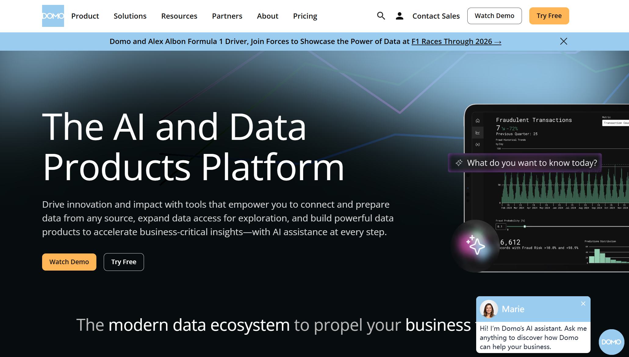
Website: https://www.domo.com/
- Real-time dashboards keep everyone on the same page.
- Low-code and no-code tools let you build reports without IT help.
- AI-powered analytics and automated insights help you spot trends quickly.
- Secure, role-based access means your data stays safe while teams collaborate.
Domo stands out as one of the best data visualization software options for companies that want fast, flexible, and secure data visualization capabilities.
7.Sisense
Sisense is a favorite for companies that need to scale up their analytics. It uses ElastiCube technology to handle big, structured datasets. You can deploy Sisense in the cloud, on-premises, or in a hybrid setup, so it fits your business as you grow.

Website: https://www.sisense.com/
| Feature | Description |
|---|---|
| ElastiCube Technology | Manages high-volume, structured data for effective analytics. |
| Deployment Options | Choose cloud, on-prem, or hybrid to match your needs. |
| Performance | In-Chip technology gives you fast query responses. |
| Data Source Connectivity | Connects to cloud warehouses, databases, and APIs. |
Sisense gives you the best data visualization software for growing enterprises that need flexibility and strong business intelligence.
8.Zoho Analytics
Zoho Analytics is a great pick for small and medium-sized businesses. It’s affordable, easy to use, and packed with features that help you get started fast.

Website: https://www.zoho.com/analytics/
| Feature | Benefit for SMBs |
|---|---|
| 250+ native connectors | Seamless data integration from many sources |
| Drag-and-drop interface | Simple report creation and visualization |
| Self-service data preparation | Manage data without IT help |
| Automated insights | Get timely information for decisions |
| Affordable pricing | Advanced analytics without breaking the bank |
You’ll find pre-built reports, interactive dashboards, and easy collaboration tools. Zoho Analytics also uses AI features like Ask Zia, which gives you instant answers through conversational queries. This makes it one of the best data visualization software choices for SMBs looking for powerful data insights.
Tip: No matter which data visualization software you choose, always look for tools that match your business needs and help you turn data into action.
Real-Time Data Visualization Tools

When you need answers fast, real-time data visualization tools make all the difference. These platforms help you see what’s happening right now, so you can act quickly and stay ahead. Let’s look at how FineReport leads the way and which other tools you should know about.
FineReport Real-Time Capabilities
FineReport gives you a powerful edge with its real-time data visualization features. You can connect to almost any data source and see updates instantly. FineReport handles large datasets with ease, so you never have to worry about slowdowns. You get open APIs, which means you can link FineReport to your favorite apps and systems without hassle. This flexibility makes it easy to fit FineReport into your workflow.
Here’s a quick look at how FineReport compares to other top tools:
| Reporting Tool | API Type | Integration Flexibility |
|---|---|---|
| FineReport | Open APIs | High |
| Power BI | Open APIs | High |
| Tableau | Open APIs | High |
| Looker | Open APIs | High |
| Others | Closed APIs | Low |
FineReport also supports teamwork. You can share dashboards securely and work together in real time. This is perfect for teams that need to make decisions on the fly.
Many industries rely on real-time data visualization to stay competitive. Here’s how different sectors benefit:
| Industry | Benefit from Real-Time Visualization |
|---|---|
| Financial Services | Faster decision-making with up-to-the-moment visibility |
| Manufacturing | Live data boosts efficiency and quick responses |
| Healthcare | Real-time insights improve patient care and resource use |
| E-commerce | Immediate data helps with pricing and inventory management |
| Logistics | Live updates optimize routes and fleet management |
| IoT-powered Systems | Constant updates manage complex data streams |
Other Leading Tools
You have more options if you want strong real-time analytics. Tools like Qlik Sense, Looker, Sisense, Lumi AI, Mode, SAS Visual Analytics, ThoughtSpot, and Sigma Computing all offer advanced features. These platforms let you explore data as it comes in, use conversational interfaces, and create interactive dashboards. You can find the right fit for your team, whether you need deep analytics or simple, live updates.
Tip: If your business depends on fast decisions, choose a tool that delivers real-time data visualization. This way, you always know what’s happening and can respond right away.
How to Choose Data Visualization Software
Choosing the right data visualization software can feel tricky, but you can make it easier by following a few clear steps. Let’s break down what you need to consider so you can find a tool that fits your business and helps you make data-driven decisions every day.
Assessing Needs
Start by understanding what your team really needs. Here’s a simple process you can follow:
- Create audience personas. Think about who will use the tool, their job roles, and how comfortable they are with technology.
- Define a clear objective. Write down what you want your visualizations to achieve, like helping managers spot trends or risks.
- Talk to your users. Ask them about their daily tasks and what information helps them make data-driven decisions.
- Prototype and test. Build a quick version of your dashboard and get feedback from your team.
FineReport makes this process smooth, especially for manufacturing and finance. You can build customizable dashboards that match your team’s needs and support data-driven insights.
Integration & Scalability
You want a tool that grows with your business and connects to all your data sources. Here’s a quick look at what matters:
| Feature | Importance |
|---|---|
| Scalability | Handles your current data and grows as your business expands. |
| Integration Capabilities | Connects easily with your existing systems for better analytics and fewer data silos. |
FineReport stands out here. It connects to databases, spreadsheets, and cloud services, making it easy to bring all your data together. This helps you unlock automated insights and predictive analytics as your needs grow.
Real-Time Visualization
Real-time data visualization lets you see what’s happening right now. When you choose a tool, look for these best practices:
- Pick charts that tell your data story clearly.
- Use color wisely so everyone can understand your visuals.
- Design dashboards that are easy to read and guide users to the right conclusions.
FineReport’s customizable dashboards help you track live data, which is key for industries like manufacturing and finance. You get data-driven insights that support fast, data-driven decision-making.
Budget Considerations
Budget matters, especially for small businesses. Some tools are free or low-cost, while others offer more advanced features at a higher price. Here’s a quick comparison:
| Tool Name | Cost | Key Features |
|---|---|---|
| Looker Studio | Free | Great integration with Google Sheets, robust features |
| Zoho Analytics | Low-cost | Handles complex data, responsive support |
| FineReport | Mid-range | Customizable dashboards, strong integration, real-time data |
FineReport gives you enterprise-level features without breaking the bank. You get the flexibility to create dashboards that fit your business and help you make smarter, data-driven decisions.
Tip: Always try a free trial before you decide. This way, you can see if the tool fits your workflow and supports your data storytelling goals.
You have many great data visualization tools to choose from in 2025. Here’s a quick look at how some top picks compare:
| Tool | G2 Rating | Key Features | Pros | Pricing Options |
|---|---|---|---|---|
| FineReport | 4.7/5 | Real-time dashboards, customization | Easy to use, flexible | Mid-range |
| Power BI | 4.5/5 | Predictive analytics, templates | User-friendly, integrations | Free, $10, $20/mo |
| Tableau | 4.4/5 | AI insights, real-time analytics | Powerful visuals | Free, $75/mo |
Matching the right tool to your business goals helps you turn complex data into clear, actionable insights. You improve communication and make smarter decisions. Try a free trial or demo—especially with FineReport—to see which platform fits your needs best.
Continue Reading About data visualization software
Why Choose 3D Data Visualization?
Which Data Visualization Certificate Suits You Best?
How to Select the Best Data Visualization Consulting Service


FAQ

The Author
Lewis
Senior Data Analyst at FanRuan
Related Articles

10 Good Data Visualization Examples by Use Case: Sales, Surveys, Finance & Time-Series
If you are searching for $1 , you likely do not need another gallery of pretty charts. You need examples that help sales leaders hit targets, finance teams explain variance, operations managers monitor change, and analys
Yida Yin
Jun 15, 2026

12 Best Data Visualization Tools for 2026: Features, Pricing, Pros and Cons
$1 are software platforms that turn raw data into charts, dashboards, maps, and interactive visual stories for analysis and decision making. 12 best data visualization tools for 2026 at a glance
Lewis Chou
Apr 23, 2026
10 Must-Have Data Visualization Tools for Modern Businesses
Compare the top 10 data visualization tools for 2025 to boost business insights, streamline analytics, and empower smarter decision-making.
Lewis
Dec 17, 2025