You probably notice how fast data visualization trends change in today’s business world. Companies that use the latest data visualization tools gain real-time insights, spot patterns, and tell better stories with their data. Most decision-makers say data visualization software helps them understand complex information, and the data visualization market keeps growing as more businesses look for an edge. Here are 10 must-have data visualization tools for modern businesses:
- FineReport
- Tableau
- Microsoft Power BI
- Google Looker Studio
- Qlik Sense
- Domo
- Sisense
- Zoho Analytics
- Chartio
- Google Data Studio
When you adopt leading data visualization platforms, you can boost sales growth, improve operational efficiency, and support data-driven decision making. Real-time insights and smart data storytelling now shape the future of the data visualization market, so choosing the right solution matters.
Choosing the Best Data Visualization Tools
Key Selection Criteria
Picking the right data visualization tools can feel overwhelming. You want something that fits your business, works with your data, and helps you tell a clear story. Let’s break down the main criteria you should consider before making a decision.
Here’s a quick table to help you compare what matters most:
| Criteria | Description |
|---|---|
| Ease-of-use | Look for intuitive drag-and-drop features and easy drill-down options. |
| Data connectivity | Make sure the tool connects to all your data sources without interruptions. |
| Line-of-business fit | Choose software that matches your business logic and offers tailored views for your KPIs. |
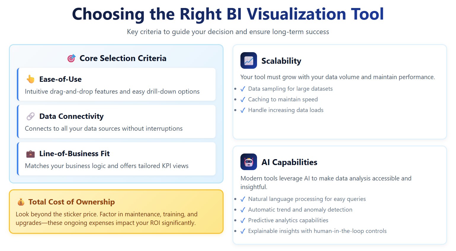
You should also think about cost. Don’t just look at the sticker price. Consider ongoing expenses like maintenance, training, and upgrades. These can add up over time and affect your return on investment.
Scalability matters too. As your data grows, your data visualization software needs to keep up. Features like data sampling and caching help maintain speed and performance.
AI capabilities are becoming more important. Some tools let you use natural language processing, so you can ask questions without knowing technical terms. Others highlight trends and anomalies, offer predictive analytics, and explain how insights are generated. Human-in-the-loop controls help you keep results accurate and trustworthy.
Usability and Integration
You want data visualization tools that your team can actually use. If a tool is too complex, it won’t help anyone. Make sure your team’s technical skills match the software’s requirements. Training should be simple and effective.
Integration is another big challenge. Many businesses struggle with tools that don’t work well with their current systems. Look for software that connects easily with your databases and supports real-time syncing. It should handle different data formats without complicated steps.
Here are some common integration challenges you might face:
- Lack of customization can make it hard to communicate your message.
- Data overload makes it tough to find key insights.
- Poor integration with existing systems slows down your workflow.
- Complex data can be hard to interpret without good visualization.
- Data quality and accuracy are critical for smart decisions.
- Cost constraints may limit your options.
- Security concerns mean you need to protect sensitive information.
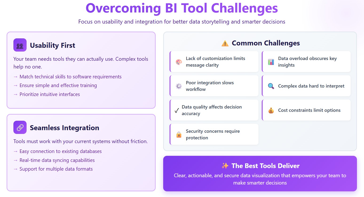
When you focus on usability and integration, you set yourself up for better data storytelling and smarter decisions. The best data visualization tools make your data clear, actionable, and secure.
1.FineReport: Best Data Visualization Software
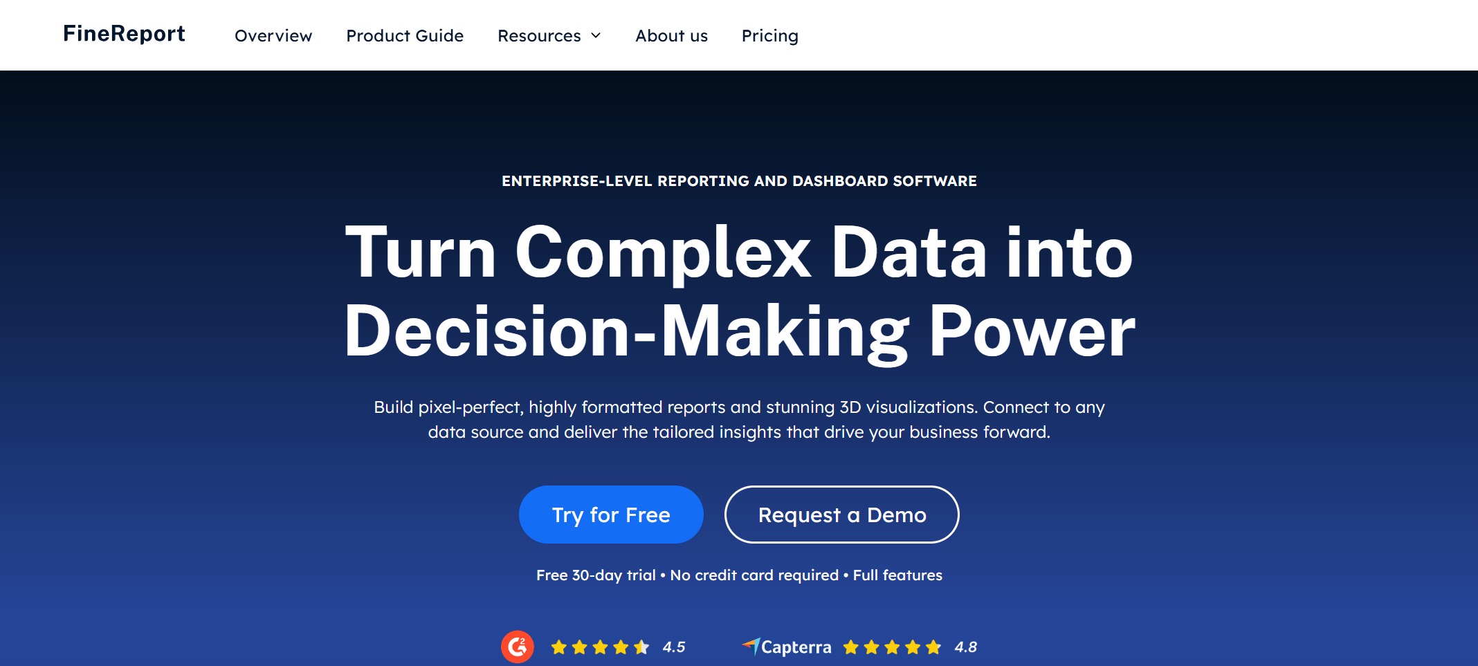
Website: https://www.fanruan.com/en/finereport
Features and Advantages
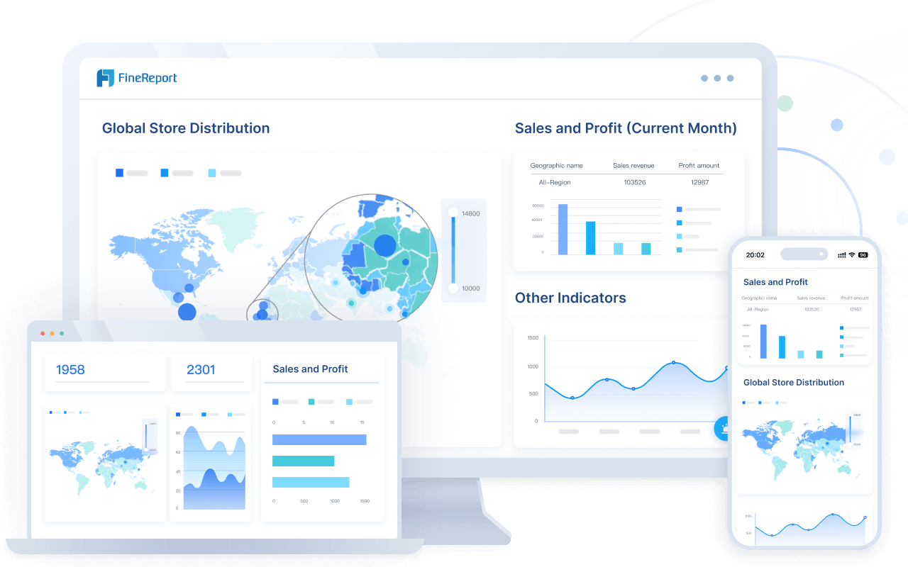
If you want the best data visualization software for your business, FineReport stands out. You get a drag-and-drop report designer that feels familiar, like working in Excel. You can connect to hundreds of data sources, so you never worry about missing information. FineReport lets you build custom reports and import data with just a few clicks. You can create dashboards with 3D charts and animation effects that make your data pop. Mobile BI means you can check your dashboards anywhere—on your phone, tablet, or computer. Automated reporting saves you time by scheduling daily, weekly, or monthly reports. You can export your work in formats like PDF, Excel, or Word.
Tip: FineReport’s custom reports and easy data import/export help you handle complex business needs without extra hassle.
Here’s a quick look at what makes FineReport the best data visualization software:
| Feature | Benefit |
|---|---|
| Drag-and-drop design | Fast, easy report creation |
| Multi-source integration | Connects to 100+ data sources |
| 3D dashboards | Engaging, interactive data storytelling |
| Mobile BI | Access insights anywhere |
| Automated reporting | Saves time, boosts efficiency |
Industry Solutions and Use Cases
FineReport delivers industry-specific solutions that help you solve real problems. In manufacturing, companies use FineReport to manage production schedules, monitor equipment, and track costs. For example, Tailer Heavy Industry Co., Ltd. built a global data ecosystem for marketing, production, and finance. Executives use the BOSS dashboard to monitor operations on any device. In retail, BOSIDENG embedded FineReport into store POS systems, connecting directly to SAP HANA for real-time data management. In finance, you can automate budget reports and visualize complex financial indicators with ease.

Customer Success Stories
You don’t have to take my word for it. Bifido Foods, a leading company in Taiwan, uses FineReport to integrate data from multiple sales channels and product lines. Their team built interactive reports that improved decision-making and saved time. UnionPay Data Services, a major player in fintech, unified their data visualization tools with FineReport. They boosted system efficiency and improved customer targeting. These stories show how the best data visualization software can transform your business.

2.Tableau: Leading Data Visualization Tool
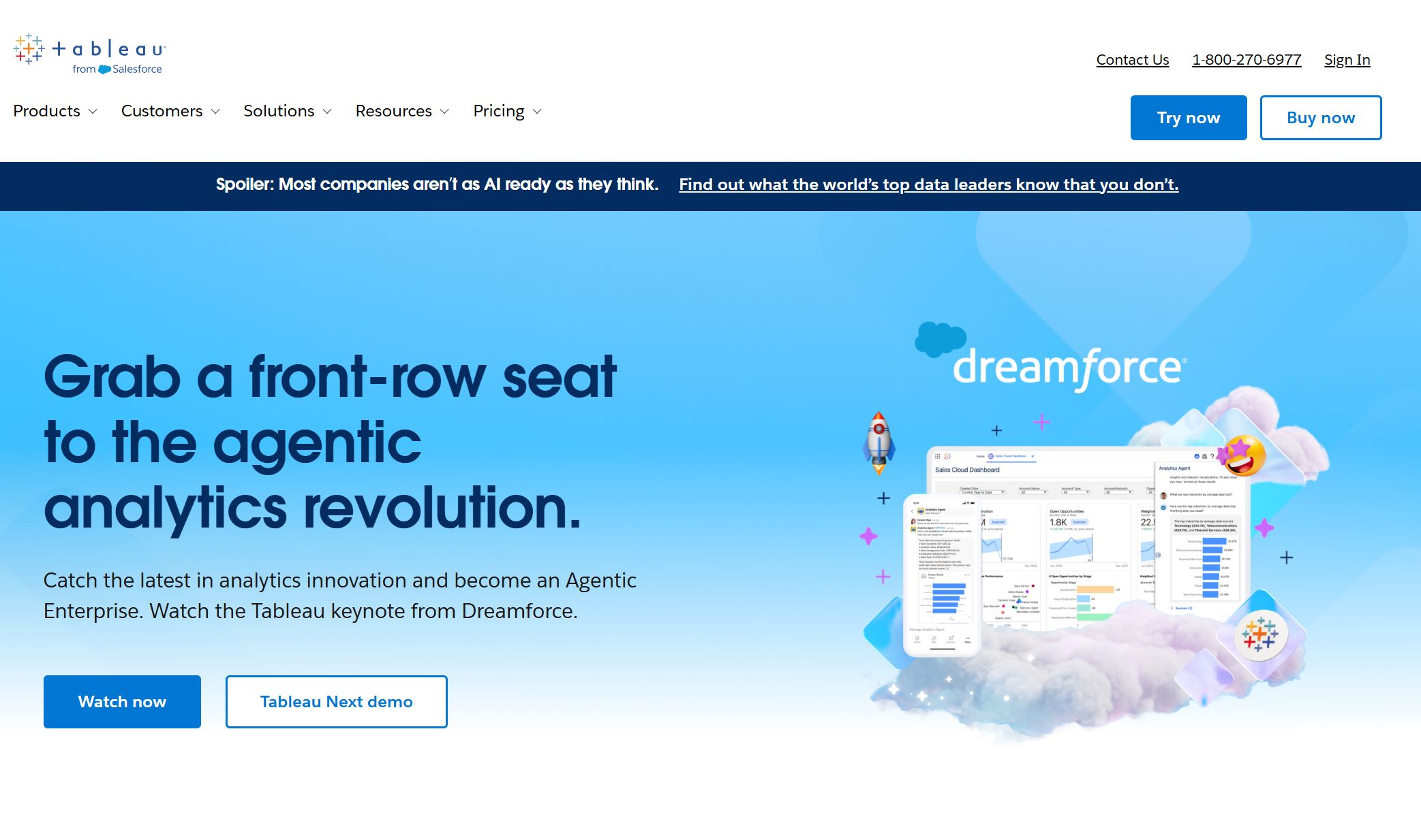
Website: https://www.tableau.com/

Core Features
Tableau stands out among data visualization tools because it gives you powerful ways to explore your data. You can connect Tableau to almost any data source, from SQL databases to cloud services. The platform lets you analyze data in real time, so you can make quick decisions when things change. The user interface feels friendly and intuitive, whether you’re a beginner or an expert. You get advanced visualization options, including interactive dashboards and a wide variety of chart types. Customization is easy, so you can adjust colors, fonts, and layouts to match your brand or style.
| Feature | Description |
|---|---|
| Data Connectivity | Connects to many data sources, including SQL and cloud services. |
| Real-time Data Analysis | Lets you analyze data instantly for fast decision-making. |
| Visualization Capabilities | Offers interactive dashboards and many chart types. |
| User Interface | Simple and user-friendly for all skill levels. |
| Customization Options | Allows you to tailor colors, fonts, and layouts for your needs. |
Pros and Cons
You’ll find Tableau has many strengths, but it also comes with a few challenges. Here’s a quick look at what you can expect:
| Advantages of Tableau | Description |
|---|---|
| Data visualization | Creates complex visuals that go beyond spreadsheets. |
| Interactive visualizations | Drag-and-drop makes building dashboards easy. |
| Ease of Implementation | No coding needed to get started. |
| Handles large data sets | Processes millions of rows without slowing down. |
| Scripting integration | Works with Python and R for advanced calculations. |
| Mobile support | Dashboards look good on any device. |
| Leading company strategy | Tableau is a top choice for data visualization software. |
| Disadvantages of Tableau | Description |
|---|---|
| Report scheduling | Lacks automatic report refreshing. |
| Custom visual imports | Limited options for importing custom visuals. |
| Formatting challenges | Conditional formatting can be tricky. |
| Static parameters | Only allows single value selections for parameters. |
| Screen resolution issues | Dashboards may not display well on all screens. |
| Data preprocessing | Basic capabilities for preparing data. |
| Scaling and pricing | Costs can be high for large organizations. |
Note: Tableau makes data storytelling easy, but you should check if its features fit your business needs before investing.
Ideal Use Cases
Tableau works best when you need to dig deep into your data and uncover trends. You can use it for:
- Time-series analysis to track changes over time
- Predictive analysis to forecast future outcomes
- Cohort analysis to compare groups
- Segmentation to break down your audience
- Scenario and what-if analysis for planning
- Advanced calculations and statistical functions
- Integrating with external services for richer insights
If your business relies on exploring large datasets or needs interactive dashboards for decision-makers, Tableau is a smart choice among data visualization tools.
3.Microsoft Power BI: Top Data Visualization Platform
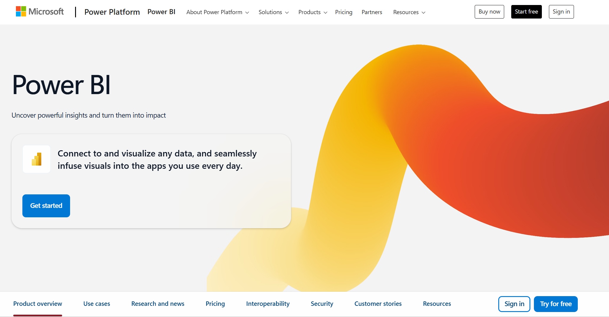
Website: https://www.microsoft.com/en-us/power-platform/products/power-bi
Key Features
You want a data visualization platform that works with your business, no matter how your data looks. Microsoft Power BI gives you plenty of options. You can connect to cloud services, on-premise databases, and even platforms like Salesforce or Google Analytics. The drag-and-drop dashboard builder makes it easy to create interactive visuals, even if you’re new to data visualization tools. Sharing reports is simple. You can use Microsoft Teams or SharePoint to collaborate with your team in real time. Power BI also lets you set role-based access, so you control who sees sensitive information. If you need advanced analytics, you’ll find robust features for deep data exploration.
| Feature | Description |
|---|---|
| Integration Capabilities | Connects to cloud, on-premise, and third-party platforms for flexible data access. |
| Visualization Options | Drag-and-drop interface with customizable visuals for easy dashboard creation. |
| Collaboration Features | Share reports through Teams and SharePoint, with real-time editing and access controls. |
| Advanced Analytics | Offers strong analytics for deeper insights and business intelligence. |
Tip: You can start with basic dashboards and scale up as your data needs grow.
Pros and Cons
Power BI stands out among data visualization software because it’s affordable and backed by Microsoft’s constant updates. You get a free desktop version, and the Pro license costs less than many competitors. Developers can create custom visuals, so your dashboards look unique. However, you might run into limits with large datasets. The platform restricts uploads to 1GB for internal datasets. The many components can feel confusing, especially when you’re new. Formatting quirks and default settings sometimes slow you down.
| Strengths | Description |
|---|---|
| Cost-Effectiveness | Free desktop version; Pro license is budget-friendly. |
| R&D Backing | Microsoft’s roadmap means regular improvements. |
| Custom Visualization | Developers can build and share custom visuals. |
| Weaknesses | Description |
|---|---|
| Data Size Limitations | 1GB dataset limit can be tough for big data projects. |
| Ecosystem Complexity | Many components may confuse new users. |
| Quirks and Nuances | Formatting and default settings can be tricky. |
- You may find the learning curve steep if you want to use advanced features.
- Power BI does not offer a desktop version for Mac or Linux.
- Large datasets may require workarounds due to upload limits.
Best Use Cases
You can use Power BI in almost any industry. Retailers track sales trends and inventory. Manufacturers monitor production and quality. Finance teams analyze budgets and forecasts. Healthcare organizations manage patient data and outcomes. Power BI fits businesses of all sizes. You can start small and add complexity as your needs change. The platform helps you make better decisions, improve teamwork, and handle large amounts of data with ease.
Note: Power BI’s flexibility makes it a top choice for companies that want to grow their analytics over time.
4.Google Looker Studio: AI Data Visualization
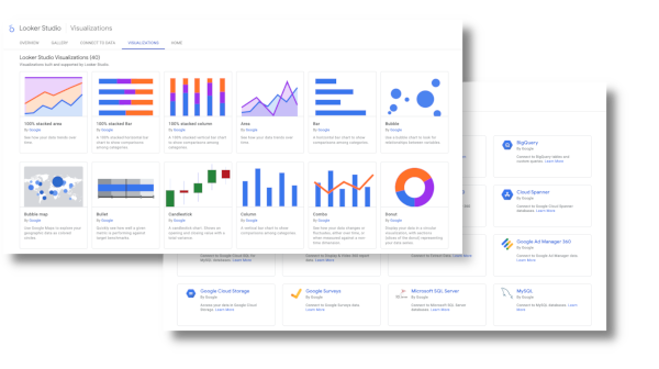
Website: https://lookerstudio.google.com/navigation/reporting
Features Overview
You want a tool that makes your data easy to understand. Google Looker Studio brings ai data visualization to the next level. You can describe metrics in plain language, and the AI suggests formulas for you. This means you spend less time figuring out how to set up your dashboard. The platform can generate complete reports from a simple prompt. You get visualizations and layouts without manual setup. The AI also helps you tell better stories with your data. It suggests the best charts and creates summaries that make your reports more impactful. If you’re not a data expert, you’ll appreciate how the AI makes data interpretation simple. You can even turn dashboards into presentations with insightful summaries, saving you hours of work.
- Natural language metric description
- Auto-generated report drafts
- Enhanced data storytelling
- Data literacy support for non-technical users
- Automated presentation creation
You don’t need to be a tech wizard to use ai data visualization features in Looker Studio. The platform makes data accessible for everyone.
Pros and Cons
Google Looker Studio gives you a lot of flexibility. You get a free basic version, which is great if you’re just starting with data visualization tools. The dashboard and report creation process feels intuitive. You can use templates for quick reports and customize them as needed. The platform connects to many data sources, so you can pull in information from almost anywhere. Sharing reports is easy, which helps your team stay on the same page.
| Pros | Cons |
|---|---|
| Free basic version available | Lack of transparent pricing |
| Intuitive dashboard and report creation | Looker add-on integrations are priced individually |
| Convenient templates for quick reports | Limited customer support for free users |
| Versatile and customizable options | May be challenging for larger organizations |
| Access to numerous data sources | Lagging issues during larger projects |
| Convenient report sharing |
If you run a small business or want to try ai data visualization without a big investment, Looker Studio is a smart choice. Larger organizations may need to plan for scaling and support.
Use Cases
You can use Google Looker Studio’s ai data visualization features in many industries. Healthcare teams analyze patient data to improve care and reduce readmission rates. Retailers track sales and customer engagement, using insights to boost marketing and manage inventory. Finance professionals use the platform for risk management and compliance, spotting fraud and streamlining reports. Manufacturers rely on ai data visualization for predictive maintenance and real-time quality monitoring. Schools and universities analyze student performance and optimize resources to help students succeed.
| Industry | Use Case Description |
|---|---|
| Healthcare | Enhancing patient care and operational efficiency through data analysis to reduce readmission rates and optimize resource allocation. |
| Retail | Driving sales and customer engagement by analyzing purchasing patterns for personalized marketing campaigns and optimizing inventory management. |
| Finance | Enhancing risk management and compliance through fraud detection and streamlined regulatory reporting processes. |
| Manufacturing | Improving production and quality control with predictive maintenance and real-time quality monitoring. |
| Education | Enhancing student outcomes and institutional efficiency by analyzing student performance and optimizing resource allocation. |
You can see how ai data visualization helps you make smarter decisions, no matter your field. The platform’s flexibility and smart features make it a top pick among data visualization software.
5.Qlik Sense: Best Data Visualization Tools for Business
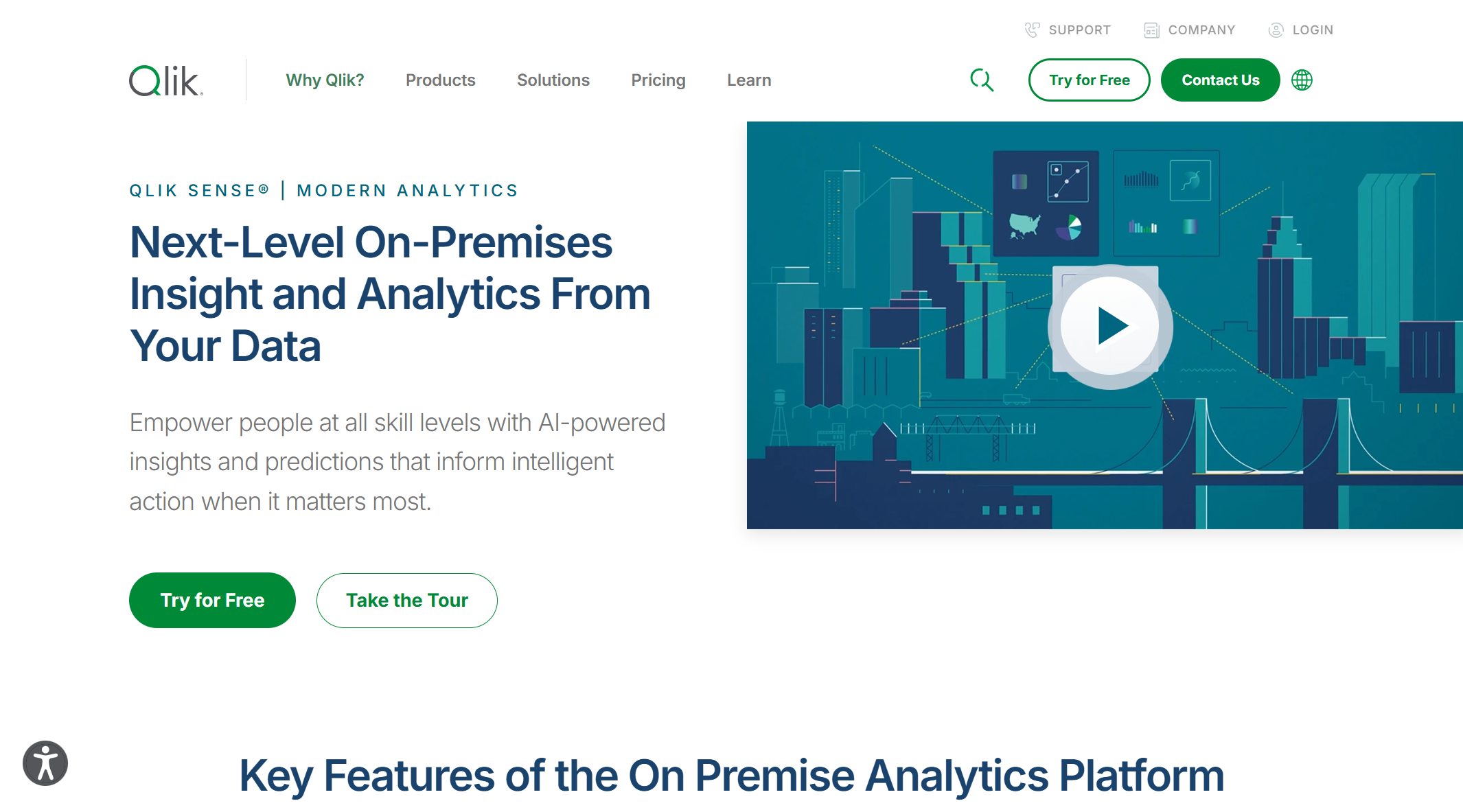
Website: https://www.qlik.com/us/products/qlik-sense
Features
Qlik Sense gives you the power to explore your data with ease. You can create dashboards and reports on your own, even if you don’t have a technical background. The platform’s associative engine helps you find patterns and connections that might go unnoticed in other data visualization tools. You get interactive charts and graphs that make complex information simple to understand. Qlik Sense connects to many data sources, so you can pull in information from different places without a hassle. The built-in ETL features let you clean and transform your data, making sure your insights are accurate. Security is strong, with role-based controls to keep your data safe. You can start small and scale up as your business grows, thanks to flexible deployment options. Fast in-memory processing means you get answers quickly, even with large datasets.
Here’s a quick look at what Qlik Sense offers:
| Feature | Description |
|---|---|
| Self-Service Capabilities | Build dashboards and reports without IT help |
| Associative Engine | Explore data relationships intuitively |
| Advanced Visualizations | Use interactive charts and graphs |
| Data Connectivity | Connect to multiple data sources easily |
| ETL Functionalities | Clean and transform data for better accuracy |
| Enterprise Security | Protect data with role-based access |
| Scalability | Grow from small teams to large enterprises |
| In-Memory Processing | Get fast responses for quick decision-making |
Pros and Cons
Qlik Sense stands out among data visualization software for its flexibility and user-friendly design. You can try it for free and enjoy affordable pricing for small teams. The platform works on many devices and supports easy sharing and collaboration. You can even build custom applications to fit your needs. However, you might notice slower performance with very large datasets. Some features and add-ons cost extra, and not all information exports smoothly to Excel. For big organizations, the price can add up.
| Advantages | Disadvantages |
|---|---|
| Affordable price point | Slows down with large data sets |
| Free trial available | Can be expensive for large teams |
| Improves data literacy | Not all info downloads to Excel |
| Works on many devices | Add-ons and features may cost extra |
Tip: If you want a flexible tool that grows with your business, Qlik Sense is a smart choice. Just keep an eye on extra costs as your needs expand.
Use Cases
You’ll find Qlik Sense in many industries. Retailers use it to track customer buying habits, manage inventory, and spot sales trends. Healthcare teams visualize patient data to improve care and cut costs. Financial services rely on Qlik Sense for risk assessment, fraud detection, and portfolio analysis. Manufacturers monitor production and quality with interactive dashboards. Government agencies use it to share public service metrics and boost transparency.
| Industry | Application Description |
|---|---|
| Retail | Analyze customer behavior, optimize inventory, monitor sales trends |
| Healthcare | Visualize patient data, improve treatment outcomes, reduce costs |
| Financial Services | Enhance risk assessment, detect fraud, analyze portfolios |
| Manufacturing | Monitor production efficiency, control quality |
| Government | Publish transparency reports, track public service performance |
Qlik Sense helps you turn raw data into clear, actionable insights. If you want data visualization tools that support growth and make your data easy to understand, this platform deserves a spot on your shortlist.
6.Domo: Cloud-Based Data Visualization
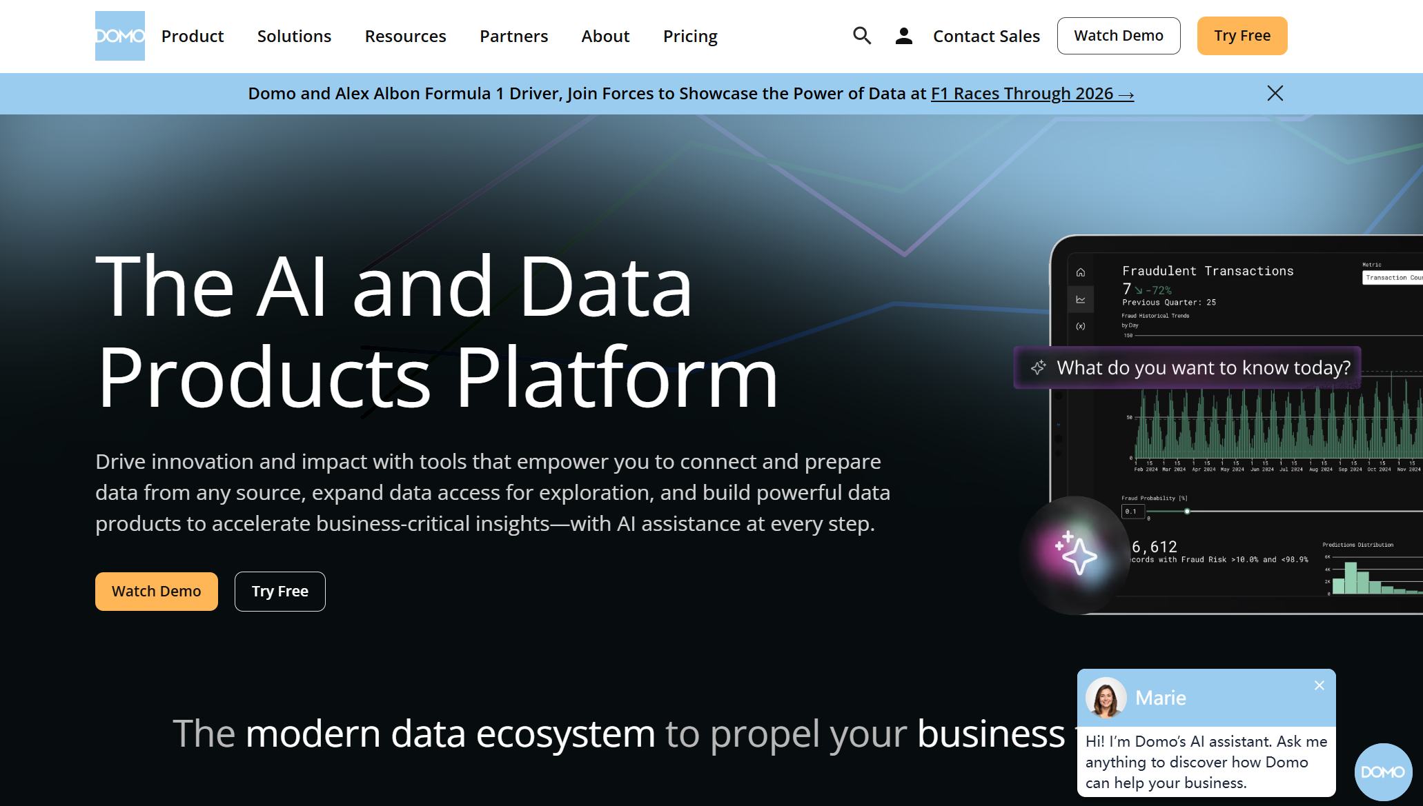
Website: https://www.domo.com/
Features
You want a platform that makes working with data easy. Domo stands out among cloud-based data visualization tools because it gives you real-time access to your information. You can connect to many third-party apps without any hassle. The drag-and-drop interface lets you build charts and dashboards quickly, even if you have no coding experience. Domo’s AI features help you spot trends and generate insights faster. You can customize dashboards to fit your needs, so you always see the most important numbers. The online ETL tool makes data integration simple, so you spend less time setting things up and more time analyzing results.
Here’s what you get with Domo:
- Wide range of data visualization tools for turning complex data into clear insights.
- Real-time data access for timely decisions.
- AI-powered analysis to uncover patterns and trends.
- Seamless connections to third-party tools.
- Easy drag-and-drop design for building visualizations.
- Customizable dashboards for quick insights.
- Online ETL component for simple data integration.
Tip: Domo’s user-friendly design means anyone on your team can create reports and dashboards without special training.
Pros and Cons
Domo gives you a lot of flexibility, but you should know what to expect before you dive in. Here’s a quick look at the ups and downs:
Pros:
- You get instant access to data from anywhere.
- The platform works for users of all skill levels.
- AI features help you find insights faster.
- Integration with other tools is smooth and reliable.
- You can build dashboards without writing code.
Cons:
- You may need to pay extra for advanced features.
- Large datasets can slow down performance.
- Customization options sometimes feel limited compared to other data visualization software.
Use Cases
Domo helps you solve real business problems. You can use it to track competitors, improve employee satisfaction, and understand customer needs. Here’s how businesses use Domo every day:
| Use Case | Description |
|---|---|
| Competitor Intelligence | Identify market opportunities to outperform rivals by understanding market dynamics and trends. |
| Human Resources | Ensure employee satisfaction and productivity by addressing their needs and benefits effectively. |
| Data Extraction | Collect and analyze essential data to understand customer pain points and optimize promotions. |
You can see how Domo’s data visualization tools help you make smarter decisions and keep your business moving forward.
7.Sisense: AI Data Visualization Tools

Website: https://www.sisense.com/
Features
You want data visualization tools that make your life easier. Sisense uses AI to help you find answers fast. You can ask questions in plain English and get instant charts. The AI Assistant lets you talk to your data, just like chatting with a friend. Sisense Narratives give you simple summaries of your charts, so you know what matters most. The platform predicts future trends using machine learning. You get guidance and insights right inside your workflow. Here’s a table that shows what Sisense brings to the table:
| Feature | Description |
|---|---|
| AI-powered insights | Automates analysis and gives you predictive answers. |
| Natural Language Query | Lets you ask questions and see results in real time. |
| Conversational Interfaces | Use dialogue-driven prompts for easy data exploration. |
| Contextual AI | Generates insights and tips while you work. |
| Assistant | Helps you build analytics through simple conversations. |
| Narrative | Summarizes charts and widgets in plain language. |
| Forecast | Predicts future trends for smarter decisions. |
Tip: Sisense makes data visualization software feel more like a helpful partner than a complicated tool.
Pros and Cons
Sisense gives you lots of power, but you should know what to expect. You get strong embedded analytics and flexible automation. The platform handles big datasets with ease. You can use APIs to automate tasks and connect with other systems. On the flip side, Sisense can use a lot of resources, especially with ElastiCubes. The price for embedding features runs high. Some business users find it hard to get started. There’s no semantic modeling layer, which means you might need extra setup for complex projects.
| Strengths | Weaknesses |
|---|---|
| Embedded analytics strength | Resource-hungry ElastiCubes |
| Flexible and extensible | High pricing for embedding |
| API-driven automation | High barrier for business users |
| Handles large datasets | No semantic modeling layer |
Note: Sisense works best for teams that want advanced data visualization tools and have technical support.
Use Cases
You can use Sisense in many industries. Financial services rely on it to spot fraud and track portfolios. Manufacturers use it to monitor machines and catch defects quickly. Supply chain teams get a clear view of shipments and routes. Healthcare providers use Sisense for better patient care and smoother operations. Here’s a quick look at how different industries benefit:
| Industry | Use Case Highlights |
|---|---|
| Financial Services | Detect fraud, track performance, support compliance. |
| Manufacturing | Monitor machine efficiency, track defects in real time. |
| Supply Chain & Logistics | See shipments, route efficiency, and bottlenecks. |
| Healthcare & Pharma | Improve patient care and boost operational efficiency. |
If you want data visualization software that uses AI to make your job easier, Sisense is worth a look. You get smart features, strong analytics, and support for big data projects.
8.Zoho Analytics: Affordable Data Visualization Software

Website: https://www.zoho.com/analytics/
Features
You want a data visualization software that gives you plenty of value without breaking the bank. Zoho Analytics makes it easy for you to connect with all your data sources. You can use over 500 native connectors, so you never feel limited. The drag-and-drop interface helps you build charts and dashboards quickly, even if you don’t have technical skills. Zoho’s AI assistant, Zia, lets you ask questions in plain English and get instant answers. You can analyze data, spot trends, and create reports with just a few clicks. The platform supports advanced analytics, so you can dig deeper when you need to. You get enterprise-grade security, which keeps your data safe. Mobile BI access means you can check your dashboards anywhere, anytime. Zoho Analytics scales with your business, so you don’t have to worry about outgrowing your data visualization tools.
Tip: Zoho Analytics helps you collaborate with your team and share insights easily, making teamwork smooth and productive.
| Feature | Description |
|---|---|
| Extensive data connectivity | Integrates with many sources, saving you time and money. |
| AI-powered assistant (Zia) | Lets you ask questions in plain language for quick insights. |
| Drag-and-drop visualization tools | Makes creating charts and dashboards simple. |
| Advanced analytics capabilities | Supports both basic and complex analysis. |
| Collaboration and sharing options | Helps your team work together and share reports. |
| Enterprise-grade security | Protects your data from threats. |
| Mobile BI access | Lets you view dashboards on the go. |
| Scalability | Grows with your business needs. |
Pros and Cons
Zoho Analytics gives you a lot of flexibility, but you should know what to expect. You get easy report creation, customizable dashboards, and interactive filters. The platform supports collaboration and sharing, so your team stays connected. AI features like natural language analysis and anomaly detection help you find insights faster. Security and compliance standards keep your data protected.
Pros:
- Abundant connectivity with hundreds of native connectors
- Simple drag-and-drop interface
- Customizable dashboards for actionable insights
- Interactive filters for data segmentation
- Strong collaboration and sharing features
- AI functions for smarter analysis
- Robust security and compliance
Cons:
- The huge number of features can overwhelm you if you’re new to data visualization tools.
- Add-on costs may stretch your budget, especially for small businesses.
- Customer support responses sometimes take longer than expected.
- Data migration can be tricky and may need technical help.
- Performance can slow down during busy hours.
Note: Zoho Analytics works best for teams that want affordable data visualization software with plenty of features, but you should plan for a learning curve.
Use Cases
You can use Zoho Analytics in many industries. Retailers track sales and inventory trends. Healthcare teams monitor patient outcomes and resource use. Finance professionals analyze budgets and spot risks. Manufacturers optimize production and quality. Schools and universities use it to improve student performance and manage resources. Zoho Analytics helps you turn raw data into clear, actionable insights. You get the flexibility to build dashboards that fit your business, share reports with your team, and make smarter decisions every day.
9.Chartio: User-Friendly Visualization Platform
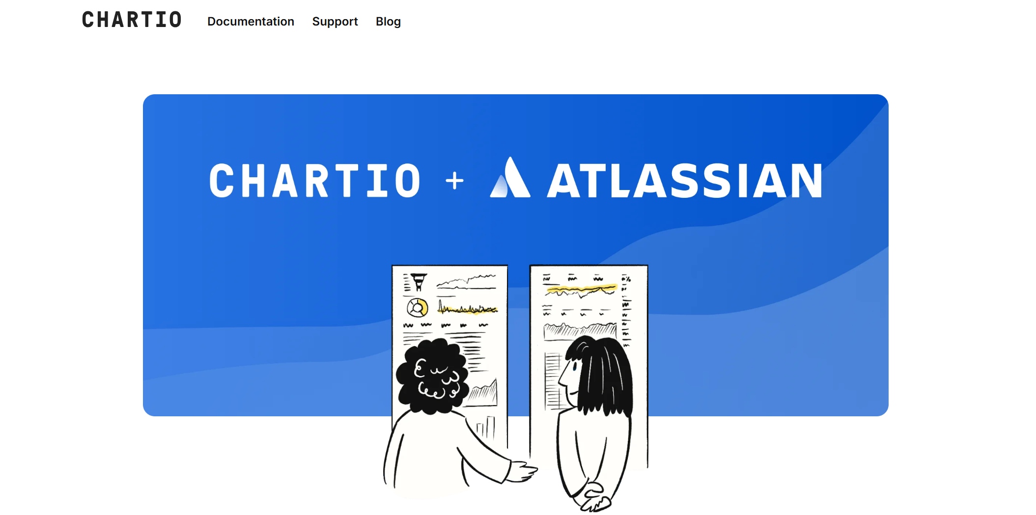
Website: https://chartio.com/
Features
You want a platform that makes data easy for everyone. Chartio stands out because it focuses on making data visualization simple, even if you are not a tech expert. The interface feels friendly and lets you explore data without feeling lost. Chartio uses Visual SQL, which means you can build charts by clicking and dragging instead of writing code. This feature helps you ask questions and get answers fast. You can organize dashboards so your team always knows where to find important information. The design is clean and keeps everything in one place.
Here’s a quick look at what Chartio offers:
| Feature | Description |
|---|---|
| Visual SQL | An intuitive way to create charts for users of all skill levels. |
| Intuitive Design | Makes data visualization easy for non-experts. |
| Organized Dashboards | Lets you manage and view data in a structured way. |
- Visual SQL works for everyone, from business users to data pros.
- The click-and-drag setup means you don’t need to know SQL to get started.
- Schema-level access lets more people in your company explore data on their own.
Pros and Cons
Chartio gives you a lot of freedom to explore your data. You can build dashboards quickly and share them with your team. The platform helps people with different backgrounds work together. You do not need to spend hours learning new skills. However, Chartio may not have as many advanced features as some other data visualization software. If you need deep analytics or custom visuals, you might want to look at other data visualization tools.
Tip: If you want a tool that helps your whole team understand data, Chartio is a great pick.
Use Cases
You can use Chartio in many ways. Sales teams track leads and see which products sell best. Marketing teams watch campaign results and adjust their plans. Operations managers follow daily numbers and spot problems early. Even if you are new to data, you can build reports and dashboards that help your business grow. Chartio makes it easy for everyone to join the conversation and make smarter choices.
10.Google Data Studio: Free Data Visualization Tools
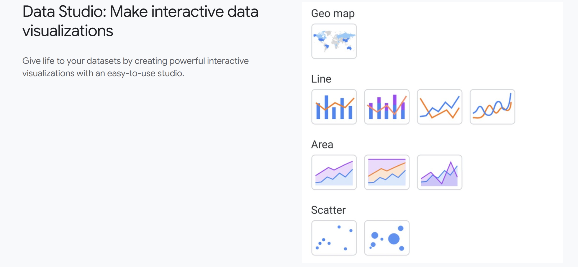
Website: https://lookerstudio.google.com/navigation/reporting
Features
You want a free and easy way to turn your data into clear visuals. Google Data Studio gives you just that. You can connect to Google Sheets, BigQuery, and other sources with a few clicks. The drag-and-drop interface lets you build charts, graphs, and dashboards without coding. You get real-time updates, so your reports always show the latest numbers. You can customize colors, fonts, and layouts to match your brand. Sharing reports is simple. You send a link, and your team sees the same dashboard. You can even embed reports on your website.
Tip: Try using templates if you want to save time. They help you get started fast and look professional.
Pros and Cons
Google Data Studio stands out among data visualization tools because it is free and works well with other Google products. You do not need special training to use it. The platform supports collaboration, so you and your team can edit reports together. You get unlimited reports and viewers. However, you might notice some limits. The platform can slow down with large datasets. Some advanced features found in paid data visualization software are missing. You may need third-party connectors for non-Google sources.
| Pros | Cons |
|---|---|
| Free to use | Slows down with big data |
| Easy Google integration | Limited advanced features |
| Real-time updates | Needs connectors for some sources |
| Simple sharing and embedding | Basic support for complex analytics |
| Unlimited reports and viewers |
Use Cases
You can use Google Data Studio in many ways. Marketers track website traffic and campaign results. Sales teams monitor leads and revenue. Teachers create dashboards to show student progress. Nonprofits share impact reports with donors. Small businesses use it to watch expenses and sales trends. You can build custom dashboards for any project. The platform helps you tell your story with data, making it easier to spot patterns and take action.
If you want a free tool that helps you visualize data and share insights, Google Data Studio is a smart choice.
Comparing the Best Data Visualization Tools
Choosing the right data visualization tools can feel tricky. You want something that fits your business, works with your data, and helps you make smart decisions. Let’s break down the top options so you can see what stands out.
Feature Comparison Table
Here’s a quick table to help you compare the most important factors. You’ll see how each tool stacks up in terms of features, ease of use, pricing, support, scalability, and security.
| Tool | Features & Functionality | Ease of Use | Price & Value | Support & Community | Scalability & Integration | Security & Compliance |
|---|---|---|---|---|---|---|
| FineReport | Real-time dashboards, 3D charts | Drag-and-drop | Cost-effective | Strong support | High, 100+ sources | Enterprise-grade |
| Tableau | Advanced analytics, rich visuals | Intuitive | Premium | Large community | Scales well | Robust |
| Power BI | Custom visuals, deep integration | User-friendly | Affordable | Microsoft backed | Flexible | Strong |
| Looker Studio | AI-driven, auto reports | Simple | Free/basic | Google support | Good for small teams | Secure |
| Qlik Sense | Associative engine, ETL | Self-service | Mid-range | Active community | Scalable | Secure |
| Domo | Cloud, AI insights | Easy | Premium | Good support | Scales in cloud | Secure |
| Sisense | AI assistant, embedded analytics | Conversational | Premium | Developer support | Scalable | Secure |
| Zoho Analytics | 500+ connectors, AI assistant | Drag-and-drop | Affordable | Growing community | Scalable | Secure |
| Chartio | Visual SQL, simple dashboards | Very easy | Mid-range | Helpful support | Good for SMBs | Secure |
| Data Studio | Free, Google integration | Simple | Free | Google support | Good for small teams | Secure |
Pricing Overview
You want to know what fits your budget. Some tools offer free versions, while others charge by user or feature. FineReport and Zoho Analytics give you cost-effective options for growing businesses. Tableau, Domo, and Sisense sit at the premium end, best for larger teams with bigger budgets. Power BI offers a free desktop version and affordable upgrades. Google Data Studio and Looker Studio let you start for free, which is great if you’re just getting started.
Best For
Each tool shines in different scenarios. FineReport works well for manufacturing, finance, and any business needing custom dashboards. Tableau fits companies that want deep analytics and rich visuals. Power BI is perfect if you use Microsoft products. Looker Studio and Data Studio are great for small teams or those who want free tools. Qlik Sense and Sisense help with advanced analytics and big data. Zoho Analytics suits businesses that want lots of connectors and easy AI features. Chartio is ideal for small and medium businesses that want simple dashboards.
Tip: Think about your team’s skills, your data sources, and your budget before you choose. The best data visualization tools help you turn numbers into clear stories.
Choosing the right data visualization tools can change how you see your business. Think about your goals, your team’s skills, and how your data flows. Match the tool to your needs, not just the features. Review your data strategy often. Stay open to new trends in AI and analytics. You will keep your business ahead and make smarter decisions every day.
Continue Reading About data visualization tools
How to Make a Box Plot Step by Step
Top 7 Visualization Tools Every Analyst Should Know
Box Plot Generator Made Easy For Free Online


FAQ

The Author
Lewis
Senior Data Analyst at FanRuan
Related Articles

10 Good Data Visualization Examples by Use Case: Sales, Surveys, Finance & Time-Series
If you are searching for $1 , you likely do not need another gallery of pretty charts. You need examples that help sales leaders hit targets, finance teams explain variance, operations managers monitor change, and analys
Yida Yin
Jun 15, 2026

12 Best Data Visualization Tools for 2026: Features, Pricing, Pros and Cons
$1 are software platforms that turn raw data into charts, dashboards, maps, and interactive visual stories for analysis and decision making. 12 best data visualization tools for 2026 at a glance
Lewis Chou
Apr 23, 2026

Top 8 Data Visualization softwares You Should Try in 2026
Compare the top 8 data visualization software for 2026, including FineReport, Tableau, Power BI, and more to find the best fit for your business needs.
Lewis
Mar 19, 2026