The rise of interactive data views drives adoption in IT and telecommunications. Big data visualization tools play a key role in business intelligence. It helps you spot errors, recognize trends, and adjust strategies quickly. Here are 7 softwares leading the market for big data visualization tools in 2025:
FineBI
Tableau
Microsoft Power BI
Qlik Sense
Looker
Apache Superset
Sisense
Benefit
Description
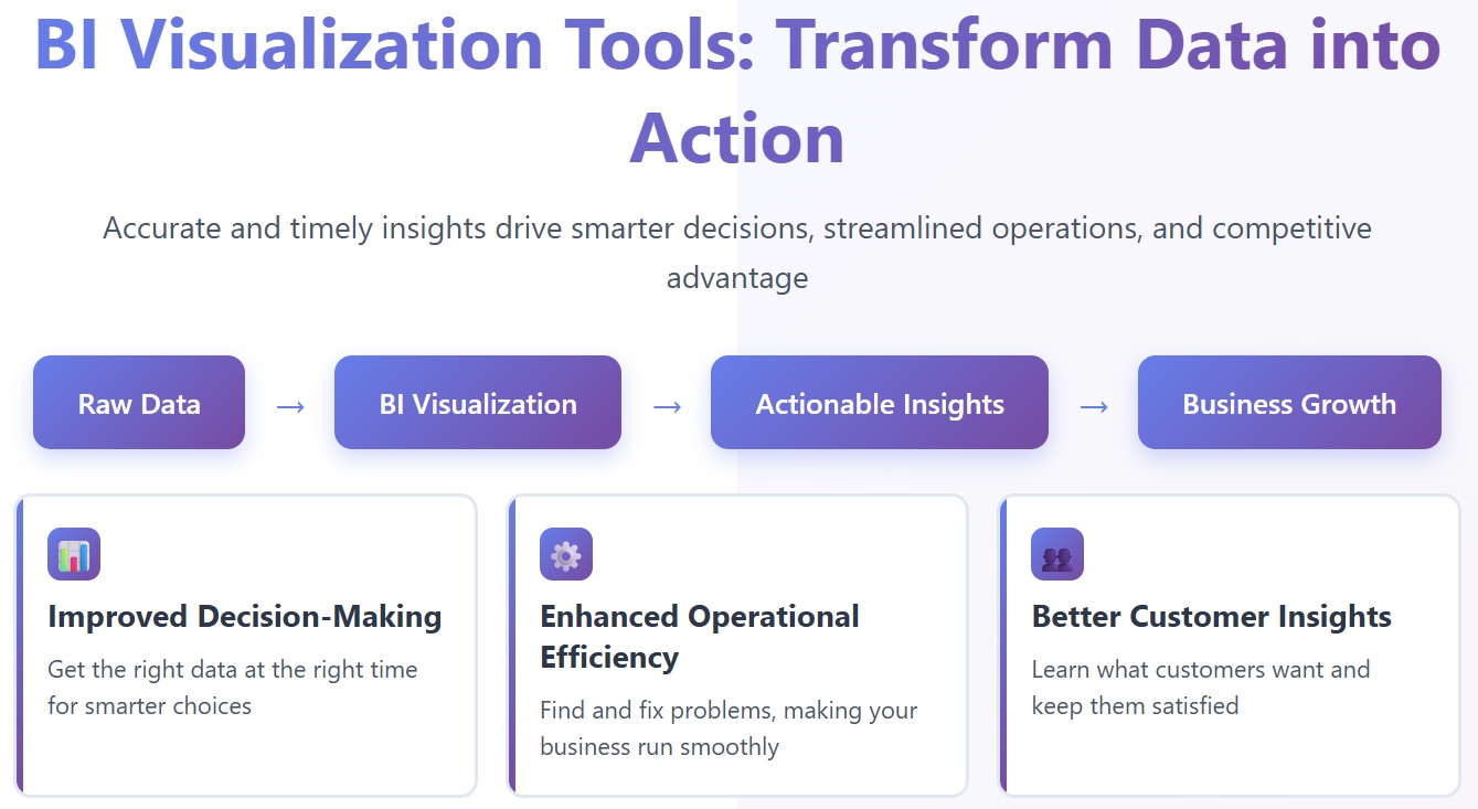
Improved Decision-Making
Visual tools help you make evidence-based choices with speed and accuracy.
Error Identification
You find inconsistencies and correct them faster through visual data.
Enhanced Storytelling
You understand complex information by seeing patterns and trends.
Innovative solutions like FanRuan and FineBI join the landscape, offering advanced features for self-service analytics. You can compare these options and select the best fit for your organization.
Why Big Data Visualization Tools Matter in 2025
Business Intelligence Trends
You see rapid growth in the market for big data visualization tools. The value is expected to rise from $8.55 billion in 2024 to $9.46 billion in 2025, with a compound annual growth rate of 10.6%. This growth reflects how organizations rely on bi visualization tools to unlock new insights and drive business success. You notice several trends shaping the adoption of these solutions:
Trend
Description
Natural-Language Interfaces
You can ask questions in plain language, making data access easier for everyone.
Predictive and Prescriptive Analytics
You forecast outcomes and receive recommendations, which helps you plan and act with confidence.
Self-Service and Embedded BI
You analyze data independently and integrate insights into your daily workflow, speeding up decisions.
These trends show that bi visualization tools now offer advanced capabilities for users at every level.
Real-Time Analytics Needs
You need instant access to data to stay competitive. Industries such as e-commerce, healthcare, financial services, and manufacturing depend on bi visualization tools for real-time analytics. You track conversion rates, monitor patient health, watch market movements, and oversee production metrics. The demand for real-time data processing, mobile responsiveness, collaborative features, and advanced integration capabilities continues to grow.
As you face more complex data challenges, you rely on big data visualization tools to make smarter decisions and improve customer experiences.
Track production metrics, quality control, equipment performance.
You benefit from bi visualization tools that deliver these capabilities in real time.
Data-Driven Decision Making
You use bi visualization tools to improve business performance. These tools provide accurate and timely data, helping you understand business dynamics and make informed choices. You identify inefficiencies, streamline operations, and allocate resources better. You gain deeper customer insights, which lets you tailor products and services to meet needs. You also spot market trends and adjust strategies quickly, giving you a competitive edge.
Benefit
Description
Improved Decision-Making
You get the right data at the right time for smarter choices.
Enhanced Operational Efficiency
You find and fix problems, making your business run smoothly.
Better Customer Insights
You learn what customers want and keep them satisfied.
Competitive Advantage
You stay ahead by acting on trends before others do.
Risk Management and Mitigation
You spot risks early and prepare for challenges.
You depend on bi visualization tools and their capabilities to transform raw data into actionable insights. Data visualization tools help you see patterns, trends, and opportunities that drive your organization forward.
Top 7 Data Visualization Tools for 2025
Choosing the right big data visualization tools helps you unlock actionable insights and drive smarter decisions. You see many bi visualization tools on the market, but these seven stand out for their advanced capabilities, interactive dashboards, and customizable visualizations. Let’s explore what makes each one unique and how you can use them to boost your business intelligence.
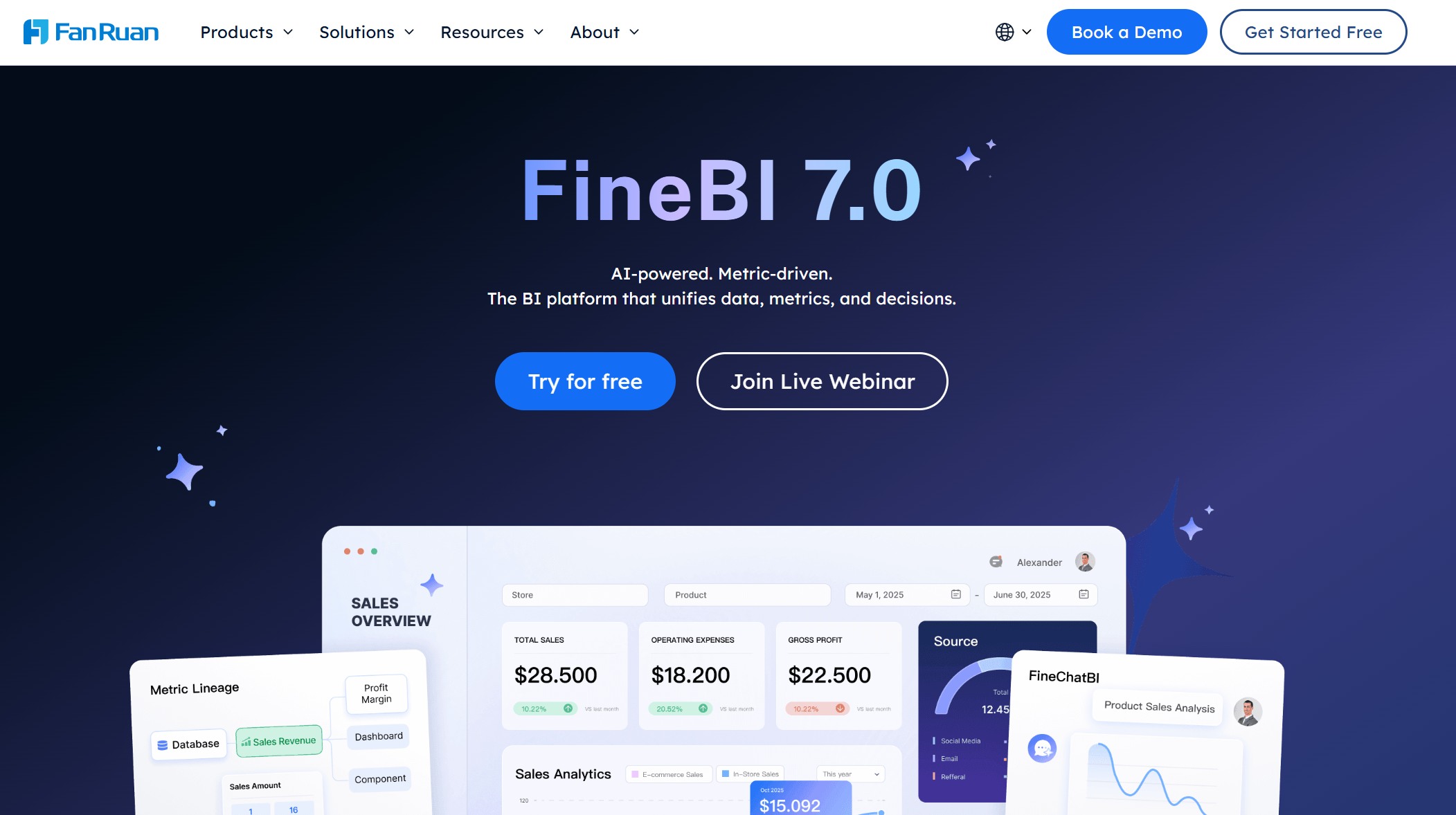
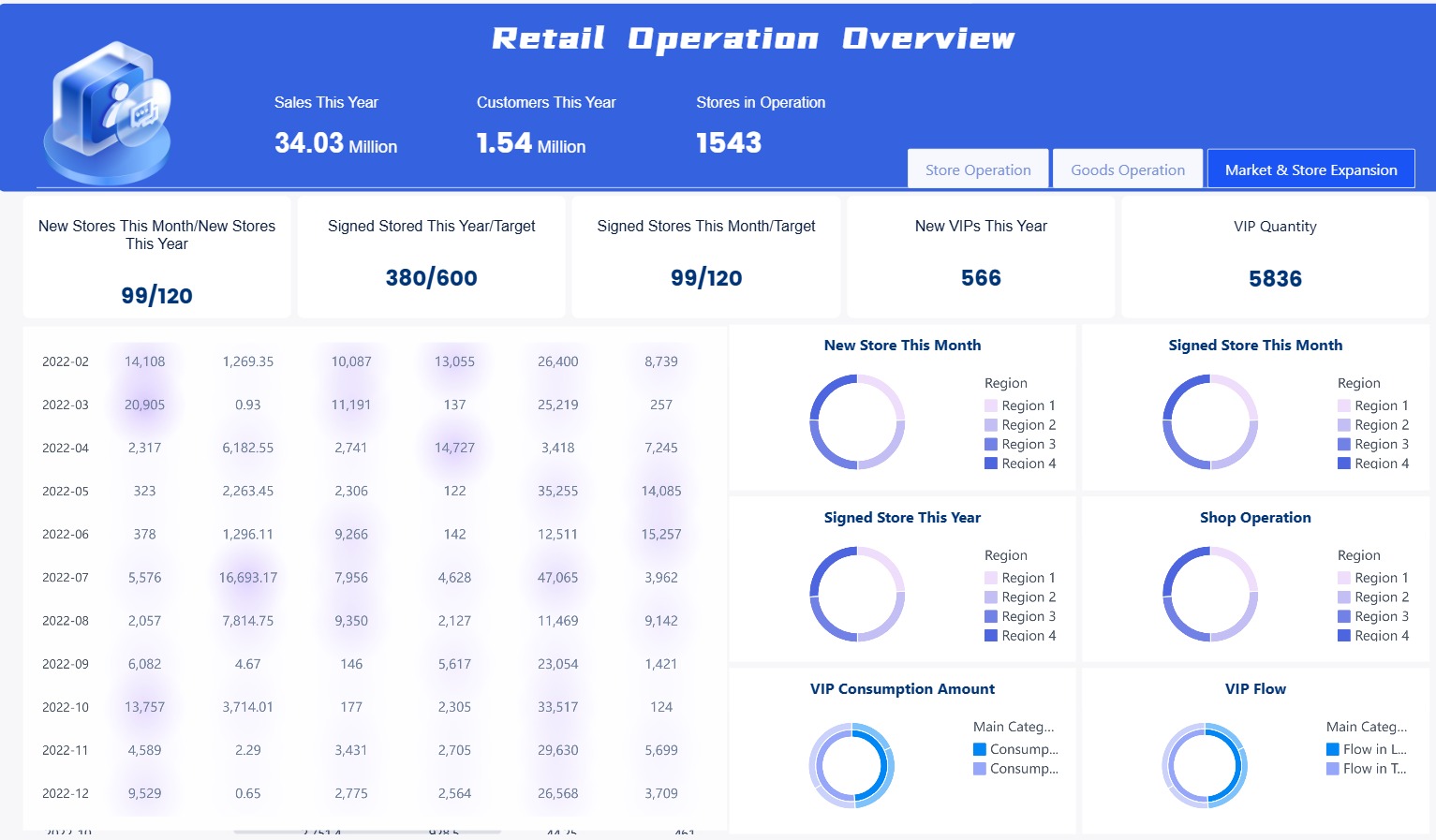
You use FineBI for self-service analytics and enterprise-grade bi visualization tools. FineBI empowers you to collaborate and share data through multiple modes. You clean and preprocess data from many sources efficiently. FineBI supports high concurrency and availability, so you and your team can access data and run queries without slowdowns. The high-performance computing engine optimizes data storage and processing, making FineBI ideal for analyzing large datasets. You control access with enterprise-level permission management, enhancing security and governance.
You collaborate and share datasets and dashboards with your team.
You preprocess and cleanse data from multiple sources.
You access data and perform queries simultaneously without performance loss.
You analyze large datasets with a high-performance computing engine.
You manage permissions for detailed control over data access.
FanRuan received an Honorable Mention in the 2023 Gartner Magic Quadrant for Analytics and Business Intelligence Platforms. This recognition highlights FanRuan’s commitment to innovation and excellence in big data visualization tools.
You choose FineBI when you want bi visualization tools that combine self-service analytics, enterprise security, and high-performance data processing. FineBI stands out as one of the best data visualization tools for organizations seeking advanced analytics capabilities and interactive dashboards.
You use tableau to create interactive visualizations and uncover data insights quickly. Tableau stands out among data visualization platforms for its advanced analytics capabilities and ai-powered data visualization. You benefit from features like Tableau Pulse, which clarifies anchor charts with legends and supports user functions for row-level security. Tableau Next introduces conversational analytics, allowing you to ask questions in plain language. You also get productivity shortcuts, dual and sync axis for comparing measures, and funnel charts to track conversion rates.
Feature
Description
Tableau Pulse: Legend in Anchor Chart
Clarifies anchor charts with a legend that helps you understand the data being reported.
Tableau Pulse: Support for User Functions
Applies row-level security to a Pulse metric, ensuring you only see authorized data.
Tableau Next: Concierge in Lightning
Enables conversational analytics within workflows, letting you ask questions in plain language.
Tableau Semantics: Description Generation
Automates description generation of objects, fields, and metrics to improve agent accuracy.
Tableau Next: Dual and Sync Axis
Lets you compare two different measures on the same chart for better visual analysis.
Tableau Next: Funnel Chart
Tracks conversion rates to identify customer drop-off points for process optimization.
Tableau Next: Productivity Shortcuts
Increases authoring efficiency with new shortcuts for quick data field addition.
Tableau Next: Semantic Model AI Optimization
Optimizes semantic models for better agent performance with AI-powered suggestions.
Tableau Next: MCP Server
Integrates custom AI with agentic analytics for complex analytical tasks.
Tableau Agent: Dashboard Narratives
Provides AI-powered explanations and contextual insights for data discovery.
You rely on tableau for best data visualization software when you need advanced analytics capabilities, interactive dashboards, and clear storytelling.
You choose power bi for its strong bi visualization tools and seamless integration with Microsoft services. Power bi helps you create customizable dashboards and interactive visualizations for many industries. You see a 40% year-over-year increase in AI-powered features, and over 80% of analytics tools will use AI by 2026. You experience up to 23% faster decision-making cycles. Power bi is popular for hospital operations dashboards and sales performance trackers.
Statistic Description
Value
Year-over-year increase in AI-powered features
40%
Projected analytics tools with AI by 2026
Over 80%
Reported faster decision-making cycles
Up to 23%
Projected mobile dashboards adoption
Exceeding 60% of enterprise BI usage
Search trend comparisons
Increasing global interest versus plateau in Tableau adoption
Hospital Operations Dashboard: You track KPIs like average patient wait time and ICU occupancy rate.
Sales Performance Tracker: You monitor sales by product and customer lifetime value.
You use power bi when you want scalable bi visualization tools, predictive analytics, and mobile-friendly dashboards.
You turn to qlik sense for its associative data model and strong self-service analytics. Qlik sense gives you high performance with large datasets and delivers actionable insights through its Qlik Insight Advisor. You explore data freely and discover relationships that other tools might miss.
Feature
Qlik Sense
Associative Data Model
Yes
Performance with Large Datasets
High
Self-Service Analytics
Strong
AI Insights
Through Qlik Insight Advisor
You use qlik sense when you need bi visualization tools that support interactive dashboards, advanced analytics capabilities, and flexible data exploration.
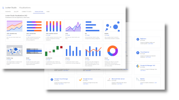
You choose Google Looker Studio for its seamless integration with Google Cloud services. Looker Studio processes data queries quickly, giving you real-time analytics and simplified data management. You experience reduced latency and consistent, reliable data. You visualize data in clear formats, making it easy to interpret and act on accurate decisions.
Advantage
Description
Speed
Data queries are processed quickly, allowing for faster insights.
Real-time Analytics
You analyze data as it comes in, ensuring decisions are based on the most recent information.
Simplified Data Management
Organizing and accessing data becomes more straightforward.
Reduced Latency
Minimal delay between requesting and receiving data.
Seamless Visualization
Presents data in clear, understandable formats, making it easier to interpret.
Consistency
Designed to work together, ensuring data consistency and reliability.
Efficiency
Integration eliminates the need for multiple tools, streamlining the data analysis process.
Accurate Decisions
With precise data at hand, you make more informed choices.
You use Google Looker Studio when you want bi visualization tools that deliver speed, efficiency, and real-time data insights.
You select Apache Superset for its open-source advantages and flexibility. Superset gives you cost-effectiveness, full access to source code, and extensibility for custom connectors and visualization types. You embed dashboards into external applications and modify the platform to fit your needs.
Advantage
Description
Cost-effectiveness
No expensive licenses or vendor lock-in, allowing you to control your stack and data.
Flexibility
Full access to source code for modifications and customizations.
Extensibility
Ability to create custom connectors and add new visualization types.
You create custom connectors for proprietary data sources.
You add new visualization types as needed.
You embed dashboards into other applications.
You use Apache Superset when you need bi visualization tools that offer customizable dashboards, extensibility, and open-source control.
You rely on sisense for its ease of use and scalability. Sisense features a drag-and-drop interface, elastic data model, and strong data integration capabilities. You connect to cloud services and traditional databases, and you use built-in AI and machine learning for predictive analytics and advanced visualizations.
Feature/Scalability Option
Description
Ease of Use
Drag-and-drop interface suitable for both non-technical users and data scientists.
Scalability
Elastic data model that accommodates data growth seamlessly.
Data Integration
Connects to various data sources, including cloud services and traditional databases.
AI and Machine Learning
Built-in capabilities for predictive modeling and advanced visualizations.
You build fully customizable dashboards.
You use AI features for predictive analytics.
You handle large, complex datasets with ease.
You choose sisense when you want bi visualization tools that scale with your business and deliver advanced analytics capabilities.
You see that each of these data visualization tools offers unique capabilities for different business needs. You can select the best fit based on your requirements for scalability, integration, interactive dashboards, and advanced analytics capabilities. These platforms help you transform raw data into actionable insights, making your business more competitive and data-driven.
Key Features of Leading Data Visualization Software
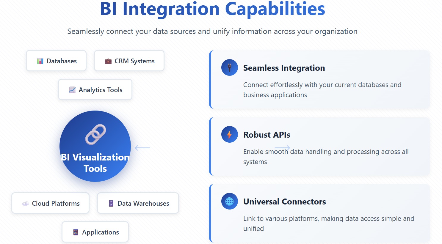
Integration Capabilities
You want bi visualization tools that connect easily to your existing systems. Integration capabilities help you bring together data from many sources. When you select data visualization software, you look for:
Seamless integration with your current databases and business applications.
Robust APIs for smooth data handling.
Connectors that link to various platforms, making data access simple.
These capabilities let you unify your data, so you can analyze information from across your organization without extra effort.
Scalability for Big Data
You need bi visualization tools that grow with your data. Scalability ensures your platform can handle large and complex datasets. The table below shows how top tools support scalability:
Tool
Scalability Features
Tableau
Handles large volumes of data with high performance and responsiveness.
Looker Studio
Maintains speed and reliability using Google’s infrastructure.
ThoughtSpot
Delivers fast query responses in large-scale environments.
Domo
Keeps performance strong as data complexity increases.
Scalable capabilities mean you can keep working efficiently, even as your data grows.
Advanced Analytics & AI
You benefit from bi visualization tools that offer advanced analytics and AI features. These capabilities help you find patterns, predict outcomes, and understand your data better.
Feature
Why it matters
What to look for
Natural language processing
Lets you ask questions in plain language.
Accurate query understanding.
AI highlights
Finds trends and anomalies quickly.
Instant alerts and insights.
Predictive analytics
Anticipates future events.
Built-in forecasting tools.
Explainable AI
Shows how insights are generated.
Transparency and trust.
Human-in-the-loop controls
Improves accuracy and reduces bias.
Feedback and governance.
Interactivity
Makes insights easy to explore.
Dynamic charts and dashboards.
These capabilities give you deeper insights and help you act faster.
Collaboration & Governance
You rely on bi visualization tools that support teamwork and keep your data secure. Collaboration features let you share dashboards and reduce data request backlogs by up to 80%. Governance capabilities protect your data and ensure compliance as your team grows. Role-based access controls help you maintain security while allowing everyone to analyze data independently.
Tip: Strong collaboration and governance capabilities make your data visualization software more effective for your whole organization.
Comparing BI Visualization Tools
Feature Overview
You want to compare bi visualization tools based on their core capabilities. Each platform offers unique features that help you analyze data and make decisions. The table below shows how leading tools differ in their capabilities:
Data visualization, data modeling, Git integration, mobile access, custom widgets
Domo
Reporting, mobile accessibility, collaboration, cloud infrastructure, data governance
Qlik Sense
Data visualizations, associative data modeling, ML capabilities, interactivity, augmented intelligence
Yellowfin
Data visualization, collaboration, automated analysis, data storytelling, data integration
Oracle Analytics Cloud
Data preparation, advanced analytics, data visualization, collaboration, Oracle ecosystem integration
You see that bi visualization tools provide a range of capabilities, from real-time analytics to advanced data modeling. FanRuan stands out with robust data import, custom reports, and a user-friendly interface. You benefit from capabilities that simplify learning and support large enterprises.
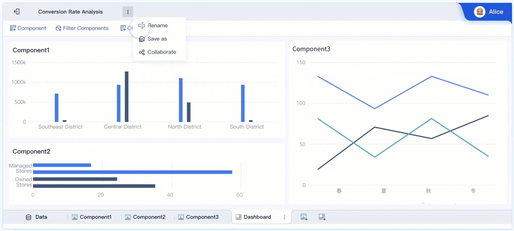
FineBI drag and drop to process data
Pricing & Licensing
You need to understand the cost of bi visualization tools before making a decision. Pricing varies by platform and depends on user numbers and feature requirements. The table below compares annual costs for 50 users:
Platform
Approx. Annual Cost (50 users)
Key Cost Drivers
Power BI
$6,000 - $12,000
User license mix, Premium capacity needs
Tableau
$25,000 - $40,000
Creator vs Explorer vs Viewer mix
Looker
$36,000 - $60,000
Standard vs Enterprise needs
Tableau requires server resources and specialists for advanced visualizations. Looker may need dedicated developers and extra cloud infrastructure. You find that FanRuan offers cost-effective solutions for large organizations, especially those needing custom reports and scalable capabilities.
Best Use Cases
You select bi visualization tools based on your industry and business needs. The table below highlights the best use cases for popular platforms:
Tool Name
Best Use Case Description
Pricing
Canva
Helps create attractive charts, infographics, and simple data visuals.
Free/$15/mo
Looker
Modeling complex datasets using LookML and delivering insights with interactive dashboards.
Free/Custom pricing
Looker Studio
Creates dynamic, shareable dashboards using live data connections.
Free
MongoDB Atlas
Integrated visualization tools for analyzing and presenting data in a NoSQL environment.
Free/Custom pricing
SAP Crystal Reports
Generates highly formatted, detail-oriented reports from multiple data sources.
Free/$295/mo
AgencyAnalytics
Purpose built-in for marketing agencies to track and report on SEO, PPC and social media.
Free/$59/mo
SAP Crystal Server
Enhances crystal reports with secure access, role based control and scalable report distribution.
Free/Custom pricing
You see real-world benefits in customer stories. Bifido Foods improved decision-making and data integration using FanRuan’s FineReport. Cupdata increased system efficiency and customer value identification with FineBI. FanRuan’s capabilities support industries like manufacturing, finance, and healthcare. You gain competitive advantages through tailored solutions and advanced analytics capabilities.
Tip: Choose bi visualization tools that match your business needs and industry requirements. Look for capabilities that support collaboration, scalability, and secure data management.
How to Choose the Right Data Visualization Tool
Assessing Business Needs
You start by looking at your organization’s goals and daily challenges. You want a tool that matches your workflow and helps you build data-driven strategies. Consider these factors:
Ease of use: You need intuitive, drag-and-drop features to explore data.
Data connectivity: You should connect to many sources for seamless analysis.
Line-of-business fit: The tool must match your business area’s needs and language.
Tool versatility: You benefit from a platform that supports many functions.
Cost of deployment: You plan for the total cost, including setup and training.
Data processing capacity: The tool should handle large datasets efficiently.
Adaptability: You want flexibility to meet your unique requirements.
Personal data protection: Compliance with regulations like GDPR is essential.
Interactivity of visualizations: You need to interact with your data easily.
Security: You must keep data access safe.
FineBI stands out when you want self-service analytics and enterprise BI. You can create customizable dashboards and visualizations without coding. FineBI supports real-time analysis and secure collaboration, making it a top choice for organizations that value independence and control.
You check if the tool fits your technical environment. You look for strong data understanding, cleaning, and preparation features. Scalability matters when your data grows. You want fast retrieval of results and clear, readable outputs. User assistance helps your team get started quickly.
Power bi, qlik sense, and sisense offer robust technical capabilities. You can process big data, use ai-powered data visualization, and build customizable dashboards. These platforms support data-driven decisions and help you scale as your needs change.
Budget & Support Considerations
You compare costs and support options before making a decision. The table below shows how budget and licensing models affect your choice:
Source
Key Point
Nucleus Analytics
Licensing with unlimited users is practical for organization-wide adoption.
StarCIO Digital Trailblazer
Pricing models may exclude smaller organizations from advanced tools.
Zoho Analytics
Budget constraints influence your choice, including fees and hidden costs.
You look for transparent pricing and reliable support. Sisense and qlik sense offer flexible plans for different business sizes. Power bi provides strong support and cost-effective options for many organizations. FineBI is ideal if you want enterprise-grade features with a lower total cost of ownership.
Tip: Match your tool’s features to your business needs, technical environment, and budget. FineBI is a smart choice for self-service analytics and scalable enterprise BI.
When you choose a big data visualization tool in 2025, focus on what matters most:
Scalability for growing data needs
Cost and total ownership
Integration with your current systems
Security and compliance
User skill requirements
Customization and visualization options
Interactivity and performance
You should explore both global leaders and new solutions like FineBI. To get started:
Identify your data sources
Prepare and clean your data
Select the right visualizations
Build interactive dashboards
Set up automated data refresh
If you need help, data visualization consultants can guide you to the best fit for your goals and budget.
Continue Reading About big data visualization tools
Access a wealth of case studies, industry insights, and solution guides to accelerate digital transformation.
FAQ
What is a big data visualization tool?
A big data visualization tool helps you turn large, complex data sets into charts, graphs, and dashboards. You can spot trends, patterns, and outliers quickly. These tools make your data easier to understand and share.
How do I choose the right data visualization tool for my business?
You should look at your data sources, team skills, and business goals. Try free trials or demos. Compare features, pricing, and support. Pick a tool that fits your needs and helps you make better decisions.
Can I use these tools without coding skills?
Yes! Most leading tools like FineBI, Tableau, and Power BI offer drag-and-drop interfaces. You can build dashboards and reports without writing code. This makes data analysis accessible to everyone on your team.
Why is real-time analytics important?
Real-time analytics lets you see what is happening in your business right now. You can react to changes, fix problems, and spot new opportunities faster. This helps you stay ahead of your competition.