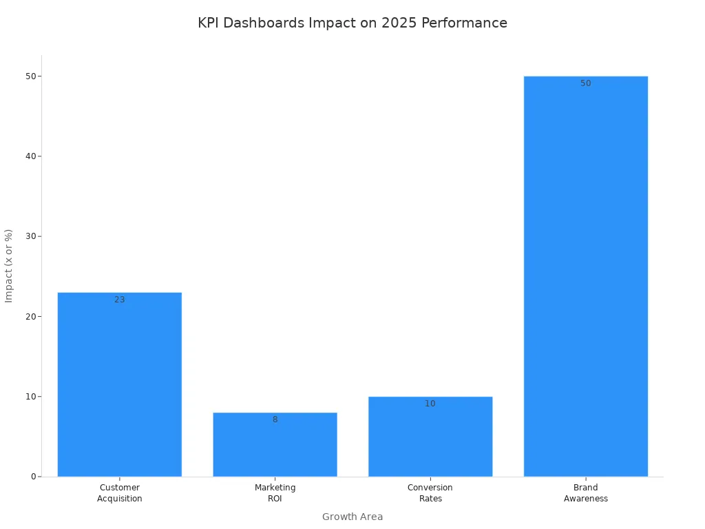
You see businesses in 2026 moving faster and making smarter choices, all thanks to kpi dashboards. When you look at real-world kpi dashboard examples, you get ideas for your own business dashboard and spot new ways to track kpi and data. These dashboards drive results—companies using them are 23 times more likely to acquire customers, and they see a 50% jump in brand awareness.
KPI dashboards help teams work together, stay on the same page, and make decisions with confidence. You can use these examples to boost your own performance and shape your strategy.
KPI Dashboard Examples Overview

KPI dashboards have become essential tools for business decision-making in 2026. You use these dashboards to track key performance indicators, spot trends, and make quick decisions. When you look at kpi dashboard examples, you see how companies organize their data and turn numbers into action. A great kpi dashboard example gives you a clear view of your business health and helps you respond fast.
What Makes a Great KPI Dashboard Examples
You want your dashboard to work for you, not against you. The best kpi dashboard examples show you the right data at the right time. FineBI stands out as a leading solution for building kpi dashboards. It lets you connect to many data sources, customize your dashboard, and share insights with your team. You get real-time updates and interactive data visualization dashboards, so you never miss a beat.
Let’s look at the most common types of kpi dashboards businesses use in 2026:
| Dashboard Type | Purpose | Common KPIs |
|---|---|---|
| Sales Dashboard | Helps sales managers monitor pipeline health, rep performance, and quota attainment. | Sales Pipeline Value, Win Rate, Sales Cycle Length, Quota Attainment Rate, Revenue by Rep or Region |
| Finance Dashboard | Gives finance teams visibility into budgeting, forecasting, and cash flow management. | Operating Expenses, Net Income, Burn Rate, Budget vs. Actual, Cash Flow Forecast |
| Operations Dashboard | Enables operations managers to optimize workflows, logistics, and supply chain performance. | Fulfillment Time, Order Accuracy, Inventory Turnover, Downtime, Resource Utilization |
| HR Dashboard | Helps HR leaders monitor workforce health, hiring progress, and engagement metrics. | Employee Turnover Rate, Time to Hire, Training Completion Rate, Employee Satisfaction Score, Diversity Metrics |
When you choose the best kpi dashboard examples, you need to look at a few key criteria:
| Criteria | Description |
|---|---|
| User Customization | You set goals and adjust the dashboard to fit your needs. |
| Knowledge Discovery | The dashboard helps you find insights and patterns in your data. |
| Security | Only authorized users can access your data. |
| Information Delivery | The dashboard communicates information clearly. |
| Alerting | You get notified about important changes or events. |
| Visual Design | The dashboard looks good and is easy to use. |
| Integration and System Connectivity | You connect the dashboard to other systems and data sources. |
A high-performing kpi dashboard stands out because it gives you a simple, clean view of your most important data. You can customize it for your department or role, making your metrics easy to find. You need clear goals, strong data integration, and a design that puts clarity first. FineBI makes this process easy, so you can build a business dashboard that works for you. If you want to compare with other tools like power bi dashboard, you’ll see FineBI offers more flexibility and better integration for your needs.
Sales Performance Dashboard as KPI Dashboard Examples
When you want to boost your sales results, you need a sales performance dashboard. This kpi dashboard example gives you a clear view of your sales pipeline, team performance, and revenue trends. You see how your team is doing in real time, so you can make smart decisions fast. Many companies use kpi dashboards to track key performance indicators and spot new opportunities. The best kpi dashboard examples help you stay ahead of the competition.
FineBI makes it easy to build a business dashboard that fits your needs. You connect your data from different sources, then use drag-and-drop tools to create data visualization dashboards. You get instant updates, so you always know where you stand. FineBI’s real-time tracking lets you see sales numbers as they happen. You can share your dashboard with your team and work together to reach your goals.
Key Metrics
A sales performance dashboard tracks the most important kpi for your sales team. You see these key metrics:
- Sales Pipeline Value
- Win Rate
- Sales Cycle Length
- Quota Attainment Rate
- Revenue by Rep or Region
You can add more metrics to your dashboard, depending on your business needs. The dashboard helps you focus on what matters most.
| Metric | What It Shows |
|---|---|
| Pipeline Value | Total value of deals in progress |
| Win Rate | Percentage of closed deals |
| Sales Cycle Length | Average time to close a deal |
| Quota Attainment | Progress toward sales targets |
| Revenue by Region | Sales performance by location |
Benefits
You get many benefits from using a sales performance dashboard:
You monitor key metrics in real time. You make data-driven decisions and adjust your strategy quickly. You analyze performance indicators and improve your sales process over time.
- You spot trends and react before problems grow.
- You motivate your team with clear goals and instant feedback.
- You share insights across departments for better collaboration.
FineBI’s kpi dashboard examples give you the flexibility to customize your dashboard for any sales team. You can connect your data, visualize results, and drive continuous improvement. If you want a kpi dashboard that helps you win more deals, FineBI is a top choice.
Financial KPI Dashboard as KPI Dashboard Examples
When you want to keep your business on track, you need a financial performance dashboard that shows you the numbers that matter. This kpi dashboard example helps you see your financial health at a glance. You get instant access to the data that drives your decisions. Many companies use kpi dashboards to track financial metrics and spot trends before they become problems. The best kpi dashboard examples make it easy to compare results and adjust your strategy.
Metrics Tracked
You want your financial performance dashboard to focus on the most important kpi. Here are the key metrics leading businesses track in 2025:
- Sales Growth
- Gross Profit Margin (GPM)
- Operating Cash Flow
- Accounts Receivable Turnover
- Customer Acquisition Cost (CAC)
- Net Profit Margin
- Revenue concentration
- Sales growth rate
- Financial spend per department
Tracking these financial business metrics helps you measure and analyze your financial state. You can identify what’s working and what needs attention. With a business dashboard, you stay on track and use a data-driven approach to financial management.
Use Cases
You use a financial performance dashboard to make better decisions every day. Here’s how kpi dashboards help you:
| Benefit | Description |
|---|---|
| Visibility | You get a real-time snapshot of your financial status. Transparency improves across teams. |
| Speed | You make decisions faster with instant access to financial figures and trends. |
| Alignment | You align your team with shared financial goals and performance metrics. |
A financial performance dashboard lets you monitor key metrics like revenue, expenses, and cash flow in real time. You can spot strong performance and areas that need improvement. Here’s what happens when you use data visualization dashboards for finance:
- You access real-time financial data without manual work.
- You see up-to-date information and quickly spot trends or issues.
- You make informed decisions that improve your bottom line.
If you want a kpi dashboard example that helps you manage your finances, FineBI makes it easy to build a dashboard that fits your needs. You connect your data, visualize results, and share insights with your team. With the best kpi dashboard examples, you stay ahead and keep your business moving forward.
Marketing KPI Dashboard Examples
You want your marketing team to move fast and make smart choices. That’s where marketing KPI dashboard examples come in. With a marketing campaign analytics dashboard, you see all your important data in one place. You track campaign performance, spot trends, and adjust your strategy on the fly. The best kpi dashboard examples help you understand what’s working and what needs to change.
Essential KPIs
When you build a marketing campaign analytics dashboard, you focus on the numbers that drive results. Here are some of the most important KPIs you should track:
| KPI | Impact on Campaign Performance and ROI |
|---|---|
| Return on Investment (ROI) | Shows how much value your campaigns generate compared to what you spend. |
| Return on Ad Spend (ROAS) | Helps you see if your ad investments pay off and how they compare to industry standards. |
| Overall Marketing Efficiency | Gives you a clear view of your marketing activities, so you can make quick decisions and fix problems. |
You also want to track metrics like click-through rate, conversion rate, and customer acquisition cost. These numbers help you measure the success of each marketing campaign analytics dashboard you create.
Use Cases
A marketing campaign analytics dashboard does more than just show numbers. It helps you:
- Replace messy spreadsheets with clear, interactive dashboards.
- Make quick decisions by comparing performance against your plans.
- Get alerts when something needs your attention, so you can act fast.
- Improve your team’s efficiency by seeing all your data in one place.
FineBI makes it easy to build and customize your marketing campaign analytics dashboard. You use drag-and-drop tools to create dashboards that fit your needs. You don’t need to be a tech expert. FineBI lets you visualize KPIs, track trends, and collaborate with your team—all in real time. You can even have multiple users edit the dashboard at once, making teamwork simple.
With kpi dashboards like these, you boost your marketing results and get more from every campaign. If you want a kpi dashboard example that helps you win in 2026, FineBI gives you the tools to do it.
Customer Service KPI Dashboard as KPI Dashboard Examples
You want your customers to feel heard and valued every time they reach out. That’s why a customer satisfaction dashboard is so important for your business. With the right kpi dashboard examples, you can track service quality, spot issues, and improve your team’s performance. You see all your data in one dashboard, making it easy to respond quickly and keep customers happy.
Service Metrics
When you build a customer satisfaction dashboard, you focus on the metrics that matter most. Top-performing organizations use these data points to measure how well their customer service teams are doing. You can forecast hiring needs, optimize resources, and find gaps in your strategy. Here are the key metrics you should track:
- Customer Satisfaction Score (CSAT)
- Net Promoter Score (NPS)
- First Response Time (FRT)
- Customer Effort Score (CES)
These metrics help you understand customer needs and improve service quality. By tracking them, you gain insights into satisfaction and loyalty, which drive business growth. You can use a customer satisfaction dashboard to see trends and make changes that boost your results.
Tip: Tracking these KPIs helps you pinpoint areas for improvement and keeps your team focused on what matters most.
Use Cases
A customer satisfaction dashboard gives you a clear view of your service performance. You can use kpi dashboards to monitor average customer satisfaction, wait times, and response rates. Here’s how some common metrics look in a dashboard:
| KPI | Description |
|---|---|
| Average Customer Satisfaction | Shows how happy your customers are with your service. |
| Average Wait Time | Tells you how long customers wait before getting help. |
| Average First Response Time | Measures how fast your team replies to customer inquiries. |
| Abandoned Calls | Tracks calls dropped before being answered, highlighting service gaps. |
| Average Customer Effort Score | Reveals how easy it is for customers to resolve their issues. |
| Net Promoter Score | Indicates customer loyalty and their likelihood to recommend your business. |
You use a customer satisfaction dashboard to improve response times and reduce abandoned calls. You can see where customers struggle and make changes that help them get answers faster. With kpi dashboards, you keep your team aligned and focused on delivering great service. You can share data across departments, making collaboration easier and boosting overall performance. If you want a kpi dashboard example that helps you build loyalty and satisfaction, this dashboard is a must-have.
Project Management KPI Dashboard as KPI Dashboard Examples
You want your projects to stay on track and finish on time. That’s where project management KPI dashboard examples come in. With the right dashboard, you see progress, spot risks, and keep everyone focused. You get a clear view of your project’s health, so you can act fast when things change.
Progress Tracking
A project management KPI dashboard helps you track progress with real-time updates. You see the latest data for every task and milestone. This means you don’t have to wait for reports or chase down team members for updates. You get instantaneous insight into what’s happening.
- Dashboards give you real-time updates on KPIs, so you always know your project status.
- Visual aids make complex data easy to understand for everyone on your team.
- You make decisions faster because you see issues as soon as they appear.
When you use kpi dashboards, you reduce misunderstandings and keep your team moving forward. You can spot delays, adjust resources, and make sure your project stays on schedule. The dashboard turns raw data into clear visuals, so you never miss a detail.
Collaboration
You want your team to work together and stay aligned. A project management KPI dashboard makes collaboration simple. Everyone sees the same data, so there’s no confusion about goals or progress. You can share updates, assign tasks, and track accountability in one place.
| Benefit | Description |
|---|---|
| Improved Communication | The dashboard gives all team members and stakeholders a unified view of performance data. |
| Real-time Visibility | Teams monitor project metrics as they happen, which boosts transparency and responsiveness. |
| Alignment on Performance Data | Everyone stays on the same page about strategy and execution. |
- Real-time views of project metrics help your team stay transparent.
- High-performing organizations use dashboards for better collaboration.
- Dashboards consolidate KPIs, so you make decisions based on data, not guesswork.
With kpi dashboards, you build trust and accountability. Your team works together, solves problems quickly, and delivers results. The dashboard keeps everyone informed and engaged, making project management smoother and more effective.
HR KPI Dashboard as KPI Dashboard Examples
Employee Metrics
You want to understand your workforce and make better decisions. An HR KPI dashboard gives you a clear view of your team’s strengths and areas for growth. You can track the most valuable employee metrics and see trends over time. When you use kpi dashboards, you get all your important data in one place, so you can act quickly.
Here are some key employee metrics you should include in your dashboard:
- Employee engagement scores
- Workplace safety stats
- Salary trends
- Workforce planning
- Staffing needs
- Employee retention rates
- Payroll costs
- Training costs
- Employee satisfaction
- Career advancement opportunities
- Promotions
- Salary increases
These metrics help you see how your team feels, how safe your workplace is, and where you might need to invest more. You can spot patterns in your data and make changes that improve your company culture.
Use Cases
You use an HR KPI dashboard to support talent management and boost employee engagement. The dashboard helps you align HR activities with business goals, monitor engagement, and plan for future talent needs. You can see how your employees feel about their work and the company. This insight lets you create targeted strategies to improve morale.
| Dashboard Feature | Purpose |
|---|---|
| Employee engagement dashboard shows employee sentiment | Gauges morale and highlights areas for improvement |
| Insights drive engagement initiatives | Predicts trends and supports proactive action |
| Engagement data tells a story about experiences | Helps you develop strategies for better engagement |
When you monitor engagement and satisfaction, you nurture a positive work environment. You attract top talent and encourage innovation. You also reduce staff turnover by focusing on employee satisfaction.
Tip: Use your HR KPI dashboard to keep your team motivated and your business moving forward. The right data helps you make smart decisions and build a stronger company.
Executive KPI Dashboard as KPI Dashboard Examples
Strategic Insights
You want to see the big picture. An executive KPI dashboard gives you a clear view of your company’s health. You get all your important data in one dashboard, so you don’t waste time searching for numbers. With executive KPI dashboards, you spot trends and understand what drives your business forward. You can compare performance across departments and see which areas need attention.
Take a look at how an executive KPI dashboard helps you:
| Benefit | Description |
|---|---|
| Improved Visibility | Gain a comprehensive understanding of your business performance. |
| Enhanced Decision-Making | Make faster, data-backed decisions. |
| Increased Efficiency | Save time by accessing all key data in one place. |
| Better Collaboration | Foster data transparency and collaboration across teams. |
You use KPI dashboard examples to set clear goals and track progress. The dashboard shows you real-time data, so you can react quickly. You don’t have to wait for reports or rely on guesswork. You see what’s working and what needs to change.
Tip: When you use executive KPI dashboards, you make smarter choices and keep your team focused on what matters most.
Decision Support
You need to make decisions fast. An executive KPI dashboard supports you by putting all your critical data front and center. You get a snapshot of your company’s performance, so you can act with confidence. These dashboards help you identify opportunities and tackle challenges before they grow.
Here’s what you get from executive KPI dashboards:
- You see a comprehensive snapshot of performance.
- You make quick, informed decisions.
- You spot trends and find new opportunities.
| Source | Key Point |
|---|---|
| CEO Dashboard: Executive Dashboards Guide 2025 | Executive dashboards provide a comprehensive snapshot of a company's performance across all key areas, enabling quick and informed decisions. |
| Executive dashboard essentials: How to build a great KPI dashboard | These dashboards give leaders the power to spot trends and tackle challenges with confidence. |
| A Complete Guide to Getting Started with KPI Dashboards | KPI dashboards consolidate critical business metrics into visual displays that enable instant decision-making. |
You use KPI dashboard examples to guide your strategy and keep your business moving. The dashboard brings together data from every part of your company. You don’t miss important details. You make decisions based on facts, not assumptions.
Note: Executive KPI dashboards help you lead with clarity and drive your business toward success.
Operations KPI Dashboard as KPI Dashboard Examples
Operations KPI dashboard examples help you keep your business running smoothly. You get a clear view of your processes, spot inefficiencies, and make quick adjustments. When you use kpi dashboards, you see all your important data in one place. This makes it easy to track performance and optimize your operations.
Efficiency Metrics
You want to measure how well your business operates. The right dashboard shows you the numbers that matter most. Here are some key efficiency metrics you should track:
| KPI Name | Description |
|---|---|
| Gross Profit Margin | Indicates the amount of revenue after subtracting COGS from net sales. |
| Accounts Receivables Turnover | Measures how efficiently you collect customer payments. |
| Accounts Payable Turnover | Measures how quickly you pay off suppliers. |
| Working Capital | Shows the money available to fund day-to-day operations. |
| Operating Cash Flow | Measures the cash generated from operations, essential for assessing financial health. |
You can also focus on metrics like Days Sales Outstanding (DSO) and Net Working Capital. These numbers help you understand how fast you move money through your business and where you can improve.
Tip: Tracking these metrics in your dashboard helps you find bottlenecks and boost efficiency.
Use Cases
You use operations KPI dashboard examples to streamline processes and cut costs. The dashboard gives you real-time visibility into your data, so you can act fast when issues pop up. Here are some ways these dashboards help you:
- You monitor operational cost reduction KPIs to spot unnecessary expenses and trim waste.
- You identify bottlenecks in your workflow, leading to smoother operations and savings.
- You align your activities with strategic goals, making sure every move supports your business objectives.
- You keep an eye on performance and adjust quickly, so you never fall behind.
| Benefit | Contribution to Optimization and Cost Reduction |
|---|---|
| Real-time visibility | Lets you manage proactively and catch problems early, reducing delays and costs. |
| Alignment with strategic goals | Ensures your operations support long-term business success, boosting efficiency. |
| Continuous performance monitoring | Helps you tweak processes on the fly, optimizing results and minimizing waste. |
When you use kpi dashboards, you get the data you need to make smart decisions. Your dashboard keeps everyone on the same page and helps you reach your goals faster.
E-commerce KPI Dashboard as KPI Dashboard Examples
Online Sales Metrics
You want to know what drives your online store’s success. A website performance dashboard gives you a clear view of your most important numbers. When you track the right metrics, you make smarter decisions and grow your business faster. In 2026, e-commerce leaders rely on kpi dashboards to keep their finger on the pulse of their operations.
Here are the key online sales metrics you should watch on your website performance dashboard:
- Revenue
- Conversion rate
- Average order value (AOV)
- Customer acquisition cost (CAC)
- Customer lifetime value (CLV)
- Cart abandonment rate
- Return rate
- Website traffic
- Checkout abandonment rate
- Early repeat customer rate
- Social media engagement
Tracking these metrics on your dashboard helps you understand customer behavior and spot trends. You see which products sell best, where customers drop off, and how much each sale is worth. This data lets you move from guesswork to real insights.
Tip: Monitoring site speed on your website performance dashboard is crucial. Slow load times can lead to higher bounce rates and lost sales.
Use Cases
You use a website performance dashboard to turn raw data into action. With kpi dashboards, you get real-time updates on sales, traffic, and customer engagement. This helps you react quickly and stay ahead of the competition.
- You identify trends in conversion rates and customer behavior.
- You make data-driven changes to your website, like improving checkout flow or testing new offers.
- You track customer retention and launch loyalty programs that boost repeat purchases.
A website performance dashboard also helps you measure the impact of marketing campaigns and social media. You see which channels bring the most value and where to invest your resources. By focusing on the kpi that matters most, you drive growth and improve your bottom line.
Note: Using kpi dashboards for e-commerce gives you the power to optimize every part of your online business. You make better decisions, keep customers coming back, and build a brand that lasts.
FineBI KPI Dashboard Examples
Features
You want a dashboard that works for you, not against you. FineBI gives you a user-friendly interface with drag-and-drop tools, making it easy to build kpi dashboards without technical skills. You can connect to many data sources, including MySQL, Oracle NetSuite, SQL Server, and PostgreSQL. This flexibility lets you bring all your data together in one dashboard. FineBI supports interactive dashboards, so you can visualize data and engage with your metrics in real time.
Here’s a quick look at what sets FineBI apart:
| Feature | Description |
|---|---|
| User-friendly interface | Drag-and-drop tools make dashboard creation simple. |
| Interactive dashboards | Visualize data and interact with your metrics easily. |
| Self-service BI features | You explore data and build dashboards without coding. |
| Integrations | Connect to databases like MySQL, Oracle NetSuite, SQL Server, and more. |
FineBI’s self-service analytics let you learn about problems in your data quickly. You can share dashboards across teams, which boosts collaboration and responsiveness. Real-time analysis helps you spot trends and act fast. You get the power to analyze large amounts of data, making your kpi dashboards more valuable than a typical power bi dashboard.
Industry Use Cases
You can use FineBI dashboards in almost any business sector. Finance teams track budgets and cash flow. Marketing teams measure campaign performance and ROI. HR managers monitor employee engagement and retention. Sales teams follow pipeline health and quota attainment. Product development teams use dashboards to spot trends and guide strategy.
- FineBI supports teams in finance, marketing, HR, sales, and product development.
- You get valuable data insights that help you make better decisions.
- Management can draw new strategies based on automated report analytics and dashboards.
- Non-technical users find FineBI easy to use, which increases business efficiency.
If you work in manufacturing, FineBI dashboards help you optimize production and reduce costs. In banking, you monitor risk and compliance. Retailers use dashboards to track sales and inventory. No matter your industry, FineBI gives you the tools to build a kpi dashboard example that fits your needs.
FineChatBI takes things further. You ask questions in plain language and get instant answers from your data. This conversational analytics tool makes it easy for anyone to interact with dashboards and find insights fast.
How to Choose the Best KPI Dashboard Examples
Key Considerations
When you start looking for KPI dashboard examples, you want a solution that fits your business goals and makes your data easy to understand. You should focus on these factors:
- Alignment with your business goals
- User experience and ease of use
- Data integration from all your sources
- Visualization capabilities that make your metrics clear
- Intuitive data experiences for everyone on your team
- Flexible and open platform for future growth
- Confidence and trust in your dashboard’s accuracy
- Shareability and offline usability
- Scalability and mobile accessibility
- Total cost of ownership
You want a dashboard that connects seamlessly with your existing systems. Building a good kpi dashboard means you can track your kpi and share insights with your team. You should choose a dashboard that helps you discover new patterns in your data and supports decision-making at every level.
Implementation Tips
You can make your KPI dashboard examples work for your business by following a few simple steps:
- Engage stakeholders from different teams to gather input on the most important metrics.
- Design a dashboard layout that highlights critical data and keeps things user-friendly.
- Select a software platform that integrates well with your current systems.
- Gather and validate your data to ensure accuracy.
- Focus on visual design and usability so everyone can understand the dashboard.
- Test your dashboard with a small group, then refine it based on feedback.
- Roll out the dashboard and train your team to use it effectively.
FineBI makes this process easy. You connect your data sources, process and clean your data, then use drag-and-drop tools to build your dashboard. You can share dashboards securely and monitor user activity. FineBI streamlines the entire process, giving you real-time feedback and boosting efficiency by at least 50% compared to traditional methods like power bi. You get a robust solution that supports big data analytics and provides immediate validation of your results.
| Feature | FineBI Description |
|---|---|
| Accessibility | Big data analytics for all users |
| Efficiency | At least 50% faster than conventional methods |
| Real-time Feedback | Immediate validation of data processing |
| Comprehensive Context | Clear business context in one step |
You want a dashboard that grows with your business and keeps your team informed. With the right approach, you turn your data into action and drive better results.
You see how kpi dashboard examples inspire business success and help you improve performance. Take a look at the table below to see why kpi dashboards matter:
| Description | Key Insight |
|---|---|
| Organizations use KPIs to measure progress | Selecting the right kpi drives business success |
| KPI dashboards show performance visually | Dashboards help you make decisions in real time |
| Tracking KPIs keeps you on track for your goals | You spot areas for improvement and set objectives |
Ready to get started? Follow these steps:
- Define your business goals and select your kpi.
- Map out your data sources.
- Choose a dashboard platform like FineBI.
- Plan your layout.
- Connect and automate your data.
- Customize your dashboard.
- Test and refine.
- Roll out and maintain your dashboard.
FineBI gives you the tools to build dashboards that fit your needs and drive results.
Continue Reading About KPI Dashboard Examples
What is a Dashboard and How Does It Work
Store Performance Dashboard: Your Retail Command Center
How to Craft an Effective Analytics Dashboard
What is a Digital Dashboard and How Does It Work
What is a KPI Dashboard and Why Your Business Needs One


FAQ

The Author
Lewis
Senior Data Analyst at FanRuan
Related Articles

How to Build an Investment Portfolio Reporting Dashboard for Executives: KPIs, Benchmarks, and Drill-Down Views
Investment portfolio reporting for executives is not about showing every holding, transaction, and chart your investment team can produce. It is about giving CEOs, CFOs, CIOs, boards, and investment committees a fast, re
Yida YIn
Jun 25, 2026

12 KPI Reporting Examples for Executive Dashboards: What to Show in Weekly, Monthly, and Quarterly Reviews
Executive leaders do not need more data. They need decision ready $1 examples that match how often they review the business and what actions they are expected to take. A weekly $1 should surface fast moving risks and per
Yida YIn
Jun 25, 2026

How to Build a Digital Marketing Reports Dashboard: Executive Examples, KPIs, and Templates
A $1 is the control layer that helps executives and marketing leaders turn scattered channel data into fast, confident decisions. If you are a CEO, CMO, operations director, or marketing analytics lead, the real problem
Yida Yin
May 07, 2026