You can unlock powerful business insights by using the top 10 tableau dashboard examples. These dashboards turn complex information into clear visuals, helping you make faster and smarter decisions. Research shows that 72% of organizations struggle with data overload, but business intelligence dashboards make data easy to understand.
| Dashboard Type | Description |
|---|---|
| Operational dashboards | Show the operational state of marketing, sales, and HR. |
| Executive dashboards | Give an overview of business health and strategic goals. |
| KPI dashboards | Highlight key performance indicators for departments. |
| Project dashboards | Track project status and responsibilities. |
| Website dashboards | Analyze website performance and audience interaction. |
Effective dashboards increase efficiency and support business intelligence services. Many professionals choose FineBI for self-service BI and dashboard creation.
Sales performance dashboards help you track and analyze sales metrics in real time. You can monitor revenue, billings, inventory, and location data. These dashboards streamline deal tracking, highlight top performers, and identify bottlenecks in your sales funnel. You gain visibility into sales growth, targets, average revenue per user, customer acquisition cost, and customer lifetime value. By consolidating KPIs and integrating with CRM systems, you can make data-driven decisions and optimize your sales pipeline. This is one of the most impactful dashboard examples for boosting team productivity and forecasting accuracy.
Tip: FineBI offers similar capabilities for sales teams. You can use its drag-and-drop interface to create analytical dashboards that track pipeline health, regional performance, and customer segmentation, empowering business users to generate actionable insights without IT support.
| KPI | Description |
|---|---|
| Revenue | Total income generated from sales |
| Billings | Amount billed to customers |
| Inventory | Stock levels of products available for sale |
| Location | Geographical data related to sales performance |
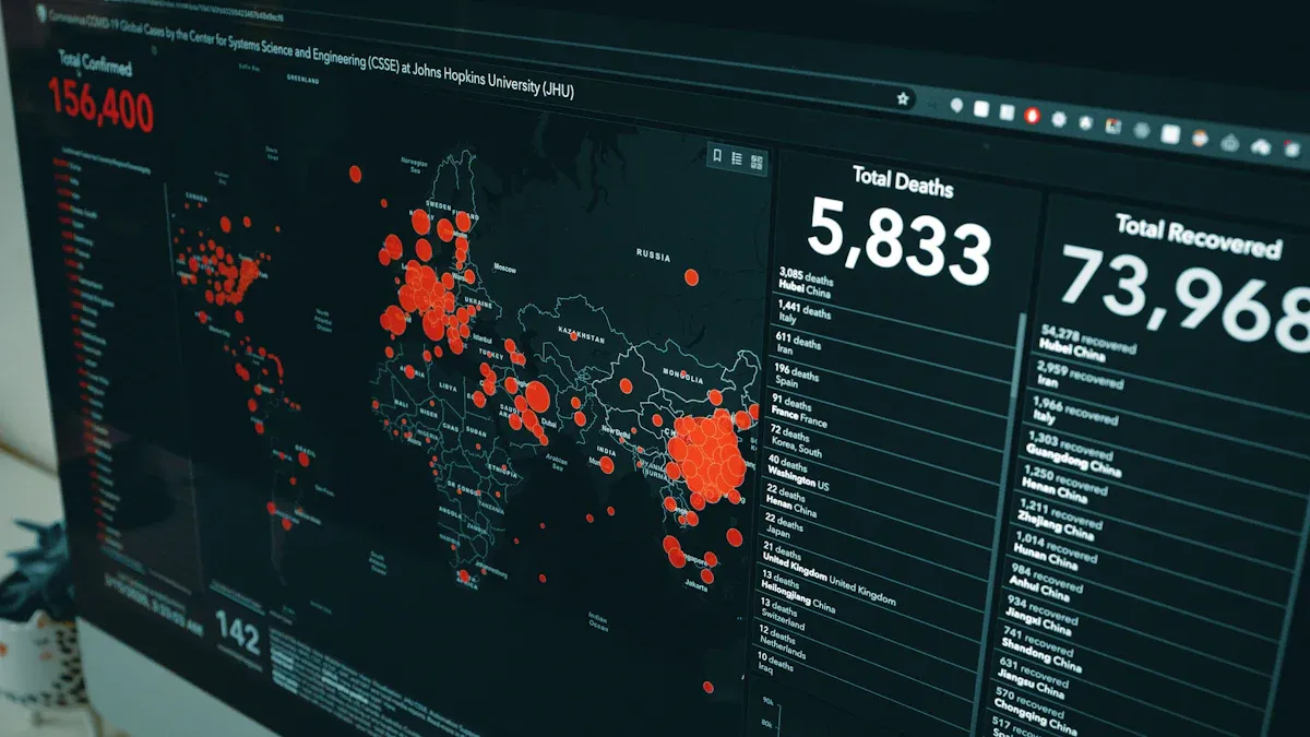
Executive overview dashboards provide a strategic dashboard for business leaders. You can view total sales, profit, costs, shipping data, and customer counts in one place. These dashboards improve visibility, enhance decision-making, and increase efficiency by consolidating key metrics. You foster better collaboration across teams and gain a comprehensive understanding of business performance. An executive dashboard acts like a GPS for your business, guiding you to make adjustments and stay on track with your goals.
| Metric | Description/Value |
|---|---|
| Total Sales | Included in dashboards |
| Total Profit | Included in dashboards |
| Total Costs | Included in dashboards |
| Shipping Costs | Included in dashboards |
| Customer Count | 18.48K |
| Total Revenue | $2.0B |
| Previous Year Comparison | Included in dashboards |
Financial analytics dashboards help you monitor your organization’s financial health and compliance. You can visualize accounting data, automate repetitive tasks, and analyze real-time budgeting, cash flow, and profit trends. These dashboards support compliance with regulations and simplify financial reporting. You prepare financial statements, investor reports, and formatted documents like profit and loss statements and balance sheets. By tracking profitability ratios, cash flow metrics, and operational efficiency indicators, you gain actionable insights for financial planning.
Marketing campaign dashboards allow you to measure campaign effectiveness and ROI. You can track lead generation, web analytics, cost per lead, and return on marketing investment. These dashboards connect various data sources and create custom visualizations for specific business questions. You analyze customer acquisition costs, lifetime value, and campaign attribution. Companies like Lenovo and Schneider Electric use Tableau dashboard examples to monitor global campaign performance and improve efficiency. You gain insights into marketing-attributed revenue, customer retention, and cross-channel attribution.
Customer insights dashboards help you understand customer behavior and preferences. You can analyze product preferences, brand performance, and consumer trends. These dashboards convert raw data into actionable insights, allowing you to explore customer interactions and uncover trends. You assess revenue distribution, demographics, and service performance metrics. By segmenting customers by age, region, and gender, you tailor marketing strategies and improve engagement.
| Type of Customer Data | Description |
|---|---|
| Revenue Distribution | Visualizes revenue across segments or categories |
| Revenue Trends Over Time | Shows revenue changes over specific periods |
| Customer Demographics | Displays age, gender, and other characteristics |
| Performance Metrics | Includes customer service scores and satisfaction levels |
Operations management dashboards provide an operational dashboard for process efficiency and resource allocation. You can view key metrics at a glance, consolidate data, and make impactful decisions. These dashboards monitor environment performance, server health, and background tasks. You track concurrent users, slow view load requests, and overall system status. By optimizing the number of data points, you enhance visual analytics and improve decision-making.
| Metric Type | Description |
|---|---|
| Environment | Performance metrics for selected environment |
| Servers | Hardware resource metrics |
| Insights | Highlights slowest views and longest extract refreshes |
| Status | Tableau Server process status |
| Performance | Health and usage of hardware resources |
| Background Tasks | Overview of background tasks and run-time histogram |
| Concurrent Users | Number of users sending requests |
Human resources dashboards support workforce planning and talent management. You gain insights into workforce demographics, hiring trends, pay rate distribution, and termination reasons. These dashboards help you manage diversity, employee retention, and satisfaction. You analyze headcount, payroll, labor turnover, new hires, and performance scores. HR dashboards create trusted metrics for leadership decisions and help tackle human capital challenges.
| HR Metric | Description |
|---|---|
| Employee Demographics | Composition of workforce, including age, gender, and tenure |
| Satisfaction Levels | Measures employee morale and engagement |
| Income Insights | Salary distributions and trends |
| Headcount | Total number of employees |
| Payroll Information | Overview of payroll expenses |
| Labor Turnover | Employee turnover rates |
| New Hires | Recruitment effectiveness |
| Performance Scores | Evaluation of employee performance |
| Absence Rates | Tracking employee absences |
| Employee Engagement | Measures engagement with work and organization |
| Well-being | Insights into employee mental health |
| Inclusion | Diversity and inclusion metrics |
| Gender Pay Gaps | Pay equity analysis |
| Length of Service | Employee tenure tracking |
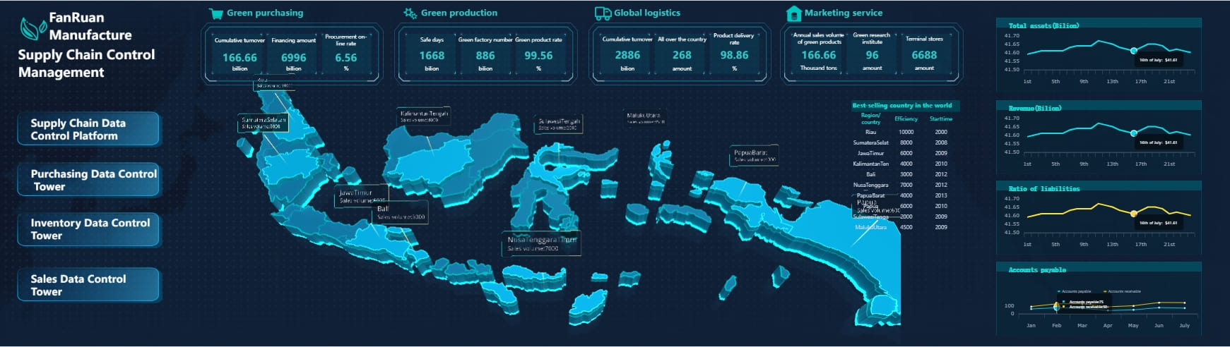
Supply chain dashboards help you optimize logistics and inventory management. You analyze shipping processes, product demand, and supplier performance. These dashboards provide real-time data visualization and advanced analytics for monitoring operations. You track inventory levels, order fill rates, on-time delivery, and cycle times. By making decisions based on valid data sources, you improve shipping modes and operational efficiency.
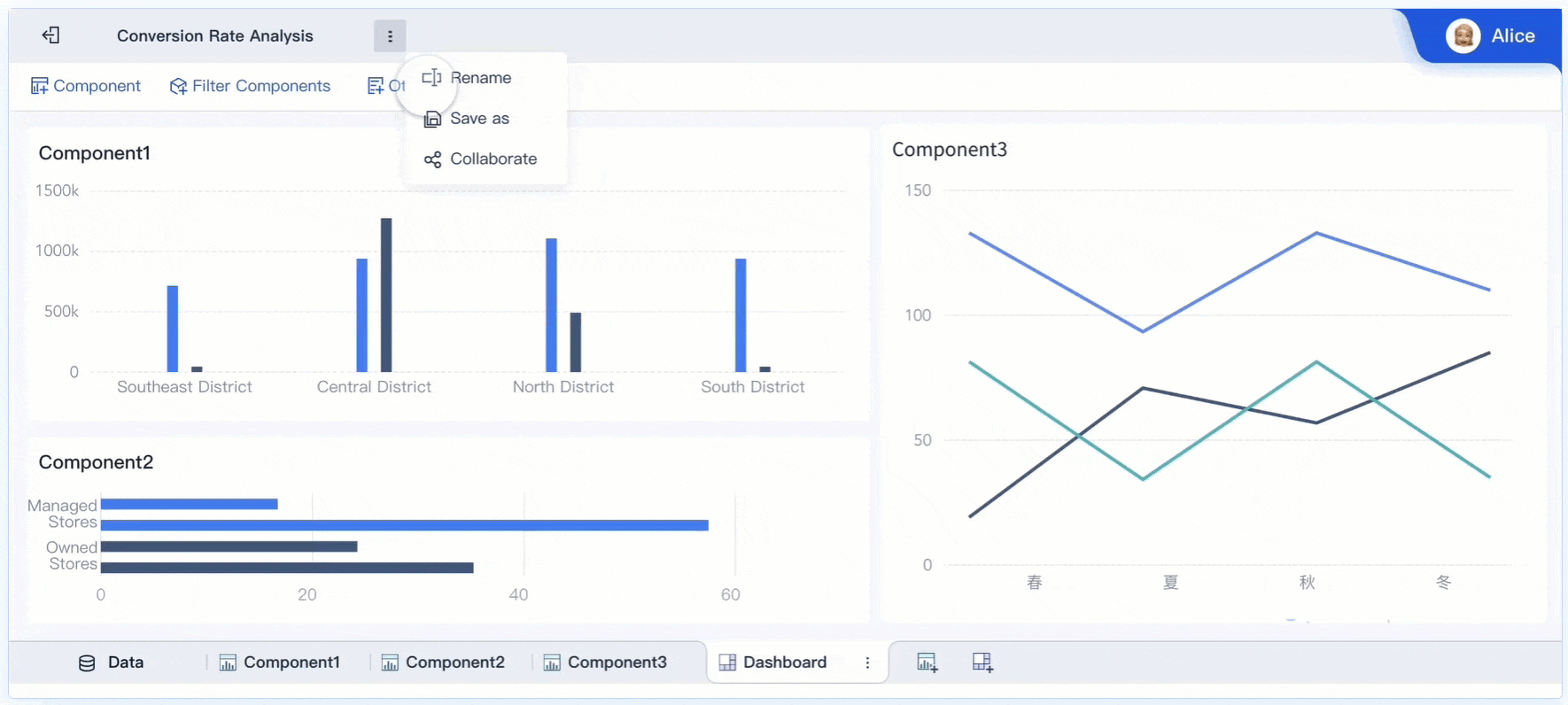
Project management dashboards facilitate project tracking and stakeholder communication. You monitor KPIs, milestones, and deliverables in real time. These dashboards improve visibility, enable proactive risk management, and guide prioritization. You keep sponsors informed and engaged without lengthy reports. By visualizing project timelines, phases, and budget consumption, you ensure better decision-making and project oversight.
| Metric | Description |
|---|---|
| Total Planned Spend | Overall financial scope of projects |
| Project Timeline | Visualizes project durations and progress |
| Project Phase | Distribution of projects across stages |
| Overall Health Assessment | Categorizes project health status |
| Active Projects Summary | Summarizes active projects by priority |
| Departmental Progress | Progress by department |
| Budget Consumption by Priority | Budget allocation by project priority |
E-commerce analytics dashboards help you monitor online sales and customer engagement. You gain insights into sales trends, customer behavior, and product usage patterns. These dashboards track product performance, customer experience, and marketing campaign analysis. You monitor sales and inventory levels, identify trends, and spot potential problems. By visualizing metrics like gross merchandise value, repeat purchase rates, and funnel performance, you improve your online business strategy.
Note: You can use FineBI to create similar e-commerce dashboards. FineBI's self-service features allow you to connect multiple data sources, visualize sales analytics, and share dashboards securely across your organization. This helps you generate actionable insights and drive business growth.
A great tableau dashboard transforms complex data into clear visuals that drive actionable insights. You should focus on three to five critical KPIs to avoid overwhelming users. When you design a strategic dashboard, provide context and narrative so users understand what the numbers mean for your business. Interactive storytelling elements, such as filters and highlights, keep users engaged and help them explore data from different angles. Consistency and clarity in design allow users to grasp information quickly. You must balance dynamic interactions with the right level of data granularity. Fast performance is essential because slow dashboards lose user interest. Adapt your dashboard to handle real-world data imperfections so decision-makers can rely on the results.
A great tableau dashboard does more than display numbers. It explains why those numbers matter. You can add annotations and explanations to clarify trends and outliers. This approach turns raw data into insights that support business intelligence and help you make better decisions.
You can create a great tableau dashboard by following proven best practices. First, know your audience. Design with their business goals in mind. Consider where users will view the dashboard most often, such as desktop or mobile. Optimize for fast load times to keep users engaged. Place important views in the top left corner, which is the sweet spot for visibility. Limit the number of views and colors to maintain focus.
Enable highlighting so users can interactively explore data. Use filters carefully to avoid slowing down performance. Tweak dashboard design by using fixed sizes and optimizing queries. When you compare Tableau and FineBI, you see both tools offer self-service analytics and user-friendly dashboard creation. Tableau excels in advanced visualization and interactive features. FineBI provides a drag-and-drop interface and real-time analytics, making it easy for business users to create dashboards without technical skills. Both platforms help you turn data into actionable insights for your organization.
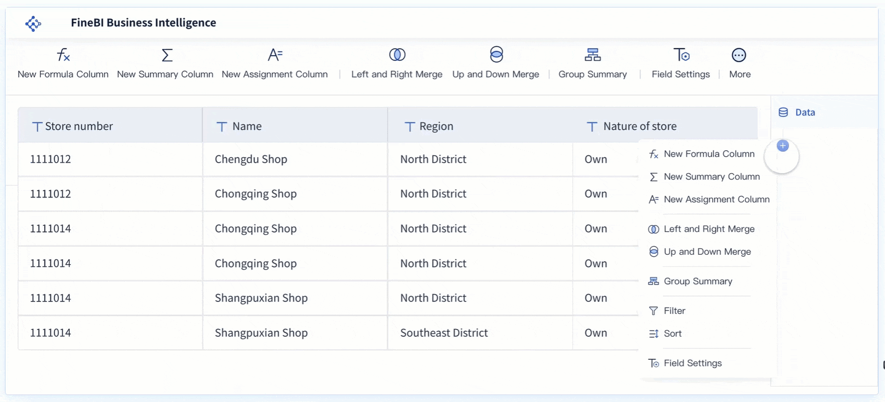
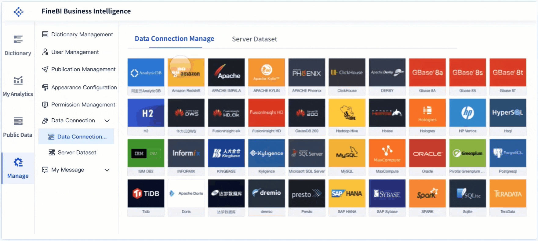
FineBI gives you a structured workflow that makes dashboard creation simple and efficient. You start by connecting to your data sources. FineBI supports over 60 connectors, including relational databases, cloud data warehouses, and big data platforms. You can also upload files or connect to APIs for real-time data. After integration, you process your data by building datasets, joining tables, and adding calculated fields. FineBI’s built-in ETL functions let you clean and transform data without coding.
Next, you move to visual exploration. FineBI’s drag-and-drop interface lets you create charts, tables, and maps quickly. You can apply filters, customize layouts, and save templates for reuse. When your dashboard is ready, you publish and share it securely. FineBI offers role-based permissions and audit trails, so you control who accesses your business insights.
| Feature | FineBI | Tableau |
|---|---|---|
| Data Integration | Built-in ETL, big data and multi-dimensional database support | Customization, drag-and-drop for quick analysis |
| Visual Exploration | Rapid analysis and visualization of business data | Advanced visualization, interactive dashboards |
| Target Users | Enterprise focus | User-friendly for quick tasks, training needed for complex tasks |
FineBI empowers you to build dashboards without technical skills. You use a self-service, drag-and-drop interface to select data, create visualizations, and arrange components. FineBI recommends the best visual effects based on your data, making analysis faster and more accurate. You can merge multiple datasets, filter and sort data, and create unified reports with adaptive layouts.
FineBI stands out with features designed for collaboration and governance. You can share dashboards through public links, enable data sharing, and work with your team in real time. The platform supports component linkage, so you can analyze related data across different views. FineBI also includes AI-driven insights, helping you spot trends and outliers automatically. With robust governance tools, you manage permissions and ensure data security across your organization.
FineBI helps you turn complex data into actionable business insights, supporting your decision-making at every step.
Selecting the right dashboard tool can shape how you analyze data and make decisions. You need to consider several factors before choosing between Tableau and FineBI. Start by looking at how each platform supports visual data exploration. A good dashboard tool lets you create visualizations and share insights easily. You should also check deployment options. Some tools work best in the cloud, while others support on-premises or hybrid setups. Make sure the tool fits your current systems.
Governed self-service analytics is another key point. The platform should empower both IT and business users, providing a secure environment for data-driven decision-making. Total cost of ownership matters as well. Look beyond the initial price and consider long-term costs, including support and upgrades. Finally, choose a vendor with a strong commitment to customer success. Companies with a history of innovation and active user communities often provide better support.
| Criteria | Description |
|---|---|
| Visual Data Exploration | Enables users to create and share visualizations easily |
| Deployment Options | Supports cloud, on-premises, or hybrid setups |
| Governed Self-Service | Empowers IT and business users with secure analytics |
| Total Cost of Ownership | Considers all costs, not just the initial purchase |
| Customer Success Commitment | Focuses on user satisfaction and ongoing support |
When you compare Tableau and FineBI, you see strengths in both platforms. Tableau offers advanced visualization and interactive features. You can build complex dashboards and explore data in depth. FineBI stands out for its self-service analytics and ease of use. You can connect to over 60 data sources, process data with built-in ETL, and create dashboards with drag-and-drop simplicity. FineBI supports real-time analytics and enterprise-level governance, making it suitable for large organizations.
Scalability is important if your business grows quickly. FineBI’s high-performance engine supports thousands of users and massive datasets. Tableau also scales well but may require more technical expertise for complex deployments. If your organization needs both structured reporting and dynamic analysis, consider FineReport vs FineBI. FineReport handles complex reporting, while FineBI enables business users to perform ad-hoc analysis independently. This combination helps you meet diverse data needs and improve decision-making.
Tip: Review your business requirements and technical resources before making a final choice. The right dashboard tool will help you unlock insights from the top Tableau dashboard examples for business insights and drive better outcomes.
You gain a clear advantage when you use Tableau dashboard examples for actionable business insights. These dashboards give you a unified view of your data and help you avoid scattered information. You see real-time updates, which means you always work with the latest numbers. Visualizing key performance indicators makes complex data easy to understand and supports better decisions.
Apply these dashboard examples to your own business or adapt them for your needs. Choose the right BI tool for your goals. Tableau and FineBI both offer strong solutions for different scenarios.
What is a Dashboard and How Does It Work
Store Performance Dashboard: Your Retail Command Center
How to Craft an Effective Analytics Dashboard
What is a Digital Dashboard and How Does It Work
What is a KPI Dashboard and Why Your Business Needs One


The Author
Lewis
Senior Data Analyst at FanRuan
Related Articles
Payment Analytics Dashboard: 12 KPIs Every Operations Leader Should Track to Cut Revenue Leakage
Losing revenue to declines? Discover 12 essential KPIs to track in your payment analytics dashboard to stop leakage and manage disputes.
Lewis Chou
May 05, 2026

SOC Dashboard Explained: 12 Essential KPIs, Views, and Workflows Security Teams Use
Learn about SOC dashboards, the 12 essential KPIs for security teams, and how they centralize alerts and workflows for faster threat detection and response.
Lewis Chou
May 05, 2026

EMR Dashboard Guide: 12 Metrics to Track for Faster Clinical and Operational Decisions
Learn the 12 essential EMR dashboard metrics to track for faster clinical and operational decisions, improving patient flow and revenue cycle management.
Lewis Chou
May 05, 2026


