A workforce metrics dashboard is not just an HR reporting tool. In practice, it is an executive decision system that turns workforce data into signals leaders can act on quickly. For CHROs, CEOs, CFOs, COOs, and business unit leaders, the value is simple: better visibility into hiring capacity, retention risk, labor cost, productivity, and organizational health.
Most organizations already have workforce data. The problem is that the data is fragmented, inconsistent, and buried inside HRIS, ATS, payroll, performance, engagement, and scheduling systems. Executives do not need more spreadsheets. They need a clear view of what is changing, why it matters, and what decisions to make next.
An effective workforce metrics dashboard closes that gap. It helps leadership answer questions like:
Are we hiring fast enough to support growth?
Where is turnover becoming a business risk?
Is labor cost rising faster than productivity?
Which teams are showing early warning signs of burnout or disengagement?
Do we have the workforce capacity to execute the next quarter’s plan?
That is the difference between operational HR reporting and executive-level workforce visibility. Operational reports are built to track transactions, compliance, and process completion. Executive dashboards are built to support business decisions. They connect people metrics directly to outcomes such as revenue growth, margin protection, customer service levels, execution capacity, and risk exposure.
Click To Try The Dashboard
What a workforce metrics dashboard is and why executives rely on it
A workforce metrics dashboard is a centralized visual view of the workforce indicators that matter most to leadership. It consolidates data across people systems and presents the few metrics executives need to monitor the health, cost, stability, and performance of the workforce.
Executives rely on it because workforce decisions are expensive and time-sensitive. Delayed hiring affects growth. Poor retention drives replacement costs and capability loss. Overtime and absenteeism can erode margins. Weak performance visibility creates planning risk. A strong dashboard makes these issues visible before they become operational problems.
At the executive level, the dashboard should do three things well:
Show current workforce status through a concise set of KPIs
Reveal trends and exceptions so leaders can spot change early
Support action by linking metrics to business impact and decision options
Key Metrics (KPIs) executives typically expect in a workforce metrics dashboard
Below is a focused KPI structure that works well for executive review. Every metric should have a clear formula, owner, refresh schedule, and decision purpose.
Headcount
Total active employees by period. Used for capacity planning and growth tracking.
Net headcount change
The change in total workforce over time after hires and exits. Shows whether staffing is expanding or contracting.
Step 1: Align the dashboard with executive decisions
Start with the business questions leaders need answered
The first mistake many teams make is starting with available data instead of strategic questions. A workforce metrics dashboard should begin with the decisions executives need to make repeatedly.
Common leadership questions include:
How quickly can we scale hiring without damaging quality or cost?
Which business units are most exposed to retention risk?
Are labor costs aligned with current revenue and productivity levels?
Where do we need workforce restructuring, redeployment, or automation?
Which roles or locations need immediate workforce planning attention?
Once those questions are clear, map each one to the minimum set of supporting metrics.
For example:
Hiring pace decision
Open roles, time to fill, offer acceptance rate, hiring rate, recruiter capacity
Total labor cost, overtime cost, labor cost per unit or revenue, absenteeism, contingent labor usage
Workforce planning decision
Headcount trend, vacancy rate, span of control, internal mobility, productivity by function
This creates a dashboard that is decision-led rather than report-led.
Define the audience, cadence, and ownership
A dashboard built for a CEO should not look the same as one built for HR operations. Define the intended audience early so the dashboard reflects how leaders consume information.
At a minimum, specify:
Primary users
Executive committee, CHRO, CFO, COO, business unit leaders, regional leaders
Review cadence
Weekly for fast-moving talent environments, monthly for executive reviews, quarterly for strategic planning
Dashboard owner
Usually HR analytics, people operations, or a BI team with executive reporting accountability
Data stewards
Owners for HRIS, ATS, payroll, engagement, and performance systems
Escalation process
Who investigates anomalies, validates numbers, and communicates corrections
If no one owns definitions, refresh timing, and quality control, trust in the workforce metrics dashboard will collapse quickly.
Step 2: Choose the workforce metrics that matter most
Prioritize a focused set of indicators
Executives do not need twenty charts on one screen. They need a short list of high-value indicators that explain workforce health and signal where intervention is needed.
A practical approach is to limit the top layer of the dashboard to:
6 to 10 core KPIs
3 to 5 trend visuals
2 to 4 exceptions or risk alerts
Optional drill-downs for deeper segmentation
Balance lagging indicators and leading indicators.
Lagging indicators tell leaders what already happened:
Turnover
Headcount change
Labor cost
absenteeism
performance outcomes
Leading indicators help predict what may happen next:
Engagement scores
offer acceptance rate
internal mobility
hiring pipeline health
overtime spikes
manager-level retention signals
This balance is what makes a workforce metrics dashboard strategic instead of historical.
Group metrics by business objective
The cleanest executive dashboards are organized around business priorities, not around source systems. That makes them easier to scan and easier to act on.
Useful metric groups include:
Headcount and workforce composition
Total headcount, FTE mix, contingent labor, span of control
Hiring and talent acquisition
Open roles, time to fill, hiring rate, offer acceptance, source effectiveness
Retention and workforce stability
Voluntary turnover, regrettable attrition, early tenure exits, internal mobility
Payroll for compensation, overtime, and labor cost
Performance systems for review outcomes and goal completion
Engagement platforms for sentiment and survey data
Scheduling or workforce management systems for hours, shifts, attendance, and absence
The critical challenge is consistency. Many organizations calculate the same metric differently across teams. One department may define turnover using monthly average headcount, while another uses period-end headcount. One region may track active employees differently from another.
Standardize:
Metric formulas
Time periods
Job families and business segments
Location naming conventions
Manager hierarchies
Inclusion and exclusion rules
Treatment of contingent workers, interns, and leave status
Executives will not trust a workforce metrics dashboard if the number changes depending on who pulls the report.
Establish governance and refresh rules
Strong governance keeps the dashboard credible over time. This is where many dashboard projects fail after launch.
Create a simple governance model covering:
Refresh frequency
Daily, weekly, monthly, or by system type
Data quality checks
Missing values, duplicate employees, outlier detection, reconciliation against source systems
Access permissions
Role-based visibility for sensitive people data
Version control
Clear handling of logic changes and metric revisions
Definition management
A metric dictionary everyone can reference
Approval workflow
Review and signoff process before executive release
A trusted workforce metrics dashboard is not just visually polished. It is operationally governed.
Step 4: Design the dashboard for executive clarity
Make the most important insights visible first
Senior leaders have limited time. The first screen should answer the most important questions in seconds.
A proven layout structure is:
Top summary KPIs
Headcount, voluntary turnover, time to fill, labor cost, absenteeism, revenue per employee
Trend section
6 to 12 month views showing whether metrics are improving, stable, or deteriorating
Benchmark and target view
Current vs goal, budget, historical baseline, or internal comparison
Exception panel
Business units, locations, or functions showing elevated risk
The executive lens should be built around signal detection, not visual density. Show what changed. Show how big the change is. Show where attention is needed.
Useful design practices include:
Keep charts simple and labeled directly
Use color sparingly for exception signaling
Show trends over time, not isolated point values
Add targets and thresholds wherever possible
Surface outliers clearly
Avoid decorative visuals that do not improve interpretation
Use segmentation without adding clutter
Executives often need to move from enterprise view to targeted diagnosis. That is where segmentation matters.
Useful segmentation layers include:
Department
Business unit
Location
Role family
Tenure band
Manager
Employment type
Diversity segment where appropriate and compliant
The key is progressive disclosure. Do not overwhelm the main dashboard with every cut of the data. Keep the top view clean, then let leaders drill into problem areas.
For example, if voluntary turnover rises, leaders should be able to quickly see whether the issue is concentrated in:
New hires under 12 months
A specific manager population
High-demand roles
A single region
Underrepresented employee groups
That is how a workforce metrics dashboard moves from monitoring to diagnosis.
Step 5: Add context that turns metrics into decisions
Connect trends to business impact
Metrics without context create passive reporting. Executive dashboards need interpretation.
For each key metric, leaders should be able to answer:
What changed?
Why does it matter?
What is the likely business impact?
What action should we consider next?
For example:
If time to fill rises in revenue-generating roles, sales capacity may be constrained.
If absenteeism increases in operations, service levels and overtime costs may deteriorate.
If regrettable attrition rises among high performers, capability risk and replacement cost increase.
If labor cost grows faster than revenue, margin pressure may require workforce redesign.
Always compare current values against relevant context:
Target
Prior period
Prior year
Budget
Internal benchmark
External benchmark where available
This framing helps leaders judge whether a number is normal, improving, or a strategic concern.
Pair quantitative data with narrative insight
One of the most overlooked design choices is adding short commentary beside the metrics. Busy executives often need one or two lines of interpretation more than they need another chart.
Effective commentary might include:
A concise explanation of the shift
The likely root cause
The affected teams or roles
A proposed next step
For example:
Voluntary turnover increased 1.8 points quarter over quarter, driven primarily by customer support roles in two high-volume locations. Early tenure exits account for 42% of the increase. Recommend manager review and onboarding redesign.
That kind of note turns a dashboard into a management tool.
Step 6: Launch, review, and improve continuously
Test the dashboard with real leadership scenarios
Before broad rollout, test the dashboard with realistic executive use cases. Ask leaders to use it to answer urgent workforce questions.
Examples:
Which business unit has the highest near-term retention risk?
Are we on track to staff the next product launch?
Where is labor cost increasing without matching productivity gain?
Which locations require hiring intervention this month?
Watch where users hesitate. That reveals whether metrics are missing, visuals are unclear, or drill paths are too complex.
A good pilot process typically includes:
Executive walkthrough sessions
Role-specific feedback collection
Accuracy validation against known reports
Testing of mobile and board-ready export views
Revision of low-value or confusing elements
Create a regular optimization process
A workforce metrics dashboard should evolve with the business. What matters during aggressive growth may differ from what matters during restructuring, cost containment, or post-merger integration.
Set a recurring review process to evaluate:
Which metrics are used most often
Which visuals are ignored
Which filters create confusion
Which decisions the dashboard improved
Which new workforce risks have emerged
Retire low-value metrics. Add new measures only when they support real decisions. Reconfirm that the dashboard is still aligned with strategy, not just legacy reporting habits.
Common mistakes to avoid when building an executive workforce dashboard
Even mature organizations make the same dashboard errors repeatedly. Avoid these pitfalls if you want adoption at the executive level.
Tracking too many metrics without clear decision value
More data does not create more insight. If a metric does not support a specific decision, remove it.
Using inconsistent definitions across systems or teams
Conflicting turnover, headcount, or labor cost calculations destroy credibility fast.
Showing data without benchmarks, trends, or recommended actions
A number by itself rarely tells leaders what to do.
Designing for analysts instead of busy senior leaders
Executives need clarity, speed, and prioritization. They do not need an analytics sandbox on the front page.
Failing to assign ownership
If no one owns refreshes, definitions, and quality checks, the dashboard will decay.
Overloading the visual layer
Too many colors, charts, or dimensions create friction and reduce adoption.
Final checklist for building a dashboard executives will actually use
Use this checklist before launch and at every quarterly review.
Confirm the business decisions the dashboard supports
Define the executive audience and review cadence
Limit the dashboard to a focused set of meaningful workforce measures
Balance leading and lagging indicators
Verify data quality, ownership, and refresh timing
Standardize formulas, time windows, and segmentation logic
Present summary KPIs first, followed by trends and exceptions
Add targets, benchmarks, and historical comparisons
Include concise action-oriented commentary
Enable drill-downs without cluttering the top-level view
Test the dashboard in real leadership scenarios
Review usage regularly and retire low-value metrics
Best practices to implement a workforce metrics dashboard successfully
If you want the dashboard to drive executive action rather than become another static report, follow these practical implementation steps.
1. Start with an executive workshop, not a data pull
Bring together HR, finance, operations, and leadership to identify the five to seven workforce decisions that matter most over the next two quarters. This prevents dashboard sprawl and creates executive ownership from day one.
2. Build a KPI dictionary before building visuals
Document every metric definition, formula, owner, source system, and refresh rule before design begins. This is one of the highest-leverage moves you can make for long-term trust.
3. Prototype one high-value view first
Do not launch with a massive enterprise dashboard. Start with one executive summary page covering headcount, hiring, retention, labor cost, and productivity. Pilot it, improve it, then expand.
4. Add exception-based alerts
Executives should not have to hunt for problems. Configure the dashboard to flag threshold breaches such as high regrettable attrition, sudden absenteeism spikes, or labor cost overruns.
5. Embed the dashboard into business reviews
A workforce metrics dashboard only matters if it becomes part of the operating rhythm. Use it in monthly business reviews, talent reviews, workforce planning sessions, and board updates.
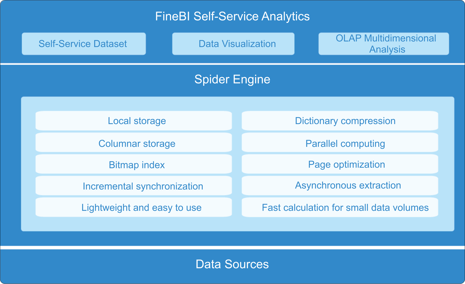
Build faster with FineBI instead of doing it manually
Building a reliable workforce metrics dashboard manually is complex. You need to connect multiple systems, standardize definitions, manage refresh rules, design executive-friendly views, and maintain trust over time. For most organizations, that means heavy spreadsheet work, slow reporting cycles, and constant version-control problems.
This is where FineBI becomes the practical solution.
With FineBI, teams can utilize ready-made templates and automate this entire workflow. Instead of stitching together HRIS, payroll, ATS, and performance data by hand, you can create a centralized, governed analytics layer that supports executive reporting at scale.
Integrate workforce data from multiple business systems
Build interactive executive dashboards faster
Apply consistent KPI definitions across the organization
Automate refresh schedules and reduce manual reporting
Enable drill-down analysis by department, location, role, tenure, or manager
Deliver cleaner, more actionable dashboards for leadership reviews
For enterprises that want a workforce metrics dashboard executives will actually trust and use, the goal is not just to visualize data. It is to operationalize decision-making. FineBI makes that far easier by combining speed, governance, and ready-to-use dashboard capabilities in one platform.
If your team is still building workforce reporting manually, this is the right time to simplify the process. Use FineBI to shorten implementation time, improve data consistency, and turn workforce analytics into an executive advantage.
FAQs
A workforce metrics dashboard is a centralized view of the people KPIs executives use to monitor hiring, retention, labor cost, productivity, and organizational health. Its purpose is to turn fragmented HR data into timely business decisions.
The most useful executive metrics usually include headcount, net headcount change, time to fill, hiring rate, voluntary turnover, labor cost, revenue per employee, absenteeism, engagement, and internal mobility. The right mix depends on the business decisions leaders need to make.
Standard HR reporting focuses on transactions, compliance, and process tracking, while a workforce metrics dashboard is built for decision-making. It highlights trends, exceptions, and business impact so leaders can act faster.
Update frequency depends on the metric and the pace of the business, but many executive dashboards refresh weekly or monthly. High-impact areas like hiring, turnover, and labor cost often need more frequent review during periods of change.
An effective dashboard is focused, easy to read, and directly tied to strategic questions such as growth capacity, retention risk, and margin pressure. It should show only the metrics that support action, not every HR number available.
Product Trial
FineReport
Pixel-perfect reports · Interactive dashboards · Easy data entry · Digital twins