Executives do not need another report. They need a decision tool.
That is the real difference between weak and effective cfo dashboard examples. A CFO dashboard should help leaders identify what changed, why it matters, and what action to take next. If your current dashboard forces executives to click through tabs, decode finance jargon, or sit through verbal explanations just to understand the story, adoption will stay low.
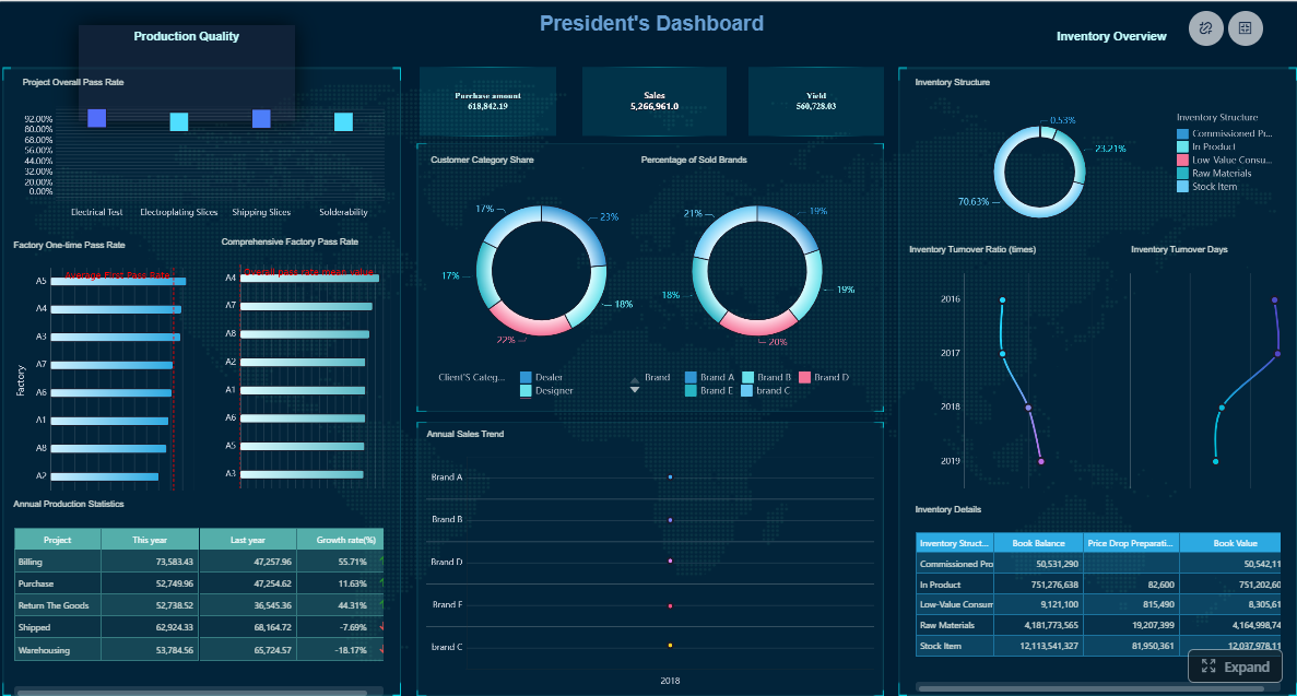
For CFOs, finance directors, FP&A leaders, and operations executives, the stakes are high. Poor dashboard design leads to slower decisions, inconsistent interpretations, and wasted time in leadership reviews. A great CFO dashboard creates a shared financial picture across the executive team. It brings clarity to liquidity, profitability, risk, and capital allocation in a format leaders can scan in seconds.
This guide breaks down what the best CFO dashboards have in common, which KPIs matter most, how to structure the experience for executive use, and how to build a dashboard that remains trusted over time.
Define the dashboard’s primary purpose: faster executive decisions, not more reporting
A CFO dashboard should answer one core question: What does leadership need to decide right now?
That purpose immediately changes what belongs on the page. Instead of trying to summarize every finance process, the dashboard should focus on signals tied to executive action, such as:
Is liquidity tightening?
Are margins slipping versus plan?
Which business units are off-forecast?
Where is financial risk increasing?
Are capital investments producing returns?
If a metric does not support a real executive question, it probably does not belong on the top layer of the dashboard.
Separate strategic signals from operational detail so leaders can scan the story in seconds
Executives want the headline first. Analysts want the supporting detail. Strong CFO dashboards respect that difference.
The top view should show strategic signals: trend, variance, threshold breaches, and business impact. Operational detail should sit beneath the summary or behind drill-down paths. This prevents the common mistake of mixing board-level indicators with transactional noise.
A simple rule works well: summary on entry, detail on demand.
Prioritize clarity, consistency, and trust over flashy visuals
Finance dashboards are not marketing microsites. They should feel precise, calm, and dependable.
The most effective dashboards use:
Consistent definitions
Stable layouts
Limited chart types
Clear labels
Visible thresholds
Obvious variance markers
Trust comes from repeatability. If EBITDA is calculated one way this month and another way next month, adoption collapses. If the same KPI appears in different formats across reports, leaders stop relying on the dashboard.
Align every metric, chart, and alert to a specific executive question
Every element should earn its place.
Before adding a metric or visualization, ask:
What decision does this support?
Who owns the response?
What threshold makes this actionable?
What follow-up detail may be needed?
This creates a dashboard that feels like an operating system for financial leadership, not a collection of unrelated charts.
The exact dashboard will vary by industry, business model, and growth stage. Still, most executive finance dashboards revolve around liquidity, profitability, forecast reliability, and capital efficiency.
Key Metrics (KPIs)
Below is a structured KPI set commonly used in strong cfo dashboard examples:
Cash Balance: Total cash on hand available at a given point in time.
Operating Cash Flow: Cash generated or consumed by core business operations.
Burn Rate: Net cash outflow over a period, especially relevant for high-growth or pre-profit companies.
Cash Runway: Estimated months the company can operate at current burn levels.
Working Capital: Current assets minus current liabilities; indicates short-term financial flexibility.
Revenue Growth: Percentage increase or decrease in revenue over a defined period.
Gross Margin: Revenue minus cost of goods sold, expressed as a percentage of revenue.
EBITDA: Earnings before interest, taxes, depreciation, and amortization; a key profitability proxy.
Net Margin: Net income as a percentage of revenue.
Cost-to-Revenue Ratio: Operating costs relative to revenue; useful for efficiency monitoring.
Budget vs. Actual Variance: Difference between planned and actual performance.
Forecast vs. Actual Accuracy: Measures how closely forecasts match actual results.
Debt Exposure: Total debt position and related leverage profile.
Covenant Status: Whether lending or financing conditions are being met.
ROI: Return on investment for projects, initiatives, or capital deployment.
Investment Performance: Ongoing performance of strategic investments or business bets.
Cash, liquidity, and runway
Cash visibility is usually the first thing executives look for. Even profitable businesses can run into strategic constraints if liquidity weakens.
Short-term liquidity risk should be impossible to miss. Use thresholds, directional arrows, and variance indicators to show when the company is moving toward a tighter position.
For example, a CFO should be able to tell at a glance whether the company has:
Stable liquidity
Temporary pressure tied to timing
Structural deterioration needing intervention
Profitability, margin, and efficiency
Executives expect a dashboard to connect top-line growth with actual value creation.
This section should include:
Revenue growth
Gross margin
EBITDA
Net margin
Cost-to-revenue ratios
Department or business unit contribution
The most useful presentation compares current performance against three anchors:
Budget
Forecast
Prior period
That comparison matters because a business can be growing year over year and still underperforming plan. A dashboard that only shows one reference point can create false confidence.
Risk, forecast accuracy, and capital allocation
High-value CFO dashboards do more than report outcomes. They reveal reliability and risk.
This section should surface:
Forecast versus actuals
Debt exposure by type and maturity
Covenant status
ROI by investment category
Capex or strategic initiative performance
Areas of rising financial risk
Executives want to know not only what happened, but whether they can trust the current forward view. Forecast accuracy is therefore a core finance credibility metric, not just an FP&A metric.
How to structure a dashboard executives will actually use
A dashboard can contain the right KPIs and still fail because the layout fights executive behavior. Structure determines usability.
Start with an executive summary row
The first row should function like a financial topsheet.
Include a compact set of headline KPIs with:
Current value
Trend direction
Variance to target or plan
Exception flags
This row should answer the executive’s opening scan:
Are we healthy?
What changed?
Where should I focus?
Use plain-language labels wherever possible. Not every executive viewing the dashboard will be finance-native. Clear wording improves adoption across CEOs, COOs, business unit leaders, and board participants.
The page should mirror the way leaders review performance.
A practical decision flow is:
Company-wide financial health
Business unit or region performance
Underlying drivers and variances
Exceptions requiring action
This sequencing reduces context switching. It keeps the dashboard aligned with executive meeting flow instead of forcing users to jump between unrelated widgets.
Group related metrics together. For example:
Liquidity metrics in one block
Profitability metrics in another
Risk and forecast metrics in a third
This creates cognitive order and shortens meeting time.
Make drill-down paths obvious
Drill-down is only useful if leaders can navigate it without friction.
Executives should be able to move from a summary metric into:
Region
Product line
Customer segment
Time period
Business unit
Cost center
The key is preserving context. If a user clicks from gross margin into product detail, they should still know which period, segment, and comparison baseline they are viewing.
Good drill-down design avoids the feeling of “falling into the data warehouse.” It should feel guided, fast, and reversible.
Design is not cosmetic. It directly affects whether a dashboard gets used in real decision cycles.
Use visual hierarchy and restraint
The eye should be drawn first to what matters most.
Use position, size, and restrained color to emphasize material changes. Avoid overloading the page with every chart type available. Too much variety slows interpretation.
Best practices include:
Put the most critical KPIs top left or top center
Use color sparingly for status and exception handling
Standardize chart types for similar comparisons
Remove decorative elements that add no analytical value
If everything is highlighted, nothing is highlighted.
Add context, benchmarks, and ownership
Raw numbers are rarely enough in executive settings.
Each major KPI should be paired with context such as:
Target
Budget comparison
Prior-period comparison
Brief commentary
Assigned owner
Ownership matters in live meetings. When a number is off-track, leaders immediately ask who is accountable and what is being done. Dashboards that include metric ownership reduce meeting friction and increase accountability.
Stable layouts and stable definitions are critical. If the dashboard changes too frequently, users lose familiarity. If it is too rigid, it becomes stale. The balance is a consistent framework with evolving metrics as business priorities shift.
Also make sure the dashboard remains useful in multiple contexts:
Most dashboard failures are not caused by missing data. They are caused by poor prioritization and weak design discipline.
Common issues include:
Showing too many KPIs without a clear decision hierarchy
Executives do not need 40 equal-priority numbers on one screen. They need signal, not volume.
Mixing strategic metrics with low-level transactional detail on the same view
This blurs the story and makes the dashboard feel cluttered.
Hiding data quality issues, calculation logic, or metric definitions
If leaders question the numbers, adoption falls immediately.
Creating drill-downs that are technically possible but too slow or confusing to use
Usability matters as much as access. If drill paths interrupt meeting flow, people stop using them.
Another common mistake is designing the dashboard for the finance team while labeling it “executive.” A true executive dashboard is shorter, clearer, and more decision-oriented.
A practical process to build and refine your CFO dashboard
A strong dashboard is rarely perfect on version one. It should be built through structured iteration, grounded in real executive behavior.
Gather executive questions before selecting KPIs
Start with stakeholder interviews, not metric libraries.
Ask executive users:
What recurring decisions does this dashboard need to support?
Which financial questions come up in every review?
What surprises are most damaging?
Which metrics trigger action versus discussion only?
Then translate those questions into a focused KPI model and reporting structure.
For example:
“Are we on track for the quarter?” becomes revenue, EBITDA, and budget variance tiles.
“How much risk is building in the business?” becomes liquidity, covenant, and forecast confidence indicators.
“Where are returns strongest?” becomes ROI and capital allocation views.
This approach keeps the dashboard anchored to executive utility.
Prototype, test, and iterate with real reviews
Do not wait for a polished final build before testing.
Create a prototype and use it in actual executive sessions. Observe:
Which widgets get referenced
Which areas create confusion
Where leaders ask for drill-down
Which views trigger action
Which elements are ignored
Then refine ruthlessly. Remove widgets that no one uses. Expand sections that consistently drive decisions.
This is how high-performing dashboards evolve from “informative” to “indispensable.”
Create a governance plan for long-term usefulness
Even the best dashboard degrades without governance.
Governance ensures the dashboard remains trusted as systems, teams, and priorities change. It also protects against the slow drift that causes one department’s version of revenue or margin to differ from another’s.
Best practices for implementing CFO dashboards successfully
If you want a dashboard executives actually use, follow these practical consultant-level recommendations.
1. Limit the executive layer to the metrics that drive decisions
Keep the top layer focused. Most executive dashboards work best with a concise summary row and a small number of grouped sections. Push secondary diagnostics into drill-down views rather than the homepage.
2. Define thresholds before launch
A KPI without a threshold is just a number. Set what counts as healthy, cautionary, or critical before rollout. This makes alerts meaningful and enables faster executive interpretation.
3. Build one source of metric truth
Standardize definitions across finance, FP&A, operations, and business units. If EBITDA, cash flow, or working capital are calculated differently in different tools, the dashboard will become a debate platform instead of a decision platform.
4. Test with live meeting behavior, not only user feedback
Users may say they like a dashboard, but actual usage patterns tell the truth. Watch how leaders navigate it during reviews. Measure what gets opened, what gets ignored, and where discussion gets stuck.
5. Assign owners to every critical metric and dashboard section
When a KPI goes red, someone should already own the explanation and corrective action. This turns the dashboard into an accountability mechanism, not just an information display.
Build smarter CFO dashboards with FineBI
Building this manually is complex. You need to integrate multiple data sources, standardize metric logic, design drill-down paths, maintain refresh schedules, and keep the user experience simple enough for executives while still powerful enough for analysts.
With FineBI, finance teams can use ready-made templates and automate this entire workflow. Instead of building a CFO dashboard from scratch in spreadsheets, disconnected BI tools, or custom-coded reporting layers, organizations can accelerate deployment with a platform designed for scalable analytics and executive visibility.
Consolidate data from ERP, CRM, budgeting, and operational systems
Build executive-ready financial dashboards faster
Use consistent KPI definitions across the organization
Create intuitive drill-down paths from summary to detail
Automate refreshes, permissions, and recurring reporting workflows
Adapt templates for different review cadences and leadership needs
For enterprise teams, this is not just a productivity improvement. It is a governance and adoption advantage. A dashboard that is easier to maintain is more likely to stay trusted, current, and widely used.
If your goal is to create the kind of cfo dashboard examples executives rely on every week, FineBI provides a practical path: faster implementation, stronger consistency, and less manual reporting overhead. In short, building this manually is complex; use FineBI to utilize ready-made templates and automate this entire workflow.
FAQs
A useful CFO dashboard should focus on the few metrics that drive executive decisions, such as cash position, operating cash flow, margin performance, budget versus actuals, forecast accuracy, debt exposure, and ROI. The goal is to show financial health, risk, and trend changes at a glance.
A CFO dashboard is a live decision tool that gives executives a fast, visual view of current performance and exceptions. A financial report is usually more detailed, static, and designed to document results for a specific period.
The most important KPIs usually include cash balance, operating cash flow, working capital, revenue growth, gross margin, EBITDA, net margin, budget variance, forecast accuracy, and covenant status. The right mix depends on the company’s business model, risk profile, and growth stage.
Keep the top layer simple, consistent, and tied to real executive questions. Show summary first, highlight variances and thresholds clearly, and let users drill into detail only when they need context.
Most CFO dashboards should refresh as often as the business needs timely decisions, which is often daily or near real time for cash, forecast, and risk signals. The key is using reliable data definitions so leaders trust the numbers every time they open it.
Product Trial
FineReport
Pixel-perfect reports · Interactive dashboards · Easy data entry · Digital twins