An effective agile metrics dashboard should do far more than display team activity. It should improve delivery decisions, expose risk early, and make progress discussions more grounded, faster, and less emotional. For engineering leaders, delivery managers, Scrum Masters, and product stakeholders, the right dashboard becomes a practical operating system for predictable delivery.
The problem is not a lack of metrics. Most teams already have too many. The real challenge is choosing the small set of measures that reveal flow, quality, and outcomes without creating noise, vanity reporting, or micromanagement.
This guide explains what an agile dashboard should actually help teams do, the 7 widgets that matter most, the 5 metrics to avoid or handle carefully, and how to design a dashboard people will trust and use. If you are building or refining an agile metrics dashboard, this is the shortest path to something useful.
What an agile metrics dashboard should actually help a team do
A good dashboard is not a scoreboard. It is a decision-support tool.
Its purpose is to help teams answer a few operational questions with confidence:
Are we delivering at a stable and predictable pace?
Where is work slowing down?
Is quality improving or eroding?
Are our planning assumptions realistic?
Is delivered work creating visible customer or business impact?
An agile metrics dashboard should support better decisions, earlier risk detection, and clearer delivery conversations. That means it should emphasize patterns and exceptions, not isolated numbers. A single slow sprint or one unusually high-output week rarely tells the full story. Trends over time, with context, are what teams can act on.
It is also critical to separate team learning metrics from executive reporting metrics.
The underlying data can be the same, but the level of detail should differ. Teams need operational visibility. Executives need concise insight. What they should not have is conflicting versions of the truth.
A strong dashboard also helps teams improve predictable delivery, quality, and flow without encouraging line-by-line supervision of individuals. The moment a dashboard turns into a surveillance tool, data quality drops and behavior gets distorted. Teams start optimizing for appearance instead of outcomes.
After defining this operating purpose, the next step is choosing the right widgets.
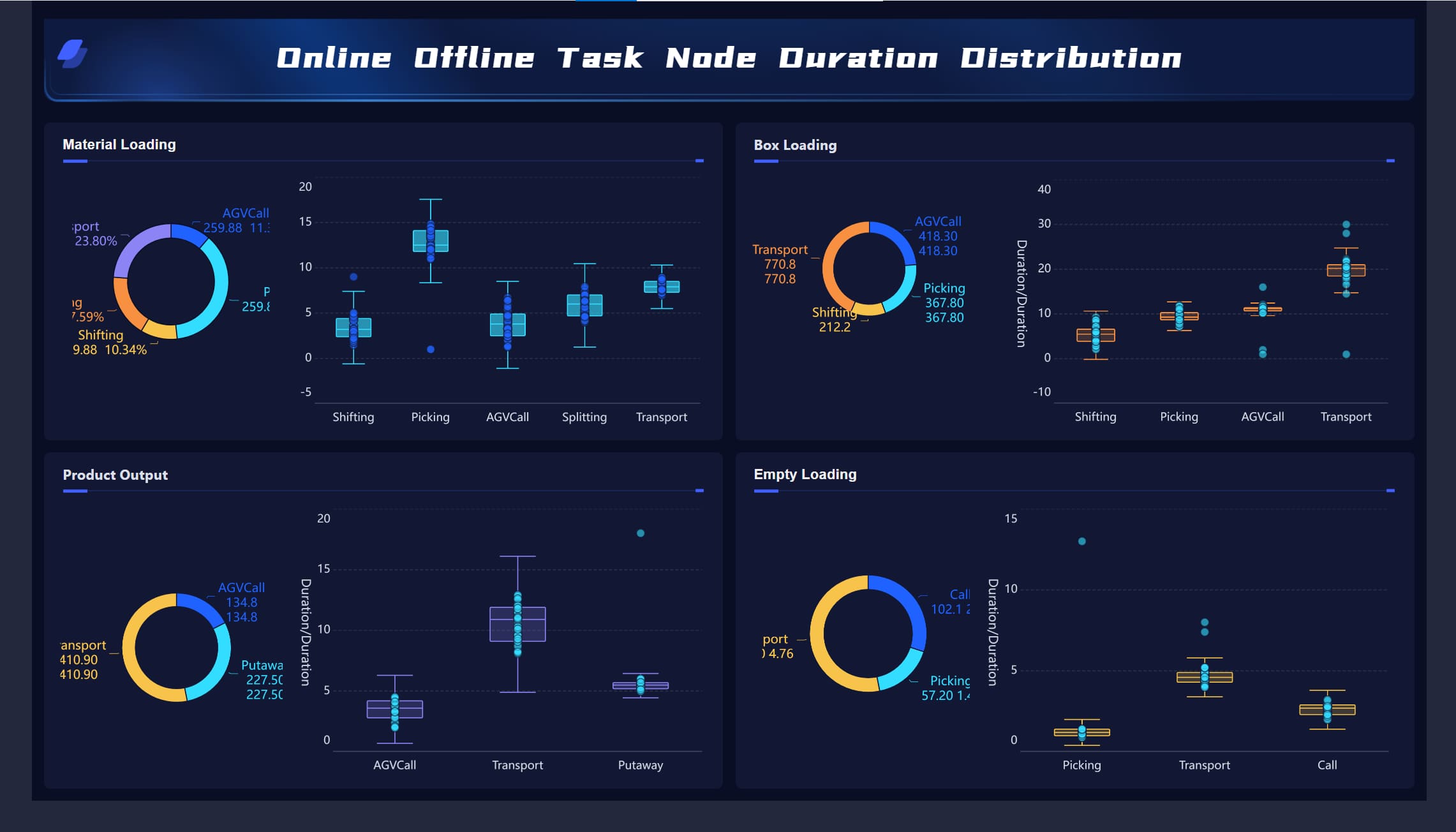
All dashboard examples in this article were created by FineBI.
The 7 core widgets every team needs on its agile dashboard
1. Throughput trends
Throughput shows how much work the team finishes over time. It is one of the simplest and most useful widgets in an agile metrics dashboard because it gives a direct view of delivery cadence without relying on subjective estimation scales.
What makes throughput valuable is not the raw count alone, but the trend. Teams should track completed work by week or sprint and use rolling averages to reduce noise. This reveals whether delivery is stabilizing, improving, or becoming erratic.
A few practical rules make this widget more trustworthy:
Track similar work item types together
Use rolling 4-week or 6-sprint averages
Compare similar periods rather than judging one sprint in isolation
Look for sustained shifts, not one-off spikes
For example, a single sprint with lower throughput may reflect holidays, incident work, or a large item finishing late. That is not automatically a performance problem. But a 6-week downward trend may indicate overloaded WIP, dependency issues, or quality drag.
A well-designed throughput widget should answer:
How much work do we typically complete?
Is our delivery pace becoming more or less stable?
Are recent changes improving output consistency?
2. Cycle time and lead time
If throughput tells you how much gets done, cycle time and lead time tell you how long it takes.
Cycle time measures how long work takes once started
Lead time measures how long work takes from request to delivery
Both belong in a serious agile metrics dashboard because they expose friction that throughput alone can hide. A team may finish a reasonable number of items, but if delivery time is widening, predictability is weakening.
These metrics help surface bottlenecks in:
Code review
Testing queues
External approvals
Handoffs between teams
Unclear requirements before work starts
The most useful visualization is not the average alone. Teams should use percentile views such as 50th, 75th, and 85th percentile. Why? Because averages can hide variation. Percentiles help teams set realistic delivery expectations.
For instance:
50% of items complete within 4 days
75% complete within 8 days
85% complete within 11 days
That is far more actionable than saying “average cycle time is 6.7 days.”
This widget is especially useful for stakeholder conversations. It enables better forecasting using observed delivery behavior rather than optimism.
3. Work in progress and flow efficiency
Work in progress, or WIP, makes the team’s current load visible. This matters because overloaded systems almost always slow down before people consciously notice it.
A WIP widget should show:
Current active work items
WIP trend over time
Whether the team is operating above healthy limits
Where work is stacking up in the workflow
Pair WIP with flow efficiency, which compares active work time versus waiting time. This is where many dashboards become powerful. Teams often discover that work spends much more time waiting than being worked on.
That insight changes the conversation. Instead of asking, “Why are people not moving faster?” leaders can ask better questions:
Where are approvals delayed?
Are review queues too deep?
Are testers or specialists becoming bottlenecks?
Are too many items being started before existing work is finished?
This widget supports healthier flow and stronger prioritization. It also helps reduce the hidden cost of multitasking and context switching.
Signal
What it may indicate
Recommended response
WIP rising steadily
Overload, scope sprawl, too many parallel efforts
Tighten intake, limit concurrent work
Flow efficiency very low
Excessive waiting, dependency delays
Review handoffs, approvals, queue times
Stable WIP but slow delivery
Work items too large, blocked downstream steps
Split work smaller, inspect review/testing stages
4. Predictability and sprint commitment health
This widget compares planned work with completed work in a way that promotes learning rather than blame.
For sprint-based teams, it should show:
Planned vs completed work
Carryover trends
Scope added during sprint
Commitment reliability over time
For flow-based teams, a similar view can compare forecasted delivery ranges against actual outcomes.
The point is not to punish missed commitments. It is to identify patterns such as:
Chronic overcommitment
Frequent in-sprint scope changes
Backlog refinement issues
Capacity assumptions that are repeatedly unrealistic
A healthy predictability widget helps teams improve forecasting over time. It is especially useful for conversations between engineering, product, and business stakeholders because it makes trade-offs visible.
When this metric is used correctly, it builds trust. When used incorrectly, it encourages sandbagging. That is why it should always be interpreted with context.
Useful annotations include:
Production incidents
Team member absences
Critical unplanned support work
Major requirement changes during sprint
5. Defect escape and quality signals
Speed without quality is expensive. That is why a mature agile metrics dashboard should include a compact quality widget.
Useful signals include:
Escaped defects
Reopen rates
Production incidents
Severity mix of bugs
Trend of customer-reported issues after release
The objective is not simply to count bugs. It is to understand whether faster delivery is creating downstream cost, rework, or customer pain.
This widget becomes more valuable when linked to workflow changes. For example:
Did escaped defects rise after WIP increased?
Did reopen rates spike after review time fell?
Did production issues drop after adding automated test coverage on critical paths?
This is the right way to treat quality: not as a separate reporting stream, but as part of the delivery system.
A useful quality widget is usually small but carefully designed. It should show trend direction, not just totals. Severity and context matter more than raw volume.
6. Blockers and aging work
Many delivery risks are visible long before a deadline slips. They appear as blocked items and aging work.
A blocker widget should show:
Number of currently blocked items
Total blocked duration
Common blocker reasons
Trends by team, product area, or workflow stage
An aging work widget should show items that have remained in progress unusually long. These are often the clearest early warning signals in an agile metrics dashboard.
Why this matters:
Blocked work consumes attention without producing progress
Aging items often indicate hidden complexity
Old in-progress items distort flow metrics and forecasting
Teams can intervene earlier when stale work is visible
This widget is especially valuable for daily and weekly operational reviews. It helps teams act on stalled work before it becomes a delivery surprise.
A practical threshold-based design works well:
Green: within normal age range
Yellow: approaching risk threshold
Red: exceeds normal aging pattern
7. Outcome or customer impact indicators
Many dashboards stop at internal execution. That is a mistake.
A high-value agile metrics dashboard should include a lightweight outcome widget that connects delivery to real impact. This does not need to be complex. In fact, it is better if it stays focused.
Useful indicators may include:
Feature adoption
Customer satisfaction for a released capability
Support ticket reduction
Conversion improvement
Time saved in operations
SLA performance change after release
The goal is to connect output to adoption, satisfaction, or operational impact. This shifts leadership conversations from “Did we ship?” to “Did it matter?”
Keep this widget small and meaningful. Teams should avoid overloading it with broad business KPI packs that are difficult to attribute. A small number of product or customer-facing indicators tied to recent delivery is enough.
How to design the agile dashboard so people trust and use it
A dashboard only works if people believe the data, understand the metrics, and know what action to take next. Trust is not a visual design issue alone. It is a governance issue.
Keep each metric actionable
Every widget should answer three questions:
What happened?
Why does it matter?
What can the team do next?
If a widget cannot trigger a useful discussion or decision, it does not belong on the dashboard. Actionable metrics create focus. Decorative metrics create clutter.
For example:
Throughput trend down for 4 weeks → inspect WIP, blockers, item size
Cycle time variance rising → review workflow bottlenecks and aging items
Good dashboards include brief annotations for events that change how data should be interpreted, such as:
Releases
Major incidents
Staffing changes
Tool migrations
Process experiments
Team structure changes
This small layer of context prevents bad conclusions. A raw number without context often leads to unnecessary escalation. An annotated trend supports better diagnosis.
Avoid overloading the interface with too many explanatory labels, filters, and decorative charts. Context should clarify, not overwhelm.
Build for different audiences without creating different truths
A common failure pattern is building separate dashboards for teams, managers, and executives using different calculation rules. That creates confusion and distrust.
A better model is:
One shared metric logic
Different views by role
Drill-down where needed
Common definitions across the organization
The team may need item-level detail. Leaders may only need trends and exceptions. Both should come from the same underlying data model.
This is particularly important in larger organizations where delivery data comes from Jira, Azure DevOps, service tools, CI/CD systems, and product analytics. Metric governance matters as much as visualization.
Review on a cadence that matches the metric
Not every metric should be reviewed at the same frequency.
This prevents overreaction. Daily inspection of monthly outcome indicators creates noise. Monthly review of blockers is too late to help.
An agile metrics dashboard becomes far more useful when review cadences are explicit and built into team routines.
The 5 metrics to skip or treat with caution in a agile metrics dashboard
Not all metrics are equally useful. Some are often misused. Some actively damage team behavior when placed on a dashboard without guardrails.
Velocity as a performance score
Velocity can be useful for team-level sprint planning. It becomes harmful when leaders use it to compare teams or judge individual performance.
Why it is risky:
Story point scales differ by team
Teams can inflate estimates
It rewards gaming rather than better delivery outcomes
Use velocity only within the team that created it, and only as one planning input.
Individual utilization
High utilization may look efficient on paper, but in delivery systems it often signals fragility.
When individuals are fully loaded all the time:
Queues grow
Handoffs slow down
Collaboration drops
Recovery from incidents becomes harder
Innovation and improvement work gets squeezed out
A dashboard that glorifies utilization usually drives the wrong behavior. Focus on system flow, not individual busyness.
Number of story points completed across teams
This metric appears attractive for portfolio comparison, but it lacks validity. Story points are not standardized units. One team’s 20 points may equal another team’s 8 or 40.
Cross-team comparison based on points creates false precision. It also pressures teams to normalize estimates for political reasons rather than planning usefulness.
If leadership needs cross-team views, use measures with more consistent definitions such as throughput trends, lead time distributions, risk indicators, and outcome measures.
Raw bug counts without severity or context
A simple bug total often misleads.
More bugs can mean:
More testing coverage
Better detection discipline
Broader feature usage
A quality problem
Or a classification change
Without severity, source, and trend context, raw bug counts distort conversations. A small number of critical production defects can matter far more than a larger number of minor issues caught early.
Lines of code or hours worked
These measures track activity, not value.
They can reward:
Bigger code changes instead of simpler solutions
Long hours instead of sustainable pace
Output volume instead of quality and usability
In modern software delivery, these are weak indicators at best and harmful incentives at worst. Keep them off the main dashboard.
How to start small and improve your agile metrics dashboard over time
The best agile metrics dashboard is rarely built in one pass. It improves through use.
Start with a small set of essential metrics that expose the three dimensions most teams need first:
Flow: throughput, cycle time, WIP
Predictability: commitment health, carryover, aging work
Then validate whether each widget actually changes decisions or conversations. If a chart looks impressive but nobody uses it to act, revise it or remove it.
A practical rollout approach looks like this:
Start with 4 to 6 widgets
Define clear metric definitions and owners
Review them on a fixed cadence
Add annotations and thresholds
Observe what questions they trigger
Retire metrics that no longer lead to action
Revisit the dashboard quarterly as goals, tooling, and delivery maturity evolve
This quarterly review matters. As teams mature, the dashboard should evolve from basic operational control toward stronger forecasting and business alignment.
For organizations that want to operationalize this at scale, the limiting factor is often not dashboard design. It is data integration, semantic consistency, and self-service access for different roles. This is where a modern BI platform becomes strategically valuable.
FineBI is a strong fit when enterprises need to build a trusted, flexible agile metrics dashboard across multiple systems and stakeholder groups. It helps organizations connect delivery, quality, and business data into a single analysis layer, then present role-based dashboard views without creating competing definitions. For decision-makers, that means faster reporting, stronger metric governance, and better alignment between engineering execution and business outcomes.
If your current reporting lives in disconnected tools, spreadsheets, and manually assembled sprint decks, FineBI can help turn fragmented delivery data into a scalable, executive-ready dashboard system—while still giving teams the operational detail they need to improve flow every week.
A final rule is worth remembering: if a metric does not support learning, decision-making, or customer value, it does not belong on the dashboard. The goal is not to measure more. The goal is to see better, decide faster, and deliver with greater confidence.
FAQs
It should help teams make better delivery decisions, spot risks earlier, and have clearer conversations about progress. The best dashboards show trends in flow, quality, predictability, and outcomes instead of acting like a performance scoreboard.
The most useful core metrics usually include throughput, cycle time, lead time, work in progress, and quality trends. These measures help teams understand delivery pace, bottlenecks, stability, and whether work is moving efficiently.
Cycle time shows how long work takes after it starts, while lead time shows the full time from request to delivery. Tracking both gives a more complete view of responsiveness and exposes delays before work even begins.
Teams should be cautious with vanity metrics, individual productivity metrics, and any number that encourages gaming or micromanagement. If a metric does not support better decisions or learning, it usually adds noise rather than value.
Most teams get better results by starting with a small set of high-signal metrics rather than tracking everything. A focused dashboard is easier to trust, easier to read, and more likely to drive action.
Product Trial
FineReport
Pixel-perfect reports · Interactive dashboards · Easy data entry · Digital twins