An agile dashboard is only useful when it helps people make better decisions faster. That is the standard enterprise teams should use.
Too many dashboards become visual clutter: too many charts, unclear ownership, inconsistent definitions, and no clear link to delivery outcomes. The result is predictable—leaders stop trusting the data, delivery teams ignore the visuals, and stakeholders ask for manual updates anyway.
A better approach is practical and disciplined. Start with decisions. Then define the metrics. Then design views for the people who will actually use them. Finally, automate the data flow so the dashboard stays credible without creating reporting overhead.
This guide explains how to build an agile dashboard step by step, with a focus on real operating value for Scrum, Kanban, and hybrid teams.
What an agile dashboard is and why teams rely on it
In practical terms, an agile dashboard is a visual decision-support layer built on top of delivery data. It brings together signals from planning, execution, quality, and collaboration tools so teams can see what is happening, why it is happening, and what to do next.
It is not just a reporting screen. A strong agile dashboard helps teams convert raw activity into management insight:
Are sprint goals likely to be met?
Is flow improving or slowing down?
Where are blockers accumulating?
Is work moving predictably across the system?
Are teams delivering customer value, or only staying busy?
For enterprise environments, this distinction matters. Leaders need direction, not ticket noise. Teams need fast operational visibility, not executive summaries. Stakeholders need confidence that progress is real, not selectively reported.
That is why agile dashboards usually serve three different purposes:
Purpose
Primary audience
Main question
Leadership reporting
Executives, department heads, PMO leaders
Are delivery outcomes on track, and where are the risks?
Team tracking
Scrum teams, Kanban teams, engineering managers
What needs attention now to improve flow and execution?
What has been delivered, what is in progress, and what may change?
A dashboard that tries to satisfy all three needs in one view often fails. The most effective agile dashboard strategy separates views while keeping the core metrics consistent.
Agile dashboards are also used differently across working models:
Scrum teams often focus on sprint progress, commitment reliability, burndown or burnup, defect trends, and sprint goal completion.
Kanban teams usually prioritize cycle time, throughput, work in progress, cumulative flow, aging work, and service-level expectation.
Hybrid teams need a combination of planning visibility and flow metrics, especially when projects involve both roadmap commitments and continuous delivery.
The shared objective is simple: improve decision quality without increasing reporting burden.
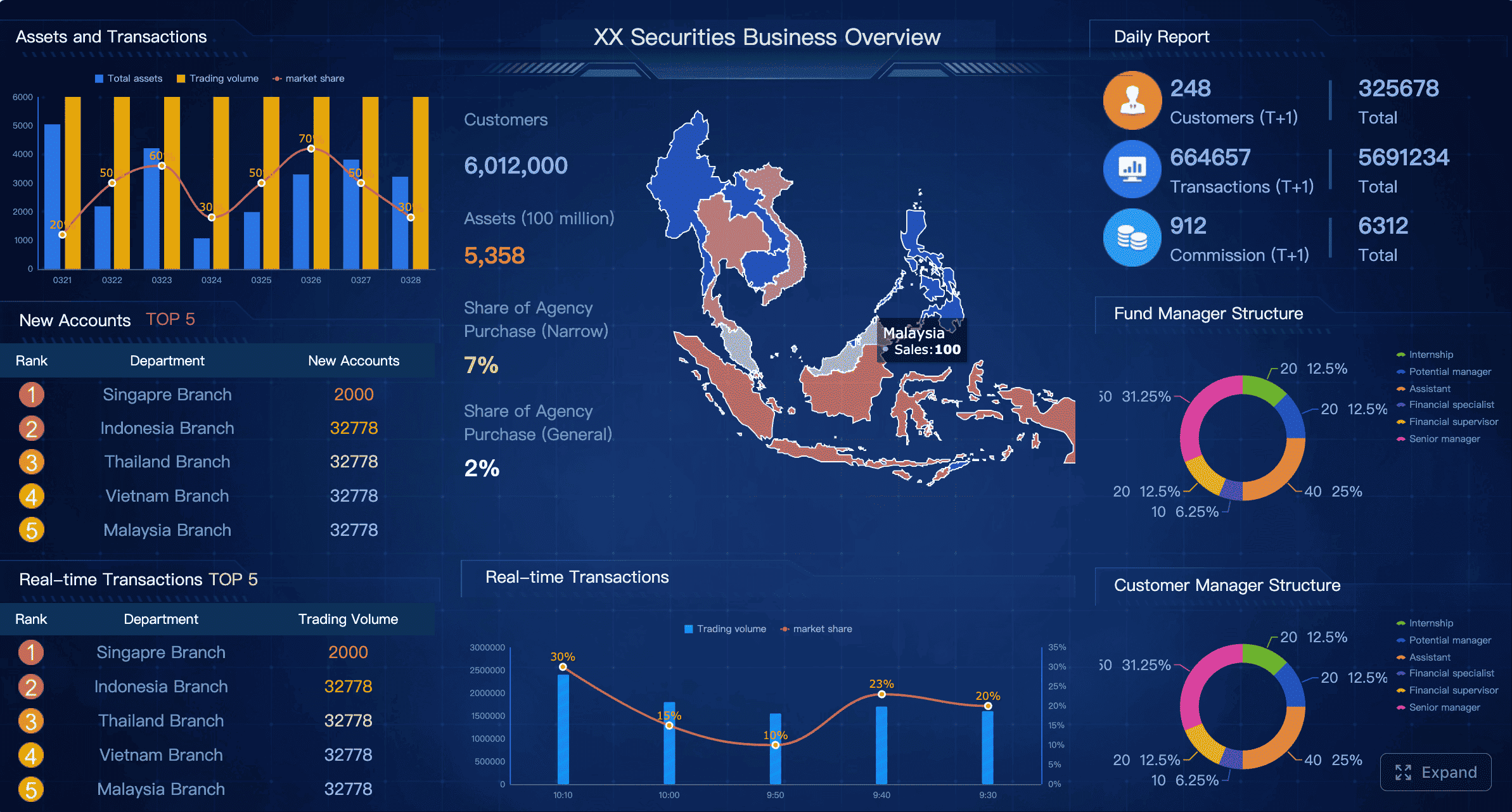
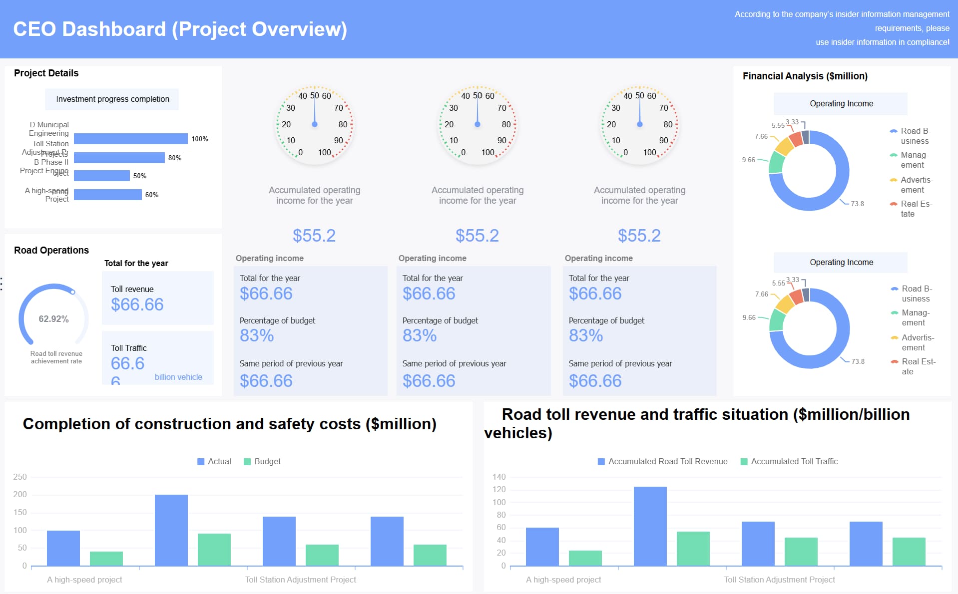
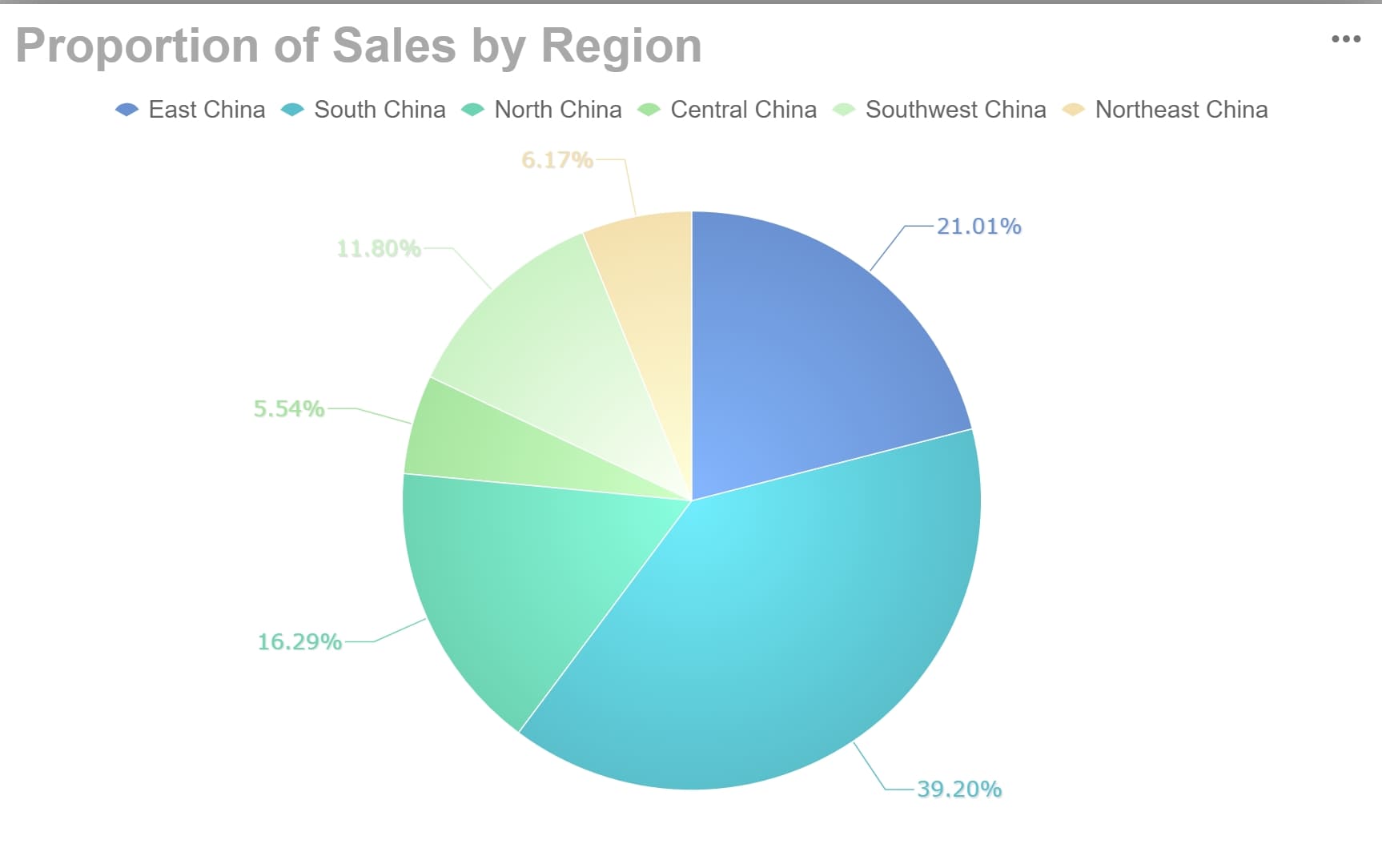
All dashboard examples in this article were created by FineBI.
Set goals before you build the agile dashboard
Before choosing a chart, a tool, or an integration, define what the dashboard is supposed to achieve. This is where many organizations skip the hard thinking and move too quickly into visualization.
A useful agile dashboard begins with management intent.
Identify the decisions the dashboard should support
Start by identifying the recurring decisions different roles need to make. This keeps the dashboard anchored to action rather than observation.
Typical decision questions include:
Leaders: Are delivery commitments realistic? Which teams or initiatives need intervention? Where is execution risk rising?
Product owners: Are priorities moving as expected? Is value reaching users on time? Are backlog changes affecting delivery confidence?
Scrum masters or agile coaches: Are blockers increasing? Is work aging? Are process constraints creating repeated delays?
Team members: What is in progress now? What is blocked? What should be finished next to protect flow?
Delivery managers: Is capacity aligned with demand? Where is predictability breaking down? Which dependencies are slowing execution?
Each question should map to a business or delivery outcome. For example:
Decision question
Metric or signal
Outcome supported
Will we hit the sprint goal?
Sprint progress, burndown, blocked items
Better short-term execution
Is delivery becoming more predictable?
Throughput trend, commitment reliability, lead time variation
The cadence determines the level of detail. Daily views should emphasize operational exceptions and flow signals. Weekly views should show trends, delivery health, and risks. Monthly views should summarize outcomes, predictability, and portfolio impact.
This helps prevent a common failure pattern: executive dashboards overloaded with team-level detail, or team dashboards diluted by management-level KPIs.
Define success criteria for the dashboard itself
The dashboard also needs performance criteria of its own. Treat it like a product.
Define standards such as:
Clarity: Can users understand the message in under 30 seconds?
Adoption: Are the intended audiences actually using it in meetings and reviews?
Accuracy: Do users trust the numbers without asking for spreadsheet validation?
Maintenance effort: Can the dashboard stay current without manual rework every week?
Actionability: Does it trigger focus and discussion, or just passive observation?
A strong agile dashboard should reduce noise, not add another reporting layer. Signs that it is working include:
Fewer manual status requests
Faster discussion in sprint reviews and operational check-ins
Better focus on blockers and trade-offs
More consistent understanding across leadership and delivery teams
Choose the right agile dashboard metrics and visuals
Metric selection is where strategic discipline matters most. The best agile dashboard is not the one with the most data. It is the one with the smallest set of high-value signals that support action.
Start with a small set of high-value metrics
Most teams should begin with a focused set of operational and delivery metrics such as:
Sprint progress
Throughput
Cycle time
Lead time
Work in progress
Predictability or commitment reliability
These metrics help teams understand speed, stability, and delivery confidence.
The key is restraint. Avoid vanity metrics such as raw story point totals, individual productivity comparisons, or chart collections that look impressive but do not support any meaningful intervention.
A useful test is simple: if a metric worsens, what action will the team or leader take? If the answer is unclear, it likely does not belong on the dashboard.
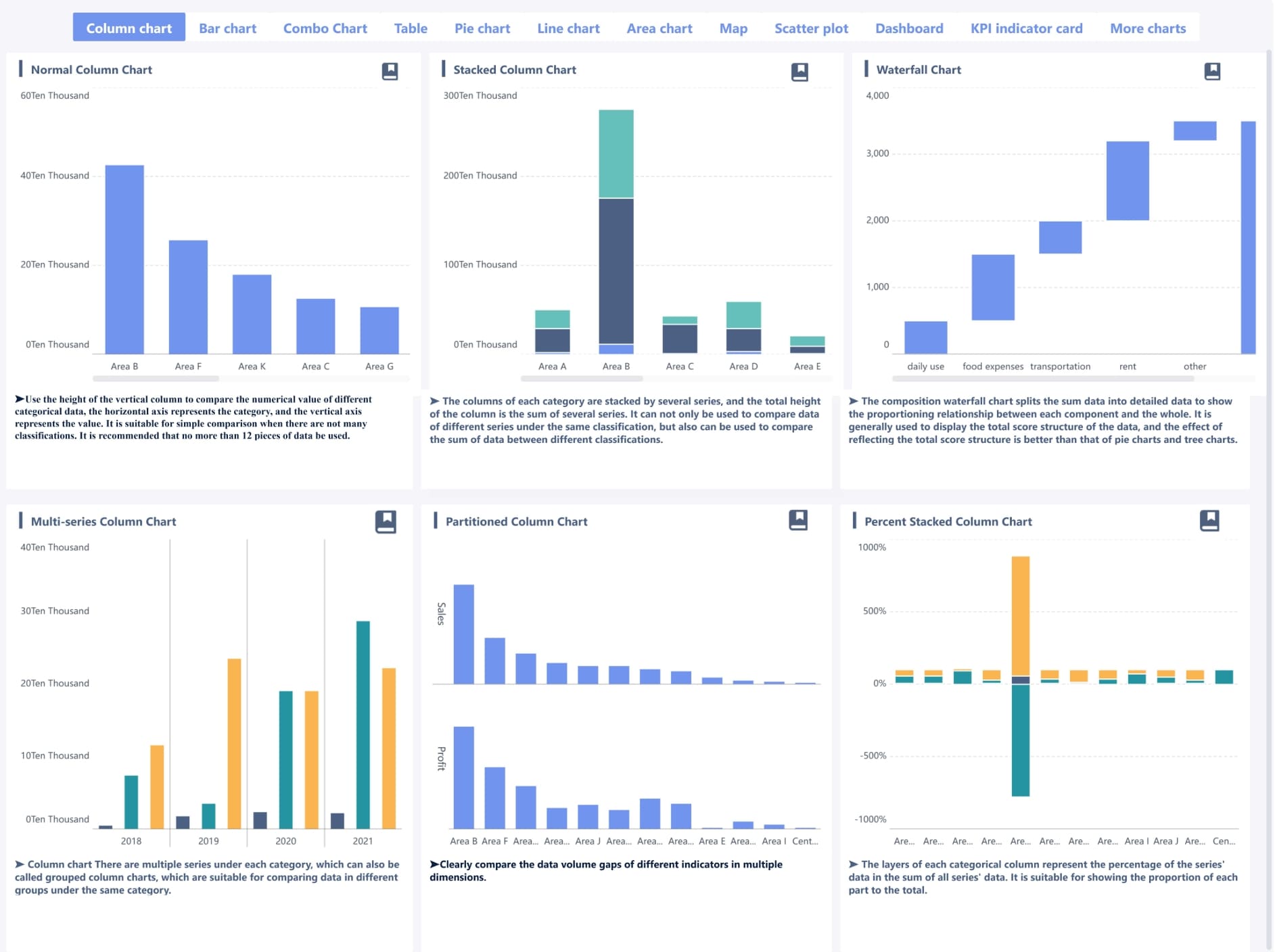
Match each metric to the best chart or visual
The visual form should match the management question. Not every metric needs a complex chart.
Makes output patterns easy to compare across periods
Cycle time
Control chart
Reveals spread, outliers, and predictability
WIP by workflow stage
Cumulative flow diagram
Highlights bottlenecks and flow imbalance
Blockers and risks
Status summary or exception table
Supports fast operational action
Goal completion
Progress bar or milestone summary
Clear for executives and stakeholders
Use simple tables when precision matters more than pattern recognition. Use trend lines when the key question is direction over time. Use alerts or exception summaries when users need to act quickly.
Complex visuals are justified only when they reduce cognitive load. If a chart takes too long to explain, it is usually the wrong chart.
Balance team health, delivery speed, and customer value
A mature agile dashboard should not focus only on speed. Fast delivery with hidden defects, overloaded teams, or poor goal alignment creates fragile performance.
A balanced dashboard includes signals from three areas:
Team health: blockers, aging work, defect burden, overload patterns
Delivery speed: throughput, cycle time, lead time, WIP
This is especially important in enterprise settings, where dashboard misuse can quickly turn into surveillance. The goal is not to monitor individuals. The goal is to improve the system.
A well-designed agile dashboard encourages learning:
Where is flow breaking down?
Which policies are slowing delivery?
Are dependencies visible early enough?
Are we optimizing for completion or for customer outcome?
That is the difference between performance management and dashboard theater.
Build a better agile dashboard for your project
Once goals and metrics are clear, the next step is design. A good dashboard layout enables rapid scanning, aligned interpretation, and focused action.
Design for clarity and fast scanning
Most users decide within seconds whether a dashboard is useful. That means layout matters.
A practical structure is to group information into four blocks:
Product team view: sprint progress, backlog readiness, defects, work aging, release alignment
Client or stakeholder view: milestones, completed scope, current progress, risks requiring communication
These views should share common definitions, but not identical layouts.
This is a major governance point. Different audiences do not need different truths. They need different levels of abstraction built on the same trusted data model.
Use examples and patterns to shape your layout
Real-world dashboard examples can accelerate design, especially when teams are not sure how to organize information. The right approach is to borrow patterns, not copy screenshots.
Patterns that work well include:
Summary KPIs at the top, diagnostic trends below
Exception panels on the right for blockers and alerts
One visual per question, not multiple visuals per metric
Layered drill-down from initiative to team to work item
Side-by-side trend comparison for throughput and cycle time
What should be avoided is copying a dashboard style that does not fit your workflow. A Scrum-heavy design may be poor for flow-based teams. A highly technical engineering dashboard may confuse business stakeholders. Layout should reflect operating reality.
Integrate tools and automate data flow in your agile dashboard
Without reliable integration, even the best dashboard design will fail. Manual updates erode trust quickly, especially when numbers differ across systems.
Connect delivery, planning, and collaboration tools
A robust agile dashboard usually pulls data from several categories of systems:
Communication tools: Slack, Microsoft Teams, email alerts
The purpose of integration is not to collect everything. It is to automate the few signals that matter most.
When the dashboard refreshes directly from source systems, teams benefit in three ways:
Less manual reporting effort
Higher consistency across meetings
Stronger trust in the numbers
This is critical for enterprise adoption. Decision-makers do not rely on dashboards they believe require human patchwork to stay current.
Standardize definitions across systems
Tool integration alone is not enough. Most reporting failures are definition failures.
Before combining data, align the core operating definitions:
What counts as “in progress”?
When does cycle time start and stop?
What qualifies as “done”?
How are blocked items labeled?
Are estimation units consistent across teams?
When does the dashboard refresh?
Standardization should cover:
Area
What to define
Status names
Workflow states and their mapping across tools
Workflow stages
Backlog, committed, in progress, review, done
Estimation method
Story points, item count, hours, or no estimates
Completion rules
Done definition, accepted definition, released definition
Metric formulas
Throughput, lead time, cycle time, predictability
Refresh timing
Real-time, hourly, daily batch
If these definitions are not documented, conflicting numbers are almost guaranteed. And once trust declines, adoption becomes expensive to recover.
Build the dashboard in phases
Do not attempt to build the final enterprise dashboard in one release. Start with a minimum viable dashboard.
A practical phased approach looks like this:
Phase 1: Core metrics for one team or one program
Phase 2: Validate usefulness with real users in ceremonies and reviews
Phase 3: Add role-based views and limited drill-down
Phase 4: Expand integrations and improve alerting or forecasting
Phase 5: Formalize governance, ownership, and periodic refinement
Assign clear ownership from the start. At minimum, define responsibility for:
Metric definitions
Data quality checks
Dashboard maintenance
Access and permissions
Change requests and enhancement prioritization
This operating model matters as much as the visuals themselves.
Review your agile dashboard and avoid common mistakes
Even a strong agile dashboard will lose value if it is not reviewed regularly. Teams change. Workflows evolve. Metrics that once mattered may become irrelevant.
Run a regular dashboard health check
A dashboard health check should be part of governance, not an occasional cleanup effort.
Review questions should include:
Do users still trust the data?
Are the visuals still easy to interpret?
Are the metrics driving decisions or just discussion?
Are any charts no longer used in meetings?
Have workflow or process changes broken metric accuracy?
A quarterly review cycle works well for most organizations. During the review, retire outdated metrics and add new ones only when they support a specific decision.
Useful indicators of dashboard health include:
Frequency of use in sprint ceremonies, weekly reviews, and executive check-ins
Number of manual clarifications required
Time spent explaining visuals
Actions triggered directly from dashboard insights
Avoid the most common dashboard pitfalls
Most agile dashboard failures are predictable. The patterns appear across tools, industries, and team structures.
Common pitfalls include:
Too many charts on one screen
Inconsistent filters between visuals
KPIs that are disconnected from delivery decisions
Overuse of colors without clear meaning
Poor data definitions across integrated tools
Metrics used to evaluate individuals rather than improve the system
That last point deserves emphasis. Agile dashboards should not become performance surveillance tools. When people feel measured rather than supported, behavior distorts quickly. Work gets gamed. Estimates get manipulated. Teams optimize what is visible instead of what creates value.
The most effective dashboards support transparency, coordination, and continuous improvement—not fear.
Create a roadmap for long-term success
To make the agile dashboard a durable management tool, create a simple roadmap for maturity.
Future enhancements such as forecasting, alerts, or benchmarking
Over time, the dashboard should evolve with the delivery model. New teams, changing workflows, and broader transformation goals all require adaptation.
For organizations looking to scale this discipline, this is where a modern BI platform becomes strategically valuable. Instead of relying on static project tool dashboards alone, teams can use FineBI to integrate delivery, quality, and operational data into a more flexible agile dashboard architecture. That is particularly useful when leaders need unified views across Scrum, Kanban, hybrid delivery, and even cross-functional business workflows.
Get Ready-to-Use Dashboard Templates in Fine Gallery
Consolidate data from multiple project and operational systems
Build role-based agile dashboard views for executives, PMOs, product leaders, and delivery teams
Standardize metric definitions across business units
Create interactive drill-down analysis without rebuilding reports each time
Reduce manual reporting while improving governance and trust
For decision-makers, that combination matters. It turns the agile dashboard from a team-level reporting artifact into a scalable management system.
The right next step is not to add more charts. It is to build a dashboard ecosystem that is trusted, actionable, and aligned to outcomes. Start small. Define decisions clearly. Standardize the data. Then scale with the right platform and governance model.
An agile dashboard should include only the metrics that support real decisions, such as sprint progress, throughput, cycle time, blockers, work in progress, and quality signals. The right mix depends on whether the audience is a Scrum team, a Kanban team, or leadership.
Start with the decisions users need to make, then map each decision to a small set of measurable signals. This helps prevent clutter and keeps the dashboard focused on delivery outcomes instead of vanity metrics.
Scrum dashboards usually emphasize sprint health, burndown or burnup, commitment reliability, and sprint goal progress. Kanban dashboards focus more on flow metrics such as cycle time, throughput, cumulative flow, aging work, and work in progress.
The best approach is to automate data collection from tools like Jira, GitHub, GitLab, or Azure DevOps so updates happen consistently. Teams should also define each metric clearly and assign ownership to maintain data quality over time.
They usually fail when they try to serve every audience in one view, track too many metrics, or show data without clear actions attached. A useful dashboard stays simple, audience-specific, and tied to decisions that improve delivery.
Product Trial
FineReport
Pixel-perfect reports · Interactive dashboards · Easy data entry · Digital twins