A free dashboard can be the fastest way to turn raw data into something useful. For beginners, the goal is not to build the most advanced interface. The goal is to create a dashboard that answers a few important questions clearly, consistently, and without confusion.
That is why simple layouts work so well. They reduce setup time, lower design risk, and make it easier to trust what you are seeing. Whether you are tracking sales, website traffic, project progress, or personal spending, the right starter layout gives you structure from day one.
This guide explains what to look for in a beginner-friendly free dashboard, shows 7 simple layouts you can copy today, and helps you choose the right tools without overcomplicating the process.
What makes a free dashboard beginner-friendly
A dashboard is a visual workspace that brings key metrics, charts, and filters into one place. Its job is simple: help a user understand performance at a glance and take action faster.
For beginners, a good free dashboard does three things well:
Shows the most important numbers first
Uses a layout that is easy to scan
Keeps interactions simple and predictable
A first dashboard should not try to answer every business question. It should answer a small number of clear questions well. That is why simple layouts usually outperform crowded ones in early projects.
The core parts beginners should look for
When evaluating a free dashboard, focus on the building blocks that matter most:
Component
What it does
Why beginners need it
KPI cards
Highlights top metrics such as revenue, visits, or tasks completed
Gives instant visibility into performance
Charts
Shows trends, comparisons, or distributions
Makes data easier to interpret than raw tables
Filters
Lets users narrow the view by date, region, team, or source
Adds flexibility without rebuilding reports
Navigation
Helps users move between sections or pages
Keeps dashboards organized as they grow
Tables
Displays detailed records behind summary metrics
Useful for checking the numbers
Insight text
Adds short explanations or context
Prevents misreading and improves adoption
A beginner-friendly free dashboard usually includes these elements in a balanced way. If a template has too many widgets, too many colors, or too many chart types, it is often harder to use than it looks.
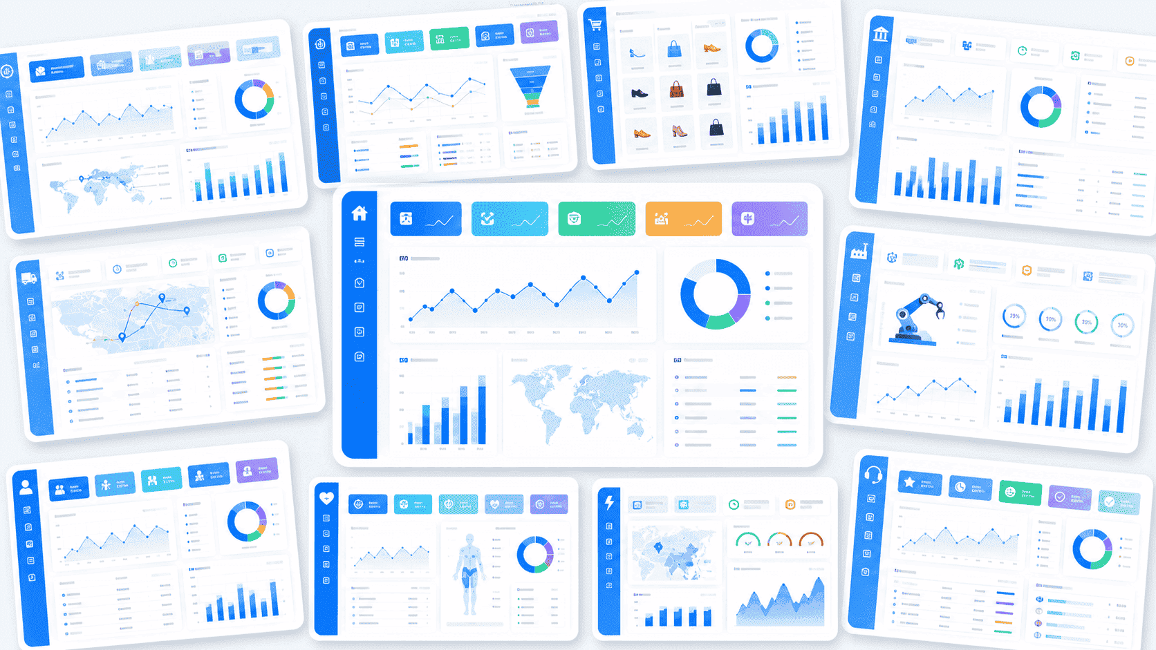
After defining these parts, it helps to visualize the intended structure before building.
All dashboard examples in this article were created by FineBI.
Static template vs live reporting tool vs dashboard generator
Not all free dashboard options solve the same problem. The right choice depends on how often your data changes and how interactive the dashboard needs to be.
Static template
A static template is best when you need a fast visual starting point.
Use it when:
You are designing a layout concept
You want to present mockups before connecting real data
You are working in design tools or spreadsheets
Best for: planning, prototyping, simple one-off reporting
Best for: operations, recurring reporting, management visibility
Dashboard generator
A dashboard generator uses uploaded data or prompts to create a dashboard automatically. Some newer options also use AI to suggest chart types and layouts.
Use it when:
You need a fast first draft
You do not want to design everything manually
You want help selecting visuals based on data structure
Best for: rapid setup, low-design-skill users, experimentation
A practical rule: if your use case is recurring and business-facing, start with a live tool. If you are still shaping the story, start with a template. If you need speed and guidance, try a generator.
7 simple free dashboard layouts you can copy today
Below are seven practical free dashboard layouts that work well for beginners. These are not just attractive examples. They reflect common reporting scenarios used by small teams, analysts, operations managers, and business leaders.
1. Single-page KPI dashboard
This is the easiest layout to start with. It works because it answers one question: How are we doing right now?
One or two simple filters, usually date and category
A common layout looks like this:
Top row: revenue, growth rate, active users, conversion rate
Middle: 30-day trend line
Bottom: short written takeaway and one comparison chart
This format is excellent for executives, team leads, or anyone who needs quick visibility without detail overload.
Best use cases:
Weekly business review
Team performance summary
Monthly operations snapshot
Why it works for beginners:
It forces prioritization. If you cannot fit a metric on one page, it may not be essential.
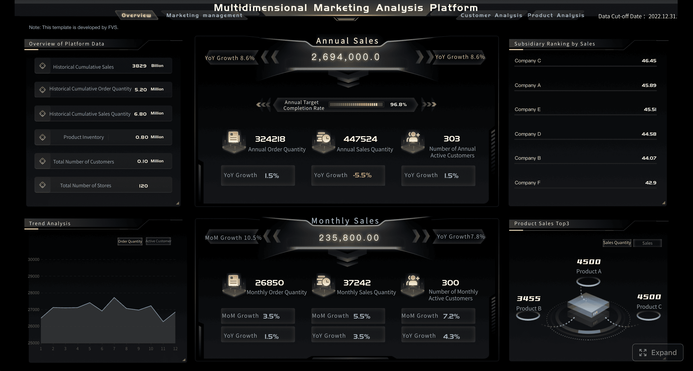
2. Sales overview dashboard
A sales dashboard should help users understand both top-line performance and the drivers behind it. Beginners often make the mistake of focusing only on revenue. A better layout adds operational context.
A beginner-friendly sales overview dashboard combines:
This layout works well because it balances summary and breakdown. It lets users see whether revenue changed, then quickly identify where the change came from.
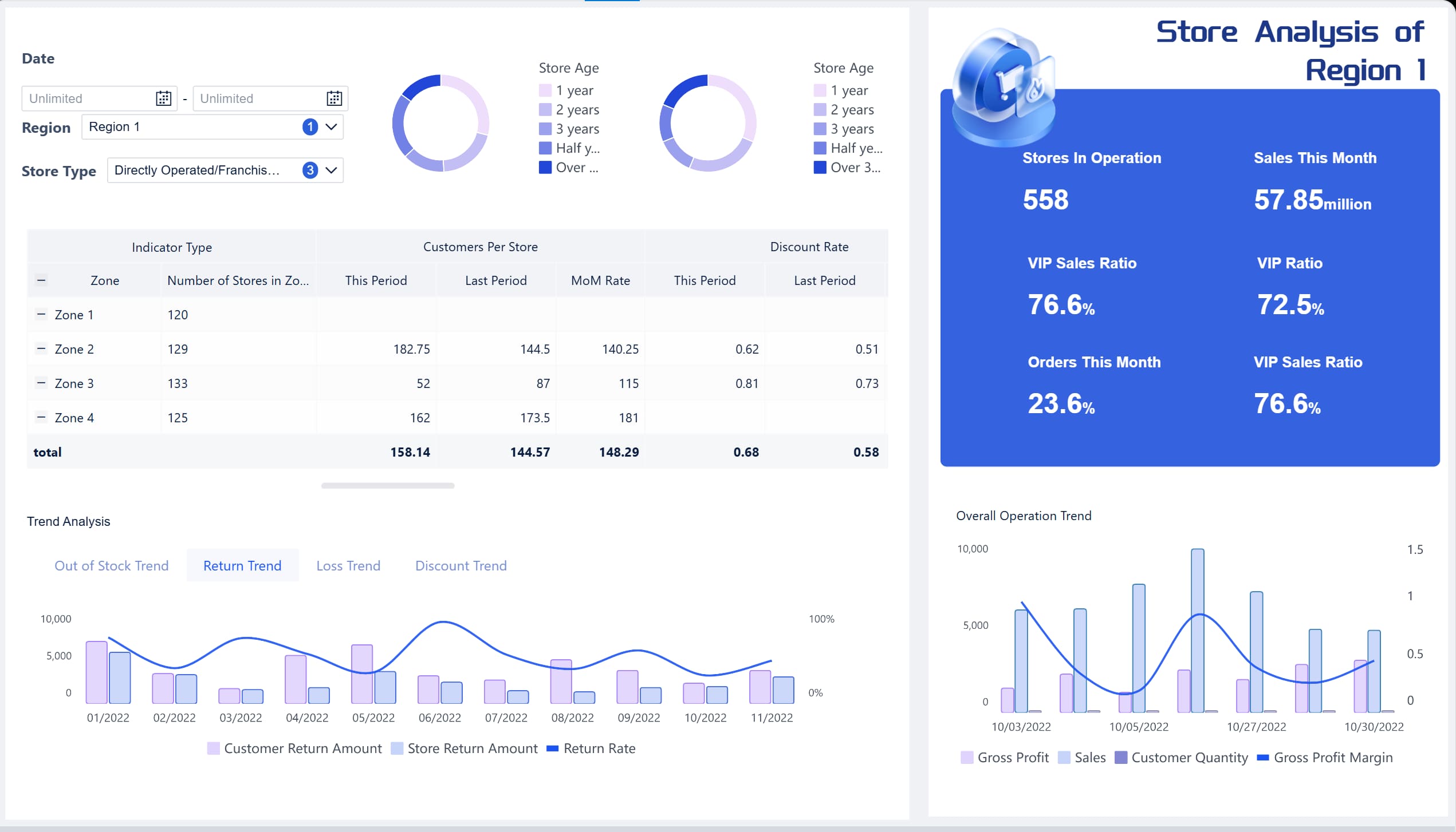
After explaining the structure, a visual example is especially helpful for stakeholders comparing product and region performance.
3. Marketing performance dashboard
Marketing dashboards are often overloaded. Beginners pull in every available metric: impressions, clicks, CPM, CPC, CTR, sessions, leads, bounce rate, engagement, and more. The result is noise.
A better free dashboard layout keeps the page focused on the marketing funnel:
Traffic
Conversions
Campaign results
Channel comparison
A practical structure:
Top row: sessions, leads, conversion rate, cost per lead
Middle left: channel performance comparison
Middle right: campaign table with top performers
Bottom: trend chart for traffic and conversions
Key design advice: use fewer chart types. A mix of KPI cards, bar charts, one line chart, and one table is usually enough.
Best use cases:
Paid media summary
Lead generation review
Monthly marketing performance report
This layout is strong because it ties volume metrics to outcome metrics. That makes it more useful for decision-makers, not just campaign managers.
4. Website analytics dashboard
Website reporting is a common first project because data is accessible and familiar. But many beginners import too many web analytics dimensions at once. Simplicity matters here.
This is easy to scan and easy to maintain. It gives enough information to identify performance changes without becoming a full analytics workstation.
Best use cases:
Content performance review
SEO monitoring
Website health summary
What to avoid: too many dimensions on one page, especially source/medium, campaign, page title, device, geography, and event data all together.
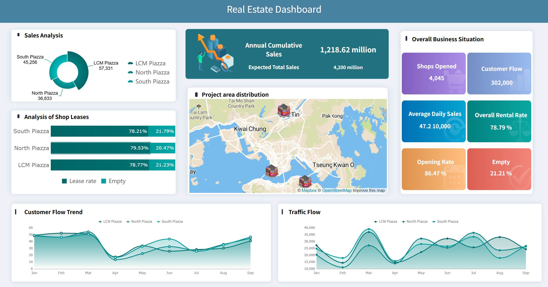
5. Project status dashboard
For internal teams, a project dashboard is one of the most practical free dashboard formats. It creates visibility, aligns stakeholders, and reduces status update meetings.
This layout works because it combines quantitative progress with operational context. A project may be 80% complete, but still at risk if key deadlines are slipping.
Best use cases:
PMO reporting
Agency project delivery
Internal transformation initiatives
After discussing progress bars and deadlines, a dashboard mockup helps clarify how to balance status visibility with team accountability.
6. Customer support dashboard
Support dashboards should make service quality visible, not just ticket volume. Beginners often build layouts that show activity but hide performance.
Top row: total tickets, first response time, resolution time, CSAT
Middle left: ticket trend over time
Middle right: issue category breakdown
Bottom: open tickets by priority or agent
Best use cases:
Help desk operations
SaaS customer support
Shared services teams
This layout helps managers answer the right questions:
Are tickets increasing?
Are teams responding fast enough?
Which issues are driving demand?
Is customer satisfaction improving?
That combination makes the dashboard operationally useful, not just descriptive.
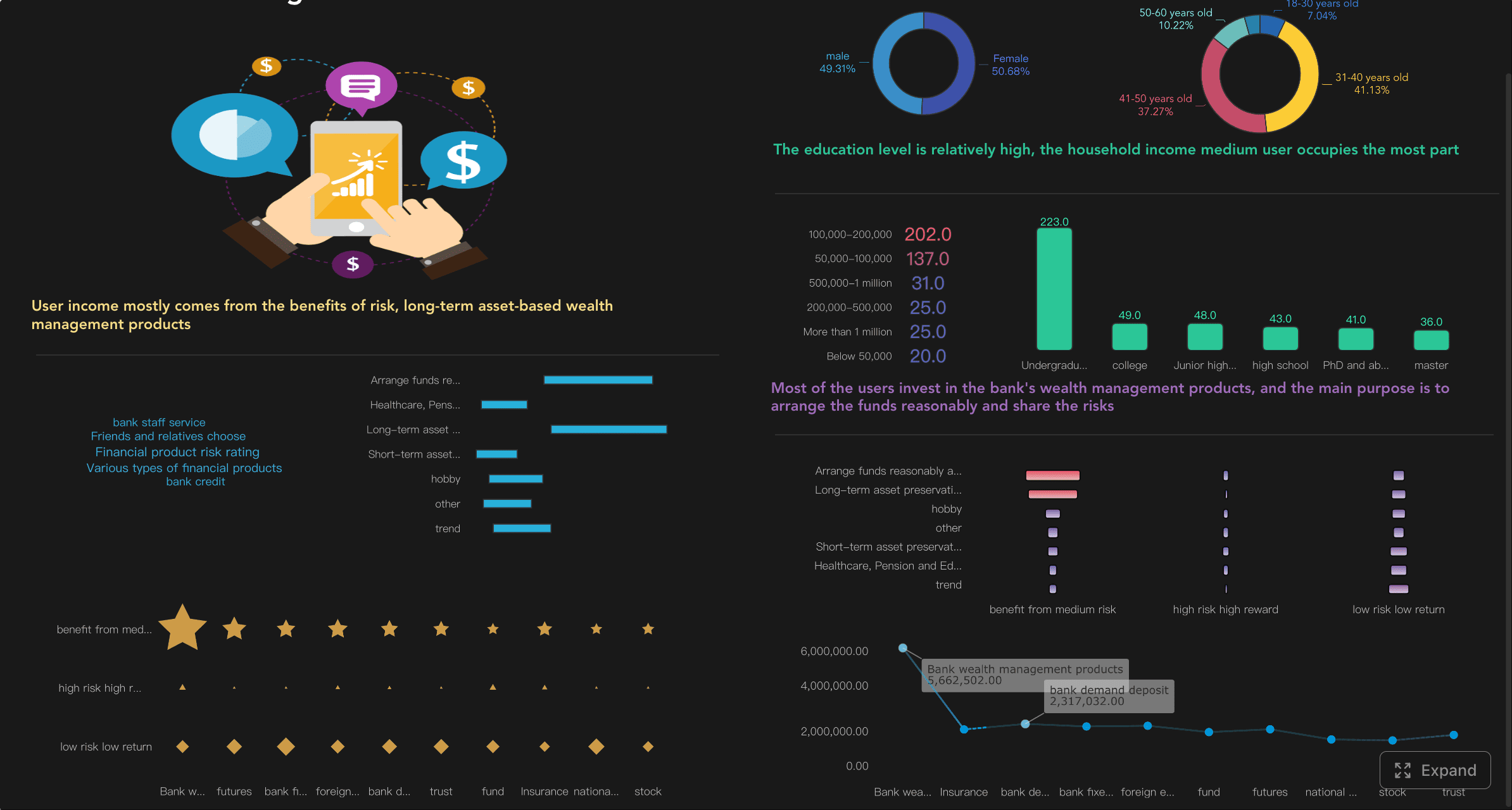
7. Personal finance dashboard
A personal finance dashboard is ideal for beginners because the data model is straightforward and the value is immediate. It teaches core dashboard logic in a low-risk setting.
A simple personal finance layout should show:
Income
Spending
Savings
Monthly trends
A recommended format:
KPI cards for total income, total expenses, net savings
Monthly spending trend
Spending by category
Savings progress against target
Optional recent transactions table
Best use cases:
Budget tracking
Freelance cash flow monitoring
Household expense planning
Why it works for beginners:
The dashboard is updated frequently, the metrics are easy to understand, and layout mistakes become obvious quickly.
A good finance dashboard should feel calm, not crowded. If the user cannot tell in five seconds whether they are overspending, the design is too complex.
Free dashboard tools and templates to build these layouts
Choosing a free dashboard tool is not only about price. It is about how quickly you can move from raw data to a reliable decision view.
Free templates and component libraries
Templates and component libraries are useful when you already know the layout you want and need a faster build path.
They typically provide:
Starter dashboard pages
KPI cards and reusable widgets
Tables, charts, and navigation blocks
Drag-and-drop sections for quick assembly
These options are ideal for:
Designers building mockups
Front-end teams starting admin panels
Analysts who want a proven layout before connecting live data
A good template saves time, but a poor one creates clutter. Look for layouts with strong spacing, clear headings, and limited visual styles. If every widget competes for attention, the dashboard will be hard to trust.
Free dashboard software and generators
Free dashboard software is better when the goal is a working dashboard, not just a visual concept.
There are three common categories:
No-code builders
Best for business users who want to drag, drop, and configure charts without technical setup.
Good for:
Fast prototyping
Internal reporting
Teams with limited technical support
Spreadsheet-based tools
Best when the data already lives in Excel or Google Sheets.
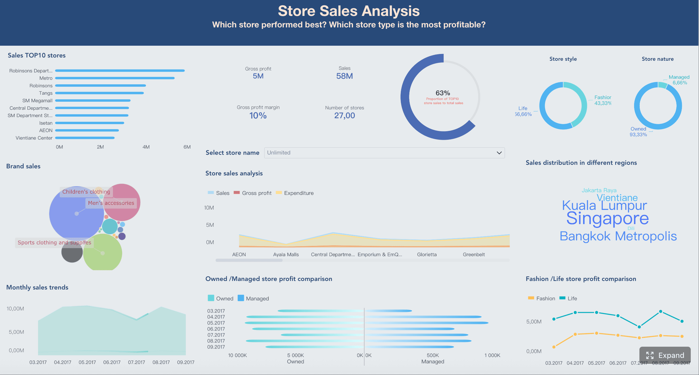
After comparing tool categories, a visual showing the same dataset rendered in different builder styles can help teams evaluate fit.
Data Studio and similar reporting platforms
Data Studio and similar reporting platforms are often a strong starting point for beginners because they balance flexibility, interactivity, and low setup friction.
For beginners, the key is to start with one page. Do not use every available connector, control, and chart. Build the core view first, validate it with users, then expand.
How to customize a free dashboard without making it confusing
Customization adds business relevance, but too much customization reduces clarity. The right approach is controlled adaptation.
Start with one goal and one audience
Before changing colors, charts, or filters, define two things:
What is the dashboard supposed to help someone decide?
A marketing manager may need campaign-level comparisons
A support lead may care about SLA and backlog risk
Every chart should answer a real question. If it does not, remove it.
A simple test: if a stakeholder asks, “So what should I do with this metric?” and there is no clear answer, that element may not belong on the dashboard.
Keep the visual hierarchy simple
Visual hierarchy determines whether users understand the page in seconds or struggle through it.
Follow these rules:
Put KPIs first
Group related charts together
Use the same color meaning throughout
Keep titles short and explicit
Use whitespace to separate sections
A practical hierarchy often looks like this:
Headline KPIs
Main trend
Supporting comparisons
Detail table or notes
Avoid decorative complexity. A free dashboard does not become more valuable because it has gradients, shadows, animations, or unusual chart styles. Value comes from clarity.
After describing hierarchy principles, include a layout mockup that shows top-to-bottom reading flow and consistent section spacing.
Make interactive elements easy to use
Interactivity is powerful, but it is also where many beginner dashboards fail.
Keep it simple:
Use only a few high-value filters
Write labels in plain language
Avoid deep menu trees
Limit chart interactions unless they serve a clear purpose
Good beginner filters include:
Date range
Region
Team
Channel
Product category
Poor beginner choices include:
Too many nested filters
Technical field names
Hidden controls
Overuse of tabs and drill paths
If users need instructions to use the dashboard, it is already too complicated.
Common beginner mistakes when using a free dashboard and how to avoid them
Even a good free dashboard can fail if the layout and logic are not aligned with the reporting goal. Below are the most common beginner mistakes and the practical fix for each one.
Adding too many metrics before deciding what matters most
This is the most frequent problem. Beginners often think more metrics mean more insight. In reality, more metrics usually mean weaker focus.
How to avoid it:
Start with 3 to 5 primary KPIs and one supporting trend. Add more only if a real user asks for them.
Using charts that look impressive but are hard to read
Complex visuals can be attractive in demos but ineffective in operations. If users cannot interpret the chart quickly, it slows decision-making.
How to avoid it:
Use line charts for trends, bar charts for comparisons, tables for detail, and simple KPI cards for headline numbers. Choose readability over novelty.
Ignoring mobile or small-screen viewing
Many dashboards are reviewed on laptops in meetings or on phones between calls. A layout that works only on large monitors creates friction immediately.
How to avoid it:
Check whether KPI rows stack cleanly, labels remain readable, and filters stay usable on smaller screens. Prioritize responsive blocks and shorter titles.
Copying a layout without adapting it to the data source and reporting goal
A copied dashboard is only useful if the data and questions match. A sales layout may not work for support data. A website dashboard may not fit project reporting.
How to avoid it:
Use templates as a structure, not a final answer. Adjust metric definitions, chart types, and section order to fit the actual use case.
A consulting perspective is useful here: the dashboard is not the deliverable. The deliverable is better decisions. The layout is only valuable if it supports that outcome.
How to choose the right layout for your next free dashboard
The best free dashboard is the one that fits your data, your update cycle, and the people who will actually use it.
Start with three decisions:
Pick a layout based on the type of data, update frequency, and who will use it
Ask:
Is the data operational, marketing, financial, or project-based?
Does it update daily, weekly, or monthly?
Is the user an executive, analyst, manager, or individual contributor?
Decide whether a free dashboard template, generator, or reporting tool is the best starting point
Use this quick logic:
Choose a template if you need structure fast
Choose a generator if you want a first draft from data quickly
Choose a reporting tool if the dashboard needs to stay live and shared
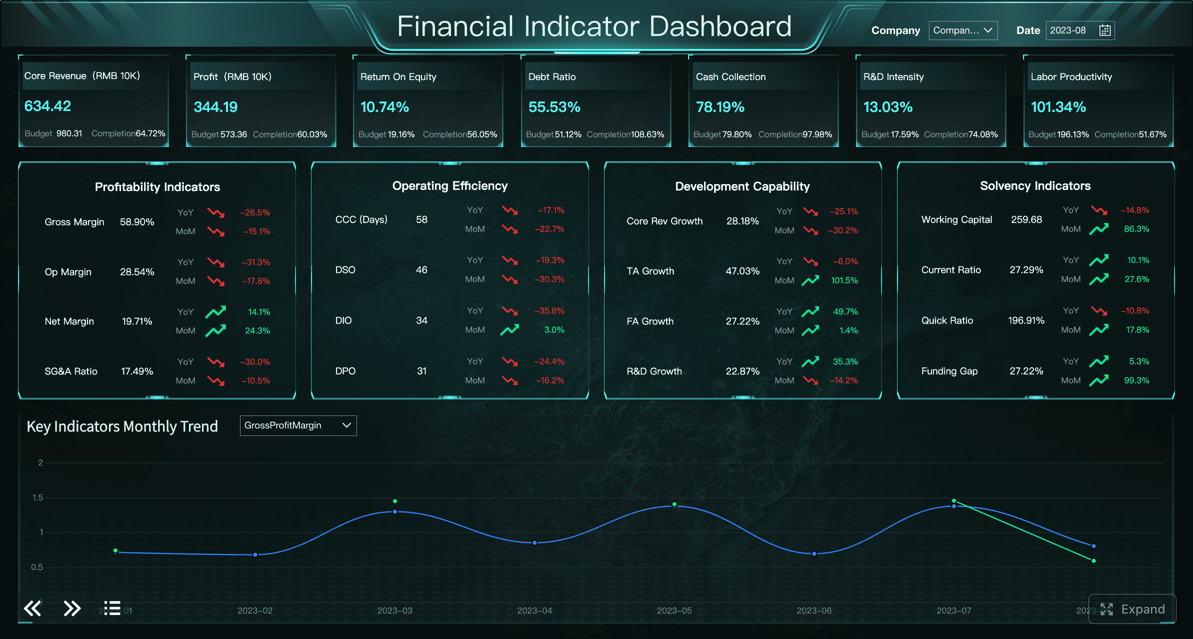
For teams moving from beginner dashboards to decision-grade business intelligence, this is where product selection starts to matter. If your organization needs not only free dashboard experimentation but also stronger governance, richer interactivity, and enterprise-ready deployment, FineBI is a practical next step. It supports self-service analytics, dashboard building, data connectivity, and scalable sharing in a way that suits both business teams and IT-managed environments. For decision-makers, that means you can start simple, then mature without rebuilding your reporting approach from scratch.
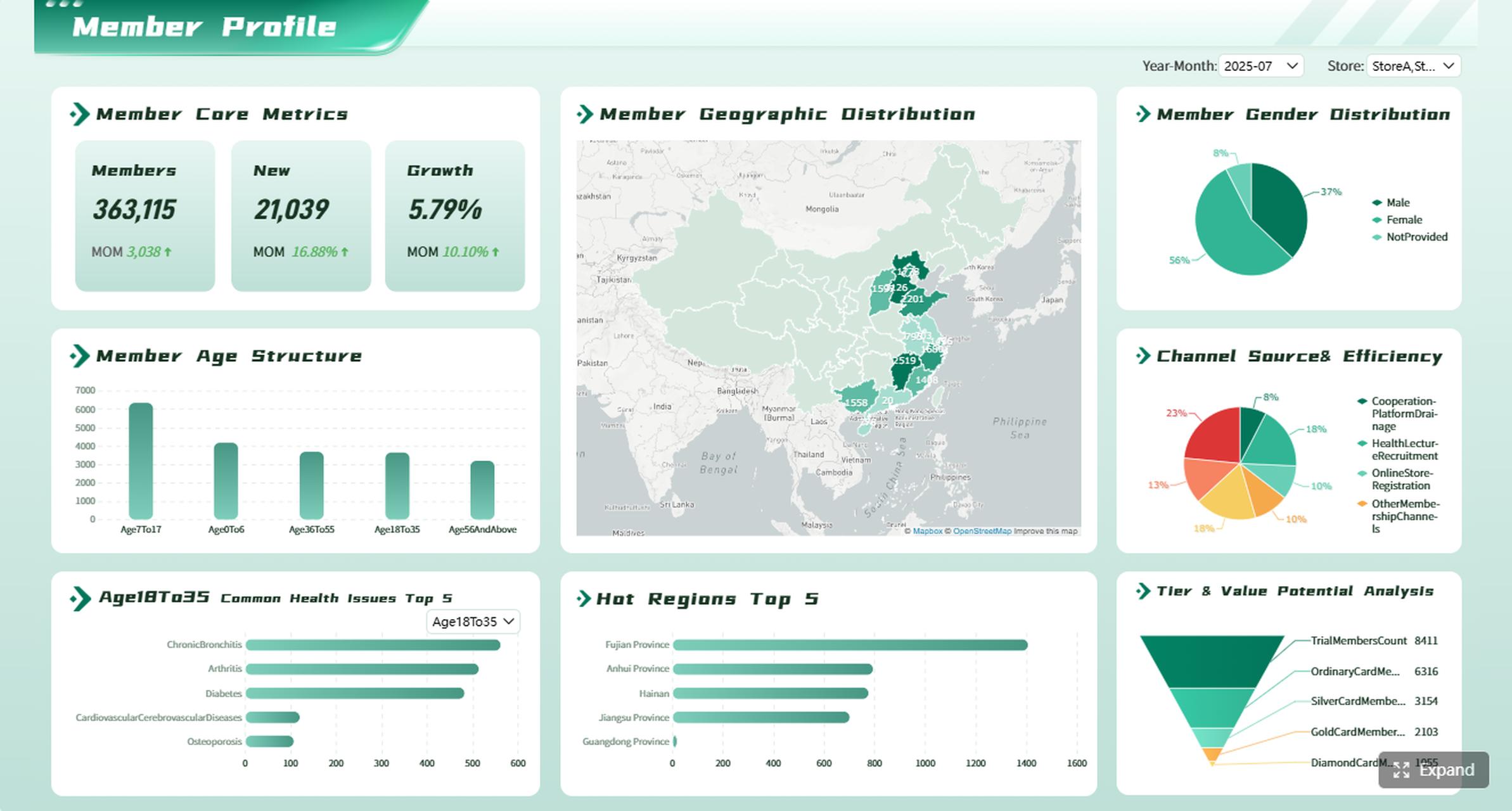
After introducing an enterprise-capable option, a product-oriented dashboard image is useful to show what “beginner-friendly but scalable” looks like in practice.
End with this simple checklist before you build or copy a layout
Use this checklist to evaluate your next free dashboard:
Is there one clear goal for the dashboard?
Does the layout match the main audience?
Are the top KPIs visible without scrolling?
Are the charts easy to read in under 10 seconds?
Are filters limited to the few that users really need?
Does the dashboard work on smaller screens?
Can the data source support the layout consistently?
Does each section help someone make a decision?
If you can answer yes to most of these, you are on the right path.
A good free dashboard is not about squeezing in more widgets. It is about presenting the right information in a layout people can trust and use. Start simple, copy a proven structure, and improve only after real usage reveals what matters most.
FAQs
A good free dashboard for beginners is simple, easy to scan, and focused on a few important metrics. It should include clear KPI cards, one or two basic charts, and simple filters without feeling crowded.
If you are planning the layout, start with a template. If your data updates often, use a live tool, and if you want a fast first draft with less manual design work, try a dashboard generator.
Most first dashboards work best with 3 to 5 KPI cards, a trend chart, a comparison chart or table, and a small filter area. This keeps the dashboard useful without overwhelming new users.
Put the most important numbers at the top, use consistent colors, and limit the number of charts on one page. Short labels and brief insight text also help users understand what they are seeing quickly.
Yes, some free dashboard generators can turn uploaded data into a draft dashboard automatically. They can save time, but you should still review the chart choices and layout to make sure the dashboard answers your real questions.
Product Trial
FineReport
Pixel-perfect reports · Interactive dashboards · Easy data entry · Digital twins