You can use the boston consulting group matrix to quickly evaluate your business products or units. This tool helps you decide where to invest, which areas to develop, and what to discontinue. It sorts your products into four groups by looking at their market growth and market share. Many large companies rely on this method. At its peak, over half of Fortune 500 companies used the matrix to guide their strategy. This shows how valuable and trusted the approach has become in business planning.
What is the Boston Consulting Group Matrix?
The Boston Consulting Group Matrix is a business planning tool that helps you analyze your brand portfolio and make strategic decisions. You use it to sort your products or business units into four categories based on their market growth and market share. This method gives you a clear picture of which areas to invest in, develop, or discontinue.
You can call the Boston Consulting Group Matrix by another name: the BCG Matrix or the BCG Growth Share Matrix. Bruce D. Henderson developed this tool in the 1960s to help companies like Mead Paper plan their strategies. Since then, many Fortune 500 companies have used it to guide their decisions. The matrix remains popular today because it simplifies complex business choices.
Tip: The BCG Matrix uses two main ideas: relative market share and market growth potential. These concepts help you compare your products to competitors and see which markets offer the most opportunity.
Purpose of the Boston Consulting Group Matrix
The BCG Matrix gives you a way to evaluate your business units or products quickly. You use it to answer important questions: Which products should you invest in? Which ones should you maintain? Which should you consider selling or discontinuing? The matrix helps you focus your resources on the areas that will bring the most growth and stability.
Here is a table that shows the historical background and main objectives of the BCG Matrix:
| Aspect | Detail |
|---|---|
| Developed by | Bruce D. Henderson |
| Year of Development | 1960s |
| Purpose | Strategic planning tool to categorize business units based on market share and growth potential. |
| First Use | Used by Mead Paper for strategic planning consultation. |
| Popularity | Gained widespread use among Fortune 500 companies in the late 1970s and 1980s. |
| Current Relevance | Still used by companies as of 2022 for developing strategic plans. |
| Objective | Description |
|---|---|
| Prioritize the right business or product | Focus on creating new winning products instead of wasting resources on declining ones. |
| Eliminate wasteful spending | Cut losses by selling off underperforming products to concentrate on successful ones. |
| Create a more robust and balanced portfolio | Balance investments across high-growth markets and maintain healthy cash cows for stability. |
The BCG Matrix helps you avoid wasteful spending. You can cut losses by selling off underperforming products and concentrate on successful ones. You also create a more balanced brand portfolio by investing in high-growth markets and maintaining stable products.
How Businesses Use the Boston Consulting Group Matrix
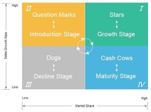
You use the BCG Matrix to guide your business planning and resource allocation. The matrix divides your products into four quadrants: Stars, Cash Cows, Question Marks, and Dogs. Each quadrant represents a different combination of market share and market growth.
| Quadrant | Description |
|---|---|
| Stars | High market share in high-growth markets; potential for future growth. |
| Cash Cows | High market share in low-growth markets; generates steady revenue with little investment. |
| Question Marks | Low market share in high-growth markets; requires careful consideration for potential growth. |
| Dogs | Low market share in low-growth markets; may be candidates for divestiture. |
You can use the BCG Matrix in several ways:
- Make informed decisions about where to invest resources.
- Maintain resources in stable units.
- Divest underperforming units to optimize portfolio performance.
Many industries use the BCG Matrix for portfolio analysis. You see it in technology, consumer goods, and healthcare. Multinational corporations rely on the matrix to visualize their product portfolios, identify strengths and weaknesses, and guide resource allocation. The matrix also helps you focus on new product development in high-growth markets.
| Theoretical Foundation | Description |
|---|---|
| Relative Market Share | The share of a product or business unit in comparison to its competitors. |
| Market Growth Potential | The potential for growth of a product or business unit in the market. |
When you use the BCG Matrix, you get a clear visual representation of your business. You see which products are strong and which need improvement. The matrix guides you to invest in Stars, maintain Cash Cows, consider the future of Question Marks, and divest Dogs. This approach helps you build a robust and balanced brand portfolio.
The Four Quadrants of the Boston Consulting Group Matrix

The bcg matrix, also known as the bcg growth share matrix, helps you analyze your business portfolio by dividing products or business units into four categories. You use this tool to understand which products deserve more investment, which ones generate steady income, and which might need to be discontinued. The matrix uses two main factors: market growth rate and relative market share. By plotting your products on the bcg matrix, you can see where each one stands and make better strategic decisions.
Each quadrant in the bcg growth share matrix represents a different type of product or business unit. These quadrants are Stars, Cash Cows, Question Marks, and Dogs. You can use this framework to guide your investments and manage your resources more effectively.
Stars
Stars are products or business units that lead the market in fast-growing industries. When you look at the bcg matrix, you will find stars in the quadrant with both high market share and high market growth. These products often set the pace for innovation and attract a lot of attention from competitors.
You can recognize stars by these characteristics:
- They hold a high market share.
- They operate in markets with a high growth rate.
- They offer significant future potential for investment and development.
- They are market leaders but require substantial investment to maintain their position.
- They generate large cash flows but also consume a lot of funds.
- As the market matures, they may transition into cash cows.
For example, a state-of-the-art smartphone often falls into the stars category. It has a significant market share and benefits from rapid market growth. You need to keep investing in stars to maintain their leadership. Over time, as the market slows down, these products can become cash cows and provide steady profits.
Note: Stars play a critical role in your portfolio. They drive growth and can secure your company's future if you manage them well.
Cash Cows
Cash cows are the backbone of your business. In the bcg matrix, you find cash cows in markets with slow growth but high market share. These products have already established themselves as leaders and do not need much investment to keep their position.
Here is a table that summarizes the typical financial performance indicators for cash cows:
| Indicator | Description |
|---|---|
| Market Growth | Slow growth in the market where the product is positioned. |
| Market Share | High market share, indicating leadership in the marketplace. |
| Investment Requirement | Minimal further investments needed to maintain position. |
| Cash Flow | High cash flows generated, often used to finance other products. |
| Strategy | Products are 'milked' for profits with minimal reinvestment. |
You can see real-world examples of cash cows in many well-known companies:
| Company | Cash Cow Products |
|---|---|
| Apple | iTunes, MacBook, iMacs |
| Microsoft | Windows OS, Office Suite |
| P&G | Tide, Pampers |
- Apple’s iTunes, MacBook, and iMacs generate healthy profits and have a loyal customer base.
- Microsoft’s Windows OS and Office Suite continue to bring in substantial revenue even though their markets grow slowly.
- P&G’s Tide and Pampers are well-established brands that deliver consistent cash flow.
You rely on cash cows to fund new projects and support stars and question marks. These products require little investment but provide the resources you need to grow your business.
Question Marks
Question marks represent products or business units with low market share in high-growth markets. In the bcg matrix, you place these products in the quadrant where the future is uncertain. They have the potential to become stars, but they also risk becoming dogs if they do not improve.
Managing question marks can be challenging. You need to:
- Investigate performance. Understand why the product is not succeeding. Analyze competitors and the market to find any mismatches.
- Test and iterate. Try different strategies to see what works best.
- Decide and act. Based on your findings, choose whether to keep investing or phase out the product.
Sometimes, a question mark can turn into a star. For example, Tesla’s products started as question marks. As demand grew and technology advanced, they moved into the stars quadrant of the bcg growth share matrix.
Tip: You should monitor question marks closely. With the right strategy, you can turn them into valuable assets for your business.
Dogs
In the bcg matrix, Dogs represent products or business units with low market share in markets that do not grow quickly. You often find these products struggling to compete. They do not attract much attention from customers or generate strong profits. When you look at the bcg matrix, Dogs sit in the quadrant with both low market growth and low market share.
You use the bcg matrix to spot Dogs because they can drain your resources. These products rarely show signs of improvement. They do not offer much potential for future growth. You may notice that they consume time, money, and effort without giving you a good return.
You can recognize Dogs in the bcg matrix by these typical characteristics:
- Poor adoption by customers
- Limited market potential
- Consumes resources without significant return
When you manage a portfolio, you want to avoid letting Dogs take up too much of your attention. You need to decide what to do with these products. The bcg matrix helps you make these decisions by showing you where to focus your resources.
Companies use several strategies to handle Dogs in the bcg matrix. You can see the most common approaches in the table below:
| Strategy | Description |
|---|---|
| Harvesting | Continue selling the product to existing customers while reducing investment in marketing. |
| Cost-cutting | Reduce costs related to production and marketing to improve profitability. |
| Divestment | Sell off the product if it does not align with strategic goals or generate sufficient revenue. |
You might choose to harvest a Dog by keeping it on the market but cutting back on spending. Sometimes, you can improve profitability by reducing costs. In other cases, you may decide to sell or discontinue the product if it does not fit your business goals.
Note: The bcg matrix does not suggest that every Dog is worthless. Some products may serve a niche market or support your brand in other ways. You should always analyze each situation before making a final decision.
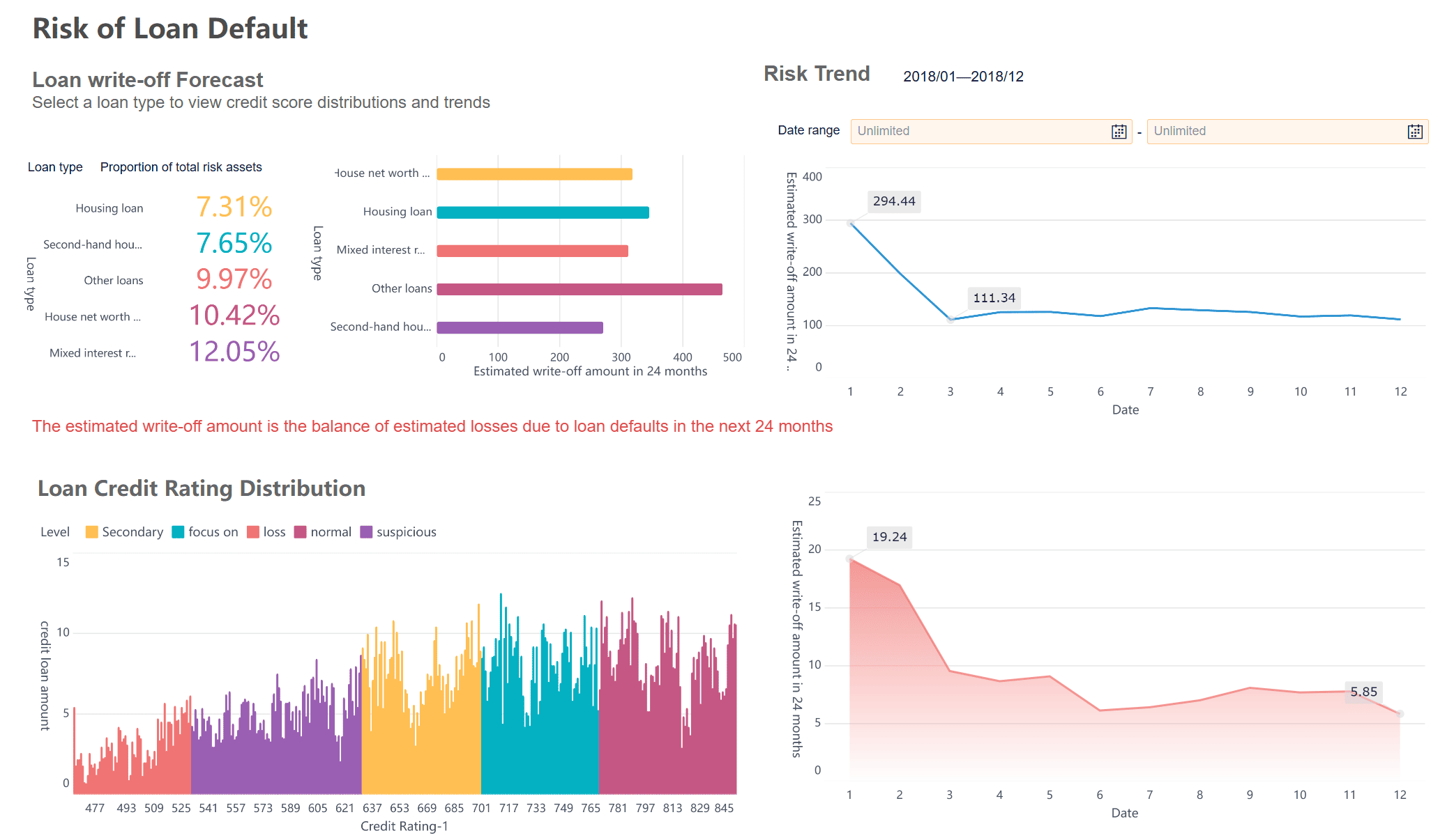
When you use a business intelligence tool like FineBI, you can quickly identify which products in your portfolio fall into the Dogs quadrant of the bcg matrix. FineBI helps you connect to your data sources, visualize product performance, and track market trends. You can create dashboards that highlight low-performing products, making it easier to decide whether to harvest, cut costs, or divest. This approach saves you time and ensures you focus your resources on products with real growth potential.
How the Boston Consulting Group Matrix Works
The boston consulting group matrix gives you a clear way to analyze your business portfolio. You use this tool to sort your products or business units into four categories based on their market share and market growth. The bcg matrix helps you see which products deserve more investment, which ones generate steady income, and which might need to be discontinued.
When you apply the bcg matrix, you create a visual chart that shows where each product stands in the market. This process helps you make better decisions about resource allocation and long-term strategy. The bcg growth share matrix remains popular because it simplifies complex business choices and guides you toward profitable actions.
Step-by-Step Guide to Using the BCG Matrix
You can follow these steps to use the bcg matrix effectively:
- List all the products or business units you want to analyze.
- Collect data on each product’s market share and the growth rate of its market.
- Plot each product on the matrix using two axes: market growth (vertical) and relative market share (horizontal).
- Place each product into one of the four quadrants: Stars, Cash Cows, Question Marks, or Dogs.
- Review the results and decide where to invest, maintain, or divest.
Tip: Use clear and recent data for each product to ensure your analysis is accurate.
What Data You Need for the BCG Matrix
To position your products accurately in the bcg matrix, you need specific data. The most important metrics are market growth and relative market share. These numbers help you categorize each product into the right quadrant.
You should gather the following types of data:
- Traffic growth rates, such as month-over-month or year-over-year changes
- Click-through rates for affiliate links
- Earnings per click for each product or category
- Commission totals by merchant or product category
- Conversion rates from merchant reports
This information gives you a complete view of how each product performs in the market. Reliable data ensures your bcg matrix analysis leads to better business decisions.
Applying the BCG Matrix with FineBI
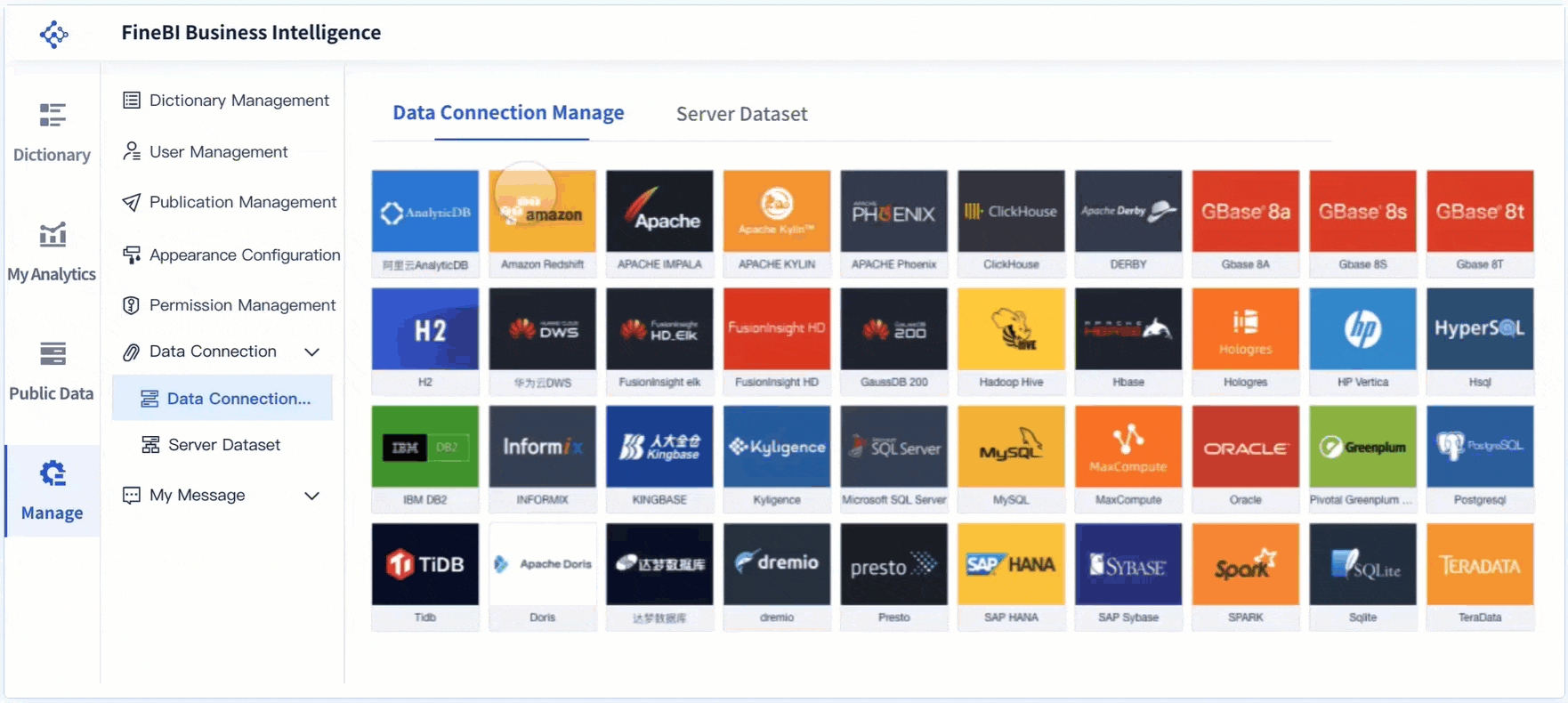
FineBI makes it easy to apply the bcg matrix to your business data. You can connect FineBI to your data sources, such as sales databases or marketing platforms. FineBI helps you gather, clean, and organize your data for analysis.
With FineBI, you can:
- Build datasets that include market share and growth rates
- Create visual dashboards to display your bcg matrix results
- Track changes over time and adjust your strategy as needed
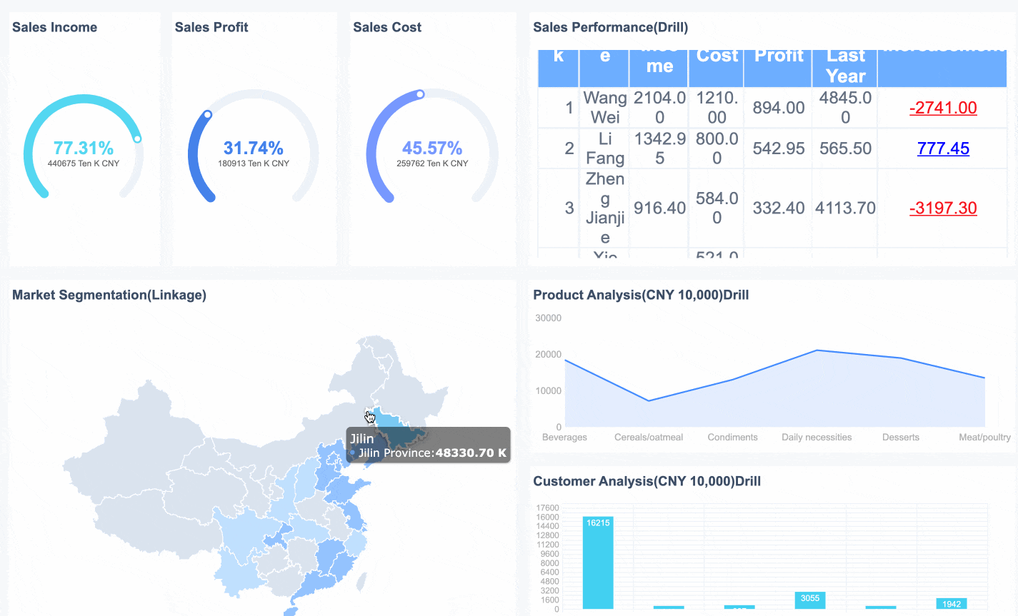
FineBI's drag-and-drop tools let you visualize your product portfolio without coding. You can quickly spot trends and identify which products are Stars, Cash Cows, Question Marks, or Dogs. This approach saves you time and helps you focus on the most valuable parts of your business.
Simple Examples of the Boston Consulting Group Matrix

You can use the BCG Matrix to sort your products into four main groups. These groups help you decide where to invest your time and money. Stars are products that lead the market and grow quickly. Cash cows are products that bring in steady profits with little extra investment.
When you look at stars, you see products with high market share in fast-growing markets. These products need a lot of support to stay ahead, but they also drive your business forward. Cash cows, on the other hand, sit in markets that do not grow much anymore. They still hold a strong position and generate reliable income, which you can use to fund new projects or support stars.
Example of a Star
Stars shine in markets that grow fast and have tough competition. You often find these products at the center of your business strategy. For example, Apple’s iPhone is a classic star. The iPhone holds a large share of the smartphone market, which keeps expanding every year. Apple invests heavily in the iPhone to keep it ahead of rivals. This product brings in a lot of revenue and helps Apple stay at the top of the industry. When you manage stars well, they can become cash cows as the market matures.
Example of a Cash Cow
Cash cows are the foundation of your business. They dominate slow-growing markets and require little extra spending. These products give you the funds to invest in stars or explore new ideas. Here is a table showing well-known cash cows and their impact:
| Company | Cash Cow Product | Financial Impact |
|---|---|---|
| Apple | iPhone | Generates massive profits with minimal marketing changes, funding new technologies like Vision Pro. |
| Nestlé | Nescafé | Provides consistent revenue, allowing investment in emerging segments like plant-based products. |
| Disney | Classic Animated Films | Generates predictable income from licensing and merchandise, supporting investments in new ventures like Disney+. |
You can see that cash cows play a key role in keeping companies strong. They help you balance risk and reward across your product portfolio.
Example of a Question Mark
Question marks are products with low market share in fast-growing markets. You might see potential in these products, but they need careful attention. For example, a new electric vehicle model from a car company could be a question mark. The market for electric cars grows quickly, but your product does not yet lead the field. You must decide whether to invest more to turn it into a star or move resources elsewhere. Using a tool like FineBI, you can track sales and market trends to make smarter choices about your question marks.
Example of a Dog
In the bcg matrix, a Dog is a product or business unit with low market share in a market that does not grow quickly. You often see Dogs as products that struggle to compete and do not generate strong profits. The bcg matrix helps you spot these products so you can decide whether to keep them, improve them, or remove them from your portfolio.
You can recognize a Dog in the bcg matrix by looking at its performance. Dogs usually have weak sales and do not attract much attention from customers. They often consume resources without giving you a good return. You may notice that these products do not fit your long-term strategy.
Let’s look at a real-world example. BlackBerry smartphones once led the market, but over time, their market share dropped as competitors like Apple and Samsung grew stronger. The smartphone market kept changing, but BlackBerry could not keep up. In the bcg matrix, BlackBerry smartphones became Dogs because they had low market share and the market stopped growing for them.
Here is a table that shows how you might identify a Dog in your portfolio using the bcg matrix:
| Product Example | Market Share | Market Growth | Typical Outcome |
|---|---|---|---|
| BlackBerry Smartphone | Low | Low | Discontinue or divest |
Note: You should not always remove Dogs right away. Sometimes, a Dog supports your brand or serves a small group of loyal customers. You need to analyze each situation before making a decision.
FineBI can help you find Dogs in your product portfolio. You can connect FineBI to your sales and market data. FineBI lets you build dashboards that show which products have low market share and slow market growth. You can use these insights to decide if you should invest, improve, or discontinue a product. FineBI makes it easier to manage your portfolio and focus on products with real potential.
Why Use the Boston Consulting Group Matrix
The bcg matrix gives you a simple way to understand your brand portfolio. You use this tool to sort your products or business units into four groups based on market growth and market share. This approach helps you see which products deserve more investment, which ones generate steady income, and which might need to be discontinued. By using the bcg matrix, you can make smarter decisions about where to focus your resources and how to grow your business.
When you apply the bcg matrix, you gain a clear view of your entire product lineup. You can spot strengths and weaknesses quickly. This method supports your long-term planning by showing you which products have the most potential and which ones may hold you back.
Key Benefits for Businesses
The bcg matrix offers several important benefits for your business:
- You can allocate resources more effectively.
- You prioritize investments in products with the best growth potential.
- You optimize your product portfolio for better performance.
Many companies choose the bcg matrix because it is easy to understand and use. You do not need complex calculations to get started. The matrix gives you a solid foundation for making strategic decisions, such as developing new products or withdrawing from weak markets.
| Benefit | Description |
|---|---|
| Simplicity and Ease of Use | The matrix is easy to understand and implement, providing a clear view of the strategic situation of various business units. |
| Decision Support | It provides a solid basis for strategic investment decisions, including product development and market withdrawal. |
You can use the bcg matrix to drive growth and profitability by focusing on the right products at the right time.
Practical Uses in Business Strategy
You use the bcg matrix to guide your business strategy in several ways:
- It helps you focus on the most promising products.
- It supports portfolio diversification, reducing risk and increasing stability.
- It encourages dynamic resource allocation, so you can adapt to market changes and seize new opportunities.
When you want to analyze your brand portfolio, the bcg matrix gives you a clear framework. You can see which products are stars, cash cows, question marks, or dogs. This insight helps you plan for the future and build a balanced business.
After you identify your product categories, you can use business intelligence tools like FineBI to track performance and visualize trends. FineBI lets you connect to your data sources, build dashboards, and monitor changes over time. This makes it easier to update your strategy and keep your business moving forward.
Limitations of the Boston Consulting Group Matrix
The bcg matrix is a popular tool for evaluating your business portfolio. You use it to sort products or business units into four categories based on market growth and market share. This approach helps you make decisions about where to invest, maintain, or divest. However, the bcg matrix does not cover every aspect of business strategy. You need to understand its limitations before relying on it for important decisions.
What the BCG Matrix Does Not Cover
The bcg matrix focuses on just two factors: market growth and relative market share. Many important business elements do not appear in this model. For example, the matrix does not consider how attractive a market is beyond its growth rate. It also ignores other sources of competitive advantage. You may miss out on profit opportunities in declining markets if you only look at high-growth areas. The matrix assumes each business unit operates independently, which is not always true. Sometimes, products work together and create value as a group.
Here is a table that summarizes what the bcg matrix does not address:
| Limitation | Description |
|---|---|
| Market Attractiveness | Overlooks factors beyond market growth that make an industry appealing. |
| Competitive Advantage | Ignores other sources of strength besides market share. |
| Declining Markets | Misses profit potential in shrinking markets. |
| Independence Assumption | Assumes no synergy between business units. |
| Suitability | Works best for business units, not always for individual products. |
| Misunderstanding of Dogs | Dogs can sometimes help your business, even if the matrix suggests otherwise. |
Drawbacks to Consider
You face several risks if you rely only on the bcg matrix for portfolio analysis methods. The model simplifies complex market realities. It gives you a snapshot at one point in time, so you may miss changes in the market. High market share does not always mean high profits. The matrix does not tell you what actions to take after you classify your products. Some industries, such as services or those driven by innovation, may not fit the model well. The matrix also overlooks outside influences like new regulations or economic shifts.
Common drawbacks include:
- Oversimplification of market dynamics.
- Static analysis that may become outdated.
- Focus on market share without considering profitability.
- Lack of clear action steps after classification.
- Limited use in some industries.
- Neglect of external factors.
Experts recommend that you use the bcg matrix with other tools. You can add PESTEL analysis to understand the broader environment. Porter's Five Forces helps you see competitive pressures. Regular updates and scenario planning keep your analysis relevant. By combining different portfolio analysis methods, you get a more complete view of your business.
You can use the boston consulting group matrix to analyze your products and make smart decisions. Understanding each quadrant in the bcg growth share matrix helps you focus resources where they matter most. FineBI lets you gather data and visualize your portfolio, making it easier to apply these insights.
The matrix gives you a clear framework, but remember it simplifies complex realities. You should consider other factors like brand strength and customer loyalty.
| Key Takeaways for Businesses | Description |
|---|---|
| Portfolio Management | Prioritize product lines and allocate resources effectively. |
| Balanced Product Life Cycle | Optimize cash flow and maintain a healthy product mix. |
| Investment Decisions | Guide investments for growth and future returns. |
| Limitations | The matrix does not cover every business factor. |

Continue Reading About Boston Consulting Group Matrix
Understand Customer Loyalty Analytics with Data and Metrics
How to Perform RFM Analysis Step by Step
Break Even Analysis Made Easy with Step-by-Step Instructions
Making Metric Conversion Chart Easy for Everyday Life


FAQ

The Author
Lewis
Senior Data Analyst at FanRuan
Related Articles

What is Ecommerce Analytics and Why Does It Matter
Ecommerce analytics helps online stores track data, optimize sales, and enhance customer experience for better growth and profitability.
Lewis
Jan 04, 2026

What is Ad-Hoc Analysis and Why is it Important
Ad-hoc analysis lets you answer unique business questions instantly, offering flexible, real-time insights that drive smarter, faster decisions.
Lewis
Sep 16, 2025

What Is a Data Model and Why Does It Matter
A data model defines how data is structured and connected, making information easier to manage, analyze, and use for smarter business decisions.
Lewis
Aug 04, 2025