When you search for the best dashboard apps for business insights, you will find top choices like FineBI, Tableau, Power BI, Looker, Qlik Sense, Google Data Studio, Domo, and Apache Superset. These dashboard apps lead the market because they help you turn complex data into clear, actionable insights. Each dashboard app offers unique strengths, but they all focus on making dashboard software easy to use, powerful in analytics, and reliable for integration.
Choosing the right dashboard software matters for your business. The best dashboard apps provide real-time data connections, flexible dashboard design, and advanced analytics tools. Studies show that dashboard software improves awareness and decision-making by letting you interact with data directly. These dashboards help you analyze trends, find patterns, and make decisions that boost operational efficiency. With the right dashboard software, you can transform raw information into insights and achieve actionable insights that drive results.
Key Features of Dashboard Apps
When you evaluate the Best Dashboard Apps for Business Insights, you should focus on features that help you turn data into actionable visualizations. Modern dashboard apps, such as FineBI, offer a blend of real-time data, advanced analytics, and seamless integration. These features ensure your business intelligence platform delivers insights that drive better decisions.
Real-Time Data Integration
You need dashboards that update instantly as new data arrives. Real-time data integration means you always see the latest numbers, trends, and KPIs. FineBI, for example, connects to over 60 data sources, including cloud warehouses and big data platforms. This ensures your visualizations reflect current business conditions. Many leading dashboard apps, like Domo and Sisense, also support real-time data integration and combine multiple sources for unified analytics.
Advanced Analytics Tools
Advanced analytics tools help you move beyond basic charts. You can use predictive analytics, natural language Q&A, and embedded analytics to uncover trends and forecast outcomes. FineBI’s AI-driven features, such as FineChatBI, let you ask questions in plain language and get instant visualizations. This makes analytics accessible to everyone, not just data experts.
| Feature | Description |
|---|---|
| Natural language Q&A | Users can type questions like “What were our sales last quarter?” and instantly get a visual answer. |
| Predictive analytics | Built-in machine learning helps identify risks and opportunities ahead of time. |
| Embedded analytics | Dashboards can be shared in Microsoft Teams or embedded on websites for broader access. |
Customization and Security
Customization lets you tailor dashboards to your needs. You can adjust layouts, choose chart types, and set up filters for specific teams. FineBI provides flexible customization options and enterprise-grade security. You control access with role-based permissions, ensuring sensitive data stays protected.
Scalability and Performance
As your business grows, your dashboard must handle more data and users. FineBI’s high-performance engine supports thousands of users and massive datasets. You get fast, responsive visualizations, even during peak usage. Performance and scalability are essential for any business intelligence platform.
Integration with Business Data Sources
Integration is key for a complete view of your business. FineBI and other top dashboard apps connect to databases, APIs, and cloud services. This broad integration supports embedded analytics and real-time data flows. You can unify data from sales, finance, and operations for comprehensive visualizations.
Tip: Choose a dashboard app that excels in real-time data, analytics, customization, performance, and integration. This ensures your business intelligence platform delivers value across your organization.
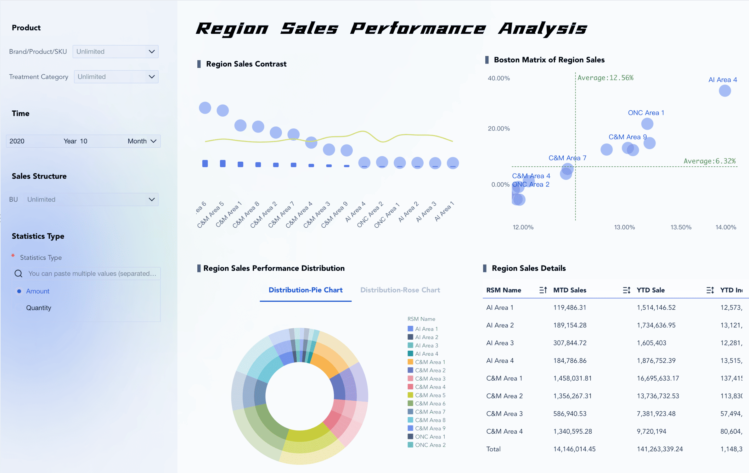
FineBI Analytics Dashboard Apps

FineBI stands out among the Best Dashboard Apps for Business Insights by offering a comprehensive approach to analytics dashboard integration. You can leverage FineBI’s unique workflow to connect, prepare, analyze, and visualize data from multiple sources. This platform empowers you to build dashboards that deliver actionable insights, whether you work in a small business or a large enterprise. FineBI’s strengths lie in its self-service capabilities, advanced analytics, and seamless integration with a wide range of business systems.
Self-Service Data Preparation
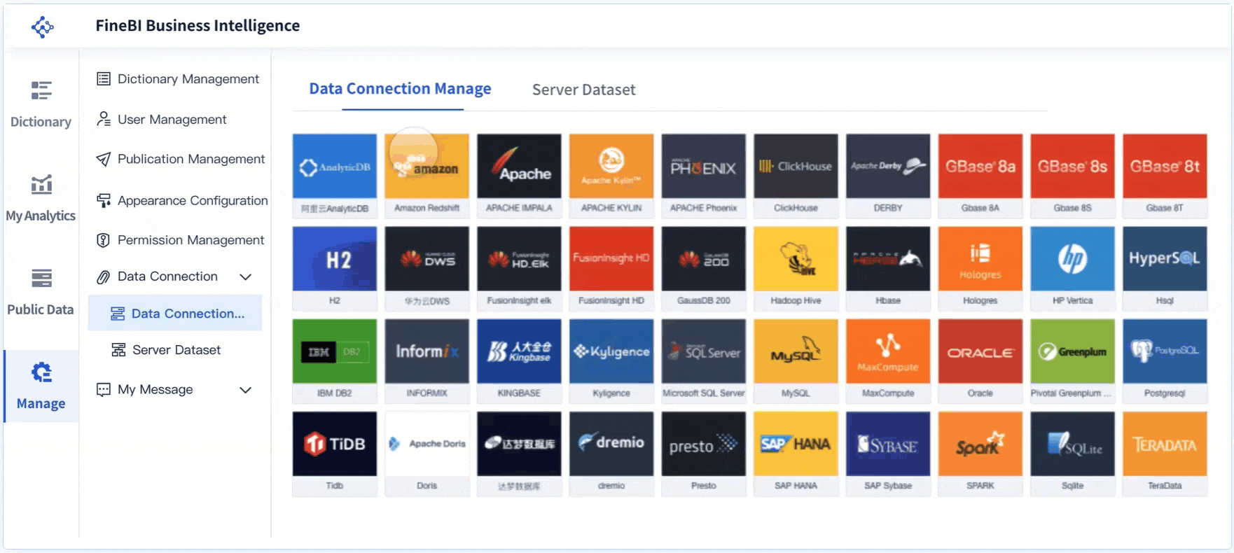
You can prepare your data for analysis without needing technical expertise. FineBI provides a no-code interface that lets you connect to over 100 data sources, including relational databases, cloud warehouses, and big data platforms. The platform’s integrated ETL tools allow you to clean, transform, and model your data directly within the dashboard environment. You can join tables, create calculated fields, and apply filters to ensure your data is ready for analytics. FineBI’s real-time data processing ensures that your dashboards always reflect the latest information, supporting immediate decision-making.
FineBI’s self-service data preparation tools simplify complex workflows. You can extract relevant fields, merge datasets, and standardize values with just a few clicks. This approach reduces your reliance on IT teams and accelerates the path from raw data to business insights. The platform’s robust data modeling features support multi-dimensional analysis, enabling you to explore trends and patterns across different business functions.
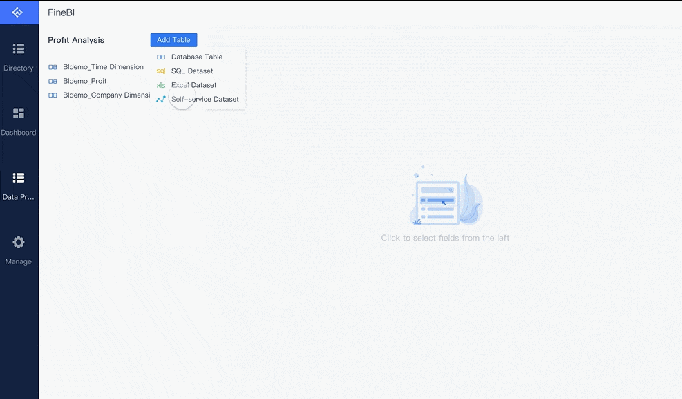
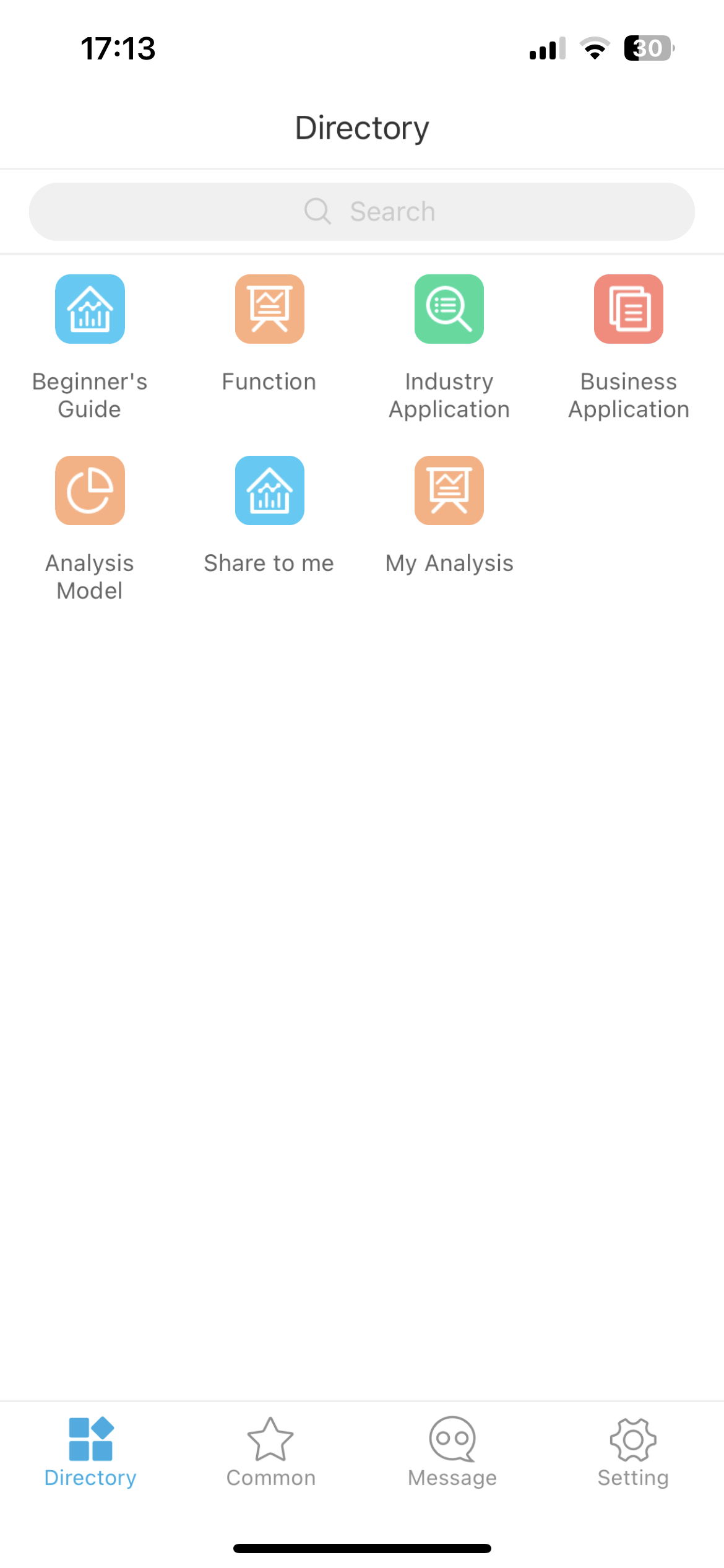
Drag-and-Drop Dashboard Creation
FineBI makes dashboard creation accessible to everyone. You can use the drag-and-drop editor to build interactive dashboards without writing any code. The platform offers a wide variety of visualization components, including bar charts, line graphs, pivot tables, and geographic maps. You can customize layouts, apply filters, and add embedded analytics elements to tailor each dashboard to your needs.
The user-friendly dashboard creation process allows you to present key indicators and dimensions on a single page. Business leaders can quickly access critical metrics and monitor performance in real time. FineBI’s dashboard environment supports embedded analytics, so you can share insights across teams or integrate dashboards into other business applications. This flexibility ensures that your analytics reach the right people at the right time.
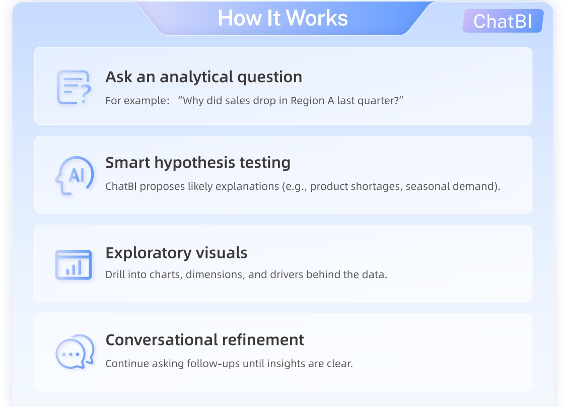
AI-Driven Analytics and FineChatBI
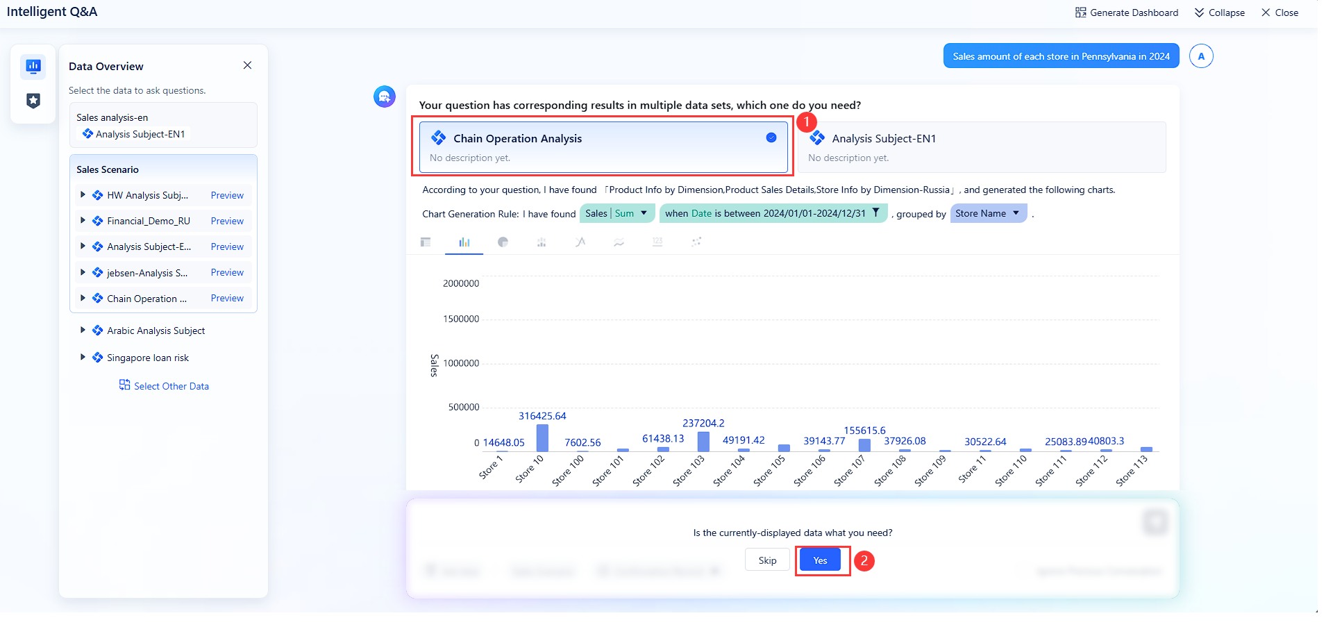
FineBI enhances your analytics experience with AI-driven features. The FineChatBI module introduces conversational analytics, allowing you to ask questions in plain language and receive instant visualizations. You can explore data by typing queries like “Show me this month’s sales by region,” and FineChatBI will generate the appropriate charts and insights.
AI-driven analytics in FineBI go beyond basic reporting. You can use predictive analytics to identify risks and opportunities before they impact your business. The platform’s in-memory computing engine delivers fast response times, even for complex queries. FineBI’s embedded analytics capabilities let you interact with data directly within dashboards, supporting real-time interactivity and deeper exploration.
Enterprise Data Governance
FineBI provides enterprise-grade data governance to ensure security and compliance. You can control access to dashboards and data at the row and column level, assigning permissions based on roles and departments. The platform supports audit trails, so you can monitor user activity and maintain accountability.
Data governance features in FineBI help you protect sensitive information while enabling collaboration. You can mask confidential data for specific teams and enforce compliance with industry regulations. FineBI’s centralized management tools make it easy to oversee data usage and ensure that your analytics environment remains secure.
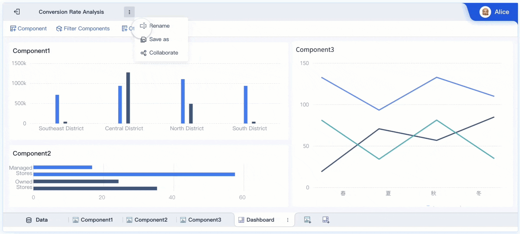
Real-Time Collaboration and Mobility
You can collaborate with your team in real time using FineBI’s embedded analytics features. The platform supports real-time interactivity, allowing multiple users to view, edit, and comment on dashboards simultaneously. You can share dashboards securely across departments, ensuring that everyone has access to the latest insights.
FineBI’s mobile app support gives you the flexibility to access analytics on the go. You can view and interact with dashboards from your smartphone or tablet, making it easy to stay informed wherever you are. The platform’s scalability ensures that it can handle increasing data volumes and user numbers as your business grows.
FineBI Compared to Other Dashboard Apps
FineBI offers several advantages over other dashboard platforms. You benefit from strong scalability, robust data source connectivity, and advanced predictive analytics. Unlike some tools that limit integration options or real-time capabilities, FineBI delivers a unified analytics experience for both technical and non-technical users. The platform’s embedded analytics and real-time data updates set it apart as a leading choice for organizations seeking comprehensive business insights.
Note: FineBI’s combination of self-service data preparation, drag-and-drop dashboard creation, AI-driven analytics, and enterprise governance makes it a versatile solution for any industry. You can use FineBI to unify your data, drive collaboration, and embed analytics into every aspect of your business.

Power BI Dashboard Apps
Data Integration and Visualization
Power BI stands out among the Best Dashboard Apps for Business Insights because it offers robust data integration and advanced data visualization features. You can connect to a wide range of data sources, including cloud services, databases, and spreadsheets. Power BI enables you to refresh data automatically, so your dashboard always displays the latest information. The Key Influencers visual helps you analyze data and identify factors that impact important metrics. You can use custom visuals, such as heatmaps and funnel charts, to create interactive visualizations that tell a compelling story. The platform supports data modeling, allowing you to build relationships and calculations across datasets for comprehensive analysis.
| Feature | Description |
|---|---|
| AI-Driven Analytics | Predictive analytics, anomaly detection, and natural language queries. |
| Real-Time Data Refresh | Automatic updates from multiple sources, customizable scheduling for automated reporting. |
| Interactive Dashboards | Allows users to monitor key performance indicators and respond promptly to emerging trends. |
| Custom Visuals | Extensive library including heatmaps, network diagrams, and funnel charts for tailored insights. |
| Data Modeling Capabilities | Establish relationships, hierarchies, and calculations across datasets for comprehensive analysis. |
Usability and Collaboration
You will find Power BI easy to use, even if you have limited experience with dashboard design. The drag-and-drop interface lets you build dashboards quickly. Power BI integrates with Microsoft Teams, so you can share data and reports with your team in real-time. The centralized Data Hub provides a single location for all your reports and dashboards. Collaboration tools, such as messaging extensions and contextual links, make it simple to share insights and maintain context. You can comment and annotate dashboards, which helps your team discuss findings and make decisions together.
| Feature | Description |
|---|---|
| Seamless Integration | Power BI integrates with Microsoft Teams for easy access to data and reports. |
| Real-time Sharing | Users can share insights in real-time, enhancing collaboration. |
| Data Hub | The Power BI app provides a centralized location for reports and dashboards. |
| Contextual Links | Links shared in Teams preserve user context, allowing direct access to specific data views. |
| Collaboration Tools | Features like messaging extensions and unfurled links facilitate quick sharing of Power BI content. |
Analytics Capabilities
Power BI delivers powerful analytics tools that help you gain deeper insights from your data. You can use advanced options for data modeling and visualization, including over 100 chart types and custom visuals. Power BI supports DAX for custom calculations and Power Query for data shaping. You can integrate R and Python to create specialized charts and perform complex analytics. The platform’s collaboration features, such as commenting and integration with SharePoint, enhance teamwork and make analytics accessible to everyone. Power BI’s analytics capabilities set it apart from other dashboard apps by providing a feature-rich environment for data exploration and decision-making.
- Power BI offers a more feature-rich interface with advanced options for data modeling and visualization compared to basic dashboard apps.
- You can define custom calculations using DAX and shape data with Power Query.
- Power BI provides over 100 different chart types and supports custom visuals.
- You can integrate R and Python for custom visuals and advanced analytics.
- Collaboration features include commenting, annotating, and integration with Microsoft Teams and SharePoint.
Tip: Power BI’s combination of data integration, interactive visualizations, and advanced analytics makes it a top choice for organizations seeking actionable insights from their data.
Tableau Dashboard Apps
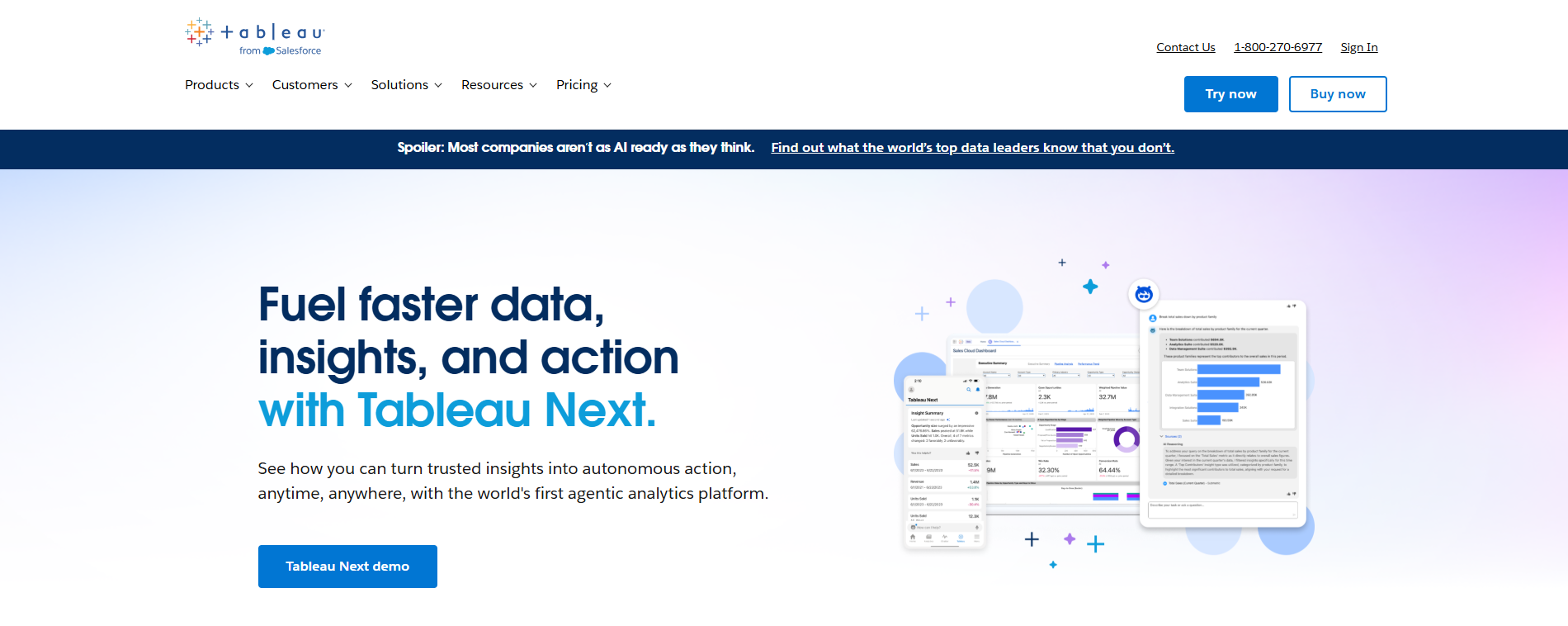
Visual Analytics Features
Tableau earns its place among the Best Dashboard Apps for Business Insights because of its powerful visual analytics features. You can create interactive dashboards that tell clear stories with your data. Tableau stands out for its ability to produce beautiful visualizations that help you see patterns and relationships quickly. The platform supports broad data connectivity, allowing you to link almost any data source through native connectors or APIs. You benefit from a strong community that shares templates and learning resources, making it easier to improve your analytics skills. Tableau dashboards work well on mobile devices, so you can access your data anywhere. The platform handles large datasets efficiently, supporting enterprise-scale analytics.
| Feature | Description |
|---|---|
| Beautiful visualizations | Creates stunning, interactive charts that effectively communicate data stories. |
| Broad data connectivity | Connects to virtually any data source through native connectors or APIs. |
| Strong community | Extensive learning resources and template gallery from its large user base. |
| Mobile-friendly | Dashboards work well across devices, including tablets and phones. |
| Visual impact | Creates the most aesthetically pleasing and intuitive visualizations in the industry. |
| Data exploration | Allows users to dive deep into data relationships through interactive filtering. |
| Enterprise scale | Handles large datasets and user bases effectively. |
Customization and Integration
Tableau gives you flexible customization and integration options for your analytics needs. You can use a variety of connectors to link with databases, spreadsheets, and cloud services. APIs allow you to build custom integrations with other business systems, making it easy to fit Tableau into your existing workflow. Tools like Tableau Desktop and Tableau Cloud simplify the process of connecting to data sources. You can embed other applications into your dashboards, which enhances your analytics experience. Tableau supports investments in integration partners across data storage, processing, and management. You can extend analysis capabilities to a broader audience and embed analytics into other applications.
- Tableau allows integration of other applications into dashboards.
- You can connect to many data sources using built-in connectors.
- APIs enable custom integration with business systems.
- Tableau enhances analytics for more users.
- Embedding capabilities let you share analytics in other platforms.
Ideal Use Cases
You can use Tableau for analytics in many industries. The platform helps you make better decisions with your data. In consumer goods, you can improve trade promotions. Retail businesses use Tableau to optimize stock levels and maximize on-shelf availability. Nonprofit organizations measure and increase their impact with data-driven analytics. Technology companies target Software as a Service (SaaS) sales more effectively. Tableau’s integration and analytics capabilities make it a top choice for organizations that need flexible dashboards and deep data insights.
| Industry | Use Case Description |
|---|---|
| Consumer goods | Making better decisions in trade promotions |
| Retail | Optimizing stock levels and maximizing on-shelf availability |
| Nonprofit | Measuring and increasing an organization’s impact |
| Technology | Better targeting Software as a Service (SaaS) sales |
Tip: Tableau’s combination of visual analytics, customization, and integration makes it one of the Best Dashboard Apps for Business Insights. You can unlock the full value of your data and drive better decisions across your organization.
Looker Dashboard Apps
Data Modeling and Exploration
Looker Data Platform gives you a powerful way to model and explore data for business insights. You can use Looker’s modeling layer, called LookML, to define business metrics in a consistent way across your organization. This approach eliminates confusion and ensures everyone trusts the data they see. When you use Looker, you map your data schema into models, which regroup views and make it easier to explore information. This structure transforms complex data into accessible formats, so you can focus on finding insights rather than managing technical details.
You do not need to rely on IT for every report or dashboard. Looker empowers you to create your own dashboards, reports, and visualizations. The intuitive interface lets you explore and analyze data independently. This independence helps you foster a data-driven culture in your organization. You can quickly answer business questions and share findings with your team.
| Feature | Benefit |
|---|---|
| Consistent metric definitions | Ensures a single source of truth for all users |
| User-driven exploration | Allows you to create dashboards and reports without IT support |
| Simplified data models | Makes business insights more accessible and easier to understand |
| Intuitive interface | Empowers you to analyze data and build visualizations independently |
Integration and Security
Looker excels at integration with a wide range of data sources. You can connect to cloud databases, on-premises systems, and third-party applications. This flexibility means you can bring together data from sales, marketing, finance, and operations into a single dashboard. Looker’s integration capabilities help you unify your business data for comprehensive analysis.
Security remains a top priority in Looker. You control access to data at every level, from user permissions to row-level security. The platform supports secure data sharing and compliance with industry standards. You can trust that your sensitive information stays protected while you collaborate with your team.
Looker’s integration features also support embedded analytics. You can place dashboards and reports directly into other business applications. This approach ensures that decision-makers always have access to the latest data, no matter where they work.
Tip: Use Looker’s integration and security features to build a reliable, unified analytics environment. You can scale your data strategy as your business grows and maintain confidence in your insights.
Qlik Sense Dashboard Apps
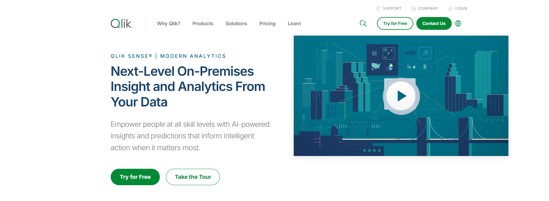
Associative Data Model
You can unlock deeper business insights with Qlik Sense’s associative data model. This model lets you explore data from multiple angles, helping you find patterns that traditional linear models might miss. You do not need to follow a fixed path when you analyze information. Instead, you can move freely between different data sets and discover relationships that drive better decisions.
The associative data model in Qlik Sense supports flexible exploration. You can view sales, inventory, and customer data together, then switch to financial or operational data without losing context. This approach helps you see connections and trends that improve your understanding of business performance. You do not need to rely on IT for every report. You can generate your own dashboards and reports quickly, which increases efficiency and productivity.
Here is a table showing the main benefits of Qlik Sense’s associative data model:
| Benefit | Description |
|---|---|
| Enhanced Data Discovery | You can explore data from different perspectives and gain better insights into trends. |
| Increased Efficiency | You can create reports and access information faster, which helps you make decisions quickly. |
| Improved Decision-Making | You get intuitive tools for analyzing data and making informed choices in real time. |
| Flexible Exploration | You can move between data sets and uncover relationships that rigid models might miss. |
Interactive Dashboards
Qlik Sense gives you interactive dashboards that make data analysis easy and engaging. You can navigate the platform with a user-friendly interface. You can customize dashboards to fit your needs, choosing from many visualization options. You can handle large amounts of data without performance issues, which is important for growing businesses.
Users rate Qlik Sense highly for its interactive dashboard capabilities. You can adjust charts, tables, and filters to focus on the data that matters most. You can analyze sales, marketing, and operational data in one place. You can share dashboards with your team and collaborate on insights. The platform manages data efficiently, so you do not experience delays when working with big data sets.
Below is a table summarizing user feedback on Qlik Sense’s interactive dashboards:
| Aspect | User Feedback |
|---|---|
| User-Friendly Interface | Easy to navigate and interact with the platform. |
| Customization Options | Many ways to customize dashboards and visualizations. |
| Data Handling | Effective management and analysis of large data volumes. |
| Customer Support | Some users want better support services. |
| Formatting Limitations | Users would like more formatting choices for visualizations. |
Tip: Qlik Sense’s associative data model and interactive dashboards help you analyze data efficiently. You can make faster decisions and improve business outcomes with real-time insights.
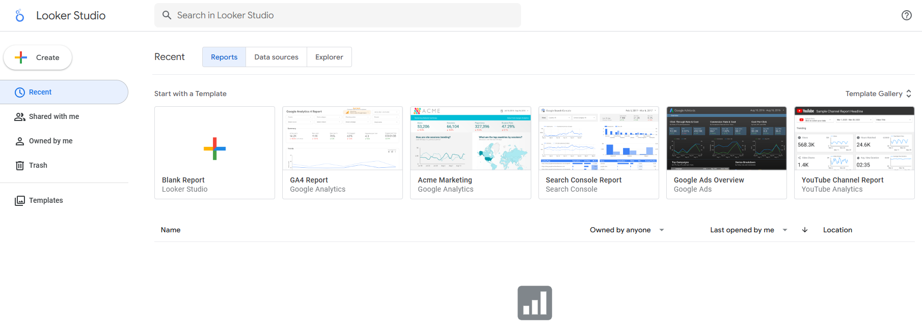
Google Data Dashboard Apps
Free Data Visualization
You can use Google Data Studio to create powerful data visualization tools without any cost. This platform gives you access to a wide range of features that help you turn raw data into clear, interactive reports. The user-friendly interface lets you build reports quickly using drag-and-drop actions. You do not need advanced technical skills to get started.
Here is a table that highlights the main advantages for small businesses:
| Advantage | Description |
|---|---|
| Cost-Effective | Google Data Studio is completely free, making it ideal for businesses seeking powerful tools. |
| Ease of Use | The user-friendly interface allows quick report creation with drag-and-drop functionality. |
| Interactive Reports | Users can create dashboards with filters and drill-down features tailored to business needs. |
| Seamless Data Integration | Connects with various data sources for a comprehensive view of metrics. |
| Automatic Data Updates | Users can set automatic refreshes to keep reports up-to-date. |
| Enhanced Sharing and Accessibility | Reports can be shared securely with customizable access controls. |
| Scalability | Suitable for both small businesses and large enterprises, handling growing data needs. |
You save time by automating data updates. This feature reduces manual input and makes your analysis more efficient. Because Google Data Studio is cloud-based, you can access your data from anywhere. You also avoid the risk of losing important information. Sharing reports with your team or clients becomes simple, which improves collaboration and accessibility.
Integration with Google Ecosystem
Google Data Studio fits perfectly into your existing Google workflow. You can connect your dashboard to Google Analytics, Google Ads, BigQuery, and Google Sheets. This integration allows you to pull data from multiple sources and see all your business metrics in one place. You do not need to set up complicated connections. The platform centralizes your data, making it easier to analyze and share insights.
You benefit from real-time reporting and cross-channel insights. Google Data Studio enables you to collect, transform, and visualize data without extra steps. If you already use Google services, you will find that this dashboard solution reduces friction in your data management process. You can scale your reports as your business grows, ensuring that your analytics keep up with your needs.
Tip: Google Data Studio’s seamless integration with the Google ecosystem makes it a smart choice for businesses that rely on Google products for their daily operations.
Domo and Dashboard Apps
Domo Cloud Analytics
You can use Domo as a cloud-based business intelligence platform to manage and analyze your data efficiently. Domo stands out among the Best Dashboard Apps for Business Insights because it offers a wide range of cloud analytics features designed for enterprise users. You gain access to automated reporting, partner analytics, and predictive analytics, all within a secure cloud environment. Domo helps you build and deploy applications that optimize workflows and track key performance indicators. You can integrate data from multiple sources and eliminate shadow data, creating a single source of truth for your organization.
Here is a table summarizing Domo’s cloud analytics features:
| Feature | Description |
|---|---|
| Partner Analytics | External self-service analytics to deliver value to customers and partners. |
| Self-Service Analytics | Automated reporting that provides value to customers and partners. |
| Integrate Data & Applications | Build an integrated data tech stack and eliminate shadow data with one source of truth. |
| Build & Deploy Apps | Optimize workflows and streamline approvals while tracking OKRs & KPIs. |
| Predictive Analytics & Data Science | Demand forecasting and customer retention optimization. |
| Data Governance & Security | Enterprise-grade security with scalable data management and compliance certifications. |
Domo’s cloud-based business intelligence platform supports real-time data integration and predictive analytics. You can scale your dashboard solutions as your business grows, ensuring that your data remains secure and accessible. Domo’s cloud architecture allows you to collaborate with partners and customers, making it a strong choice for organizations seeking advanced cloud analytics.
Apache Superset Open-Source Dashboard
Apache Superset is a powerful open-source dashboard solution that you can use for cloud-based business intelligence. Superset ranks among the Best Dashboard Apps for Business Insights due to its scalability and customization options. You can handle large volumes of data and create dashboards that match your brand identity. Superset supports over 40 visualization types and offers both drag-and-drop and SQL-based exploration. You can customize dashboards using CSS and enable or disable features with flexible feature flags.
- Superset integrates with big data platforms like Apache Spark and Hadoop, making it ideal for cloud environments that require massive-scale computing.
- You can perform real-time analytics and manage petabyte-scale datasets without extensive configuration.
- Superset excels in big data integration, making it a top choice for data engineers who need robust cloud-based business intelligence tools.
You can use Superset to create dashboards that support real-time data analysis and advanced customization. The platform’s cloud capabilities ensure that you can scale your analytics as your organization grows. Superset’s open-source nature gives you control over your data and dashboard design, making it a flexible solution for enterprises.
Best Analytics Dashboard Apps Compared
Feature Comparison Table
When you compare the best analytics dashboard integration platforms, you want to see how each one performs in key areas. The table below summarizes the main features, usability, analytics, and value for each dashboard. This overview helps you quickly identify which platforms fit your business needs.
| Platform | Data Integration | Visualization | Analytics Tools | Usability | Scalability | Value for Money |
|---|---|---|---|---|---|---|
| FineBI | 60+ connectors, seamless dashboard integration, real-time updates | Wide range of charts, maps, and tables | AI-driven analytics, predictive modeling, conversational analytics | Drag-and-drop, no-code, mobile-friendly | Supports 10,000+ users, high-performance engine | Enterprise-grade features at competitive pricing |
| Power BI | Extensive connectors, Excel, cloud, APIs | Custom visuals, interactive dashboards | DAX, Power Query, AI insights | Intuitive, integrates with Microsoft Teams | Scales for large organizations | Flexible pricing, strong value for Microsoft users |
| Tableau | Broad data source support, APIs | Stunning visualizations, templates | Advanced analytics, trend analysis | User-friendly, strong community | Handles large datasets | Higher cost, premium features |
| Looker | Cloud and on-premises, strong modeling | Custom dashboards, embedded analytics | LookML modeling, self-service analytics | Clean interface, easy exploration | Enterprise-ready | Subscription-based, good for large teams |
| Qlik Sense | Associative data model, many connectors | Interactive dashboards, flexible layouts | Associative analytics, real-time exploration | Simple navigation, customizable | Manages big data efficiently | Tiered pricing, scalable for growth |
| Google Data Studio | Google ecosystem, Sheets, Ads, BigQuery | Free, interactive reports | Basic analytics, real-time updates | Drag-and-drop, easy sharing | Cloud-based, scalable | Free, ideal for small businesses |
| Domo | Cloud-native, partner integrations | Custom dashboards, app builder | Predictive analytics, data science | Modern UI, mobile access | Enterprise cloud scalability | Premium pricing, strong for large enterprises |
| Apache Superset | Open-source, big data platforms | 40+ visualization types | SQL-based, real-time analytics | Flexible, developer-friendly | Petabyte-scale, cloud-ready | Free, requires technical setup |
Note: You should focus on platforms that offer seamless dashboard integration and strong data connectivity. This ensures your analytics dashboard integration supports real-time insights and comprehensive business metrics.
Usability and Integration Summary
You need a dashboard that is easy to use and connects to all your important data sources. FineBI stands out for its drag-and-drop interface and no-code workflow. You can build dashboards without technical skills. Power BI and Tableau also offer user-friendly environments, but Power BI integrates especially well with Microsoft products. Google Data Studio provides a simple experience, making it a favorite for small businesses that rely on Google Sheets.
Integration matters as much as usability. The best analytics dashboard integration platforms connect to databases, cloud warehouses, spreadsheets, and third-party tools. FineBI and Power BI excel in this area, offering seamless dashboard integration with a wide range of sources. Some platforms, like Apache Superset, require more technical setup but deliver powerful integration for big data environments.
You should check if the dashboard supports two-way sync with your most-used tools. For example, if your business depends on Google Sheets, make sure the platform offers direct integration. A lack of essential connectors can limit your ability to get timely insights.
Analytics and Value Overview
Analytics capabilities set these platforms apart. FineBI delivers AI-driven analytics, predictive modeling, and conversational analytics through FineChatBI. You can ask questions in plain language and get instant answers. Power BI and Tableau provide advanced analytics, including custom calculations and trend analysis. Qlik Sense uses an associative data model, letting you explore data from multiple angles.
Value for money depends on your business size and needs. Google Data Studio offers a free solution with strong integration for small businesses. FineBI and Power BI provide enterprise features at competitive prices, making them attractive for organizations that want advanced analytics without high costs. Domo and Tableau offer premium features but come with higher price tags.
You should choose a platform that matches your analytics needs and budget. Effective dashboard solutions connect to all your data sources, support real-time decision-making, and deliver actionable insights. The best analytics dashboard integration platforms help you turn raw data into valuable business intelligence.
Tip: Always assess your current and future data needs before selecting a dashboard. Look for seamless dashboard integration, strong analytics, and a pricing model that fits your organization.

Choosing the Right Dashboard Apps

For Small Businesses
When you run a small business, you need a dashboard that is easy to use and quick to set up. You want to see your data in one place and get insights without technical barriers. The best dashboard apps for small businesses offer template libraries, integration with popular tools, and mobile compatibility. You can track key performance indicators and receive alerts when important metrics change. Customization and data control help you tailor the dashboard to your needs.
Here is a table that highlights the most important criteria for small businesses:
| Criteria | Description |
|---|---|
| Extensive Template Libraries | Access to a wide range of dashboard templates and styles. |
| Integration Capabilities | Seamless connection with third-party tools and platforms. |
| Mobile Responsiveness | Compatibility with all devices and screens. |
| Customization Options | Full control over dashboard appearance and features. |
| Data Control | Role-based management for secure data access. |
| KPI Tracking | Combine multiple KPIs and metrics from various sources. |
| Alerts and Notifications | Prompt alerts for important trends or milestones. |
| Performance Updates | Automated reports and updates via email or messaging apps. |
| Gamification | Features that boost user engagement and morale. |
Popular choices for small businesses include Datapad, Klipfolio, Databox, and Plecto. FineBI also provides a user-friendly interface, strong integration, and real-time insights, making it suitable for growing teams that want to unlock the value of their data.
For Enterprises
If you manage an enterprise, you face complex data environments and need advanced governance. The best dashboard apps for business insights must handle large data volumes, support strict security, and scale with your organization. You need tools that automate compliance, manage risk, and provide reliable analytics.
Consider these leading enterprise solutions:
| Tool Name | Description | G2 Review Score |
|---|---|---|
| Alation | Uses machine learning for data management and intelligence. | N/A |
| Databricks Data Intelligence | Integrates and analyzes data for large-scale projects. | 4.6 out of 5 |
| IBM watsonx.governance | Automates compliance and risk management in hybrid cloud environments. | 4.2 out of 5 |
FineBI stands out for its scalability, robust data governance, and ability to serve thousands of users. You can control access at every level and ensure compliance while delivering actionable insights across departments.
For Industry-Specific Needs
Different industries require tailored analytics and insights. The best dashboard apps for business insights adapt to your sector’s unique challenges. Retail, finance, and healthcare each demand specialized features for data analysis and reporting.
Here is a comparison of platforms suited for industry-specific needs:
| Platform | Industry Suitability | Key Features |
|---|---|---|
| Domo | Retail, Finance, Healthcare | Real-time data access, customizable visualizations |
| Power BI | Retail, Finance, Healthcare | Robust visualization tools, integration capabilities |
| Tableau | Retail, Finance, Healthcare | Adaptable analytics, performance monitoring |
FineBI offers flexibility for various sectors, including manufacturing, banking, and real estate. You can connect to diverse data sources, create custom dashboards, and gain insights that drive better decisions in your industry.
Tip: Match your dashboard app to your business size, data complexity, and industry needs. This approach ensures you get the most relevant insights and value from your analytics investment.
You have many dashboard options for business insights. The table below shows how leading tools compare:
| Dashboard Tool | Key Features |
|---|---|
| Power BI | Unified data view, automated machine learning |
| Looker | Embedded analytics, scalable modeling |
| Sisense | Fast processing, AI-driven insights |
To choose the best dashboard, focus on usability, integration, and scalability. FineBI stands out for self-service analytics and enterprise governance. You should assess your needs and try top dashboard apps to find the right fit.
- Employ iterative design for usability.
- Engage users during implementation.
- Ensure visualizations are easy to interpret.

Continue Reading About Dashboard Apps
How to Do Retention Analysis for Business Success
What is Pareto Chart and How Does it Work
How DuPont Analysis Helps You Understand Your Business


FAQ

The Author
Lewis
Senior Data Analyst at FanRuan
Related Articles

How to Build an Investment Portfolio Reporting Dashboard for Executives: KPIs, Benchmarks, and Drill-Down Views
Investment portfolio reporting for executives is not about showing every holding, transaction, and chart your investment team can produce. It is about giving CEOs, CFOs, CIOs, boards, and investment committees a fast, re
Yida YIn
Jun 25, 2026

12 KPI Reporting Examples for Executive Dashboards: What to Show in Weekly, Monthly, and Quarterly Reviews
Executive leaders do not need more data. They need decision ready $1 examples that match how often they review the business and what actions they are expected to take. A weekly $1 should surface fast moving risks and per
Yida YIn
Jun 25, 2026

How to Build a Digital Marketing Reports Dashboard: Executive Examples, KPIs, and Templates
A $1 is the control layer that helps executives and marketing leaders turn scattered channel data into fast, confident decisions. If you are a CEO, CMO, operations director, or marketing analytics lead, the real problem
Yida Yin
May 07, 2026