Business report writing succeeds when readers can move from data to decision fast. For executives, managers, and analysts, the real problem is rarely a lack of numbers—it is too many pages, too many charts, and too many disconnected conclusions competing for attention. When reports feel dense, trust drops, meetings get longer, and decisions stall. The goal is simple: present findings so readers immediately understand what matters, why it matters, and what should happen next.
Why clarity matters in business report writing
In strong business report writing, clarity is not a style preference—it is a business requirement. When a page is overloaded with tables, labels, and competing visuals, readers must work harder to find the signal inside the noise. That extra effort slows interpretation and increases the chance of misreading what the data actually says.
Crowded visuals create a second problem: they weaken confidence. If a report tries to say five things at once, the audience may leave unsure which point matters most. Leaders often interpret this as poor analysis rather than poor presentation. Even when the numbers are right, messy reporting can make the work feel less credible.
The real purpose of presenting data is to support action. A useful report helps readers answer three questions quickly:
What happened? The most important result or change
Why does it matter? The business impact on cost, risk, growth, timing, or performance
What should we do next? The recommended decision or follow-up action
That means charts and findings should never exist as decoration. In business report writing, every visual should earn its place by helping someone understand a business issue faster and more accurately.
Key Metrics (KPIs) to keep business report writing decision-focused
Below are the core metrics and presentation checks that make reports easier to read and act on:
Decision relevance: Whether the chart or finding directly supports a business decision
Single-message clarity: Whether one visual communicates one main insight
Benchmark alignment: Whether the result is compared against a target, prior period, forecast, or peer group
Variance magnitude: The size of the gap between expected and actual performance
Trend direction: Whether performance is improving, declining, or remaining stable over time
Signal-to-noise ratio: How much useful information remains after removing nonessential labels, colors, and detail
Interpretation quality: Whether the report clearly explains what the data means
Actionability: Whether each section ends with a practical implication or next step
Audience fit: Whether the level of detail matches executive, managerial, or technical needs
Consistency: Whether terms, dates, colors, and metric definitions remain stable across pages
All reports in this article are built with FineReport.
Start with the decision the reader of your business report writing needs to make
If the reader’s decision is unclear, the report will drift into information overload. The fastest way to improve business report writing is to identify the decision first, then include only the evidence required to support it.
Identify the audience and their level of detail
Different audiences need different versions of the same truth. A CFO may want revenue variance, margin pressure, and forecast risk in one page. A department manager may need channel-level drivers and staffing implications. A technical team may need methodology, assumptions, and raw segmentation.
A practical way to handle this is to tier the content:
Audience
What they need
What to avoid
Executives
Summary insights, business impact, decision options
In business report writing, matching the depth of explanation to the audience keeps the document concise without making it shallow.
Lead with the key message before showing the evidence
Readers should never need to decode your point from the chart alone. Start each section with the takeaway in plain language, then support it with numbers and visuals. This approach reduces cognitive load and keeps the report moving.
Strong: “Q2 Sales Missed Target Due to Declines in Two High-Volume Regions”
The second version tells the reader what the chart means before they inspect the bars or lines. That is far more effective in business report writing because it shortens the path from evidence to action.
9 ways to present charts and findings in your business report writing without overwhelming readers
1) Choose one chart purpose per visual
Every chart should do one job well. Use a visual to show comparison, trend, composition, distribution, or relationship—not several at once. A chart that mixes stacked categories, trend lines, and multiple axes often forces the reader to interpret structure before insight.
Good practice includes:
Use bar charts for comparisons
Use line charts for trends over time
Use stacked bars sparingly for composition
Use scatter plots for relationships
Use histograms or box plots for distributions
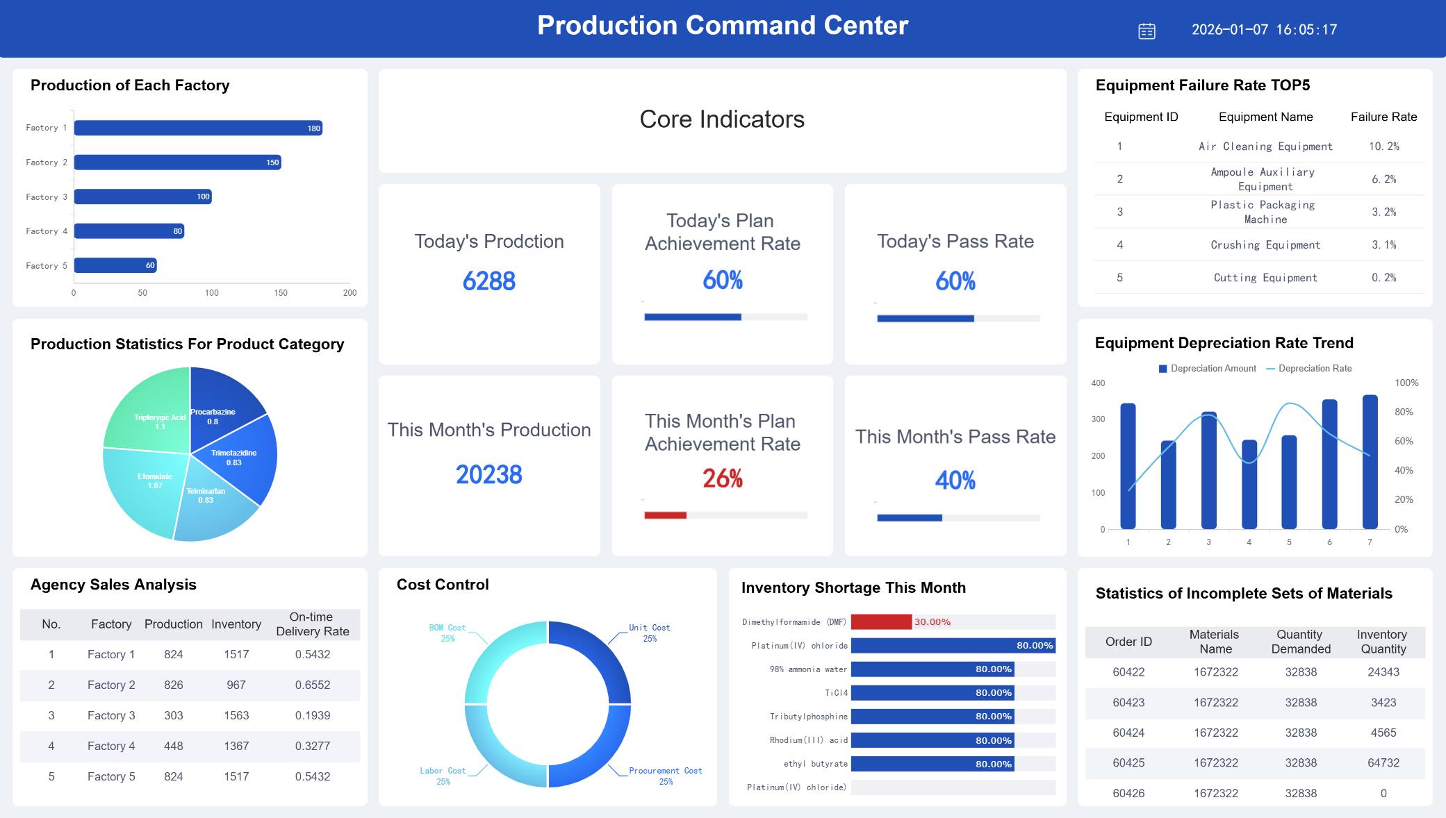
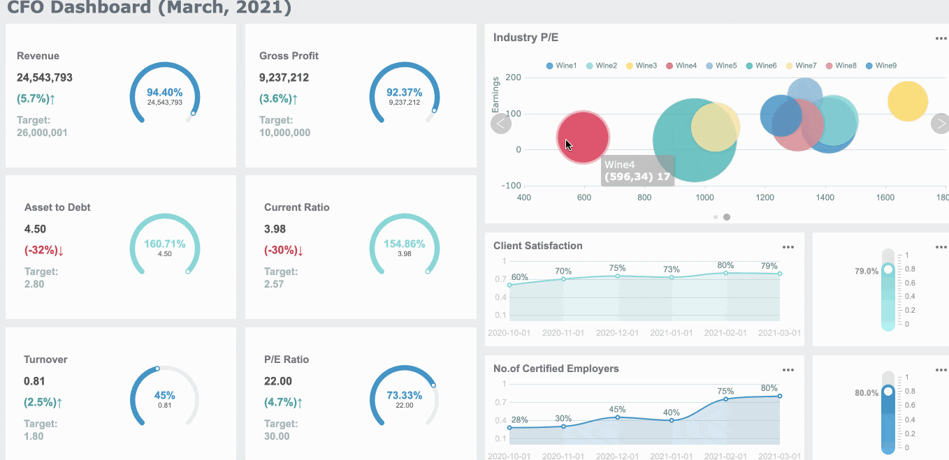
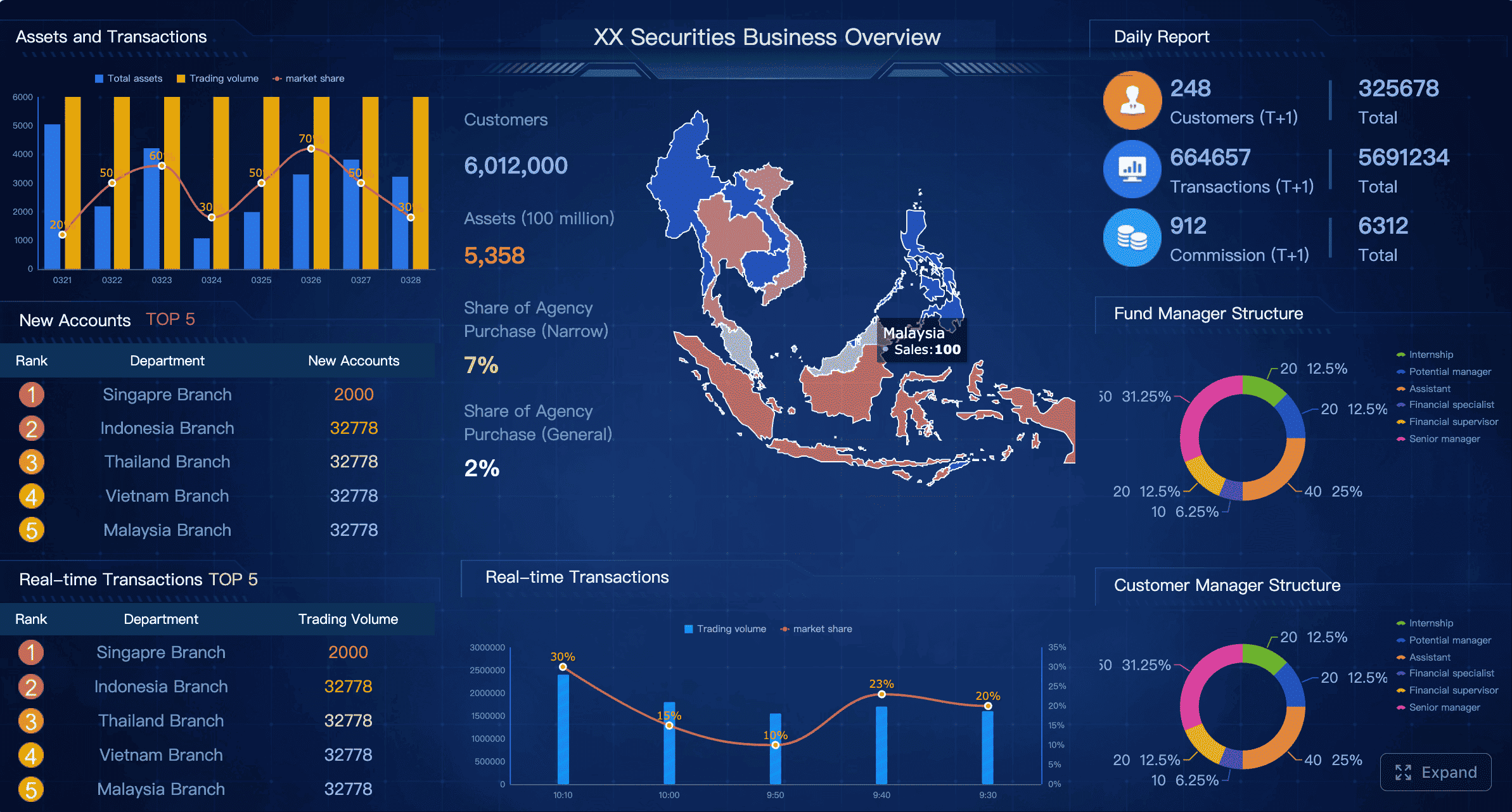
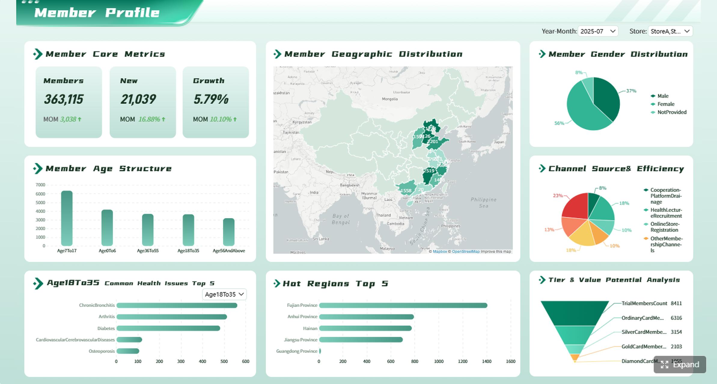
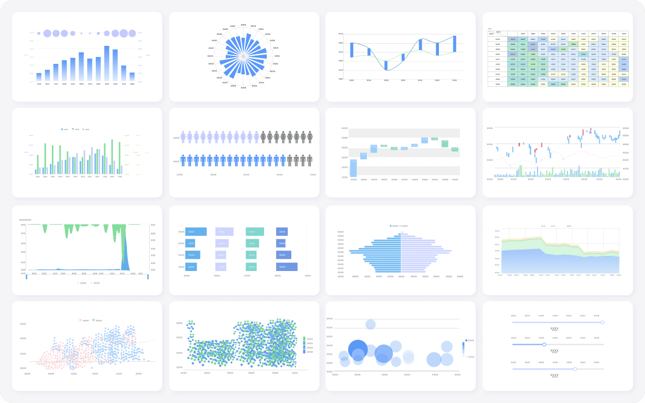
Diverse visualization chart types created by FineReport
Remove chart junk such as 3D effects, excessive gridlines, gradients, and decorative icons. In business report writing, simplicity is a performance advantage.
2) Write takeaway-first chart titles
Neutral titles describe the topic. Strong titles summarize the finding. This is one of the easiest upgrades you can make to business report writing because it helps readers scan quickly and remember the point.
Examples:
Neutral: “Customer Churn by Quarter”
Better: “Customer Churn Increased for Three Consecutive Quarters”
A strong chart title acts like a headline. It tells the audience what to notice before they look at the data.
3) Highlight only the data that supports the story
If every bar is bright, nothing stands out. Use contrast intentionally. Highlight the one segment, time period, or outlier that matters most. Let secondary data stay visible but quiet.
This keeps attention on the business message instead of the graphic design.
4) Simplify labels, scales, and legends
Charts become unreadable when labels compete with the data. Tighten wording, remove unnecessary decimals, and keep units consistent. If one chart uses percentages and another uses raw volume, explain that clearly.
Use these simplification rules:
Round where precision does not change the decision
Keep date formats consistent across the report
Avoid forcing readers to jump back and forth to distant legends
Label data directly where possible
Use the same unit style throughout, such as K, M, or B
In business report writing, clean labeling reduces friction and helps readers trust that the report is under control.
5) Pair every visual with a brief interpretation
A chart without interpretation leaves too much work to the audience. Add one or two sentences below each visual to explain:
What changed
Why it matters
What action follows
For example: “Operating margin fell 2.3 points due to freight and discounting pressure. If this trend continues, Q4 profitability will miss plan unless pricing discipline improves in two low-margin product lines.”
That interpretation transforms a chart from observation into decision support.
6) Break complex findings into small sections
Trying to explain multiple insights in one dense block usually overwhelms readers. Instead, separate findings into short subsections, each with one idea, one chart, and one implication.
A useful structure looks like this:
Key finding
Supporting visual
Brief interpretation
Business implication
This creates a rhythm that makes reports easier to scan and easier to present in meetings.
A Report created by FineReport with small sections
7) Compare against a meaningful benchmark
A number alone is rarely persuasive. Readers need context. Compare performance against something that gives the metric meaning:
Target or budget
Prior period
Forecast
Historical average
Peer or regional benchmark
Just as important, explain why that comparison matters. A 6% increase may be strong against the market but weak against plan. In business report writing, context is what turns raw performance into interpretable performance.
8) Put detailed data in an appendix
Decision-makers should not have to wade through raw tables and calculation logic to find the core message. Keep the main report focused on the decision. Move supporting detail to an appendix.
Typical appendix content includes:
Raw data tables
Methodology notes
Assumptions
Segment-level calculations
Supplemental charts for technical review
This approach respects both audiences: leaders get a concise narrative, while analysts still have access to depth.
9) End each findings section with a clear implication
Each section should conclude with what the evidence means in business terms. Do not stop at description. Spell out the implication for:
Cost
Risk
Growth
Timing
Resource priority
For example: “Because fulfillment delays are concentrated in one distribution center, the immediate priority is process correction rather than network-wide expansion.”
That final implication is what makes business report writing useful, not just informative.
Structure the business report writing to make insights easy to follow
Even strong analysis can fail if the report structure forces readers to hunt for context. Good business report writing follows a layout people already understand.
Use a report format readers recognize
A familiar structure reduces mental effort. Most readers expect a sequence that moves from summary to evidence to action:
Summary
Background
Findings
Analysis
Recommendations
This order helps the audience absorb the story logically. They understand the issue, review the evidence, and then see the recommended response.
Give each section one job
When findings, analysis, and recommendations overlap too much, readers lose orientation. Keep the roles clean:
Findings = what the data shows
Analysis = why it happened and what it means
Recommendations = what should happen next
Charts should appear where they answer a specific question, not where they look visually balanced on the page.
Maintain consistency from page to page
Consistency makes reports easier to process. Reuse the same language, time periods, metric definitions, and color rules throughout the document. If blue means actuals on page one, it should not mean forecast on page six.
Consistency should apply to:
Terminology
Date ranges
Color logic
KPI definitions
Number formatting
Chart order
Page layout
This predictability lowers reader effort and improves confidence in the report.
Actionable best practices for implementing better business report writing
Improving business report writing is not about redesigning everything at once. It is about building a repeatable operating method your team can use every reporting cycle.
1. Start every report with a decision brief
Before anyone builds a chart, define:
The decision to be made
The primary audience
The top three questions the report must answer
The KPIs required to answer them
This prevents unnecessary visuals from entering the report in the first place.
2. Build a message map before designing visuals
Draft each section in this order:
Main takeaway
Supporting metric
Best chart type
Required comparison point
Business implication
This ensures that visuals support the story instead of driving it.
3. Apply a “one-page executive scan” test
Ask whether an executive can identify the main conclusion of each section in seconds. If not, tighten titles, remove clutter, or split the content. This test is especially useful for monthly and quarterly reporting packs.
4. Create a standard chart and annotation library
Use standardized templates for common reporting needs:
Trend charts
Actual vs target views
Variance waterfalls
Benchmark comparisons
KPI scorecards
A chart library improves consistency and speeds up production across teams.
5. Separate summary reporting from technical backup
Create two layers:
Core report for decisions and implications
Appendix or backup tabs for detailed review
This keeps the primary document lean while preserving analytical rigor.
Common mistakes that make business report writing harder to read
Several recurring mistakes make reports look comprehensive while actually reducing usability.
Overloading one page with too many charts or KPIs
Using visuals without explaining the business meaning
Mixing unrelated findings in the same section
Hiding the conclusion until the end instead of leading with it
Including every available number instead of the most decision-relevant evidence
Switching definitions, colors, or date ranges across pages
Using generic chart titles that force readers to interpret the message alone
The pattern behind all of these mistakes is the same: the report reflects what the author knows rather than what the reader needs to decide.
Final checklist before sharing your business report writing
Before sending the report, run a final editorial check. This is where good business report writing becomes reliable business communication.
Quick review checklist
Can a reader identify the main conclusion of each section in seconds?
Does every chart answer a specific question?
Have unnecessary labels, colors, and metrics been removed?
Are findings linked to business implications and next steps?
Is supporting detail available without interrupting the main story?
A practical rule: if a chart or sentence does not help someone make a decision, cut it or move it to the appendix.
Build clearer business report writing faster with FineReport
Building this manually is complex; use FineReport to utilize ready-made templates and automate this entire workflow. For teams producing recurring management reports, operational dashboards, or board-ready reporting packs, FineReport makes it easier to standardize layouts, highlight KPIs, apply consistent chart logic, and deliver clear decision-focused outputs at scale.
If your current reporting process relies on manual spreadsheets, repeated slide edits, and inconsistent chart formatting, that is exactly where overload begins. FineReport helps you replace fragmented reporting with a more controlled, scalable, and decision-ready system.
Start with the main decision or takeaway, then show only the evidence needed to support it. Clear section titles, simple charts, and short explanations help readers move from data to action faster.
Pick one chart type based on one purpose, such as comparison, trend, or composition. When each visual answers a single question, the report feels clearer and more credible.
Include only the charts that directly support the report’s key message or recommendation. If a chart does not help explain what happened, why it matters, or what to do next, it should usually be removed.
Overloaded charts increase cognitive effort and make it harder to find the real insight. When readers must decode too much detail, confidence drops and decisions take longer.
Strong business reports usually end with clear recommendations tied to the findings. That makes the report more actionable and helps readers understand the next step instead of stopping at interpretation.
Product Trial
FineReport
Pixel-perfect reports · Interactive dashboards · Easy data entry · Digital twins
 Diverse visualization chart types created by