Creating an effective hr dashboard template requires you to define clear goals, select relevant metrics, and choose a modern tool like FineBI for integration and visualization. You need to design the dashboard for usability and actionability, making sure it meets your company’s unique needs. Many companies face challenges, such as tool selection, metric identification, and maintaining accuracy, as shown below:
| Challenge | Description |
|---|---|
| Choose the right tool | Find a solution that matches your needs and budget. |
| Select critical metrics | Focus on the most important hr indicators for your dashboard. |
| Prioritize accuracy | Keep your data clean and reporting reliable. |
Define HR Dashboard Goals When Making HR Dashboard Template
Setting clear goals for your hr dashboard template is the first step toward building a tool that drives real results. You need to clarify the purpose of your dashboard and set measurable objectives. When you define specific goals, you create a foundation for meaningful analysis and decision-making.
Identify Stakeholders for Your HR Dashboard Template
You should involve key stakeholders early in the process. Listening to their needs helps you design an hr dashboard template that reflects their priorities. Stakeholders, such as HR executives, managers, and finance leaders, often have unique requirements.
- Stakeholders determine which metrics and visualizations matter most.
- Engaging stakeholders ensures the dashboard meets their expectations.
- Different roles may require different KPIs, so tailor the dashboard accordingly.
Tip: Ask stakeholders why they need the dashboard, what they want to achieve, and how they plan to use it. This approach helps you select the right KPIs and optimize the dashboard’s design.
Align with Business Strategy for Your HR Dashboard Template
Your hr dashboard template should support your company’s strategic goals. Aligning HR metrics with business priorities ensures your dashboard delivers value.
- Involve HR in strategic planning to match HR initiatives with business objectives.
- Translate business goals into talent needs, identifying skills and capabilities required for success.
- Design HR programs that drive business outcomes and measure their impact.
- Align incentives with strategic priorities to focus employee efforts.
- Adapt your dashboard to changing business needs for ongoing relevance.
Note: Companies with effective leadership and aligned HR programs often see higher earnings and improved performance.
Common Pitfalls to Avoid
| Pitfall | Description |
|---|---|
| Choosing the wrong metrics | Metrics should be relevant, actionable, and aligned with HR goals. |
| Overloading the dashboard | Limit to 5-7 key metrics for clarity. |
| Ignoring data quality | Ensure accuracy and completeness to maintain credibility. |
| Forgetting user needs | Involve users to tailor the dashboard to their requirements. |
| Neglecting the story behind data | Use the dashboard to communicate insights and recommendations. |
| Failing to update the dashboard | Review and improve regularly to keep it accurate and relevant. |
When you set clear goals, you provide an overview of HR decisions, support team well-being, and optimize costs. You also consolidate KPIs into visual formats, making it easier for leaders to grasp performance and take action. Clear, measurable goals align teams, guide decisions, and promote accountability.
Select HR Metrics and KPIs in HR Dashboard Template
Choosing the right metrics and KPIs is the foundation of an effective hr dashboard template. You need to focus on the indicators that matter most for your company’s retention, engagement, and overall workforce health. When you select relevant metrics, you give leaders the information they need to make decisions and drive improvements.
Core HR Metrics for Your HR Dashboard Template
Start by identifying the core HR metrics that leading organizations use to track workforce performance. These metrics help you monitor retention, productivity, and employee satisfaction. You should select metrics that align with your business goals and provide actionable insights.
| Category | Key Metrics |
|---|---|
| Workforce Planning and Talent Acquisition | Time-to-hire, Quality of hire, Offer acceptance rate, Cost-per-hire |
| Retention and Engagement | Voluntary turnover rate, Employee Net Promoter Score (eNPS), Employee satisfaction, Internal mobility rate |
| Learning, Development, and Skills | Training completion rate, Skills acquisition velocity, Skills gap index, Percentage of workforce with future-ready skills |
| Organizational Health | Pay equity index, Equitable promotion rate, Inclusion survey scores |
| Workforce Productivity and Operational Efficiency | Span of control, Revenue per employee, Absenteeism rate, AI adoption and usage metrics, Manager effectiveness scores |
You should pay special attention to retention and turnover rates. A healthy turnover rate is around 10 percent, but this number can vary by industry. For example, retail often sees turnover rates near 37 percent. Tracking employee Net Promoter Score (eNPS), absenteeism rate, and job satisfaction scores also helps you understand workforce engagement and retention.
Tip: Focus on the vital few metrics. Limit your dashboard to 5-7 key indicators to avoid data overload and keep your hr dashboard template clear and actionable.
Custom Metrics for Your HR Dashboard Template
Every company has unique needs. You may want to track custom metrics that reflect your specific goals or challenges. These could include:
- Internal mobility rate: Measures how often employees move to new roles within your company, supporting retention.
- Skills gap index: Shows where your workforce needs development to meet future demands.
- Manager effectiveness scores: Evaluates how well managers support retention and engagement.
- Percentage of workforce with future-ready skills: Tracks your progress in preparing employees for new technologies or business models.
When you design your hr dashboard template, map each custom metric to a business objective. Involve key stakeholders and get leadership buy-in. Set targets for each KPI and document your process. Review your metrics annually to ensure they still align with your strategy.
Note: Custom metrics help you address specific retention challenges and support long-term workforce planning.
Data Sources for Your HR Dashboard Template
Accurate metrics depend on reliable data sources. You need to connect your hr dashboard template to systems that provide up-to-date and comprehensive workforce data. Common sources include:
- Internal HR systems: HRIS, ATS, and performance management systems supply core retention and engagement data.
- Business data: Financial, sales, and operational data link workforce trends to company outcomes.
- External data: Industry reports, job market databases, and compliance information help you benchmark retention and other metrics.
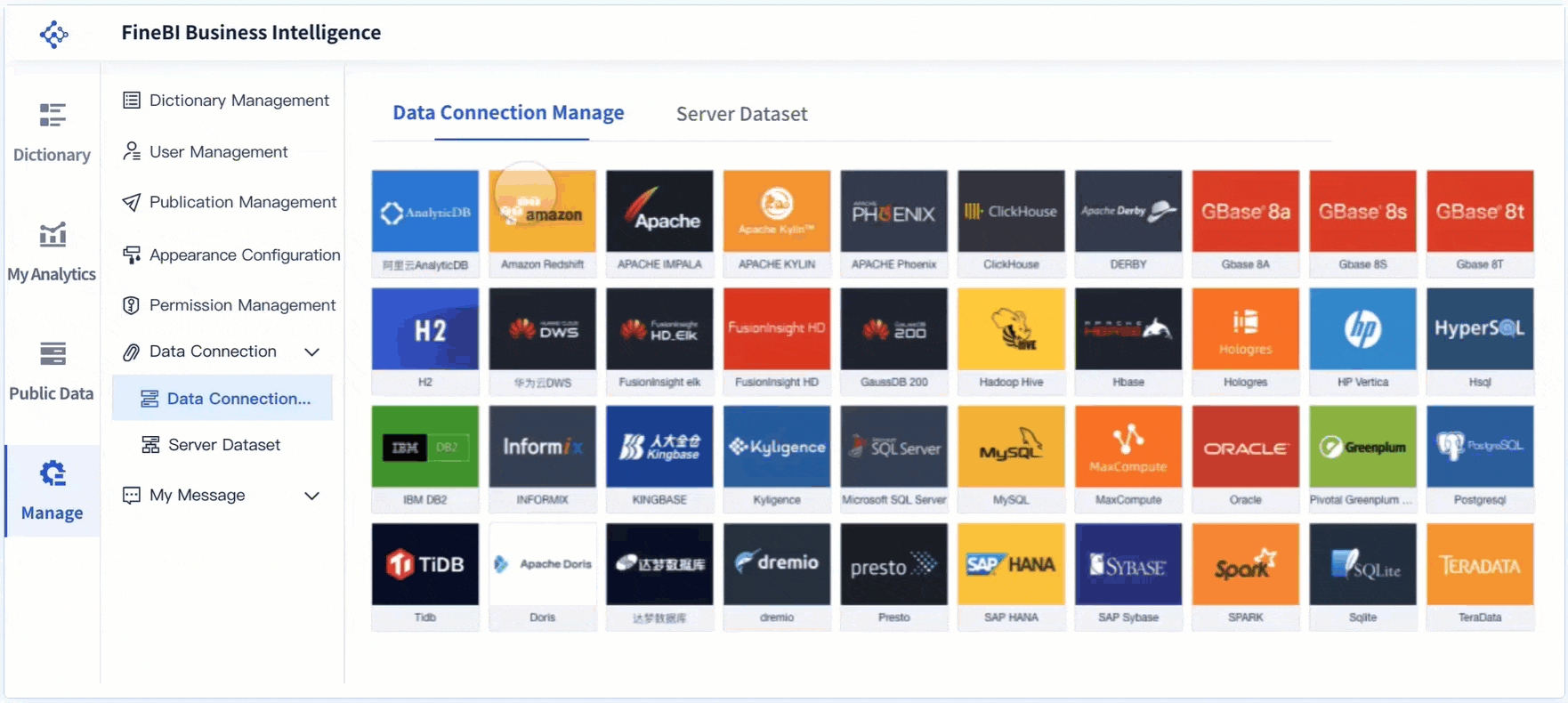
FineBI makes it easy to integrate multiple data sources. You can connect to over 60 types of databases, cloud warehouses, and APIs. This integration gives you a unified view of workforce data and eliminates data silos. You access real-time information from different systems, which improves your ability to analyze retention trends and make strategic decisions.
| Evidence Point | Description |
|---|---|
| Unified View of Data | Integrating various data sources provides a consolidated perspective, facilitating better analysis and trend identification. |
| Real-Time Data Access | HR professionals can access up-to-date information from different systems, aiding in strategic planning and employee engagement. |
| Elimination of Data Silos | Data integration allows for automatic sharing between applications, resolving issues related to isolated data sets. |
Tip: Use FineBI to automate data collection and validation. This reduces manual entry, improves efficiency, and helps your HR team focus on retention strategies instead of operational tasks.
When you select the right metrics, customize them for your needs, and connect reliable data sources, you build an hr dashboard template that supports retention, engagement, and business success.
Design Your HR Dashboard Template
Creating an effective hr dashboard template requires a structured approach. You need to select the right tool, organize your data, and design a layout that supports decision-making. The following steps will help you build a dashboard that meets your organization’s needs and drives results.
Choose BI Tools (FineBI) for Your HR Dashboard Template
Selecting the right BI tool is the foundation of your hr dashboard template. You want a solution that is user-friendly and offers robust features for data integration and visualization. FineBI stands out as a recommended choice for building your dashboard. It provides a drag-and-drop interface, making it easy for you to create and customize dashboards without coding.
Follow these essential steps when designing your hr dashboard template:
- Select the medium for your dashboard. Choose a BI tool like FineBI that matches your requirements and offers a simple interface.
- Identify your data sources. Determine where your hr data will come from and how you will integrate it into your dashboard.
- Design your dashboard. Organize your data by indicator group, level of detail, or causality. Select graphics that best represent your information.
FineBI supports integration with over 60 data sources, including databases, cloud warehouses, and APIs. You can connect your HRIS, ATS, and other systems to create a unified view of your workforce data. The platform offers a variety of dashboard components, such as Decision Directory and My Analysis, which help you structure your hr dashboard template for maximum impact.
| Feature | Description |
|---|---|
| Data Dashboard Component | Create a data portal dashboard with specialized components for HR analysis. |
| Customization Options | Set dashboard styles, backgrounds, titles, and component layouts. |
| Data Visualization | Use multiple chart and table styles for effective data representation. |
| Interaction Features | Filter, drill down, and interact with charts and tables for deeper insights. |
Layout and Visualization for Your HR Dashboard Template
The layout and visualization of your hr dashboard template play a critical role in how users interpret and act on data. You should define clear goals for your visualizations and choose chart types that enhance clarity. Minimalist designs help you avoid overwhelming viewers and keep the focus on key insights.
Consider these best practices when designing your dashboard layout:
- Define your goals. Set clear objectives for each section of your hr dashboard template.
- Choose the right format. Use bar charts, pie charts, and tables to present data effectively.
- Keep it simple. Limit the number of visual elements to avoid clutter.
- Tell a story. Use visualizations to highlight findings and provide context for HR decisions.
- Make it interactive. Add filters and dropdowns so users can explore data in-depth.
Organize your dashboard logically. Separate sections for recruitment, retention, and engagement make navigation easier. Use clear headings and navigation links to guide users through the dashboard. FineBI allows you to customize layouts and incorporate interactive elements, helping users engage with the data and uncover trends.
Usability in Your HR Dashboard Template
Usability determines how well your hr dashboard template supports decision-making and user adoption. You need to ensure that your dashboard is easy to navigate, accessible on both desktop and mobile devices, and provides clear labeling for all KPIs and sections.
Usability impacts several areas:
| Impact Area | Description |
|---|---|
| Enhanced decision-making | Real-time data access enables HR to respond quickly to workforce challenges. |
| Improved efficiency | Automated data collection reduces errors and saves time, allowing HR to focus on strategy. |
| Increased transparency | Accessible metrics promote accountability and align HR actions with company goals. |
| User adoption | User-friendly designs and effective training encourage HR teams to use the dashboard. |
Address common usability issues by following these steps:
- Ensure proper navigation. Make your dashboard intuitive and accessible.
- Avoid unnecessary complexity. Focus on delivering essential information.
- Use legible fonts and graphics. Make sure all text and visuals are easy to read.
- Simplify the design. Remove elements that do not add value.
- Ensure mobile-friendliness. Design your dashboard for use on smartphones and tablets.
- Incorporate interactive elements. Add features like filters and drill-downs to enhance engagement.
FineBI’s responsive design ensures your hr dashboard template works seamlessly across devices. You can apply real-time filtering and interactive features, making it easier for users to analyze data and make informed decisions. Clear labeling and logical organization help users find information quickly, improving transparency and collaboration within your HR team.
By following these steps, you create an hr dashboard template that is actionable, easy to use, and aligned with your organization’s goals. FineBI empowers you to design dashboards that drive HR performance and support strategic decision-making.
Best Practices in HR Dashboard Template
Actionable Insights
You want your hr dashboard to deliver actionable insights that drive real results. Focus on metrics that align with your business objectives. Place the most important information at the top of your dashboard, since users spend most of their time looking above the fold. Design your dashboard for engagement by highlighting trends and patterns that prompt action. Avoid data overload by limiting the number of metrics and visualizations. Use clear labels and concise explanations to help users understand what each insight means for your organization.
| Strategy | Description |
|---|---|
| Align Metrics with Business Objectives | Choose metrics that reflect your company’s goals, such as growth or efficiency. |
| Integrate Data Effectively | Set clear data definitions and validation rules to ensure consistency across systems. |
| Design for User Engagement | Place critical insights in prominent positions to maximize user attention and response. |
Tip: Actionable insights help you identify opportunities for improvement and guide HR decisions that support engagement and retention.
Data Quality
High data quality is essential for a reliable dashboard. You need accurate information to simplify usage and avoid inefficiencies. Reliable data builds trust in HR reporting and strengthens the credibility of your recommendations. When your dashboard uses high-quality data, you make better decisions and support strategic initiatives with confidence.
- Accurate data makes your dashboard easier to use and reduces errors.
- Reliable information builds trust and confidence in HR reporting.
- Informed decisions depend on data that reflects the true state of your workforce.
Note: Regularly validate your data sources and update your dashboard to maintain high standards of quality.
Continuous Improvement
Continuous improvement keeps your hr dashboard relevant and effective. Leading organizations review their dashboards regularly to ensure alignment with changing goals. Monitor key performance indicators and update your dashboard as priorities shift. Frequent reviews help you adapt to new business needs and maintain engagement across your HR team.
- Assess your dashboard often to match evolving organizational objectives.
- Monitor KPIs to track progress and identify areas for improvement.
- Update metrics and visualizations as HR priorities change each year.
Tip: Continuous improvement ensures your dashboard delivers fresh insights and supports ongoing engagement.
HR Dashboard Template Examples
You can use an hr dashboard template to address different HR scenarios. Each dashboard serves a unique purpose and helps you make informed decisions. FineBI enables you to build these dashboards quickly, integrating data from multiple sources and visualizing key metrics for actionable insights.
Recruitment Dashboard
A recruitment dashboard helps you track the effectiveness of your hiring process. You can monitor conversion rates, source effectiveness, and candidate satisfaction. FineBI allows you to connect data from your applicant tracking system and visualize trends in real time.
| Metric | Impact on Hiring Outcomes |
|---|---|
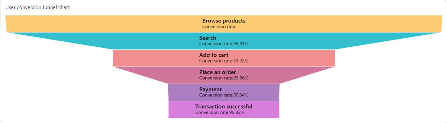
| Recruitment Funnel Effectiveness | Identifies conversion rates at each hiring stage, helping you pinpoint bottlenecks. |
| Source Effectiveness | Analyzes recruitment channels to optimize strategies and budget allocation. |
| Candidate Satisfaction Scores | Provides feedback on the hiring experience, highlighting areas needing improvement to enhance your employer brand. |
| Offer Acceptance Rates | Indicates competitiveness of job offers, suggesting necessary adjustments in compensation or benefits. |
| Recruiter Productivity Metrics | Tracks sourcing and hiring efficiency, identifying high performers and training needs. |
You can also track time-to-fill, cost-per-hire, and quality of hire. These metrics help you improve your recruitment strategy and reduce hiring costs.
Engagement Dashboard
An employee engagement dashboard measures how connected and motivated your workforce feels. You can track morale, productivity, absenteeism, and the impact of new initiatives. FineBI’s interactive features let you filter data by department or location, making it easy to identify trends.
| Metric | Implication |
|---|---|
| Employee Morale | Gauges overall employee satisfaction and areas for improvement |
| Productivity | Highly engaged employees are 14% more productive |
| Absenteeism | Engaged employees are 81% less likely to be absent |
| Initiative Impact | Measures the effectiveness of new programs or changes |
| Turnover Prediction | Identifies trends indicating potential resignations |
You can use survey results and feedback tools to enhance your employee engagement dashboard. This approach helps you address issues before they affect retention.
Performance Dashboard
An employee performance dashboard tracks productivity and development. You can measure quality of work, Net Promoter Score, and learning progress. FineBI supports advanced analytics, allowing you to compare performance across teams and identify top performers.
| Performance Metric | Description |
|---|---|
| Quality of Work | Establish clear, quantifiable metrics for measuring output against expectations. |
| Net Promoter Score (NPS) | Measures customer satisfaction and employee performance on a scale of 1-10. |
| Forced Ranking | Grades employees on a scale from best to worst, impacting morale and company culture. |
| Learning and Development | A strategic tool to measure and manage key employee performance metrics for optimizing business performance. |
You can set up alerts for critical metrics and share dashboards securely with your team. FineBI’s self-service features make it easy to update your employee performance dashboard as your business needs change.
Tip: You can use FineBI to create dashboards similar to those used by leading companies, such as Workday HCM Executive Dashboard and SAP SuccessFactors Workforce Analytics.
You can create an effective hr dashboard by following a clear process. Select relevant KPIs, understand your company’s culture, and keep the design simple. Make sure your dashboard is user-friendly and tells a compelling story with usable data. After implementation, focus on change management, present a plan to stakeholders, and use the dashboard to drive engagement. Pilot your dashboard, visualize data clearly, maintain accuracy, and refine it based on feedback for ongoing improvement.

Continue Reading About HR Dashboard Template
What is a Dashboard and How Does It Work
Store Performance Dashboard: Your Retail Command Center
How to Craft an Effective Analytics Dashboard


FAQ

The Author
Lewis
Senior Data Analyst at FanRuan
Related Articles

How to Build an Investment Portfolio Reporting Dashboard for Executives: KPIs, Benchmarks, and Drill-Down Views
Investment portfolio reporting for executives is not about showing every holding, transaction, and chart your investment team can produce. It is about giving CEOs, CFOs, CIOs, boards, and investment committees a fast, re
Yida YIn
Jun 25, 2026

12 KPI Reporting Examples for Executive Dashboards: What to Show in Weekly, Monthly, and Quarterly Reviews
Executive leaders do not need more data. They need decision ready $1 examples that match how often they review the business and what actions they are expected to take. A weekly $1 should surface fast moving risks and per
Yida YIn
Jun 25, 2026

How to Build a Digital Marketing Reports Dashboard: Executive Examples, KPIs, and Templates
A $1 is the control layer that helps executives and marketing leaders turn scattered channel data into fast, confident decisions. If you are a CEO, CMO, operations director, or marketing analytics lead, the real problem
Yida Yin
May 07, 2026