You can create a dashboard in Excel by following a series of straightforward steps. A dashboard Excel solution enables you to visualize and interpret your data effectively, making it easier to identify trends and drive informed decisions. The right dashboard Excel setup transforms raw data into actionable insights, enhances task performance, and helps prevent information overload.
| Actionable Insights | Visual Representation | Interactive Features |
|---|---|---|
| Quickly grasp key information | Improve situational awareness | Dynamically explore data for better decisions |
This guide is ideal for beginners and also introduces advanced options like FineBI for those with more complex analytics needs. Try each step and customize your dashboard Excel project to align with your specific objectives.

You can use an excel dashboard to display key information in a single, interactive view. This tool helps you focus on the most relevant data for decision-making. You design the dashboard to match the needs of your audience. Essential components include pivot tables, static tables, dynamic charts, and widgets. You can add slicers and timelines to filter data quickly. These features make it easy to explore and analyze information without switching between multiple sheets.
An excel dashboard offers many advantages for both business and personal use. You can track sales, motivate teams, and manage tasks efficiently. Dashboards automate data analysis and visualization, saving you time and effort. You gain immediate access to key metrics, which helps you make faster decisions. The dashboard improves communication by presenting complex data in a clear format.
| Benefit | Description |
|---|---|
| Improved efficiency | Automates data analysis and visualization, allowing you to focus on strategic planning instead of manual reporting. |
| Improved insight discovery | Uses advanced analysis to uncover hidden patterns and correlations, enhancing your planning capabilities. |
| Better communication | Facilitates clear communication of complex data insights to stakeholders, fostering transparency and trust. |
| Real-time insights | Provides immediate access to key metrics, enabling faster, informed decision-making. |
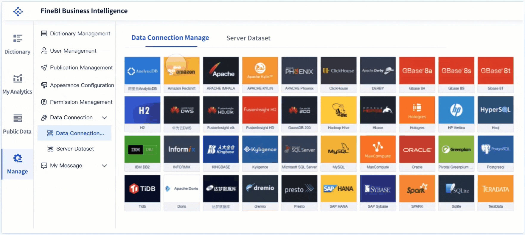
You may need more advanced features than a standard excel dashboard can provide. FineBI is a self-service business intelligence platform designed for complex analytics and large datasets. FineBI supports strong scalability, high interactivity, and real-time data updates. You can connect to over 100 data sources for seamless integration. FineBI is ideal for enterprises that require advanced data visualization and need to manage complex KPIs. The drag-and-drop interface makes it easy for you to build interactive dashboards without technical expertise.
| Feature | FineBI | Excel |
|---|---|---|
| Scalability | Strong scalability for large datasets and complex KPIs | Limited in handling large-scale data visualizations |
| Interactivity | Supports high interactivity and real-time data updates | Generally less interactive and slower updates |
| User Accessibility | Self-service BI features with drag-and-drop interface | Requires more technical expertise for complex tasks |
You start your dashboard Excel project by importing data from reliable sources. Excel allows you to bring in data from files such as CSV, TXT, and XML, as well as databases and web APIs. You can use the 'Get & Transform' feature for efficient data import. This tool helps you connect to external sources and load data directly into your workbook. When importing, you may encounter errors that affect your dashboard Excel setup. The table below lists common issues and solutions:
| Error Type | Cause | Fix |
|---|---|---|
| #N/A Errors | Missing data in lookup formulas or inconsistent data between datasets. | Ensure the lookup value exists; use IFERROR or IFNA to handle errors. |
| #REF! Errors | Deleting a referenced cell or incorrect copy-pasting of formulas. | Use Undo or audit formulas with Trace Dependents and Precedents. |
| #VALUE! Errors | Mismatched data types or incorrect argument types in formulas. | Check data types with ISTEXT() or ISNUMBER(); ensure valid references. |
| #NAME? Errors | Typing errors in function names or missing defined names. | Double-check formula names and use Name Manager to verify ranges. |
| #DIV/0! Errors | Division by zero or empty cells. | Use an IF statement to prevent division by zero. |
| Duplicate Data | Inconsistent imports or manual errors. | Use Remove Duplicates feature or COUNTIF() to check for duplicates. |
| Text Formatting | Cells formatted as Text preventing formula calculations. | Change cell format to General and refresh formulas. |
| VLOOKUP Errors | VLOOKUP not finding a valid match. | Consider using XLOOKUP for more flexibility and accuracy. |
FineBI supports direct Excel file uploads and advanced data integration. You can connect to over 60 data sources, including databases and cloud platforms, for seamless dashboard Excel creation.
You need to clean and organize your data before building a dashboard Excel. Start by gathering all necessary data and placing it in Excel with clear headers. Use Excel functions like TEXT, DATE, and TRIM to standardize formats and remove errors. Maintain consistency in style by using the same font and colors throughout your dashboard Excel. Label charts and tables clearly to improve understanding. Set up your workbook with separate sheets for raw data, cleaned data, and analysis. This structure helps you manage data efficiently and prevents mistakes.
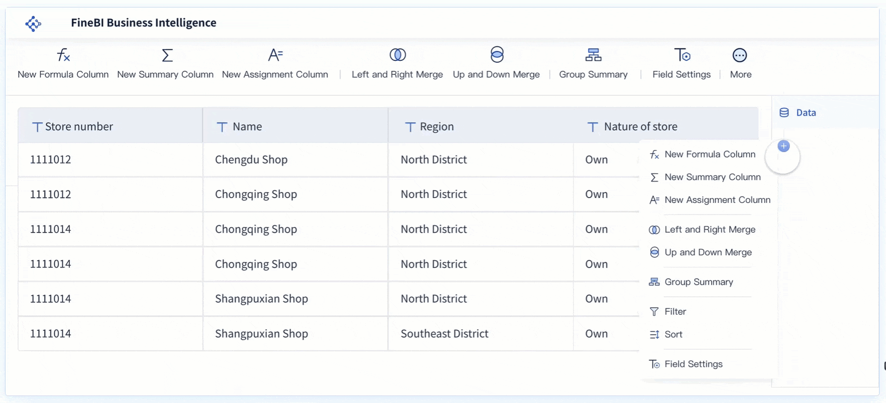
Formatting your data as a table in Excel improves dashboard Excel functionality. Tables organize raw data for easier manipulation. You can filter and summarize information quickly using pivot tables. Tables also enable dynamic interactions and clearer visualizations. Excel tables update automatically when you add new data, keeping your dashboard Excel current and accurate. FineBI also supports table formatting and advanced data modeling, making it easier to build interactive dashboards with real-time updates.
Tip: Always format your source data as a table before creating charts or pivot tables. This step ensures your dashboard Excel remains flexible and easy to maintain.

Creating a dashboard excel project involves several steps that help you transform raw data into actionable insights. You use pivot tables and charts to summarize and visualize your data. You design the layout to make your dashboard easy to read and navigate. This guide walks you through each step so you can create a dashboard in excel that meets your needs.
Pivot tables are the foundation of any excel dashboard. You use them to summarize large datasets and extract key metrics. Follow these steps to build pivot tables for your dashboard excel:
Tip: Always use clear labels and consistent formatting in your pivot tables. This makes your dashboard excel easier to understand and maintain.
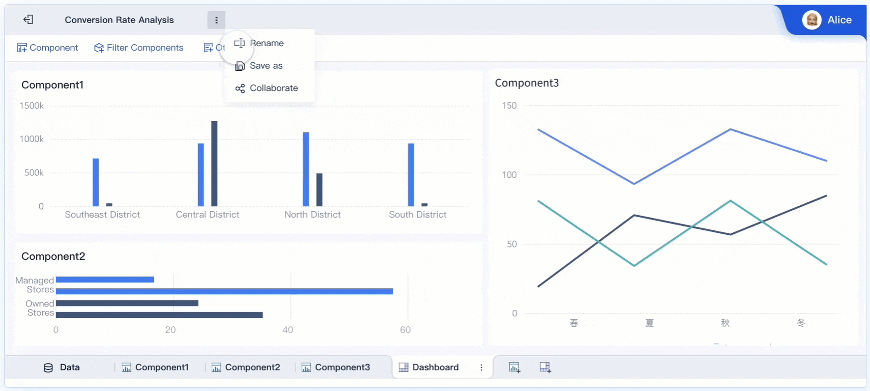
You can assemble the excel dashboard by combining multiple pivot tables and charts. This approach lets you track sales, monitor KPIs, and analyze trends in one place. You follow these steps to create a dashboard in excel that is both functional and visually appealing.
Pivot charts bring your data to life. You use them to visualize trends, compare values, and highlight important metrics. After you build your pivot tables, you add pivot charts to your dashboard excel:
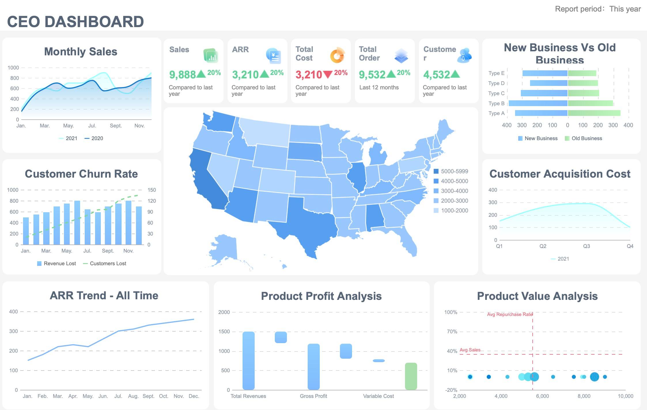
You can create a dashboard in excel with several types of pivot charts. Popular templates include marketing dashboards, KPI dashboards, and funnel dashboards. These templates help you track performance, visualize pipeline health, and monitor key stats from different channels.
Note: Pivot charts update automatically when you refresh your pivot tables. This keeps your dashboard excel current and accurate.
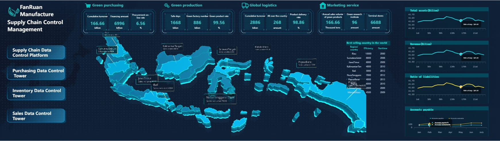
FineBI offers a drag-and-drop dashboard creation experience. You can build interactive dashboards without coding. The platform supports advanced visualizations, real-time filtering, and seamless integration with multiple data sources. If you need more flexibility or want to manage large datasets, FineBI is a powerful alternative to traditional excel dashboard tools.
Dashboard design best practices help you create a dashboard in excel that is easy to use and understand. You focus on layout, alignment, and navigation to optimize the user experience.
| Evidence Description | Key Points |
|---|---|
| Proper alignment and spacing | Enhances organization and aids user comprehension. |
| Use of color schemes | Balances contrast and readability, highlighting critical insights. |
| Intuitive navigation aids | Facilitates user interaction and dynamic data exploration. |
Thoughtful layout design guides users through complex datasets. You sketch wireframes or mockups to clarify which metrics are most important. Place key visual elements to optimize flow and reduce cognitive overload. Use color schemes to highlight critical insights and maintain readability.
You can assemble the excel dashboard using templates that suit your needs. Marketing dashboards consolidate key metrics into a single view. KPI dashboards simplify performance tracking. Funnel dashboards provide an overview of pipeline health. These templates help you create a dashboard in excel that matches your business goals.
Tip: Test your dashboard excel with real users. Gather feedback and make adjustments to improve clarity and usability.
FineBI supports dashboard design best practices with its flexible layout options. You drag and drop components, customize styles, and preview your dashboard before publishing. The platform adapts to any device, making it easy for users to access insights anywhere.
This guide gives you the steps to create a dashboard in excel that is both effective and easy to use. You combine pivot tables, pivot charts, and thoughtful layout design to assemble the excel dashboard. If you need advanced features, FineBI provides a scalable solution for interactive excel dashboard creation.
You can make your interactive excel dashboard more engaging by adding slicers and timelines. Slicers allow you to filter data visually, giving you control over what you see in your dashboard Excel. Timelines work well with date fields, letting you explore trends over time. When you click on a slicer or timeline, all related visuals in your dashboard update instantly. This dynamic filtering helps you analyze specific segments of your data.
Slicers and timelines provide intuitive filtering options. As you interact with these tools, the values on your visuals change based on your selections. This makes your interactive excel dashboard more responsive and user-friendly.
| Interactive Feature | Description |
|---|---|
| PivotTables | Summarize and analyze data dynamically. |
| Slicers | Filter data visually and interactively. |
| Hyperlinks | Navigate between dashboard sections. |
| Drill Down | Explore data in greater detail. |
Customizing your interactive excel dashboard improves clarity and impact. You can set chart types, change colors, and adjust font styles to match your preferences. Shape tools and color palettes help you create a visually appealing dashboard Excel. Interactive elements, such as filters and sorting options, engage users and support dynamic data exploration.
| Customization Option | Description |
|---|---|
| Shape Tools | Create visually appealing dashboards. |
| Color Palettes | Enhance dashboard impact. |
| Interactive Elements | Enable dynamic data exploration. |
Once you establish the layout, you can modify colors, select fonts, and add filters to enhance user interaction. These steps make your interactive excel dashboard more effective for analysis.
Maintaining your interactive excel dashboard ensures accuracy and relevance. You should keep the dashboard clean and simple, focusing on key metrics. Double-check your data sources to confirm reliability. Validate data input to prevent inconsistencies. Standardize formats for consistency across your dashboard Excel. Monitor for errors and fix them quickly, including checking for broken connections and incorrect calculations.
FineBI offers advanced interactivity, real-time filtering, and mobile access. You can build dashboards that update instantly and work across devices. This makes FineBI a strong choice for users who need scalable and interactive excel dashboard solutions.
You may find that an excel dashboard works well for simple data visualization and reporting. However, as your needs grow, you might face limitations with Excel dashboards. FineBI offers a more advanced solution for users who want to move beyond basic dashboard creation. You should consider FineBI if you need to handle large datasets, require real-time data updates, or want to integrate data from multiple sources. FineBI provides a structured learning path, making it easier for you to create interactive dashboards without advanced technical skills.
| Criteria | FineBI Features | Excel Features |
|---|---|---|
| Dashboard Design | Structured learning path for interactive dashboards | Limited dashboard capabilities |
| Data Manipulation | Advanced merging, grouping, and summarizing | Basic data manipulation |
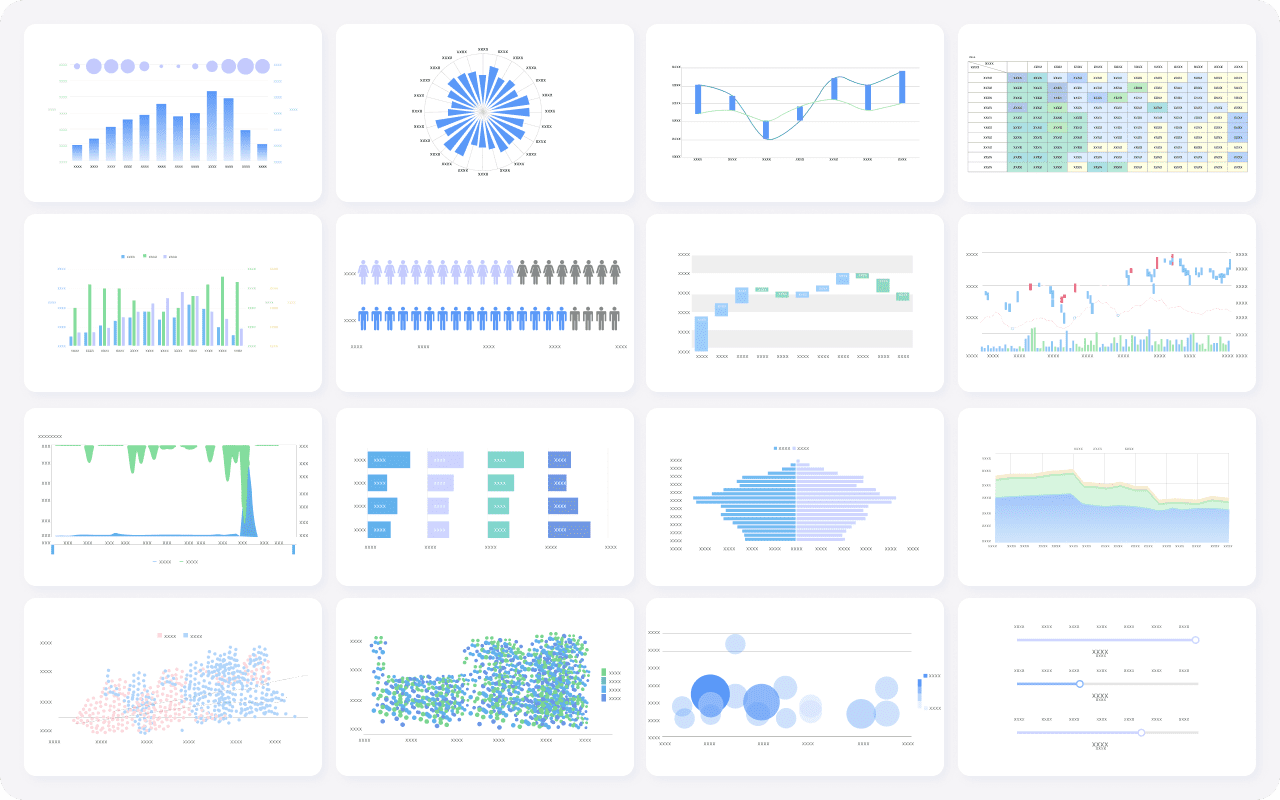
| Data Visualization | Rich visual charts and deep analysis components | Basic charting options |
You may also encounter challenges when switching from an excel dashboard to FineBI. Some users feel hesitant to change tools or worry about losing control over their workflow. You can address these concerns by starting with small projects in FineBI and gradually building your skills. FineBI allows you to export data back to Excel, which helps you maintain familiarity during the transition.
FineBI stands out for its self-service analytics and powerful dashboard capabilities. You can connect to over 60 data sources, including databases, cloud platforms, and Excel files. FineBI lets you merge, group, and summarize data easily, which is essential for advanced dashboard creation. The drag-and-drop interface allows you to build dashboards quickly, even if you have limited technical experience.
FineBI supports collaborative dashboard development, so your team can work together on the same dashboard. You can also access dashboards on any device, making it easy to stay informed wherever you are. If you need to analyze complex data or require enterprise-level features, FineBI provides a scalable and flexible alternative to a traditional excel dashboard.
You can create a dashboard Excel by preparing clean data, using pivot tables, and refining your layout. The table below highlights the key takeaways:
| Key Takeaway | Description |
|---|---|
| Preparation is key | Start with clean data and a clear plan. |
| Utilize Excel's features | Use pivot tables, slicers, and formatting for better functionality. |
| Test and refine | Test your dashboard Excel and adjust as needed. |
Dashboards give you real-time insights and simplify complex data, helping you make informed decisions. Try building your dashboard Excel in Excel for simple needs. For advanced, scalable, or collaborative solutions, explore FineBI.
What is a Dashboard and How Does It Work
Store Performance Dashboard: Your Retail Command Center
How to Craft an Effective Analytics Dashboard
What is a Digital Dashboard and How Does It Work
What is a KPI Dashboard and Why Your Business Needs One


The Author
Lewis
Senior Data Analyst at FanRuan
Related Articles
Executive Summary Dashboard for Enterprise Leaders: 9 Steps to Design KPIs, Layout, and Governance
Learn 9 steps to design an executive summary dashboard for enterprise leaders. Define KPIs, layout, and governance for better strategic decision-making.
Lewis Chou
May 04, 2026

Executive Dashboard Template: What Enterprise Leaders Should Include Before They Build
Learn what to include in an executive dashboard template for better decision-making. Focus on KPIs, risk signals, and strategic alignment for leadership teams.
Lewis Chou
May 04, 2026

How to Build a Teams Call Queue Dashboard: Turn Raw Queue Data Into Actionable Insights
Learn how to transform raw Teams call queue data into a dashboard for real-time monitoring, trend analysis, and proactive service level management.
Lewis Chou
May 04, 2026


