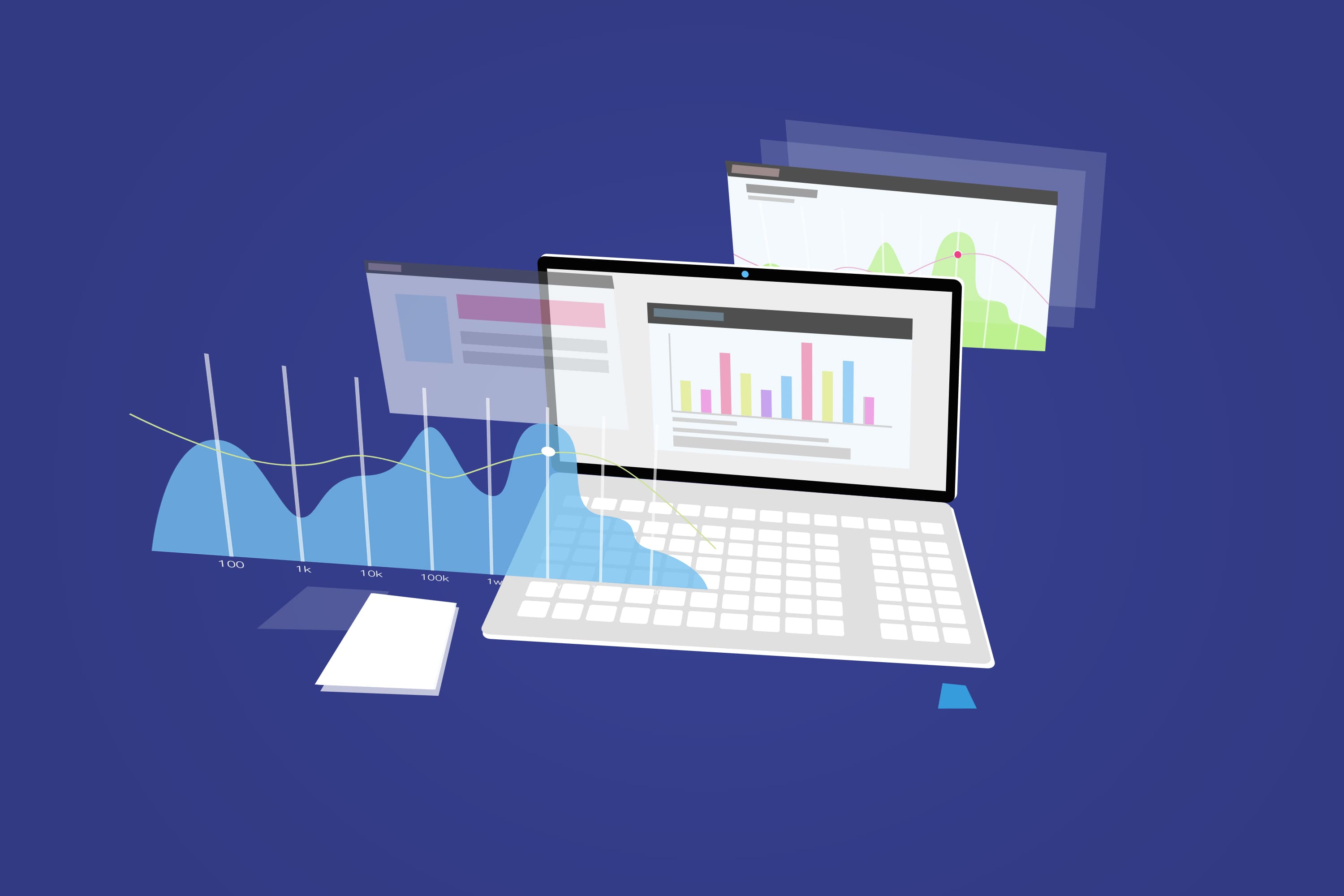
A dashboard tool is a data management platform that consolidates key metrics into a single interface, transforming complex data into intuitive visualizations to enable real-time performance tracking and informed decision-making.If you want to transform your business in 2025, you need dashboard tools that deliver real results. The following is the Top 10 Dashboard Tools to Transform Your Business in 2025:
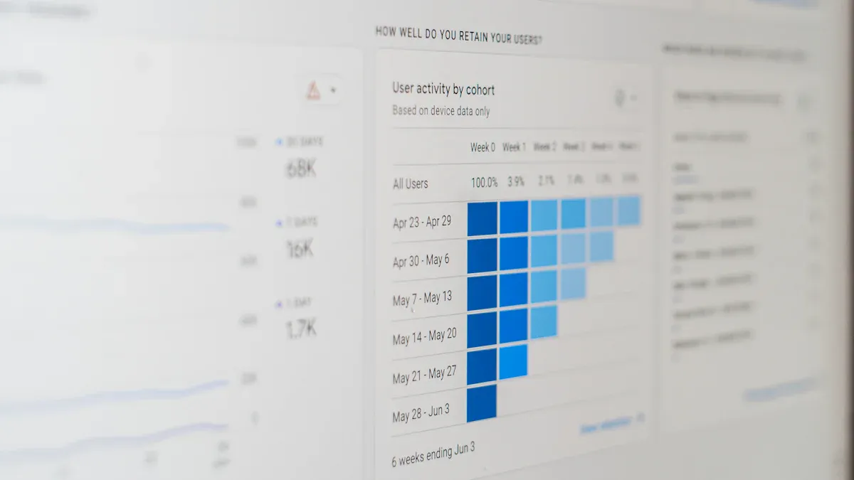
Data visualization tools help you see live metrics visualization in action, making it easier to spot trends and act fast. Most businesses see a 15-30% boost in productivity when employees use these platforms. You can expect faster decisions, higher engagement, and better outcomes when you choose the right solution.
Check out how data visualization tools can improve the way you work. Well-designed dashboards make your information clearer and your decisions smarter.
| Metric | Value Range |
|---|---|
| Adoption Rate | 60-80% of employees active |
| Engagement Depth | 15-25 prompts per user/day |
| Time-to-Proficiency | 7-14 days |
| Productivity Impact | 15-30% improvement |
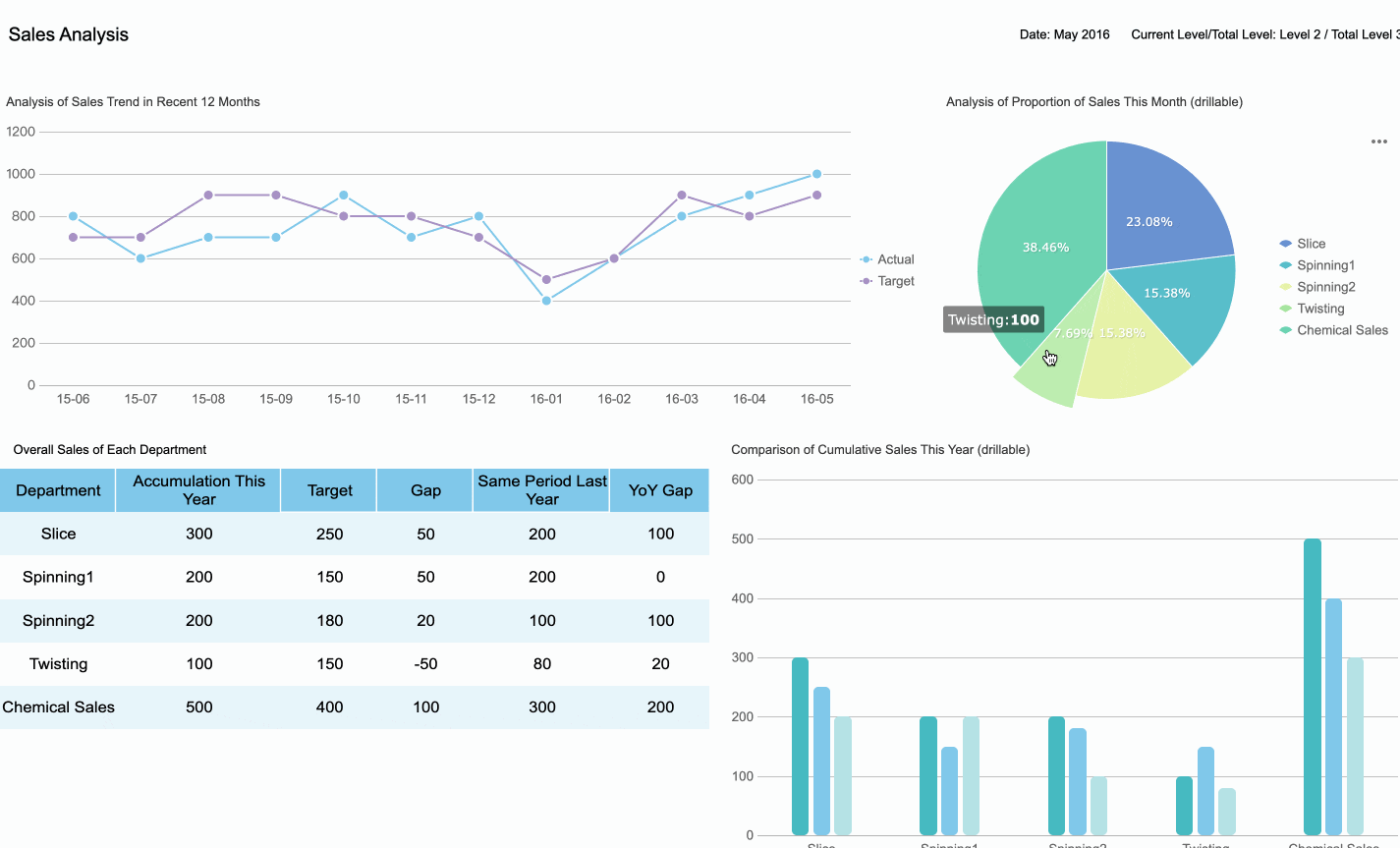
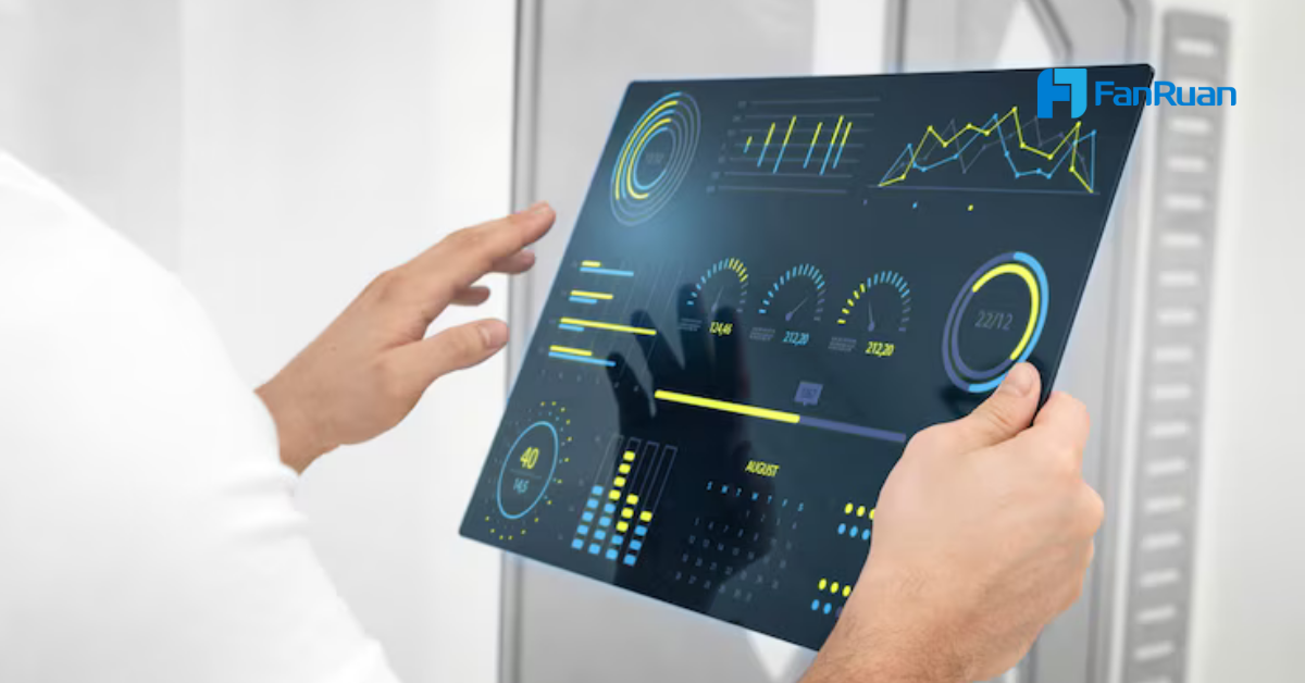
You want your business to move faster and smarter in 2025. That’s where data visualization tools come in. These tools turn complex numbers into clear pictures, so you can spot trends and make decisions quickly. When you use dashboards, you see real-time updates and can track performance as it happens. This means you catch problems early and keep your team focused on what matters most.
As more companies shift to data-driven decision-making, the demand for data visualization tools keeps rising. Over 70% of businesses are expected to use these tools in 2025. You’ll find that dashboards not only help you understand your data, but also improve communication across your team. Everyone stays on the same page, and you can act on insights right away.
Here’s a quick look at the benefits you get from using dashboard tools:
| Benefit | Description |
|---|---|
| Timely Data Access | Dashboards provide real-time updates, ensuring decisions are based on the most current data. |
| Enhanced Decision-Making | Visual formats help in understanding complex information, empowering data-driven decisions. |
| Improved Efficiency | Automation of data analysis reduces manual reporting time, allowing for deeper analysis. |
| Insight Discovery | Advanced machine learning capabilities uncover hidden patterns and correlations in data. |
| Better Communication | Visually engaging reports facilitate effective communication with stakeholders, fostering trust. |
You’ll notice some big trends shaping dashboard tools in 2025. Real-time data tracking lets you monitor your business as it happens. User-friendly interfaces make these tools easy for everyone, not just tech experts. Integration capabilities mean you can pull in data from all your favorite sources, giving you a complete view of your business.
| Key Trend | Description |
|---|---|
| Real-time data tracking | Enables businesses to monitor performance as it happens. |
| User-friendly interfaces | Simplifies the user experience, making tools accessible to a wider audience. |
| Integration capabilities | Allows seamless connection with various data sources for comprehensive insights. |
| Customization | Offers tailored solutions to meet specific business needs. |
| Mobile accessibility | Ensures users can access dashboards on-the-go, enhancing flexibility. |
Data visualization tools now offer more customization and mobile access than ever. You can check your metrics from anywhere, making it easier to stay flexible. As you focus on customer experience, remember that a good dashboard can help you track performance, spot trends, and personalize your approach. This is how you stay ahead and make the most of data-driven decision-making.
Choosing the right dashboard software can change the way you work. Let’s dive into the top dashboard tools that will help you transform your business in 2025. You’ll find a mix of established leaders and innovative newcomers, each with their own strengths.
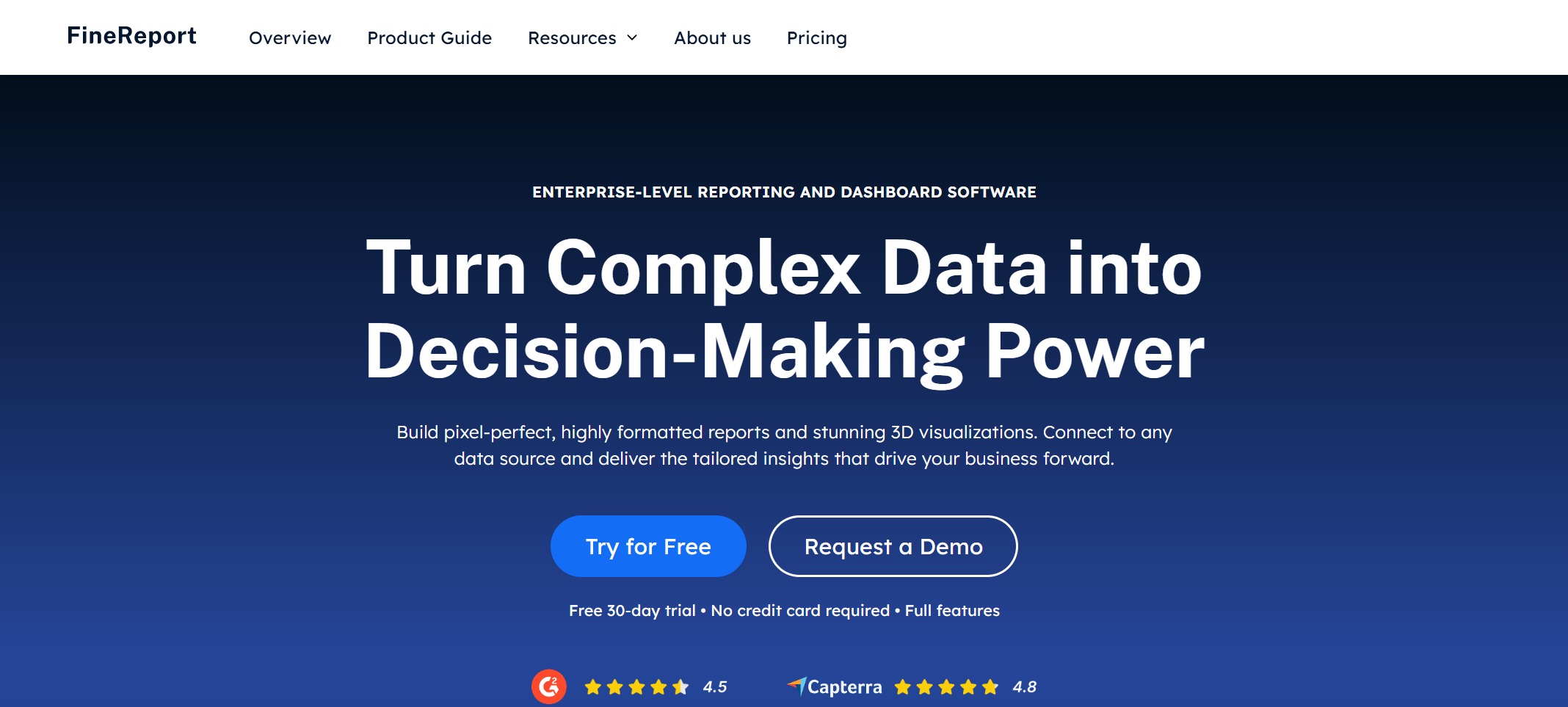
Website: https://www.fanruan.com/en/finereport
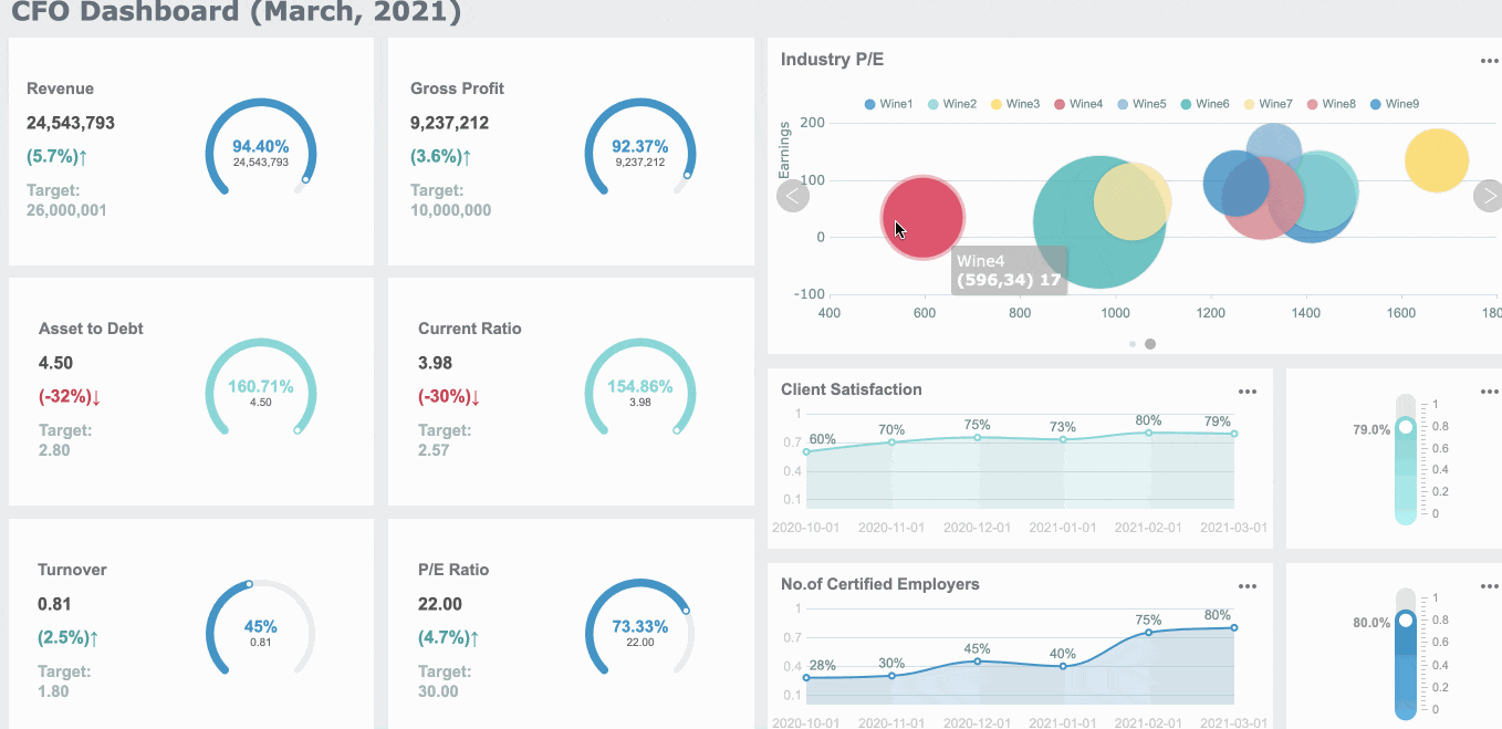
FineReport stands out as a flexible and powerful dashboard software trusted by over 15,000 companies worldwide. You can create pixel-perfect reports, interactive dashboards, and advanced data visualization tools—all with a drag-and-drop interface that feels familiar if you’ve ever used Excel. FineReport connects to more than 500 data sources, so you can bring all your information together in one place.
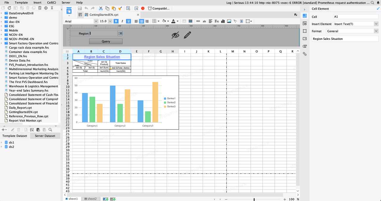
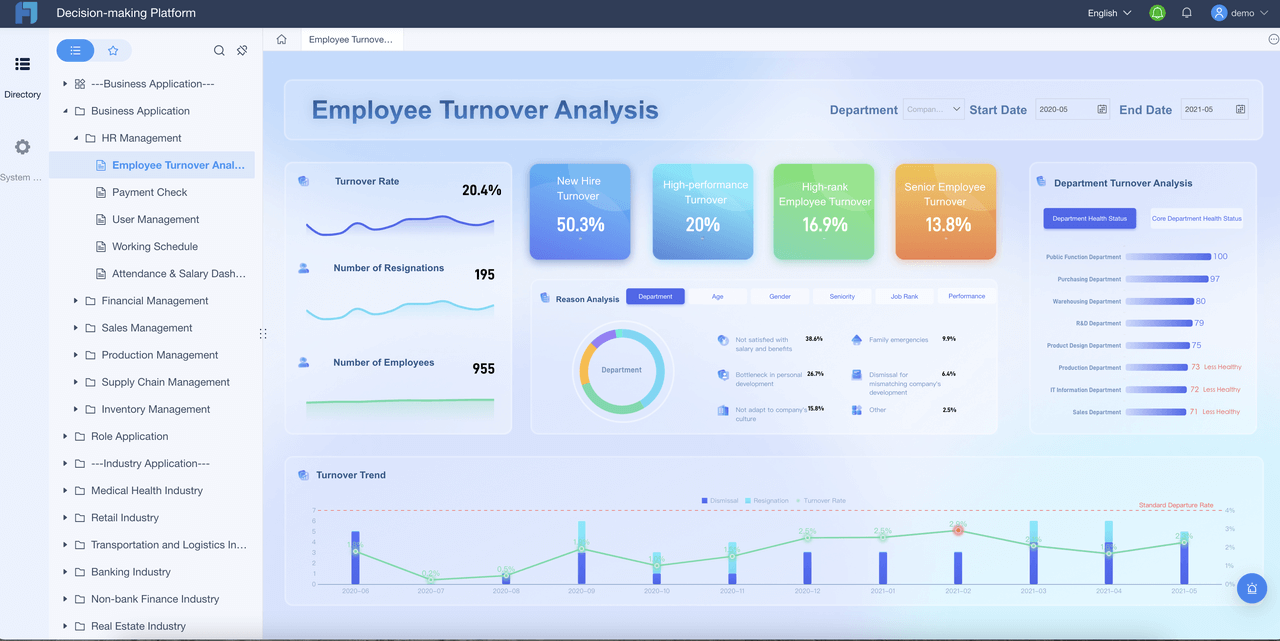
You’ll love how FineReport makes it easy to build dashboards for any department. In finance, you can automate financial reporting, track KPIs, and manage budgets with real-time data. In manufacturing, FineReport helps you monitor production, manage resources, and spot trends before they become problems. The software’s decision-making platform gives you a central hub for all your reports, dashboards, and user management, making collaboration simple.
Customer Success Story:
BOE Technology Group, a global leader in IoT and semiconductor displays, used FineReport to unify their data and build KPI dashboards. They reduced inventory costs by 5% and boosted operational efficiency by 50%. FineReport helped them move from scattered spreadsheets to a single source of truth, making data-driven decisions faster and easier.
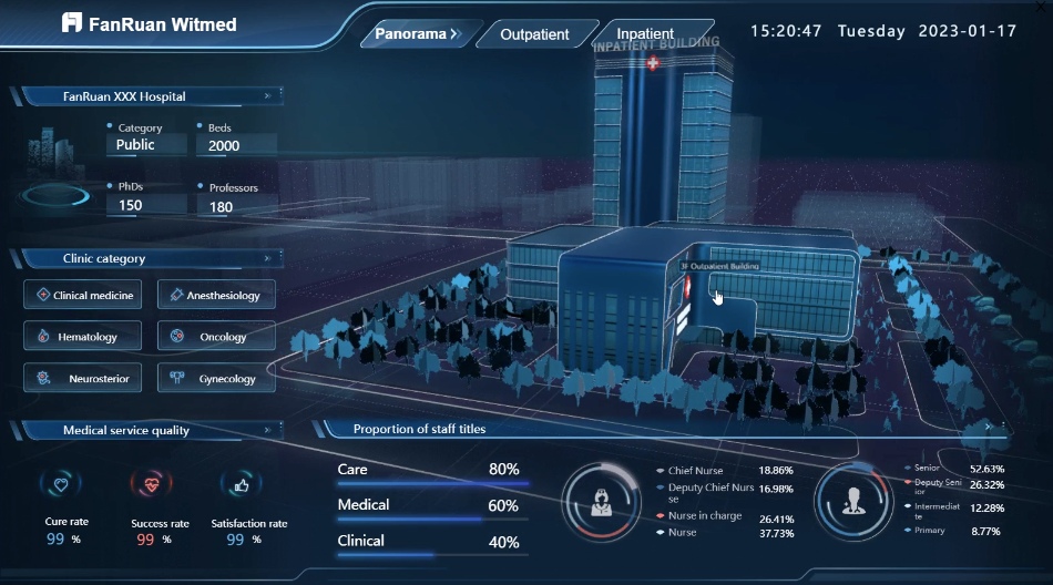
FineReport’s 3D dashboards, mobile access, and customizable layouts mean you can visualize your data anywhere, anytime. You can even embed dashboards into your own apps or use the mobile dashboard to keep an eye on key metrics on the go. FineReport’s data entry forms and multi-report layouts make it a top choice for dashboard reporting tools in both finance and manufacturing.

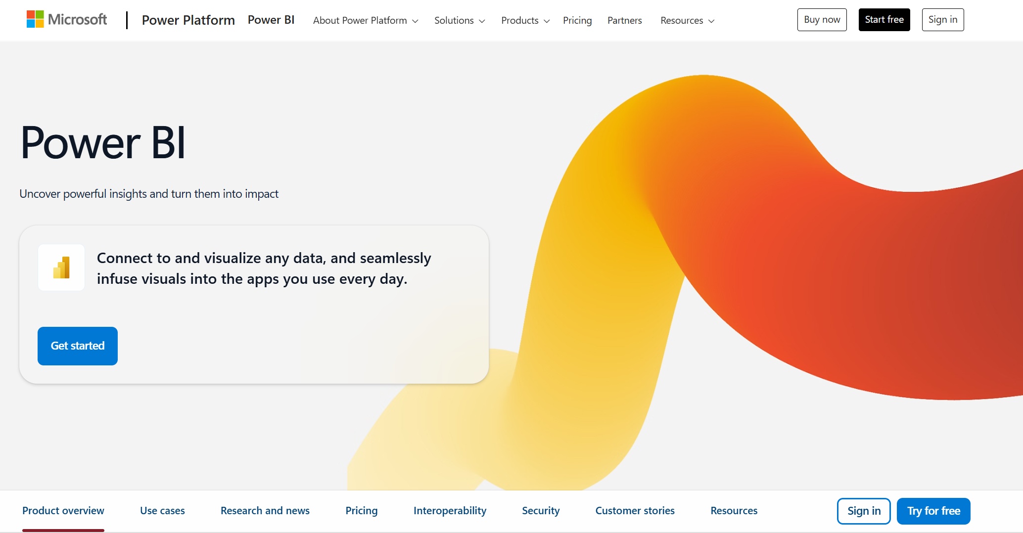
Website: https://www.microsoft.com/en-us/power-platform/products/power-bi
Power BI from Microsoft is one of the most popular dashboard tools for real-time data visualization. You get a user-friendly interface with drag-and-drop features, making it easy for anyone to build dashboards. Power BI integrates deeply with Microsoft products like Excel and Azure, so if you already use those, you’ll feel right at home.
| Feature | Description |
|---|---|
| User-Friendly Interface | Drag-and-drop functionality for non-technical users to create dashboards. |
| Microsoft Integration | Seamless connection with Excel, Azure, and other Microsoft products. |
| Pricing | Free version; Pro at ~$14/user/month; Premium at ~$24/user/month. |
| Rich Visualizations | Many options for data visualization, including custom visuals. |
| AI-Enhanced Analytics | Predictive analytics and automated insights built in. |
Pros:
Cons:
Power BI works best for businesses already using Microsoft products and those who want to upgrade from Excel to a more powerful dashboard analytics tool. You can start with the free desktop version or choose a paid plan for team collaboration.
| Plan | Price | Use Case |
|---|---|---|
| Power BI Desktop | Free | Personal data analysis |
| Power BI Pro | $14/user/month | Teams needing collaborative analytics |
Website: https://www.tableau.com/
Tableau is a leader in dashboard software, known for its advanced analytics and interactive data visualization tools. You can handle large datasets and create beautiful, interactive dashboards that help you dig deep into your data.
| Advantages | Disadvantages |
|---|---|
| Advanced analytical abilities | High pricing, especially for smaller organizations |
| Comprehensive visualization options | Steeper learning curve compared to competitors |
| Handles large datasets with ease | Requires dedicated admins and ongoing maintenance |
| Rich library of visualization types | Not intuitive for non-technical users |
| Enables informed business strategies | Heavy reliance on analysts for report building |
Tableau shines when you need to analyze complex data and want to create dashboards that tell a story. It’s a favorite among analysts and data professionals who need dashboard reporting tools that can handle anything you throw at them.
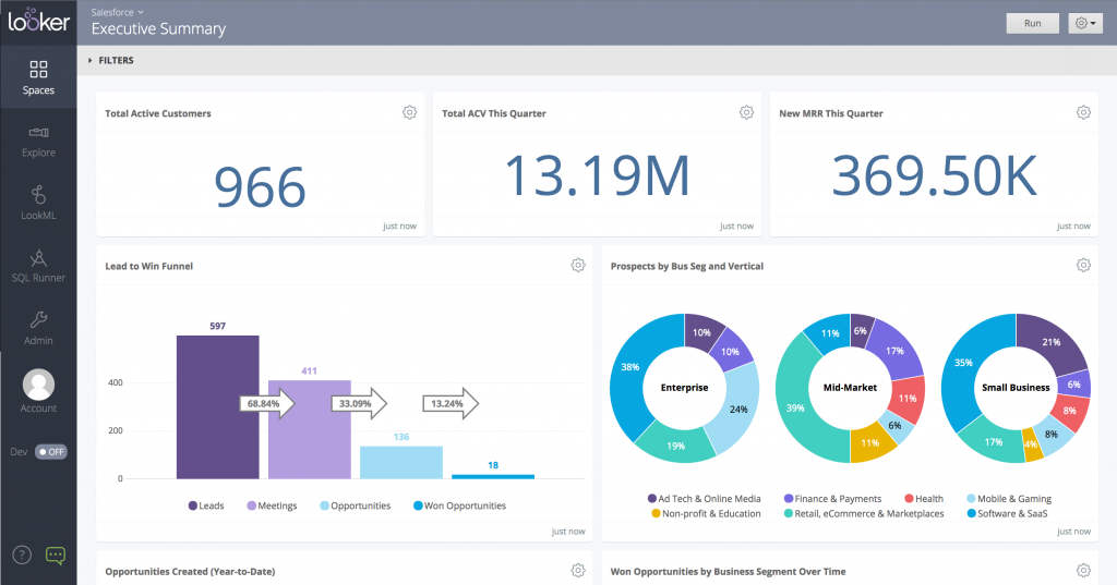
Website: https://lookerstudio.google.com/navigation/reporting
Looker, now part of Google Cloud, focuses on cloud-based dashboard software and AI-powered analytics. You can customize dashboards and reports, but you might notice a steeper learning curve compared to other data visualization tools. Looker’s integration capabilities are not as seamless as some competitors, often requiring third-party tools to connect to various data sources. Real-time analytics can be a challenge, so it’s best for businesses that don’t need instant updates.
Looker is a good fit for companies already invested in Google Cloud and those who want to build custom analytics solutions with strong governance.
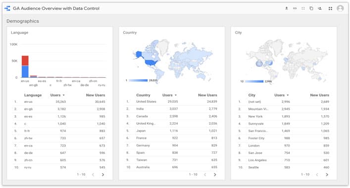
Google Data Studio, now called Looker Studio, is a free dashboard software that makes it easy to create interactive reports and dashboards. You can connect to Google Analytics, Google Ads, and other Google services right out of the box. For more advanced needs, Looker Studio Pro offers collaboration tools and Google Cloud support.
| Pricing Model | Description |
|---|---|
| Free Option | Limited access to Google-native data sources like Google Analytics, Google Ads, etc. |
| Looker Studio Pro | For larger teams, includes service-level agreements and collaboration tools. |
| Third-party Connectors | Additional costs for using connectors to non-Google platforms. |
You’ll find Google Data Studio perfect for marketing teams, small businesses, and anyone who wants to visualize Google data quickly. If you need more power, Looker Studio Pro is available for enterprise teams.
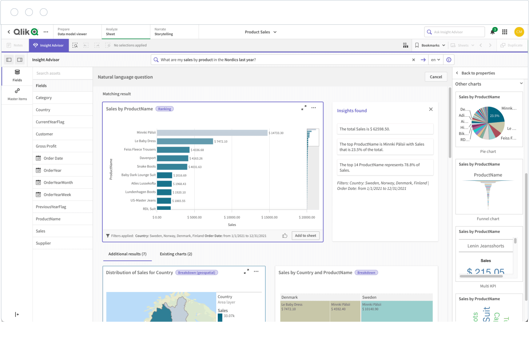
Website: https://www.qlik.com/us/products/qlik-sense
Qlik Sense is a flexible dashboard software that works well across many industries. You can use it to track sales in retail, monitor patient outcomes in healthcare, or manage risk in financial services. Qlik Sense stands out for its associative data model, which lets you explore data freely and uncover hidden insights.
| Industry | Use Case Description |
|---|---|
| Retail | Track sales, evaluate demand, optimize inventory. |
| Healthcare | Monitor treatment results, aggregate patient records. |
| Financial Services | Conduct risk assessments, analyze portfolios. |
| Manufacturing | Boost production efficiency, reduce downtime. |
| Government | Enable non-technical users to analyze data for better decisions. |
Qlik Sense is a great choice if you want dashboard reporting tools that adapt to your industry and help you make smarter decisions.
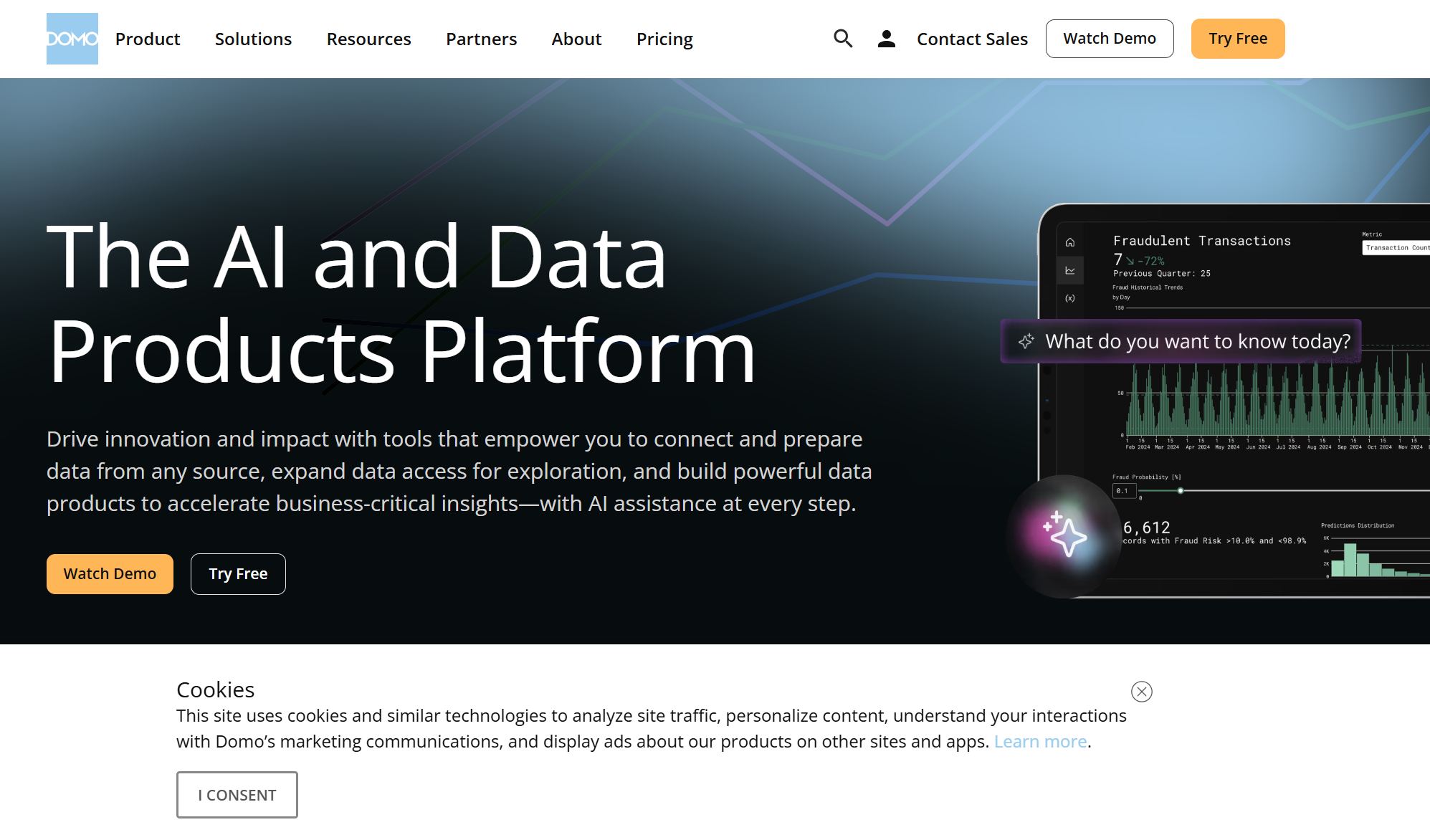
Website: https://www.domo.com/
Domo is a cloud-based dashboard software designed for ease of use. You can create dashboards with drag-and-drop features and pre-built templates, even if you’re not a tech expert. Domo connects to over 1,000 data sources, so you can blend and clean data visually without writing code.
Pros:
Cons:
Domo works well for businesses that want to bring together lots of data sources and need a dashboard analytics tool that anyone can use.

Website: https://www.sisense.com/
Sisense is a powerful dashboard software that brings advanced analytics and AI features to your business. You can use Sisense Intelligence to extract insights, identify trends, and manage risks. The AI Assistant helps you create visualizations and insights without needing to know SQL or data science. Sisense also offers narrative summaries and forecasting tools powered by machine learning.
Sisense is a smart pick if you want to use data visualization tools to drive innovation and make data-driven decisions.
Website: https://www.zoho.com/analytics/
Zoho Analytics is a cost-effective dashboard software built for small and medium businesses. You can start with the Basic plan at $22 per month for two users, or scale up to the Premium plan for $112 per month for up to 15 users. Zoho Analytics handles large datasets with ease, using columnar storage and in-memory processing for fast performance. The auto-scaling infrastructure grows with your needs.
Zoho Analytics is ideal if you want dashboard reporting tools that are easy to use, budget-friendly, and scalable.

Website: https://www.klipfolio.com/
Klipfolio gives you customizable dashboards with over 140 integrations. You can create internal dashboards using “Klips” (widgets), but setting up custom metrics may require some technical know-how. Klipfolio offers strong security, including TLS 1.2 encryption and GDPR compliance. You can share reports by email, link, or PDF, and schedule automated updates.
| Plan | Price/month (annual) | Included Dashboards | Key Features |
|---|---|---|---|
| Base | $80 | 3 | Unlimited users, 4-hour data refresh, 130+ integrations, PDF reports |
| Grow | $170 | 10 | 1-hour data refresh, report scheduling, link sharing |
| Team | $310 | 20 | 15-min data refresh, SSO, custom onboarding, priority support |
| Team+ | $600 | 40 | All Team features plus custom onboarding and priority support |
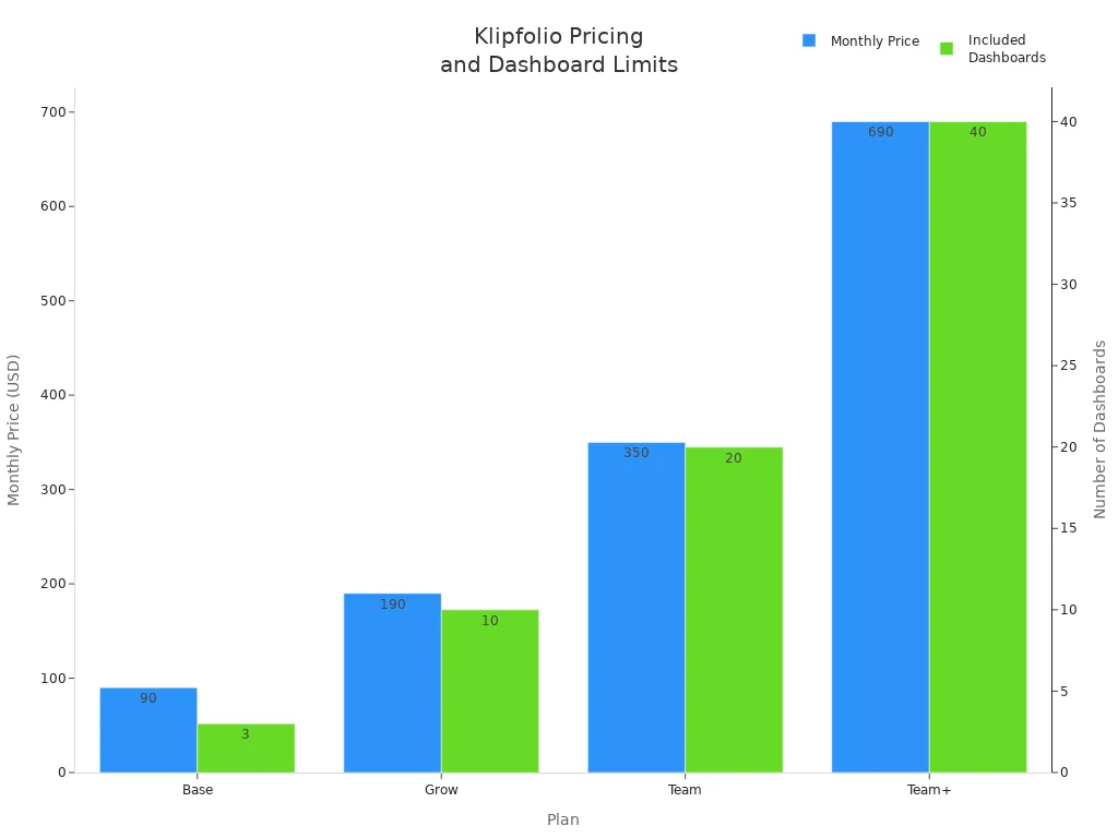
Klipfolio is a good fit for teams that want customizable dashboards and need to connect to many data sources.
Tip:
When you choose dashboard software, think about your team’s needs, your data sources, and how much customization you want. The right dashboard tools will help you unlock the full power of your data visualization tools and make smarter decisions every day.
When you pick dashboard software, you want something that fits your business now and grows with you. Let’s break down the features you should look for in dashboard reporting tools so you can make the best choice.
You need dashboard reporting tools that connect with all your data sources. This makes your data visualization application powerful and complete. Look for features like advanced filters, customizable templates, and user roles. These let you tailor dashboards for each department or team member. Here’s a quick look at what matters:
| Feature | Description |
|---|---|
| Integrations | Connects with many data sources for better data visualization. |
| UI Interactivity | Drilldown and drill-through for deeper insights. |
| Data Filter Capabilities | Lets you refine searches and focus on what matters. |
| User Roles | Custom access for admins, editors, and viewers. |
| Advanced Graphs | Highlight trends with secondary axes and formatting. |
| Predictive Analytics | Forecast future outcomes using past data. |
| Tabs | Track different metrics across teams. |
| Custom Templates | Build dashboards that match your business needs. |
FineReport stands out here. You get flexible integration, drag-and-drop customization, and industry-specific solutions for finance and manufacturing. You can even design dashboards with the end-user’s goals in mind, making your data visualization clear and interactive.
As your company grows, your dashboard software should keep up. Many traditional tools struggle with more users and bigger data. You want a solution that scales without slowing down or breaking the bank.
| Key Insight | Description |
|---|---|
| Traditional BI Limitations | Older tools can’t handle lots of users or data, leading to higher costs. |
| Demand for Scalable Analytics | Most tech leaders want analytics at scale, but many tools fall short. |
| Barriers to Adoption | Legacy systems often block new dashboard reporting tools. |
FineReport offers a scalable platform that adapts as your needs change, so you never have to worry about outgrowing your solution.
Modern dashboard reporting tools use AI and automation to make your job easier. You can get predictive analytics, automated insights, and even natural language queries. These features help you spot trends and act fast.
| Tool Name | AI and Automation Features | Target Users |
|---|---|---|
| Looker | Governed metric layer, great for embedding | Data-engineering teams |
| Domo | End-to-end cloud platform | Mid-to-large enterprises |
| Qlik Sense | Flexible exploration with AI | Teams needing deep data discovery |
| Sisense | Embedded analytics, scalable for big data | SaaS/product teams |
| Klipfolio | Fast KPI dashboards, many connectors | SMBs, marketing and sales teams |
FineReport brings automation to your workflow with scheduled reports, real-time alerts, and smart data entry forms.
You want your dashboard software to keep your data safe and meet industry standards. Top tools support standards like SOC 2, ISO 27001, and GDPR. FineReport gives you robust permission controls and secure data management, so you can trust your dashboards with sensitive information.
Tip: Always choose dashboard reporting tools that match your security needs and compliance requirements.
What should you remember?
You want to see how dashboard tools stack up side by side. Here’s a quick table that highlights their strengths, ideal use cases, and pricing info. FineReport stands out for its flexible integration and real-time reporting, while other tools offer unique features for different business needs.
| Tool | Ideal Use Case | Key Features | Pricing Information |
|---|---|---|---|
| FineReport | Finance, manufacturing, enterprise-wide reporting | Drag-and-drop design, 3D dashboards, mobile access, direct database integration | Custom pricing, scalable for any size |
| Power BI | Teams using Microsoft products | User-friendly, deep Microsoft integration, AI analytics | Free, Pro $14/user/month, Premium $24/user/mo |
| Tableau | Data-heavy teams, deep BI projects | Advanced visualization, AI analysis | Starts ~$70/user/month |
| Looker BI | Enterprises with complex data systems | Strong data modeling, predictive analytics | Custom pricing, starts ~$60,000/year |
| Klipfolio | Custom dashboards, coding capability | Role-based access, wide integration reach | Base $80/mo, Grow $170/mo, Team $310/mo |
| Looker Studio | Beginners, Google users | Easy builder, native Google integrations | Free, Pro $9/user/month |
Every dashboard tool brings something special to the table. You want to know what works best for your business goals. Here’s a summary to help you decide:
| Advantages | Disadvantages |
|---|---|
| Improved decision-making | Real-time dashboards may need extra setup and maintenance |
| Enhanced data accuracy | Too many metrics can cause information overload |
| Increased efficiency | Some tools may not integrate well with all your systems |
| Saves time and resources | Dashboard reporting needs meaningful metrics |
| Easy performance checks | Compatibility issues can arise |
| Up-to-date progress evaluation | Scalability and cost vary by tool |
Tip: Focus on the features that match your team’s workflow. You’ll get the most value when your dashboard fits your business needs.
Pricing can make or break your dashboard choice. You want a tool that fits your budget and scales as you grow. Here’s a quick look:
You can choose a dashboard tool that matches your budget and business needs. FineReport gives you flexibility and scalability, making it a strong choice for growing companies.
You want to make better decisions, and data visualization tools help you do just that. These tools turn complex numbers into clear visuals, so you can spot trends and act fast. When you use real-time dashboards, you see the latest updates without waiting for reports. This means you can respond to changes as they happen.
You do not need to be a data expert to benefit. These tools make analytics easy for everyone. You can share insights with your team, so everyone stays on the same page. As Paul Ross from Forbes says:
"Visual representations enable rapid data analysis, improving decision making efficiency by providing an instant overview of critical information."
FineReport stands out here. You can build interactive dashboards for finance, manufacturing, or any department. You get a clear view of your business, and you can act on insights right away.
You do not want to be tied to your desk. With real-time dashboards, you can check key metrics on your phone or tablet. Mobile access means you always have the latest information, no matter where you are. These dashboards adjust to any screen size, so you get a smooth experience on any device.
FineReport gives you mobile-optimized dashboards that work across devices. You can track sales, monitor production, or manage budgets from anywhere. This flexibility helps you stay ahead and make smart choices, even when you are out of the office.

Data visualization tools bridge the gap between analytics and action. They help you turn numbers into insights and insights into results.
Choosing the right dashboard tool can transform your business in 2025. Start by setting up your data foundation, then expand with more analytics, and finally optimize with AI and mobile features. Here’s a simple path you can follow:
When you compare tools, look for scalability, user-friendliness, integration, cost, AI, and mobile support. Try FineReport and other top options. Involve your team, review your needs, and keep an eye on new trends. Your best dashboard is the one that grows with you.
What is a Digital Dashboard and How Does It Work
Mastering the Blooket Dashboard for Optimal Classroom Engagement
How to Quickly Build a Core App Dashboard
How Dashboard Blooket Transforms Student Engagement in the Classroom
How to Access the Chrysler Employee Portal and Dashboard Anywhere

The Author
Lewis
Senior Data Analyst at FanRuan
Related Articles
Payment Analytics Dashboard: 12 KPIs Every Operations Leader Should Track to Cut Revenue Leakage
Losing revenue to declines? Discover 12 essential KPIs to track in your payment analytics dashboard to stop leakage and manage disputes.
Lewis Chou
May 05, 2026
SOC Dashboard Explained: 12 Essential KPIs, Views, and Workflows Security Teams Use
Learn about SOC dashboards, the 12 essential KPIs for security teams, and how they centralize alerts and workflows for faster threat detection and response.
Lewis Chou
May 05, 2026

EMR Dashboard Guide: 12 Metrics to Track for Faster Clinical and Operational Decisions
Learn the 12 essential EMR dashboard metrics to track for faster clinical and operational decisions, improving patient flow and revenue cycle management.
Lewis Chou
May 05, 2026


