A qa dashboard gives you a real-time view of software quality by tracking key metrics and highlighting areas for action. To build one that drives real improvements, you need to set clear goals and choose the right tools. FineBI helps streamline this process, letting you organize your dashboard around the goals most important to your team. When you use actionable metrics, you can spot areas needing improvements and make decisions that lead to better outcomes. The right tools allow you to focus on what matters, so your dashboard supports ongoing improvements in both quality and efficiency.
Define QA Dashboard Goals and Metrics
Align Objectives with Business Needs
You need to start by clarifying the purpose of your qa dashboard. Think about what your team wants to achieve and how the dashboard will support those goals. Many organizations use business goal-focused dashboards to:
- Enhance decision-making
- Proactively manage risks
- Align with business goals
- Utilize essential QA metrics
When you focus on business goal-focused dashboards, you ensure that every metric and visualization serves a clear purpose. QA metrics guide your team to deliver high-quality products. These metrics help you spot areas for improvement, track performance, and assess risks. They also support a culture of continuous improvement. You should always connect your dashboard to your business goals so that the data you collect and display leads to real action.
Select Key QA Metrics
Choosing the right metrics is vital for business goal-focused dashboards. High-performing organizations often track these metrics:
- Defect Density: Measures the number of defects in a set period or version.
- Test Coverage: Shows the percentage of the application tested.
- Cycle Time: Tracks how long it takes to complete a testing phase.
- Pass/Fail Rates: Compares the number of tests that pass to those that fail.
You should use criteria that keep your dashboard focused and actionable. The table below shows what to consider:
| Criteria | Description |
|---|---|
| Risk-based summaries | Identify risky areas and blockers on key devices or user flows. |
| Customer-impact visibility | Assess if the release affects customers and user experience. |
| Coverage intelligence | Check code and test case coverage for all user bases. |
| Trends over time | Compare current and past metrics to track effectiveness and defect leakage. |
| Clarity and brevity | Present information concisely to avoid overwhelming stakeholders. |
| Indicators Analysis and Recommendations | Provide actionable insights to support decision-making. |

You should select metrics that match your business goals and help your team make decisions based on data.
Integrate Test Automation Metrics Dashboard
A test automation metrics dashboard gives you a complete view of your QA process. You need to include both manual and automated test metrics for a full picture. Automated metrics provide real-time data and reliability. Manual metrics add context that automation may miss. This combination helps you make data-driven decisions, find gaps, and track improvements.
Tracking the right test automation metrics dashboard allows you to measure effectiveness and efficiency. You can refine your test strategies, improve coverage, and reduce time to market. When you define clear goals, select relevant metrics, and automate data collection, you integrate these metrics smoothly into your dashboard. Business goal-focused dashboards that include both manual and automated data help you align QA efforts with your business goals and drive continuous improvement.
Data Integration and Quality with FineBI

Connect Data Sources in FineBI
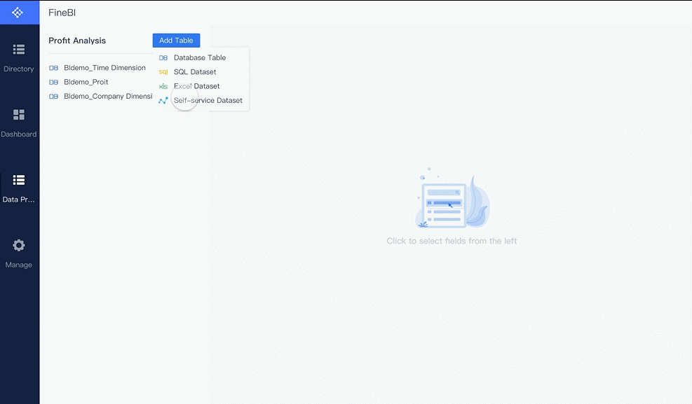
You need to bring all your data together before you can build effective data source-focused dashboards. FineBI lets you connect to over 60 types of data sources, including databases, cloud storage, and APIs. You can upload files or link to live systems. This flexibility means you can pull in data from every part of your business. When you connect these sources, you create a foundation for accurate reporting and analytics. FineBI’s tools help you schedule updates, so your dashboard always shows the latest information. You can also use custom connectors for unique business systems, making your data source-focused dashboards even more powerful.

Build Data Quality Dashboards
Once you connect your data, you need to make sure it is reliable. Data quality dashboards help you track the health of your data. You can use these dashboards to monitor missing values, duplicates, and outliers. FineBI gives you tools to visualize data quality metrics, so you can spot problems quickly. You can set up alerts for issues like sudden drops in data volume or unexpected changes in metrics. These data quality dashboards support continuous improvements by showing you where to focus your efforts. When you use data quality dashboards, you make your test automation metrics dashboard more trustworthy and actionable.
Tip: Use data quality dashboards to drive data quality improvement and support better decision-making.
Ensure Data Consistency and Accuracy
You need to keep your data consistent and accurate for reliable reporting and analytics. FineBI’s data quality dashboards let you compare data across sources and check for mismatches. You can use data quality reporting to document issues and track resolutions. These dashboards help you enforce standards for data entry and processing. When you monitor data quality metrics, you can see trends and measure the impact of your improvements. Data quality dashboards also support data quality reporting, so you can share results with your team. This process ensures your data source-focused dashboards always reflect true business performance.

Design and Build Your QA Dashboard in FineBI
Creating a qa dashboard in FineBI gives you a clear view of your software quality. You can use self-service tools to build dashboards that help your team act on real data. FineBI makes this process simple, even if you do not have a technical background. You can focus on what matters most—turning data into insights that drive improvement.
Drag-and-Drop Dashboard Creation
FineBI lets you build dashboards with a drag-and-drop interface. You do not need to write code. You start by selecting your data sources. FineBI supports many types of data, such as databases, spreadsheets, and APIs. You can connect these sources in just a few clicks.
After you connect your data, you create datasets. You can join tables, add formulas, and filter records. This step helps you prepare your data for analysis. FineBI shows you a preview, so you know your data is ready.

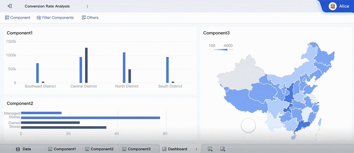
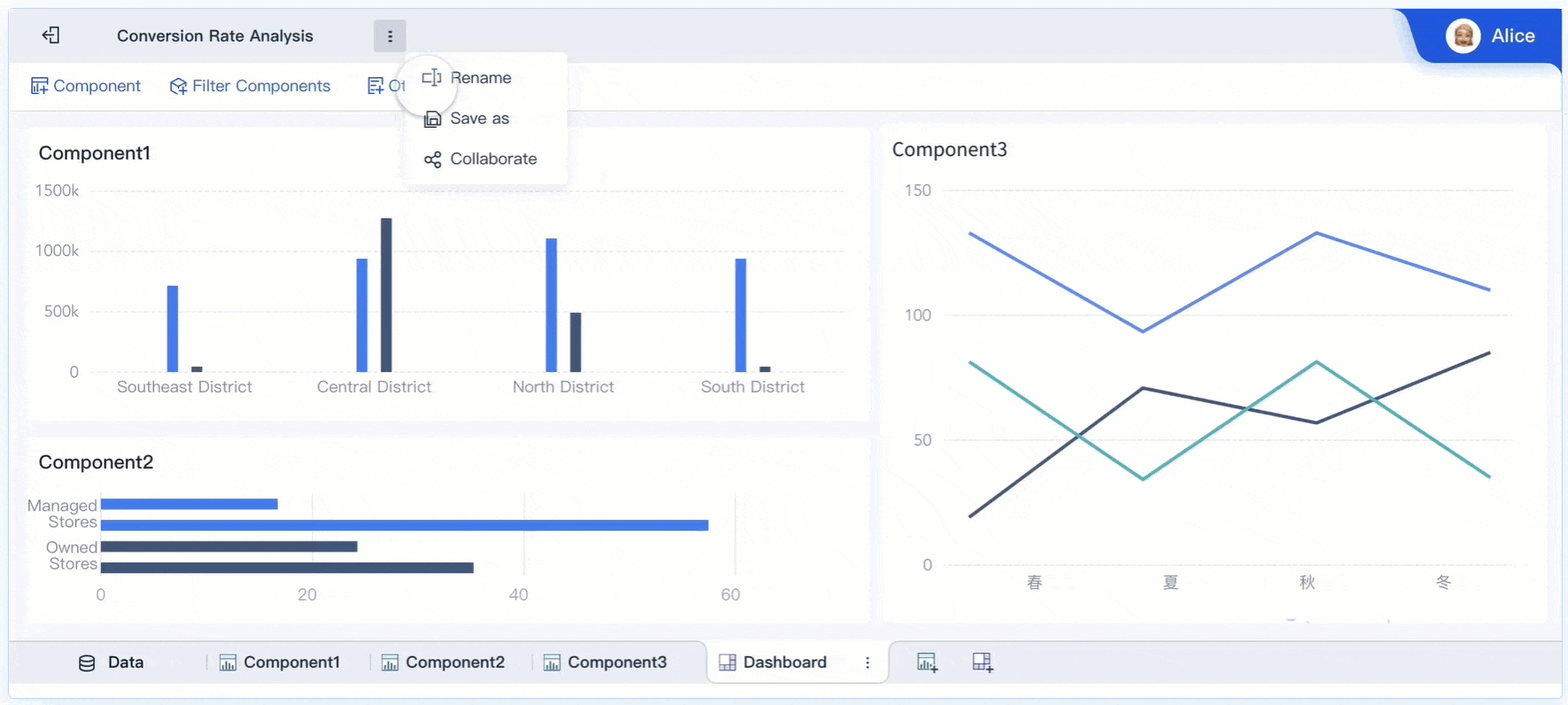
To build your dashboard, you drag charts, tables, and indicators onto the canvas. You can choose from many chart types, such as bar charts, line graphs, and pie charts. Each component can display different data quality dashboards or metrics. You can arrange these components to highlight the most important information.
Tip: Start with a simple layout. Add more charts as you identify new questions or insights.
Customize Layout and Visuals
You can customize your dashboard to match your team’s needs. FineBI lets you adjust the size and position of each component. You can group related charts together. This makes your dashboard easy to read.
Use colors and labels to make your data stand out. For example, you can use red to highlight urgent issues or green to show positive trends. Clear labels help everyone understand what each chart shows.
FineBI also lets you add text, images, and web components. You can use these features to explain your data or provide extra context. A well-designed dashboard helps your team find insights quickly.
| Best Practice | Why It Matters |
|---|---|
| Group related charts | Makes data easier to compare |
| Use clear labels | Reduces confusion |
| Highlight key data | Draws attention to important insights |
| Keep it simple | Prevents information overload |
Note: A clean layout helps users focus on the most important data quality dashboards.
Real-Time Filtering and Interactivity
FineBI dashboards support real-time filtering and interactivity. You can add filters that let users explore data by date, product, or team. When you change a filter, the dashboard updates instantly. This feature helps you answer questions on the spot.
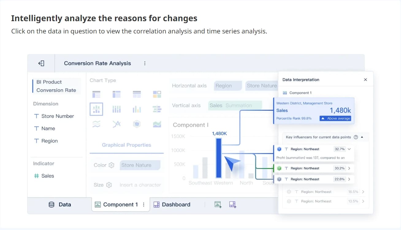
You can also set up drill-downs. Users can click on a chart to see more details. For example, you can click on a defect count to see which tests failed. This makes your qa dashboard more interactive and useful.
Real-time filtering helps you spot trends and outliers. You can use data quality dashboards to monitor data quality metrics as they change. This supports fast decision-making and keeps your team informed.
Callout: Interactive dashboards turn raw data into actionable insights. Your team can respond to issues as soon as they appear.
When you design your dashboard, always think about usability. Make sure users can find answers without extra training. Use clear visuals and simple navigation. Focus on metrics that support your business goals. FineBI gives you the tools to build dashboards that deliver real value.
By following these steps, you create a qa dashboard that helps your team track data, monitor data quality dashboards, and gain insights. You can use these insights to improve your processes and achieve better results.
Implement, Share, and Improve Your QA Dashboard
Publish and Collaborate with FineBI
You have built your qa dashboard and prepared your data quality dashboards. Now, you need to share your dashboard with your team and enable collaboration. FineBI makes this process simple. You can publish your dashboard to your organization and set permissions for each user. Role-based views allow you to tailor data consumer-focused dashboards for different responsibilities. This ensures that each team member sees the data and goals most relevant to their work. Real-time data integration keeps your dashboard updated, so everyone works with the latest data. When you share your dashboard, you encourage transparency and accountability. Team members can use data quality dashboards to monitor their own progress and contribute to shared goals.
| Improvement Type | Description |
|---|---|
| Enhanced Decision Making | Provides data-driven insights for informed decisions on staffing and resource allocation. |
| Proactive Issue Resolution | Enables early identification of quality concerns through real-time monitoring. |
| Increased Accountability | Creates transparency around quality metrics, encouraging ownership among team members. |
| Operational Efficiency | Streamlines quality monitoring by automating data collection, reducing administrative overhead. |
| Continuous Improvement | Highlights trends that inform process enhancements and technological advancements. |
Gather Feedback and Iterate
You need to gather feedback to make your data quality dashboards more effective. FineBI supports several methods for collecting feedback:
- In-app surveys let users share their experiences directly within the dashboard.
- Support tickets allow users to report issues or suggest improvements.
- Thematic analysis helps you organize feedback into common themes, making it easier to identify areas for action.
You should evaluate your dashboard multiple times during preparation, implementation, and sustainment. Continuous feedback helps you redesign or update your dashboard as user needs change. Multiple rounds of feedback may be necessary because perspectives and organizational contexts evolve. When you listen to your team, you improve your data quality dashboards and make your reporting more useful.
Tip: Regular feedback ensures your dashboard stays aligned with business goals and supports ongoing improvements.
Maintain Dashboard Relevance
Your dashboard must remain relevant as your business and quality goals change. You can use these strategies to keep your data quality dashboards up to date:
- User-centered design keeps your dashboard focused on the needs of your team.
- Role-based views provide tailored data consumer-focused dashboards for different users.
- Real-time data integration ensures immediate access to the latest data for quick decision-making.
- Continuous improvement through feedback loops helps you adapt your dashboard to new goals and requirements.
You should monitor your dashboard and data quality dashboards regularly. When you see trends in your data, you can make improvements that support your goals. The BOE case shows how a unified dashboard and standardized metrics led to a 5% reduction in inventory costs and a 50% increase in operational efficiency. Their team used KPI dashboards and cross-factory benchmarking to drive data-driven decisions and improvements.
Callout: When you maintain your dashboard and data quality dashboards, you help your team achieve better results and support long-term business goals.
You can build a QA dashboard that drives daily action and quality improvements by following these steps with FineBI. When you align your metrics with business goals, you connect quality assurance to revenue and customer satisfaction. You make every decision count for business growth. You need to focus on data that matters most. FineBI gives you real-time analytics, a user-friendly interface, robust data modeling, mobile app support, elastic cloud deployment, in-memory computing, and enterprise-grade security features.
| Feature | Description |
|---|---|
| Real-time analytics | Immediate data processing and updates for timely QA insights. |
| User-friendly interface | Drag-and-drop GUI for easy data visualization. |
| Robust data modeling | Supports complex data structures for accurate QA reporting. |
| Mobile app support | Access dashboards anywhere, anytime. |
| Elastic cloud deployment | Scalable solutions for growing business needs. |
| In-memory computing engine | Efficiently manages large data volumes. |
| Enterprise-grade security features | Role-based access control and audit logging for data integrity. |
You need to keep your dashboard relevant by gathering feedback and iterating. Continuous improvements come from releasing features in stages, analyzing usage patterns, and integrating user feedback. You should always put user needs first and refine your dashboard with feedback loops. These loops help you align your dashboard with user needs and reduce failure rates.
- AI-based test optimization and real-time quality intelligence are shaping the future of QA dashboards.
- BI insight testing gives you a complete view of strategies and experiences.
- Advanced AI capabilities, like natural language processing and predictive modeling, help you adapt to new trends.
You can make customer experience better, keep dashboards positive, enable customization, test assumptions, and revisit dashboard design regularly. FineBI helps you achieve these goals by making data accessible and actionable. You can start building or optimizing your QA dashboard today and see real improvements in your processes.
Continue Reading About Dashboard
How to Build an Effective Manufacturing KPI Dashboard
What is a Call Center Metrics Dashboard and How Does It Work
How to Launch a Financial Reporting Dashboard with No Code
Strategy Dashboard Explained and Why Your Business Needs One


FAQ

The Author
Lewis
Senior Data Analyst at FanRuan
Related Articles

How to Build an Investment Portfolio Reporting Dashboard for Executives: KPIs, Benchmarks, and Drill-Down Views
Investment portfolio reporting for executives is not about showing every holding, transaction, and chart your investment team can produce. It is about giving CEOs, CFOs, CIOs, boards, and investment committees a fast, re
Yida YIn
Jun 25, 2026

12 KPI Reporting Examples for Executive Dashboards: What to Show in Weekly, Monthly, and Quarterly Reviews
Executive leaders do not need more data. They need decision ready $1 examples that match how often they review the business and what actions they are expected to take. A weekly $1 should surface fast moving risks and per
Yida YIn
Jun 25, 2026

How to Build a Digital Marketing Reports Dashboard: Executive Examples, KPIs, and Templates
A $1 is the control layer that helps executives and marketing leaders turn scattered channel data into fast, confident decisions. If you are a CEO, CMO, operations director, or marketing analytics lead, the real problem
Yida Yin
May 07, 2026