A customizable dashboard is a visual tool that lets you design and adjust the way you view data. You can choose which information to show, arrange charts or tables, and create a dashboard that fits your unique needs. This flexibility helps you keep important data front and center, making your work easier.
Customizable dashboards bring value to all kinds of users and industries. You get real-time updates, quick performance checks, and the power to track goals as they happen. Take a look at the table below for some common benefits:
Benefit
Description
Saves time and resources
Shows updated results instantly, so you don’t wait for manual reports.
Improves decision making
Gives you fast access to data, helping you act quickly and confidently.
Easy performance checks
Lets you monitor progress in real time, boosting team motivation and results.
Up-to-date progress evaluation
Measures goals against progress for better operational insights.
Before you jump in, think about who will use your dashboard and what you want to achieve. Setting clear goals at the start will help you build a dashboard that truly makes a difference.
Define Customizable Dashboard Goals
Setting clear goals is the first step to building acustomizable dashboardthat actually helps you and your team. You want your dashboard to answer real questions and solve real problems, not just look impressive. Let’s break down how you can define these goals and make sure your dashboard delivers value.
Identify User Needs
Start by figuring out who will use your customizable dashboard and what they need to see. Ask yourself: What decisions do users make every day? What information do they need at their fingertips? For example, in manufacturing, a quality control manager might want to track defect rates and scrap rates to spot problems early. In healthcare, a clinic manager may need to monitor appointment volumes and patient satisfaction scores.
Here’s a simple process to help you identify user needs:
Understand your users and their goals. Talk to them and learn what matters most.
Define the key metrics and organize information so users can find what they need quickly.
Test your dashboard with real users, gather feedback, and make improvements.
Tip: Use industry examples to guide your questions. In manufacturing, focus on quality indicators. In healthcare, look at patient outcomes and operational efficiency.
Set Key Metrics
Once you know what users need, decide which metrics to track. The right metrics keep your customizable dashboard focused and actionable. For manufacturing quality control, you might track product qualification rates, defect causes, and scrap rates. In other industries, you could monitor sales revenue, customer satisfaction, or employee performance.
Check out the table below for common dashboard goals and metrics across industries:
Goal
Description
Tailored Insights for Every Business
Custom dashboards provide specific insights for unique KPIs and reporting needs.
Seamless Integration with Multiple Data Sources
Connect various data sources for a unified view.
Scalability and Flexibility
Add new data sources and update visualizations as your business grows.
Choosing the right metrics helps you build a dashboard that supports smart decisions and keeps everyone on track.
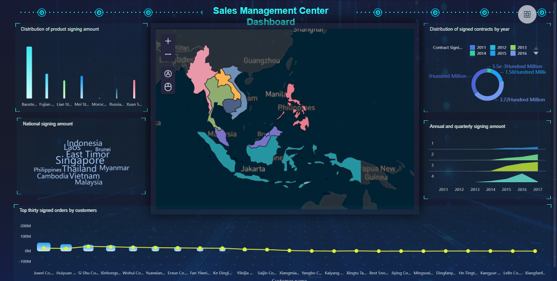
FineBI'sSales Management Dashboard - Click To Engage
Customizable Dashboard Data Integration and Preparation with FineBI
When you want your customizable dashboard to deliver real value, you need to start with solid data integrationand preparation. FineBI, as a leading custom dashboard builder, makes this process simple and powerful. You can connect to almost any data source, clean up your data, and get everything ready for analysis—all without needing to write code.
Connect Data Sources
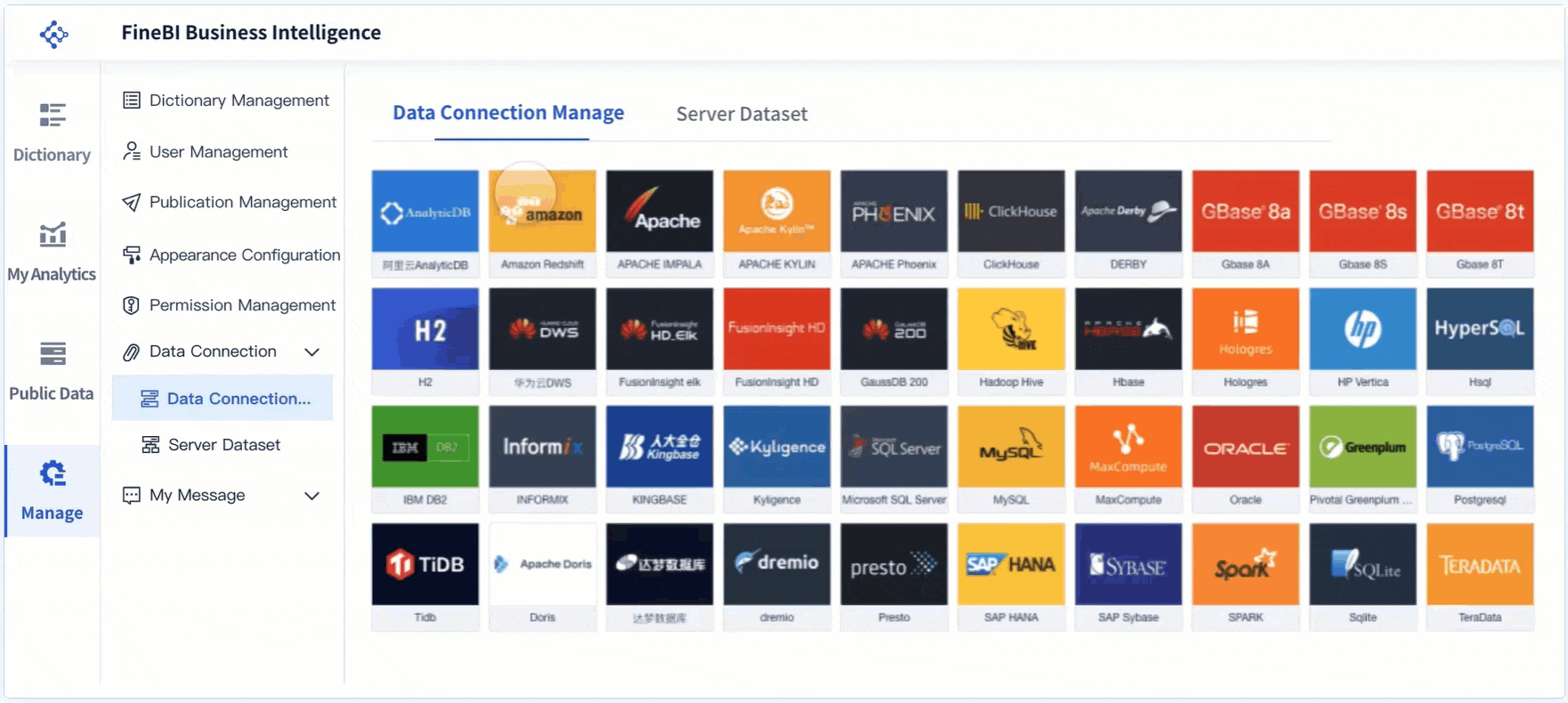
A great custom dashboard builder lets you bring together information from everywhere you need it. FineBI stands out because it supports more than 60 types of data sources. You can connect to traditional databases, cloud data warehouses, big data platforms, and even APIs. This means you can pull in sales numbers, customer feedback, inventory levels, or any other data you need for your dashboard.
Here’s what you can connect with FineBI as your custom dashboard builder:
Relational databases like MySQL, PostgreSQL, SQL Server, and Oracle
Cloud data warehouses such as Snowflake, Amazon Redshift, and Google BigQuery
Big data platforms including Hadoop, Spark, and Cassandra
File uploads (Excel, CSV, flat files)
REST APIs for real-time data from external systems
Custom connections using JDBC/ODBC or SDKs for unique business systems
You don’t have to worry about where your data lives. FineBI, as a custom dashboard builder, brings it all together so you can analyze it in one place. You can even schedule automatic updates, so your dashboard always shows the latest real-time data.
Tip: If you work with complex or legacy systems, FineBI’s integration helps you streamline data pipelines and manage advanced ETL operations. This ensures your customizable dashboard always has high-quality, up-to-date information.
FineBI's Real Time Multi Source Data Integration Feature
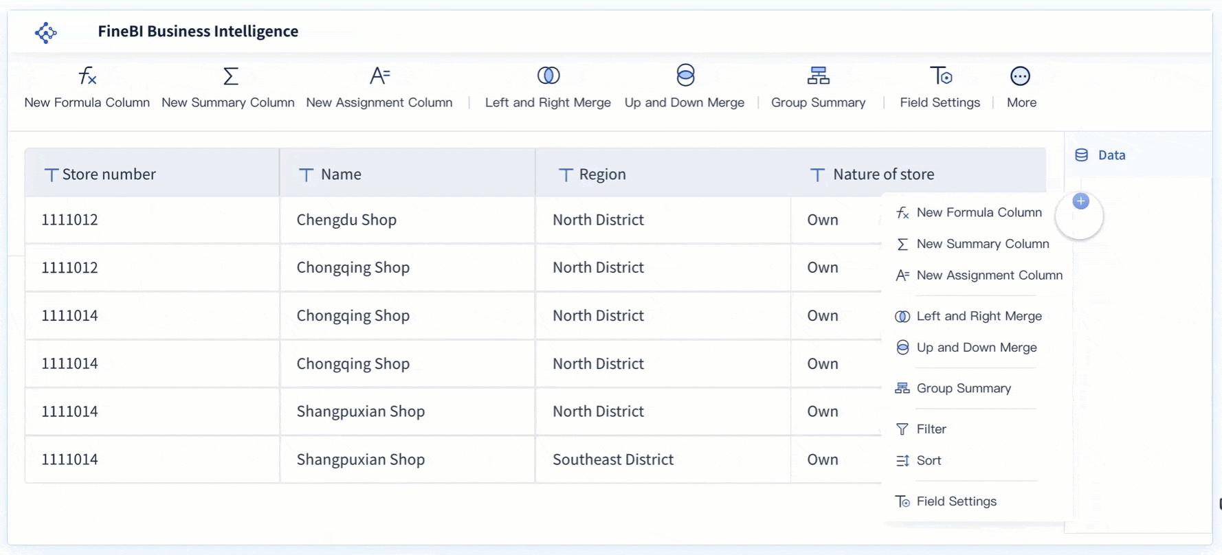
Once you connect your data sources, the next step is to prepare your data for analysis. A custom dashboard builder like FineBI gives you self-service tools to create, clean, and organize your data sets. You don’t need to rely on IT for every change—you can do it yourself.
FineBI’s self-service data set creation makes the data preparation process much easier. Take a look at how these features help you get your dashboard ready:
Feature
Benefit
Self-service data set creation
Enables you to explore data and perform joint analysis without manual configuration.
Visual data analysis
Helps you spot data issues intuitively, speeding up the analysis process.
User-centric visualization
Recommends visual effects based on your selected data, making your dashboard more engaging.
Functionalities
Lets you add columns, group, filter, sort, and merge data, streamlining your prep work.
Reduced reliance on IT personnel
Allows you to focus on analysis instead of waiting for IT to prepare your data.
With FineBI as your custom dashboard builder, you can join tables, add calculated fields, and filter out unnecessary records. You can also merge multiple data sets for a unified view. This is especially useful when you want your dashboard to show information from different departments or systems.
Data cleaning is a critical part of building a reliable dashboard. Here are some common challenges you might face—and how FineBIhelps you solve them:
Incomplete Data: Missing values or gaps can skew your analysis. FineBI helps you identify these gaps and choose the best way to handle them.
Inconsistent Data: Different formats or entries can cause confusion. FineBI lets you standardize formats for consistency.
Duplicate Data: Repeated entries can distort your results. FineBI makes it easy to remove duplicates and keep your data clean.
Note: Clean and well-prepared data ensures your customizable dashboard delivers accurate insights. You avoid misleading results and make better decisions.
FineBI’s custom dashboard builder also supports real-time data updates. When your data changes, your dashboard reflects those changes instantly. This is essential for tracking KPIs, monitoring operations, or responding to new trends as they happen.
If you want to build a customizable dashboard that truly empowers your team, start with strong data integration and preparation. FineBI gives you the tools to connect, clean, and organize your data—so your dashboard always tells the right story.
Plan Your Customizable Dashboard Layout and User Experience
A well-planned dashboard layout makes your customizable dashboard easy to use and understand. You want users to find answers quickly, enjoy the experience, and trust the information they see. Let’s look at how you can sketch the structure and visuals, then make usability a top priority.
Sketch Structure and Visuals
Before you start building, sketch out your dashboard structure. This step helps you organize information and create a clear flow. Think about how users will move through the dashboard and what they need to see first.
Start with summary metrics at the top. Give users quick context right away.
Use visual hierarchy. Make important numbers bigger or use color to draw attention.
Organize content into sections. Group related charts and tables together.
Choose the right data visualization tools for each metric. Bar charts work well for comparisons, while line charts show trends.
Add white space between elements. This keeps the dashboard from feeling cluttered and helps users focus.
You can use FineBI's drag-and-drop interface to arrange components easily. The system lets you quickly move charts, tables, and text blocks, so you can test different layouts without any coding. The interface adapts to different screen sizes, making your dashboard look good on desktops, tablets, and phones.
Usability is key in dashboard design. You want everyone, from beginners to experts, to get value from your customizable dashboard. Here are some principles to keep in mind:
Principle
Description
Personalization
Show users the most relevant content for their needs.
Accessibility
Use high-contrast colors and consider color blindness. Make sure the dashboard works with screen readers and keyboard navigation.
Performance Optimization
Make sure the dashboard loads quickly, even with large or real-time data sets.
Organization of Visual Content
Split information into clear sections to avoid overload and help users focus.
FineBI’s responsive design and drag-and-drop features help you meet these goals. You can create dashboards that look great, work smoothly, and are easy for anyone to use. When you follow these best practices, your customizable dashboard becomes a powerful tool for decision-making.
Build Your Customizable Dashboard with FineBI
Once you have a clear plan for your customizable dashboard, it’s time to bring your ideas to life. A custom dashboard builderlike FineBI gives you the tools to create dashboards that are both powerful and easy to use. You don’t need to be a developer or a designer. You just need to know what you want to see and how you want to interact with your data.
Add Components and Interactivity
FineBI’s custom dashboard builder makes dashboard development simple and intuitive. You start by opening the dashboard editor, where you can drag and drop different components onto your canvas. This approach lets you build interactive dashboards without writing any code.
Here’s how you can use FineBI’s custom dashboard builder to add the most popular components and interactive elements:
Charts and Visualizations: Choose from a wide range of chart types—bar charts, line charts, pie charts, maps, and more. Each chart helps you turn raw data into a visual story that’s easy to understand.
Tables and Pivot Tables: Add tables to display detailed data. Use pivot tables for quick summaries and deeper analysis.
Filters and Slicers: Insert filter components so users can drill down into specific data points. Global filters let you control multiple charts at once, making your dashboard more interactive.
Customizable Views: Let users tailor their experience. They can adjust what they see, focus on the metrics that matter, and find answers quickly.
Text, Images, and Web Components: Add text blocks for explanations, images for branding, or web components to embed external content.
FineChatBI for Conversational Analytics: With FineChatBI, you can ask questions in plain language and get instant answers. This feature brings conversational analytics to your dashboard, making data exploration even easier.
Tip: Keep your layout clean and simple. Avoid clutter. Focus on clarity and user-centric design. The best interactive dashboards help users find insights fast.
FineBI'scustom dashboard builder also supports real-time updates. When your data changes, your dashboard reflects those changes instantly. This is essential for tracking KPIs, monitoring operations, or responding to new trends as they happen.
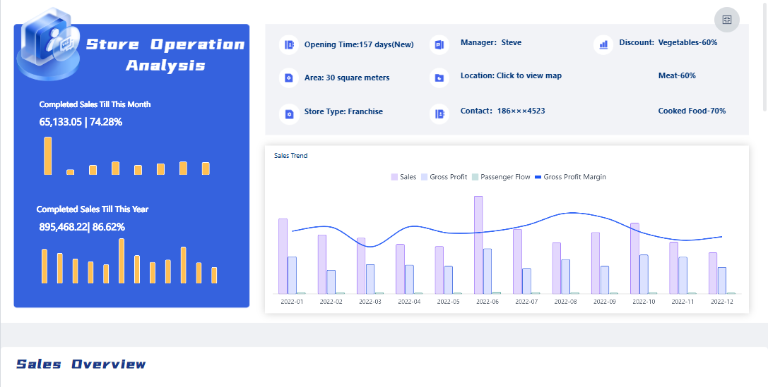
FineBI'sStore Operation Analysis Dashboard - Click To Engage
A great dashboard does more than show data—it looks and feels like it belongs to your organization. FineBI’s custom dashboard builder gives you a wide range ofcustomization options so you can match your dashboard to your brand and your users’ preferences.
You can adjust the look and feel of every part of your dashboard. Here’s a table that shows some of the key style settings you can control in FineBI:
Feature
Description
Dashboard Style
Set and customize backgrounds, titles, components, and themes.
Custom Style Setting
Save custom styles for reuse across different dashboards.
Chart Style Setting
Customize color matching and text styles for charts.
Table Style Setting
Modify styles for all table components, including theme color and text.
Filter Component Style
Set styles for filter components, including title background and font.
You can also personalize your dashboard to match your organization’s branding. Here are some common customization options:
Change color schemes and fonts to fit your company’s style.
Add your logo to the header or loading screen.
Set a custom favicon and application title for a polished look.
Arrange layouts to highlight the most important information.
This level of customization helps users feel at home with your dashboard. It also makes your insights more engaging and relevant.
Note: When you create dashboards with FineBI'scustom dashboard builder, you can save your favorite styles and apply them to new dashboards. This saves time and keeps your branding consistent.
FineBI’s custom dashboard builder gives you everything you need for dashboard development. You can build interactive dashboards that are clear, actionable, and visually appealing. With powerful customization options, you can make sure your dashboard fits your needs and your brand.
If you want to empower your team with a customizable dashboard that adapts as your business grows, FineBI’s custom dashboard builder is the tool you need.
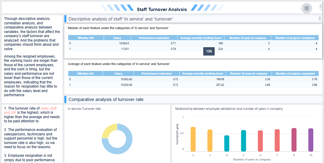
FineBI'sStaff Turnover Analysis Dashboard - Click To Engage
Publish, Test, and Secure Your Customizable Dashboard
Once you finish building your customizable dashboard, you need to make sure the right people can access it and trust the data they see. FineBI gives you several ways to share, integrate, and secure your dashboard, so your team can work together with confidence.
Share and Integrate
You have multiple options for publishing and sharing your dashboard in FineBI. Each method fits different needs, whether you want to collaborate with your team or reach a wider audience. Here’s a quick overview:
Method
Description
Collaboration
Work together by editing dashboards while viewing those shared by others.
Applying for Publication
Request to mount dashboards to directories, so others with permissions can view them.
Sharing Through Public Links
Let users without FineBI accounts view dashboards via public links.
Sharing Dashboards to Directories
Share directly with specific users in FineBI, skipping the administrator.
For most business needs, sharing dashboards to directories is the safest choice. You can select which departments, roles, or users can view the dashboard and set their permissions. This approach helps prevent data leaks and keeps sensitive information secure.
Tip: Assign viewing permissions carefully. Only share your dashboard with users who need access.
Test Usability and Security
Before you roll out your customizable dashboard, you should test how well it works and how secure it is. Start by checking dashboard usability. Try these methods to make sure your dashboard is easy to use:
Usability Testing Method
Description
Paper and Pencil Tests
Use paper prototypes to gather feedback.
Think Aloud
Ask users to talk through their thoughts as they use the dashboard.
Codiscovery
Let users work in pairs and share insights.
Field Observation
Watch users interact with the dashboard in their usual environment.
Query Techniques
Ask users specific questions about their experience.
Questionnaires
Collect structured feedback.
Card Sorting
Have users organize information to improve layout.
You also need tosecure your dashboard. FineBI uses role-based access control to protect your data:
Add users who need access.
Define roles like Manager or Team Member.
Create groups for each role and add users.
Assign permissions such as Read, Write, or Delete.
Test by logging in as different users to confirm access.
Real-world examples, like Kintetsu’s use of dashboards for logistics, show how important it is to test for both performance and security. When you follow these steps, you make sure your dashboard is reliable, safe, and ready for your team.
You’ve seen how to build a dashboard step by step—from setting goals to sharing your results. When you use a dashboard, you help your team innovate, improve data use, and work more efficiently. Many organizations report that dashboards with FineBIboost independent thinking and streamline workflows. If you want to keep learning, check out resources like the Learning Path of Dashboards or try a free trial. Start your dashboard project today and see how curiosity and experimentation can transform your work.
Access a wealth of case studies, industry insights, and solution guides to accelerate digital transformation.
FAQ
What is a customizable dashboard?
A customizable dashboard lets you choose what data to see and how to see it. You can add charts, tables, and filters. You decide the layout and style. This helps you focus on what matters most.
Why should I use a customizable dashboard?
You get quick access to important information. You can track goals, spot trends, and make better decisions. A customizable dashboard saves you time and keeps your team on the same page.
How do I choose the right customizable dashboard tool?
Look for a tool that connects to your data sources, offers drag-and-drop features, and supports real-time updates. Make sure it fits your team’s skill level and lets you adjust layouts and visuals easily.
Can I share my customizable dashboard with others?
Yes, you can share your customizable dashboard with your team or organization. Most tools let you set permissions, so only the right people see sensitive data.
Do I need coding skills to build a customizable dashboard?
No, you don’t need coding skills for most modern customizable dashboard tools. You can use drag-and-drop editors and simple menus to build and update your dashboard.