What is a "metrics dashboard"?
A metrics dashboard is a brief report you can use to track and present key performance indicators and metrics in real time across multiple channels. It increases transparency, helps you prove ROI, and lets you evaluate performance from a management or operational perspective.
When you track dashboard metrics, you gain instant insight into what matters most for your business or project. You can spot trends, monitor progress, and make faster decisions. FineReport is a leading tool that helps you create dashboards with ease, so you can focus on understanding and improving your results.
Dashboard metrics are the specific measurements you track and display on a metrics dashboard. These metrics give you a clear view of your business performance, helping you understand what is working and where you need to improve. When you use a metrics dashboard, you can see important numbers at a glance and make decisions based on real data.
You can track many different metrics on a metrics dashboard, depending on your goals and industry. Most dashboards focus on the numbers that matter most for your business. Here are some common types of metrics you might see:
You can choose which dashboard metrics to track based on your business needs. For example, if you work in sales, you might focus on revenue and new customers. If you manage a website, you might watch traffic and conversion rates. The flexibility of a metrics dashboard lets you customize your view so you always see the most relevant information.
Tracking dashboard metrics helps you understand your progress and make better decisions. When you monitor these metrics, you can quickly spot changes, identify problems, and take action. You also create a shared understanding among your team, making it easier to work toward common goals.
The table below shows how dashboard metrics contribute to organizational success:
| Aspect | Contribution to Success |
|---|---|
| Performance Evaluation | Metrics facilitate the assessment of performance and progress towards goals. |
| Goal Setting | Metrics help in establishing realistic and measurable targets aligned with objectives. |
| Data-Driven Decision-Making | Metrics support informed decision-making based on quantifiable data. |
| Performance Monitoring | Regular tracking allows for real-time performance assessment and timely interventions. |
| Accountability | Clear metrics foster accountability and transparency within the organization. |
| Benchmarking | Metrics enable comparison against industry standards to identify areas for improvement. |
When you use a metrics dashboard, you gain several key benefits:
Dashboard metrics also help you avoid confusion by including only the right amount of information. You and your team can access relevant data immediately, which supports quick analysis and informed choices. By tracking dashboard metrics, you build a foundation for accountability, transparency, and continuous improvement.
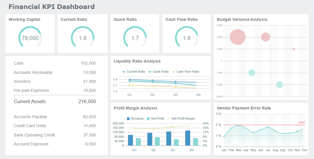
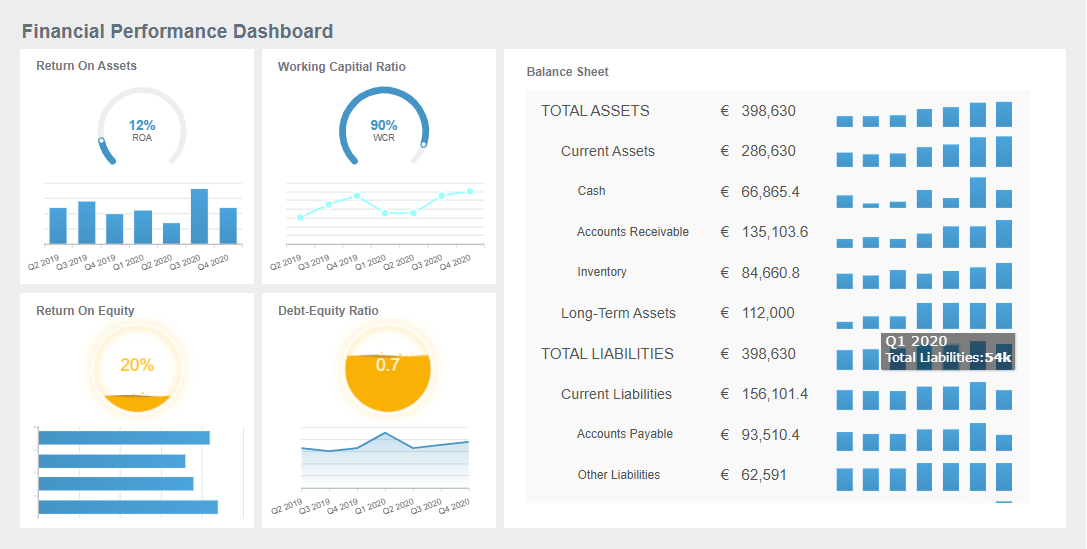
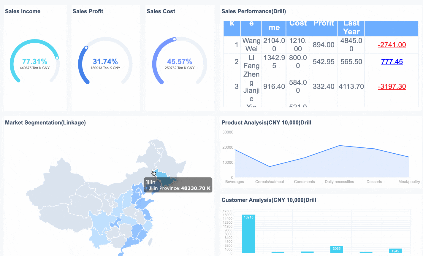
A metrics dashboard collects, processes, and displays important data so you can monitor your business in real time. You do not need to be a data expert to understand how these dashboards function. They bring together information from different sources, update it automatically, and show it in a way that is easy to read and analyze.
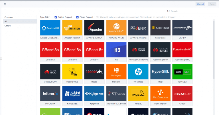
You can connect a metrics dashboard to many types of data sources. These include databases, spreadsheets, cloud services, and even IoT devices. When you integrate these sources, you automate data gathering and make information available when you need it. This process reduces errors because all data entries stay in one place. You also save time since you do not have to log in to multiple systems or check different files.
A metrics dashboard gives you a complete view of your business. You can see sales, operations, and customer data together. This helps you make better decisions and improves your organization’s success.
Metrics dashboards also help you keep your data accurate and reliable. They act as a central hub where you can monitor data health. You can spot problems early and fix them before they affect your results. This builds trust in your data and helps you avoid mistakes.
A metrics dashboard uses technology to keep your data fresh and up to date. You do not have to refresh the page or enter new numbers by hand. The dashboard updates automatically, so you always see the latest information.
| Technology Type | Description |
|---|---|
| Event Streaming | Allows continuous data flow and real-time processing of events as they occur. |
| In-Memory Processing | Enables fast data retrieval and processing by keeping data in RAM instead of on disk. |
| Automated Refresh Mechanisms | Ensures that data is updated automatically without manual intervention, providing live insights. |
| Data Sources | Includes SQL & NoSQL databases, cloud data warehouses, marketing tools, and IoT monitoring tools. |
| Security Measures | Role-based access control (RBAC) to protect sensitive information from unauthorized access. |
When you use a metrics dashboard, you get quick access to large amounts of information. This helps you make decisions before the data becomes outdated. You do not need a data analyst to understand the numbers. The dashboard presents complex data in a simple way, so you can act quickly and confidently.
FineReport gives you powerful tools to build and manage a metrics dashboard. You can use its drag-and-drop interface to add charts, tables, and widgets without writing code. This makes it easy for anyone to create a dashboard that fits their needs.
FineReport stands out because it connects to many data sources at once. You can pull in data from databases, spreadsheets, and cloud platforms. The dashboard updates in real time, so you always see the latest numbers.
FineReport offers features that make your metrics dashboard more effective:
FineReport’s drag-and-drop interface is user-friendly and has a low learning curve. You can create interactive dashboards quickly, even if you have little technical experience. FineReport also supports advanced customization, so you can design dashboards that match your business goals.
A metrics dashboard built with FineReport helps you collect, process, and display data efficiently. You can monitor key metrics, spot issues early, and share insights with your team. This leads to better decisions and improved performance across your organization.
A metrics dashboard gives you the tools to track, analyze, and act on your most important data. When you choose a metrics dashboard, you want features that make your experience smooth and effective. FineReport delivers these essentials, helping you stay focused on what matters.
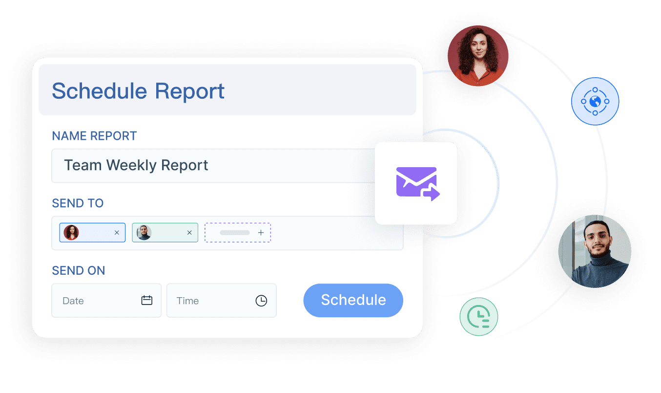
You can personalize your metrics dashboard by selecting and arranging widgets to fit your workflow. Customizable dashboards let you focus on the data that matters most, saving you time and increasing satisfaction. You can adjust views, apply filters, and set alerts, which gives you control over your dashboard experience. FineReport’s drag-and-drop interface makes it easy to build layouts that match your needs. You can reuse components, choose from built-in themes, and organize your dashboard with card-style templates. This flexibility means you always see the most relevant information.
A metrics dashboard must provide real-time updates and instant alerts. You get fresh data without manual refreshes, so you can respond quickly to changes. FineReport supports scheduled reporting and multi-indicator dashboards, ensuring you always have the latest insights. Real-time alerts notify you about important events, helping you act before issues grow.
| Impact Type | Description |
|---|---|
| Improved Responsiveness | You react immediately to market changes and adjust resources as needed. |
| Reduced Risk | Current data helps you avoid blind spots and make precise decisions. |
| Personalized Customer Experience | Live insights let you adapt offerings based on customer behavior. |
| Operational Efficiency | You identify bottlenecks and improve resource management as events happen. |
You can access your metrics dashboard anywhere using FineReport’s mobile and 3D dashboard features. Mobile dashboards let you monitor KPIs and interact with reports on your phone or tablet. Off-screen control allows you to manage dashboards remotely, making presentations more dynamic. FineReport’s 3D dashboards provide advanced visualizations for smart factories, logistics, and city management.
| Feature | Description |
|---|---|
| Off-screen Control | Control dashboards remotely from mobile devices for better presentations. |
| Mobile Terminal Capabilities | Efficiently access and interact with dashboards on your mobile device. |
| Interaction Events | Click on interactive elements like page buttons and pop-up windows. |
FineReport’s metrics dashboard adapts to your workflow, supports scheduled reporting, and delivers advanced visualization. You stay informed, make faster decisions, and manage your business with confidence.
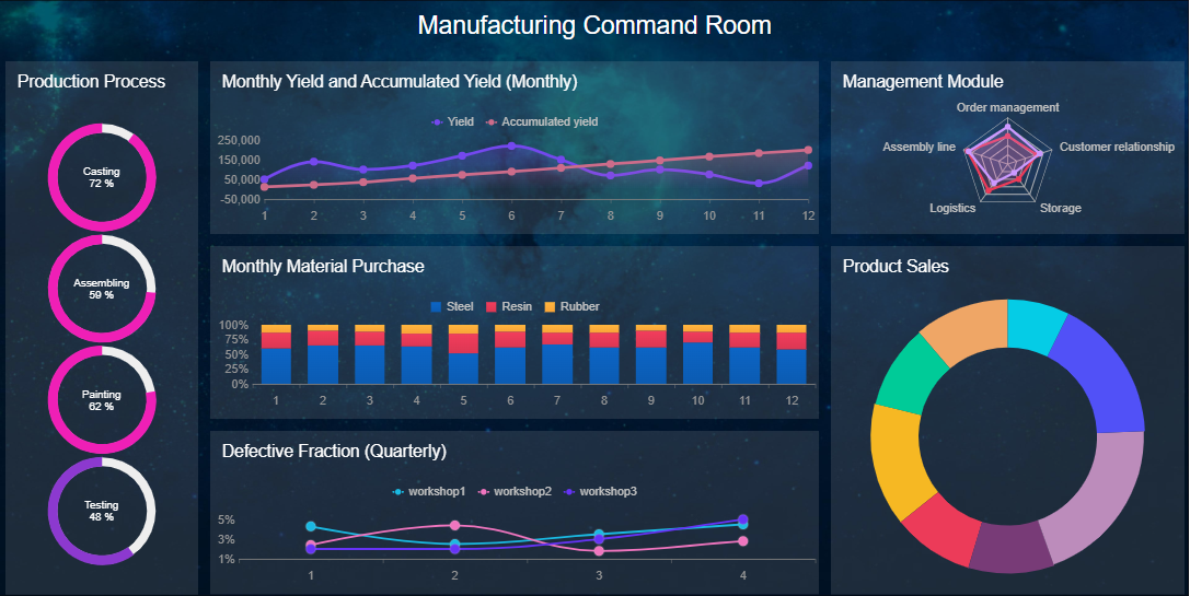
You can use a kpi dashboard to monitor quality control in manufacturing. FineReport helps you track product qualification rates, defect rates, and scrap rates in real time. When you set up a kpi dashboard, you see visual summaries of your production data. You can spot trends, compare different production lines, and identify root causes of defects quickly.
For example, FineReport’s manufacturing solution lets you display multi-indicator dashboards. You can use bar charts to compare qualification rates across stages and line charts to analyze defect trends. Pie charts show the distribution of defect causes. You customize colors and styles to highlight important metrics. This approach helps you respond to issues before they affect product quality.
Manufacturers report measurable improvements after using a kpi dashboard. The table below shows some common benefits:
| Improvement Type | Description |
|---|---|
| Clear Actionable Insights | Visual summaries help you recognize patterns and make decisions faster. |
| Improved Alignment and Accountability | Real-time visibility keeps teams focused on strategic goals. |
| Higher Productivity and Efficiency | Automated data processes reduce manual reporting time. |
A kpi dashboard gives you the tools to maintain high standards and improve efficiency in your factory.
You can use a kpi dashboard to track sales performance and website analytics. FineReport makes it easy to connect data from multiple sources, so you see all your key metrics in one place. Real-time analytics show you strengths and weaknesses without waiting for reports.
Here are some ways a kpi dashboard helps you manage sales and website data:
You can set up different reports in your kpi dashboard:
A kpi dashboard supports data-driven decision-making. You gain real-time insights, encourage accountability, and align goals across departments. You use actionable data to improve transparency and teamwork. This approach helps you make better decisions and drive business growth.
You need to make smart choices quickly in today’s business world. A metrics dashboard helps you do this by bringing all your important data together. You can use a performance dashboard to track every kpi that matters for your team. This tool lets you see trends, spot problems, and compare results across departments. You do not have to guess what is working. You can use real numbers to guide your actions.
A metrics dashboard gives you a complete view of your business. You can use predictive analytics to see what might happen next. This helps you plan ahead and stay ahead of the competition. When you use a kpi dashboard, you align your team and make sure everyone works toward the same goals. You can see which products or services drive results and which need attention. This focus leads to better resource use and higher returns.
You save time when you use a metrics dashboard. You do not need to collect data by hand or build reports from scratch. A performance dashboard updates your kpi data in real time. You can automate routine tasks and spend more time on analysis. For example, HR teams have saved hours each month by automating kpi calculations with dashboards.
A metrics dashboard makes data easy to find and understand. You can design your dashboard to be user-friendly and accessible to everyone. Visualizations help both technical and non-technical users see the story behind each kpi. You do not need special training to spot data quality issues or track progress.
| Principle | Description |
|---|---|
| Make it accessible | Dashboards must be designed to be accessible to all users. |
| Alternative formats | Provide different formats to cater to diverse user needs. |
| Clear labeling and descriptions | Ensure all elements are clearly labeled for better understanding. |
You can follow accessibility standards to make sure your metrics dashboard works for everyone.
FineReport gives you the tools to build a powerful metrics dashboard for any business need. You can connect data from many sources and create a performance dashboard that tracks every kpi you care about. FineReport supports real-time updates, mobile access, and advanced visualizations. You can use 3D dashboards for smart factories or mobile dashboards for sales teams on the go.
Many companies have seen real improvements with FineReport. For example, BOE used kpi dashboards to reduce inventory costs and boost efficiency. Manufacturing teams use FineReport to monitor quality control kpi and respond to issues before they grow. You can use scheduled reporting to keep everyone informed and aligned.
A metrics dashboard built with FineReport grows with your business. You can scale your kpi tracking as your company expands. Everyone on your team can stay focused on the right metrics, driving growth and long-term success.
You have learned how a metrics dashboard brings together data for a clear visual display of metrics. You can use dashboards to track progress, make faster decisions, and improve teamwork. When you choose a solution like FineReport, you gain user-friendly customization, strong data integration, and scalability. Industry examples and customer stories show how dashboards help teams act quickly and plan better. Explore these solutions to inspire your own dashboard journey.

Best Dashboard Apps for Business Insights
What is a Call Center Dashboard and Why Does It Matter
What is a Reporting Dashboard and How Does it Work
What is An Interactive Dashboard and How Does It Work
What is a Call Center Metrics Dashboard and How Does It Work

The Author
Lewis
Senior Data Analyst at FanRuan
Related Articles
Payment Analytics Dashboard: 12 KPIs Every Operations Leader Should Track to Cut Revenue Leakage
Losing revenue to declines? Discover 12 essential KPIs to track in your payment analytics dashboard to stop leakage and manage disputes.
Lewis Chou
May 05, 2026
SOC Dashboard Explained: 12 Essential KPIs, Views, and Workflows Security Teams Use
Learn about SOC dashboards, the 12 essential KPIs for security teams, and how they centralize alerts and workflows for faster threat detection and response.
Lewis Chou
May 05, 2026

EMR Dashboard Guide: 12 Metrics to Track for Faster Clinical and Operational Decisions
Learn the 12 essential EMR dashboard metrics to track for faster clinical and operational decisions, improving patient flow and revenue cycle management.
Lewis Chou
May 05, 2026


