A sales metrics dashboard is a visual tool that displays your key sales data in one place. You use it to track performance, spot trends, and make quick decisions. With a sales metrics dashboard, you see real-time insights that help your team respond to changes before they become problems. Many organizations report a 31% reduction in reporting time and faster deal closures. You can measure gains through higher win rates and better forecasting accuracy. Both technical and non-technical users can set up and benefit from this practical tool.
What Is a Sales Metrics Dashboard

A sales metrics dashboard is a visual reporting tool that brings your most important sales data together in one place. You use it to track essential sales metrics, performance data, and trends in real time. This dashboard gives you a clear view of your team’s progress toward goals, helps you oversee your sales pipeline, and lets you spot areas that need improvement quickly. By integrating key performance indicators (KPIs), a sales metrics dashboard allows you to monitor quotas and assess both team and individual performance. This tool plays a central role in sales management because it turns raw data into actionable insights.
Value for Sales Teams
You gain several advantages when you use a sales metrics dashboard. First, it supports data-driven decisions. You can see up-to-date numbers, which helps you react to changes in the market or your team’s performance. The dashboard also increases transparency. Every team member can track their own results and compare them with others. This visibility encourages accountability and motivates everyone to reach their targets. When you recognize individual contributions, you foster a culture of engagement and healthy competition. In fact, 58% of employees say that recognition improves their motivation and accountability.
| Evidence | Explanation |
|---|---|
| Sales team’s progress is displayed clearly and transparently | This visibility reduces social loafing, as all team members are aware of each other's performance. |
| Sales dashboards track a variety of metrics | This helps in recognizing individual contributions, fostering accountability among team members. |
| 58% of employees state that recognition improves engagement | Recognition of all team members' efforts enhances motivation and accountability within the team. |
Key Features of a Metrics Dashboard
A sales metrics dashboard offers several features that make it valuable for your team:
- You can monitor sales performance statistics in real time.
- The dashboard tracks a range of metrics, such as revenue, conversion rates, and pipeline value.
- You get a comprehensive view of both team and individual achievements.
- The dashboard encourages transparency and accountability.
- It helps you identify trends and areas for improvement quickly.
A sales metrics dashboard motivates your sales representatives by providing clear performance metrics. It boosts overall results by encouraging healthy competition. Transparency in performance metrics ensures long-term success for your sales team.
Choosing Sales Metrics Dashboard
Essential Sales Metrics to Track
You need to choose the right key metrics to make your sales dashboard effective. High-performing organizations track a range of sales performance metrics to understand their sales process and results. The following table shows some of the most important sales metrics you should consider for your dashboard:
| Metric | Description |
|---|---|
| Average Sales Cycle Length | Measures the time taken for leads to convert into closed deals. A shorter cycle indicates efficiency. |
| Email Open Rate | Percentage of email recipients who open marketing emails, indicating the effectiveness of email strategies. |
| Monthly Recurring Revenue (MRR) | Income expected monthly from subscribers, crucial for subscription-based businesses. |
| Win Rate | Percentage of closed deals from total opportunities, reflecting the effectiveness of sales strategies. |
| Percentage of Revenue From Existing Customers | Shows customer retention success by comparing revenue from existing clients to new buyers. |
| Upsell and Cross-Sell Rates | Tracks the effectiveness of upselling and cross-selling strategies. |
| Sales Velocity | Measures how quickly revenue is generated over a specific period. |
You can use these key metrics to monitor your sales data and gain a clear view of your team’s progress. Tracking these numbers helps you spot trends, identify strengths, and address weaknesses in your sales process.
Aligning Metrics with Business Goals
You should select sales metrics that match your company’s goals and sales strategy. Consider these steps when choosing key metrics for your sales dashboard:
- Align your metrics with company goals to ensure your sales efforts support broader objectives.
- Involve key stakeholders, such as sales managers and finance officers, to get valuable insights.
- Apply the SMART criteria: Specific, Measurable, Achievable, Relevant, and Time-bound.
- Limit the number of metrics to focus on those that drive performance and make execution easier.
- Review and adjust your metrics regularly to keep up with changes in your business environment.
By following these steps, you ensure your sales dashboard tracks the right sales metrics. This approach helps you focus on what matters most and supports better decision-making with accurate sales data.
Tools for Building a Sales Metrics Dashboard
When you select a tool for building a sales dashboard, you want features that make your work easier and your insights clearer. The right tool helps you connect your data, design your dashboard, and share results with your team. You should look for these key features:
| Feature | Description |
|---|---|
| Real-time data | Lets you spot problems and opportunities quickly, so you can adjust your sales strategy fast. |
| Customizable metrics | Allows you to focus on the KPIs that matter most to your business goals. |
| Visual display options | Turns raw numbers into charts and graphs, making trends easy to see and understand. |
| Multi-channel tracking | Gives you a single view of sales performance across all your platforms. |
| Sharing capabilities | Makes it simple for your team to access and collaborate on the dashboard. |
You also need to consider how your sales dashboard connects to your data sources. Make sure you can set it up yourself or with minimal help. The dashboard should be easy to read at a glance, and your team should be able to access it without barriers. Pricing should be clear and fit your budget.
Why Choose FineReport
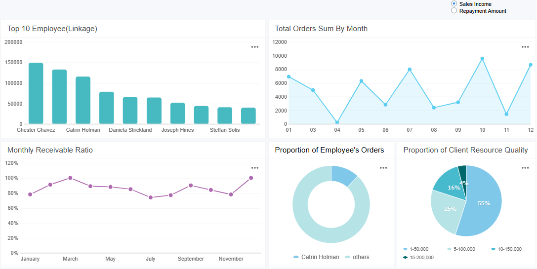
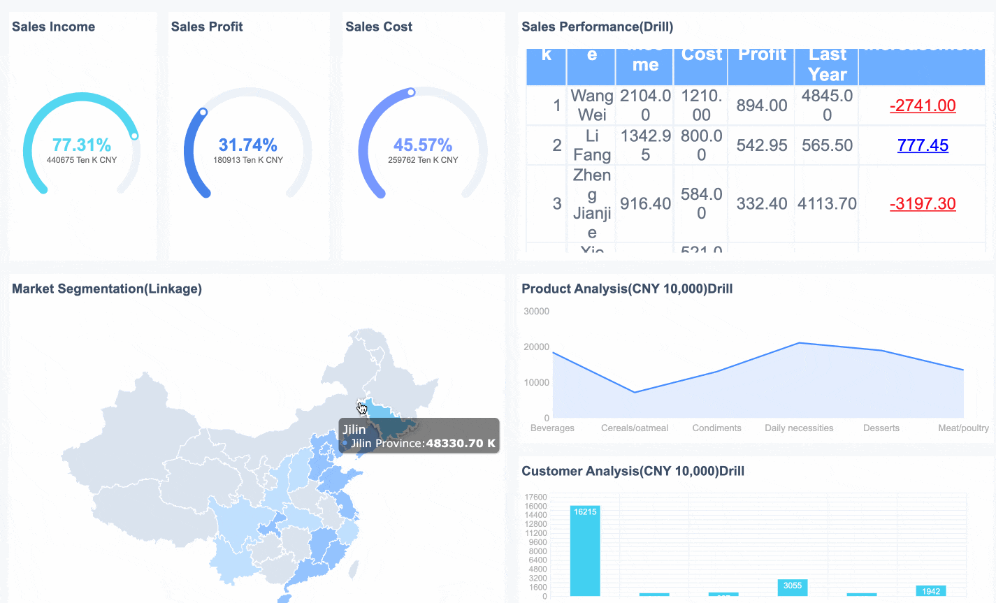
FineReport stands out as a powerful tool for building a sales dashboard. You get a drag-and-drop designer that feels familiar, even if you have little technical experience. FineReport connects to many data sources, including databases and Excel files, so you can bring all your sales data together. The platform supports real-time data updates, which means you always see the latest numbers. You can customize your dashboard with different charts and layouts, making it easy to highlight the metrics that matter most. FineReport also offers mobile dashboards, so you and your team can check sales performance from any device, anywhere.
Sales teams often work outside the office. With FineReport’s mobile features, you can monitor your sales dashboard on your phone or tablet. This access helps you make faster decisions and keeps everyone informed, no matter where they are.

Comparing FineReport with Other Tools
When you compare FineReport to Excel and other business intelligence tools, you notice several advantages. FineReport has a user-friendly interface that reduces the learning curve. You can analyze data, track indicators, and review performance without needing advanced technical skills. FineReport scales easily, supporting both small teams and large enterprises. It integrates with many data sources and lets you import historical data from Excel in batches. You can also enter new data directly through web reports. These features make FineReport a flexible and efficient choice for building a sales dashboard that grows with your business.
Build Your Sales Metrics Dashboard Step by Step
Creating a sales dashboard from scratch may seem complex, but you can break it down into clear, manageable steps. This process helps you consolidate your sales data, design an effective dashboard layout, choose the right visualizations, and automate reporting for your team. With the right approach, you can build a sales metrics dashboard that delivers real-time insights and supports better decision-making.
Data Integration and Preparation
Start by identifying the key performance indicators (KPIs) you want to track. These might include revenue, win rate, sales cycle length, or upsell rates. Next, determine where your data lives. Most organizations pull information from several sources, such as sales systems, CRM platforms, and marketing tools.
| Data Source Type | Description |
|---|---|
| Sales Systems | Systems that track sales transactions and performance. |
| CRM Platforms | Tools for managing customer relationships and data. |
| Marketing Tools | Platforms used for marketing campaigns and analytics. |
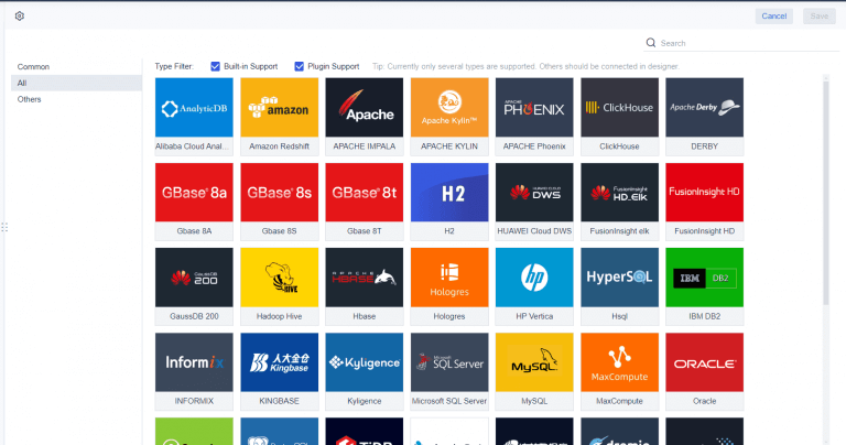
You need to bring all this data together before you can visualize it. FineReport makes this step easier by connecting to multiple data sources, including databases and Excel files. You can use its data connector to link your sales systems, CRM, and marketing platforms. This integration ensures your sales metrics dashboard always reflects the latest numbers.
Before you load your data into the dashboard, clean and prepare it. Remove duplicate records, handle missing values with smart methods, and standardize formats for text, dates, and categories. Look for outliers that may signal errors or unusual sales activity. These steps help you maintain data integrity and ensure your sales dashboard provides accurate insights.
Tip: Automate data consolidation with business intelligence software. This approach saves time and reduces errors, letting you focus on analysis instead of manual data entry.
Dashboard Layout and Visualization
Once your data is ready, you can design the layout of your sales dashboard. Start with a template or a blank canvas. Decide which metrics matter most and place them where users will see them first. Arrange your dashboard to match natural reading patterns, usually from left to right and top to bottom. This structure helps users understand the story behind your sales numbers.
| Strategy | Description |
|---|---|
| Clarity and Simplicity | Use clear, easy-to-read graphs and charts. Place critical metrics in prominent positions. |
| Interactive Elements | Add filters and drill-down features to let users explore specific sales data. |
| Regular Review | Update and adjust the dashboard as your business needs change. |
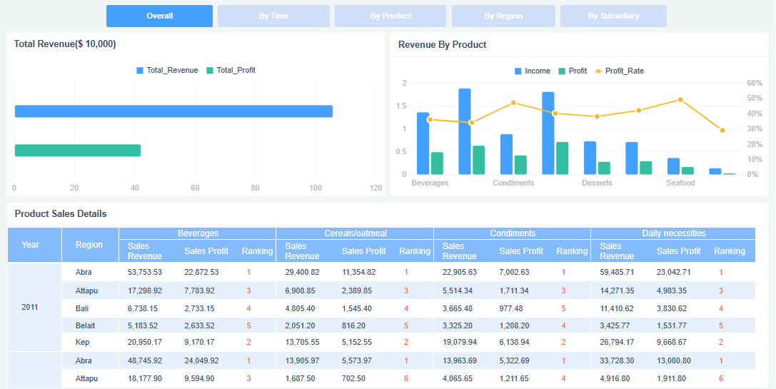
FineReport offers a drag-and-drop designer, so you can add charts, tables, and graphs without coding. You can use multi-report layouts to display several tables or charts on one page. This feature is useful if you want to compare revenue, sales activity, and pipeline value side by side. FineReport also supports 3D dashboards and interactive elements, making it easy to drill down into specific sales data.
Keep your dashboard focused. Limit the number of data points to six to ten. Avoid overcrowding the display with too much information. Use color and highlights to draw attention to important metrics, but do not overdo it. A clean, simple design helps users find answers quickly.
Note: Avoid common mistakes like cluttered layouts, irrelevant details, or poorly chosen visualizations. These issues can confuse users and reduce the effectiveness of your sales activity dashboard.

Automation and Sharing
After you design your sales dashboard, set up automation to keep it updated. FineReport lets you schedule automatic data refreshes and report generation. You can configure the dashboard to pull new sales data at regular intervals, ensuring your team always sees the most current numbers.
| Feature | Benefit |
|---|---|
| Real-time data tracking | Gives you immediate access to critical sales metrics, supporting faster decisions. |
| Automated reporting | Removes manual data entry, improving accuracy and freeing up time for selling. |
| Customizable dashboard views | Lets users see the data most relevant to their roles, reducing information overload. |
Sharing your sales metrics dashboard is just as important as building it. FineReport provides several options for distribution. You can share dashboards through web links, email, or mobile devices. The mobile dashboard feature ensures your team can access sales data from anywhere, supporting remote work and quick decision-making.
To maximize adoption, design your dashboard for intuitive navigation. Tailor views for different roles, such as sales managers or executives. Collect feedback from users and refine the dashboard based on their needs. Regular training helps your team use the dashboard effectively, leading to better integration with daily sales activities.
Remember: Define clear objectives for your dashboard, choose the right metrics, and verify data accuracy regularly. These steps ensure your sales metrics dashboard remains a valuable tool for your organization.
By following these steps, you can build a sales dashboard that brings together all your sales data, visualizes key metrics, and automates reporting. FineReport’s features for data connection, multi-report layout, and scheduled reporting make the process efficient and scalable. With a well-designed sales metrics dashboard, you empower your team to track revenue, monitor sales performance, and drive business growth.

Best Practices for Sales Metrics Dashboard
Design for Clarity and Simplicity
You want your sales metrics dashboard to deliver insights at a glance. Start with a simple design. Remove any elements that do not help you understand your sales performance. Focus on the data that matters most, such as sales revenue, pipeline value, and sales forecast. Use a high data-ink ratio by displaying only what communicates information directly. Limit your color palette to three colors. This approach prevents confusion and helps you group related charts for quick comparisons.
| Design Principle | Description |
|---|---|
| Simplicity | Avoid clutter and keep the metrics dashboard easy to read. |
| Data-ink ratio | Show only essential data, removing unnecessary visuals. |
| Limited color usage | Use up to three colors for clarity and consistency. |
| Color-grouping | Use color to connect related charts and metrics. |
| Minimalism | Focus on key metrics and remove distractions. |
| Visual hierarchy | Place critical sales metrics, like sales revenue and sales forecast, in prominent positions. |
| White space | Add space around data to make the dashboard easier to scan. |
| Appropriate visualizations | Choose the right chart for each metric to avoid misinterpretation. |
| Contrast and readability | Ensure text stands out against the background for easy reading. |
Color plays a key role in your metrics dashboard. Consistent color usage helps you and your team quickly interpret sales data. High contrast between text and background improves readability for everyone. Avoid overloading your dashboard with too many colors, as this can overwhelm users and reduce the effectiveness of your sales metrics dashboard.
Ongoing Use and Refinement
A sales metrics dashboard is not a one-time project. You need to review and refine it regularly to keep it valuable. Customize dashboard views for different roles, such as sales managers or executives. Schedule regular feedback sessions with your team to learn how they use the dashboard and what improvements they need. Use surveys or interviews to collect feedback, and prioritize changes that improve usability and data relevance.
Tip: Create feedback loops between sales and marketing teams. This process helps you align your sales forecast and sales revenue targets with actual performance.
Automate data synchronization so your metrics dashboard always shows real-time numbers. Release updates in short cycles to respond quickly to user needs. Stay aware of trends in dashboard design, such as minimalist layouts, mobile-first dashboards, and embedded collaboration tools. These trends help you keep your sales metrics dashboard modern and effective.
| Strategy | Description |
|---|---|
| Schedule feedback sessions | Meet with users to discuss dashboard usability and improvements. |
| Use surveys and interviews | Gather structured feedback for ongoing refinement. |
| Prioritize improvements | Focus on changes that impact sales revenue and sales forecast accuracy. |
| Iterate rapidly | Update the metrics dashboard often to address new needs. |
By following these best practices, you ensure your sales metrics dashboard remains a powerful tool for tracking sales revenue, improving your sales forecast, and driving better business decisions.
To build an effective sales metrics dashboard, you should:
- Identify the sales metrics that matter most.
- Define the dashboard’s purpose and users.
- Select the right software for your needs.
Tracking the right metrics helps you spot bottlenecks, optimize your sales process, and benchmark performance. Next, experiment with dashboard layouts, automate data feeds, and share insights with your team. A well-designed sales metrics dashboard can boost engagement by 60%, increase productivity by 50%, and drive profitability up to 23%. Start today and see the difference in your sales results.

Continue Reading About Sales Metrics Dashboard
Best Dashboard Apps for Business Insights
What is a Call Center Dashboard and Why Does It Matter
What is a Reporting Dashboard and How Does it Work
What is An Interactive Dashboard and How Does It Work
What is a Call Center Metrics Dashboard and How Does It Work


FAQ

The Author
Lewis
Senior Data Analyst at FanRuan
Related Articles

How to Build an Investment Portfolio Reporting Dashboard for Executives: KPIs, Benchmarks, and Drill-Down Views
Investment portfolio reporting for executives is not about showing every holding, transaction, and chart your investment team can produce. It is about giving CEOs, CFOs, CIOs, boards, and investment committees a fast, re
Yida YIn
Jun 25, 2026

12 KPI Reporting Examples for Executive Dashboards: What to Show in Weekly, Monthly, and Quarterly Reviews
Executive leaders do not need more data. They need decision ready $1 examples that match how often they review the business and what actions they are expected to take. A weekly $1 should surface fast moving risks and per
Yida YIn
Jun 25, 2026

How to Build a Digital Marketing Reports Dashboard: Executive Examples, KPIs, and Templates
A $1 is the control layer that helps executives and marketing leaders turn scattered channel data into fast, confident decisions. If you are a CEO, CMO, operations director, or marketing analytics lead, the real problem
Yida Yin
May 07, 2026