A strong wealth management report dashboard helps advisors, branch managers, and firm leadership answer one question fast: where are we growing, where are we leaking value, and what action should we take next? In practice, most firms struggle with fragmented CRM records, inconsistent AUM definitions, delayed custodian files, and dashboards overloaded with charts but short on decision support. The business value of getting this right is immediate: better client reviews, cleaner revenue visibility, earlier attrition detection, and faster book-of-business decisions.
Click To Try The Dashboard
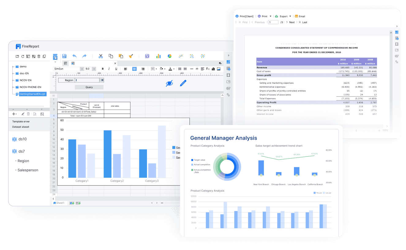
All reports in this article are built with FineReport
What a wealth management report dashboard should achieve
A wealth management dashboard is not just a reporting layer. It is an operating tool for client coverage, growth management, and leadership oversight. Different users need different views, but the dashboard should align them around the same core metrics and definitions.
For advisors and relationship managers, the dashboard should make client review preparation easier. They need to see household assets, recent cash flows, portfolio changes, meeting history, service issues, and revenue contribution in one place. For branch leaders, the focus shifts to team productivity, advisor-level growth, and client retention risk. For firm leadership, the dashboard should summarize strategic performance across offices, channels, and client tiers.
The dashboard should support decisions such as:
Which clients need outreach before the next review cycle
Which advisors are growing net new assets fastest
Which books are profitable but vulnerable to attrition
Whether revenue is on pace against plan
Which service bottlenecks are reducing client satisfaction
Where product mix or portfolio concentration may require attention
Operational monitoring, performance reporting, and strategic planning views
The most effective wealth management report designs separate usage into three views:
Operational monitoring: Daily or near-real-time visibility into flows, service tickets, pending reviews, and exceptions
Performance reporting: Monthly management reporting on AUM, revenue, retention, margins, and advisor productivity
Strategic planning: Quarterly and annual views for growth strategy, segmentation, market opportunity, and resource allocation
This separation matters. A daily dashboard built for operations should not look like a quarterly board pack. Mixing both usually creates clutter and weakens adoption.
Core KPIs to include in a wealth management report
A dashboard only works when it is anchored in a disciplined KPI set. Too few metrics and leaders miss important signals. Too many and no one acts. For most firms, the right answer is a compact first-screen summary with deep drill-downs.
Key Metrics (KPIs)
Assets Under Management (AUM): Total managed client assets at a point in time; the core scale metric for the business
Net New Assets (NNA): New money won minus assets lost; the clearest signal of organic growth
Gross Inflows: New contributions, transfers in, and additional invested assets
Gross Outflows: Withdrawals, transfers out, and closed-account asset exits
Household Growth: Increase in the number of client households over time
Client Retention Rate: Percentage of clients or households retained in a period
Revenue per Household: Average revenue generated from each client household
Recurring Revenue: Ongoing fee-based income generated from advisory relationships
Fee-Based Revenue Mix: Share of total revenue coming from recurring fee arrangements versus transactional revenue
Client-Level Profitability: Revenue minus servicing and support costs at the client or segment level
Share of Wallet: Estimated percentage of the client’s total investable assets held with your firm
Meeting Cadence: Frequency of advisor-client reviews and touchpoints
Service Response Time: Time taken to resolve client requests or operational issues
Advisor Productivity: AUM, revenue, or NNA per advisor or relationship manager
Margin Trend: Profitability trend after operating and servicing costs
Cross-Sell Penetration: Number or percentage of clients using multiple products or advice services
Attrition Risk Flag: Early warning indicator based on withdrawals, inactivity, complaint patterns, or reduced engagement
Client and asset growth metrics
The growth layer of a wealth management report should answer whether the firm is expanding client relationships in a healthy, sustainable way. AUM remains foundational, but it is incomplete on its own because market appreciation can mask weak organic growth.
The most useful growth metrics include:
AUM by advisor, office, region, and client segment
Net new assets by month, quarter, and year
Household growth by advisor and branch
Inflows versus outflows by client tier
New account openings and closures
Portfolio-type growth across discretionary, advisory, retirement, and alternative allocations
A consultant’s recommendation: always separate market-driven AUM growth from organic asset growth. Leadership should be able to see whether performance is coming from new client wins, wallet expansion, or simply favorable market conditions.
Segmentation is equally important. The dashboard should allow users to compare performance by:
Advisor
Office or branch
Client tier
Household type
Portfolio type
Region
Channel or business line
Revenue and profitability indicators
Growth without revenue quality can create misleading optimism. A strong wealth management report must show how asset growth converts into sustainable profitability.
Core revenue and profitability indicators should include recurring advisory fees, planning revenue, transactional revenue where relevant, and margin contribution by segment. Leadership should also be able to compare actuals against targets, prior periods, and expected benchmark ranges.
Critical indicators include:
Recurring revenue trend
Fee-based revenue as a percentage of total revenue
Product mix by revenue contribution
Revenue by advisor and office
Revenue per client or household
Margin trend by segment
Client-level profitability
Target versus actual attainment
A practical point: client-level profitability often reveals service model issues. Some households produce strong gross revenue but consume disproportionate service effort. Your dashboard should highlight these cases so leaders can redesign coverage models, pricing, or service tiers.
Client engagement and retention signals
In wealth management, attrition rarely arrives without warning. Signals usually appear first in behavior: fewer meetings, declining wallet share, unusual withdrawals, slow follow-up, or rising service complaints. That is why engagement metrics deserve equal prominence alongside AUM and revenue.
Useful retention and engagement metrics include:
Retention rate by client tier and advisor
Share of wallet estimate
Review meeting cadence
Digital engagement or portal usage, where available
The dashboard should also surface early warning signs for advisors, such as:
Large outflows after prolonged inactivity
Missed annual review milestones
Service tickets open beyond SLA
Sudden drop in communication frequency
Revenue decline from historically stable households
This is where a good wealth management report becomes operationally valuable. It moves teams from passive reporting to proactive intervention.
Data sources and inputs that power the dashboard
A dashboard is only as reliable as the systems feeding it. In wealth management, the complexity comes from multiple platforms that were not built with shared identifiers or unified metric definitions.
Internal systems and firm data
Most firms need to combine data from several internal sources:
Service or case management tools: Requests, complaints, response times, and issue categories
The common failure point is not extraction. It is ownership. Every metric in the wealth management report should have a business owner, a technical owner, a refresh schedule, and a clear calculation rule.
Set explicit standards for:
Data refresh timing
Source system priority
Exception handling
Missing value logic
Reconciliation thresholds
Metric sign-off responsibility
External research and market intelligence
External data does not usually drive operational reporting, but it strengthens strategic interpretation. Firms can use reputable industry studies and market intelligence to contextualize trends in client behavior, advisor productivity, fee pressure, product adoption, and broader wealth market shifts.
Use external inputs to enrich:
Benchmark ranges for growth and retention
Peer context for revenue mix or fee-based adoption
Investor behavior trends
Market environment commentary for executive reviews
Strategic planning around segmentation, personalization, and portfolio demand shifts
The key is restraint. Do not clutter the main dashboard with too much outside data. Instead, layer benchmark context into executive and quarterly views where it improves interpretation.
Data modeling and governance basics
This is the part many firms underestimate. Without clean data modeling, even a visually polished dashboard will fail in executive review.
At minimum, standardize these entities across systems:
Client ID
Household ID
Advisor ID
Account ID
Office or branch ID
Product or portfolio category
Revenue category
Then create a metric dictionary that defines exactly how the dashboard calculates AUM, NNA, recurring revenue, retention, profitability, and other core measures.
This governance layer is what makes the wealth management report trustworthy enough for both advisor action and executive decision-making.
How to design the reporting workflow
A dashboard project fails when teams focus only on the visual layer and ignore reporting operations. The workflow must be designed end to end, from extraction to publishing, with clear roles and controls.
From data collection to dashboard delivery
A mature reporting workflow typically follows this sequence:
Extract data from CRM, custodians, accounting, billing, and compliance systems
Validate completeness, file freshness, and structural integrity
Transform data into standardized entities and calculated metrics
Reconcile critical values such as AUM, revenue, and flows against source totals
Review dashboard outputs with data owners or business analysts
Publish approved views to the right user groups
Distribute reports through scheduled refreshes, subscriptions, or portal access
Define roles clearly:
Operations or data engineering prepares feeds
Finance validates revenue-related outputs
Wealth leadership or reporting managers approve KPI presentation
Advisors, managers, and executives consume role-based views
This role clarity reduces disputes about numbers and speeds up reporting cycles.
Reporting cadence and audience views
Not every user needs the same update frequency. Matching cadence to decision needs improves usability and performance.
Recommended structure:
Daily monitoring: Flows, service issues, review schedules, exceptions, and key client activity
If the dashboard is used in regulated or client-facing contexts, governance should be designed in from day one, not added later.
Best practices for building a dashboard advisors will actually use
Adoption is the real test. A dashboard that looks sophisticated but does not help advisors act will be ignored within weeks.
Keep the interface clear and actionable
The first screen should answer the most important business questions at a glance. Put high-value KPIs front and center, then allow drill-down into client, advisor, office, or segment details.
Use these design principles:
Lead with decision-ready KPIs
Put AUM, NNA, revenue, retention, and key alerts on the first screen.
Reduce visual clutter
Do not overload the page with redundant charts, decorative graphics, or low-value metrics.
Use meaningful filters
Let users slice by advisor, office, household tier, product type, and date range.
Support drill-down paths
Users should move from executive summary to advisor view to client-level detail without leaving the reporting environment.
Show comparisons clearly
Include prior period, target, and benchmark comparisons where they support action.
A dashboard becomes useful when it prompts follow-up action, not just observation.
Best practices from implementation projects:
Attach thresholds to metrics
Define green, amber, and red conditions for retention risk, outflows, stale reviews, and service delays.
Build alerts for priority events
Trigger notifications for large withdrawals, missed client reviews, or deteriorating wallet share.
Align outputs with advisor workflows
Make sure dashboard insights can be used directly in client review prep, growth planning, and service management.
Add follow-up logic
For example, if a household has declining assets and no meeting in 180 days, create a follow-up task for the advisor team.
Review usage data
Track which views users open, which filters they apply, and where they drop off. This reveals what is useful and what should be simplified.
These steps separate a reporting artifact from a working management tool.
Focus on AUM, NNA, recurring revenue, retention, and service alerts
Launch role-based views for a small pilot group
Phase 2: Improve segmentation and drill-down
Add advisor, office, household tier, and portfolio segmentation
Introduce target comparisons and period-over-period views
Refine filters and navigation based on user feedback
Phase 3: Add intelligence and automation
Introduce attrition flags, thresholds, and alerts
Automate distribution and scheduled refreshes
Add executive summary pages for monthly and quarterly reviews
Phase 4: Strengthen governance
Finalize the metric dictionary
Formalize reconciliation and approval workflows
Expand audit trails, role permissions, and compliance controls
This phased model lowers risk, speeds adoption, and prevents the team from getting stuck in months of design without business impact.
Build the dashboard faster with FineReport
Building this manually is complex; use FineReport to utilize ready-made templates and automate this entire workflow.
For enterprise wealth management teams, the challenge is rarely just visualization. It is integrating multiple systems, standardizing KPI definitions, supporting role-based access, and delivering reliable reports on schedule. FineReport helps solve that by giving firms a practical way to build dashboards, automate refreshes, manage permissions, and publish different views for advisors, managers, and executives without relying on fragile spreadsheet chains.
FineReport is especially well suited when you need to:
Consolidate CRM, custodian, billing, and portfolio data
Strengthen governance with controlled publishing and access
Scale from pilot dashboards to enterprise-wide reporting
If your current reporting process depends on manual exports, spreadsheet merging, and repeated reconciliation, the cost is not just time. It is slower decisions, weaker advisor adoption, and lower trust in the numbers. FineReport gives you a faster path to a dashboard that is operationally useful and executive-ready.
Start with a compact summary of core KPIs such as AUM, net new assets, inflows, outflows, client retention, revenue, and advisor productivity. Then add drill-downs by advisor, branch, segment, and household so users can move from signal to action quickly.
Net new assets should separate organic client-driven flows from market performance so growth is not overstated. A clear calculation usually combines new money in, money out, transfers, and closed-account asset movement for the selected period.
Most firms need data from CRM systems, portfolio accounting platforms, custodian files, revenue or billing systems, and service or ticketing tools. Accuracy depends on reconciling definitions and refresh timing across these sources before metrics reach the dashboard.
It depends on the use case. Operational views may need daily or near-real-time updates, while performance reporting is often monthly and strategic planning is usually quarterly or annual.
Common problems include inconsistent AUM definitions, mixing market gains with real asset growth, fragmented client records, and dashboards with too many charts but too little decision support. The best reports keep metric definitions consistent and organize views by operational, management, and strategic needs.
Product Trial
FineReport
Pixel-perfect reports · Interactive dashboards · Easy data entry · Digital twins