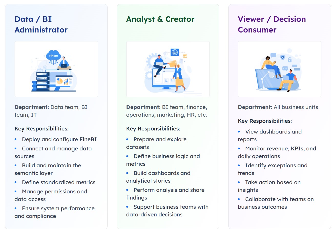
An effective onboarding dashboard does more than show whether tasks are checked off. It helps HR, IT, hiring managers, shared services, and executives see where onboarding is slowing down, where risk is building, and where intervention will have the biggest business impact.
In practice, delays and escalations rarely come from one missed task alone. They usually come from broken handoffs, unclear ownership, approval bottlenecks, system access gaps, or inconsistent definitions of “complete.” That is why a high-performing onboarding dashboard must measure process health, not just process activity.
This guide explains what to track, how to structure KPIs, and how to design views that support both leaders and operational teams.
Why an onboarding dashboard should track more than task completion
Many organizations start with a simple dashboard: total tasks assigned, tasks completed, overdue tasks, and completion percentage. That is a useful first step, but it is not enough for managing risk.
Task-based reporting can easily hide the real problem. A workflow may appear healthy because 90% of tasks are complete, while one unresolved dependency is blocking badge access, payroll setup, equipment delivery, or mandatory compliance steps. The dashboard looks green. The day-one experience does not.
A stronger onboarding dashboard should reveal three things early:
Where flow is slowing down
Where ownership is unclear
Where escalation risk is rising
If it cannot do that, it is a reporting layer, not a management tool.
Delayed onboarding creates measurable business damage:
Impact area
What delays cause
Productivity
New hires cannot start effectively, managers lose time chasing setup issues
Compliance
Required forms, policy acknowledgments, and access controls may be missed
Service quality
IT, HR, and support teams face avoidable fire drills and manual workarounds
Stakeholder confidence
Hiring managers and leaders lose trust in the onboarding process
Employee experience
New hires start frustrated, confused, or disengaged
The key distinction is simple:
Reporting activity answers: “What got done?”
Measuring onboarding health answers: “Are we on track for a ready, low-risk start?”
That second question is what executives and delivery teams actually need.
All dashboard examples in this article were created by FineBI.
Core metrics to include in an onboarding dashboard
The best onboarding dashboards combine operational efficiency, risk visibility, and readiness outcomes. A balanced KPI set should help teams detect delays before they become escalations.
Time and flow metrics that reveal delays early
Time-based metrics are often the fastest way to expose hidden blockers. They show not just whether work is done, but how smoothly the process is moving.
Key metrics to include:
Time to first milestone
Average onboarding cycle time
Aging by stage
Time stalled between owners
Time waiting for approval
Queue volume by work type
These metrics matter because onboarding delays often happen in transition points, not inside a single task. A handoff from recruiting to HR, from HR to IT, or from IT to the hiring manager can create silent waiting time that standard completion reports miss.
To make these metrics actionable, segment them by:
Team
Location
Role type
Onboarding path
Vendor dependency
Employment type
For example, if engineering hires in one region consistently show longer access setup times, the issue may be local provisioning, not the overall onboarding design.
A practical KPI structure looks like this:
Metric
What it reveals
Typical action
Time to first milestone
Whether onboarding starts promptly after offer acceptance
Review intake trigger and ownership
Average cycle time
Overall process efficiency
Identify high-friction stages
Aging by stage
Where cases accumulate
Rebalance workload or simplify approvals
Time stalled between owners
Handoff failure
Clarify routing rules and accountability
Queue growth
Early signal of future delay
Add capacity or prioritize backlog
Risk and escalation indicators
If time metrics show where flow is slowing, risk metrics show where delay is about to become disruption.
Important risk indicators include:
Overdue critical steps
Exception rates
SLA breaches
Reopen rates
Escalation volume
Cases with repeated status changes
Dependency misses
Approval lag
These are especially valuable because they are leading indicators of operational instability. A rise in approval lag today often becomes a rise in escalations next week.
Look closely at repeated status changes. If cases move from “in progress” to “waiting” to “reopened” multiple times, the problem is usually not execution speed. It is process clarity, incomplete intake data, or weak dependency management.
A mature employee onboarding dashboard should also separate routine overdue items from business-critical delays. Missing a nonessential welcome message is not the same as missing identity creation, payroll configuration, or compliance review.
Use weighted risk logic where possible:
Critical compliance miss = high risk
Day-one system access unavailable = high risk
Manager confirmation not completed = medium risk
Noncritical task overdue = low risk
This helps teams focus on the issues that truly drive escalation.
Experience and readiness measures
Completion is not readiness. A process can be marked complete while the employee still lacks access, training, equipment, or manager alignment.
That is why readiness metrics should be part of every serious onboarding dashboard.
These metrics connect process performance to business outcomes. If onboarding is “complete” but day-one readiness is low, the KPI design is flawed.
Feedback signals are also important. Short pulse surveys from new hires, managers, and support teams can reveal recurring friction that operational data alone may not show, such as unclear instructions, duplicate requests, or poor communication between teams.
In most organizations, readiness should be defined in business terms, not task terms. For example:
Ready for day one may mean:
Identity and device issued
Core systems accessible
Mandatory training assigned or completed
Manager check-in scheduled
Compliance requirements met
That definition should be explicit in the dashboard.
How to design onboarding dashboard KPIs that drive action
A dashboard becomes valuable only when it changes behavior. Good KPI design ensures every metric has an owner, a threshold, and a clear response.
Align every KPI to an owner and decision
One of the most common dashboard failures is presenting metrics that no one owns. If a KPI turns red and nobody knows who should act, the metric creates noise, not improvement.
For each KPI, define:
Business owner
Operational owner
Decision triggered
Expected response time
Escalation path
For example:
KPI
Owner
Decision when threshold is missed
Approval aging over 48 hours
Hiring manager / approver group lead
Escalate to backup approver
Day-one access readiness below target
IT operations
Prioritize provisioning queue
SLA breaches rising in one region
Regional HR operations
Review staffing and vendor dependency
Reopen rate above baseline
Process excellence / HR ops
Audit intake quality and workflow rules
This structure is critical because leaders and operators use data differently. Executives need a concise summary of business health. Delivery teams need detailed metrics tied to immediate action.
So separate:
Executive summary indicators: delays, escalation trend, readiness risk, SLA health
That separation makes the dashboard more useful for both audiences.
Set thresholds, segments, and drill-down views
Thresholds should reflect business impact, not arbitrary round numbers.
Do not set a target just because it “sounds right.” Set it because crossing that threshold creates a meaningful risk to productivity, compliance, or employee experience.
A practical red-yellow-green model may look like this:
Green: On track, no intervention needed
Yellow: Emerging risk, monitor or intervene locally
Red: Business impact likely, action required now
The most useful thresholds are usually tied to:
Start date proximity
SLA commitments
Critical dependency timing
Cost of delay
Compliance exposure
Segmentation is equally important. Aggregate averages can hide serious local problems. A dashboard should allow drill-down by:
Region
Department
Job family
Onboarding type
Hiring volume
Vendor or service provider
Manager group
This is where root causes become visible. For example, overall cycle time may appear stable, while one high-volume business unit is driving most escalations.
Strong KPI design combines what already happened with what is likely to happen next.
Lagging indicators show outcomes:
Completion time
Escalation count
SLA attainment
Readiness rate
Leading indicators show early warning signs:
Queue growth
Approval aging
Dependency misses
Repeated status changes
Rising overdue critical steps
If a dashboard tracks only lagging indicators, it helps explain failure after the fact. If it tracks only leading indicators, it may create too many signals without proving business impact. You need both.
Also avoid vanity metrics. Common examples include:
Total tasks created
Total users in process
Generic completion percentages without readiness context
These can look positive while delays and escalations continue to rise.
The test is simple: if improving the metric does not reduce delay, improve readiness, or lower escalation volume, it likely does not belong in the core KPI set.
Onboarding dashboard views for executives and operational teams
Different stakeholders need different levels of detail. A single cluttered screen rarely works for everyone.
What leaders need in an onboarding executive dashboard
An onboarding executive dashboard should be concise, trend-oriented, and focused on business impact.
Leaders typically need to see:
Delay trends over time
Escalation volume and severity
SLA performance
Readiness risk by business unit or region
Top blockers
Areas requiring intervention
The goal is not task supervision. It is decision support.
A useful executive view answers questions like:
Are onboarding delays increasing?
Which teams or regions are driving risk?
Are we putting compliance or productivity at risk?
Where should leadership intervene now?
This view should prioritize trends, exceptions, and concentration of risk. Dense operational tables are usually unnecessary at this level.
What frontline teams need in an employee onboarding dashboard
An employee onboarding dashboard for frontline teams should support daily execution. It should help coordinators, HR operations, IT support, and managers know exactly where to act.
Core elements include:
Queue visibility
Overdue critical items
Owner-level workload
Cases needing immediate follow-up
Aging by stage
Approval bottlenecks
Next-best actions
Operational teams need a dashboard that reduces search time. They should not have to open multiple systems to find which cases are at risk.
A strong operational view typically includes:
Operational need
Dashboard element
What needs attention now
Priority queue with overdue critical cases
Who owns the work
Owner-level assignment and aging
Why cases are blocked
Dependency and exception flags
What to do next
Suggested actions or escalation triggers
This makes the dashboard a working cockpit, not a retrospective report.
Build an onboarding tracking dashboard overview that supports both audiences
The best onboarding tracking dashboard overview uses a layered design.
At the top:
Summary KPIs
Trends
Risk status
SLA and readiness indicators
Below that:
Segment comparisons
Team views
Drill-through detail
Case-level action queues
This approach serves both executives and operators without forcing one audience to navigate the other’s complexity.
Consistency also matters. Definitions such as “overdue,” “ready,” “critical,” “stalled,” and “escalated” must be standardized across every view. If HR, IT, and leadership all interpret these terms differently, the dashboard becomes a source of debate instead of a source of truth.
How to build and simplify a customer onboarding dashboard approach for internal onboarding
Many useful practices from a customer onboarding dashboard can be adapted for employee onboarding. The key is to borrow the operating logic, not copy the surface-level metrics blindly.
Start with a simple operating model
Before building visuals, map the process.
You need to define:
The onboarding journey
Key milestones
Dependencies
Owners
Status definitions
Escalation rules
This operating model is the foundation of a reliable dashboard. Without it, metrics become inconsistent and teams lose trust in the output.
For the first version, keep scope tight. Focus on a small set of high-value KPIs that expose delay and escalation risk, such as:
Time to first milestone
Aging by stage
Overdue critical steps
Approval lag
Day-one readiness
Escalation count
That first version should answer one question well: where are delays forming, and what should we do about them?
Use templates and checklists without copying them blindly
Templates can accelerate design, especially when building a making a onboarding dashboard initiative from scratch. They help teams think about common workflow stages, checklist structures, and role-based views.
But templates should be treated as scaffolding, not strategy.
Review any onboarding checklist or dashboard template through three questions:
Does this metric reflect how our workflow actually operates?
Does someone own the metric?
Does the metric support a real decision?
If the answer is no, do not include it.
This is especially important when adapting a customer onboarding dashboard style to internal HR onboarding. Customer onboarding often emphasizes adoption and engagement; employee onboarding must also manage compliance, access control, equipment readiness, and internal service dependencies.
So use templates to accelerate structure, but validate every metric against operational reality.
Connect dashboard data to the systems where work happens
Manual dashboard updates fail quickly. They create lag, increase effort, and reduce trust.
A strong onboarding dashboard should pull data from the systems where onboarding work is actually executed, such as:
HRIS
Ticketing platforms
Identity and access tools
Learning systems
Approval workflows
Asset management tools
Collaboration or case management platforms
This reduces duplicate entry and improves timeliness.
Data quality controls are equally important. Add checks for:
Missing owners
Invalid statuses
Duplicate records
Inconsistent milestone dates
Closed tasks without prerequisite completion
Start dates without readiness data
Without these controls, dashboard adoption declines because teams stop believing the numbers.
For enterprise use, this is where a modern BI platform becomes especially valuable. Tools such as FineBI can help unify multi-source onboarding data, standardize KPI definitions, enable self-service drill-downs, and support role-based dashboard views for both leaders and operational teams. That matters when HR, IT, and shared services each rely on different source systems but need one trusted operational picture.
Common mistakes when making a onboarding dashboard and a practical rollout plan
Even well-intended dashboards can fail if they are overloaded, poorly defined, or disconnected from execution.
Pitfalls that make dashboards look useful but fail in practice
The most common mistakes include:
Tracking too many metrics
Using inconsistent data definitions
Mixing executive and operational use cases into one crowded screen
Measuring completion but not readiness
Ignoring rework, exceptions, and escalation drivers
Failing to assign owners to KPIs
Building dashboards without reliable system integration
These mistakes often produce dashboards that look sophisticated but do not improve outcomes.
A dashboard is not successful because it is visually impressive. It is successful because it helps teams reduce delays, lower escalation volume, and improve day-one readiness.
If possible, review your design against this checklist:
Question
If “no,” fix before rollout
Does every KPI have an owner?
Assign accountability
Does every red metric trigger an action?
Define playbooks
Are definitions consistent across teams?
Standardize metric logic
Can users drill into root causes?
Add segmentation and detail views
Does the dashboard measure readiness, not just completion?
Add outcome-oriented KPIs
A phased rollout that reduces delays and escalations fast
The most effective rollout is phased, not enterprise-wide on day one.
Start with one onboarding type, one region, or one business unit. Use that pilot to test:
KPI relevance
Threshold logic
Data quality
Escalation rules
Team adoption
Weekly review cadence
A practical rollout plan looks like this:
Pilot one onboarding flow
Choose a process with visible pain points and enough volume to generate learning.
Define owners and actions
Every KPI must map to a response. No orphan metrics.
Review exceptions weekly
Focus early reviews on overdue critical cases, SLA breaches, and repeated blockers.
Refine thresholds
Adjust green-yellow-red rules based on actual business impact.
Expand gradually
Add more onboarding types once the team is using the dashboard consistently.
Revisit KPIs regularly
Onboarding processes evolve. Your KPI set should evolve too.
This phased approach reduces risk and improves adoption because teams can see immediate operational value.
In larger organizations, this is also the right stage to formalize the dashboard on a scalable analytics platform. FineBI is well suited for this move because it supports governed self-service analysis, cross-system data integration, interactive drill-down, and role-based views that align executive oversight with frontline action. In other words, it helps convert a useful dashboard into a sustainable onboarding management system.
A high-performing onboarding dashboard is not a passive report. It is a control system for onboarding health. If you design it around flow, risk, readiness, ownership, and action, it will do more than monitor progress. It will reduce delays, cut escalations, and strengthen confidence across HR, IT, managers, and leadership.
FAQs
It should track process flow, ownership gaps, approval delays, stalled handoffs, and readiness risk. These metrics help teams spot issues before they affect day-one readiness or cause escalations.
The most useful KPIs include time to first milestone, average onboarding cycle time, aging by stage, time waiting for approval, and time stalled between owners. Together, they show where work is slowing down and where intervention is needed.
A strong dashboard highlights leading risk indicators such as overdue critical steps, SLA breaches, exception rates, and repeated reopenings. This allows HR, IT, and managers to act early instead of reacting after the start date is already at risk.
HR, IT, hiring managers, shared services teams, and executives all benefit from different dashboard views. Operational users need task and bottleneck detail, while leaders need trends, risk signals, and overall readiness visibility.
An effective dashboard helps teams identify blockers quickly, improve day-one readiness, and reduce overdue critical steps and escalations over time. If it only reports completed tasks, it is not giving enough insight to manage onboarding health.
Product Trial
FineReport
Pixel-perfect reports · Interactive dashboards · Easy data entry · Digital twins