A project report is only valuable if leaders can understand it fast enough to act on it. For project managers, PMO leaders, operations directors, and IT stakeholders, the real challenge is not producing more updates. It is turning scattered status notes, budget files, risk logs, and team commentary into one executive-ready dashboard that answers three questions immediately: Are we on track, what needs attention, and what decision is required now?
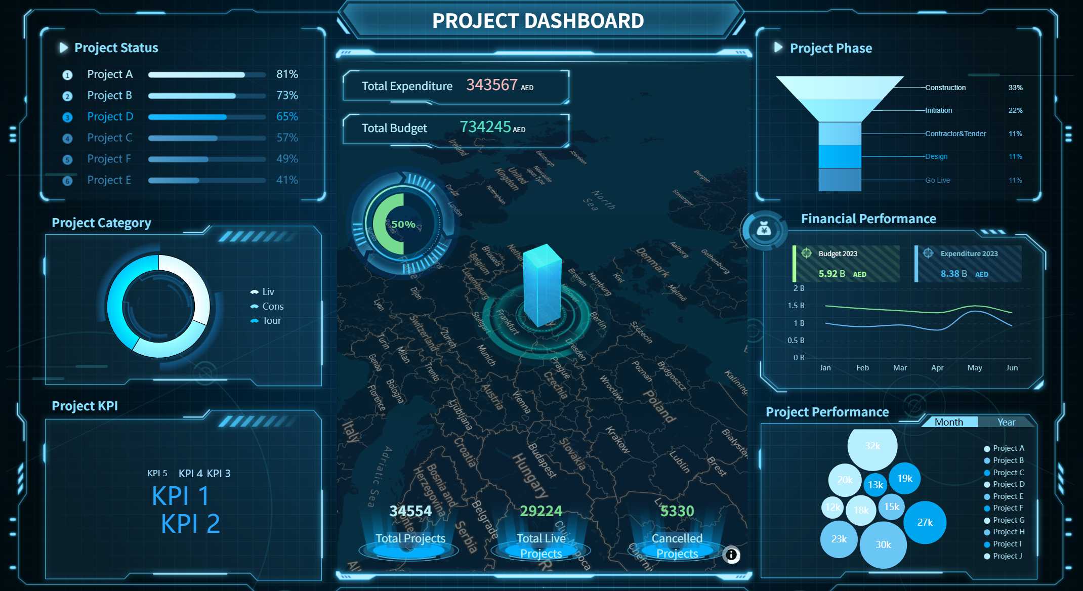
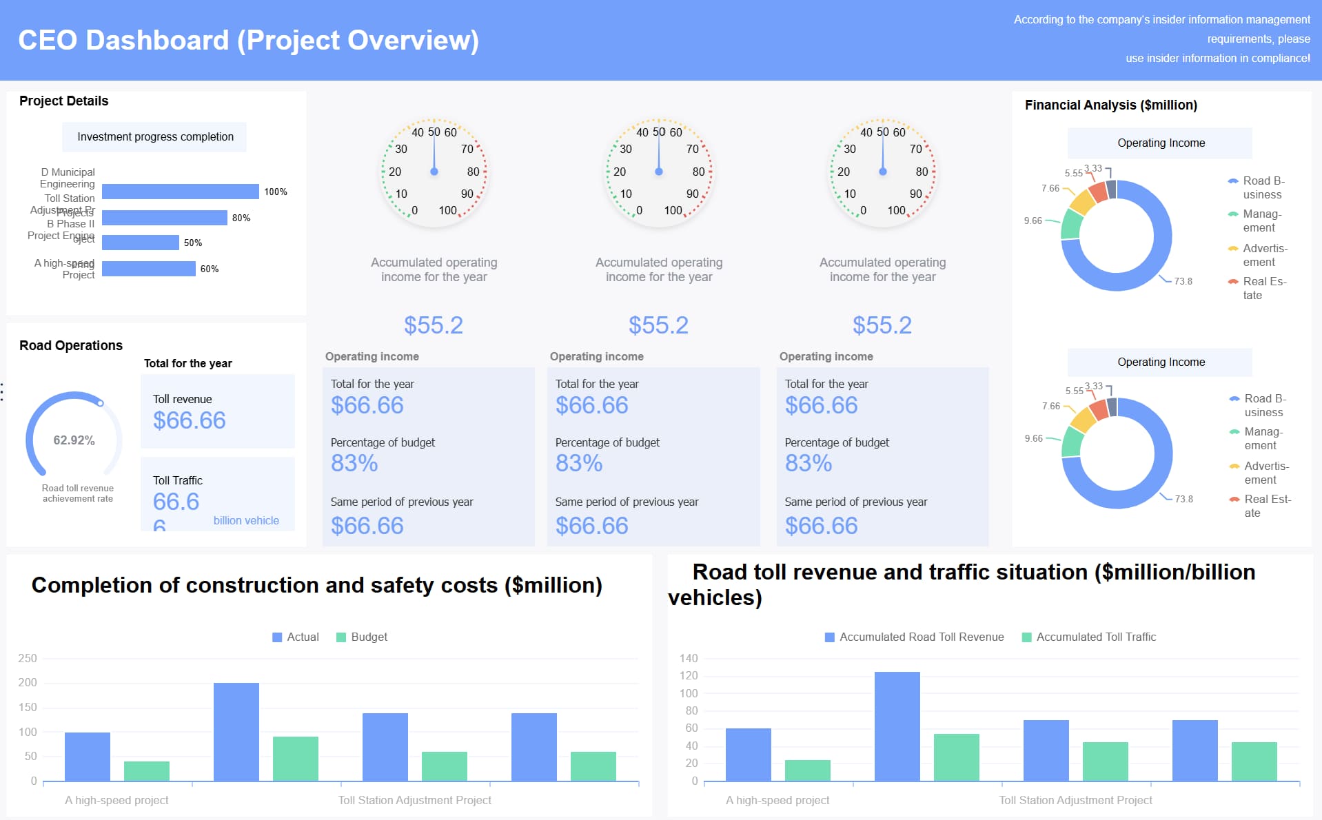
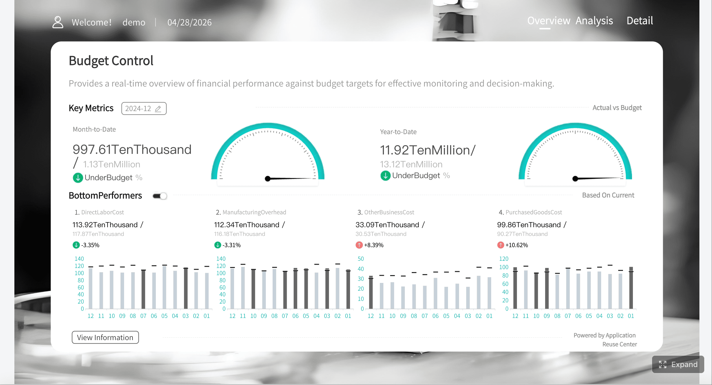
All reports in this article are built with FineReport
Most project reporting breaks down because teams confuse a working-level status update with an executive-facing project report dashboard. A status update documents activity. An executive project report filters information into a decision tool.
Leaders do not need every task comment, meeting recap, or dependency note. They need a quick read on business impact, delivery confidence, financial movement, and escalation points. When a report tries to serve everyone equally, it usually serves no one well.
The most common friction points are predictable:
Too much detail: executives get buried in task-level noise
Unclear priorities: the report lists updates but does not rank what matters
No decision path: risks are visible, but the required leadership action is missing
Poor layout: insights are hidden across tabs, long text blocks, or dense spreadsheets
Inconsistent reporting: each project manager formats the project report differently, slowing comprehension
What executives actually want in the first 30 seconds is simple:
Overall project status
What changed since the last review
Whether timeline or budget confidence moved
The top blocker or risk
The specific action, support, or decision needed
If your project report dashboard cannot answer those points at a glance, it will be skimmed, delayed, or ignored.
Start with the right structure for a project report
A strong project report dashboard is not a compressed document. It is a structured management interface. The layout should be built around fast pattern recognition and decision support.
Focus on decisions, not documentation
The best executive dashboards center on four things:
Business impact: what the project is enabling or protecting
Current status: where delivery stands today
Risks and issues: what could derail progress
Next actions: what happens next and who owns it
Everything else is secondary. Historical background, long requirement summaries, and detailed work logs may be important for governance, but they do not belong in the primary executive view unless they affect a current decision.
This is where many teams overbuild the project report. They try to preserve every input instead of curating the signal. A dashboard should reduce cognitive load, not reproduce the project folder.
Keep the layout scannable
Executives scan before they read. That means the dashboard must use a clear hierarchy:
Headline summary
Status and KPI strip
Major blockers and risks
Owner updates and next steps
The most important insight should be visible without scrolling, clicking through tabs, or opening attachments. If a sponsor has to hunt for the real issue, the dashboard is already underperforming.
A scannable project report dashboard usually includes:
A one-line executive summary at the top
Traffic-light or confidence indicators
Limited KPI cards with variance context
A short risk section with escalation labels
Action items with owner and due date
Match the dashboard to the audience
Not every leader needs the same project report view.
Executive sponsors want business impact, high-level risk, and decision needs
Department heads want functional implications, resource constraints, and ownership clarity
Cross-functional executives want dependency visibility and trade-off awareness
You should also distinguish between sections meant for:
Awareness: information leaders should know
Action: information leaders must respond to
That distinction alone dramatically improves executive response quality.
The 7 smart ways to create a version executives will actually read
A readable project report dashboard is built through disciplined choices. These seven methods consistently improve executive engagement and decision speed.
1. Lead with the headline and overall status
Start with one sentence that answers:
What changed
Why it matters
Whether leadership action is needed
Example:
ERP rollout remains on target, but vendor integration delays have reduced timeline confidence from high to medium and require procurement approval by Friday.
That is far more effective than opening with generic text like “The project is progressing well.”
Your overall status should also be standardized. Avoid vague language. Use a consistent framework such as:
On Track
At Risk
Off Track
Pending Decision
2. Show only the metrics that prove progress
Executives do not need every metric available. They need the few that prove whether the project is advancing as planned.
Key Metrics (KPIs)
Milestone Health: Shows whether major deliverables are completed, delayed, or at risk.
Schedule Confidence: Indicates the likelihood of hitting the target delivery date based on current progress and dependency status.
Budget Variance: Compares actual spend against approved budget to highlight overrun or underspend.
Forecast at Completion: Estimates final project cost or completion timing if current trends continue.
Outcome KPI: Measures whether the project is moving the business result it exists to achieve, such as revenue enablement, cycle-time reduction, or adoption rate.
Open Critical Risks: Counts major unresolved threats with meaningful delivery or financial impact.
Decision Aging: Tracks how long pending approvals or escalations have been waiting, which is useful for governance bottlenecks.
Owner Accountability: Shows whether next-step actions are assigned and progressing on time.
A practical rule: if a metric does not change executive behavior, it should not sit in the top section of the dashboard.
3. Turn risks into decision-ready insights
Too many project report dashboards list risks like a compliance register: descriptive, complete, and operationally useless for leadership.
Executives need risks translated into action-ready statements. For each major risk, show:
The risk itself
The likely impact
What mitigation is underway
What support is required from leadership
A better risk statement looks like this:
Data migration quality remains a high risk. Impact: potential two-week UAT delay. Mitigation: dual validation stream launched. Leadership need: approve temporary contractor support this week.
That format converts passive awareness into active governance.
4. Make next steps impossible to miss
Every section of the project report should end with a visible action path. The reader should never wonder, “So what happens now?”
Use a simple action structure:
Action
Owner
Due Date
Dependency or required decision
This is especially important for steering committees and weekly executive reviews. When action items are buried in narrative text, follow-through drops.
5. Use visual hierarchy to control attention
Good dashboards do not just present information. They guide the eye. Use size, spacing, contrast, and grouping to make the most important content impossible to overlook.
Best practice:
Use bold summary text for the main takeaway
Keep KPI cards compact and comparable
Group risks separately from routine updates
Highlight changes since the last report
Reserve color for exceptions, not decoration
This makes the project report easier to scan in under a minute, which is exactly how many executives will consume it first.
6. Show trends, not just snapshots
A single number can hide deterioration. A trend exposes it.
For executive readability, your project report dashboard should show movement in:
Budget variance over time
Milestone completion trend
Risk count trend
Schedule confidence trend
Decision turnaround time
A project can still appear “green” while weakening week by week. Trend lines make early intervention possible.
7. Standardize the format across projects
If every team submits a different project report structure, executives waste time relearning where to find information. Standardization improves trust, speed, and portfolio oversight.
Create one template with fixed sections, fixed KPI definitions, and fixed status logic. Let teams update the data, not redesign the communication model every week.
What to include and what to leave out in project report
The hardest part of building an executive-ready project report is deciding what to exclude. Strong reporting is editorial discipline.
Include the signals that drive action
Your dashboard should include the signals leaders can use immediately:
Progress against project goals
Major wins that change confidence or momentum
Emerging blockers
Pending decisions
Material budget or schedule movement
Risks with visible business impact
Owners and deadlines for next actions
Simple visuals work best here. Use:
Status indicators
Milestone timelines
Compact variance charts
Risk summary tables
Owner-action trackers
The purpose of visuals in a project report is speed, not decoration.
Leave out details better suited for appendices
Move the following into supporting files or secondary tabs:
Task-by-task logs
Long meeting notes
Raw system exports
Full RAID registers
Detailed requirement histories
Verbose team commentary
Duplicate screenshots from other systems
This information still matters. It just does not belong in the core dashboard. A clean executive view plus linked detail is a much stronger operating model than one overloaded report trying to do everything.
Templates and formatting shortcuts of project report
The fastest way to improve reporting quality is to stop creating each project report from scratch.
Use a repeatable dashboard template
A standard template creates consistency and reduces weekly reporting friction. It also helps leaders compare projects more easily across teams, functions, and business units.
A strong template usually includes:
Executive summary
Overall status
KPI strip
Milestone progress
Top risks and blockers
Pending decisions
Next steps with owners
Formatting shortcuts that work well:
Keep each section title question-based, such as What changed?, What is at risk?, What needs a decision?
Limit each narrative box to 2 to 3 lines
Use one color for neutral status and one for exception states
Put dates beside actions, not in separate notes
Show week-over-week change arrows on major KPIs
Offer supporting files without overloading the main view
Executives should be able to go deeper when needed, but the main dashboard should remain concise.
Use linked supporting assets for:
Downloadable references
Archived versions
Printable status packs
Detailed finance backup
Workstream-level logs
This structure gives you the best of both worlds: leadership clarity in the main project report, with traceable detail available on demand.
How to write a project report that drives results
Building a useful dashboard is only half the job. High-performing teams refine the project report based on executive behavior, not internal preference.
Review before every send
Before publishing a report, ask three hard questions:
Does each section answer a likely executive question?
Is the required decision or escalation obvious?
Can the dashboard be understood in under one minute?
If not, tighten it. Remove anything that is interesting but not useful at leadership level.
Track whether leaders actually use it
A project report is a communication product. If leaders do not engage with it, the design needs improvement.
Watch for signals such as:
Faster response times
Better quality follow-up questions
Fewer clarification meetings
More timely approvals
More accurate decisions on scope, risk, or budget
These are the real indicators that your dashboard is working.
Best practices to implement an executive-ready project report dashboard
If you want this reporting model to succeed across the organization, treat it like an operating standard rather than a formatting exercise.
1. Define one governance model for status and escalation
Set clear rules for what counts as On Track, At Risk, and Off Track. Also define when an issue becomes an escalation. This prevents teams from softening status language and protects decision quality.
2. Pull data from a single reporting layer
Do not build executive dashboards by manually stitching together spreadsheets every week. Connect project, finance, resource, and operational inputs into one governed reporting flow so the project report reflects one version of the truth.
3. Separate dashboard content from detailed documentation
Use the dashboard for decision support. Store logs, registers, detailed notes, and exports elsewhere. This keeps the executive view clean while preserving auditability and team-level detail.
4. Automate recurring weekly and monthly updates
Standardize refresh cycles, owner responsibilities, and scheduled delivery. The more manual the process, the more likely the project report will be late, inconsistent, or error-prone.
5. Build feedback into the reporting cycle
After major reviews, ask sponsors what they used, what they skipped, and what they still had to ask for. That feedback should shape the next version of the dashboard.
Manually building an executive-ready project report dashboard is complex. You need multi-source data integration, consistent KPI logic, visual hierarchy, repeatable templates, scheduled distribution, and enough flexibility to support both summary and drill-down views.
That is exactly where FineReport becomes the practical solution.
Building this manually is complex; use FineReport to utilize ready-made templates and automate this entire workflow.
Get Ready-to-Use Dashboard Templates in Fine Gallery
Build project report dashboards in a low-code, Excel-like design environment
Integrate data from ERP, CRM, finance systems, Excel files, APIs, and other enterprise sources
Create executive dashboards, printable reports, and interactive drill-down views from one platform
Standardize templates across projects for consistent governance
Automate scheduled report generation and distribution
Support web and mobile access for leadership review anywhere
Combine visual dashboards with analysis text, charts, tables, and structured commentary in one reporting workflow
For enterprise teams, this matters because project reporting is rarely just a design issue. It is a data integration, standardization, and decision enablement issue. FineReport helps solve all three.
Instead of spending each reporting cycle collecting files, reformatting metrics, and rewriting summaries, you can create a governed project report system that is faster to update, easier to read, and more useful for executives.
If your current reporting process depends on PowerPoint stitching, spreadsheet copying, and manual follow-ups, you are not just wasting time. You are slowing down decisions.
It should show overall status, key milestone progress, budget variance, top risks, and the next action or decision needed. The goal is to let leaders understand project health in seconds.
A regular status update captures detailed activity, while an executive report filters that information into business impact, confidence, and decision points. Executives need signal, not task-by-task detail.
Update it on a consistent cadence that matches the pace of decisions, such as weekly or biweekly for active projects. If major risks, delays, or budget changes occur, refresh it immediately.
The most useful metrics are schedule health, budget performance, milestone status, risk severity, and delivery confidence. Each metric should include context so leaders know whether action is required.
FineReport can consolidate project data into a single visual dashboard with standardized layouts and live updates. That makes reports easier to scan, compare, and use for faster executive decisions.
Product Trial
FineReport
Pixel-perfect reports · Interactive dashboards · Easy data entry · Digital twins