A finance report dashboard is not just a prettier version of the monthly pack. It is a decision system that converts income statements, balance sheets, and cash flow data into fast, executive-ready insight. For CFOs, finance directors, FP&A leaders, and operations executives, the pain is familiar: reports arrive late, metrics conflict across departments, commentary is weak, and leadership meetings spend more time debating numbers than making decisions. A well-built dashboard fixes that by surfacing what changed, why it changed, and what needs action now.
All reports in this article are built with FineReport
Finance report dashboard fundamentals for executive decision-making
A finance report dashboard exists to turn raw financial statements into timely, decision-ready insight. Instead of forcing executives to interpret dozens of static pages, the dashboard organizes financial performance into a visual flow: headline results, key trends, major variances, root causes, and required actions.
For enterprise leaders, the dashboard must answer business questions before it displays charts. That means defining exactly who will use it and what decisions they need to make. A CFO may care about margin pressure, cash conversion, and leverage. A CEO may focus on growth quality, capital allocation, and forecast confidence. A COO may want to connect financial outcomes to operating drivers such as volume, utilization, supply cost, or headcount efficiency.
A finance report dashboard is fundamentally different from a static monthly reporting pack. Traditional packs are document-driven. Dashboards are decision-driven. Static reports are often backward-looking, manually assembled, and hard to scan. Dashboards are interactive, standardized, and built for fast drill-down into drivers and exceptions.
To make the dashboard useful at the executive level, define success criteria early:
Speed: Data refreshes quickly enough to support monthly, weekly, or even daily decisions.
Clarity: Metrics are labeled clearly and visual design reduces interpretation effort.
Comparability: Results can be compared across time periods, business units, regions, and plans.
Actionability: Exceptions, risks, and opportunities are visible enough to trigger management action.
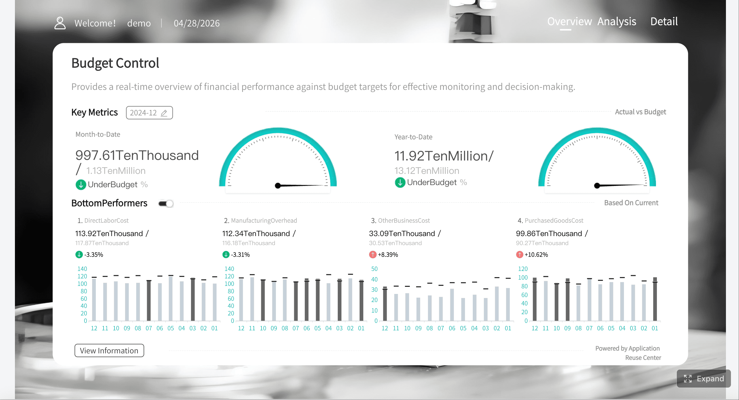
Key Metrics (KPIs) of finance report
A strong finance report dashboard should not overwhelm executives with every available number. It should prioritize a concise KPI layer that translates financial statements into business insight.
Revenue Growth: Measures top-line expansion over time and signals market traction.
Gross Margin: Shows how efficiently the business converts sales into gross profit after direct costs.
EBITDA: Tracks core operating profitability before financing and non-cash accounting effects.
Operating Cash Flow: Indicates whether the business is generating real cash from operations.
Net Profit Margin: Measures bottom-line efficiency relative to revenue.
Working Capital: Assesses short-term capital tied up in operations.
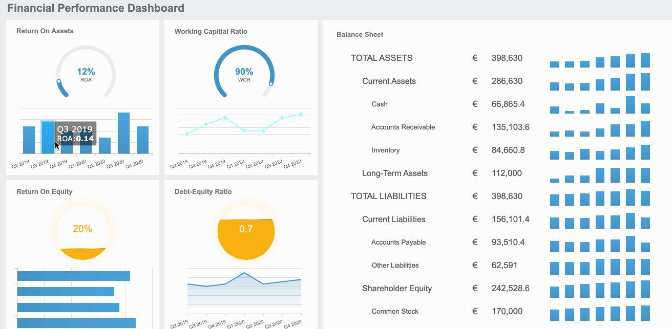
Current Ratio: Evaluates short-term liquidity and the ability to meet obligations.
Debt-to-Equity: Monitors leverage and capital structure risk.
Cash Runway: Estimates how long available cash can support operations if cash generation is weak.
Budget Variance: Compares actual performance with approved plan.
Forecast Variance: Shows whether the business is tracking ahead of or behind expected outlook.
Return Measures: Includes metrics such as ROE or ROA to assess capital efficiency.
The financial statements and finance report inputs you need
An effective finance report dashboard depends on reliable reporting inputs. If the source structure is weak, the dashboard will look polished but fail in the boardroom.
Core financial statements to include
The foundation starts with the three core financial statements.
Income statement for profitability trends, margin shifts, and operating performance
The income statement tells the story of growth and profitability. It helps leaders see how revenue, cost of goods sold, operating expenses, and profit lines are moving over time. In dashboard form, it should surface trend direction, margin compression, expense spikes, and segment-level performance.
Balance sheet for liquidity, leverage, and capital structure visibility
The balance sheet is essential for understanding financial resilience. It shows the condition of assets, liabilities, and equity at a point in time. For executives, this statement becomes more useful when translated into liquidity, debt, receivables quality, inventory efficiency, and capital structure indicators.
Cash flow statement for cash generation, burn, and funding needs
The cash flow statement often reveals risk sooner than the income statement. A company can report profits while struggling to generate cash. The dashboard should make operating, investing, and financing cash movements easy to interpret so leaders can identify burn rate, cash conversion issues, and potential funding pressure.
Supporting sources and reporting context
Financial statements alone are necessary but not sufficient. Executives also need context.
Budget, forecast, and prior-period actuals for variance analysis
Every key metric should be viewed against plan and history. A revenue number without budget variance or prior-period comparison does not support decision-making. Variance views help management separate expected movement from underperformance.
Segment, product, customer, and regional data for executive drill-downs
When a KPI shifts, leadership needs to know where the movement originated. Segment data provides the bridge from financial result to business driver. For example, gross margin deterioration may be concentrated in one product line, one customer tier, or one region.
External benchmarks and market context where relevant to business performance
For many industries, internal reporting improves when it includes market context. That could mean peer margins, commodity prices, FX impacts, interest rate movements, or sector growth rates. These benchmarks help executives determine whether underperformance is company-specific or market-driven.
Step 1–3: Design the finance report around executive questions
The best finance report dashboards are built backward from executive decisions, not forward from available data.
Step 1: Identify the decisions leaders need to make
Start by documenting the recurring decisions that the dashboard must support. These usually fall into five categories:
Growth: Are we growing in the right markets, products, and customer groups?
Profitability: Which areas are improving margin and which are destroying value?
Cash: Are we generating enough cash to fund operations and investments?
Risk: Where are the pressure points in leverage, liquidity, or concentration?
Resource allocation: Where should we invest, cut, or rebalance spending?
Then map each question to a measurable view. If leaders ask whether profitability is deteriorating, they need gross margin trend, expense ratio movement, and a bridge explaining the change. If they ask whether cash is tight, they need operating cash flow, working capital movement, and runway.
Step 2: Choose the KPIs that translate statements into insight
Do not confuse completeness with usefulness. Executives do not need every account line on the front page. They need a focused KPI set that captures performance, health, and direction.
Balance lagging indicators with forward-looking signals. Lagging metrics explain what has already happened. Forward-looking signals such as pipeline-linked revenue expectations, rolling forecast shifts, or receivables aging deterioration help leaders anticipate what comes next.
Step 3: Build a reporting structure executives can scan quickly
Executives scan before they analyze. Your structure should support that behavior.
A reliable layout sequence is:
Headline metrics: The few numbers that define current performance.
Trend views: Time-series context to show direction and momentum.
Driver analysis: Breakdown of the components causing movement.
Exceptions and risks: Items that need management attention now.
Use consistent periods across the dashboard. If one chart shows monthly data and another shows quarterly rolling averages without clear labeling, trust erodes immediately. Keep labels simple, visual density controlled, and color usage intentional. Red should signal an issue, not just decoration.
Step 4–5: Turn finance report data into analysis and narrative
A dashboard becomes strategic when it explains performance rather than merely displaying it.
Step 4: Add variance, trend, and ratio analysis
Variance analysis is one of the most important upgrades from static reporting to decision reporting. Executives need to see actuals against budget, forecast, and prior period in one coherent view.
Best-practice analysis layers include:
Actual vs budget: Shows execution against approved targets.
Actual vs forecast: Shows whether the latest business outlook is holding.
Actual vs prior period: Reveals trend acceleration or deterioration.
Ratio analysis: Explains structural performance through liquidity, leverage, and return metrics.
Useful finance ratios for executive dashboards include:
Current ratio: Short-term liquidity strength
Quick ratio: Near-cash ability to cover short-term obligations
Debt-to-equity: Balance sheet leverage
Gross margin %: Pricing and cost efficiency
Operating margin %: Operating discipline
ROE / ROA: Capital efficiency and returns
Highlight unusual or material movements automatically. If receivables days rise sharply, EBITDA declines while revenue grows, or operating cash flow diverges from net income, the dashboard should flag it clearly.
Step 5: Add executive commentary and business context
Numbers alone rarely drive action. Commentary translates movement into meaning.
Strong executive commentary follows a simple structure:
What changed?
Why did it change?
What should management do next?
For example, instead of saying “gross margin declined 2.1%,” explain that margin fell because discounting increased in one region, input costs rose in two product categories, and the sales mix shifted toward lower-margin accounts. Then recommend the next action: pricing review, supplier renegotiation, or product mix adjustment.
The most useful commentary connects financial outcomes to operational drivers such as:
Price changes
Sales volume shifts
Customer churn
Headcount growth
Procurement inflation
Inventory buildup
Delayed collections
Capacity utilization
A short narrative block at the top of each major dashboard section can dramatically improve executive adoption. It reduces meeting time spent asking basic interpretation questions and keeps discussion focused on decisions.
Step 6–7: Build, govern, and improve the finance report
Even a smart design will fail if the underlying data, controls, and governance are weak.
Step 6: Ensure data quality, controls, and governance
Finance leaders trust dashboards only when definitions and controls are stable. That requires governance discipline from the start.
Key governance practices include:
Define data owners: Every metric and source should have a business owner.
Set refresh cadence: Daily, weekly, or monthly updates must match decision needs.
Run reconciliation checks: Confirm dashboard totals tie back to source statements.
Control versions: Remove ambiguity around approved actuals, budget versions, and forecast versions.
Standardize metric definitions: Align finance, operations, and leadership on how KPIs are calculated.
A mature finance report environment also validates key relationships automatically. For instance, balance sheet structure should reconcile correctly, and ending cash should align with the cash flow statement. These checks reduce rework, improve traceability, and protect executive confidence.
Step 7: Iterate based on executive usage
A finance report dashboard should evolve with executive behavior. The goal is not to build a perfect dashboard once. The goal is to improve speed to insight over time.
Review actual usage patterns after major reporting cycles:
Which KPIs are referenced most in leadership meetings?
Which visuals trigger useful discussion?
Which tabs are ignored?
Where do executives consistently request extra explanation or drill-down?
Use that feedback to remove low-value content, sharpen exception reporting, and add views that support real decisions. As strategy changes, reporting should change too. A dashboard built for cost control in a margin squeeze may need new views when the business shifts toward expansion, acquisition, or capital restructuring.
Common mistakes to avoid and what good looks like in finance report
Many finance dashboards fail for predictable reasons. Avoid these common mistakes:
Too many metrics or visuals: More content usually creates less clarity.
No interpretation: Statements are displayed, but business implications are missing.
Inconsistent definitions: Different teams calculate the same KPI differently.
Mixed time ranges: Monthly, quarterly, and YTD views are combined without discipline.
Design-first thinking: Visual style takes priority over decision support.
What good looks like is much simpler. A strong finance report dashboard helps executives spot issues in minutes, understand root causes quickly, and decide what to do next with confidence. It creates one version of financial truth, shortens reporting cycles, and moves finance from scorekeeping to strategic guidance.
Best practices for implementing a high-value finance report dashboard
If you are building or upgrading a dashboard, use this practical implementation sequence.
Standardize the metric framework first
Define KPI names, formulas, source systems, refresh frequency, and ownership before dashboard design begins. This creates one financial language across the business.
Integrate data from finance and operations
Link ERP, accounting, CRM, planning, and relevant operational data so financial outcomes can be explained by business drivers rather than viewed in isolation.
Prototype with executive scenarios, not full report packs
Start with a few high-value use cases such as margin decline, cash pressure, or forecast miss. Build dashboards around those decisions and test them in real leadership meetings.
Automate controls and delivery
Add reconciliation checks, version controls, scheduled refreshes, and approval workflows. The less manual handling involved, the more reliable and scalable the finance report process becomes.
Embed commentary and action prompts
Pair visual metrics with short management notes, exception flags, and recommended actions. This turns reporting into a decision support workflow.
Build the finance report dashboard faster with FineReport
Building this manually is complex; use FineReport to utilize ready-made templates and automate this entire workflow.
Get Ready-to-Use Dashboard Templates in Fine Gallery
For most enterprises, the real challenge is not understanding what a good finance report dashboard should contain. It is connecting multiple data sources, standardizing metrics, building interactive views, enforcing governance, and delivering a dashboard executives actually trust. Doing all of that through spreadsheets and fragmented tools creates recurring manual work, version conflicts, and reporting delays.
FineReport helps solve this at the system level. It enables teams to connect data from ERP, CRM, accounting systems, Excel, APIs, and other business sources, then build finance dashboards, fixed reports, automated reports, and drill-down views in one platform. That makes it easier to move from static reporting packs to a governed executive reporting experience.
In practice, FineReport supports the core requirements of a high-performing finance report dashboard:
For organizations trying to reduce reporting lag, improve data consistency, and give executives faster access to financial insight, this is the practical path forward. Instead of rebuilding the same finance pack every cycle, your team can create a repeatable reporting system that scales with the business.
A finance report dashboard is an interactive view of financial statements and KPIs that helps executives understand performance quickly. It highlights trends, variances, and actions instead of forcing leaders to read static reports line by line.
Most finance dashboards should combine the income statement, balance sheet, and cash flow statement. Together, they show profitability, financial position, and cash generation in one decision-ready view.
The most useful KPIs usually include revenue growth, gross margin, EBITDA, operating cash flow, working capital, budget variance, and forecast variance. The exact mix should match the decisions the CFO, CEO, or operations leaders need to make.
A traditional financial report is usually static, manual, and backward-looking, while a dashboard is interactive and built for faster analysis. Dashboards make it easier to compare periods, drill into drivers, and spot exceptions that need action.
The update frequency depends on the business and the decisions being supported, but monthly is only the minimum for most executive teams. Many organizations refresh key finance dashboards weekly or daily to improve speed and response time.
Product Trial
FineReport
Pixel-perfect reports · Interactive dashboards · Easy data entry · Digital twins