A variance report is the management view that shows where your plan is drifting from reality. For finance teams, operations directors, and department managers, it turns a monthly close from a backward-looking exercise into a decision tool: which costs are off plan, which revenue lines are outperforming, what changed, and what needs intervention now. If your monthly budget review still lives in static spreadsheets, long email threads, and manually updated commentary, you are likely spending too much time reconciling numbers and not enough time fixing the business drivers behind them.
All reports in this article are built with FineReport
What Is a Variance Report and Why It Matters in Monthly Budget Reviews
A variance report compares budgeted figures with actual results for the same reporting period. In plain language, it answers a simple business question: Did we perform as planned? If not, by how much, where, and why?
In a monthly budget vs actual review, the report usually covers revenue, operating expenses, departmental spend, and sometimes balance sheet or cash flow items. The purpose is not just to list differences. It is to isolate the variances that matter, explain the business reason behind them, and support corrective action.
Favorable vs unfavorable variances
Not every variance is bad. A good variance report distinguishes between direction and business impact.
Favorable variance: Actual results are better than plan.
Example: Revenue is above budget.
Example: Operating expenses are below budget.
Unfavorable variance: Actual results are worse than plan.
Example: Sales are below target.
Example: Marketing spend exceeds budget without corresponding returns.
The key is context. An expense being over budget is not automatically negative if it drove stronger revenue or supported a strategic priority. Likewise, underspending is not always good if it reflects delayed hiring, stalled projects, or underinvestment.
Why monthly budget vs actual reviews matter
Monthly reviews help teams catch issues before they become quarter-end surprises. Instead of waiting until annual planning to discover bad assumptions, you can see changes in cost, pricing, demand, productivity, or timing as they emerge.
The business value is immediate:
Earlier intervention: Spot overruns and revenue gaps before they compound.
Better forecasting: Recalibrate future assumptions based on real results.
Stronger accountability: Assign owners to explain and resolve exceptions.
Faster decisions: Give managers a clear view of where to adjust spend, staffing, or priorities.
Who uses a variance report
A strong variance report is not just for accountants.
Finance and FP&A teams use it to manage close reviews, update forecasts, and brief executives.
Department managers use it to monitor budgets and explain over- or underspending.
Operations leaders use it to trace cost changes to process, volume, or efficiency issues.
Executives and board stakeholders use it to evaluate whether the business is tracking to plan.
In practice, the best monthly variance report serves multiple audiences: a concise executive summary at the top, with enough drill-down detail for managers to investigate root causes.
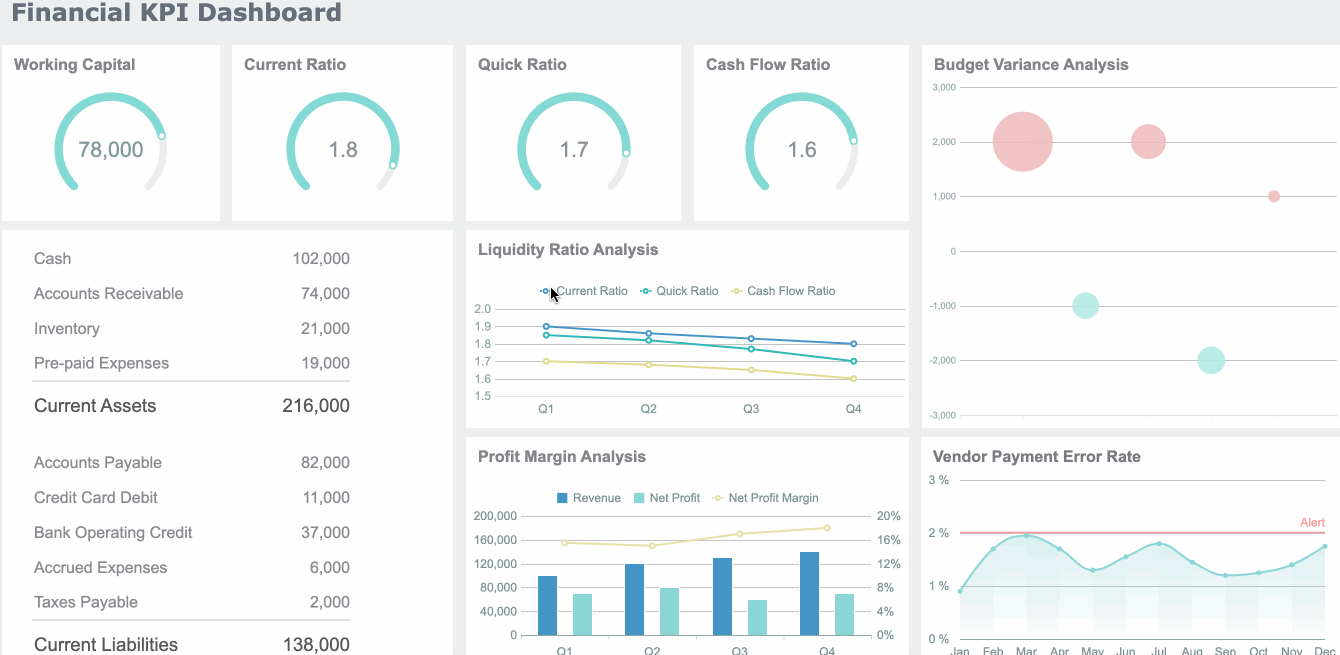
Key Metrics and Formulas to Include in a Variance Report
A monthly dashboard should not overwhelm users with every possible line item on the first screen. It should lead with a small set of metrics that explain plan vs performance clearly and consistently.
Core variance formulas every dashboard should show
These are the essential building blocks of any variance report:
Budget amount
The planned value for the reporting period. This is the benchmark you are measuring against.
Actual amount
The real recorded result from your accounting, ERP, or operational system.
Dollar variance
The absolute difference between actual and budget. Formula:Actual - Budget
Percentage variance
The difference expressed relative to budget. Formula:(Actual - Budget) / Budget
This distinction helps determine whether you need explanation only, or structural action.
Compare month-to-date and year-to-date views
A line item may look alarming in one month but normal in the year-to-date view. Or the opposite: a series of small monthly misses may reveal a growing structural problem.
A useful variance dashboard lets users switch between:
Monthly view
Quarter-to-date view
Year-to-date view
Prior period comparison
How to Build a Monthly Variance Report Step by Step
Building a reliable monthly variance report dashboard is part data design, part reporting design, and part operating discipline. The goal is not just to make the report look good. The goal is to make it reviewable, repeatable, and actionable.
Choose the right data sources and reporting period
Start with trusted source systems. Most organizations pull from a mix of:
ERP or accounting system for actuals
Budgeting or planning tool for budget values
Prior-period reports for historical comparison
Department-owned inputs for commentary or action status
Before building visuals, align on the reporting grain:
Monthly close period
Fiscal calendar
Department hierarchy
Cost center structure
Account mapping rules
If budget categories and actual account names do not match, the dashboard will create confusion immediately. Standardization comes first.
Consultant best practice
Create a controlled mapping table for:
Account code to reporting category
Department code to business owner
Expense type to fixed/variable classification
Exception threshold by account materiality
That one layer of governance prevents most reporting disputes later.
Design the dashboard layout for fast review
A good monthly dashboard follows the logic of an executive conversation.
Recommended layout
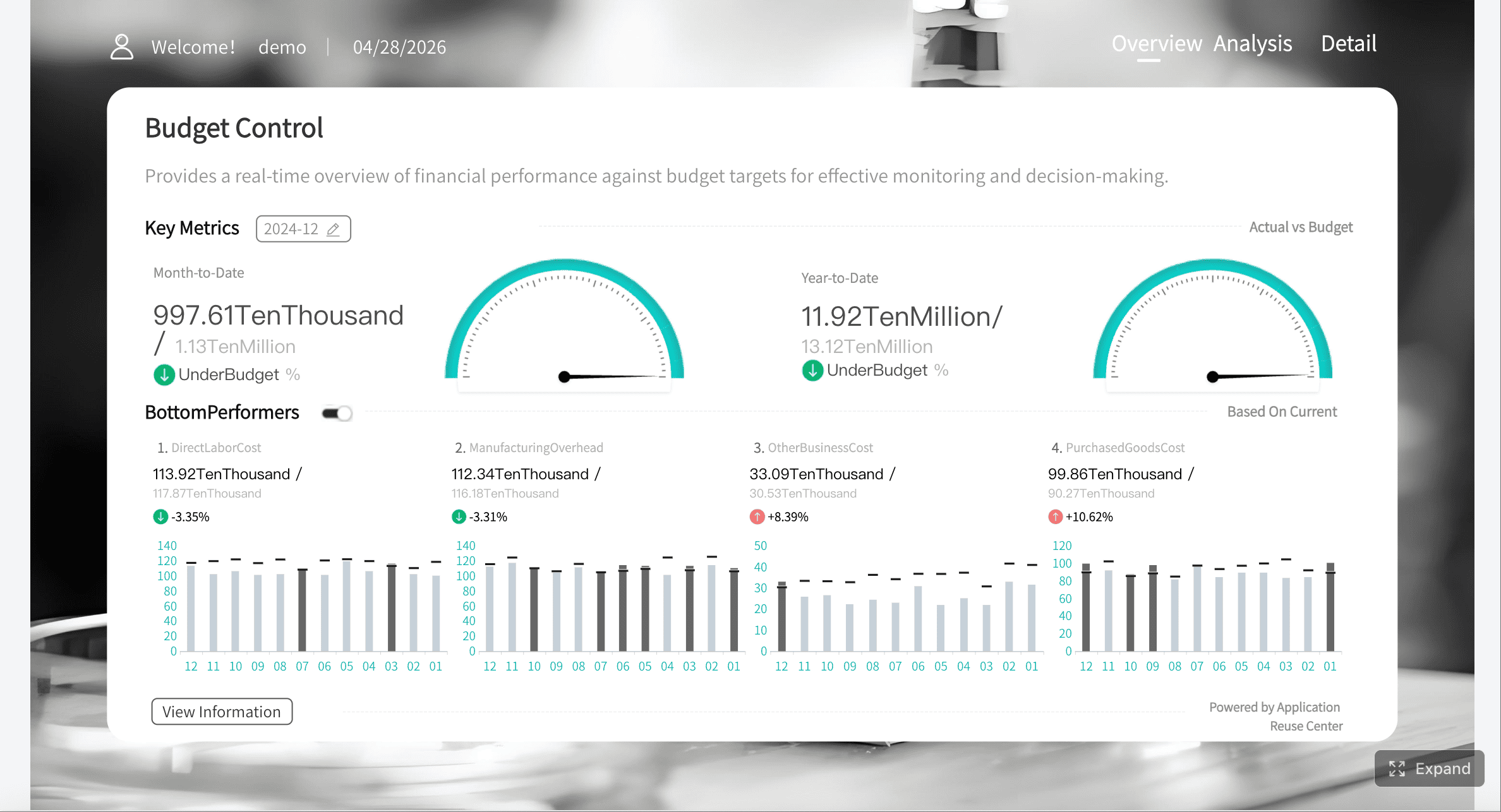
Top row: Summary KPI cards
Middle section: Revenue, expense, and margin trend charts
Lower section: Department or account-level variance table
Right or bottom panel: Commentary, owners, and action items
This creates a clear flow from summary to diagnosis.
Best visual elements to use
KPI cards for budget, actual, dollar variance, percentage variance
Bar charts for favorable vs unfavorable variance by department
Trend lines for month-to-month movement
Tables with conditional formatting for high-detail review
Waterfall charts for explaining margin or profit changes
Use color carefully. Most finance teams use:
Green for favorable
Red for unfavorable
Neutral gray for on-plan or immaterial items
Add filters, drill-downs, and commentary fields
Static reports slow review cycles because users must ask finance for follow-up slices. Interactive dashboards reduce that dependency.
Useful filters include:
Month
Quarter
Department
Cost center
Account category
Region or entity
Useful drill-down paths include:
Total expenses → department → account → transaction summary
Revenue → product line → region → customer segment
Margin variance → price → volume → cost driver
Commentary fields are equally important. Numbers without explanation do not drive action.
Include fields for:
Variance explanation
Business driver
Owner
Next action
Due date
Status
This turns the dashboard into a management workflow, not just a visual report.
Test the dashboard with real review scenarios
Do not launch based on aesthetics alone. Test whether the dashboard works in an actual monthly review.
Ask reviewers to complete real tasks:
Find the top three unfavorable expense variances
Identify whether a revenue miss is isolated or recurring
Trace a departmental overrun to account level
Add a note and assign an owner
Compare the current month with YTD performance
If users cannot answer those questions quickly, revise the layout. A strong dashboard reduces review friction and shortens meeting time.
Actionable best practices from the field
Here are four implementation practices that consistently improve monthly variance reporting:
Set a materiality rule before dashboard design
Decide what counts as an exception by dollar and percentage threshold. This prevents endless debate and keeps focus on impactful items.
Separate data preparation from presentation logic
Clean mappings, formulas, and business rules in the data layer first. Do not bury core calculations inside visual widgets only.
Assign ownership to every material variance
Each major deviation should have a named owner, explanation, and follow-up date. Accountability is what turns insight into action.
Review the dashboard with both finance and business managers
Finance ensures metric consistency. Business managers validate whether the structure matches how decisions are actually made.
How to Read and Write Variance Report That Drives Action
A variance report only becomes valuable when people can interpret it quickly and explain it clearly. That means asking better questions and writing sharper commentary.
Questions to ask when reviewing monthly variances
Every monthly review should move through three layers of analysis.
What changed versus plan
Start with the factual gap:
Which lines are above or below budget?
How large is the variance in dollars and percentage?
Is the issue concentrated in one department, account, or business unit?
Why the change happened
Then move to business drivers:
Did volume change?
Did pricing change?
Did timing shift across periods?
Was there a supplier, labor, or demand issue?
Did an assumption in the original budget prove wrong?
Is the variance temporary, structural, or timing-related
This is the most important management question.
Temporary: A short-term issue unlikely to repeat
Structural: A lasting shift that requires forecast or strategy changes
Timing-related: A movement between periods that may self-correct
This classification determines whether to monitor, reforecast, or intervene.
How to write concise explanations for stakeholders
Weak commentary is one of the most common reasons variance reporting fails. Notes like “higher than expected,” “timing issue,” or “under review” add little value.
Strong explanations do three things:
State the driver
Clarify the impact
Define the next step
Better variance commentary examples
Instead of this:
“Marketing expense over budget due to campaign activity.”
Write this:
“Marketing spend exceeded budget by 14% due to an unplanned product launch campaign in the East region. The campaign generated qualified pipeline above target, and the team will reallocate discretionary Q4 spend to offset the overrun.”
Instead of this:
“Revenue below budget.”
Write this:
“Revenue finished 6% below plan due to delayed enterprise deal closures in two accounts originally expected this month. Pipeline remains active, with revised close dates in the next period. Sales leadership has updated the forecast accordingly.”
Practical writing rules
Keep explanations to 2 to 4 sentences
Avoid jargon without business meaning
Do not speculate without evidence
Always include owner and next action where relevant
A dashboard with embedded commentary is far more useful than a table exported to email and explained in a separate slide deck.
Common Variance Report Mistakes and How to Improve Reporting
Most variance reports underperform for predictable reasons. The issue is rarely the formula. It is usually the reporting process, the structure, or the lack of context.
Problems that make variance reporting less useful
Too much detail without prioritization
If every line is treated as equally important, users stop seeing what matters. A report with 400 rows and no exception logic is not insight. It is document overload.
Inconsistent formulas or category mapping
Nothing erodes trust faster than finance and department leaders seeing different answers for the same question. If budget categories, account mappings, or variance formulas change between periods, the dashboard loses credibility.
Missing context behind major changes
A large variance without explanation forces extra meetings, email follow-ups, and manual investigation. Reports should reduce uncertainty, not create more of it.
Ways to improve and automate the reporting process
The best improvement path is to make variance reporting systematic, not heroic.
Automate data refreshes and recurring calculations
Manual copy-paste work introduces delay and error. Connect the dashboard directly to source systems so budget, actuals, and prior-period data refresh on schedule.
Use templates and review workflows
A standardized monthly template keeps format, calculations, and review expectations consistent across teams. This is especially important for multi-department or multi-entity organizations.
Set thresholds so teams focus on the most important exceptions
Threshold-based alerts, exception tables, and conditional formatting let stakeholders focus on the items that truly require action.
Add alerts, commentary workflows, and action tracking
That progression moves the organization from reactive reporting to disciplined performance management.
Build the Variance Report Faster With FineReport
Building this manually is complex; use FineReport to utilize ready-made templates and automate this entire workflow.
Get Ready-to-Use Dashboard Templates in Fine Gallery
For many teams, the pain is not understanding what a variance report should include. The pain is producing it every month without delays, broken formulas, version confusion, and spreadsheet cleanup. That is where FineReport becomes a strong fit for enterprise reporting teams.
FineReport enables teams to build monthly budget vs actual dashboards with:
Low-code report development in an Excel-like design environment
Dashboard design for combining KPI cards, charts, filters, and detailed tables in one management view
Multi-data-source integration for budget, actuals, and prior-period data
Drill-down and linked analysis so users can move from summary to root cause quickly
Complex report design support for enterprise finance layouts and cross-tab structures
Interactive reporting workflows with filtering, commentary, and reusable templates
Automated publishing and sharing so reports are delivered consistently across teams
The real advantage is not just speed of development. It is sustainability. Instead of rebuilding budget vs actual reports every month, you create a repeatable reporting application that updates with new data, supports stakeholder review, and scales across departments.
For enterprise decision-makers, that means:
Faster month-end review cycles
More consistent metric definitions
Better manager self-service
Less spreadsheet dependency
Stronger control over reporting standards
If your current monthly budget review still depends on disconnected files and manual explanation gathering, this is usually the point where automation pays for itself.
A variance report compares budgeted figures with actual results to show where performance is above or below plan. Its main purpose is to highlight meaningful gaps, explain why they happened, and support faster corrective action.
Dollar variance is calculated as Actual minus Budget. Percentage variance is calculated as Actual minus Budget divided by Budget, which helps show the size of the gap relative to the plan.
A useful dashboard should include budget, actuals, dollar variance, percentage variance, and clear KPIs such as revenue, operating expense, margin, and department-level performance. It should also surface material exceptions so managers can focus on the biggest issues first.
A favorable variance means actual results are better than plan, such as higher revenue or lower expenses. An unfavorable variance means results are worse than expected, but the business impact should always be reviewed in context.
FineReport can help teams combine budget and actual data into interactive dashboards with KPI cards, charts, and drill-down views. This makes monthly variance analysis faster, easier to update, and more actionable than static spreadsheets.
Product Trial
FineReport
Pixel-perfect reports · Interactive dashboards · Easy data entry · Digital twins