A sales 360 dashboard is built to solve one core business problem: revenue decisions are too often made from fragmented data, delayed reports, and conflicting definitions. For sales leaders, revenue operations teams, marketing managers, and customer success directors, that fragmentation creates missed targets, weak forecasts, slow handoffs, and unclear accountability.
A well-designed sales 360 dashboard gives the business a single, shared view of pipeline, bookings, conversion performance, customer movement, and revenue risk. Instead of asking five teams for five different reports, decision-makers can see what is happening across the revenue engine in one place and act faster.
Click To Try The Dashboard
What a Sales 360 Dashboard Actually Means
A sales 360 dashboard is a unified performance view that combines sales, marketing, customer success, and revenue data into one decision-ready interface. In plain language, it shows how revenue is created, where deals are getting stuck, which activities are driving outcomes, and where risks are emerging.
This is not just another reporting screen. It is a business operating layer for revenue teams.
A plain-language definition
At its simplest, a sales 360 dashboard answers questions like:
How much pipeline do we have, and is it enough to hit target?
Which segments, regions, and reps are driving revenue?
Where are leads dropping out of the funnel?
Are handoffs from marketing to sales working?
Are renewals, expansion, or churn trends affecting net revenue performance?
The value is in the unified revenue view. Teams stop managing isolated slices of the customer journey and start managing the full path from lead to closed-won to retention and growth.
Dashboard vs CRM report vs BI tool
This distinction matters because many teams think they already have a sales 360 dashboard when they only have partial reporting.
Dashboard
A visual, role-based view of metrics and trends.
Designed for monitoring, decision-making, and action.
Often combines multiple systems and perspectives in one place.
CRM report
Usually limited to CRM-resident data such as opportunities, accounts, contacts, and activities.
Useful for pipeline inspection and rep management.
Often lacks full marketing, billing, product, and customer success context.
BI tool
The technology layer that can connect, model, and visualize data from many systems.
More flexible and scalable than native operational reporting.
Enables the creation of a true sales 360 dashboard with governed definitions and cross-functional analysis.
In other words, a CRM report is one input. A BI platform is the engine. The sales 360 dashboard is the business-facing output.
Who uses it across the business
A strong sales 360 dashboard is not only for sales executives. It supports multiple operating roles:
Most organizations do not struggle because they lack data. They struggle because their data is spread across systems, interpreted differently by each team, and reported without a common operating model.
The common problems caused by disconnected data
When reporting is siloed, the same business can produce multiple versions of the truth:
Sales reports one pipeline number from the CRM
Marketing reports a different sourced pipeline figure
Finance tracks bookings and revenue from billing systems
Customer success measures retention from a separate platform
Leadership receives static summaries that are already outdated
This creates predictable operational pain:
Forecasts become unreliable
Pipeline reviews turn into definition debates
Handoffs between teams break down
Reps optimize for activity, not outcomes
Managers react too late to revenue risk
Executives lose confidence in reporting
Disconnected data also makes root-cause analysis much harder. If win rates fall, is it a lead quality issue, a pricing issue, a stage discipline issue, or a product fit issue? Without a unified view, teams are guessing.
How a unified revenue view improves operations
A sales 360 dashboard improves performance because it connects the full revenue system.
Forecasting
Brings together pipeline volume, stage progression, historical conversion, and sales cycle timing
Improves forecast confidence with current, consistent data
Pipeline visibility
Shows whether coverage is sufficient by segment, region, product, or owner
Highlights bottlenecks before they become end-of-quarter surprises
Cross-functional handoffs
Clarifies where leads become qualified opportunities
Makes it easier to see whether sales follow-up and customer onboarding are working
Decision-making
Gives leaders one place to evaluate trends, exceptions, and performance drivers
Supports faster action without chasing data across tools
Business questions the dashboard should answer
A practical sales 360 dashboard should help teams answer questions such as:
Do we have enough qualified pipeline to hit revenue targets?
Which funnel stages are creating the biggest drop-off?
Which segments or channels are producing the highest win rates?
Where are deals stalling, and for how long?
How is sales activity translating into pipeline creation and closed revenue?
Are renewals and expansions offsetting new logo pressure?
Which regions, teams, or products are underperforming?
What risks should leadership act on this week, not next month?
If a dashboard cannot help answer those questions quickly, it is not truly 360.
The best sales 360 dashboard balances lagging results with leading indicators. It should not only show what happened, but also what is likely to happen next.
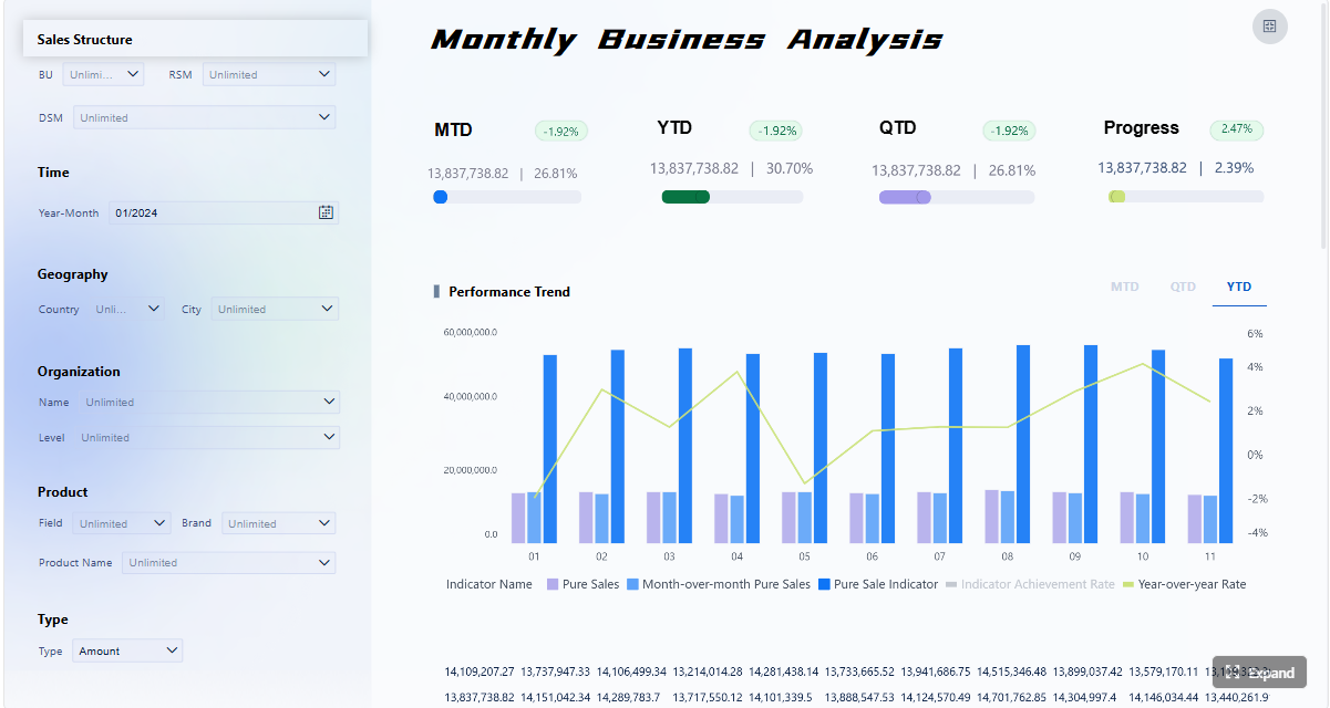
Revenue and pipeline metrics
These are the foundational metrics that most revenue teams need for planning, inspection, and forecasting.
Key Metrics (KPIs)
Pipeline Coverage: The ratio of open pipeline to target quota or revenue goal. Used to assess whether there is enough pipeline to support future attainment.
Win Rate: The percentage of qualified opportunities that close successfully. Indicates sales effectiveness and deal quality.
Conversion Rate: The percentage of records moving from one funnel stage to the next, such as lead to opportunity or opportunity to closed-won.
Average Deal Size: The average value of closed deals. Helps evaluate segment mix, pricing performance, and rep selling behavior.
Revenue by Segment: Revenue broken down by market, region, product, customer size, or channel. Essential for strategic prioritization.
Pipeline by Stage: Total opportunity value within each sales stage. Useful for identifying imbalance and bottlenecks.
Forecast vs Target: Projected revenue against quota or budget. Tracks attainment risk in real time.
Sales Cycle Length: Average time taken for a deal to progress from creation to close. Reveals efficiency and friction in the sales process.
Booked Revenue: Total closed business within a period. The core lagging indicator of sales output.
Renewal and Expansion Revenue: Revenue from existing customers through renewals, upsells, or cross-sells. Critical for full revenue visibility.
What to include in the revenue view
A strong revenue section of the dashboard should typically show:
Total pipeline value
Pipeline coverage by team and segment
Forecast category distribution
Win rate trends over time
Average deal size trends
Revenue by region, product, and customer segment
Closed-won vs closed-lost analysis
Renewal and expansion contribution
This allows leadership to move beyond isolated bookings numbers and manage the full revenue flow.
Revenue outcomes lag reality. Activity and funnel metrics help teams see change earlier.
Leading indicators that matter
A sales 360 dashboard should include leading indicators such as:
Number of meetings booked
Outreach volume by rep or team
Email or call response rates
Lead follow-up speed
Stage movement counts
Opportunity aging
Sales cycle length by segment
Demo-to-opportunity conversion
Opportunity-to-close progression
Rep activity tied to pipeline creation
These metrics are important because they show whether execution is strengthening or weakening before revenue results fully appear.
How to balance leading and lagging indicators
A common mistake is to flood the dashboard with activity numbers that do not connect to outcomes. Activity should always be interpreted in context.
For example:
High outreach with low response may indicate targeting or messaging issues
High meeting volume with poor opportunity conversion may point to weak qualification
Long sales cycles with falling win rates may signal pricing friction or delayed approvals
Strong top-of-funnel volume with weak pipeline creation may reveal lead quality problems
The dashboard should help users connect behavior to business impact, not just count effort.
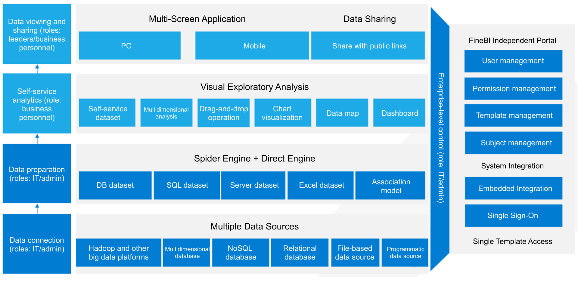
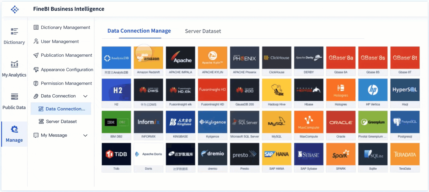
Systems that feed the dashboard
A real sales 360 dashboard requires multiple data sources. If the dashboard only uses one operational system, it will almost always miss important revenue context.
Support systems: Ticket trends, escalations, customer friction indicators
Data warehouse or BI layer: Modeled and standardized data for cross-functional analysis
Why source integration matters
The quality of a sales 360 dashboard depends less on chart design and more on data integration and governance. A clean interface built on inconsistent source logic will mislead users faster than a spreadsheet ever could.
The most effective dashboards are not designed around available charts. They are designed around decisions.
Step 1: Define the business questions and audience
Start with the decisions the dashboard must support, then design backward.
Ask the right planning questions
Before building anything, clarify:
Who will use the dashboard?
What decisions should it support daily, weekly, monthly, and quarterly?
Which metrics trigger action?
What revenue risks need early warning?
What level of detail does each audience need?
Different users need different views:
Executives need summary performance, forecast confidence, and strategic risk
Managers need team performance, stage bottlenecks, and rep-level insight
Frontline teams need actionable activity, pipeline movement, and account focus
If one dashboard tries to serve everyone equally, it usually serves no one well.
Best practice
Design role-based pages or views under a common metric framework. This keeps definitions aligned while giving each audience the level of depth they need.
Step 2: Standardize definitions and clean the data
This is the step most teams underestimate. It is also the step that determines whether stakeholders trust the dashboard.
Align on metric definitions
You need formal agreement on core revenue definitions such as:
What counts as pipeline?
When does a lead become qualified?
How is sourced pipeline attributed?
What defines a renewal vs expansion?
Which stage date is used for conversion analysis?
How are split ownership and overlays handled?
Which source is authoritative for booked revenue?
Without this alignment, every report review becomes a debate.
Clean the data before visualization
Focus on practical data quality controls:
Standardize lifecycle stages
Resolve duplicate accounts and contacts
Enforce ownership rules
Audit close dates and opportunity amounts
Normalize segment and region labels
Validate campaign and source tracking
Check for missing or stale activity data
Best practice
Create a simple metric dictionary and ownership model. Every KPI should have:
A business definition
A calculation method
A system of record
A data owner
A refresh cadence
That governance layer is what turns a dashboard into a trusted operating asset.
Step 3: Connect sources and design the dashboard layout
Once the business logic is clear, integrate the systems and build the user experience.
Connect the right systems
At minimum, most organizations should connect:
CRM data for opportunity and account visibility
Marketing automation for lead and campaign context
Billing or finance data for closed revenue validation
Customer success or product data for post-sale visibility
The goal is not to connect everything at once. The goal is to connect the systems required to answer priority business questions accurately.
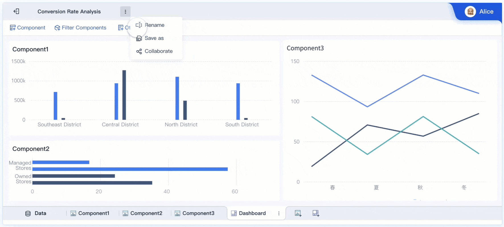
Organize the dashboard for fast interpretation
A practical layout often includes:
Executive summary
Revenue vs target
Forecast outlook
Pipeline coverage
Win rate trend
Key risks and exceptions
Pipeline and funnel view
Pipeline by stage
Conversion by stage
Opportunity aging
Segment-level performance
Stage movement trends
Activity and productivity view
Meetings, outreach, and response
Follow-up speed
Rep-level activity to pipeline relationship
Sales cycle trends
Customer and expansion view
Renewal pipeline
Expansion opportunities
Health signals
Churn exposure
Best practice
Use visual hierarchy carefully. Put the highest-value business indicators at the top, then allow users to drill into root causes. A sales 360 dashboard should reduce cognitive load, not increase it.
Step 4: Launch, validate, and improve over time
A dashboard launch is the start of the operating cycle, not the end of the project.
Validate before broad rollout
Run a structured validation process:
Compare dashboard outputs against trusted reports or source systems
Review edge cases such as split credits, reopened opportunities, and stage reversals
Test filters across segments, regions, and time ranges
Confirm that executive, manager, and frontline views all answer their intended questions
Document known limitations before release
Build stakeholder feedback into the rollout
After launch, gather feedback from each user group:
Which metrics do they use most?
Which visualizations are unclear?
Where do they still export data manually?
What decisions are still difficult to make?
Best practice
Set a quarterly review process for dashboard logic, usability, and adoption. Revenue processes evolve, and the dashboard must evolve with them.
Common Mistakes to Avoid
Even well-funded dashboard projects fail when they focus on visibility without usability.
1. Tracking too many metrics without clear actions
More metrics do not create more insight. If a KPI does not support a decision or trigger action, it probably does not belong on the main dashboard.
Consultant advice: Prioritize a focused metric set that maps directly to revenue outcomes, early warnings, and management actions.
2. Mixing leading and lagging indicators without context
Showing meetings, emails, win rate, and revenue on one page is not enough. Users need to understand how those indicators relate.
Consultant advice: Group metrics by business logic. Separate activity, funnel progression, and revenue outcomes while preserving drill paths between them.
3. Relying on inconsistent source data or unclear ownership
A visually polished dashboard built on broken definitions will lose credibility quickly.
Consultant advice: Assign clear data owners and define a system of record for each metric before launch.
4. Building a dashboard once and never revisiting it
Revenue models change. Segments change. Sales motions change. Your dashboard should too.
Consultant advice: Treat dashboard management as an operating discipline with regular audits, stakeholder reviews, and enhancement cycles.
How to Measure Success After Launch
The success of a sales 360 dashboard is not measured by whether it exists. It is measured by whether it improves how the business runs.
Operational success metrics to track
After launch, evaluate performance across four dimensions:
Adoption: Are leaders, managers, and frontline teams using the dashboard regularly?
Accuracy: Do users trust the numbers, and do outputs align with validated source records?
Decision speed: Are pipeline reviews, forecast calls, and handoff decisions faster and more consistent?
Cross-functional alignment: Are sales, marketing, finance, and customer success using the same definitions and metrics?
Signs the dashboard is delivering real value
A strong sales 360 dashboard should lead to visible improvements such as:
Higher confidence in forecasts
Earlier identification of revenue risk
Faster response to stage bottlenecks
Better alignment between lead generation and pipeline creation
Clearer accountability across team handoffs
Reduced manual reporting effort
More strategic use of manager review time
Set a review cadence
To keep performance high, establish a recurring operating rhythm:
Weekly: review exceptions, anomalies, and urgent pipeline shifts
Monthly: validate KPI trends and business relevance
Quarterly: audit definitions, layout, user feedback, and source reliability
That cadence helps protect trust while keeping the dashboard aligned with business priorities.
Build the Methodology, Then Use FineBI to Scale It
The methodology is straightforward: define the decisions, standardize the metrics, integrate the right systems, and continuously improve the dashboard. The challenge is execution. Building a true sales 360 dashboard manually is often slow, complex, and hard to maintain across changing revenue processes.
This is where FineBI becomes a practical advantage.
Instead of stitching together static reports and manually maintaining spreadsheet logic, teams can use FineBI to centralize data, standardize KPI definitions, and deliver role-based dashboards at scale. For enterprise environments, that means faster deployment, stronger governance, and far less reporting friction.
Why FineBI fits this use case
FineBI helps organizations:
Connect multiple revenue data sources in one BI environment
Build unified dashboards for executives, managers, and frontline teams
Standardize metric logic across departments
Reduce manual reporting and version-control issues
Use ready-made templates to accelerate rollout
Support ongoing optimization as reporting needs evolve
The practical takeaway
If your team is still managing revenue visibility through disconnected CRM reports, spreadsheets, and ad hoc exports, the cost is not just inefficiency. It is slower decisions, weaker forecasts, and reduced trust in the numbers.
Building this manually is complex; use FineBI to utilize ready-made templates and automate this entire workflow. That approach allows your team to move from fragmented reporting to a scalable, governed, and decision-ready sales 360 dashboard that supports real revenue growth.
FAQs
A sales 360 dashboard is a unified view of revenue performance that combines sales, marketing, customer success, and related business data. It helps teams see pipeline, conversions, bookings, and risks in one place.
A CRM report usually focuses only on data stored inside the CRM, such as opportunities and activities. A sales 360 dashboard brings together multiple systems to give a broader, decision-ready revenue view.
Core metrics often include pipeline coverage, stage conversion rates, win rates, bookings, forecast status, deal velocity, and retention or churn signals. The exact mix should match the goals of sales, marketing, and customer success teams.
Sales leaders, revenue operations, marketing managers, customer success teams, and executives all benefit from it. Each group uses the same trusted data to monitor performance and make faster decisions.
A unified revenue view reduces conflicting numbers and makes it easier to spot bottlenecks, stalled deals, and coverage gaps early. This improves forecast confidence and helps teams act before revenue targets are missed.
Product Trial
FineReport
Pixel-perfect reports · Interactive dashboards · Easy data entry · Digital twins