A campaign performance dashboard is not just a reporting screen. For enterprise marketing teams, it is the operating layer that turns fragmented campaign data into budget decisions, channel actions, and executive alignment.
If you manage campaigns across multiple regions, product lines, agencies, and platforms, the pain is familiar: data lives in too many systems, definitions vary by team, and leadership wants fast answers on pipeline, ROI, and what to do next. A well-built dashboard solves that by creating one trusted view of performance for every stakeholder who needs to act on it.
This guide explains how to build a campaign performance dashboard that enterprise teams can actually use to monitor campaigns, compare results, and optimize investment with confidence.
Click To Try The Dashboard
What a campaign performance dashboard should do for enterprise marketing teams
At the enterprise level, a dashboard has one job: help teams make better decisions faster. That means it must do more than display clicks and spend. It should connect campaign activity to business outcomes across channels, regions, and stakeholders.
A strong campaign performance dashboard gives marketing leaders a unified view of campaign health while also giving operators the detail they need to improve performance in-flight. It should reduce reporting friction, remove ambiguity, and create a shared understanding of what success looks like.
Turn campaign data into decisions across regions, channels, and stakeholders
Enterprise marketing teams rarely run simple campaigns. They manage paid media, email, events, content syndication, ABM, web experiences, and partner activity across multiple markets. Without a centralized dashboard, performance reviews become manual, inconsistent, and slow.
A dashboard should help answer questions like:
Which campaigns are generating the highest pipeline contribution?
Which channels are efficient but low scale?
Where is spend rising without proportional return?
Which regions or segments are underperforming?
What actions should the team take this week?
This is the difference between passive reporting and active performance management.
Clarify the difference between operational reporting, executive summaries, and strategic performance views
One of the biggest enterprise mistakes is trying to force every user into a single dashboard view. Different stakeholders need different levels of abstraction.
Operational reporting supports day-to-day execution. Campaign managers need detailed metrics, recent changes, pacing, creative performance, and channel-level comparisons.
Executive summaries are designed for leadership. CMOs, VPs, and finance stakeholders need a concise view of spend, pipeline, revenue influence, ROI, and notable exceptions.
Strategic performance views help marketing operations, demand generation leaders, and regional heads understand trends over time. These views support planning, forecasting, channel mix decisions, and budget allocation.
If your dashboard tries to serve all three audiences in one flat layout, it usually serves none of them well.
Identify the business questions the dashboard should answer before any design work begins
Before selecting charts or metrics, define the decisions the dashboard must support. This should happen before design and before data integration.
Start with business questions such as:
Are campaigns meeting their stated objectives by funnel stage?
Which channels drive qualified pipeline, not just engagement?
How does performance vary by audience, geography, or product line?
Are we investing in the right campaigns based on current efficiency?
Where should budget shift next month?
What leading indicators suggest future pipeline strength or weakness?
If those questions are vague, the dashboard will become bloated. If those questions are specific, the design becomes much easier.
Choose the KPIs, dimensions, and data sources that matter most
A campaign performance dashboard is only as useful as the logic behind it. Enterprise teams need a disciplined KPI model, standardized dimensions, and validated source systems. This is where many dashboards either become decision-ready or break under complexity.
Align metrics to campaign goals and funnel stages
Different campaigns serve different purposes. Brand awareness campaigns should not be judged by the same metrics as lead generation or expansion campaigns. Start by mapping metrics to the campaign objective and the buying stage they are meant to influence.
Efficiency analysis: CPC, CPL, CPA, cost per opportunity, cost per revenue dollar
Separate leading indicators from lagging outcomes. This is critical in enterprise environments where revenue may take months to materialize. Leading indicators help teams react early. Lagging metrics confirm business impact later.
Standardize dimensions for consistent reporting
Metrics are only comparable when the dimensions behind them are standardized. If one region uses different naming for channels or campaign types than another, your dashboard will produce misleading comparisons.
Use a shared dimension framework such as:
Channel
Campaign
Region
Country
Business unit
Product line
Audience
Industry
Segment
Owner
Time period
Funnel stage
This requires agreed naming conventions and governed metric definitions. For example, everyone should understand exactly how a “marketing qualified lead” or “influenced opportunity” is defined.
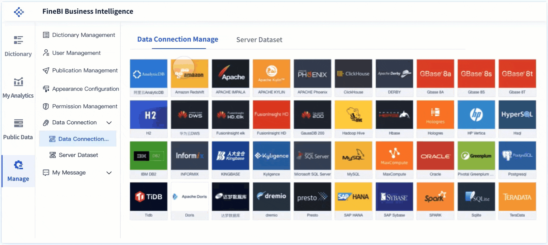
Audit the systems that feed the dashboard
Most enterprise campaign dashboards pull from multiple systems, and each has limitations. Before building, document what each source contributes and where data quality risks exist.
Common sources include:
CRM platforms
Ad platforms
Marketing automation systems
Web analytics tools
Data warehouses
Existing BI environments
Offline campaign tracking files
Sales attribution platforms
During the audit, look for these common issues:
Missing campaign IDs across systems
Duplicate leads or contacts
Inconsistent UTM usage
Delayed spend data
Weak attribution coverage
Unclear source ownership
Different refresh schedules across platforms
This step prevents expensive redesign later.
Key Metrics (KPIs) for an enterprise campaign performance dashboard
Below is a practical KPI set that works well for most enterprise marketing teams. Not every dashboard needs every metric, but every metric should be tied to a clear decision.
Spend: Total campaign investment over a defined period. Used for budget pacing and ROI analysis.
Impressions: Total number of ad or content views. Indicates reach and visibility.
Reach: Unique users exposed to the campaign. Helps assess audience penetration.
Clicks: Total interactions driving traffic. Useful for engagement and channel comparison.
Click-through rate (CTR): Clicks divided by impressions. Measures message and creative relevance.
Cost per click (CPC): Spend divided by clicks. Indicates traffic acquisition efficiency.
Leads or conversions: Total captured responses such as form fills, sign-ups, or registrations.
Conversion rate: Conversions divided by visits or clicks. Measures landing page and offer effectiveness.
Cost per lead (CPL): Spend divided by leads. Tracks top-of-funnel acquisition efficiency.
Marketing qualified leads (MQLs): Leads that meet defined marketing quality criteria.
Design the dashboard structure for different stakeholders
Enterprise dashboard design should follow a decision hierarchy, not a visual preference. The best dashboards feel simple because the design work was strategic.
Build views for executives, campaign managers, and channel owners
You will usually need at least three dashboard layers.
Executive view
This view should be concise and outcome-focused. It typically includes:
Total spend
Pipeline generated
Revenue sourced or influenced
ROI or ROAS
Top-performing channels
Underperforming regions or business units
Trend versus prior period or target
Executives do not need twenty charts. They need fast answers and confidence in the numbers.
Campaign manager view
This is where daily optimization happens. It should include:
Campaign pacing
Spend versus budget
Conversion trends
Audience and region filters
Creative or offer comparison
Funnel progression
Alerting for anomalies
This view should make weekly action planning obvious.
Channel owner view
Channel specialists need deep but focused analysis. Paid media managers, email marketers, and web teams should be able to isolate performance drivers within their own domains while still aligning to shared KPI definitions.
Organize the layout around decisions, not just metrics
A common design mistake is placing metrics in random sections based on source system or chart type. Instead, structure the dashboard as a performance story.
A practical layout often follows this sequence:
Investment: spend, budget pacing, media allocation
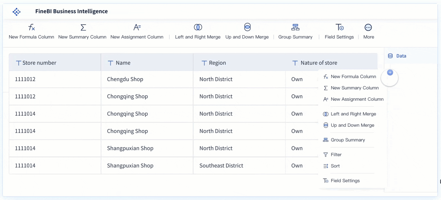
Build the dashboard with clean data and practical reporting logic
This is the stage where dashboard quality is won or lost. Attractive charts cannot compensate for weak data modeling or unclear calculations.
Create a reliable data model
Your campaign performance dashboard should sit on a consistent reporting layer that combines campaign metadata, cost data, engagement activity, conversion outcomes, CRM records, and revenue signals.
In practice, that means:
Matching campaigns across systems using shared IDs
Resolving duplicate lead and contact records
Unifying date logic
Standardizing campaign names
Mapping source-specific metrics into enterprise definitions
Separating raw ingestion from curated reporting tables
If your enterprise has multiple regions or business units, build the model so local flexibility does not break global comparability.
Set reporting rules and calculations
Every enterprise dashboard needs clear rules for how metrics are calculated. If these rules are not documented, debates will dominate every review meeting.
Critical rules typically include:
Attribution window definitions
First-touch, last-touch, multi-touch, or weighted attribution model
Conversion logic
Spend allocation by campaign and time period
Currency conversion rules
Benchmarks and target logic
Exclusion rules for test campaigns or internal traffic
When stakeholders understand the formulas, trust rises. When formulas are hidden, dashboard adoption falls.
Make reporting easy to maintain
Enterprise dashboards fail when they depend on heroic manual effort. Build for maintainability from the beginning.
Focus on these practical controls:
Automated data refresh schedules
Data quality checks
Exception handling for failed loads
Version-controlled metric definitions
Ownership assignments for validation
Governance for adding new metrics or dimensions
A dashboard should become easier to run over time, not harder.
The real value of a campaign performance dashboard comes after launch. It should not function as a passive report. It should become the control center for campaign optimization, budget shifts, experimentation, and planning.
Use the dashboard to spot trends and performance gaps
Once data is structured correctly, the dashboard should help teams identify patterns quickly.
Look for comparisons such as:
Campaign versus campaign
Channel versus channel
Audience versus audience
Geography versus geography
Creative versus creative
Current period versus prior period
Actuals versus target or benchmark
This makes it easier to find issues such as:
Strong click volume but weak downstream conversion
High spend regions with low pipeline creation
Creative fatigue in certain channels
Segment-specific underperformance
Campaigns that are efficient but underfunded
The best enterprise teams use these insights to reallocate budget while campaigns are still live.
Establish a review cadence and decision process
A dashboard only drives value when paired with a decision routine. I typically recommend a two-level cadence for enterprise teams.
Weekly operational reviews
Use the dashboard to review:
Spend pacing
Conversion movement
Channel efficiency
Performance anomalies
Immediate action items
Each action should have an owner, a due date, and a success metric.
Monthly strategic reviews
Use the dashboard to assess:
Pipeline and revenue contribution
Budget allocation effectiveness
Regional performance trends
Forecast updates
Experiment results
Recommendations for next-cycle planning
This rhythm turns reporting into an operating system.
Improve the dashboard over time
Your first version will not be perfect. Nor should it be. Enterprise marketing needs evolve with campaign strategy, attribution maturity, leadership priorities, and platform changes.
Continuously improve the dashboard by gathering feedback on:
Missing metrics
Confusing filters
Unused visualizations
Data trust issues
Slow page performance
New segmentation needs
Make updates based on decision value, not stakeholder preference alone. If a feature does not improve actionability, it should not be prioritized.
Common mistakes to avoid when building an enterprise dashboard
Most failed dashboards do not fail because of visualization tools. They fail because the design logic is weak or governance is missing.
Avoid these common mistakes:
Tracking too many metrics without tying them to decisions: More metrics do not create more insight. They create noise.
Mixing inconsistent data sources without clear definitions or governance: If source systems disagree and definitions are unclear, trust collapses.
Designing one view for everyone instead of tailoring the experience by role: Executives, operators, and analysts do not need the same interface.
Treating the dashboard as a static report rather than a tool for ongoing optimization: If there is no review cadence or action process, the dashboard becomes shelfware.
A good rule: every section on the dashboard should answer a real business question and support a real operational choice.
Build faster and scale smarter with FineBI
Building an enterprise-grade campaign performance dashboard manually is possible, but it is rarely efficient. You need reliable data integration, reusable templates, governed KPI logic, stakeholder-specific views, and ongoing maintenance. That combination becomes complex fast.
This is where FineBI becomes the practical choice.
With FineBI, enterprise marketing teams can use ready-made templates, connect data from multiple business systems, standardize reporting logic, and automate the entire workflow from refresh to visualization. Instead of spending months stitching together spreadsheets, ad platform exports, CRM reports, and custom BI logic, teams can move faster with a scalable framework.
Build dashboards for executives, campaign managers, and channel owners
Blend campaign, cost, engagement, and revenue data in one place
Reuse templates instead of starting from a blank page
Automate refreshes and reduce manual reporting effort
Create governed KPI definitions across regions and teams
Support drill-down analysis for optimization and planning
The strategic point is simple: building this manually is complex; use FineBI to utilize ready-made templates and automate this entire workflow.
For enterprise teams under pressure to prove marketing impact, improve data trust, and accelerate decision-making, that shift is not just convenient. It is operationally necessary.
FAQs
It should include KPIs tied to campaign goals, standardized dimensions like region and channel, and views tailored for operators, executives, and strategic planners. The dashboard should connect activity metrics to pipeline, revenue, and ROI so teams can make decisions quickly.
Start with the business questions the dashboard needs to answer, then map metrics to campaign objectives and funnel stages. Use both leading indicators such as CTR or conversions and lagging outcomes such as pipeline or revenue.
Standardization ensures metrics can be compared accurately across teams, regions, and channels. Without shared definitions and naming conventions, the dashboard can create confusion instead of clarity.
It highlights which campaigns and channels are driving efficient results and which ones are consuming spend without enough return. That makes it easier to shift budget toward stronger performers and respond faster to underperformance.
An executive dashboard focuses on high-level outcomes such as spend, pipeline, ROI, and major exceptions. An operational dashboard gives campaign managers more granular detail on pacing, channel performance, and actions needed in-flight.
Product Trial
FineReport
Pixel-perfect reports · Interactive dashboards · Easy data entry · Digital twins