A saas kpi dashboard is not a reporting vanity project. It is a decision system for executives who need to answer three questions fast: Are we growing, are we retaining value, and are we doing it efficiently?
For CEOs, CFOs, CROs, and operations leaders, the pain is familiar. Metrics live across billing systems, CRM platforms, product analytics, spreadsheets, and finance decks. Leadership meetings get stuck debating numbers instead of making decisions. Dashboards become overloaded, outdated, or ignored because they were built around available data rather than executive priorities.
A useful executive dashboard fixes that. It compresses the company’s operating reality into one trusted view: what changed, why it changed, and what action is needed now. This guide explains how to build that dashboard, which 12 metrics matter most, how to adapt them to your business model, and how to avoid the common mistakes that make dashboards unusable.
Click To Try The Dashboard
What Makes a SaaS KPI Dashboard Useful to Executives
An executive-grade saas kpi dashboard exists to improve decision speed, increase trend visibility, and create accountability across functions. It is not designed to replace detailed analysis. It is designed to tell leadership where to focus.
The dashboard’s purpose: fast decision-making, trend visibility, and accountability
Executives do not need a screen full of raw operational data. They need a compact view of business performance that helps them:
Spot growth acceleration or slowdown early
Understand whether retention is strengthening or weakening
Evaluate go-to-market efficiency
See if product usage supports renewal and expansion
Hold owners accountable to targets and corrective actions
A strong dashboard reduces meeting friction. Instead of asking, “What happened?” executives can move directly to, “What should we do next?”
How an executive view differs from dashboards built for operators or analysts
Operators need workflow detail. Analysts need diagnostic depth. Executives need signal clarity.
Few metrics, high relevance: only the numbers tied to leadership decisions
Time-based trend views: month-over-month, quarter-over-quarter, and year-over-year comparisons
Exception highlighting: misses, spikes, threshold breaches, or unusual segment changes
Cross-functional synthesis: finance, sales, customer success, and product in one view
Commentary layer: short explanation of what changed and what action is planned
By contrast, operator dashboards usually include task queues, campaign-level metrics, rep performance, ticket backlog, or cohort analysis. Those are essential, but they belong one layer below the executive summary.
Clarify the difference between metrics, KPIs, and supporting context
This distinction matters because many dashboards fail by mixing all three without hierarchy.
Metric: any measurable data point, such as trial signups or support tickets
KPI: a metric tied directly to a strategic business objective, such as NRR or CAC payback period
Supporting context: information that explains KPI movement, such as pricing changes, segment mix, sales cycle length, or release adoption
Executives should see the KPI first, then supporting context only where it explains the movement. If every data point gets equal visual weight, the dashboard becomes noise.
Outline the business questions leaders want answered at a glance
A well-built saas kpi dashboard should answer these questions in under a minute:
Are recurring revenue and growth trending up or down?
Are we retaining and expanding existing customers effectively?
Is customer acquisition becoming more or less efficient?
Are product engagement patterns supporting long-term retention?
Where are the biggest risks by segment, plan, channel, or region?
Which metric is off target and who owns the response?
The 12 Metrics Every SaaS KPI Dashboard Should Prioritize
The best dashboards do not track everything. They prioritize the KPIs that reveal the health of the subscription engine. Below are the 12 metrics most executive teams should include.
Key Metrics (KPIs)
Monthly Recurring Revenue (MRR): The monthly subscription revenue normalized into a recurring base. Best for tracking near-term momentum.
Annual Recurring Revenue (ARR): MRR annualized, or recurring subscription revenue on a yearly basis. Useful for strategic planning and investor communication.
Revenue Growth Rate: The percentage increase or decrease in recurring revenue over time. Shows growth speed, not just size.
Net Revenue Retention (NRR): The percentage of recurring revenue retained from existing customers after expansion, contraction, and churn. A core measure of retention quality.
Customer Acquisition Cost (CAC): The average sales and marketing cost required to acquire a new customer. Indicates go-to-market efficiency.
Customer Lifetime Value (LTV): The projected revenue or gross profit generated over a customer’s lifespan. Helps assess acquisition economics.
Churn Rate: The percentage of customers or recurring revenue lost in a period. Signals retention risk.
Customer Retention Rate: The percentage of customers retained over a defined period. Complements churn with a positive framing.
CAC Payback Period: The number of months required to recover acquisition cost from gross profit or contribution margin. Critical for cash efficiency.
Average Revenue per Account (ARPA): Average recurring revenue per customer account. Useful for pricing, segmentation, and expansion analysis.
Product Engagement or Active Usage: The level of ongoing customer activity in the product. Often the best leading indicator of retention.
Conversion Rate Across the Funnel: The rate at which prospects move from lead to trial, demo, opportunity, win, or activation. Exposes pipeline efficiency and bottlenecks.
Growth and revenue metrics
Monthly recurring revenue (MRR)
MRR is the heartbeat metric for most SaaS companies. It shows the recurring revenue base leadership can count on each month and helps isolate subscription performance from one-time revenue.
Executives use MRR to monitor:
New business momentum
Upsell and expansion impact
Churn pressure
Short-term forecast confidence
For the dashboard, show:
Current MRR
12-month trend line
Net new MRR components: new, expansion, contraction, churn
Annual recurring revenue (ARR)
ARR matters most when the business sells annual contracts, serves mid-market or enterprise customers, or reports heavily to investors and boards. It frames scale more clearly than MRR in strategic discussions.
ARR is especially useful for:
Annual planning
Board reporting
Headcount and capacity decisions
Long-range revenue forecasting
Display ARR with a trailing trend and, if relevant, split by segment such as SMB, mid-market, and enterprise.
Revenue growth rate
Revenue growth rate answers a vital executive question: is the business speeding up or slowing down?
A company can have strong ARR and still have a weakening growth rate. That is why this KPI belongs on the dashboard alongside the absolute revenue number.
Use it to assess:
Market demand strength
Sales execution changes
Pricing impact
Growth deceleration risk
A simple month-over-month and year-over-year view is usually enough for the top-level dashboard.
Net revenue retention (NRR)
NRR is one of the most important metrics in any saas kpi dashboard because it reveals how much value existing customers retain and expand over time.
High NRR tells executives that the product is sticky, accounts are growing, and the business can compound efficiently. Low NRR signals hidden weakness even if top-line acquisition looks healthy.
CAC tells leaders how expensive growth has become. If CAC rises without corresponding improvement in ARPA, LTV, or retention, the business may be scaling inefficiently.
CAC should always be defined consistently. Teams often disagree on whether to include:
Fully loaded sales compensation
Brand marketing
Partner costs
Onboarding costs
Standardize the definition early, or the dashboard will lose trust.
Customer lifetime value (LTV)
LTV estimates how much value a customer generates over the relationship. It is useful, but only if the assumptions are sound. Poor churn estimates or margin exclusions can make LTV misleading.
Executives use LTV to evaluate:
Pricing health
Customer quality by acquisition channel
Segment attractiveness
Sustainable acquisition limits
Treat LTV as directional unless your data discipline is strong.
Churn rate
Churn rate remains one of the clearest indicators of SaaS health. It can be measured by customer count or revenue. For executive use, revenue churn is often more strategically useful, but logo churn still matters for understanding segment instability.
Show churn in a way that highlights:
Trend over time
Segment concentration
Cohort behavior
Relationship to product engagement and support load
Customer retention rate
Retention rate complements churn by showing the percentage of customers that stay. For executive reporting, this KPI is often easier to communicate in board settings and leadership summaries.
CAC payback period shows how quickly the company earns back customer acquisition spend. This is a critical cash-efficiency KPI, especially in growth-stage SaaS.
It is highly actionable for leadership because it affects:
Hiring pace
Sales model viability
Budget allocation
Burn and runway planning
If payback is too long, growth may look strong on paper but be financially fragile.
Average revenue per account (ARPA)
ARPA helps leadership understand account quality, pricing effectiveness, and upsell opportunity. Rising ARPA can offset rising CAC. Falling ARPA can indicate discounting, lower-value customer mix, or weak packaging.
Track ARPA by:
Acquisition channel
Segment
Pricing plan
Geography
Product engagement or active usage
Revenue metrics are lagging indicators. Product engagement is often the leading indicator executives need to prevent retention problems before renewal dates arrive.
Useful engagement measures include:
Weekly active accounts
Core feature adoption
Seat utilization
Time to first value
Usage depth by segment
The right engagement KPI depends on your product. A collaboration tool, analytics platform, and workflow app will each need a different definition of healthy use.
Conversion rate across the funnel
This KPI connects go-to-market effort to actual outcomes. It helps executives see whether issues are caused by weak lead quality, poor sales execution, onboarding friction, or product activation problems.
A strong dashboard will show funnel conversion at the highest-value stages, such as:
How to Choose the Right KPIs for Your Stage, Model, and Team
Not every SaaS company should weight these 12 metrics equally. The right saas kpi dashboard depends on stage, GTM model, and operating reality.
Match KPIs to company stage
Early-stage SaaS: prove demand, activation, and early retention
At early stage, leadership should resist overbuilding financial reporting. The priority is proving the market wants the product and users reach value quickly enough to stay.
Hybrid SaaS requires both views, but the dashboard should still stay simple. A common mistake is combining every KPI from every motion into one cluttered page.
The core KPIs are similar, but their interpretation differs based on contract structure and buying behavior.
Contract length, pricing model, and expansion motion considerations
Your dashboard should reflect the mechanics of how revenue is earned.
Consider these variables:
Monthly vs. annual contracts
Seat-based vs. usage-based pricing
Fixed plans vs. custom enterprise pricing
Upsell-driven vs. cross-sell-driven expansion
For example, a usage-based product should not rely on simple seat utilization as the main product health KPI. A long-contract enterprise SaaS should not over-index on monthly logo churn without renewal context.
Avoid common KPI selection mistakes
The wrong KPI set creates confusion faster than no dashboard at all.
Tracking too many numbers without a decision owner
If no executive owns the decision tied to a metric, it should not sit on the main dashboard.
A simple rule: every KPI should have:
A business owner
A target
A threshold for escalation
A review cadence
Mixing lagging and leading indicators without context
Executives need both, but they must be labeled and interpreted properly.
Lagging indicators: MRR, ARR, churn, NRR
Leading indicators: product engagement, activation, funnel conversion, pipeline quality
The value comes from connecting them. If churn rises, what leading indicators foreshadowed it?
Reporting vanity metrics that do not influence action
Examples include raw website traffic, social followers, or total signups with no quality filter. If the metric does not change a decision, remove it from the executive view.
How to Build a Dashboard Executives Will Actually Use
A dashboard gets adopted when it helps leaders make recurring decisions with confidence. That requires business design, not just good charts.
Start with executive decisions, not data availability
The right build process starts with decisions, then metrics, then data sources, then visuals.
Tie each KPI to a recurring leadership decision
Before adding a KPI, ask what decision it informs. For example:
MRR growth: should we increase hiring pace?
NRR: should we invest more in customer success or product adoption?
CAC payback: should we change channel mix or reduce spend?
Engagement: which at-risk segments need intervention?
This discipline keeps the dashboard strategic.
Set targets, thresholds, and alert logic for every core metric
Executives do not just need a number. They need to know whether it is on plan.
For each KPI, define:
Target
Acceptable range
Warning threshold
Critical threshold
Escalation owner
This turns the dashboard from passive reporting into active management.
Keep the layout focused on trends, exceptions, and drivers
An executive page should usually show:
Top-line revenue and growth
Retention and customer economics
Sales efficiency and funnel health
Product usage signals
Short commentary on changes, causes, and actions
That is enough for most board and leadership meetings.
Design principles that improve adoption
Use one-page summary views for board and leadership meetings
If executives need to click through six tabs to understand performance, usage will drop. Build a one-page summary first, then link to deeper functional views.
Keep the top page board-ready by limiting visual clutter and emphasizing:
Current value
Trend
Target status
Variance explanation
Show benchmarks, time comparisons, and segment filters sparingly
More filters do not mean more value. Too many options slow interpretation and create meeting chaos.
Use only the views leaders repeatedly need, such as:
Current month vs. prior month
Current quarter vs. plan
Year-over-year trend
Segment filter for enterprise, mid-market, SMB
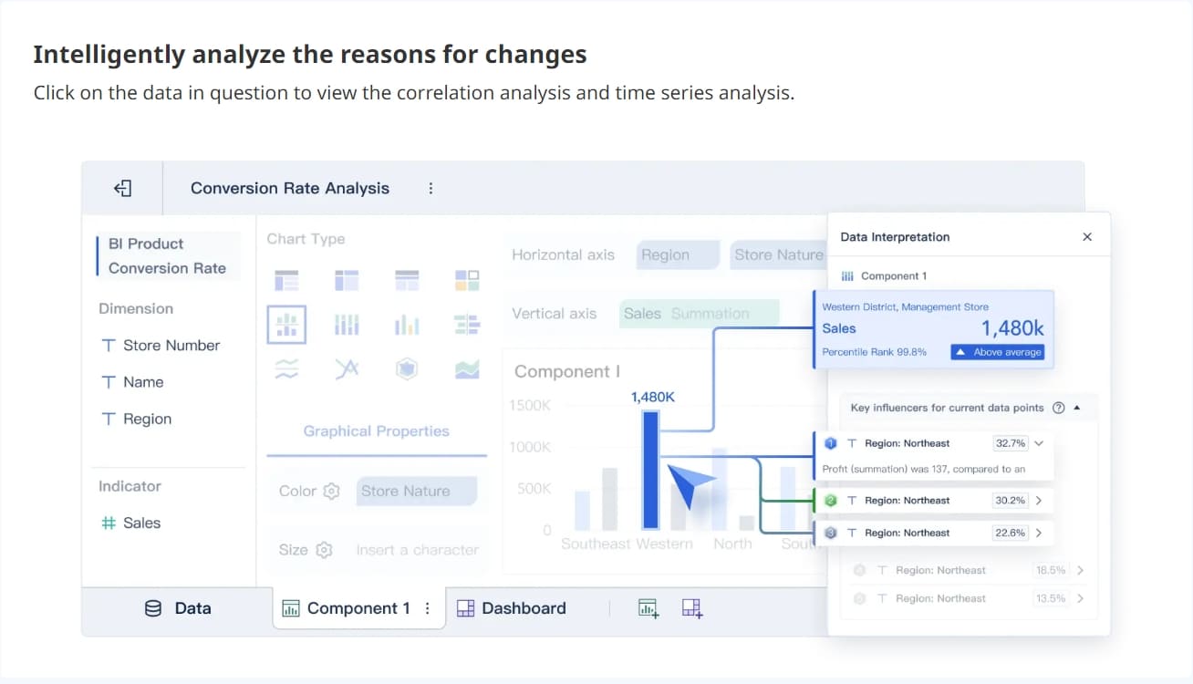
Add concise commentary so leaders know what changed and why
A dashboard without commentary invites interpretation fights. Add brief notes such as:
NRR declined due to contraction in one large enterprise cohort
CAC rose from increased paid search spend without corresponding conversion lift
Product engagement improved after onboarding workflow update
This saves meeting time and improves trust.
Create a reliable reporting workflow
Standardize metric definitions across teams
This is where executive dashboards often fail. Finance, sales, product, and customer success may all define the same metric differently.
SaaS KPI Dashboard Examples and Templates to Model
Templates help teams move faster, but the best ones are adapted to decision use cases, not copied blindly.
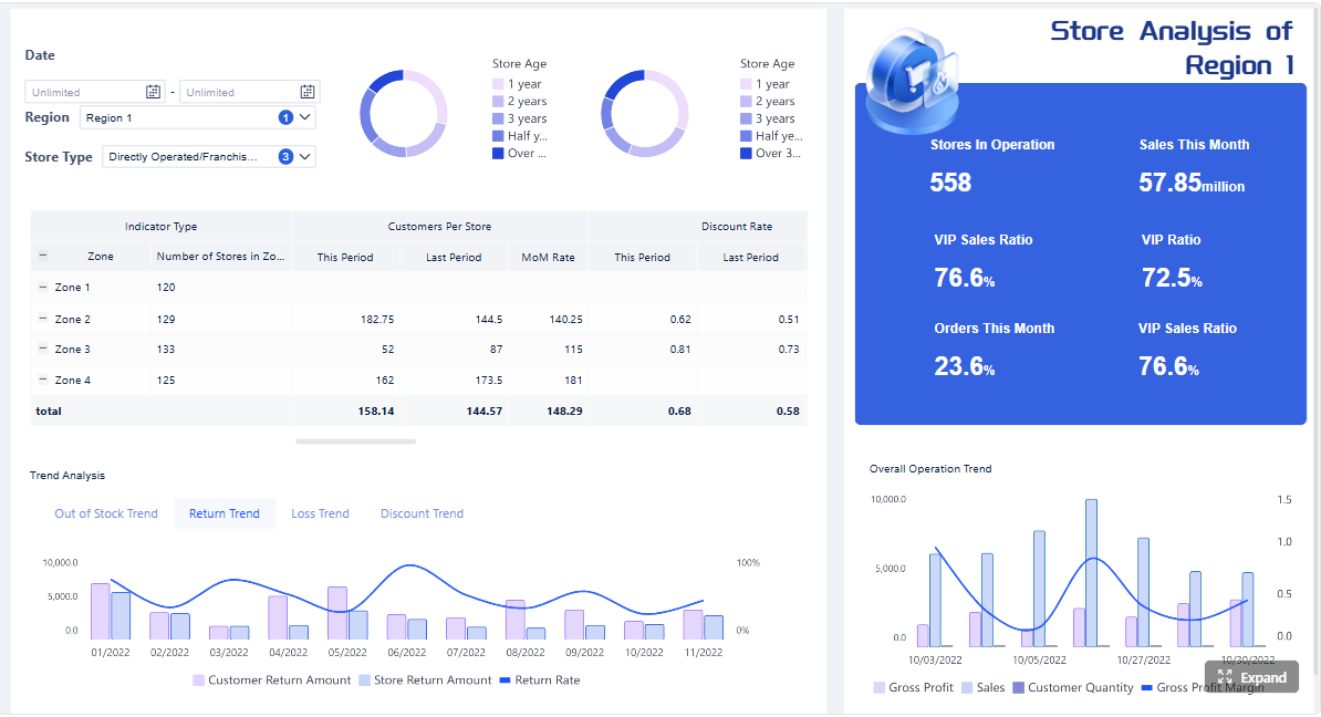
Executive dashboard example
A board-ready executive dashboard should fit on one page and answer the core health questions immediately.
A strong monthly layout includes:
MRR and ARR
Revenue growth rate
NRR
Churn and retention
CAC and CAC payback
ARPA
Product engagement health signal
Funnel conversion summary
Brief executive commentary
This view is ideal for monthly business reviews because it balances growth, retention, and efficiency.
Functional dashboard example
Functional dashboards should connect directly to operational levers.
A sales and marketing view with pipeline, CAC, and conversion metrics
This version should focus on:
Pipeline created
Pipeline by segment
Lead-to-opportunity conversion
Opportunity-to-win conversion
CAC by channel
Sales cycle length
Forecast vs. target
Its purpose is not broad company reporting. It is to help GTM leaders improve acquisition efficiency.
A customer success view with churn, retention, and expansion indicators
This dashboard should include:
Gross revenue churn
Net revenue retention
Renewal schedule
Expansion pipeline
Health score or engagement proxy
Support or onboarding risk indicators
This gives leadership a forward view into retention quality rather than just a backward-looking churn report.
Reusable dashboard template checklist
If you are creating a template for repeated use across teams or business units, include these elements.
Must-have sections, chart types, and annotations
Must-have sections:
Revenue summary
Retention summary
Efficiency summary
Product health summary
Commentary and actions
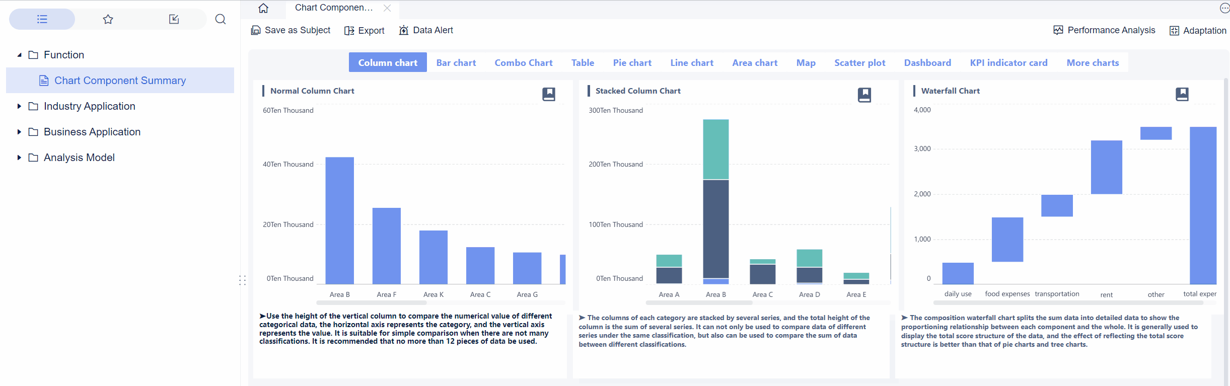
Recommended chart types:
Line charts for trends
Bullet or variance charts for target tracking
Waterfalls for net new MRR
Simple tables for segment comparison
Annotations to include:
Pricing changes
Major launches
Sales org changes
One-time churn or expansion events
Questions to ask before building in BI tools or spreadsheets
Before building, ask:
Who is the executive audience?
Which decisions should this dashboard support?
What is the reporting cadence?
Which metrics are board-level vs. functional?
Where do the source systems live?
Which definitions are still disputed?
These questions save significant rework.
How to customize templates without losing consistency
Use a standard KPI framework, then allow limited customization by audience.
For example:
Keep core definitions identical across all dashboards
Allow segment filters based on team needs
Add one or two role-specific KPIs per function
Maintain the same visual language and target logic
That balance preserves trust while improving usability.
Common Pitfalls and How to Keep the Dashboard Actionable
Many executive dashboards fail for predictable reasons. The issue is rarely the charting tool. It is usually governance, clarity, or relevance.
Signs the dashboard is overloaded, outdated, or ignored
Watch for these warning signs:
More than 15 to 20 top-level metrics on one page
Frequent disputes over the “real” number
Leadership asking analysts for separate spreadsheets
No commentary on movement or action plans
Metrics remain on the dashboard even though nobody uses them
If these symptoms appear, simplify aggressively.
How to handle conflicting numbers across finance, product, and go-to-market teams
Conflicting numbers usually come from inconsistent definitions, timing differences, or data source mismatch.
The fix is operational, not visual:
Appoint a KPI governance owner
Create one approved formula per executive metric
Define source-of-truth systems for each KPI
Lock reporting periods and refresh schedules
Escalate exceptions through a regular review process
Executives will not trust a saas kpi dashboard unless metric governance is clear.
When to add, remove, or redefine KPIs as the business evolves
Adjust the dashboard when:
The company changes stage
GTM motion shifts from PLG to hybrid or enterprise-led
Pricing model changes materially
Product strategy expands into new lines
Existing KPIs stop driving decisions
Do not change KPIs casually. Redefine only when the business model or leadership question has changed enough to justify it.
A simple rollout plan to drive adoption among executives and department leads
A practical rollout sequence looks like this:
Align on executive decisions
Identify the recurring decisions the dashboard must support.
Approve KPI definitions
Get cross-functional signoff from finance, RevOps, product, and CS.
Launch a one-page executive version first
Avoid overwhelming leaders with too much detail at rollout.
Embed it into recurring meetings
Use the dashboard as the default view in weekly and monthly reviews.
Collect feedback and refine quarterly
Track which metrics drive decisions and which are ignored.
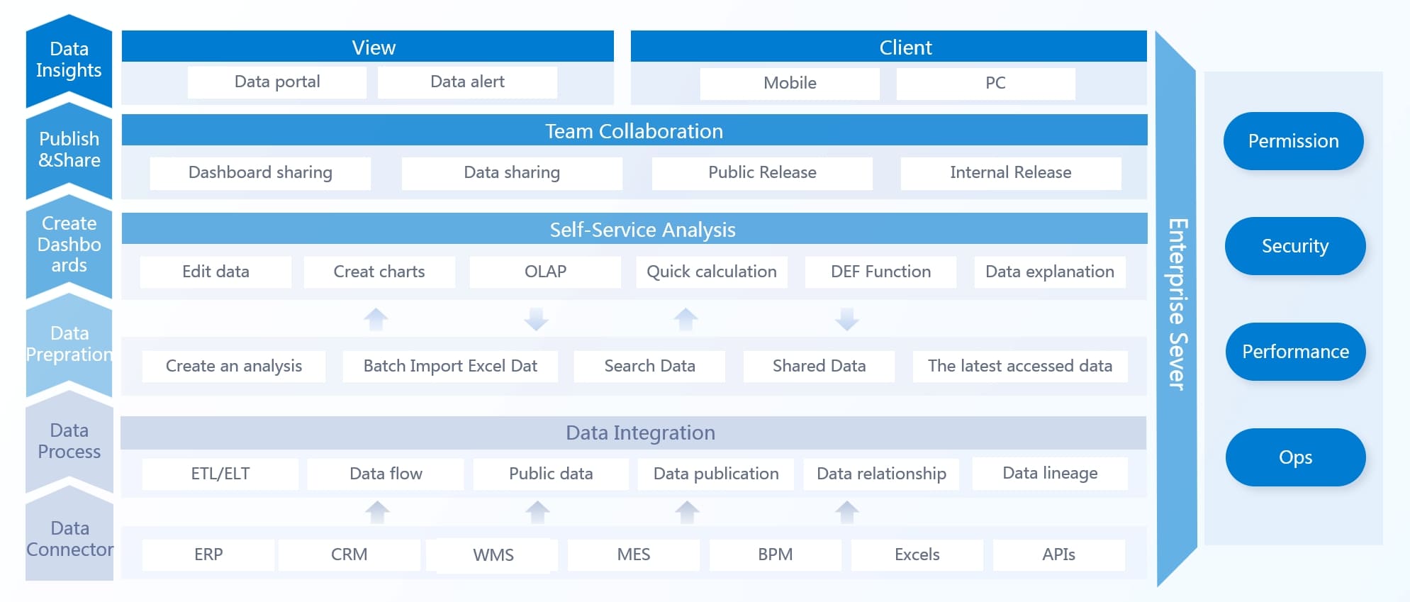
Building This Manually Is Complex. Use FineBI to Automate the Workflow
Designing an executive-ready saas kpi dashboard is not hard because the metrics are unknown. It is hard because the work sits at the intersection of metric governance, cross-functional alignment, data integration, and dashboard usability.
Building this manually in spreadsheets or disconnected tools creates predictable problems:
Definitions drift across teams
Refresh cycles break
Commentary gets lost
Executives stop trusting the numbers
Analysts spend too much time maintaining reports instead of improving them
This is where FineBI becomes the practical solution.
With FineBI, you can utilize ready-made templates and automate this entire workflow. Instead of assembling a dashboard from scratch every month, teams can standardize SaaS KPI logic, connect data sources, build executive summary views, and deliver role-based dashboards with far less manual effort.
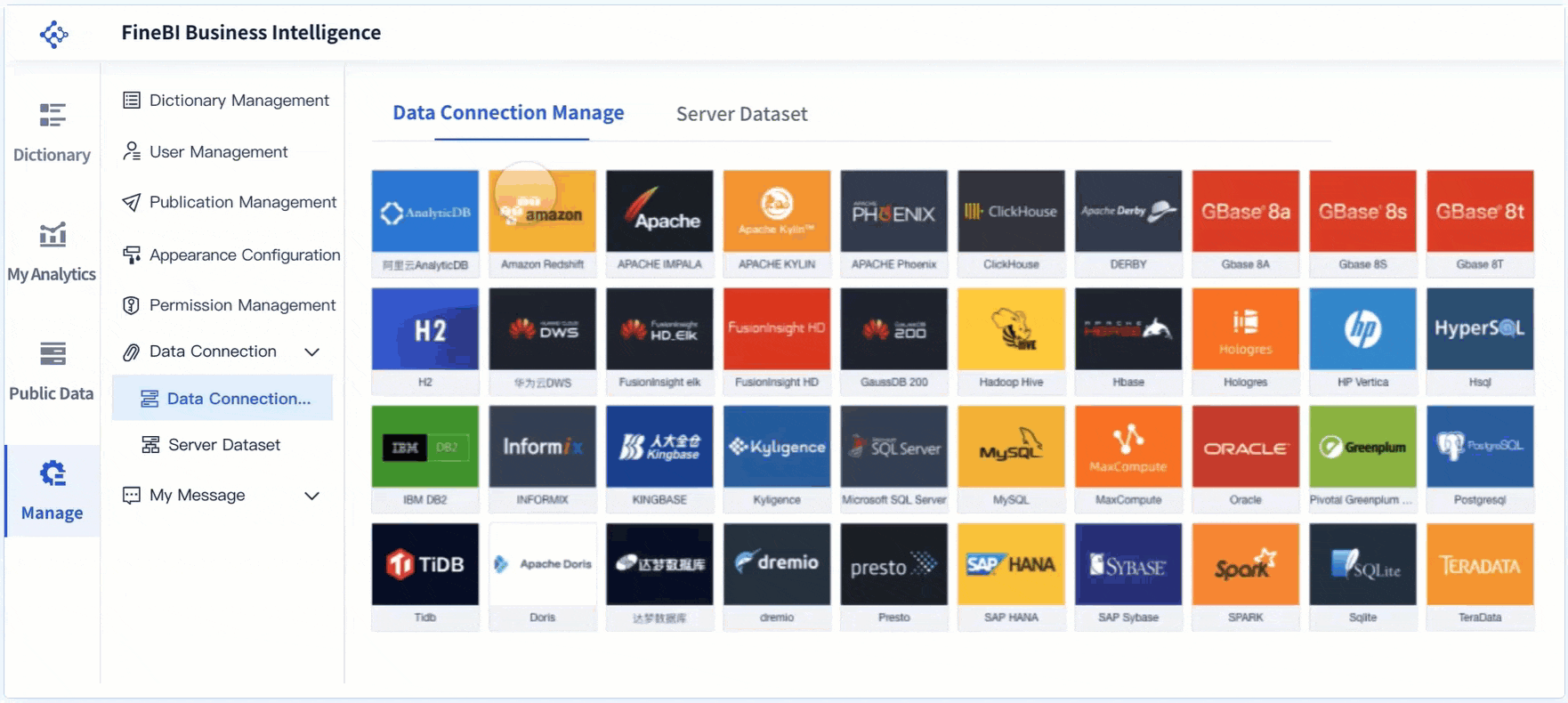
Consolidate finance, CRM, billing, and product data
Standardize KPI definitions across departments
Build reusable executive and functional dashboard templates
Add filters, trend comparisons, and annotations without clutter
Automate refreshes and reduce spreadsheet dependency
Scale reporting from leadership view to team-level drill-downs
For enterprise decision-makers, the value is straightforward: faster reporting cycles, higher trust in the numbers, and better adoption by executives who need clarity, not complexity.
If your current dashboard is overloaded, inconsistent, or underused, the fix is not another spreadsheet tab. It is a structured KPI system built for executive decisions. FineBI helps you get there faster with templates, automation, and a more reliable path from raw data to action.
FAQs
An executive SaaS KPI dashboard should include a small set of high-impact metrics tied to growth, retention, and efficiency. It should also show trends, highlight exceptions, and give enough context for leaders to decide what action to take next.
The most important SaaS KPIs usually include MRR, ARR, revenue growth rate, NRR, churn, customer retention, CAC, LTV, CAC payback period, ARPA, product engagement, and funnel conversion rate. The exact mix should reflect your business model and leadership priorities.
An executive dashboard focuses on summary signals that support strategic decisions, while an operational dashboard goes deeper into team-level workflows and diagnostic details. Executives need clarity and speed, not every underlying data point.
Most executive SaaS dashboards should refresh at least daily, with some teams monitoring near real-time data for key revenue and pipeline metrics. The right update frequency depends on how quickly your business changes and how often leaders review performance.
They usually fail because they track too many metrics, lack a clear hierarchy, or rely on inconsistent data across systems. Dashboards also get ignored when they report numbers without explaining what changed and who owns the response.
Product Trial
FineReport
Pixel-perfect reports · Interactive dashboards · Easy data entry · Digital twins