Visualization tools are software applications that convert raw data into graphical formats such as charts, graphs, and maps to make complex information easier to understand and analyze. Here are the top 7 visualization tools for 2026 you should know:
- Tableau
- Microsoft Power BI
- Google Looker Studio
- FineBI
- Qlik Sense
- Plotly
- Apache Superset
You need the best data visualization software to stay ahead. These tools help you spot patterns, forecast trends, and make business intelligence work for you. The right data visualization software can boost your decision-making and ROI. Industry leaders like FineBI set the standard for self-service analytics and real-time insights. As you read, think about what you need most in your own analysis.
Did you know? Over 70% of businesses plan to use visualization tools by 2025, showing how vital data-driven decisions have become.
| Statistic | Impact |
|---|---|
| 77% | Companies with CEOs making data-driven decisions are more likely to exceed business goals. |
| 59% | More likely to find actionable insights in analytics. |
| 1300% | Average return on investment for organizations implementing BI and analytics solutions. |
Why Visualization Tools Matter in 2026
Analyst Needs and Trends
You face more data than ever before. Every day, you see new sources, formats, and platforms. The right visualization tools help you turn this chaos into clear, actionable stories. In 2026, you need tools that do more than just make charts. You want interactive dashboards, automated insights, and customizable dashboards that fit your workflow.
The trends in data analysis driving the increased importance of visualization tools in 2026 include the increasing complexity of data, the demand for data-driven insights, AI-powered data storytelling, immersive data experiences, and ethical data visualization.
AI-powered data visualization is changing the game. Now, you can let AI handle the heavy lifting. AI can scan huge datasets, spot patterns, and create stunning visuals in seconds. You also get to explore data in new ways. With VR and AR, you can step inside your data and see it from every angle. As you use these tools, you also need to think about fairness and ethics. It’s important to make sure your visuals tell the whole story and avoid bias.
Here’s a quick look at why experts say data visualization tools are essential for you in 2026:
| Key Reasons for Data Visualization Tools in 2026 | Description |
|---|---|
| Communicating Insights | Visualization tools are designed to present processed data in a clear and understandable manner, making insights accessible to stakeholders. |
| Enhancing Data Storytelling | These tools help in crafting narratives around data, making it easier to convey complex information effectively. |
| Integrating AI Capabilities | The incorporation of AI features in visualization tools aids analysts in making informed decisions based on data trends and patterns. |
You have more choices than ever, from open source data visualization tools to the best data visualization software on the market. Many companies even offer free data visualization tools to help you get started.
Impact of Data Visualization on Decision-Making
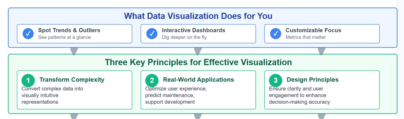
Data visualization helps you see what matters most. You can spot trends, outliers, and opportunities at a glance. When you use interactive dashboards, you can dig deeper and answer questions on the fly. Customizable dashboards let you focus on the metrics that matter to your team.
- Effective data visualization transforms complex data into visually intuitive representations, aiding decision-makers in identifying patterns and trends.
- Case studies from the tech industry illustrate applications such as optimizing user experience, predicting maintenance needs, and supporting product development.
- The study emphasizes the importance of design principles in data visualization to ensure clarity and user engagement, which enhances decision-making accuracy.
With business intelligence tools, you can move faster and make smarter choices. Automated insights save you time and reduce errors. When you use data visualization tools, you help everyone in your organization understand the story behind the numbers. This leads to better teamwork and stronger results.
1.FanRuan FineBI Data Visualization Tools
Website: https://www.fanruan.com/en/finebi
FineBI Features and Benefits
If you want to make sense of your data fast, FineBI gives you the power to do it. You get self-service data visualization tools that let you build interactive dashboards with a simple drag-and-drop. You don’t need to know how to code. FineBI connects to over 60 data sources, so you can bring all your information together in one place. You can see real-time data visualization on any device, which means you never miss a beat. FineBI also keeps your data safe with enterprise-grade governance. You control who sees what, down to the row and column. With augmented analytics, you can spot trends and get smart suggestions right away.

Tip: FineBI’s real-time data visualization helps you react to changes as they happen.
Use Cases and Industry Solutions
You can use FineBI in almost any industry. In manufacturing, you can track production, quality, and costs with live dashboards. In finance, you can monitor cash flow and spot risks before they grow. Retail teams use FineBI to see sales trends and manage inventory. Healthcare groups use it to improve patient care and operations. FineBI’s flexible platform fits your needs, whether you’re in HR, supply chain, or executive leadership.
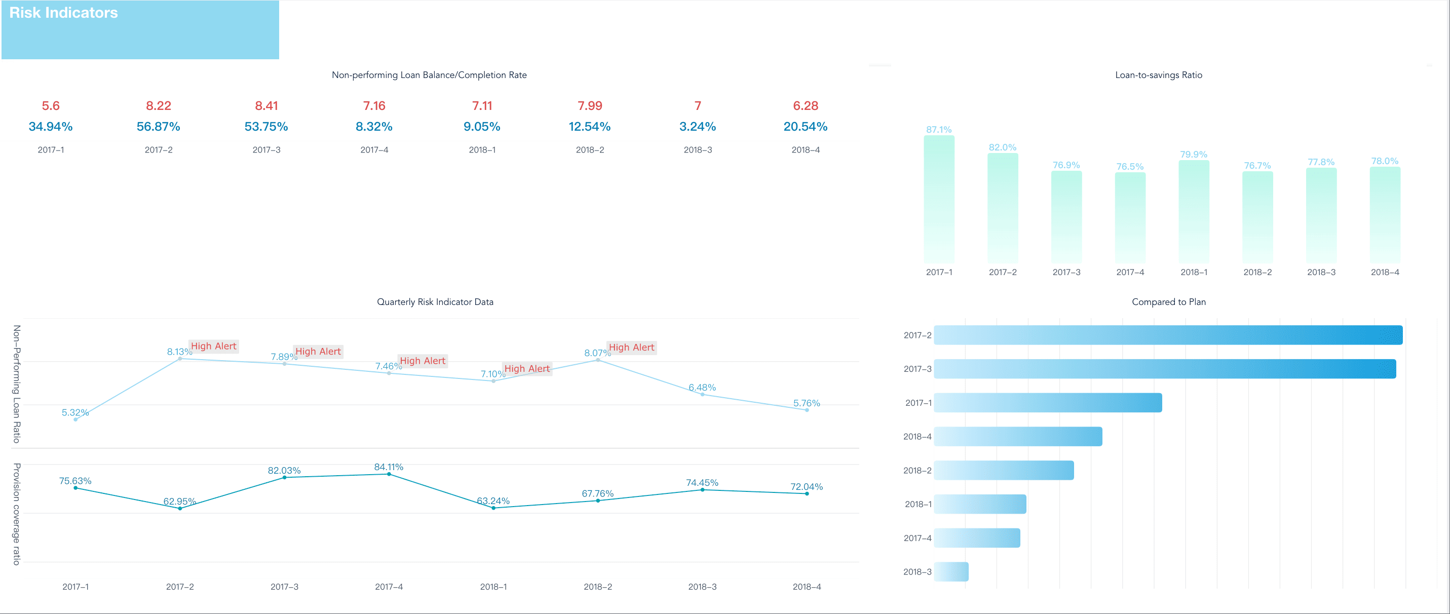
| Industry | How FineBI Helps |
|---|---|
| Manufacturing | Lean production and quality |
| Finance | Risk and profitability tracking |
| Retail | Sales and inventory analysis |
| Healthcare | Patient and operations insights |
Customer Success Stories
You’re not alone when you choose FineBI. UnionPay Data Services used FineBI to unify their data and boost system efficiency by 5%. They also improved customer targeting and engagement. Bifido Foods brought together data from many channels and made smarter decisions with interactive reports. These stories show how FineBI’s data visualization tools help real companies solve real problems.

Note: FineBI’s interactive dashboards make teamwork easier and help everyone see the same story.
2.Tableau Data Visualization Tools
Website: https://www.tableau.com/
Key Features
You want a tool that makes your work easier and faster. Tableau stands out among data visualization tools because it gives you a wide range of features that help you turn raw data into clear stories. Here’s a quick look at what makes Tableau special:
| Feature | Description |
|---|---|
| Connector Ecosystem | Connects to many databases and cloud services, so you can pull in data from almost anywhere. |
| Speed and Responsiveness | Uses in-memory processing for quick data retrieval and smooth visualizations. |
| Business User Collaboration | Lets you share visualizations and insights with your team for better teamwork. |
| Security Measures | Keeps your data safe with strong encryption and compliance tools. |
| Server and Online Deployment | Gives you options to deploy on your own servers or in the cloud for flexible access. |
| User-Friendly Interface | Drag-and-drop design means you don’t need to code to build reports or interactive dashboards. |
You can build customizable dashboards that fit your needs. The drag-and-drop interface helps you create interactive dashboards without much effort.
Best Use Cases
Tableau works well in many industries. You can use it for everything from financial projections to business analytics. Here’s how different fields use Tableau:
| Industry/Profession | Application of Tableau |
|---|---|
| Data Analytics | Telling stories with data results |
| Business Analytics | Analyzing and visualizing business insights |
| Financial Analytics | Organizing data for financial projections |
If you need to share insights with your team or present findings to leadership, Tableau gives you the tools to do it.
Pros and Limitations
Tableau brings a lot to the table, but you should know where it shines and where it might slow you down.
Pros:
- You get a user-friendly interface that makes building visualizations simple.
- The connector ecosystem lets you pull data from almost any source.
- Collaboration features help your team work together on data projects.
- Security and deployment options keep your data safe and accessible.
Limitations:
- Performance can drop with very large datasets, making dashboards slow or unresponsive.
- There’s a steep learning curve if you want to master advanced features.
- Costs can add up, especially if you need extra features or more users.
If you want a flexible, powerful tool for ai-powered data visualization and interactive dashboards, Tableau is a solid choice. Just keep in mind the learning curve and pricing as you decide what fits your workflow.
3.Microsoft Power BI Visualization Software
Website: https://www.microsoft.com/en-us/power-platform/products/power-bi
Core Features
If you want a tool that helps you turn numbers into stories, Power BI stands out. You get a wide range of features that make your work easier and faster. Here’s what you can do with Power BI:
- Create both simple and complex dashboards and reports with powerful visualization options.
- Connect to over 70 data sources, so you can bring all your information together.
- Monitor and visualize data in real time, which helps you make quick decisions.
- Access your reports and dashboards on your phone or tablet with mobile apps.
- Keep your data safe with row-level security and strong governance tools.
- Share your insights and collaborate with your team easily.
- Use artificial intelligence for advanced analytics and predictive modeling.
- Transform and model your data with tools like Power Query and DAX.
You can even build custom visuals using JavaScript libraries. Scheduled refresh options keep your reports up to date without extra work.
Use Cases
You might wonder who gets the most out of Power BI. This tool works well for many types of organizations and teams:
- BI and analytics directors or managers who need to oversee business intelligence programs.
- IT and BI teams that design and deploy enterprise solutions.
- Subject matter experts and content creators who want to build self-service and departmental analytics.
If you need to create interactive dashboards for your department or share data visualization tools across your company, Power BI fits right in.
Tip: Power BI is a great choice if you already use other Microsoft tools. It works smoothly with Excel, Teams, and Azure.
Pros and Cons
Let’s break down what you’ll love about Power BI and what might slow you down:
| Advantages of Microsoft Power BI | Disadvantages of Microsoft Power BI |
|---|---|
| Easy to learn and use | Interface can feel bulky |
| Affordable for most businesses | Limited capacity for huge datasets |
| Interactive content | Restricted customization for visuals |
| Works well with Microsoft tools | Takes time to master advanced features |
| Real-time data access |
You get a user-friendly interface, frequent updates, and scalable options for different needs. However, you might find some limits if you want to customize every detail or work with very large data sets.
If you want a tool that brings together data visualization, interactive dashboards, and ai-powered data visualization, Power BI is a smart pick for many teams.
4.Google Looker Studio Data Visualization

Website: https://lookerstudio.google.com/navigation/reporting
Features Overview
When you use Google Looker Studio, you get a flexible platform that makes data visualization easy and effective. You can pick from a wide variety of chart options, so you always find the right way to show your data. The tool lets you create reports that help you make smart, data-driven decisions. You can track performance in real time across many metrics. If you want to bring together information from different sources, Looker Studio lets you combine them into a single dashboard. You also get inspiration from live demo examples, which can help you design your own reports. Many people use Looker Studio for SEO tracking, paid ads, and ecommerce sales dashboards. These dashboards help you see sales data and marketing results at a glance.
Ideal Scenarios
You might wonder where Looker Studio really shines. It works well in many business situations. Here’s a quick table to show you some of the best uses:
| Business Scenario | Description |
|---|---|
| Inventory and supply chain management | Track inventory levels and optimize supply chain operations. |
| HR and employee performance | Monitor HR metrics and evaluate performance based on KPIs. |
| Website and app analytics | Analyze website traffic and user behavior for better marketing. |
| Customer support | Track support ticket volumes and monitor customer feedback. |
| Compliance and risk management | Monitor compliance with regulations and spot risks early. |
| Geospatial analytics | Visualize data on maps to see trends and patterns. |
| Social media engagement | Monitor social media metrics and analyze public sentiment. |
| Financial analysis and forecasting | Keep an eye on cash flow and profitability. |
| Product analytics and user behavior | See how people use your products and improve their experience. |
| Healthcare analytics | Analyze healthcare data to improve patient care. |
| E-commerce analytics | Track customer retention and conversion rates. |
You can use Looker Studio for almost any department, from marketing to operations. It helps you build interactive dashboards that everyone on your team can use.
Strengths and Weaknesses
Looker Studio has some clear strengths. You get strong integration with the Google ecosystem, which makes it easy if you already use Google products. The platform is user-friendly and offers good customization options. It’s also cost-effective, so you don’t have to worry about high fees. Real-time capabilities let you see changes as they happen.
But there are a few things to keep in mind. If you work with very large datasets, you might notice some performance issues. Advanced analytics features are limited compared to some other data visualization tools. You may also find some limits with data connectors and basic collaboration features. Support and price transparency can be concerns for some users.
| Strengths | Weaknesses |
|---|---|
| Integration with Google ecosystem | Performance issues with large datasets |
| Usability | Limited advanced analytics capabilities |
| Customization options | Data source and connector limitations |
| Cost-effectiveness | Basic collaboration and version control |
| Real-time capabilities | Support limitations |
| Price transparency concerns |
If you want a tool that’s easy to use, works well with Google, and helps you build interactive reports, Looker Studio is a solid choice for your data visualization needs.
5.Qlik Sense Visualization Tools
Website: https://www.qlik.com/us/products/qlik-sense
Main Features
You want a tool that helps you explore your data from every angle. Qlik Sense stands out because it gives you a unique way to interact with your information. Check out the main features that make Qlik Sense a favorite among analysts:
| Feature | Description |
|---|---|
| Associative Model | You can select any data point and instantly see how it connects to everything else. This sparks new insights. |
| AI-Powered Analytics | Qlik Sense uses AI to help you ask questions in plain language and get smart visualizations fast. |
| User-Friendly Interface | The interface feels simple and interactive. You get a central hub, smart search, and drag-and-drop tools. |
| Self-Service Capabilities | You can connect to data, build dashboards, and share insights without waiting for IT. |
These features let you create interactive dashboards that help you find answers quickly.
Best Applications
Qlik Sense works best when you need to make decisions based on data. You see the biggest impact in industries that rely on fast, accurate insights. Here are some top ways you can use Qlik Sense:
- Media intelligence teams use it to turn complex data into clear stories for clients.
- Communication strategists track engagement and campaign results in real time.
- Customer engagement teams spot trends and respond to feedback faster.
Companies like Infomedia use Qlik Sense to give stakeholders actionable insights. You can do the same in your field.
Pros and Cons
You want to know what works well and what might slow you down. Here’s a quick look at the main pros and cons of Qlik Sense:
| Pros | Cons |
|---|---|
| Easy for basic BI tasks | Advanced analytics need more expertise |
| Wide range of visualizations and improved dashboards | Learning curve for scripting and modeling |
| Smooth sheet-editing experience | Dependence on Qlik’s connectors and workflows |
| Strong performance with quick dashboard loading | Some AI features only in Qlik Cloud with extra cost |
| Integration with Talend for better governance | High pricing for base and embedded analytics packages |
If you want a tool that makes data visualization simple and interactive, Qlik Sense is a strong choice. You get flexibility, speed, and a modern approach to visualization tools.
6.Plotly Data Visualization Software
Website: https://plotly.com/
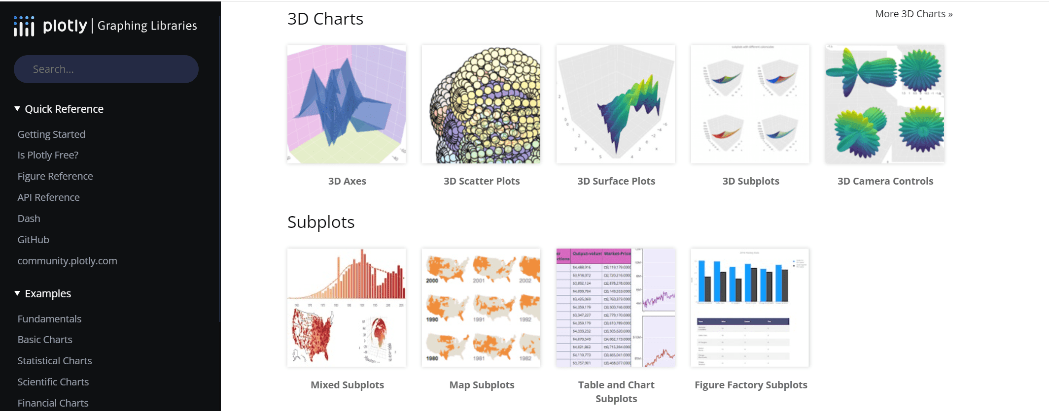
Features Overview
If you want to create beautiful and interactive charts, Plotly gives you the tools you need. You can build everything from simple line graphs to complex 3D plots. Every chart you make is interactive, so you can zoom, pan, and hover to see details. Plotly stands out because it makes your visuals look modern and polished right away. You do not have to spend hours tweaking the design. You can also connect Plotly with web apps using Python’s Dash, which helps you build custom dashboards fast.
Here’s a quick look at what makes Plotly special:
| Feature | Plotly Strengths |
|---|---|
| Interactivity | Every plot lets you zoom, pan, and see tooltips for more details. |
| Aesthetics | Charts look sharp and professional with little effort. |
| Web App Integration | Works smoothly with Python’s Dash for building web-based dashboards. |
Tip: You can use Plotly with Python, R, or JavaScript, so it fits many different workflows.
Use Cases
You can use Plotly in many fields. Utilities companies use it to track work orders and cut down on customer complaints. In healthcare, researchers use Plotly to share and explore health data. Manufacturing teams rely on Plotly for equipment analytics and fleet tracking. Sports teams, like the Kansas City Chiefs, use Plotly for real-time ticket pricing and operations. You can also use Plotly for customer segmentation or retail demand forecasting.
- Utilities: Improve efficiency and keep customers happy.
- Healthcare: Make research data easy to access and visualize.
- Manufacturing: Monitor performance and report on equipment.
- Sports: Manage data for ticket sales and game operations.
- Retail: Forecast demand and manage inventory.
You can build interactive dashboards that help your team see trends and act quickly.
Pros and Cons
Plotly gives you a lot of control over your charts. You can customize almost everything. The syntax is simple, so you do not need to be a coding expert. You get a large variety of chart types and a strong support community. Plotly works with many programming languages, which makes it easy to share your work.
Here’s a table to help you see the main advantages and disadvantages:
| Advantages | Disadvantages |
|---|---|
| Control over every detail | Public plots in the free version |
| Simple syntax | Limited color options in the free version |
| Interactive charts | API call limits in the free version |
If you want a flexible tool for data visualization, Plotly is a great choice. You can create interactive dashboards that look good and help you make better decisions.
7.Apache Superset Top Data Visualization Software
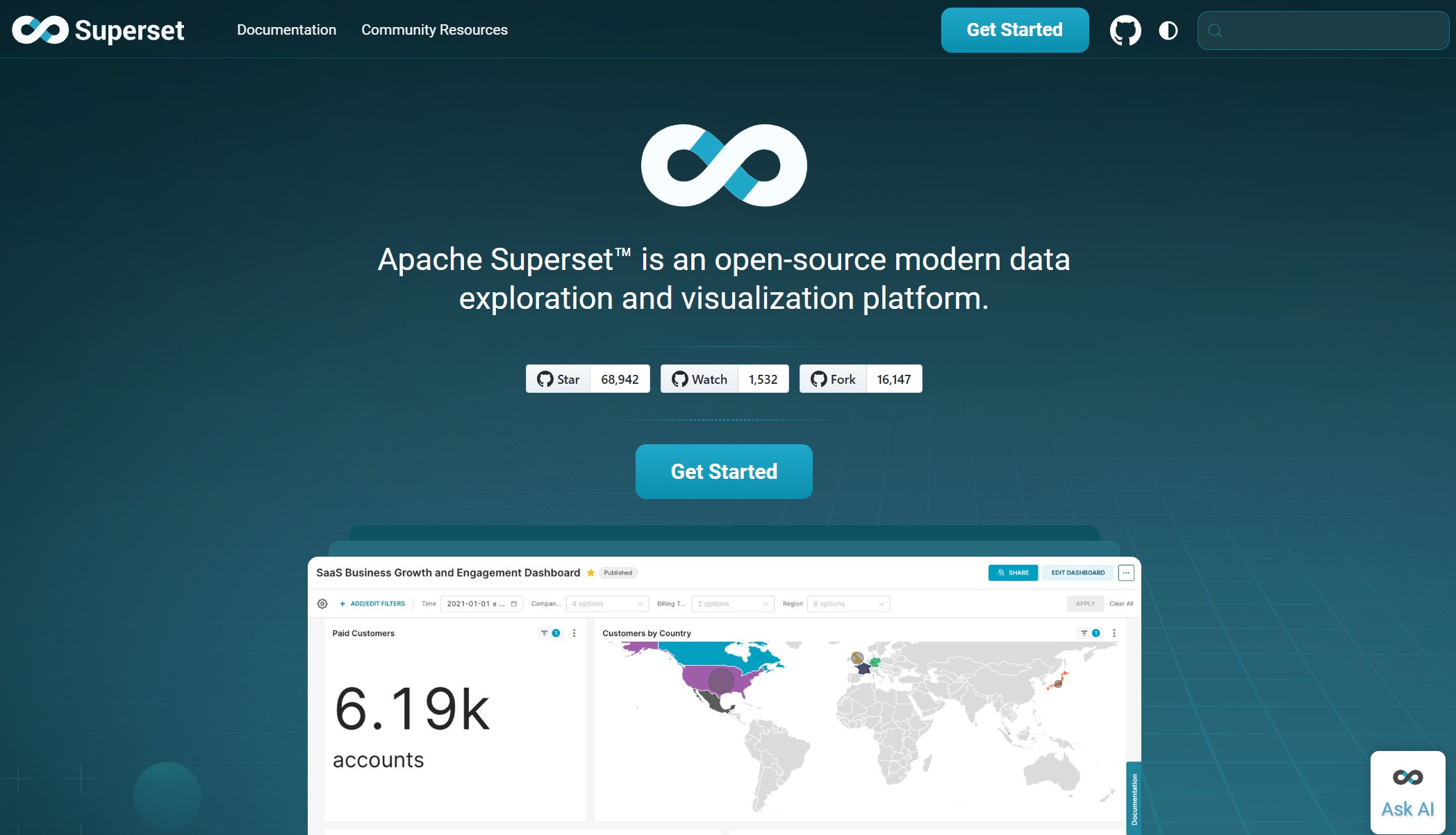
Website: https://superset.apache.org/
Key Features
You want a tool that gives you flexibility and power. Apache Superset stands out among visualization tools because it connects to many data sources. You can unify fragmented data and get holistic insights. Superset lets you build interactive dashboards for real-time data exploration. You can filter and drill down into your data with just a few clicks. If you need custom visualizations, Superset has you covered. You can create advanced charts or tailor your dashboards to fit your business needs. The platform makes data exploration easy for everyone. You get a SQL editor for advanced users and a visual query builder for those who prefer a no-code approach. Superset also supports extensibility, so you can add custom connectors or embed dashboards in other apps.
| Feature | Description |
|---|---|
| Flexible and Diverse Data Connectivity | Connects to various data sources for unified insights. |
| Interactive Dashboards for Real-Time Data | Dynamic dashboards let you filter and drill down instantly. |
| Custom and Advanced Data Visualizations | Build unique charts and dashboards for your business. |
| Accessible Data Exploration | Use SQL or visual query builder for easy data engagement. |
| Extensibility and Customization | Add connectors, new visualization types, and embed dashboards as needed. |
Use Cases
You can use Apache Superset in many ways. In business intelligence, you build interactive dashboards for reporting and decision-making. Analysts explore structured data and visualize trends without writing much code. Superset works well with big data and cloud data warehousing. You can connect it to platforms like Snowflake or Google BigQuery for large-scale analysis. If you develop SaaS platforms, you can embed analytics dashboards for real-time data visualization. Data engineers use Superset to monitor ETL pipelines and transformations, integrating with tools like Apache Airflow.
Superset’s web-based architecture lets you scale easily. You don’t need to store data inside the platform. Its cloud-native design gives you flexibility with metadata engines and caching. Semantic layers help you reuse queries for faster results. You also get granular security controls and robust caching to prevent timeouts during long queries.
Pros and Cons
Superset brings a lot to the table. You get a web-based data consumption layer that handles heavy data lifting through connected databases. The cloud-native architecture offers flexibility and scalability. Semantic analysis speeds up your work by reusing queries. Security filtering keeps your data safe. Robust caching prevents timeouts, even with extended queries. Sharing dashboards across teams is simple.
| Pros | Cons |
|---|---|
| Scalable web-based architecture | Requires setup and configuration |
| Flexible cloud-native design | Some advanced features need technical skill |
| Fast semantic analysis | Limited out-of-the-box visualizations |
| Granular security controls | Learning curve for non-technical users |
If you want a powerful, flexible platform for data visualization, Apache Superset is a smart choice. You can build interactive dashboards, explore data, and scale as your needs grow.
Comparing Top Data Visualization Software
Feature Comparison Table
Choosing the right visualization tools can feel overwhelming. You want something that fits your needs, your budget, and your team’s skill level. Here’s a quick table to help you compare the top data visualization software side by side:
| Tool | Features | Pricing | Scalability |
|---|---|---|---|
| Tableau | Advanced analytics, interactive dashboards, many chart types | Subscription-based | High, great for large enterprises |
| Power BI | Microsoft integration, real-time updates, AI analytics | Affordable for SMBs | Scalable for small to mid-sized |
| Qlik Sense | Self-service, associative data engine | Higher for small firms | High, ideal for big organizations |
| Looker Studio | Google Cloud integration, customizable dashboards | Expensive | Scalable for SMBs and enterprises |
| Apache Superset | Flexible, open-source, supports RBAC | Free | Great for engineering teams |
| Plotly | Interactive, code-friendly, web app integration | Free & paid options | Scalable for developers |
| FineBI | Self-service, real-time data, enterprise governance | Cost-effective | High, supports large user bases |
Tip: If you’re just starting out, you might want to try free data visualization tools like Plotly or Apache Superset before investing in a paid platform.
Best Fit by Analyst Type
Not every tool works for every analyst. Your background, your team, and your business goals all play a part. Here’s a table to help you find the best fit:
| Tool | Best For | Pros | Cons | Common Use Case |
|---|---|---|---|---|
| Tableau | Design-focused analysts, large teams | Beautiful visuals, active community | Expensive, can be slow | Executive reporting |
| Power BI | Microsoft users, finance teams | Cost-effective, strong modeling | Not the prettiest visuals | Cross-department reporting |
| Qlik Sense | Data-driven organizations | Flexible, interactive dashboards | Higher price for small companies | Customer analytics |
| Looker Studio | Google Cloud users, marketing teams | Customizable, real-time data | Pricey, needs Google ecosystem | Marketing analytics |
| Apache Superset | Engineering-heavy teams | Full control, open-source | Needs setup, steeper learning curve | Internal dashboards |
| Plotly | Developers, data scientists | Code-friendly, interactive | Not drag-and-drop | Custom analytics apps |
| FineBI | Business users, enterprise analysts | Self-service, real-time, secure | Requires initial setup | Company-wide data visualization |
You can see that interactive dashboards and real-time data are now must-haves for many teams. If you want something easy to use, FineBI and Power BI stand out. If you love to code, Plotly or Apache Superset might be your best bet. For those who want to explore data without limits, Qlik Sense and Tableau offer powerful options.
Remember, the best data visualization tools are the ones that match your workflow and help you turn data into action.
Picking the best data visualization software shapes your success. You want tools that fit your team, data size, and budget. Check out this table to compare what matters most:
| Criteria | Description |
|---|---|
| Tool Versatility | Covers everything from data prep to advanced analytics. |
| Cost of Deployment | Pricing fits your company’s needs and size. |
| Data Processing Capacity | Handles big data and connects to many sources. |
| Adaptability | Customizes for your industry or workflow. |
| Personal Data Protection | Keeps your data safe and meets regulations. |
To find the best data visualization software, try these steps:
- Define your needs and goals.
- Look for user-friendly, interactive dashboards.
- Make sure the tool grows with your data.
- Check if it works with your current systems.
- See if it supports teamwork and sharing.
- Ask about support and training.
FineBI from FanRuan stands out for business intelligence, real-time analysis, and interactive features. If you want to learn more, explore free trials or user guides to see which best data visualization software fits your team.


FAQ

The Author
Lewis
Senior Data Analyst at FanRuan
Related Articles
ERP Reporting Explained: What It Is, How It Works, and Why Enterprise Teams Rely on It
ERP reporting is the process of turning data inside your enterprise resource planning system into usable business insight. For finance leaders, operations directors, supply chain managers, and IT teams, that matters beca
Yida Yin
Jun 25, 2026
8 Best Restaurant Reporting Software Tools for 2026: Compare FineReport, Toast, SpotOn & More
$1 is a highly customizable business intelligence and reporting platform that helps restaurants turn POS, labor, inventory, finance, and multi location data into real time dashboards and decision ready reports. 8 Best Re
Yida Yin
Jun 24, 2026

Database Reporting Architecture: When to Use a Reporting Database vs Your Operational System
$1 is not just about pulling data into a dashboard. It is an architecture decision that affects application performance, reporting speed, data trust, and how confidently your teams can make decisions. If you are an IT ma
Yida Yin
Jun 24, 2026