You see businesses everywhere turning to these tools. Over 70% of companies will use data visualization services this year. Why? Advanced techniques like interactive dashboards and AI-driven insights help you see data clearly and act fast. These tools stand out for their innovation, scalability, seamless integration, user experience, and support for advanced analytics. The right choice helps you make smarter data-driven decisions, no matter your industry or team size.
What Are Data Visualization Tools?
Definition and Key Functions
You probably hear the term "data visualization tools" all the time. These are software platforms that help you turn raw numbers and facts into charts, graphs, and dashboards you can actually understand. Instead of staring at endless spreadsheets, you get visuals that make patterns and trends pop out.
You can click through layers of data to see details or zoom out for the big picture.
Real-time updates
Dashboards refresh automatically, so you always see the latest numbers.
Mobile responsiveness
Dashboards work on your phone or tablet, so you stay connected wherever you are.
Collaborative features
You and your team can comment, share, and work together on the same data.
Advanced analytics integration
You get built-in tools for stats and predictions, right inside your visualizations.
Data visualization software makes it easy for you to explore information, spot outliers, and share findings with others. You don’t need to be a tech expert to use these platforms. Most offer drag-and-drop features and simple interfaces.
Tip: If you want to dig deeper, try using drill-down or filter options. You’ll find hidden insights that can change your strategy.
Importance for Business Intelligence
Why do businesses care so much about these tools? You get answers faster. You make decisions with confidence. Visual dashboards show you what’s happening right now, not just last week.
People engage with insights and actually use them.
When you use data visualization software, you bridge gaps between departments. Everyone can see the same story, even if they have different backgrounds. Investing in strong visuals helps your company work smarter and stay ahead.
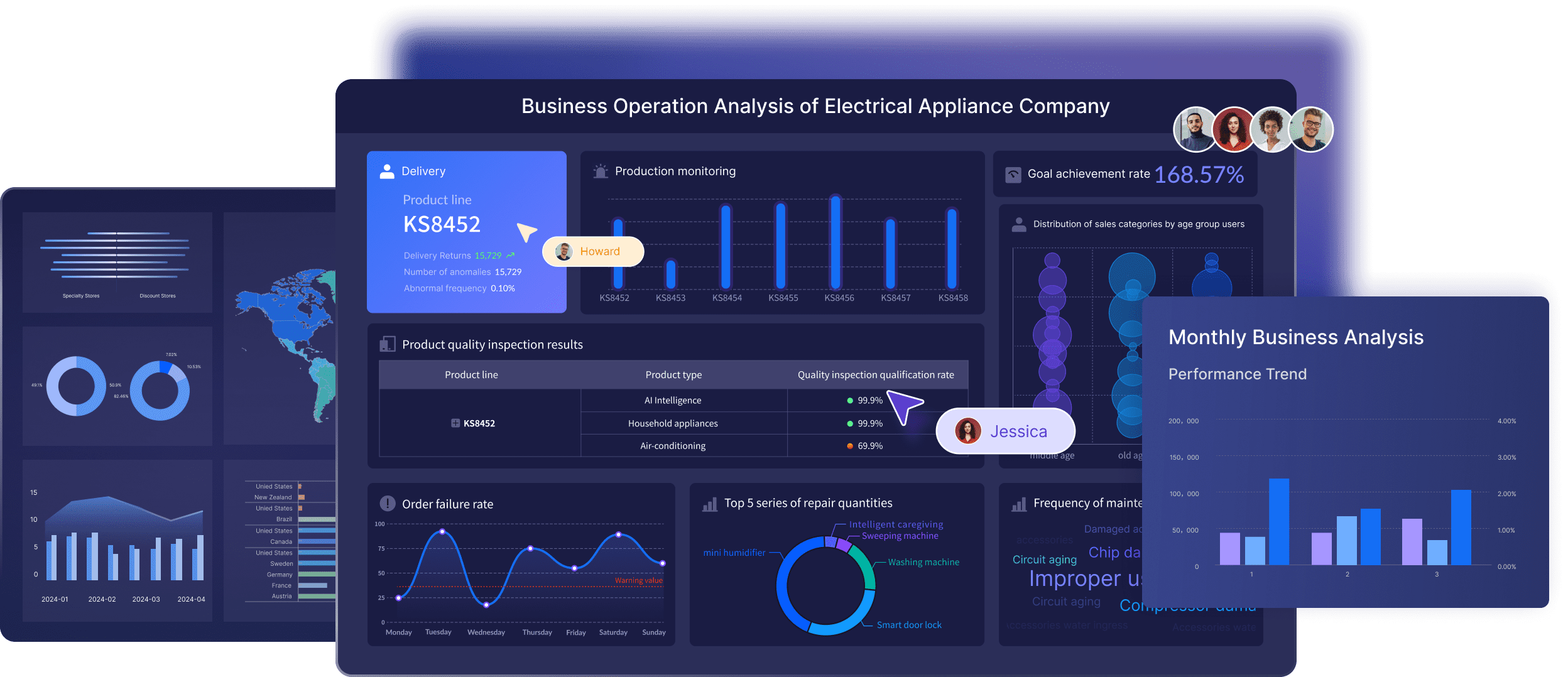
Advanced Visualization Techniques in Data Visualization Software
You want to get the most out of your data. That’s where advanced visualization techniques come in. These methods help you see patterns, trends, and outliers that might stay hidden in raw numbers. Let’s break down how the latest data visualization tools use these techniques to give you a real edge.
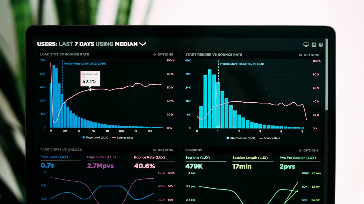
Real-Time Analytics
Real-time data integration is a game changer. You can spot issues as they happen and act before they become big problems. With real-time data visualization, you don’t have to wait for daily or weekly reports. You see what’s happening right now. This means you can adjust your strategy, fix bottlenecks, and keep your business running smoothly.
Here’s a quick look at how real-time analytics helps you:
Benefit
Description
Enhanced Decision-Making
Real-time analytics shows you which strategies work, so you can invest smarter and cut costs.
Proactive Problem-Solving
You catch problems early and respond fast to minimize impact.
Improved Customer Experiences
You monitor customer feedback instantly and solve issues before they escalate.
Increased Operational Efficiency
You tweak logistics and supply chains on the fly, saving time and money.
You can also use real-time data integration to optimize logistics, respond to market changes, and build stronger customer relationships. Real-time data visualization keeps your team in sync and ready to act.
AI-Driven Insights
AI data visualization takes advanced analytics to the next level. You don’t have to dig through endless charts. AI finds the trends, outliers, and patterns for you. These advanced visualization techniques help you make sense of huge datasets in seconds.
Here’s how AI-driven insights boost your analysis:
Automated insight discovery: AI scans your data and highlights trends and anomalies you might miss.
Predictive insights: AI uses historical data to forecast what’s coming next, so you can plan ahead.
Dynamic, personalized views: AI customizes dashboards for each user, showing the most relevant data.
AI data visualization also detects outliers in real-time and tells a story with your data. You get context, suggested actions, and a clear path forward. These advanced analytics features make your decisions smarter and faster.
Interactive Dashboards
Interactive dashboards are the heart of modern data visualization tools. You don’t just look at charts—you explore them. You click, filter, and drill down to see exactly what matters to you. These advanced visualization techniques turn static reports into dynamic dashboards that update in real-time.
Some benefits you’ll notice:
You make decisions faster because you see patterns and trends instantly.
Real-time insights let you monitor KPIs and react quickly.
You can build automated marketing dashboards that update as new data comes in.
Teams collaborate better with shared, interactive dashboards.
Check out this table of advanced visualization techniques used by top data visualization tools:
Tool
Advanced Visualization Techniques
Tableau
Treemaps, heatmaps, box and whisker plots, geographic maps for exploring complex patterns and trends.
Looker Studio
Geo maps and treemaps for advanced data visualization.
Domo
Interactive dashboards and custom apps for presenting complex data in an understandable format.
ThoughtSpot
Automated pattern and anomaly detection with SpotIQ.
Encord
Embedding plots for high-dimensional data.
FiftyOne
Embedding projections for visualizing high-dimensional data in lower dimensions.
With these visualization techniques, you can build automated marketing dashboards, use real-time data integration, and unlock the full power of advanced analytics. The best data visualization tools combine all these features, making your job easier and your insights sharper.
Selection Criteria for Best Data Visualization Tools
Choosing the right data visualization tools can feel overwhelming. You want powerful software applications that make your job easier, not harder. Let’s break down the main factors you should look for when picking data visualization software for your business.
Integration Capabilities
You need tools that connect smoothly with your existing systems. The best data visualization tools offer seamless integration, so you can pull data from different sources without a headache. Look for platforms that support various databases and ETL tools. Pre-built connectors save you time and effort.
Here’s a quick table to help you compare integration capabilities:
Key Factor
Description
Seamless Integration
Integrates easily with your current data sources and analytics platforms.
Support for Various Databases
Handles a wide range of databases and ETL tools for flexible data management.
Pre-built Connectors
Offers ready-made connectors to simplify the integration process.
FineBI stands out here. You can integrate data from multiple sources for comprehensive analysis. This means you get unified insights without jumping between systems.
Your business grows, and your data grows with it. You need data visualization tools that scale up and keep performance high, even with massive datasets. Leading platforms like Tableau, Looker Studio, Encord, and Domo handle large volumes of data while staying fast and responsive.
Check out how top tools compare:
Tool
Scalability and Performance Description
Tableau
Handles big data and stays quick and responsive.
Looker Studio
Manages datasets of all sizes with steady performance, thanks to Google’s infrastructure.
Encord
Built for huge datasets, keeping things efficient.
Domo
Stays fast as your data gets more complex and larger.
FineBI also delivers strong performance. You can process large datasets and access reports on mobile devices. This flexibility helps you keep up with business demands.
User Experience
You want data visualization tools that are easy to use. A good user experience means you spend less time learning and more time analyzing. Look for drag-and-drop dashboards, clear workflows, and mobile access.
FineBI shines with its variety of visual tools and dashboards. You get mobile BI, so you can check reports anywhere. The interface is simple, making it easy for anyone to explore data and share insights.
Tip: Pick data visualization tools that match your team’s skill level. The right choice boosts collaboration and helps everyone make smarter decisions.
When you focus on integration, scalability, and user experience, you unlock the full potential of data visualization capabilities. FineBI checks all these boxes, making it a top choice for businesses that want reliable, flexible, and easy-to-use data visualization tools.
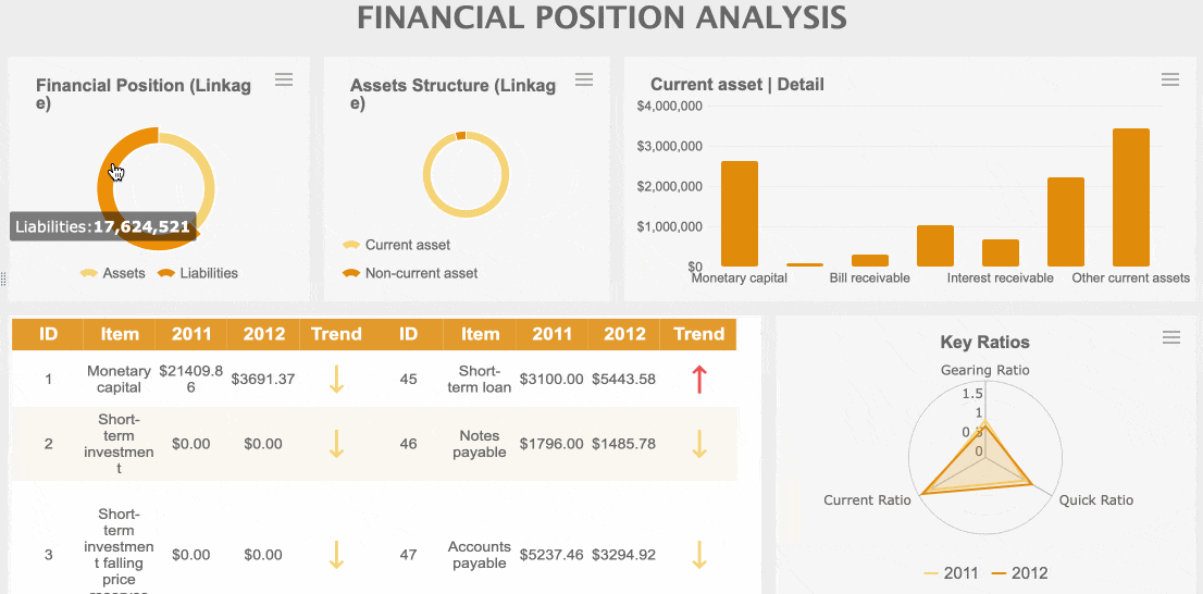
Top 10 Data Visualization Tools for 2025
Choosing the right data visualization tools can transform the way you see and use your data. Here’s a closer look at the best data visualization tools for 2025 and what makes each one a smart pick for your business.
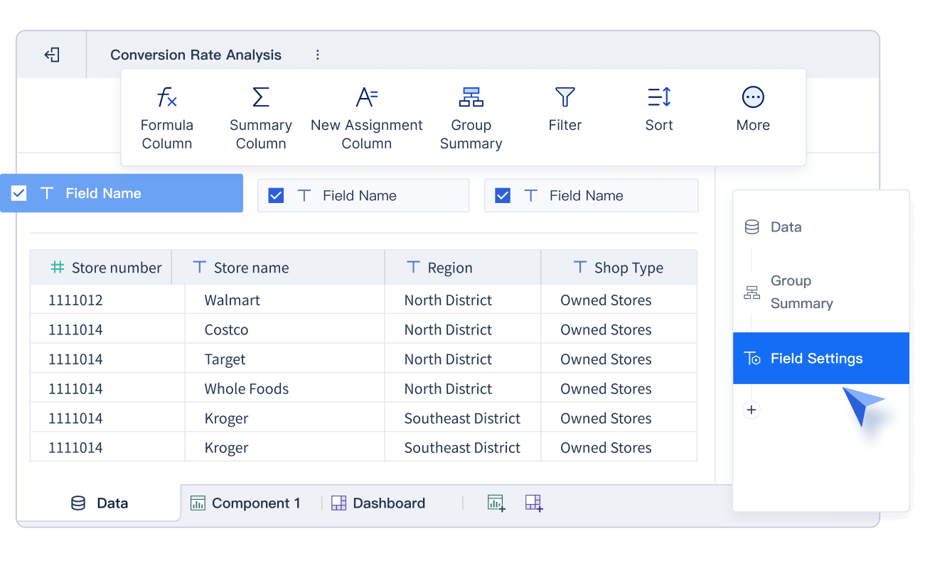
FineBI gives you a powerful self-service platform that makes data analysis easy for everyone. You can connect to over 60 data sources, including big data platforms, cloud warehouses, and APIs. FineBI lets you drag and drop to build dashboards, so you don’t need to write code.
You get real-time analytics, interactive dashboards, and AI-driven insights with FineChatBI. The platform supports advanced data modeling, flexible ETL/ELT, and enterprise-grade governance. You can set up role-based permissions, automate alerts, and collaborate with your team in real time. FineBI stands out for its high performance, supporting thousands of users and massive datasets without slowing down. If you want a tool that grows with your business and keeps your data secure, FineBI is a top choice.
Tableau remains one of the most popular data visualization tools for a reason. You get a rich set of advanced features that help you dig deep into your data:
Data Guide gives you insights about dashboards and checks data accuracy.
Dynamic Zone Visibility customizes dashboard elements for each user.
Table Extensions let you bring in analytics from external tools.
Modern Sharing Experience streamlines how you share content.
Collections Site Setting helps you organize content across Tableau Server.
MCP Server brings AI into complex analytics.
External Embedding with SDK lets you add analytics to web apps.
Revamped Tableau Pulse homepage on mobile gives you quick access to key metrics.
Custom themes keep your workbooks looking sharp.
VizQL Data Service API provides data access without visualizations.
You can use Tableau to create interactive dashboards, test ideas in real time, and share insights across your team. It’s a favorite for businesses that want flexibility and depth.
Power BI is a go-to for many companies that need strong integration and analytics. You can connect to over 120 data sources and see all your data in one place. Power BI gives you real-time analytics, so you always know what’s happening. You can build advanced data models, use AI-powered insights, and create custom dashboards that fit your needs.
Feature
Description
Seamless Data Integration
Connects with over 120 data sources for a complete view.
Real-Time Analytics
Monitors KPIs and performance with instant updates.
Advanced Data Modeling
Links different datasets and calculates metrics for deeper insights.
AI-Powered Insights
Uses machine learning for predictions and trend analysis.
Custom Visualizations
Lets you build interactive dashboards for better decisions.
Power BI works well for both small teams and large enterprises. You can use it to track sales, monitor operations, or forecast trends—all in one place.
Qlik Sense gives you a unique way to explore your data. Its engine lets you move in any direction, so you can find insights that other tools might miss. You can build visually stunning dashboards and interact with your data in real time.
Qlik Sense creates interactive dashboards that are easy to use.
Its engine allows you to explore data freely, not just follow set paths.
You can spot hidden trends and outliers quickly.
If you want a tool that helps you think outside the box, Qlik Sense is a great pick.
Looker brings AI and machine learning right into your analytics. You can ask questions in plain language and get instant answers, even if you’re not a data expert.
"Our vision is to make Looker the most innovative and flexible AI-driven BI platform, with an integrated, simple and beautiful experience, enabling self-service analytics, governed reporting and embedded BI with a leading semantic model, across databases and clouds."
Natural language queries make it easy for anyone to use.
AI-powered tools help you analyze and visualize data instantly.
Machine Learning Accelerator lets you build predictive models without coding.
You can prepare your data foundation with LookML models and enable AI features through integrations.
Looker is perfect if you want advanced analytics with a user-friendly touch.
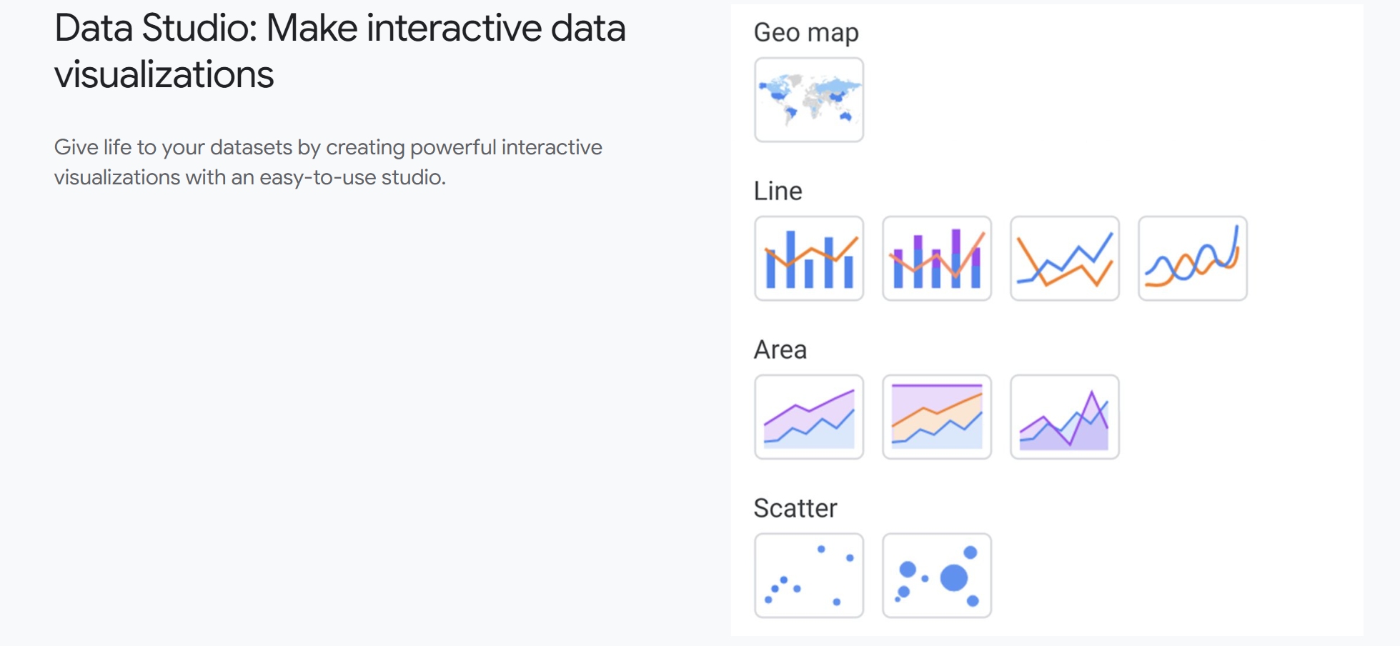
Google Data Studio makes it simple to turn your data into clear, interactive reports. You can connect to hundreds of data sources and use pre-built templates to get started fast.
Sisense lets you build advanced data pipelines and create real-time dashboards. You can use AI-powered tools to prepare your data and get fast answers, even with huge datasets.
Feature
Description
Advanced data pipelines
Build and manage data flows easily.
AI-powered data prep
Clean and organize data with AI tools.
Optimized query performance
Fast, responsive queries with the ElastiCube engine.
Scalability and flexibility
Handles growing data and complex relationships.
Interactive dashboards
Real-time insights for decision-makers.
Sisense is great for companies that need to handle lots of data and want to keep things running smoothly.
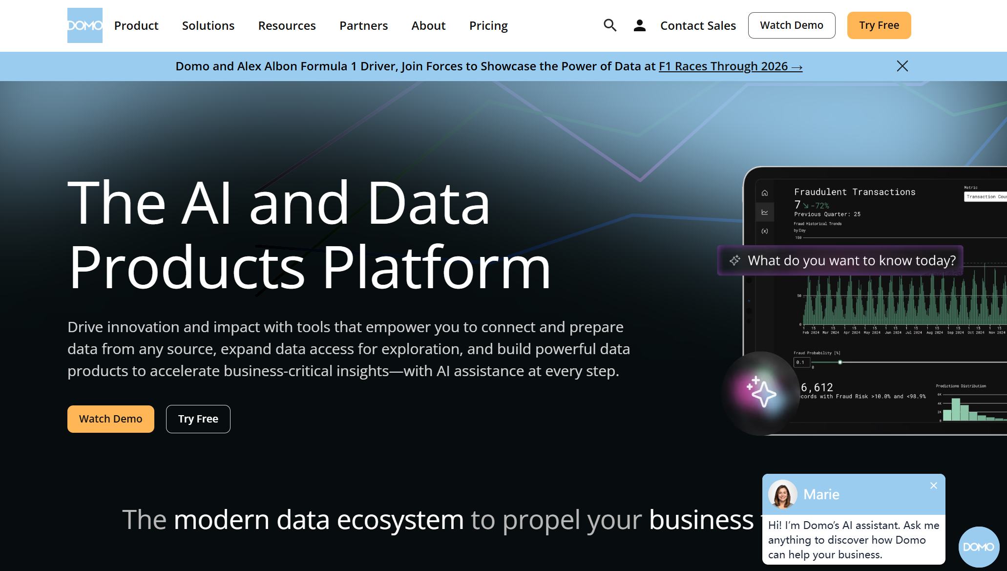
Domo gives you everything you need to visualize and analyze your data, all in one place. You can connect to many data sources, build custom dashboards, and use advanced analytics.
The Analyzer allows you to build powerful data visualizations with a drag-and-drop interface, making complex datasets easy to understand.
Data Integration: Connects to many sources for unified analytics.
Data Visualization: Customizable dashboards with real-time updates.
Collaboration Tools: Chat and annotate with your team.
Mobile Access: Use full features on your phone or tablet.
Advanced Analytics: Machine learning and predictive tools for forecasting.
Security: Enterprise-grade protocols keep your data safe.
Domo offers over 150 chart types for data visualizations, including Trellis charts and data science charts, powered by its proprietary visualization engine.
Domo is a strong pick if you want a tool that covers everything from data prep to sharing insights.
Zoho Analytics helps your business grow by scaling with your needs. You can integrate it with many systems and keep performance high, even as your data grows.
Feature
Description
Scalability
Grows with your business and handles more data as you expand.
Seamless Integration
Connects easily with other business tools and platforms.
Consistent Performance
Maintains speed and reliability as your data and user base increase.
Zoho Analytics is a good fit if you want a tool that adapts as your business changes.
Apache Superset is an open-source platform that gives you flexibility and control. You can create interactive dashboards, connect to many data sources, and customize your analytics.
You get a wide range of chart types and visualization options.
Superset supports real-time data exploration and sharing.
You can extend its features with plugins and custom code.
If you want a free, flexible tool that you can shape to fit your needs, Apache Superset is worth a look.
When you look at the best data visualization tools for 2025, you see a mix of power, flexibility, and innovation. Each tool brings something unique to the table, whether you need real-time analytics, AI-driven insights, or seamless integration. The right choice depends on your business goals, your team’s skills, and how you want to use your data. Try out a few and see which one helps you unlock the full value of your data.
Data Visualization Services and Use Cases
Industry Applications
You see data visualization services making a difference in every industry. If you work in manufacturing, you can track production lines and spot problems before they slow you down. In retail, you use dashboards to watch sales trends and adjust your inventory. Healthcare teams rely on data visualization services to monitor patient outcomes and improve care. Financial companies use these tools to catch fraud and manage risk. You get real-time updates, so you can react fast and stay ahead of the competition.
Here are some ways you might use data visualization services:
Monitor supply chain performance in smart factories.
Analyze customer behavior for better marketing.
Track employee productivity in HR departments.
Improve safety and compliance in public sector projects.
You can see how data visualization services help you make smarter choices, no matter your field.
Customer Success Stories
When you look at real-world results, you see how data visualization services deliver big wins. Companies save time, cut costs, and boost profits. You can check out these stories:
Company Name
Success Story
ROI/Impact
BNP Paribas
Reduces Fraud
20%
Fourth
Added Analytics and Realized ROI
117%
Cisco
Saves Employee Hours
4 Million Hours
Transport For London
Cuts Congestion
10%
Ad Tech Agency
Greater ROI through Identity Graph Analysis
N/A
You see BNP Paribas using data visualization services to reduce fraud by 20%. Fourth added analytics and saw a 117% return on investment. Cisco saved over 4 million employee hours. Transport For London cut congestion by 10%. These stories show you the real impact of data visualization services.
If you want to unlock similar results, you can start by exploring how data visualization services fit your business needs. You get the tools to turn data into action and drive success.
Comparing Data Visualization Tools
Feature Comparison
You want a tool that fits your workflow and grows with your business. Let’s look at how the top data visualization tools stack up when it comes to features and integration. This table gives you a quick overview:
FineBI stands out for its self-service analytics and enterprise-grade governance. You get robust security, flexible permissions, and real-time collaboration—all in one platform.
Use Case Summary
Every business has unique needs. Some tools shine for complex visualizations, while others work best for quick reports or deep analytics. Here’s a summary to help you match the right tool to your use case:
Tool Name
Main Use Case
Key Features
FineBI
Self-service analytics for all users
Drag-and-drop dashboards, AI insights, real-time data, strong governance
If you want a platform that empowers everyone in your company, FineBI gives you the tools for self-service analytics and secure, enterprise-level data management. You can explore data, build dashboards, and share insights—no coding required.
How to Choose the Right Data Visualization Software
Choosing the right data visualization software can feel tricky, but you can break it down into simple steps. Let’s walk through what matters most.
Assessing Business Needs
Start by thinking about what your business really needs. Do you want easy dashboards for everyone, or do you need advanced analytics for a few experts? Consider these factors:
Factor
Description
Costs
Look at license fees, subscriptions, and hidden costs like training or maintenance.
Privacy and Governance
Make sure the software protects sensitive data and follows legal rules.
Community Support
Open-source tools often have strong communities for help and updates.
Interoperability
The software should work with different data formats and sources.
Technical Readiness
Check if your team has the skills to use the tool well.
Tip: If your team is new to analytics, pick a tool with a simple interface and good support.
Data Complexity and Integration
Think about your data. Is it simple, or do you have lots of sources and formats? The right tool makes complex data easy to handle. Here’s what to look for:
Factor
Description
Ease of Use
A friendly interface helps you explore and analyze data quickly.
Scalability
The tool should handle large datasets without slowing down.
Customization Options
Personalize charts and dashboards to fit your needs.
Support for Multiple Sources
Connect to different databases, files, and APIs for a complete view.
If you deal with big data or need to combine information from many places, choose a platform that offers strong integration and scalability.
Budget and Scalability
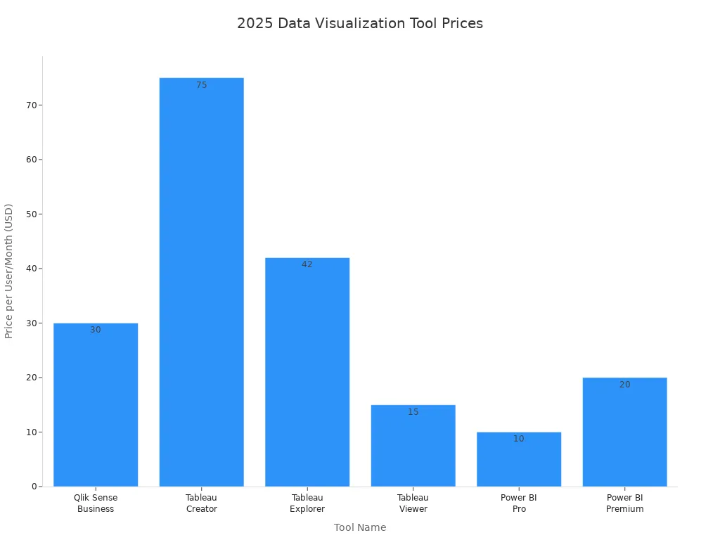
Money matters. You want a tool that fits your budget and grows with your business. Here’s a quick look at typical prices for popular platforms:
Tool Name
Price per User/Month
Qlik Sense Business
$30
Tableau Creator
$75
Tableau Explorer
$42
Tableau Viewer
$15
Power BI Pro
$10
Power BI Premium
$20
Note: Some tools offer custom pricing or extra features for larger teams. Always check what’s included before you decide.
When you match your needs, data complexity, and budget, you’ll find the best fit for your business. The right choice helps you unlock insights and make smarter decisions every day.
Choosing the right data visualization tool can change how you see your business. You want features that make your work easier and your insights clearer. Check out these key takeaways:
Key Takeaway
Description
Interactivity
Explore data with interactive dashboards and charts.
Integration
Connect easily with your current systems for smooth analysis.
User-friendly
Use simple interfaces everyone on your team can handle.
Take time to review your needs. Try out top tools like FineBI. You might even talk with data experts to find your best fit.
Continue Reading About data visualization services
Access a wealth of case studies, industry insights, and solution guides to accelerate digital transformation.
FAQ
What makes a data visualization tool easy to use?
You want a tool with a drag-and-drop interface. Clear workflows help you build dashboards fast. Mobile access lets you check reports anywhere. Simple menus and guided steps make your job easier.
Can I connect multiple data sources with these platforms?
Yes, you can link databases, cloud warehouses, and APIs. Most tools offer built-in connectors. You get unified dashboards that pull data from different places.
How do advanced analytics tools help my business?
Advanced analytics tools find patterns and trends in your data. You get predictions and automated insights. These features help you make smarter decisions and spot opportunities quickly.
Is my data secure when using visualization software?
You control access with role-based permissions. Many platforms offer encryption and audit logs. Your sensitive data stays protected while you share insights with your team.
Can I customize dashboards for different users?
You can set up personalized views. Each user sees the most relevant data. Filters and layout options let you tailor dashboards for every department or role.