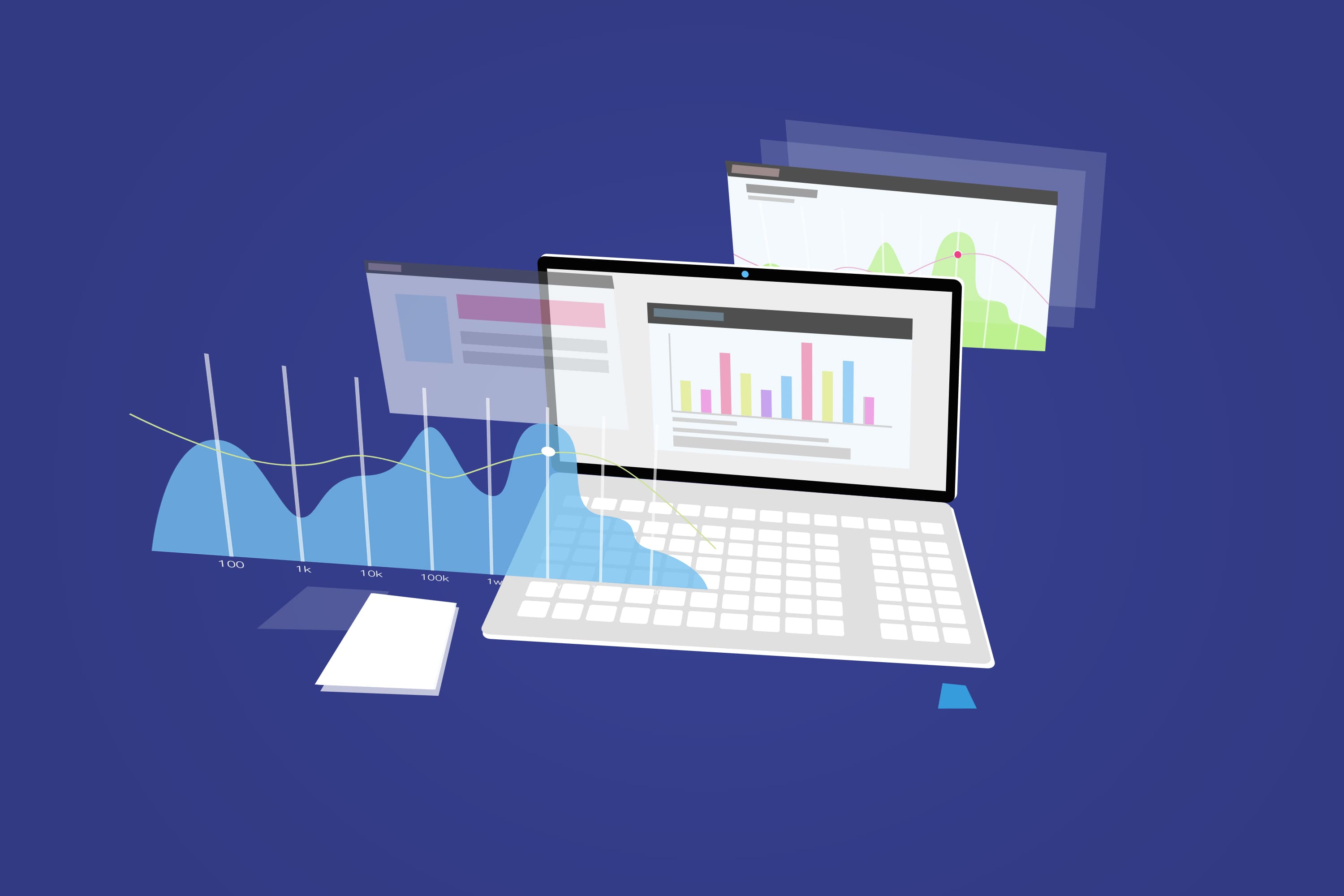
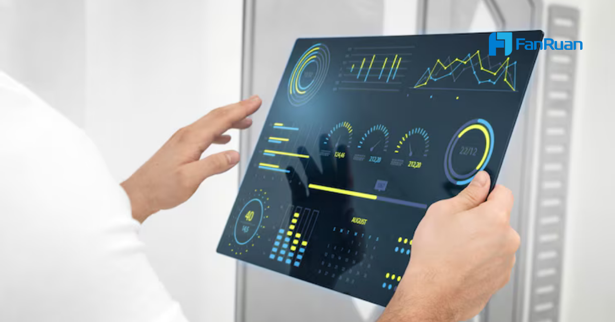
An application dashboard is a visual tool that lets you track key metrics and performance indicators from different data sources in one place, helping you monitor business activities and make smarter decisions quickly.
You see patterns and trends as soon as they happen. About 20% of organizations now use dashboards for business intelligence.
| Real-Time Dashboard Features | Impact on Decision-Making |
|---|---|
| Provides real-time insights | Accelerates decision-making |
| Allows focused analysis of key metrics | Improves accuracy in identifying trends and anomalies |
FineReport stands out as a leading solution, giving you the power to manage your data and drive success in a data-driven world.
An application dashboard is a centralized visual interface that lets you monitor, analyze, and interact with key business metrics from multiple data sources in real time. You use it to track performance, spot trends, and make informed decisions quickly.
You rely on application dashboards to support business intelligence. These dashboards bring together data from different systems, giving you a clear view of your organization’s performance. You see important numbers, charts, and tables all in one place. This helps you respond to changes and challenges as they happen.
Tip: You can access dashboards from your computer, tablet, or phone, making it easy to stay updated wherever you are.
Here is a table showing the main components and functions of an application dashboard in business intelligence:
| Component | Function |
|---|---|
| Connections to data sources | Connects to various data stores for up-to-date information. |
| Data visualizations | Displays performance metrics through various graphical formats. |
| Data tables | Provides a quick overview of relevant data values, often enhanced with color coding. |
| Drill-down capabilities | Allows you to access detailed data by clicking on visualizations. |
| Data filters | Enables you to customize views based on specific parameters. |
| Text boxes and tooltips | Offers explanations and additional context for the visualized data. |
Application dashboards play a vital role in business intelligence. You use them to consolidate information from multiple sources into a single interface. This makes it easier to track performance and analyze data. Dashboards enable real-time monitoring and help you respond to changing trends. You can view and analyze data from various devices at any time. Dashboards also foster better communication and teamwork across your organization.
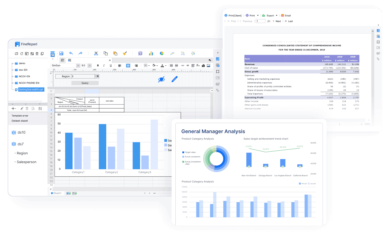
FineReport is a modern dashboard solution that makes these tasks simple. You do not need coding skills to design or customize your dashboard in application. FineReport connects to many databases and offers a user interface similar to Excel, which makes it easy for you to get started. You can choose from over 50 visualization styles across 19 categories, giving you plenty of options to display your data.
Here is a comparison table to show how FineReport stands out from other dashboard tools:
| Feature | FineReport | Other Tools |
|---|---|---|
| User-Friendliness | No-code solution | Requires coding knowledge |
| Customization of Reports | Easy customization | Varies by tool |
| Database Connectivity | Connects to various databases | Limited in some tools |
| User Interface | Similar to Excel | Varies widely |
| Data Visualization Styles | Over 50 styles across 19 categories | Limited options |

You use dashboards in application to perform several core functions that drive business success. These functions help you monitor operations, analyze data, and improve efficiency.
FineReport implements these core dashboard functions through different dashboard types:
Application dashboards give you the tools to manage your business more effectively. You see the big picture and the details, all in one place.
An application dashboard is a centralized visual interface that lets you monitor, analyze, and interact with key business metrics from multiple data sources in real time. You use dashboards to track performance, spot trends, and make informed decisions quickly.
You can connect your dashboard to a wide range of data sources. This flexibility allows you to unify information from different systems and get a complete view of your business. Common sources include:
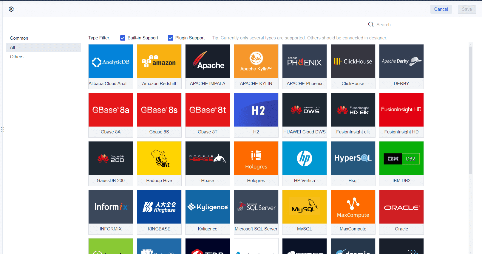
FineReport makes integration simple. You can connect and unify data from over 70 different sources, including databases, spreadsheets, and APIs. The low-code, Excel-like interface helps you create reports and dashboards quickly. You can deploy FineReport as a web application, making it easy to integrate with your existing business systems.
| Feature | Description |
|---|---|
| Data Sources | Connects and unifies data from over 70 heterogeneous sources |
| Interface | Low-code, Excel-like interface for report creation |
| Deployment | Web application for seamless integration with business systems |
You benefit from real-time dashboard features that keep your information current. FineReport supports real-time updates by monitoring background data and refreshing the dashboard instantly when changes occur. You can set intervals for updates or trigger refreshes based on specific conditions. This ensures you always see the latest data.
| Feature | Description |
|---|---|
| Data Push Refresh | Achieves real-time push refresh based on data changes |
| Monitor Refresh | Initiates refresh requests at set intervals for timely updates |
| Component Refresh | Enables instant refresh of dashboard components when conditions are met |
Real-time data dashboards offer several advantages:
You interact with dashboards using features that make data exploration easy and engaging. Modern dashboards let you customize views, drill down into details, and filter data dynamically. You can select specific data points, use advanced filters, and explore information at different levels.
| Feature | Description |
|---|---|
| Customization | Select specific data points and visualizations to display |
| Drill-downs | Explore data at different levels of detail |
| Advanced dashboard filters | Filter data dynamically for tailored insights |
| Real-time data processing | Dashboard visuals and metrics update immediately as data changes |
| Agile decision-making | Make quicker and more informed business decisions |
| Empowered business users | Interact with data without technical support |
| Increased productivity | Access relevant data instantly |
FineReport enhances your experience with optimized data alerts, improved visual effects, and intuitive dashboard setup. You can navigate data easily, zoom in on content, and receive timely alerts tailored to your role or department. These interactive features help you stay engaged and productive while using dynamic dashboards.
An application dashboard is a centralized interface that displays key metrics and data visualizations, helping you monitor business performance and make informed decisions.
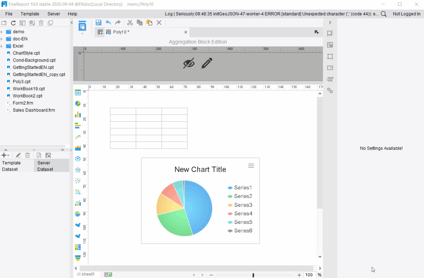
You can create custom dashboards in FineReport that fit your business needs. The platform gives you flexible layout options, such as Adaptive Layout and Absolute Layout, so you can organize your data in the most effective way. You set adaptive attributes for the entire dashboard, which means you do not need to adjust each component individually. You also control report zooming settings, font size, and content display modes. These customization options let you focus on the metrics that matter most, improving workflow efficiency and productivity.
| Customization Option | Description |
|---|---|
| Adaptive Attributes | Set for the whole dashboard, not just individual components |
| Layout Methods | Choose Adaptive or Absolute Layout for different effects |
| Report Zooming Settings | Options like Bidirectional Adaptive and Horizontal Adaptive |
| Font Settings | Adjust font size based on zooming |
| Content Display Modes | Select how content appears in report blocks |
Tip: Custom dashboards help your team access relevant insights quickly, reducing time spent searching for information.
FineReport supports a wide range of data visualizations. You can use charts to compare differences, show distributions, highlight proportions, and reveal associations. You also visualize processes, intervals, time, and trends. Interactive data visualizations allow you to manipulate data and view different perspectives in real time. By integrating multiple visualizations into one business dashboard, you gain deeper insights and make faster decisions.
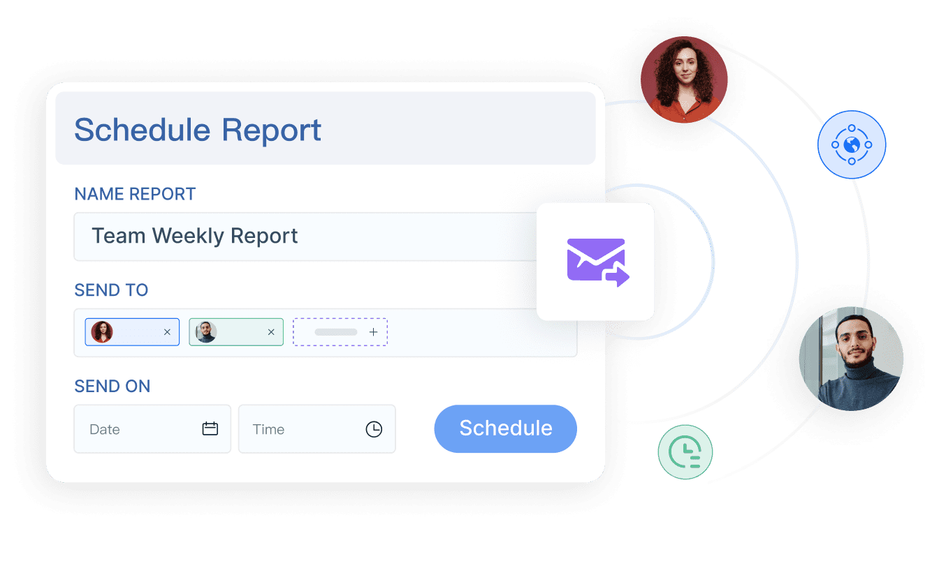
You can enter data directly into your dashboards and use parameter queries to filter information. FineReport lets you set parameters to interact with data in real time. For example, you can query sales by region or link data between report blocks. You define dataset parameters in SQL statements, such as ${region}, to filter results based on user input. This feature supports dynamic filtering and enhances interactivity.
| Feature | Benefit |
|---|---|
| Real-time data updates | Monitor performance and respond swiftly |
| Automated data gathering | Focus on analysis, not compilation |
| Customizable metrics and KPIs | Track the most relevant data points |
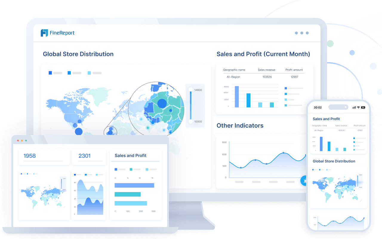
FineReport gives you mobile dashboard access, so you can view insights on any device. Dashboards adapt to tablets, phones, TVs, and large screens. You use abundant visual elements, multiple layout types, and component reuse for quick dashboard creation. Features like data monitoring, timed refresh, and auto carousel keep your information current. Mobile dashboards provide real-time data access, interactive visualizations, personalization, offline capabilities, and seamless integration with your business systems.

| Feature | Description |
|---|---|
| Multi-screen adaptation | Dashboards fit tablets, phones, TVs, and large screens |
| Real-time data access | Make instant decisions with up-to-date information |
| Interactive visualizations | Understand trends and patterns quickly |
| Personalization features | Customize dashboards for your role and needs |
| Offline capabilities | Access critical data even without a network |
| Seamless integration | Connect dashboards with existing systems for unified insights |
You use these features to create business dashboards that deliver actionable insights, support collaboration, and drive better decisions.
An application dashboard gives you a single interface to monitor, analyze, and interact with key business metrics from multiple sources in real time.
You can choose from several dashboard types in FineReport, each designed for specific business needs. Here is a table that summarizes the main types and their functions:
| Dashboard Type | Description |
|---|---|
| Management Cockpit | Lets you monitor and analyze data in real time for better decision-making. |
| Operational Cockpit | Supports drilling, linkage, and multi-dimensional views for comprehensive analysis. |
| Multi-terminal Display | Allows you to track key indicators on mobile devices, improving accessibility and usability. |
| Monitor Refreshing | Enables real-time monitoring of key indicators in settings like command centers. |
You can also use dashboards for different purposes:
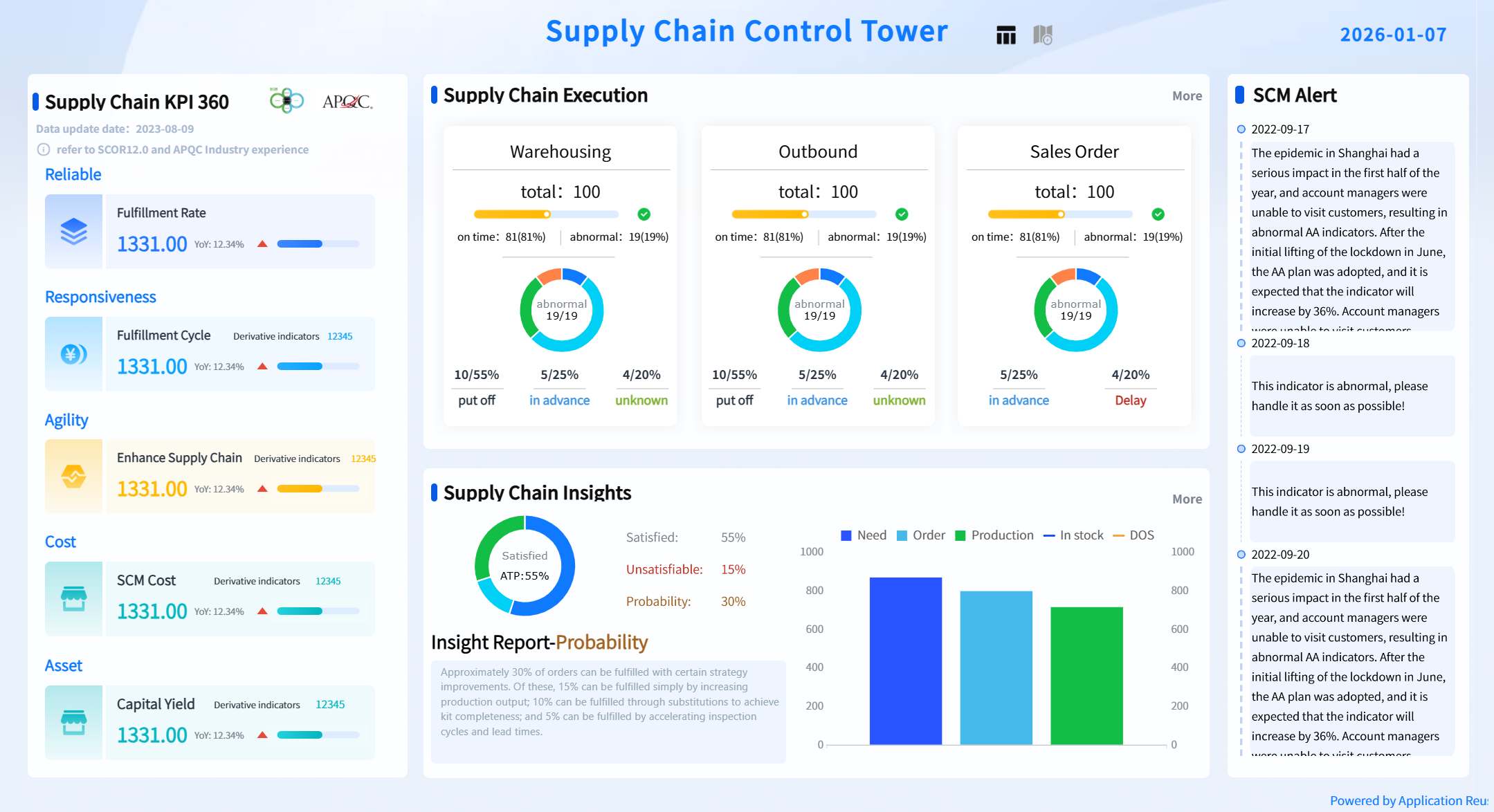
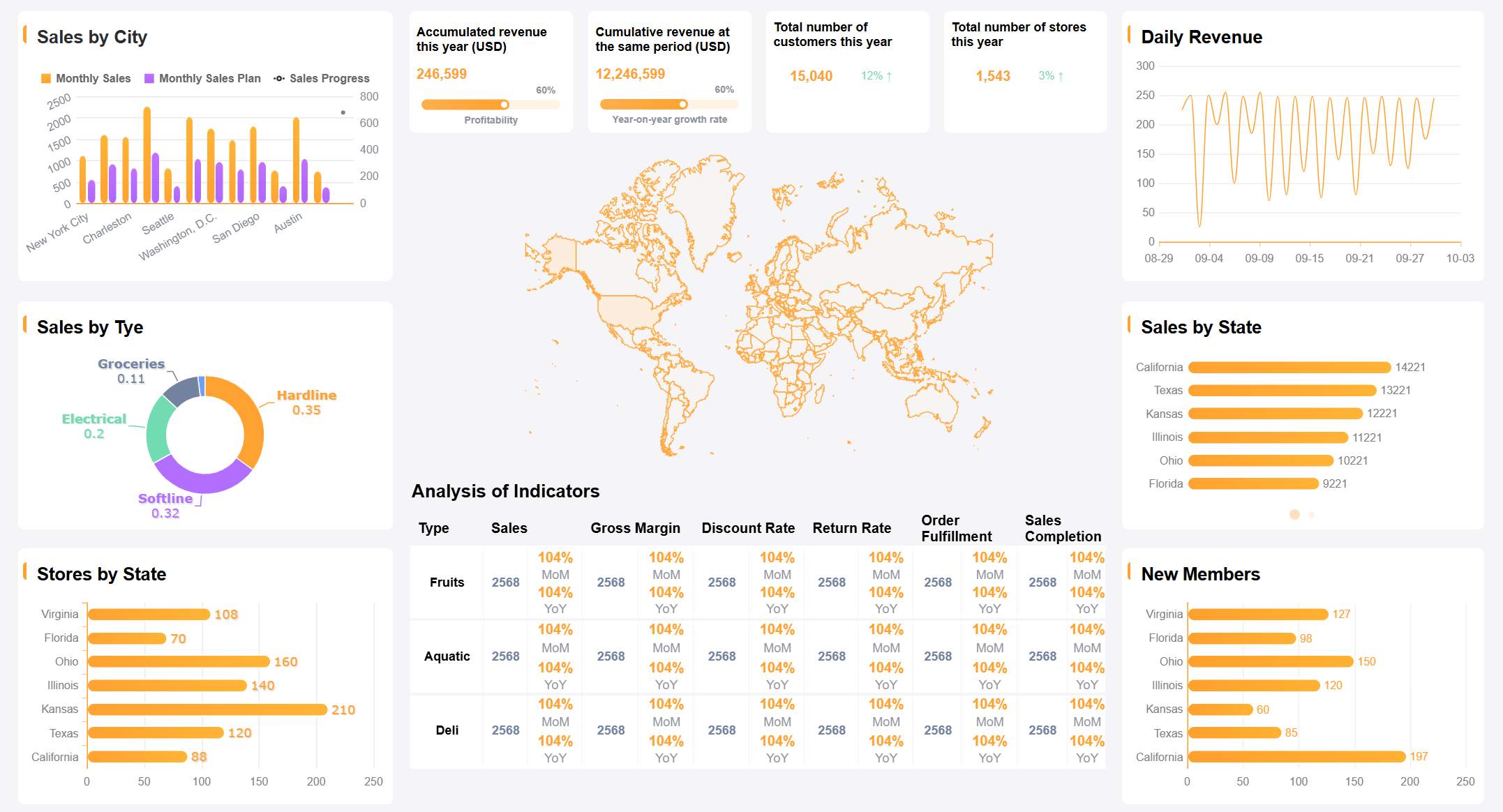
You can apply FineReport dashboards across many industries. In manufacturing, you track supply chain indicators and production efficiency with real-time data visualization. In retail, you monitor sales performance, inventory, and customer behavior. In logistics, you oversee shipment status and optimize delivery routes.
FineReport improves operational efficiency by reducing communication costs and consolidating information into a single dashboard. You receive AI-driven risk alerts and recommendations, which help you respond quickly to changes. The low-code integration feature lets you connect data from different systems, removing silos and making analysis easier.
Tip: You can use mobile dashboards to access key metrics anywhere, keeping you informed on the go.
Kintetsu World Express (China) uses FineReport to manage logistics data. You can see how their sales teams now access real-time dashboards that show customer visits and cargo volumes. This system integrates multiple data sources, giving you a complete view of operations. As a result, Kintetsu improved information management and operational efficiency. You can use similar dashboards to streamline reporting and make better decisions in your own organization.
An application dashboard is a visual interface that lets you monitor, analyze, and interact with key business metrics from multiple sources in real time, helping you make faster, smarter decisions.
You use dashboards to see important data at a glance. This helps you make decisions based on facts, not guesses. Dashboards present visualizations that show trends and risks, supporting public health and business efforts. For example, in Rwanda, dashboards helped teams understand project performance and identify areas needing more support.
| Evidence Description | Key Findings |
|---|---|
| Dashboards display data visually | They inform decisions in health, business, and community projects |
| Dashboards influence choices for specific groups | They provide evidence-based support for communities |
Tip: Dashboards give you the power to act quickly when you see changes in your data.
You track performance using dashboards that update in real time. This means you do not wait for monthly reports to find problems. You see issues as they happen and can fix them right away. Dashboards highlight crucial data and let you dive deeper into specifics, making your work more interactive.
You notice big differences between dashboards and traditional reports. Dashboards offer real-time insights, while reports often show outdated information. Dashboards use visual aids for better clarity, but reports rely on static tables and text.
| Feature | Dashboard (FineReport) | Traditional Reports |
|---|---|---|
| Data Updates | Real-time | Periodic |
| Visualization | Interactive charts and graphs | Static tables and text |
| User Engagement | High (drill-down, filters) | Low |
| Analytics | Immediate, actionable | Delayed, less dynamic |
| Data Clarity | Strong, visual | Limited, text-heavy |
Note: FineReport dashboards help you stay ahead by providing up-to-date information and easy-to-use analytics tools.
An application dashboard is a visual tool that helps you track and analyze key business metrics in real time. You use dashboards to make smarter decisions and improve efficiency. FineReport gives you powerful features for data integration, visualization, and mobile access.
You can explore FineReport to create dashboards that fit your needs and drive better results.
What is a Digital Dashboard and How Does It Work
Dashboard Anywhere Made Easy for Chrysler Employees

The Author
Lewis
Senior Data Analyst at FanRuan
Related Articles
Payment Analytics Dashboard: 12 KPIs Every Operations Leader Should Track to Cut Revenue Leakage
Losing revenue to declines? Discover 12 essential KPIs to track in your payment analytics dashboard to stop leakage and manage disputes.
Lewis Chou
May 05, 2026
SOC Dashboard Explained: 12 Essential KPIs, Views, and Workflows Security Teams Use
Learn about SOC dashboards, the 12 essential KPIs for security teams, and how they centralize alerts and workflows for faster threat detection and response.
Lewis Chou
May 05, 2026

EMR Dashboard Guide: 12 Metrics to Track for Faster Clinical and Operational Decisions
Learn the 12 essential EMR dashboard metrics to track for faster clinical and operational decisions, improving patient flow and revenue cycle management.
Lewis Chou
May 05, 2026


