A PPC dashboard is a single view that pulls your paid advertising data into one place so you can quickly see what is working, what is wasting budget, and where to optimize next. For beginners, this matters because PPC data usually lives across multiple ad platforms, spreadsheets, exported reports, and analytics tools. That creates slow decisions, inconsistent numbers, and too much time spent explaining performance instead of improving it.
All dashboards in this article are built with FineBI.
What a PPC dashboard is and why beginners use one
A PPC dashboard is a visual reporting layer for paid media performance. It combines campaign metrics from tools like Google Ads, Microsoft Ads, paid social platforms, and conversion systems into charts, tables, and KPI cards that are easy to scan.
For a beginner, the real value is not just visibility. It is decision speed. Instead of opening several platforms and trying to reconcile totals manually, you can review one dashboard and answer practical questions faster:
- Are campaigns on track this week?
- Which channel is spending the most?
- Which campaign is generating leads or revenue?
- Is cost rising faster than conversions?
- Where should the next optimization happen?
A dashboard also helps beginners move beyond fragmented reporting. Raw exports often show rows and rows of data but do not explain what deserves attention. A dashboard organizes that data into patterns and exceptions, which makes it easier to act with confidence.
Dashboard vs raw report vs full analytics platform
These terms are often confused, but they serve different purposes:
- PPC dashboard: A visual monitoring tool focused on key paid media metrics and trends.
- Raw report: A detailed table or export with granular records, useful for audits and deep investigation.
- Analytics platform: A broader system that may include attribution, event tracking, audience analysis, and cross-journey measurement beyond PPC.
A good beginner setup usually starts with a dashboard, uses raw reports for troubleshooting, and adds broader analytics only when the team needs deeper attribution or customer journey analysis.
Why beginners rely on dashboards early
Beginners often struggle with two recurring issues: too much data and too little context. A PPC dashboard solves both by showing only the metrics needed for routine decisions and grouping them into views that match how campaigns are managed.
Key Metrics (KPIs) beginners should expect in a PPC dashboard:
- Impressions: The number of times ads were shown. Indicates reach and visibility.
- Clicks: The number of users who clicked an ad. Shows traffic volume.
- CTR (Click-Through Rate): Clicks divided by impressions. Measures ad engagement and relevance.
- Spend: Total advertising cost in a period. Tracks budget usage.
- CPC (Cost Per Click): Spend divided by clicks. Measures traffic acquisition efficiency.
- Conversions: The number of desired actions completed, such as purchases or form submissions.
- Conversion Rate: Conversions divided by clicks. Shows how well traffic turns into outcomes.
- CPA (Cost Per Acquisition): Spend divided by conversions. Measures how expensive it is to generate a result.
- Revenue: Income generated from PPC activity. Critical for ecommerce and high-visibility ROI reporting.
- ROAS (Return on Ad Spend): Revenue divided by spend. Shows how effectively ad dollars generate revenue.
- Lead Quality: A measure of whether conversions are actually qualified. Important for B2B and lead generation.
- Pipeline Impact: Down-funnel value influenced by PPC, such as opportunities or sales pipeline created.

Core metrics you will usually see in a PPC dashboard
The best PPC dashboard does not try to show everything. It shows the metrics that help you judge performance, efficiency, and business impact.
Traffic and visibility metrics
Traffic and visibility metrics tell you whether people are seeing and engaging with your ads.
- Impressions: Useful for understanding how much exposure your campaigns are getting.
- Clicks: A direct indicator of traffic driven from paid campaigns.
- CTR: Helps you evaluate ad relevance, messaging strength, and audience alignment.
If impressions are high but clicks are weak, the issue may be creative, targeting, or keyword intent. If clicks are strong but results are still poor, the problem may sit further down the funnel.
Cost and efficiency metrics
Cost metrics help you determine whether performance is sustainable.
- Spend: Shows total budget usage over time.
- CPC: Helps benchmark how expensive each click is becoming.
- CPA: Measures the actual cost to produce a conversion.
- ROAS: Essential for judging revenue efficiency in ecommerce and performance-driven campaigns.
For beginners, these metrics are often the first signal that a campaign needs intervention. Rising spend with flat conversions usually means wasted budget. Stable CPC with falling conversion rate suggests a landing page or targeting problem.
Conversion and business outcome metrics
This is where PPC reporting becomes useful to leadership, sales teams, and finance stakeholders.
- Conversions: The number of completed goals.
- Conversion Rate: Tells you whether paid traffic is turning into action.
- Revenue: Links campaigns to actual business value.
- Lead Quality: Distinguishes raw lead volume from sales-ready demand.
- Pipeline Impact: Shows whether PPC contributes to downstream revenue opportunities.
A beginner mistake is focusing only on clicks and traffic. Mature PPC dashboard design always connects top-of-funnel performance to business outcomes.
Diagnostic metrics for optimization
Diagnostic metrics explain why performance is changing.
- Quality Score: Indicates how relevant your ads, keywords, and landing pages are in search campaigns.
- Impression Share: Shows how often your ads appear compared with total available opportunities.
- Search Terms: Helps identify irrelevant queries, profitable intent patterns, and negative keyword opportunities.
- Device Performance: Reveals whether mobile, desktop, or tablet traffic behaves differently.
- Audience Performance: Compares segments such as remarketing, in-market users, or custom audiences.
These are the metrics that turn a PPC dashboard from a reporting screen into an optimization tool.
Common dashboard views that make campaign data easier to understand
A strong PPC dashboard is usually built from several views, each designed for a specific question. That structure matters more than adding more charts.
Overview view
The overview view is the control center. It gives a fast read on overall account health and short-term movement.
It usually includes:
- Spend
- Clicks
- Impressions
- CTR
- Conversions
- CPA
- Revenue or ROAS
- Trend lines over time
This is the view most marketers check daily or weekly. It should help someone understand performance in under a minute.
Channel or platform view
This view compares performance across ad platforms in one structure. It is especially useful when budgets are split across multiple channels.
Typical platforms include:
- Google Ads
- Microsoft Ads
- Meta Ads
- LinkedIn Ads
- TikTok Ads
- Other paid social or programmatic channels
The goal is not just comparison. It is budget allocation. A channel view helps you spot which platform is producing cheap traffic, qualified leads, or stronger ROAS.
Campaign, ad group, and keyword view
This is the drill-down layer. It helps you move from "performance changed" to "this specific campaign or keyword caused it."
Useful elements in this view include:
- Campaign spend and conversions
- Ad group efficiency
- Keyword-level CTR and CPC
- Search term quality
- Conversion rate by campaign segment
For beginners, this is often where learning accelerates. You begin to see that not all traffic is equal and not all budget is working equally hard.
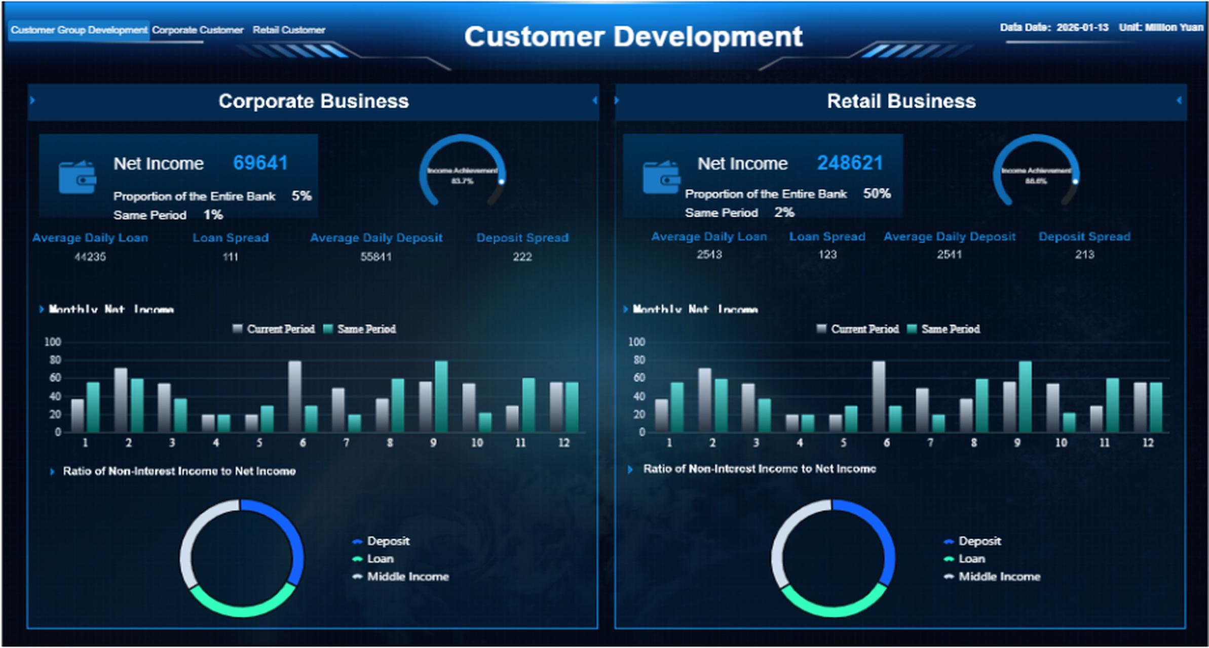
 FineBI's Dashboard with Drill-down layers
Audience, device, and location view
Segmentation views make targeting decisions much easier.
This view usually breaks performance out by:
- Device type
- Geography
- Audience list
- Demographic group
- New vs returning users
A common beginner insight is discovering that mobile drives most clicks but desktop drives more conversions, or that one region has significantly lower CPA than another. That is exactly the kind of finding a PPC dashboard should surface.
PPC dashboard examples and templates beginners can learn from
Beginners do better with clear templates than with blank canvases. A practical PPC dashboard should match the reporting goal, not just look polished.
Simple starter template
A starter template is ideal for weekly monitoring and basic optimization. It should include only the metrics needed for quick check-ins.
Recommended layout:
| Section | What to include | Why it matters |
|---|---|---|
| KPI summary | Spend, clicks, conversions, CPA, CTR | Gives an instant health check |
| Trend chart | Spend and conversions over time | Shows movement week to week |
| Campaign table | Top campaigns by spend and conversions | Highlights winners and waste |
| Alerts section | Rising CPA, falling CTR, overspend flags | Directs attention to action points |
This template works well for small businesses, junior marketers, and teams just formalizing PPC reporting.
Lead generation reporting template
Lead gen teams need more than platform conversions. They need to know whether the leads are usable.
A stronger lead generation PPC dashboard will track:
- CPL
- Form fills
- Call tracking outcomes
- Qualified leads
- Conversion rate by landing page
- Pipeline contribution by campaign
This helps align marketing with sales. A campaign that generates cheap leads but weak qualification rates should not be treated as a success.
Ecommerce reporting template
For ecommerce, the dashboard must connect ad cost to transaction value.
Core ecommerce PPC dashboard metrics include:
- Revenue
- ROAS
- Average order value
- Transactions
- Conversion rate
- Product or category performance
- Cart and checkout trends
This template is built to answer one key question: which campaigns and products generate profitable growth?
Agency reporting template
Agencies need a dashboard that works for both internal optimization and external communication.
A strong agency-focused PPC dashboard often includes:
- Executive summary for clients
- KPI pacing against budget
- Cross-platform view
- Campaign insights and commentary
- Top wins, risks, and next steps
The best agency templates separate performance data from narrative guidance. Clients want numbers, but they also want interpretation and a plan.
How agencies and teams use PPC dashboards in real workflows
A PPC dashboard becomes much more valuable when it fits real operating routines. This is where many teams fail. They build reports but do not design them around actual decisions.
Dashboards for agencies managing multiple clients
Agencies need repeatable structure and fast switching between accounts. Most successful workflows separate reporting into layers:
- Executive summary: High-level KPIs for client-facing communication
- Account performance view: Daily and weekly optimization metrics for specialists
- Detailed drill-down: Campaign, keyword, ad, and audience analysis for troubleshooting
This separation keeps dashboards readable. It also reduces the common agency problem of showing clients too much tactical detail and not enough business clarity.
Dashboards for in-house marketing teams
In-house teams use PPC dashboards differently. They often need to coordinate across marketing, finance, sales, and leadership.
Typical internal use cases include:
- Budget pacing checks
- Weekly performance reviews
- Creative and landing page test monitoring
- Regional or product-level reporting
- Stakeholder update preparation
An in-house PPC dashboard should make it easy to answer both operational and executive questions without rebuilding reports every week.
Using one tool to track PPC campaigns across platforms
If your campaigns run across more than one platform, using separate native dashboards creates reporting friction fast. A unified solution should help you:
- Combine data sources into one model
- Standardize KPI definitions across platforms
- Automate refresh schedules
- Filter by date, campaign, channel, or audience
- Build role-based views for specialists and executives
This is especially important when teams need a reliable source of truth. If Google Ads, Meta, CRM data, and spreadsheet totals all show different answers, trust collapses.
How to build a useful PPC dashboard without overcomplicating it
A useful PPC dashboard is not the one with the most widgets. It is the one that supports faster, better decisions. Beginners should aim for clarity first and complexity later.
1. Start with one goal and a short KPI list
Begin with the primary business objective:
- Lead generation
- Ecommerce revenue
- Brand visibility
- Pipeline creation
- Budget control
Then choose only the KPIs needed to judge progress. Most beginner dashboards need no more than 5 to 8 top-level metrics.
2. Choose views based on actions, not data volume
Every dashboard view should answer a question that leads to action.
Examples:
- Overview view: Are we on track?
- Channel view: Where should budget shift?
- Campaign view: Which initiatives need optimization?
- Audience view: Which segments deserve more spend?
If a view does not help someone decide something, it probably does not belong.
3. Keep charts readable and labels obvious
A dashboard fails when people cannot interpret it quickly. Use plain metric names, clear date filters, and clean chart selection.
Best practice includes:
- One chart purpose per section
- Consistent naming conventions
- Side-by-side period comparison
- Limited color use for emphasis
- Tables for detail, charts for trends
4. Separate monitoring from analysis
Daily monitoring dashboards should stay simple. Deep analysis can live in separate drill-down pages. This prevents clutter and keeps routine reporting efficient.
5. Use a beginner checklist before calling it “done”
Ask these questions:
- Can someone understand account health in under one minute?
- Are the KPIs tied to a real business goal?
- Does each view support a specific action?
- Are platform metrics standardized clearly?
- Can stakeholders find answers without asking for manual exports?
- Does the dashboard reduce reporting time?
- Does it help identify optimization opportunities faster?
If the answer is no to several of these, the dashboard needs simplification.
Consultant best practices for implementation:
- Define one owner for metric logic. Someone must own KPI definitions so spend, conversions, and revenue are interpreted consistently.
- Set a reporting cadence before building visuals. Daily, weekly, and monthly users need different views.
- Map every chart to a decision. Never add visuals because they look impressive.
- Validate conversion tracking first. A beautiful PPC dashboard built on broken tracking is dangerous.
- Review with end users early. Let marketers, managers, and stakeholders test the dashboard before full rollout.
Build a smarter PPC dashboard with automation instead of manual reporting
At some point, manual PPC reporting becomes too slow, too fragile, and too hard to scale. Pulling exports from ad platforms, cleaning spreadsheets, updating charts, and explaining discrepancies every week is not a sustainable workflow.
That is where the right BI and reporting stack makes a measurable difference. Building this manually is complex; use FineBI to utilize ready-made templates and automate this entire workflow. With the right setup, teams can centralize PPC data, standardize KPIs, create role-based dashboard views, and refresh reporting automatically without rebuilding the same reports over and over.
FineBI is especially useful when you need to:
- Consolidate PPC data from multiple platforms
- Build interactive dashboards for different stakeholders
- Create standardized templates for agencies or internal teams
- Automate recurring reporting workflows
- Scale from beginner reporting to enterprise visibility
For teams that want self-service exploration and dashboard analysis, FineBI complements this approach by making data more accessible to business users. Together, they help reduce manual reporting effort and improve decision-making speed.
The bottom line is simple: a good PPC dashboard turns paid media data into action. A great one does it consistently, automatically, and at scale.
 Get Ready-to-Use Dashboard Templates in Fine Gallery
FAQs
A PPC dashboard brings key paid advertising metrics into one view, such as spend, clicks, impressions, conversions, CTR, CPC, CPA, and ROAS. It helps beginners quickly understand performance without checking multiple platforms separately.
Beginners use PPC dashboards to reduce reporting confusion and make faster decisions. Instead of sorting through raw exports, they can spot trends, wasted spend, and top-performing campaigns more easily.
The most important metrics usually include spend, clicks, CTR, CPC, conversions, conversion rate, CPA, and ROAS. These show whether ads are getting attention, generating results, and using budget efficiently.
A raw report shows detailed rows of data for investigation, while a PPC dashboard highlights the most important trends and KPIs visually. Dashboards are better for quick monitoring, while raw reports are better for deep analysis.
Yes, a PPC dashboard can pull data from platforms like Google Ads, Microsoft Ads, paid social channels, and conversion tools into one place. This makes cross-channel comparison and budget decisions much easier.


The Author
Yida Yin
FanRuan Industry Solutions Expert
Related Articles

Portfolio Reporting for PMOs: 9 Executive Metrics Every Weekly Portfolio Dashboard Should Include
Weekly portfolio reporting should help executives answer three questions fast: Are we delivering the right initiatives, are we putting outcomes at risk, and what decisions need leadership this week? For PMOs, that means
Yida Yin
Jul 01, 2026

How to Build an Investment Portfolio Reporting Dashboard for Executives: KPIs, Benchmarks, and Drill-Down Views
Investment portfolio reporting for executives is not about showing every holding, transaction, and chart your investment team can produce. It is about giving CEOs, CFOs, CIOs, boards, and investment committees a fast, re
Yida YIn
Jun 25, 2026

12 KPI Reporting Examples for Executive Dashboards: What to Show in Weekly, Monthly, and Quarterly Reviews
Executive leaders do not need more data. They need decision ready $1 examples that match how often they review the business and what actions they are expected to take. A weekly $1 should surface fast moving risks and per
Yida YIn
Jun 25, 2026