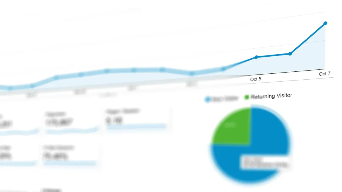
A data visualization dashboard is a digital platform where you view and interact with data using charts, graphs, and tables, helping you track important metrics and trends in real time. In 2026, you rely on a dashboard for instant insights, making dashboard reporting essential for daily business decisions. The popularity of data visualization dashboards has grown rapidly, especially among businesses needing quick data access. You use a dashboard to replace static reports, choosing interactive dashboard reporting to stay competitive. With data visualization dashboard tools, you work smarter, analyze data faster, and make better decisions.
What is a data visualization dashboard?
A data visualization dashboard gives you a clear, interactive view of your most important data by combining charts, graphs, and tables in one place. You use it to track key metrics, spot trends, and make decisions quickly, all from a single, easy-to-understand screen.
Core features and functions
You rely on a data dashboard to bring together information from different sources and present it visually. This tool helps you see the big picture and focus on what matters most. The main purposes of a data dashboard include:
- Informed decision making: You get a real-time snapshot of business performance.
- Efficiency: You view key metrics at a glance, saving time.
- Goal tracking: You monitor progress toward your goals or KPIs.
- Data accessibility: You make complex data easy for everyone to understand.
- Predictive analysis: You forecast trends using historical data.
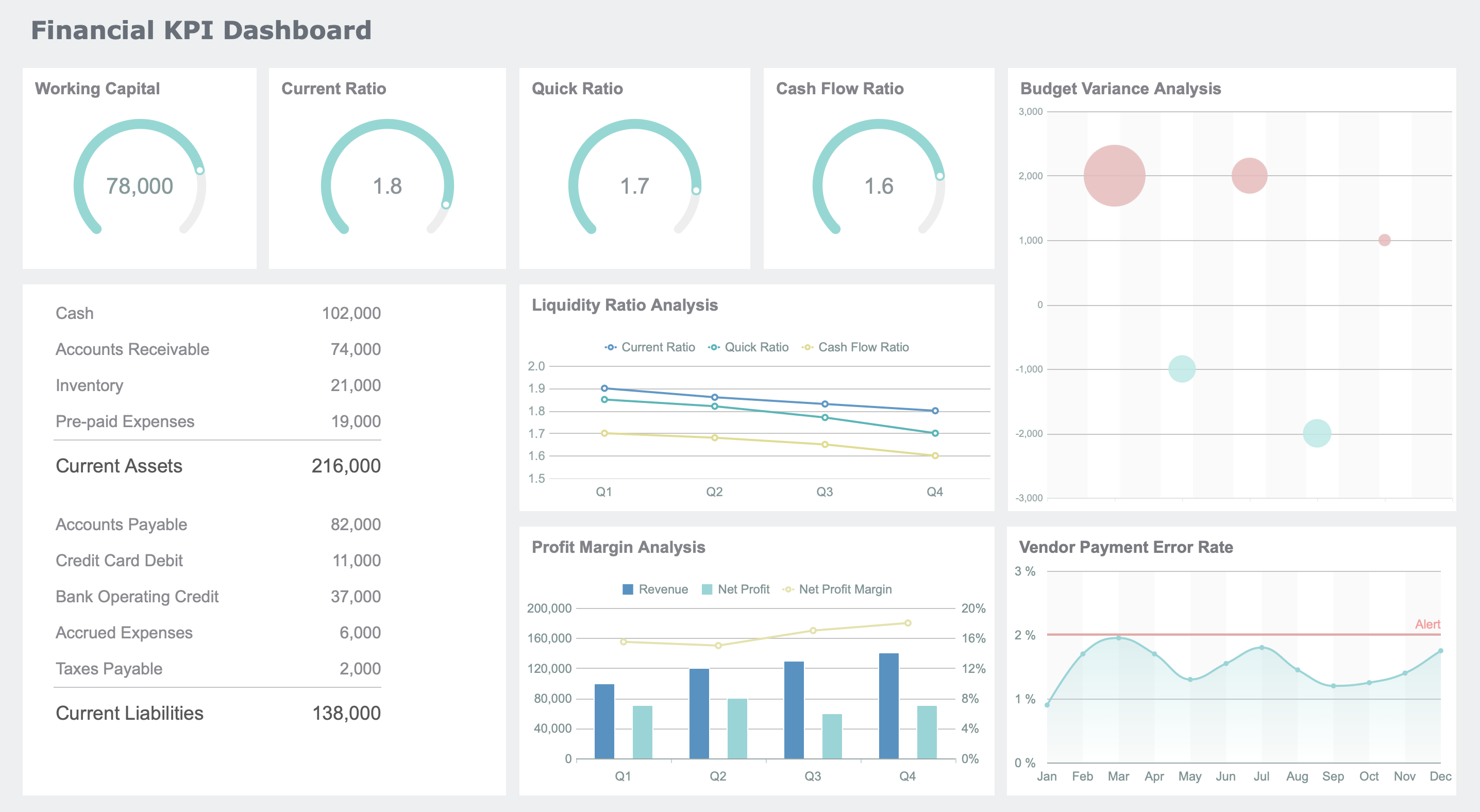
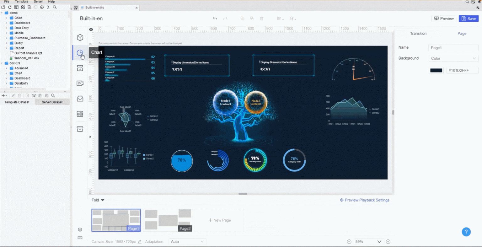
FineReport stands out as a modern data dashboard solution. You can use its drag-and-drop interface to build dashboards without coding. You connect to multiple data sources and see all your information in one place. FineReport also supports real-time updates, so your data dashboard always shows the latest numbers.
| Criteria for Effective Dashboards | Description |
|---|---|
| Logical Naming Standards | Names are distinct and consistent |
| Prioritized Data Format and Flow | Data is organized for easy understanding |
| Readability | Clear display with proper margins |
| Avoid Data Overload | No clutter or hidden information |
| Accessibility | Key data is easy to find |
| Clarity | All data fits on a single page |
You benefit from features like automated reporting, static dashboards for storytelling, and SaaS dashboards that organize sales or customer data. These functions help you analyze and share insights quickly.
Data visualization vs. data dashboard
You might wonder about the difference between a single data visualization and a full data dashboard. A data visualization shows one set of data, often as a chart or graph. You use it for quick analysis or to highlight a specific trend. A data dashboard, on the other hand, brings together many visualizations and data sources. You interact with it, explore details, and make decisions based on a complete view.
| Feature | Data Visualization | Integrated Data Dashboards |
|---|---|---|
| Purpose | Shows raw data visually | Combines multiple sources for analysis |
| Complexity | Simple and straightforward | Complex and multi-layered |
| Interactivity | Often static or limited | Highly interactive and exploratory |
| Audience | Broad, general use | Tailored for specific users |
| Use Case | Quick checks and highlights | In-depth analysis and decision-making |
FineReport lets you move from simple visualizations to advanced data dashboards. You can drag and drop charts, connect to different databases, and create interactive dashboards that fit your needs.
Key components and layout
A well-designed data dashboard helps you find answers fast. You see the most important metrics at the top. Related data groups together, making it easy to compare. Clear fonts and enough white space keep your dashboard readable. Icons and graphics highlight key insights. You use filters to control what data you see, and you can customize your view.
Tip: Always design your data dashboard with your audience in mind. Keep it simple, use consistent styles, and make sure it works on any device.
To build an effective data dashboard, follow these steps:
- Understand what your audience needs.
- Keep the layout simple and avoid clutter.
- Use visual elements like charts and icons wisely.
- Make the design consistent across all pages.
- Add interactivity so users can explore data.
- Show real-time data for up-to-date decisions.
- Ensure everyone can access the dashboard.
- Make it mobile responsive.
- Optimize for fast loading.
- Collect feedback and improve over time.
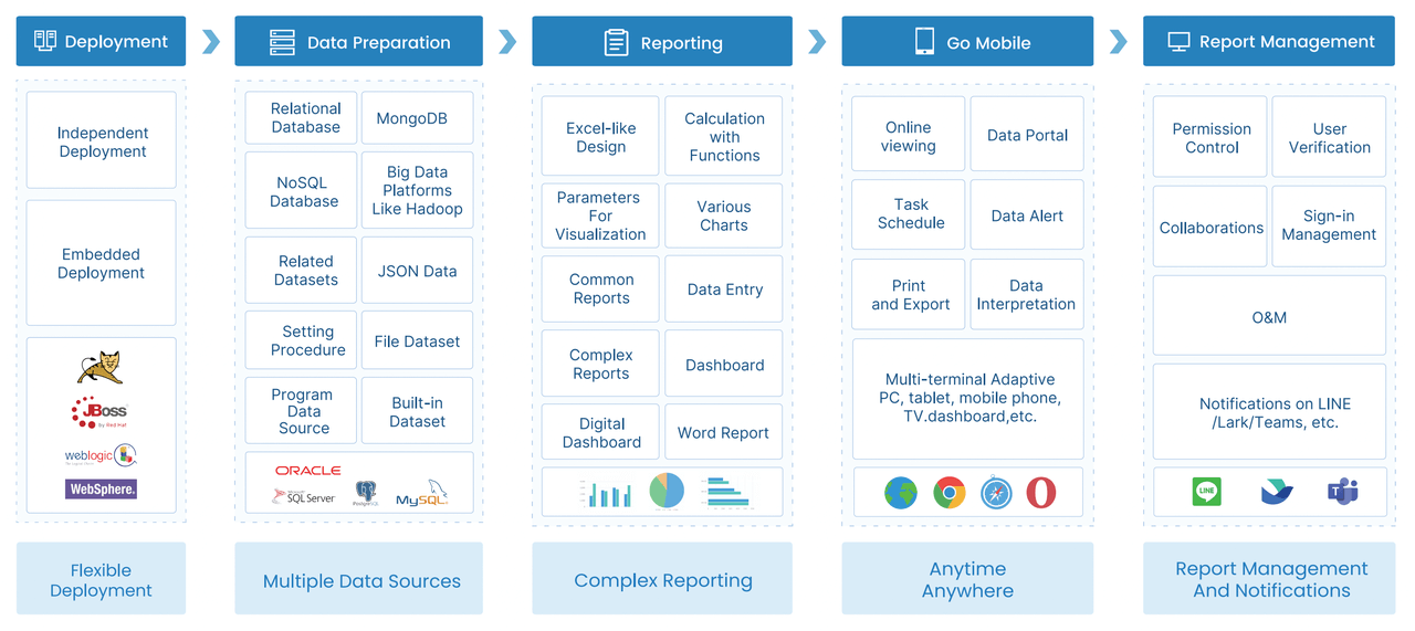
FineReport gives you flexible layout options, such as tiled or full-screen views. You can group related charts, add filters, and even use 3D components for advanced visualization. With multi-source integration, you combine data from databases, spreadsheets, and cloud services. This approach ensures your data dashboard tells a complete story and supports smarter decisions.
A data dashboard is more than just a collection of charts. You use it to transform raw data into actionable insights, making your work easier and your decisions better.
Types of data visualizations in a data dashboard
A data visualization dashboard is a digital tool that lets you view, analyze, and interact with multiple data visualizations in one place, helping you make informed decisions quickly.
Common chart and graph types
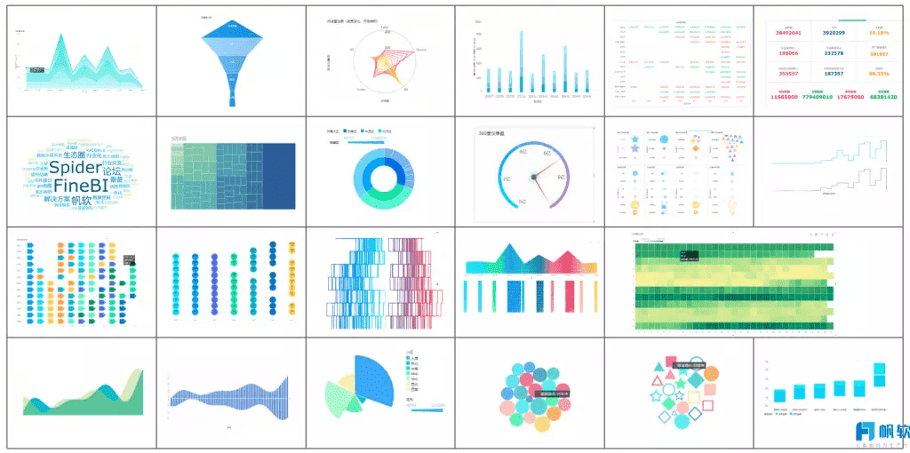
You use a dashboard to display many types of data visualizations. Each chart type helps you understand your data in a unique way. The most popular options include line charts, bar charts, pie charts, and more. FineReport’s chart library gives you access to advanced visualization tools, such as trajectory maps and 3D word clouds. Here is a quick overview:
| Chart Type | Best Use Cases |
|---|---|
| Line chart | Trend analysis, time series data, comparing multiple data series |
| Bar chart | Comparing categories, ranking items, frequency distribution |
| Stacked bar chart | Comparing categories with multiple subdivisions |
| Column chart | Ranking items, frequency distribution |
| Pie chart | Showing proportions, part-to-whole relationships |
| Donut chart | Reading proportions with a central hole |
FineReport also supports ring diagrams, Sankey diagrams, pictogram columns, bullet maps, and 3D word clouds. These visualization types help you present complex data in a clear and engaging way.
Choosing the right visualization
You need to select the best visualization for your dashboard based on your goals and the type of data you have. Consider these criteria:
- Know the purpose of your visualization. Are you showing trends, comparisons, or proportions?
- Identify the type of data you want to analyze. Is it time-based, categorical, or numerical?
- Think about your audience. Choose a visualization style that matches their needs and understanding.
Tip: Use simple charts for quick insights. Choose advanced visualizations for deeper analysis.
Interactive and mobile dashboards
Interactive dashboards let you explore data in real time. You can click, filter, and drill down into details. This makes data exploration intuitive and user-friendly. Responsive designs and real-time updates allow you to access information seamlessly. Interactive maps and charts help you visualize complex data trends. These features boost engagement and encourage you to spend more time analyzing data.
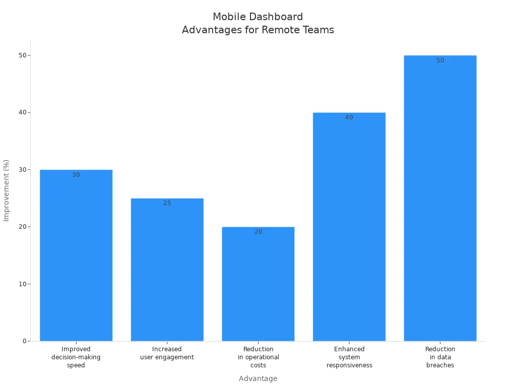
Mobile-compatible dashboards give you flexibility. You can view and interact with data from any device, anywhere. This improves decision-making speed by 30%, increases user engagement by 25%, and reduces operational costs by 20%. Enhanced system responsiveness and reduced data breaches make your dashboard secure and efficient.
FineReport’s dashboard platform supports interactive and mobile visualization features. You can create dashboards that work on PCs, tablets, and smartphones. This ensures you always have access to your data and can make decisions on the go.

Benefits of a dashboard for business
A data visualization dashboard is a digital platform that brings together real-time data, analytics, and visualizations to help you monitor and understand business performance at a glance.
Benefits of a dashboard for business
Real-time insights and decision-making
You gain a powerful advantage when you use a dashboard for business analytics. Real-time data flows into your dashboard, giving you instant access to key metrics and trends. You no longer wait for static reports. Instead, you see live analytics that help you act quickly. Dashboards let you monitor sales, operations, and performance in real time. This approach supports data-driven decisions and keeps your team aligned with shared goals.
| Benefit | Description |
|---|---|
| Improved efficiency | Automates data analysis and visualization, freeing time for strategic planning. |
| Enhanced decision-making | Presents data visually, making complex information easier to understand. |
| Better communication | Facilitates clear communication of insights to stakeholders. |
| Timely data access | Provides real-time updates on KPIs and metrics. |
| Improved insight discovery | Uses advanced analytics to uncover hidden patterns and correlations. |
You use dashboards to minimize delays and respond to changes as they happen. Real-time analytics improve operational efficiency and resource usage.
Use cases in manufacturing and finance
Dashboards transform how you manage manufacturing and finance. In manufacturing, you track labor productivity, monitor equipment performance, and identify errors early. Real-time dashboards display analytics on production quality and OEE (Overall Equipment Effectiveness), helping you optimize processes. FineReport supports quality control by visualizing defect rates and scrap causes, making it easier to improve production lines.
| Use Case | Description |
|---|---|
| Labor Productivity | Measures output per hour, showing efficiency. |
| Performance Monitoring | Provides live stats on production and equipment. |
| Error Identification | Helps you spot issues early for continuous improvement. |
In finance, dashboards help you analyze revenue, monitor KPIs, and identify trends. Companies like BOE and UnionPay use dashboards to unify data, standardize metrics, and drive data-driven decisions. You see improvements in operational efficiency and customer engagement through real-time analytics.

Customization and scalability with FineReport
You need a dashboard that adapts to your business. FineReport offers seamless database connections and supports complex analytics for large enterprises. You can customize dashboards with drag-and-drop tools, integrate multiple data sources, and access analytics on any device. FineReport’s mobile support and advanced visualization features ensure your dashboard grows with your needs. You scale analytics as your data expands, keeping your business agile and data-driven.

Best practices for dashboard design

A data visualization dashboard is a digital workspace where you use data visualization tools to combine, display, and interact with data from multiple sources, making it easy to monitor trends, track key metrics, and make informed decisions in real time.
Best practices for dashboard design
Principles of effective dashboards
You need to focus on clarity, simplicity, relevance, and interactivity when designing a dashboard. These principles help you create a tool that supports quick understanding and confident decision-making. A strong visual hierarchy guides your attention to the most important data first. Customizable layouts let you adjust the dashboard to your needs, which increases engagement. Clean UI design avoids clutter and keeps your focus on the data.
| Principle | Description |
|---|---|
| Visual hierarchy | Guides your attention to key data using size, color, and layout. |
| Customizable dashboard layout | Lets you tailor the dashboard for your workflow, improving usability. |
| Clean UI design | Keeps the interface simple and clear, removing distractions. |
A clear and simple dashboard helps you understand performance metrics quickly. You do not need extra help to interpret the data. When you see critical metrics emphasized and supporting data secondary, you can act faster. Context, such as benchmarks and trends, helps you interpret the data accurately.
Common mistakes to avoid
You can avoid many dashboard design mistakes by following a few simple rules:
- Do not start without a clear goal.
- Always consider the end user’s needs.
- Avoid unnecessary decoration.
- Use enough white space for readability.
- Group related metrics together.
- Limit the number of visualizations to avoid clutter.
- Choose the best visualization for your data.
- Use a subtle color palette.
- Organize visualizations thoughtfully.
- Provide context for all data.
Tip: Keep your dashboard focused and organized. This makes it easier for you to find and use the data you need.
Getting started with FineReport
FineReport gives you powerful options for customizing your dashboard. You can use data portals to find reports and notifications quickly. Adjust the portal content to match your habits, such as adding favorites or recent visits. Dynamic notifications keep you updated on new reports. The drag-and-drop interface makes it easy to configure your dashboard with built-in components.
| Feature | Description |
|---|---|
| Data Portals | Find reports and notifications easily, improving data query efficiency. |
| Customization | Adjust dashboard content based on your workflow and preferences. |
| Notifications | Stay informed with dynamic updates on new reports. |
| Development Ease | Use drag-and-drop tools to build dashboards without coding. |
| FineVis Plugin | Create advanced dashboards and 3D visualizations easily. |
| Multi-Device Support | Access dashboards on any device, anywhere. |
You can start by defining your goals, choosing the right data, and selecting the best visualization for each metric. FineReport helps you build dashboards that are clear, interactive, and tailored to your business needs.
A data visualization dashboard is a tool that lets you see and interact with your most important data in one place. You gain faster insights and make better data-driven decisions. Organizations using dashboards make choices five times faster and see higher performance. To get started, define your goals, gather your data, and build a dashboard that fits your needs. FineReport helps you customize dashboards for any business. Assess your data needs today and unlock the full value of your dashboard.
- Plan your project and involve key team members.
- Gather requirements and map them to KPIs.
- Use real-time dashboards to track performance and spot issues early.
Tip: A well-designed dashboard improves efficiency, supports clear communication, and drives business growth.
Continue Reading About data visualization dashboard
Top 8 Data Visualization softwares You Should Try in 2025
Why Choose 3D Data Visualization?
What Does a Data Visualization Engineer Do


FAQ

The Author
Lewis
Senior Data Analyst at FanRuan
Related Articles

How to Build an Investment Portfolio Reporting Dashboard for Executives: KPIs, Benchmarks, and Drill-Down Views
Investment portfolio reporting for executives is not about showing every holding, transaction, and chart your investment team can produce. It is about giving CEOs, CFOs, CIOs, boards, and investment committees a fast, re
Yida YIn
Jun 25, 2026

12 KPI Reporting Examples for Executive Dashboards: What to Show in Weekly, Monthly, and Quarterly Reviews
Executive leaders do not need more data. They need decision ready $1 examples that match how often they review the business and what actions they are expected to take. A weekly $1 should surface fast moving risks and per
Yida YIn
Jun 25, 2026

How to Build a Digital Marketing Reports Dashboard: Executive Examples, KPIs, and Templates
A $1 is the control layer that helps executives and marketing leaders turn scattered channel data into fast, confident decisions. If you are a CEO, CMO, operations director, or marketing analytics lead, the real problem
Yida Yin
May 07, 2026