Dashboard
Lewis Chou
Apr 27, 2026
A dashboard designer is a specialist or software platform that turns business data into clear, usable visual interfaces for faster decision-making.
Below is a practical shortlist of the best dashboard designers and dashboard design tools for 2026, covering both service-based and software-based options so teams can compare custom expertise against scalable platforms.
These options represent the main paths most teams consider today:
In 2026, the most important evaluation factors are:
Great dashboard design is no longer just about visual polish. The best dashboard designers and tools help users find what matters quickly, understand performance in context, and act without confusion.
Key qualities to look for include:
The strongest dashboards balance three things:
If one of those is weak, adoption usually drops.
Most buyers choose between two routes.
A dedicated dashboard designer is often the better fit when you need:
This route is especially useful when dashboard requirements are ambiguous, politically sensitive, or tied to high-visibility decision-making.
A dashboard design tool is often enough when you need:
This route is ideal for teams prioritizing speed, repeatability, and lower dependency on external specialists.
Many organizations now use a hybrid model:
This approach is common in larger companies that need both scale and polish.
To compare dashboard designers and tools fairly, this guide focuses on:
If your team needs tailored dashboards rather than a DIY platform, service-based dashboard designers can be the better option.
What to look for:
Freelance and contract dashboard designers stand out for:
But quality can vary widely, so portfolio review matters more than marketplace presence alone.
Software-based dashboard design tools are usually the better choice for organizations that need scale, standardization, and repeatability.
They are strongest for:
The main trade-offs usually involve:
| Option | Best for | Standout features | Pros | Cons | Starting price |
|---|---|---|---|---|---|
| Upwork Dashboard Designers | Flexible freelance hiring | Large talent marketplace, varied budgets | Fast sourcing, broad skill range | Quality varies, vetting required | Custom/project-based |
| Fiverr Dashboard Designers | Low-cost quick projects | Fixed-price gigs, rapid turnaround | Budget-friendly, simple procurement | Less strategic depth, inconsistent quality | Custom/project-based |
| Toptal Dashboard Designers | Premium freelance talent | Curated experts, stronger vetting | Higher quality, enterprise-friendly | Higher cost | Custom/project-based |
| Fresh Consulting | End-to-end custom dashboard projects | Research-led UX, engineering support | Strong strategy and design alignment | Agency pricing, longer engagement cycles | Custom quote |
| Tableau | Advanced visual analytics | Rich visuals, broad ecosystem | Powerful exploration, strong community | Can be expensive, steeper learning curve | Custom / subscription |
| Microsoft Power BI | Microsoft-centric BI | Deep Excel and Azure integration | Strong value, enterprise adoption | UI customization can be limiting | Low entry pricing |
| FineBI | Self-service BI with fast dashboard building | Drag-and-drop analysis, strong sharing, enterprise data access | Good balance of power and usability, scalable for business teams | Less globally recognized than some legacy leaders | Custom quote / demo |
| Looker Studio | Lightweight dashboarding | Google ecosystem connectivity, easy sharing | Free entry point, simple collaboration | Limited advanced modeling and governance | Free / paid add-ons |
| Qlik Sense | Associative analytics | Flexible exploration, in-memory engine | Strong data discovery | Learning curve for some users | Custom / subscription |
| Sisense | Embedded and scalable analytics | Embedded BI, customization, multi-source dashboards | Good for product analytics use cases | Setup can be more technical | Custom quote |
| Geckoboard | KPI monitoring dashboards | TV dashboards, live metrics, simple sharing | Fast setup, highly readable KPI boards | Limited deep analytics | Subscription |
| Mokkup.ai | Dashboard wireframing and prototyping | Rapid mockups, layout ideation | Great pre-build workflow | Not a full BI platform | Subscription |
One-sentence overview: FineBI is a self-service BI and dashboard design platform built for teams that need fast dashboard production, governed access to enterprise data, and business-friendly analysis workflows.
 Key Features:
Pros & Cons:
Best For: Companies that want a practical dashboard designer platform for cross-team reporting, self-service BI, and scalable analytics delivery.
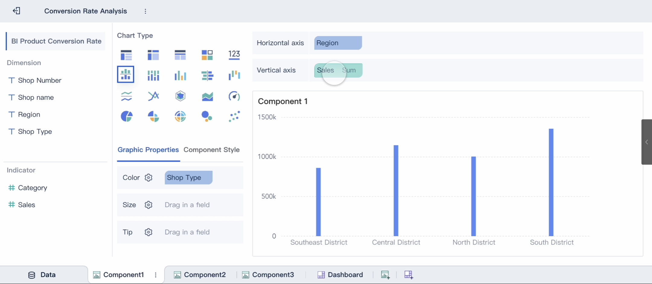
FineBI deserves particular attention for teams evaluating dashboard designers in a broader sense, because it reduces the need to hire separate specialists for every reporting request. In many organizations, that means business users can build routine dashboards themselves while analysts and designers focus on higher-value work.
One-sentence overview: Fiverr offers fixed-scope dashboard design services that are often suited to smaller projects and cost-sensitive buyers.
Key Features:
Pros & Cons:
Best For: Startups and small businesses that need low-cost dashboard designers for straightforward reporting work.
One-sentence overview: Toptal provides access to curated freelance talent, including dashboard designers with stronger enterprise and product experience.
Key Features:
Pros & Cons:
Best For: Mid-market and enterprise teams that need high-quality freelance dashboard designers without building a full in-house team.
One-sentence overview: Fresh Consulting is a design and engineering agency that delivers custom dashboard experiences backed by UX research and technical implementation.
Key Features:
Pros & Cons:
Cons:
Best For: Organizations building custom analytics products, embedded dashboards, or high-value internal systems that need both UX strategy and implementation.
One-sentence overview: Tableau is a mature analytics platform known for powerful data visualization, interactive exploration, and enterprise reporting.
Key Features:
Pros & Cons:
Best For: Analyst-heavy teams and enterprises that want advanced visualization and exploratory BI.
One-sentence overview: Power BI is a widely adopted BI platform that combines affordable entry pricing with strong Microsoft ecosystem integration.
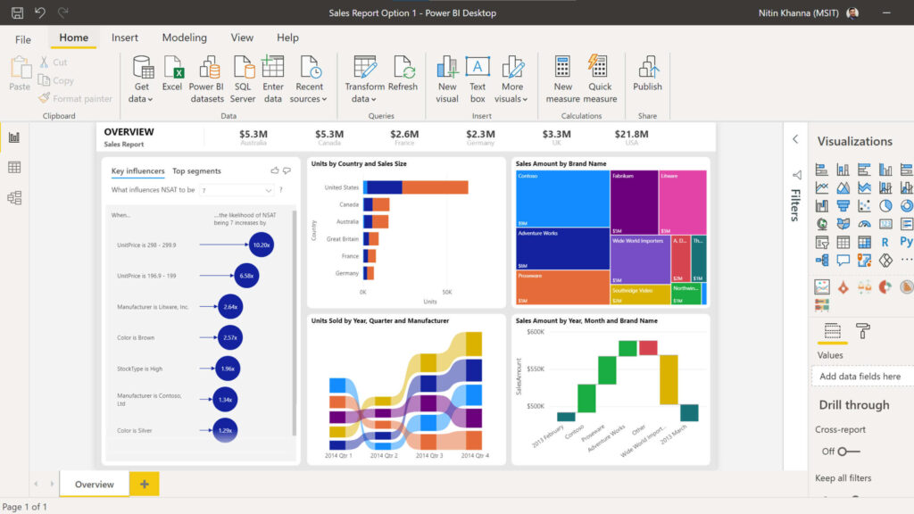 Key Features:
Pros & Cons:
Best For: Organizations already invested in Microsoft tools and looking for scalable internal dashboarding.
One-sentence overview: Upwork is a large freelance marketplace where businesses can hire dashboard designers for BI builds, reporting design, and data visualization projects.
Key Features:
Pros & Cons:
Best For: Companies that want flexible access to freelance dashboard designers for one-off builds, redesigns, or backlog support.
One-sentence overview: Looker Studio is a lightweight reporting tool that makes it easy to build shareable dashboards, especially inside the Google ecosystem.
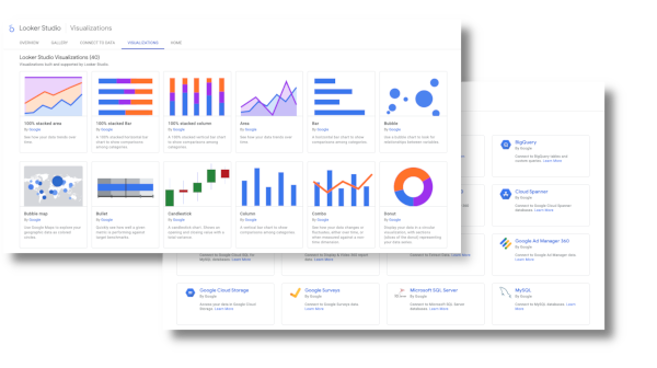 Key Features:
Pros & Cons:
Best For: Marketing teams, startups, and small businesses that need fast, shareable dashboards with minimal setup.
One-sentence overview: Qlik Sense is an analytics platform known for flexible exploration and associative data discovery.
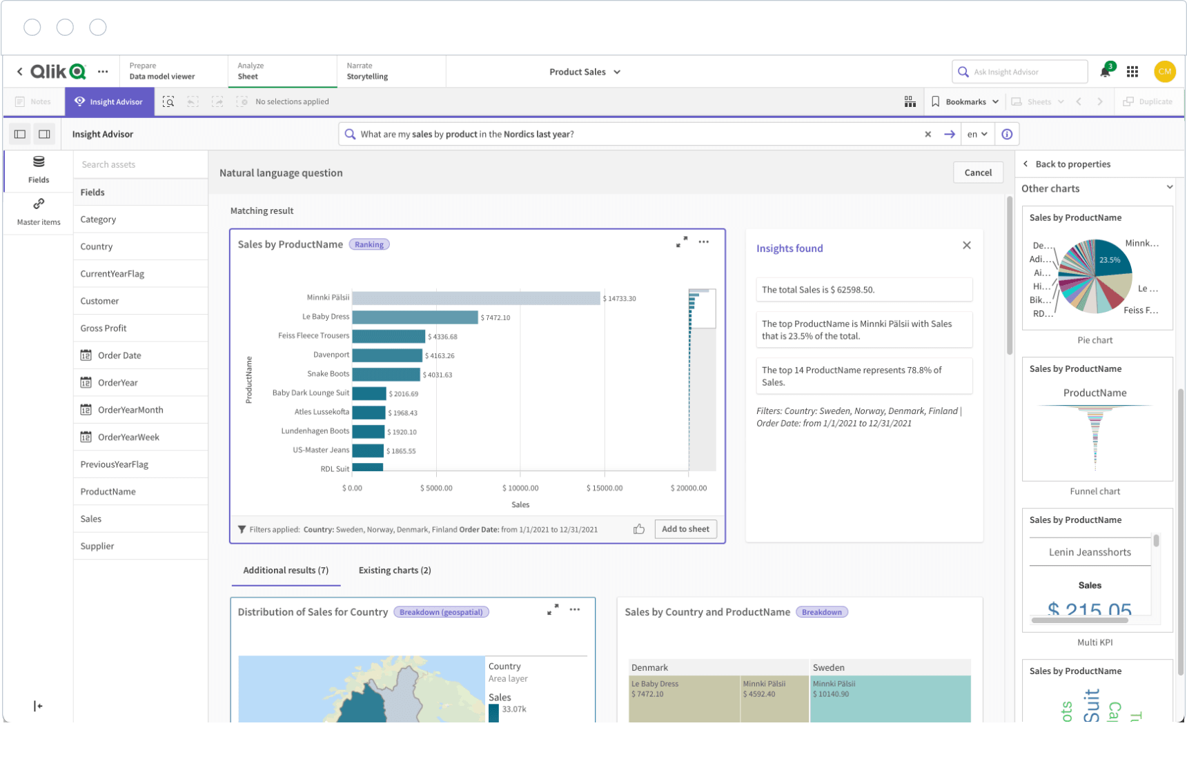 Key Features:
Pros & Cons:
Best For: Data-rich organizations that need advanced exploration beyond static reporting.
One-sentence overview: Sisense is a BI platform that is particularly strong for embedded analytics and customizable data experiences.
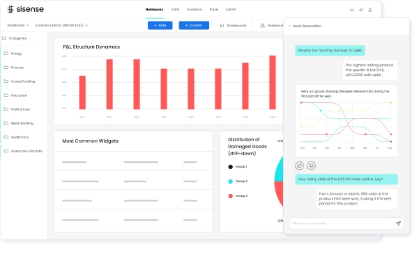 Key Features:
Pros & Cons:
Best For: SaaS vendors, product teams, and enterprises that need embedded analytics or highly customized BI deployments.
One-sentence overview: Geckoboard is a KPI-focused dashboard tool designed for quick setup, operational visibility, and always-on monitoring.
Key Features:
Pros & Cons:
Best For: Operations, support, and sales teams that need highly visible performance dashboards with minimal setup.
One-sentence overview: Mokkup.ai is a dashboard wireframing tool that helps teams prototype layouts and data stories before building them in BI software.
Key Features:
Pros & Cons:
Best For: Teams that want better dashboard planning, wireframing, and design validation before development.
The right choice depends less on brand popularity and more on your reporting workflow.
Startups often need speed and cost control. Good options include:
Agencies usually need repeatable delivery and flexible client work.
Large organizations usually need security, governance, and maintainability.
For custom executive experiences, pairing one of these with expert dashboard designers often works best.
If analytics is part of the product experience:
If you need recurring KPI visibility and low-maintenance dashboards:
Before choosing between dashboard designers and dashboard design tools, ask:
If your biggest issue is unclear business questions, hire expertise first.
If your biggest issue is slow reporting production, prioritize the right platform.
Many teams choose the wrong option for predictable reasons.
Common mistakes include:
A polished dashboard that answers the wrong question is still a poor dashboard.
Use this simple decision framework:
For many businesses in 2026, the most balanced route is to adopt a strong platform such as FineBI and use dashboard designers selectively for high-stakes or custom reporting experiences. That approach keeps routine analytics efficient while preserving the option for expert-led optimization when clarity, adoption, and stakeholder trust matter most.
The best dashboard designers help organizations translate messy reporting needs into usable decision tools, while the best dashboard design tools make that process faster, more scalable, and easier to maintain. If you need custom strategy and UX, hire a specialist. If you need repeatable, team-wide reporting, choose a platform. If you need both flexibility and scale, combine expert design support with a capable dashboard builder like FineBI to cover everyday BI needs without sacrificing quality.
A dashboard designer is a person or service that creates tailored dashboards around your goals, users, and workflows. A dashboard design tool is software that helps teams build, share, and maintain dashboards at scale.
Hire a dashboard designer if you need custom UX, executive-ready presentations, or embedded analytics. Use a dashboard design tool if your priority is faster rollout, repeatable reporting, and self-service access for teams.
The most important factors are data connectivity, customization, collaboration, scalability, governance, and ease of maintenance. Teams should also weigh reporting quality and how quickly the tool can be deployed.
Popular choices include Tableau, Microsoft Power BI, FineBI, Looker Studio, Qlik Sense, and Sisense. The best fit depends on your data stack, budget, technical skill level, and reporting needs.
A strong dashboard highlights the most important KPIs first, uses clear visual hierarchy, and gives data enough context to support decisions. It should be easy to read, consistent across views, and practical for daily use on different devices.

The Author
Lewis Chou
Senior Data Analyst at FanRuan
Related Articles
Executive Summary Dashboard for Enterprise Leaders: 9 Steps to Design KPIs, Layout, and Governance
Learn 9 steps to design an executive summary dashboard for enterprise leaders. Define KPIs, layout, and governance for better strategic decision-making.
Lewis Chou
May 04, 2026

Executive Dashboard Template: What Enterprise Leaders Should Include Before They Build
Learn what to include in an executive dashboard template for better decision-making. Focus on KPIs, risk signals, and strategic alignment for leadership teams.
Lewis Chou
May 04, 2026

How to Build a Teams Call Queue Dashboard: Turn Raw Queue Data Into Actionable Insights
Learn how to transform raw Teams call queue data into a dashboard for real-time monitoring, trend analysis, and proactive service level management.
Lewis Chou
May 04, 2026


