Choosing the right manufacturing dashboard software is no longer just an IT decision. In 2026, it is a core operations decision that affects productivity, downtime, quality, inventory control, and how quickly teams can respond to problems on the shop floor.
The best platforms do more than display charts. They connect data from machines, ERP systems, MES platforms, sensors, spreadsheets, and maintenance systems into one clear view. That visibility helps manufacturers move from reactive firefighting to faster, data-driven execution.
In this guide, we compare the top manufacturing dashboard tools for 2026, including their strengths, limitations, and best-fit use cases for different types of factories.
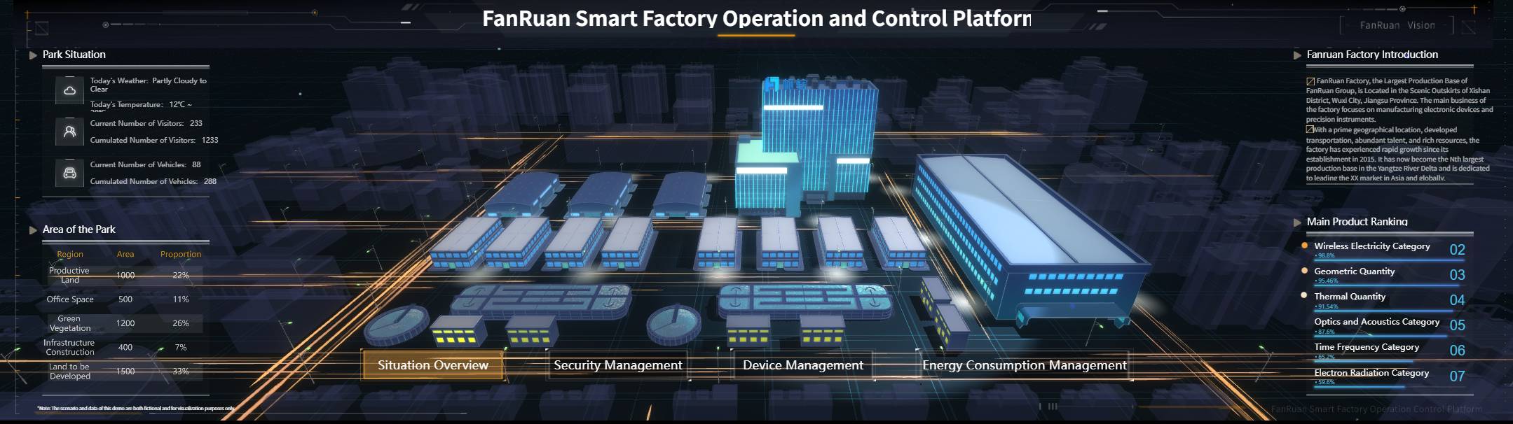
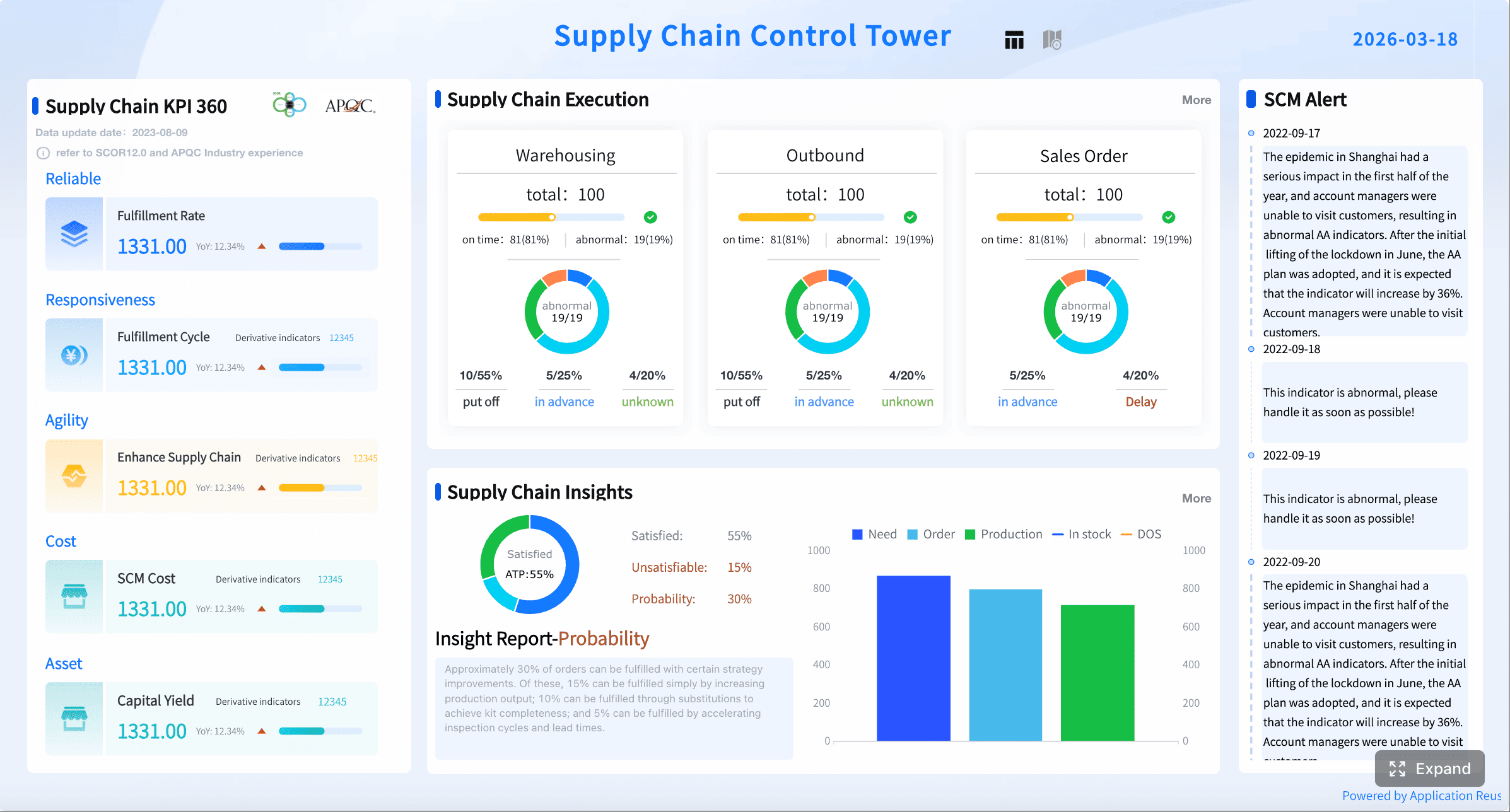
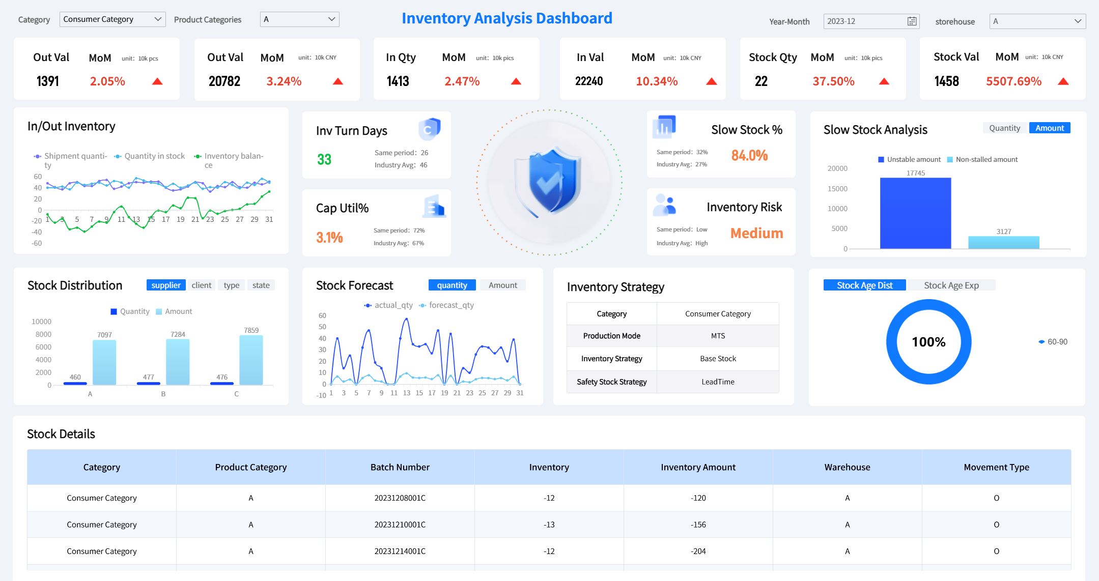
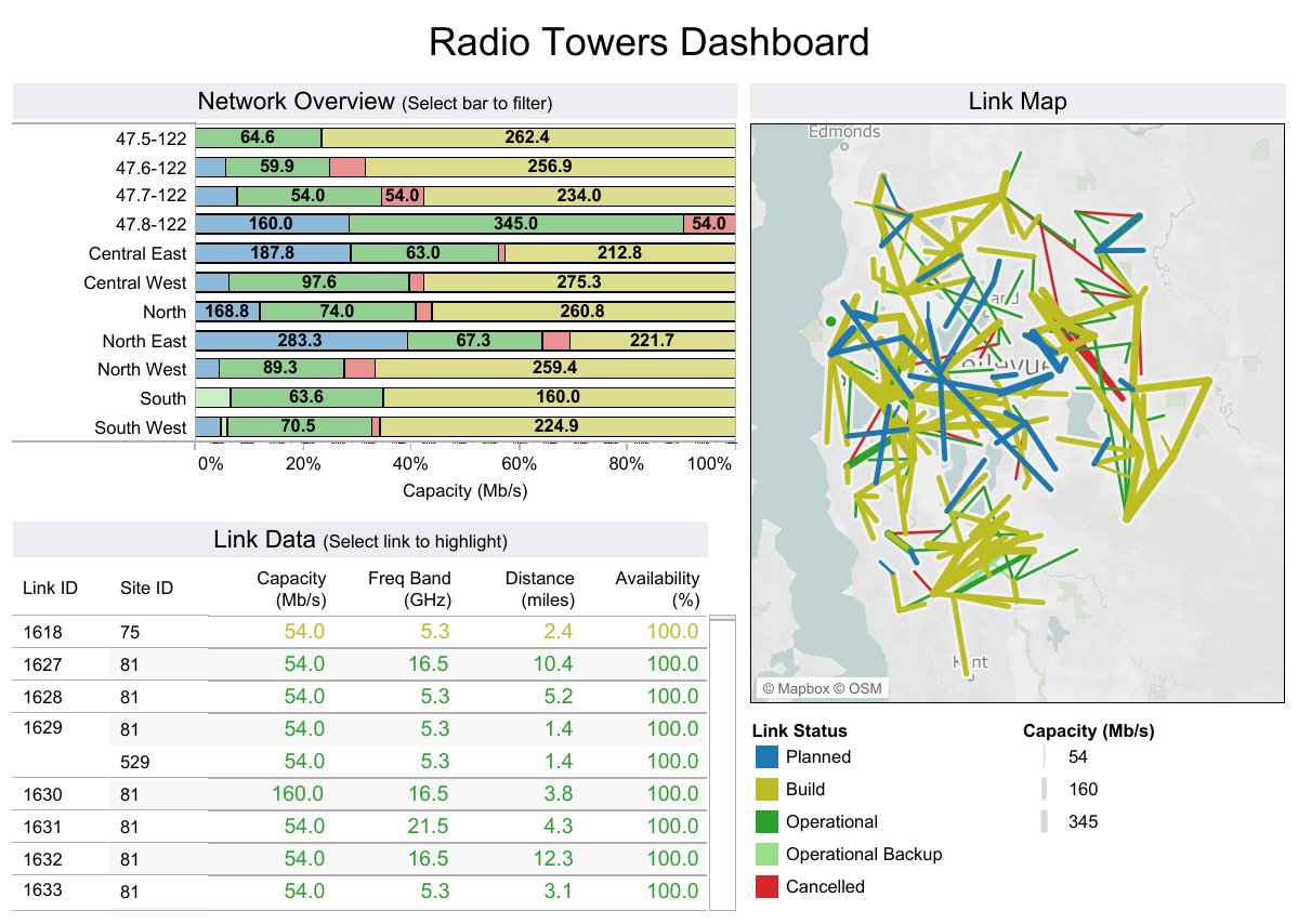
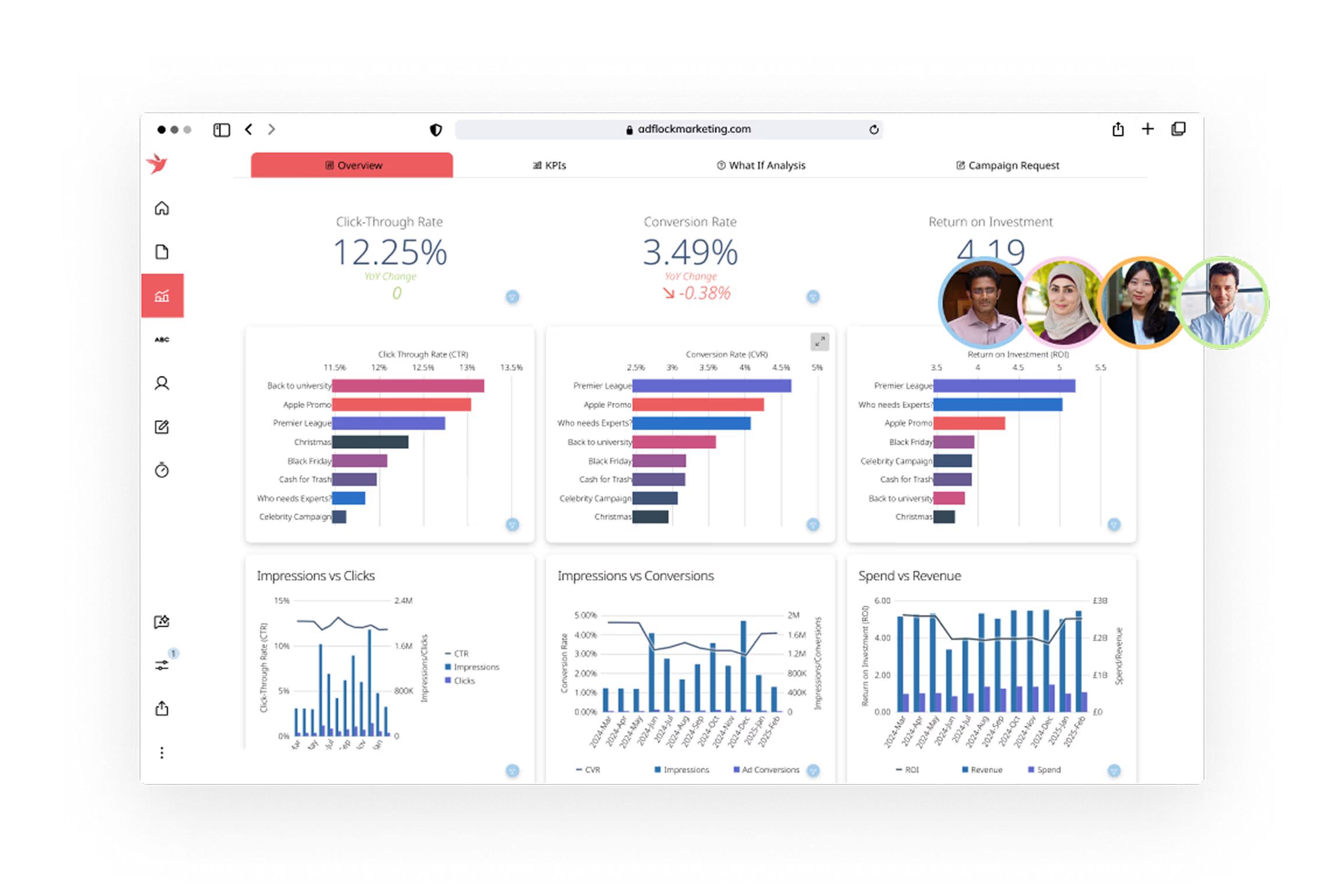
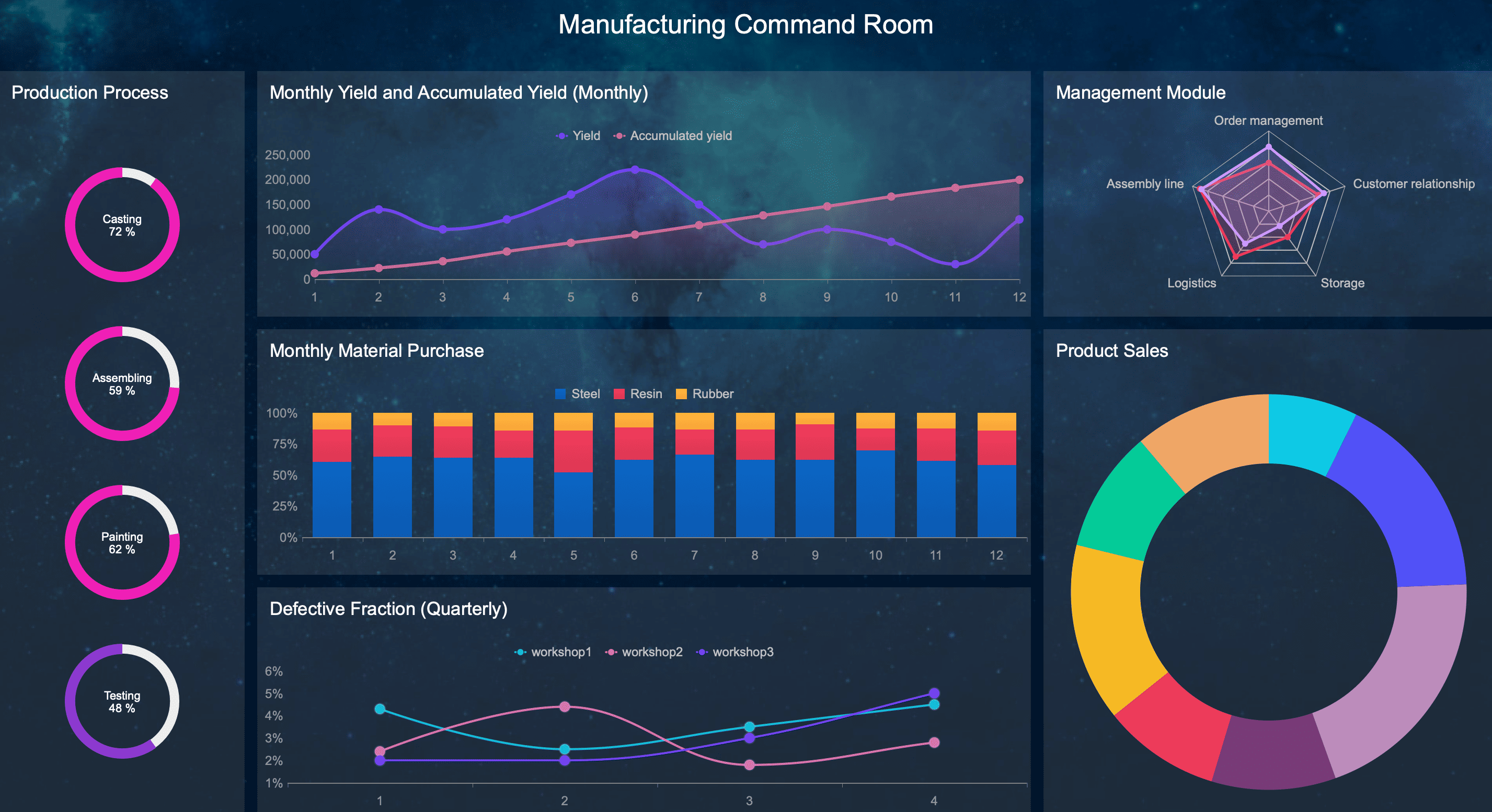
All manufacturing dashboards featured in this post were generated using FineReport.
Why Manufacturing Dashboard Software Matters in 2026
Manufacturers are operating in a more demanding environment than ever. Connected equipment is producing more data, labor remains tight in many regions, and margins are under pressure from material costs, energy prices, and delivery expectations. As a result, real-time visibility has become essential.
Modern manufacturing dashboard software helps operations teams bring critical data into one place. Instead of toggling between whiteboards, spreadsheets, ERP reports, SCADA screens, and maintenance systems, teams can monitor the metrics that matter most in a unified dashboard.
Typical dashboards help track:
- Production output
- Downtime and stoppages
- Quality performance
- Scrap and rework
- Inventory levels
- Labor performance
- Maintenance activity
- OEE and related equipment metrics
This matters because delays in visibility often lead to delays in action. If supervisors only see yesterday’s problems today, the opportunity to correct them is already gone. Real-time or near-real-time dashboards help teams spot bottlenecks, escalate issues faster, and make better shift-level decisions.
The biggest beneficiaries usually include:
- Plant managers who need a full operational view
- Operations leaders responsible for output, cost, and service levels
- Production supervisors managing daily targets and line performance
- Continuous improvement teams focused on root cause analysis and KPI improvement
- Maintenance leaders monitoring downtime and asset performance
- Quality teams tracking defects, first-pass yield, and nonconformance trends
In short, manufacturing dashboards have become the digital control center for modern factories.
How We Evaluated the Best Tools
To identify the best manufacturing dashboard platforms for 2026, we compared each tool across the factors that matter most in real-world manufacturing environments.
Evaluation criteria
We looked at each platform based on:
- Usability for frontline teams, managers, and analysts
- Implementation effort and technical complexity
- Integrations with ERP, MES, SCADA, IoT, and databases
- Customization for role-based dashboards and plant-specific KPIs
- Analytics depth for drill-down, trend analysis, and root cause exploration
- Pricing flexibility for small plants and enterprise rollouts
- Scalability across sites, users, and data volumes
We also considered the practical capabilities manufacturers often need but do not always get:
- Real-time or near-real-time data refresh
- Alerts and exception-based visibility
- Mobile access for leaders and distributed teams
- Cross-functional reporting across production, quality, maintenance, and inventory
- Support for both operational dashboards and executive KPI summaries
Not all dashboard tools are built for manufacturing
One important distinction is that these tools do not all serve the same purpose.
General BI tools
Platforms like Power BI, Tableau, Qlik Sense, Looker, and Sisense are flexible analytics tools. They can work well for manufacturing, but they often require stronger data preparation, modeling, and internal analytics support.
Factory-floor platforms
Tools like Ignition and Tulip are closer to operations execution and plant-floor visibility. They are often better suited for live production dashboards, machine connectivity, and operator-facing use cases.
Manufacturing-specific analytics or monitoring solutions
Some tools are especially strong in industrial monitoring and time-series visualization, such as Grafana, or in combining operational workflows with dashboards. These can be a better fit when machine data and live status matter more than traditional BI reporting.
That difference matters because a dashboard used by executives once a week is not the same as one used by a supervisor every hour.
11 Best Manufacturing Dashboard Software Tools in 2026
1. FineReport
FineReport is a strong option for manufacturers that need highly customizable dashboards, reports, and production analytics without committing to the cost structure of some premium BI tools. It is especially attractive for companies that want flexible reporting across departments while still supporting operational use cases.
What makes FineReport stand out is its balance between dashboard building, reporting depth, and enterprise-style customization. Manufacturers can use it to build plant performance dashboards, quality summaries, inventory views, and management reports with relatively broad control over layout and logic.
Pros:
- Strong dashboard and report customization
- Good fit for production, quality, and management reporting
- Supports complex table-style and visual reporting needs
- Can serve both operational and executive users
- Often appealing for organizations needing broad reporting flexibility
Cons:
- User experience may feel less modern than some newer tools
- Can require planning and technical effort for larger deployments
- Real-time industrial connectivity may not be as native as plant-floor-first platforms
Best use case: Manufacturers that want versatile reporting and dashboarding across operations, quality, and business functions, especially when customization is a priority.
2. Power BI
Power BI remains one of the most popular dashboard tools for manufacturers because it combines broad reporting capabilities with relatively accessible pricing. It is especially compelling for organizations already invested in Microsoft 365, Azure, SQL Server, or Dynamics.
 For manufacturing teams, Power BI can consolidate data from ERP, MES, maintenance, quality, and inventory systems into executive and operational dashboards. It works well for KPI scorecards, production summaries, downtime analysis, and multi-site reporting.
Pros:
- Powerful visualizations
- Broad connector library
- Scalable reporting
- Strong Microsoft ecosystem integration
- Affordable entry point for many organizations
Cons:
- Setup can become complex for plants with fragmented machine data
- Live industrial visibility may require additional architecture
- Governance and model design can become difficult at scale without strong ownership
Best use case: Companies that already use Microsoft tools and need broad operational reporting.
3. Tableau
Tableau is a strong choice for manufacturers with advanced analytics needs and teams that value exploration, interactivity, and visual storytelling. It is often favored in enterprise environments where leaders want polished dashboards and analysts need deep drill-down capability.
 In manufacturing, Tableau is often used for trend analysis across production, supply chain, quality, and financial performance. It is highly capable when a business wants to combine factory data with broader enterprise performance metrics.
Pros:
- Rich visual analytics
- Strong drill-down capabilities
- Flexible dashboard design
- Excellent for interactive data exploration
- Strong support for executive and analytical storytelling
Cons:
- Licensing and administration can be expensive for larger deployments
- Real-time industrial use cases may require more integration work
- Can be more analytics-centric than shop-floor-centric
Best use case: Enterprises that prioritize data storytelling across operations and leadership.
4. Qlik Sense
Qlik Sense is well suited for manufacturers that want to uncover hidden patterns in production and operational data. Its associative analytics approach makes it useful for teams exploring relationships between downtime, shift performance, quality defects, throughput, scrap, and other variables.
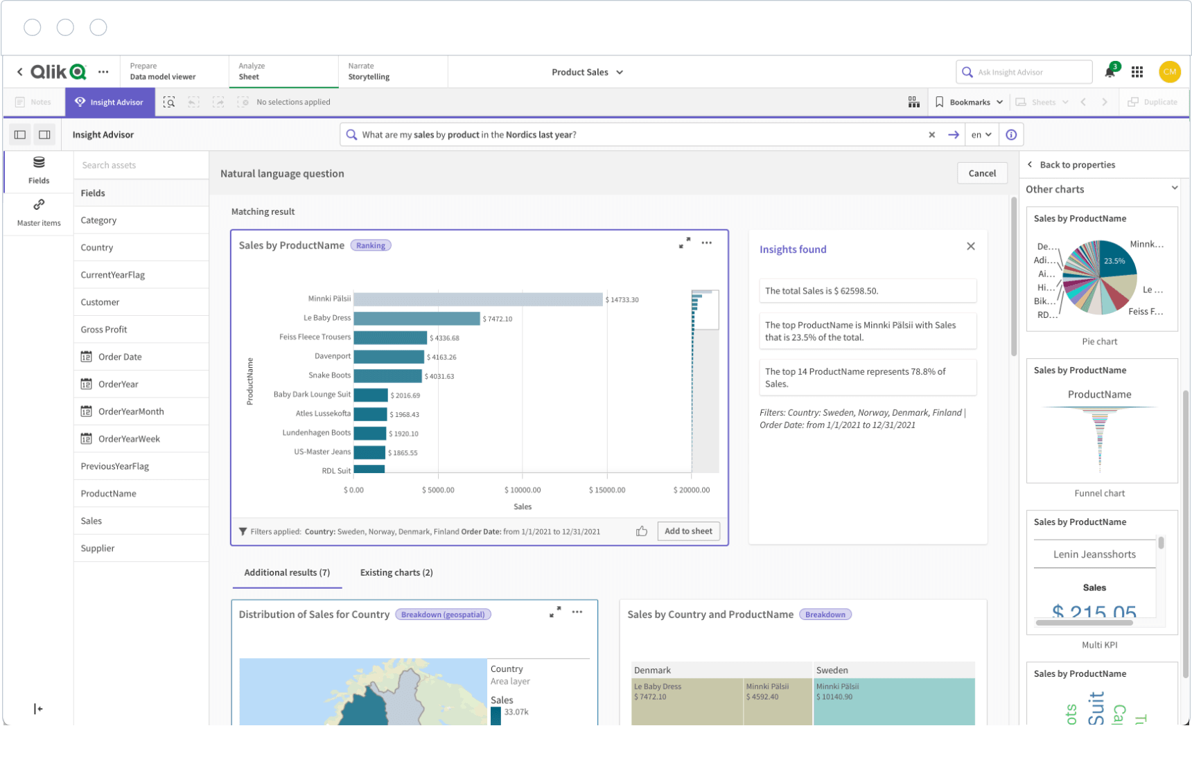 For operations and continuous improvement teams, that can be valuable when investigating root causes and performance variation across products, lines, plants, or time periods.
Pros:
- Strong self-service analytics
- Flexible data modeling
- Useful for complex reporting
- Good for multi-dimensional manufacturing analysis
- Effective for exploring relationships across datasets
Cons:
- May have a steeper learning curve for non-technical users
- Setup and data modeling may require experienced resources
- Less intuitive for some frontline dashboard audiences
Best use case: Teams analyzing quality, throughput, and operational variability.
5. Ignition
Ignition is one of the most relevant platforms for manufacturers that want dashboards closely tied to plant-floor systems. It is widely used in industrial environments because it connects well with SCADA, PLCs, historians, and MES architectures.
Unlike BI-first tools, Ignition is often chosen to build live dashboards for machine status, downtime, alarms, line performance, process monitoring, and control-room visibility. It is especially strong where real-time operational data matters most.
Pros:
- Industrial connectivity
- Real-time visualization
- Strong plant-floor relevance
- Useful for custom operational dashboards
- Well aligned with SCADA and automation environments
Cons:
- Often needs technical resources for deployment and maintenance
- Dashboard quality depends heavily on internal design capability
- May require more engineering effort than packaged analytics tools
Best use case: Facilities that need live operational dashboards from machine and process data.
6. Grafana
Grafana has become a go-to option for technical teams that need lightweight, real-time dashboarding built around time-series data. It is particularly useful in manufacturing environments with strong engineering, IoT, automation, or reliability teams.
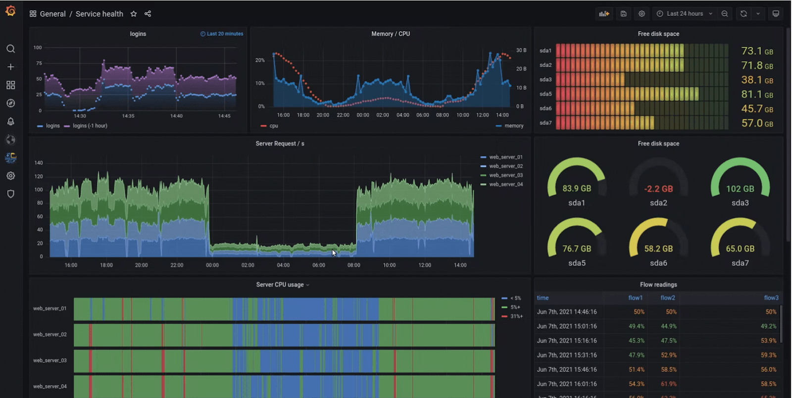 Grafana shines when monitoring equipment signals, sensor trends, process conditions, and machine states. It can be highly cost-effective, especially for organizations comfortable managing technical infrastructure.
Pros:
- Strong live monitoring
- Flexible integrations
- Cost-effective for technical teams
- Excellent time-series visualization
- Useful for equipment and process signal tracking
Cons:
- Less business-user-friendly than some packaged analytics tools
- Often requires technical setup and administration
- Not always ideal for polished executive reporting
Best use case: Engineering-heavy manufacturers tracking equipment and process signals.
7. Sisense
Sisense is a solid fit for manufacturers that want to embed analytics into internal software, supplier portals, or customer-facing applications. Its architecture and embedded analytics strengths make it useful when dashboarding needs to live inside a broader digital experience.
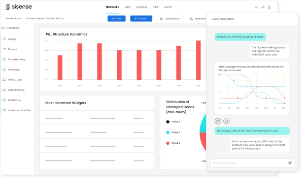 For example, manufacturers may use Sisense to surface operational performance inside internal operations portals or to provide role-based analytics to distributed users.
Pros:
- Embedded analytics strength
- Customizable experiences
- Scalable architecture
- Good flexibility for application-based reporting
- Supports tailored user experiences
Cons:
- Setup and modeling may require specialized expertise
- May be more platform-oriented than out-of-the-box for plant teams
- Can require substantial design effort for best results
Best use case: Organizations that want operational reporting delivered inside existing software environments.
8. Domo
Domo is often attractive for manufacturers that need cloud-based visibility across multiple sites and functions. Its interface is generally approachable, and it is designed for sharing dashboards quickly across business users and leaders.
 For distributed manufacturers, Domo can support centralized KPI visibility across plants, warehouses, and management teams. It is particularly useful when executive accessibility and collaboration are major priorities.
Pros:
- Accessible interface
- Fast dashboard sharing
- Strong cloud collaboration
- Good for centralized KPI views
- Useful for distributed business visibility
Cons:
- Costs can rise with broader adoption and data volume
- Deep industrial integration may need extra effort
- Some advanced manufacturing use cases may require custom modeling
Best use case: Multi-site manufacturers needing centralized KPI visibility.
9. Looker
Looker is a strong choice for data-mature manufacturers that want governed metrics, consistent definitions, and scalable reporting logic. It is especially valuable in organizations where reporting standardization across plants and departments is a strategic goal.
 Rather than letting every team calculate KPIs differently, Looker helps create shared metric logic. That can be very important in manufacturing environments where OEE, scrap, throughput, labor efficiency, or inventory turns must be defined consistently.
Pros:
- Strong semantic modeling
- Scalable analytics governance
- Reliable metric consistency
- Good for standardized enterprise reporting
- Supports governed self-service analytics
Cons:
- Requires data infrastructure maturity to unlock full value
- Not the fastest option for teams seeking lightweight deployment
- Less suited to organizations without clear data ownership
Best use case: Manufacturers building standardized reporting across plants and departments.
10. Klipfolio
Klipfolio is a practical option for smaller manufacturers that need straightforward dashboards without the complexity of larger enterprise platforms. It can work well for lean teams that want to monitor a focused set of KPIs and deploy dashboards quickly.
 It is not the deepest platform for industrial analytics, but it offers enough functionality for many small to mid-sized operations looking for visibility into production, inventory, order fulfillment, or management KPIs.
Pros:
- Quick setup
- Practical KPI dashboards
- Easier adoption for lean teams
- Lower complexity than many enterprise tools
- Good for focused operational reporting
Cons:
- Less depth for advanced industrial analytics use cases
- May not scale as well for highly complex manufacturing environments
- Limited fit for heavy machine-data scenarios
Best use case: Small to mid-sized operations that need straightforward performance tracking.
11. Tulip
Tulip is a compelling option for frontline operations teams that want configurable apps combined with visual production monitoring. It goes beyond traditional dashboards by allowing manufacturers to create operator-facing workflows, data collection apps, and live visibility screens in one environment.
That makes Tulip especially useful when dashboarding needs to connect directly to frontline execution, operator input, and process improvement.
Pros:
- Flexible interfaces
- Strong shop-floor workflows
- Useful for visualizing live production data
- Good support for configurable frontline experiences
- Can tie dashboards to operator actions and process steps
Cons:
- May require process design effort and change management
- Value depends on thoughtful rollout and user adoption
- Can involve broader workflow redesign, not just dashboard deployment
Best use case: Manufacturers that want interactive dashboards tied to operator workflows.
Side-by-Side Comparison: Features, Pros, Cons, and Best-Fit Use Cases
The best manufacturing dashboard software depends heavily on your plant environment, data sources, and who needs to use the system every day. Below is a practical comparison framework.
Core features to compare
When comparing manufacturing dashboard tools, pay closest attention to these capabilities:
- Real-time data refresh
- Machine connectivity
- ERP and MES integrations
- Alerting and exception visibility
- Mobile access
- Role-based dashboards
- Production tracking
- Downtime analysis
- Quality monitoring
- Scrap visibility
- Inventory reporting
If your main goal is live plant-floor monitoring, machine connectivity and refresh speed should carry more weight. If your priority is enterprise reporting, governance and cross-functional integration may matter more.
Common pros across leading tools
The strongest platforms usually deliver similar business benefits, even if they approach them differently.
Common advantages include:
- Faster decision-making
- Better visibility into bottlenecks
- Improved KPI alignment across teams
- Stronger reporting consistency
- Easier escalation of production issues
- Better accountability by shift, line, or plant
- More confidence in operational reviews
When dashboards are designed well, they also reduce reporting friction. Teams spend less time gathering numbers and more time acting on them.
Common limitations to watch for
Even good tools can disappoint if expectations are unrealistic. Common limitations include:
- Integration complexity with fragmented data sources
- Hidden implementation costs
- Long deployment timelines
- Training requirements for non-technical users
- Mismatch between shop-floor needs and executive dashboard design
- Weak adoption if dashboards are too complex or not actionable
A platform may look excellent in a demo but still struggle if your machine data is inconsistent, your ERP data is incomplete, or your teams do not trust the numbers.
Which type of manufacturer each tool fits best
Here is a practical way to think about fit:
Best for small plants
- Klipfolio
- Power BI
- FineReport
These are often suitable for teams that need affordable or lower-complexity reporting without heavy industrial engineering resources.
Best for multi-site enterprises
- Power BI
- Tableau
- Domo
- Looker
These tools are strong for centralized KPI governance, cross-site comparisons, and executive reporting.
Best for highly automated facilities
- Ignition
- Grafana
- Tulip
These tools are especially relevant when live machine data, sensors, SCADA connectivity, and operator-facing visibility are key priorities.
Best for teams with limited IT support
- Klipfolio
- Domo
- Tulip
Depending on scope, these can be easier to operationalize than deeply technical or heavily engineered platforms.
How to Choose the Right Platform for Your Factory
Selecting the right manufacturing dashboard platform starts with clarity about your factory’s data, users, and operating priorities.
Match the tool to your data environment
Start by identifying where your data actually lives today.
For many manufacturers, data is spread across:
- ERP systems
- MES platforms
- Spreadsheets
- SCADA systems
- PLCs
- IoT devices
- Quality systems
- CMMS or maintenance platforms
If most of your reporting is business-system-driven, a BI platform may be enough. If you need live line visibility from machines and sensors, you may need a more industrially connected solution.
Also check whether the software supports both:
- Historical reporting for trends, root causes, and management reviews
- Live production visibility for immediate operational decisions
Some platforms do one much better than the other.
Prioritize the dashboards your team will actually use
Many manufacturers try to design everything at once. That often leads to bloated dashboards and poor adoption.
Instead, start with the dashboards people truly need every day, such as:
- Daily production
- Downtime
- Quality
- Maintenance
- Labor
- Inventory
Make sure the interface matches the audience. Frontline dashboards should be simple, fast, and easy to read. Management dashboards should support trends, comparisons, and drill-down. Analysts may need deeper exploration and custom slicing.
If one dashboard tries to serve everyone equally, it often serves no one particularly well.
Consider total cost, rollout time, and internal resources
Software licensing is only part of the real cost. You should also compare:
- Implementation support
- Integration effort
- Dashboard development time
- Customization work
- Training
- Ongoing administration
- Governance and ownership needs
Some tools offer faster time to value but less long-term flexibility. Others take more effort upfront but scale better across plants and use cases.
A smart selection process weighs short-term wins against long-term maintainability.
Final Takeaways
The best manufacturing dashboard software in 2026 depends less on brand popularity and more on operational fit.
For smaller manufacturers or leaner teams, tools like Klipfolio, Power BI, and FineReport can provide strong visibility without excessive complexity. For enterprise reporting and standardized analytics, Power BI, Tableau, Qlik Sense, Domo, and Looker are strong contenders. For real-time factory-floor visibility and operational workflows, Ignition, Grafana, and Tulip stand out.
A few final points are worth remembering:
- The best platform matches your actual data environment
- Real-time needs should shape your shortlist early
- Shop-floor users and executives often need different dashboard experiences
- Implementation effort matters as much as feature depth
- Long-term scalability and governance should not be ignored
If you are evaluating manufacturing dashboard tools, start by defining your must-have use cases, required integrations, and primary user groups. From there, build a shortlist based on practical fit, not just feature checklists. The right platform should help your team see problems faster, act sooner, and improve operations with confidence.
FAQs
Manufacturing dashboard software brings production, quality, maintenance, inventory, and machine data into one view so teams can monitor performance and respond faster. It is used to track KPIs like output, downtime, scrap, OEE, and labor efficiency.
Look for real-time or near-real-time data refresh, integrations with ERP, MES, SCADA, and IoT systems, role-based dashboards, alerts, drill-down analysis, and mobile access. The best tools also support both shop-floor visibility and executive reporting.
General BI tools are often better for historical analysis and corporate reporting, while manufacturing-focused platforms are usually stronger for live operations visibility and machine connectivity. The right choice depends on whether you need strategic reporting, shop-floor action, or both.
Yes, smaller manufacturers can use dashboards to reduce manual reporting, spot downtime faster, and improve daily decision-making without adding more administrative work. Many teams start with a few critical KPIs and expand as their needs grow.
Start by matching the tool to your use case, such as real-time production monitoring, executive KPI reporting, or cross-site analysis. Then compare implementation effort, integration options, customization, scalability, and total cost based on your internal technical resources.


The Author
Yida Yin
FanRuan Industry Solutions Expert
Related Articles
How to Build a Manufacturing Production Report Dashboard Plant Managers Actually Use
A manufacturing $1 dashboard should help plant managers run the floor, not just explain results after the fact. If supervisors still rely on whiteboards, spreadsheets, and verbal updates after your dashboard launch, the
Yida Yin
May 31, 2026

Digital Production Tracking Dashboard Solutions: A Scenario-Based Guide to Real-Time Manufacturing Visibility
Digital production tracking dashboard solutions exist to solve a costly operational problem: manufacturing teams cannot improve what they cannot see in time. For plant managers, line supervisors, operations directors, an
Yida Yin
May 21, 2026
What Is OEE (Overall Equipment Effectiveness)? How to Calculate It Correctly and Avoid Misleading Results
Learn what Overall Equipment Effectiveness (OEE) is, how to calculate it correctly, and how to avoid misleading results.
Yida Yin
May 11, 2026