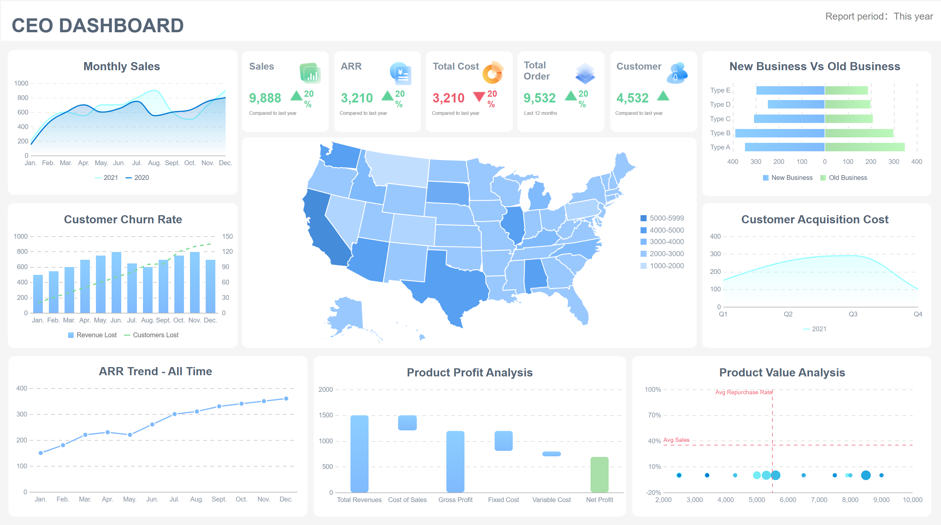
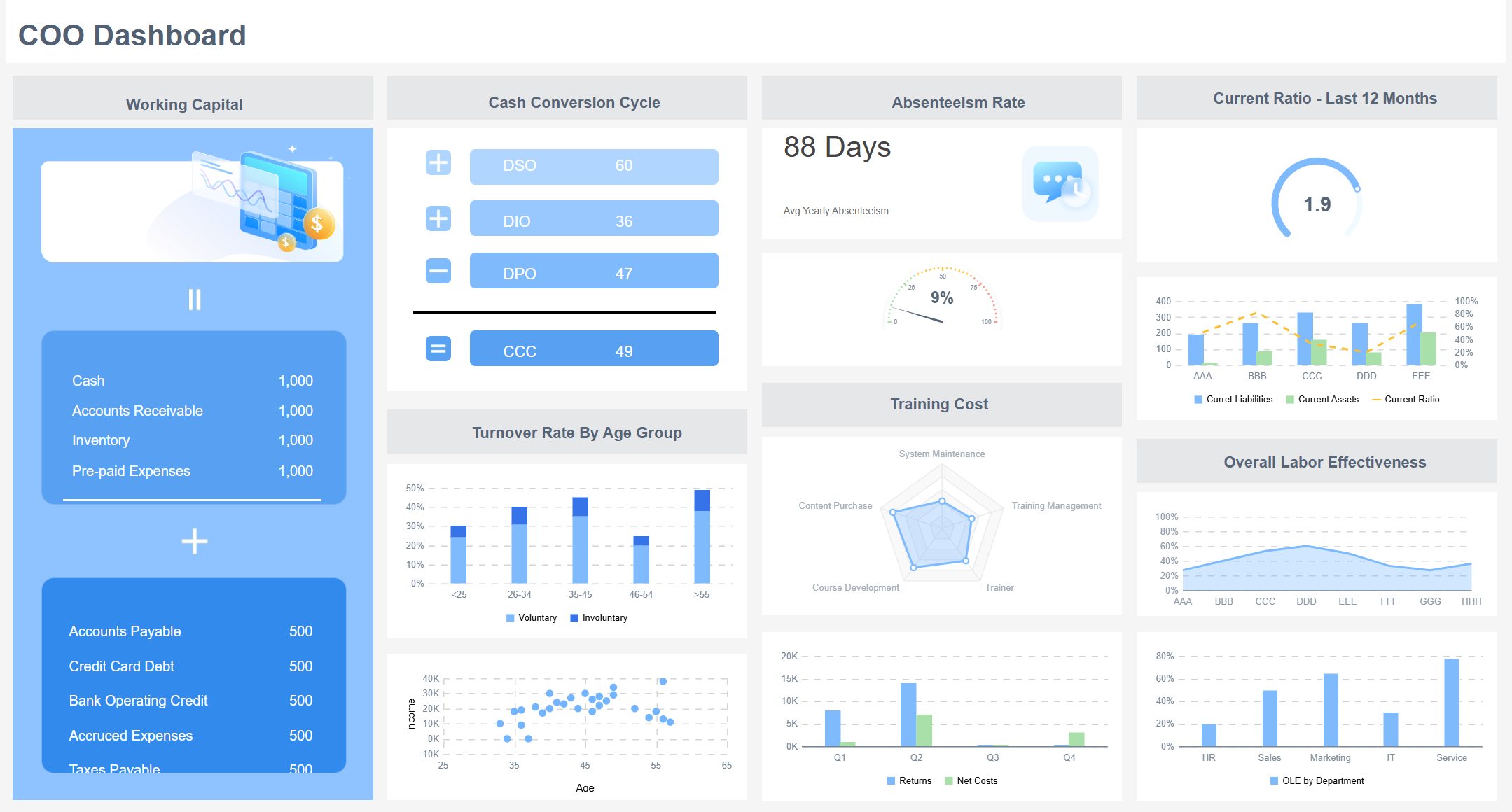
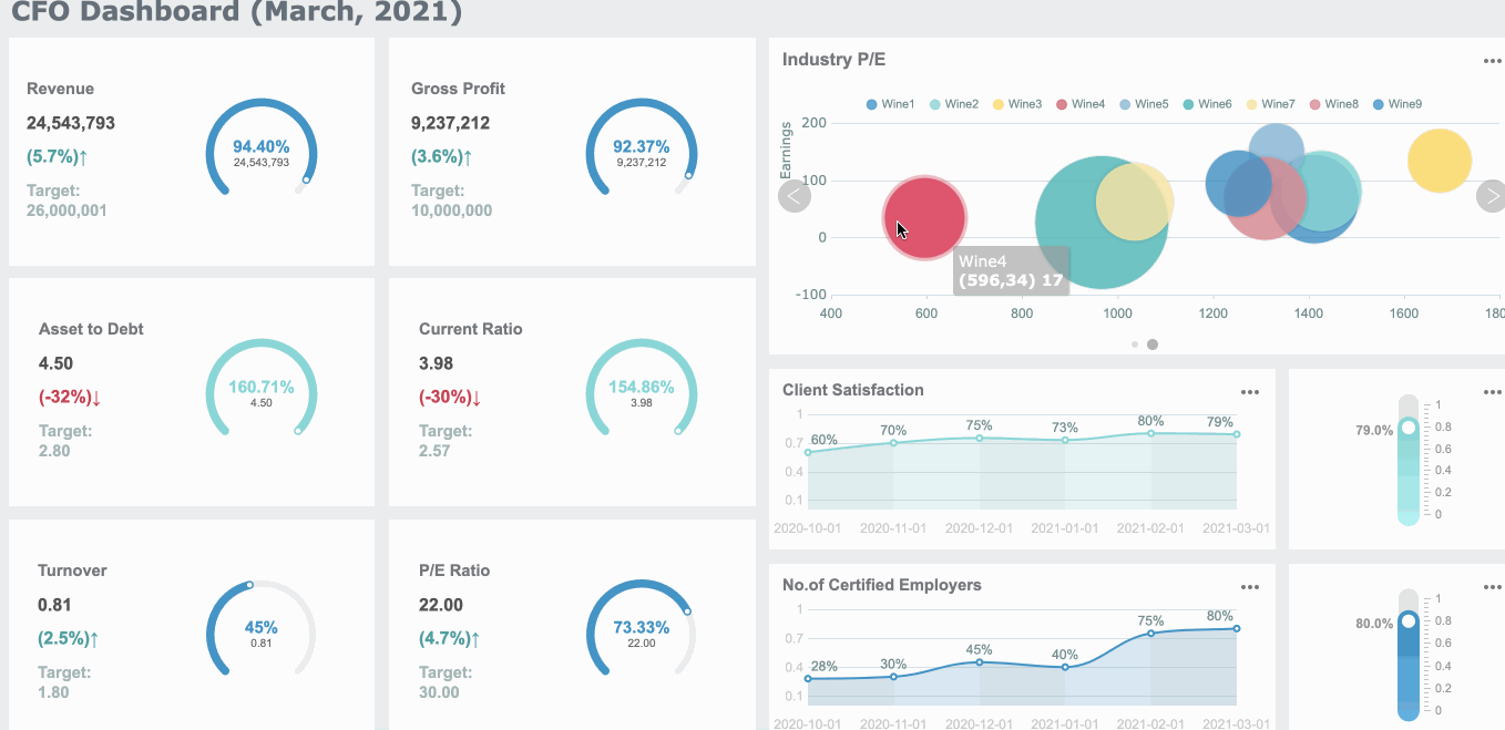
A board dashboard is a centralized platform that displays critical business metrics for executive review and action. Streamlined board dashboards are essential for effective decision-making in 2026 because you gain clarity on priorities, reduce information overload, and act with confidence. Today, dashboards have evolved into dynamic, real-time decision surfaces that drive data-driven decision-making. FineReport empowers you to access actionable insights and real-time data, transforming how you interpret information and make each decision. Consider how dashboard design shapes your boardroom’s effectiveness.

A board dashboard is a visual tool that displays your organization’s most important metrics and trends for executive review. When dashboards are not designed with clarity, you risk confusion, slow decisions, and missed opportunities. Understanding these pitfalls helps you create a more effective decision environment.
You often face data overload when dashboards present too much information at once. Many industry surveys show that executives do not need more raw data. Instead, you need clear, actionable information. Legacy processes and siloed data sources make this problem worse, leading to misalignment and confusion. When you see too many charts or tables, you may hesitate or avoid making decisions. This analysis paralysis can cause missed opportunities and delayed innovation. Poorly structured dashboards also create blind spots, making it hard to trust the information you receive.
A lack of focus in your dashboard can signal a deeper governance issue. If your goals are vague, you may end up measuring success arbitrarily. When metrics do not connect to revenue or customer targets, your efforts become misaligned. This weakens accountability and reduces your impact. Sometimes, dashboards provide metrics that only reassure you, rather than reflect true performance. This reassurance trap can delay important conversations about real challenges.
Slow decisions often result from dashboards that lack clarity. Boards value clear information over the number of charts. When decision logic is unclear, you may feel uneasy and delay action. Even with updated dashboards and skilled people, decision latency can occur if information is not presented clearly. Complex dashboards can distort the story your data tells, making it harder to act quickly. The main goal should always be to support fast, confident decisions.
Tip: FineReport helps you overcome these pitfalls by integrating data from multiple sources, simplifying dashboard layouts, and highlighting the metrics that matter most for your board.
Simplifying your board dashboard builds decision-making muscle by focusing attention on key metrics and trends, reducing distractions, and enabling faster, more confident decisions.
You strengthen your decision-making muscle when you focus on the metrics that matter most. A streamlined dashboard helps you see the big picture and spot patterns quickly. When you highlight KPIs and trends, you transform raw data into actionable information. This approach allows you to monitor performance, identify risks, and respond before issues escalate.
| Metric Type | Measurement Method | Impact on Boardroom Performance |
|---|---|---|
| KPIs | Track over time using charts | Spot patterns and respond to declining performance early |
| Trend Analysis | Visual representation of data | Identify when interventions are needed and measure improvements |
You answer three critical questions with a focused dashboard:
FineReport empowers you to highlight metrics and meaning with intuitive visualization tools. You can create dashboards that bridge the gap between information and insight, making complex data easy to understand.
Building decision-making muscle means acting with confidence and speed. Real-time data visualization accelerates decision-making by delivering immediate insights. You interpret information quickly and respond to market changes without delay. FineReport’s real-time dashboards ensure you always have the latest data at your fingertips, whether you access them on your PC or mobile device.
Recent research shows that interactive dashboards enable leadership to process information faster and make strategic decisions based on actionable insights. You avoid confusion and hesitation when your dashboard presents clear, up-to-date data. FineReport’s multi-source integration reduces the time spent switching between tools or compiling reports, so you focus on decisions instead of searching for information.
A simplified dashboard supports strategic alignment across your organization. You connect portfolio data with strategic context, allowing leadership to navigate from high-level strategy to operational execution. Living dashboards automatically update and flag issues, helping you allocate resources in line with strategic goals.
| Evidence Description | Impact on Strategic Alignment |
|---|---|
| Dashboards connect portfolio data with strategic context | Enhance visibility and expose gaps in alignment with business goals |
| Living dashboards update and flag issues | Facilitate faster decision-making and ensure alignment |
| Health indicators influence project management decisions | Keep decisions grounded in business impact |
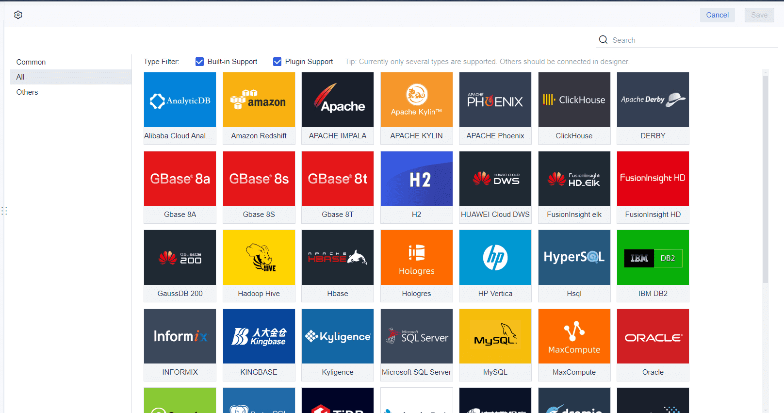
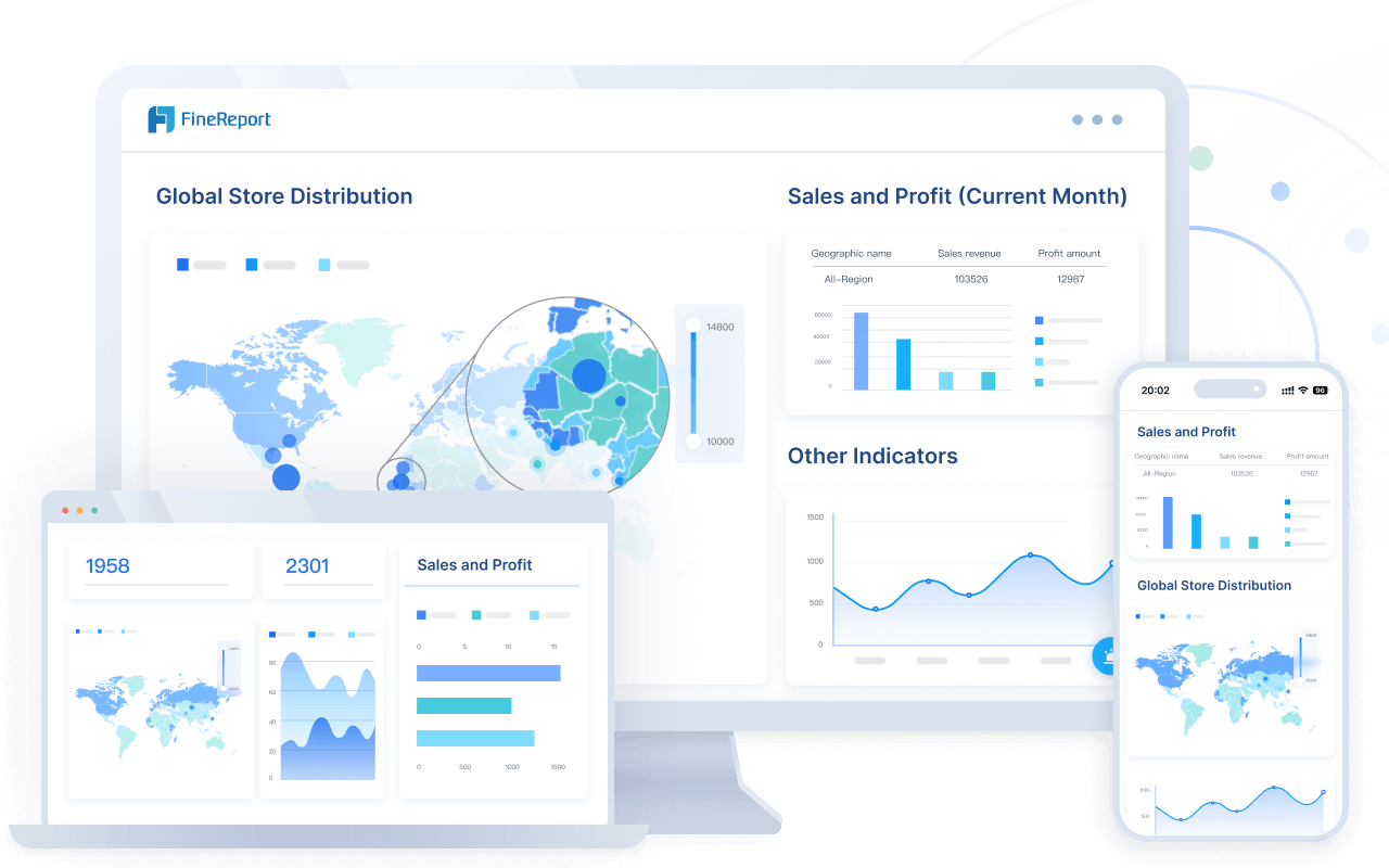
FineReport’s multi-source data integration gives you holistic insights. You view performance across departments and systems in one dashboard. You tailor dashboards for different roles, ensuring each team sees the metrics relevant to their objectives. This comprehensive view strengthens strategic planning and keeps everyone aligned with business goals.
Tip: Use FineReport to build decision-making muscle by simplifying your dashboard, focusing on metrics and meaning, and integrating real-time data from multiple sources. You will accelerate decision-making and improve boardroom performance.
A board dashboard is a centralized digital platform that displays key business metrics and trends for executive decision-making. FineReport board dashboard solutions help you streamline information, maintain control, and drive confident decisions.
You can simplify your dashboard using FineReport by removing unnecessary noise, grouping related metrics, and focusing on decision-support. Start by identifying which metrics directly impact your board’s goals. Use FineReport’s drag-and-drop interface to organize these metrics into clear visual sections. Group similar metrics together so you can compare performance at a glance. Eliminate redundant charts and tables that distract from the main decision points. FineReport enables you to create dashboards that highlight actionable information, making it easier to spot trends and exceptions. This approach ensures your board dashboard supports fast, informed decisions.
You may worry about losing access to supporting data when you streamline your dashboard. FineReport addresses this by providing robust data access and control features. You can set user authentication to secure sensitive information. Assign role-based permissions so each board member sees only the data relevant to their responsibilities. FineReport maintains audit logs to track user actions and ensure accountability. Regular access reviews help you adapt permissions as your organization changes. Data segmentation allows you to control exposure of confidential information. These methods keep your data secure and accessible, even as you simplify your dashboard.
| Method | Description |
|---|---|
| User Authentication | Multi-factor authentication enhances security for all users. |
| Role-Based Permissions | Assign access levels based on user roles to control data visibility and actions. |
| Audit Logging | Track user access and actions for accountability and security. |
| Regular Access Reviews | Review permissions quarterly to maintain security and adapt to changes. |
| Data Segmentation | Limit exposure of sensitive information by applying access controls to different data categories. |
You may encounter resistance when updating your board dashboard. FineReport helps you overcome this by using proven strategies:
For example, BOE Technology Group improved operational efficiency by 50% after implementing FineReport dashboards. In finance and manufacturing, organizations use FineReport to automate reporting, integrate data, and visualize metrics, leading to faster decisions and better alignment.


A board dashboard is a digital platform that displays essential business metrics, enabling you to monitor performance and make informed decisions. Streamlined dashboards transform boardroom dynamics by accelerating anomaly detection, focusing discussions, and improving alignment with organizational strategy.
You gain real-time visibility into data with a streamlined dashboard. This immediate access helps you spot unusual patterns and trends before they escalate. AI-powered features can automatically flag anomalies, so you respond quickly during board meetings. These capabilities support timely decision-making and reduce risk.
| Metric | Description |
|---|---|
| Precision | Measures the accuracy of the positive predictions made by the model. |
| Recall | Indicates the ability of the model to find all relevant instances (anomalies). |
| F1-score | The harmonic mean of precision and recall, useful for imbalanced classes. |
| ROC Curve | Plots True Positive Rate against False Positive Rate, useful for evaluating model performance. |
| PR Curve | Focuses on the performance of the positive class, providing insights into precision-recall trade-offs. |
| Confusion Matrix | A table that describes the performance of the model by showing True Positives, False Positives, etc. |
| AUC | Area Under the ROC Curve, a threshold-independent measure of model separability. |
A focused dashboard streamlines boardroom conversations. You assess performance quickly and shift attention to strategic topics. By tracking progress against key metrics, you simplify the user experience and dedicate more time to complex issues.
| Key Aspect | Contribution to Boardroom Discussions |
|---|---|
| Streamlined Presentation | Allows quick assessment of performance, facilitating strategic discussions. |
| Reduced Routine Updates | Frees up time for critical conversations that enhance organizational performance. |
| Evidence-Based Decisions | Combines quantitative data with qualitative insights for informed decision-making. |
Enhanced dashboard design brings board members and executives onto the same page. You establish a common language for strategic discussion, mapping metrics to organizational objectives. Boards that align dashboard metrics with strategy report higher satisfaction and governance effectiveness.
| Evidence Description | Source |
|---|---|
| Dashboards help establish a common language for strategic discussion, enhancing alignment between the board and executive team. | Spencer Stuart's Board Practice |
| Boards that map dashboard metrics to strategic objectives report 41% higher satisfaction with governance effectiveness. | Gartner |
| Dashboards provide a concise overview of data, enabling informed decision-making and highlighting critical issues. | Cascade.app |
You see a concise overview of information, which highlights critical issues and supports better decisions. Streamlined dashboards foster operational efficiency and strategic alignment, as seen in organizations that use FineReport to optimize boardroom performance.
Effective dashboards accelerate decision-making. Overloaded dashboards create information noise, forcing users to filter what matters on their own, which consumes time and energy. By reducing metrics, key patterns and trends become more visible, anomalies are detected faster, and discussions become more focused and efficient. This speed is critical in business environments that demand fast and accurate responses.
You gain the ability to monitor, visualize, and act on real-time metrics. Patterns become visible, and you respond to issues and opportunities earlier.
FineReport empowers you with actionable insights and real-time data, improving boardroom performance. To prepare for 2026, follow these steps:
| Trend | Description |
|---|---|
| AI Integration | Dashboards will use AI to highlight metrics and provide predictive analytics. |
| UX Focus | Simplicity and accessibility will improve user engagement and decision-making. |
| Mobile-First Approach | Dashboards will be designed for mobile compatibility, enabling access to critical information. |
Review and update your dashboards now to unlock better decisions and drive your organization’s success.

What is a Business Performance Dashboard
What is a Dashboard and How Does It Work
Management Dashboard Explained with Core Features

The Author
Lewis
Senior Data Analyst at FanRuan
Related Articles
How to Build an Ops Dashboard: Key Metrics, Best Layouts, and Examples for Operations Teams
An ops dashboard gives operations leaders a live, decision ready view of what is happening across workflows, teams, systems, and service levels. If you manage delivery, support, logistics, IT operations, or multi site pe
Eric
Jan 01, 1970
How to Build a Clients SEO Dashboard That Proves ROI Step by Step
Learn how to create a clients SEO dashboard focused on business outcomes like leads and revenue. Step-by-step guide for agencies and marketers to prove SEO ROI.
Lewis Chou
May 05, 2026
12 Metrics Dashboard Examples by Department: Sales, Marketing, Operations, Finance, and HR
Explore 12 practical metrics dashboard examples for Sales, Marketing, Operations, Finance, and HR.
Lewis Chou
May 05, 2026


