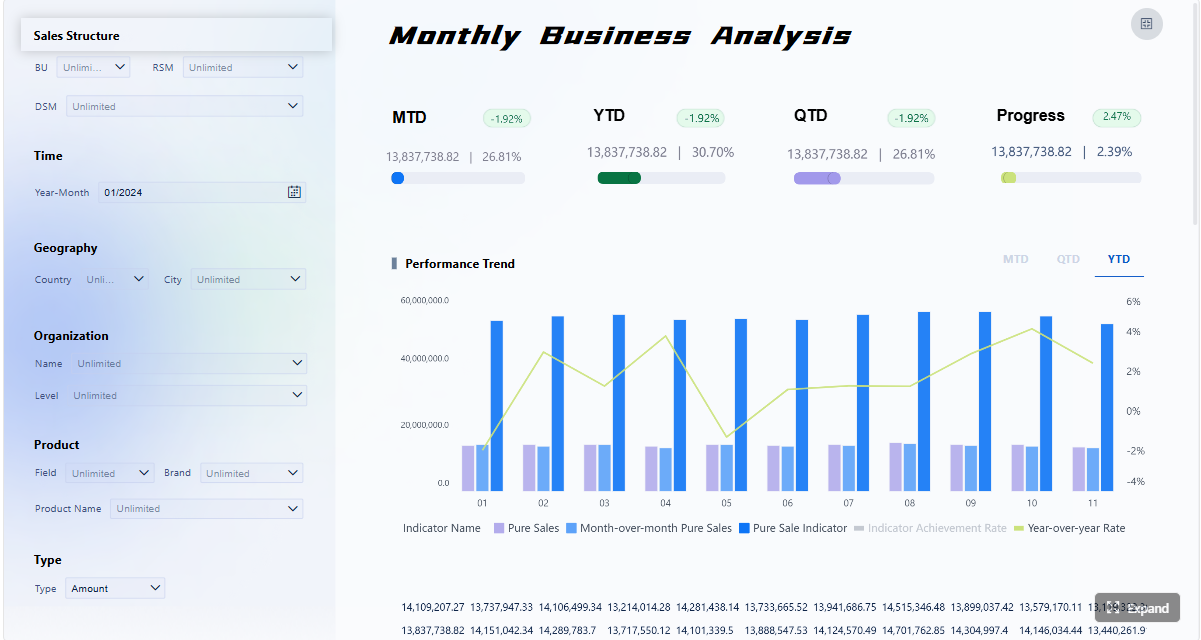
A small business KPI dashboard should help your team make better decisions every week, not just display numbers. If your weekly meeting turns into a debate about whose spreadsheet is right, which metrics matter, or what needs action next, the dashboard is failing its job.
For owners, operations managers, sales leads, and finance-minded team members, the business value is straightforward: a strong dashboard creates alignment, reduces reporting friction, and turns performance data into clear next steps. Instead of chasing dozens of disconnected metrics, your team sees one shared view of what is working, what is off track, and what needs intervention now.
Click To Try The Dashboard
What a small business KPI dashboard should do each week
A weekly dashboard is not a data dump. It is a decision tool.
At a minimum, your small business KPI dashboard should convert raw business activity into a short list of actions. That means surfacing the few numbers that tell your team whether revenue is moving, cash flow is tightening, service quality is slipping, or operational bottlenecks are growing.
A useful weekly dashboard should:
Turn raw numbers into a short list of decisions your team can act on
Keep everyone focused on the same weekly priorities instead of chasing too many metrics
Show trends, targets, and exceptions at a glance so meetings move faster
Separate useful signals from vanity metrics that do not change action
The best dashboards create management discipline. When everyone reviews the same metrics on the same schedule, accountability becomes easier. You reduce side conversations, avoid conflicting interpretations, and spend more time deciding what to do next.
Key Metrics (KPIs) every weekly dashboard should support
Before choosing exact numbers, make sure your dashboard structure supports these KPI characteristics:
Actionability: Each KPI should point to a decision or follow-up action.
Ownership: Every metric needs a named person responsible for reviewing and responding.
Consistency: Definitions, formulas, and time windows must stay stable.
Comparability: Metrics should show current performance versus target, prior period, or threshold.
Relevance: Only include KPIs tied to current business goals.
Visibility: Important changes should be obvious within seconds of opening the dashboard.
Timeliness: Data should refresh on a predictable cadence that matches weekly review needs.
The hardest part of building a dashboard is not the design. It is choosing the right metrics.
Most small businesses collect more data than they can use effectively. The solution is to start with the decisions you need to make each week and work backward from there.
Start with the decisions you need to make every week
A dashboard becomes valuable when each metric supports a recurring management question.
Ask:
Do we need to adjust pricing, discounts, or sales effort?
Are leads converting at the expected rate?
Is cash getting tighter over the next few weeks?
Are delivery delays or service issues increasing?
Do we need to reallocate team capacity?
For each KPI, define three things clearly:
The business choice it informs
The owner responsible for it
The expected next step if performance moves out of range
This is where many dashboards go wrong. They show numbers without linking them to action. If nobody knows what to do when a KPI turns red, it should not be on the dashboard.
Limit the dashboard to KPIs that materially influence:
Revenue
Cash flow
Customer retention
Operational performance
That discipline keeps the dashboard useful and prevents it from becoming a cluttered reporting archive.
Focus on the most important small business KPIs
A practical small business KPI dashboard usually includes a balanced set of metrics across sales, marketing, service, operations, and finance. The exact mix depends on your business model, but the categories should be familiar to everyone.
Core KPI categories to consider
Sales KPIs
Revenue
Sales pipeline value
Close rate
Average deal size
Marketing KPIs
Leads generated
Cost per lead
Conversion rate
Website-to-lead rate
Customer KPIs
Retention rate
Repeat purchase rate
Customer satisfaction
Response or resolution time
Operations KPIs
On-time delivery
Order cycle time
Utilization rate
Inventory turnover
Finance KPIs
Cash balance
Gross margin
Net profit
Accounts receivable aging
Key Metrics (KPIs) for a small business dashboard
Below is a structured list of commonly used KPIs and what each one tells you:
Weekly Revenue: Total revenue booked in the week. Indicates short-term sales performance.
Sales Growth Rate: Percentage increase or decrease versus the prior week, month, or year. Shows momentum.
Lead Volume: Number of qualified leads generated. Helps assess marketing pipeline health.
Conversion Rate: Percentage of leads or visitors that become customers. Measures sales and marketing effectiveness.
Customer Acquisition Cost (CAC): Cost to acquire one new customer. Tracks efficiency of growth spending.
Retention Rate: Percentage of customers retained over a period. Signals loyalty and recurring value.
Average Order Value (AOV): Average revenue per transaction. Helps identify pricing and upsell opportunities.
Gross Margin: Revenue minus direct costs, expressed as a percentage. Shows operational profitability.
Cash Flow / Cash Position: Money available after inflows and outflows. Critical for small business stability.
Accounts Receivable Days: Average time to collect payment. Highlights cash collection risk.
On-Time Delivery Rate: Percentage of orders or projects completed on time. Reflects operational reliability.
Resolution Time: Average time to resolve customer issues. Indicates service performance and capacity.
Just as important, define whether each KPI is:
Leading: Predicts future outcomes, such as lead volume or pipeline growth
Lagging: Confirms results already achieved, such as monthly revenue or profit
Diagnostic: Helps explain why performance changed, such as win rate by channel or late orders by supplier
That distinction improves weekly discussions. Leading indicators help the team act early. Lagging indicators confirm whether the strategy is working. Diagnostic indicators explain where to investigate.
Avoid common KPI selection mistakes
In small businesses, dashboard bloat happens fast. A metric makes sense once, gets added, and never leaves. Over time, the dashboard becomes harder to scan and less useful in meetings.
Avoid these common mistakes:
Do not overload the dashboard with interesting but nonessential data
Remove metrics that no one owns or reviews regularly
Revisit KPIs quarterly as goals and business conditions change
A simple test helps: if a metric changes and nobody would do anything differently, it is not a KPI. It is background information.
A dashboard is only effective if people can understand it in seconds. Good design is not about visual flair. It is about reducing cognitive load so the team can move quickly from observation to action.
Keep the layout simple and scannable
The layout should mirror management priority.
Put the most important metrics at the top, where users naturally look first. Keep the number of charts limited. If every tile is equally prominent, nothing stands out.
A strong weekly dashboard layout usually includes:
Top-row summary KPIs for overall business health
Trend visuals for core performance areas
Exception or risk indicators that need discussion
Supporting detail only where it helps explain a change
Use these practical design principles:
Put the most important metrics at the top
Use clear labels, consistent time ranges, and a small number of charts
Highlight only the changes that require attention
Consistency matters more than creativity. If one chart uses week-over-week data and another uses trailing 30 days without explanation, confusion is guaranteed.
Add context so numbers lead to action
Raw values alone are rarely enough. Teams need context to interpret whether a number is good, bad, or irrelevant.
Every key KPI should ideally show:
Actual result
Target
Prior period comparison
Threshold or alert range
Owner
That lets your team answer the essential question immediately: are we on track, behind, or facing an exception?
To improve actionability:
Compare actuals against targets, prior periods, and thresholds
Include brief notes for unusual spikes or drops
Make it obvious who is responsible for each KPI
Brief comments are underrated. If revenue dipped because a major invoice moved into the next week, add a short note. If support response time rose because of a staffing issue, say so. This prevents unnecessary confusion and keeps the meeting focused.
Build for weekly review habits
Even well-designed dashboards fail when the update process is inconsistent or the review rhythm is unclear.
Your dashboard should fit into a repeatable team habit. That means the data refreshes before the same meeting each week, the agenda follows a standard structure, and everyone knows how to use the dashboard.
Best practice here is simple:
Make updates easy and predictable
Use one shared dashboard for the whole team, with role-specific views if needed
Set a standard agenda for the weekly KPI check-in
If your team has to hunt across multiple files, tabs, and tools before the meeting even starts, adoption will stay low. One shared dashboard creates a single source of truth.
This foundation is critical because dashboard trust depends on calculation consistency.
Follow these setup practices:
List where each KPI comes from and how often it refreshes
Standardize calculations before the dashboard goes live
Check data accuracy with a simple validation process
A lightweight validation process works well. For example, compare dashboard totals to the original source once a week for the first month. Fix mismatches early before skepticism spreads through the team.
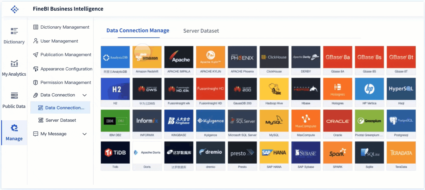
Choose a dashboard template or software
Most small teams should not start from a blank canvas unless they already have strong internal BI capability.
A practical template helps you move faster, especially if your team is new to KPI management. The goal is not advanced customization on day one. The goal is reliable weekly usage.
Start with a practical template if your team is new to KPI tracking
Compare software based on ease of setup, reporting, sharing, and integrations
Pick a tool your team will maintain consistently, not just one with the most features
In consulting terms, maintainability beats sophistication. A simple dashboard that updates every week is more valuable than a complex dashboard that breaks after two months.
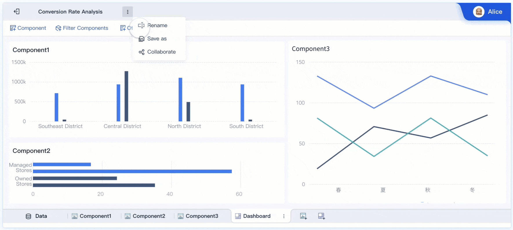
Create a first version and test it with your team
Build the smallest dashboard that can support a useful weekly meeting. That is your minimum useful dashboard.
For most small businesses, that means:
8 to 12 core KPIs
A few simple trends
Targets and thresholds
Assigned owners
One-page or one-screen layout
Then test it in live meetings, not in theory.
Ask your team:
Which metrics do you check first?
Which visuals are confusing?
Which KPIs lead to actual discussion?
Which numbers feel redundant?
What is missing for decision-making?
Use these implementation best practices:
Build version one around weekly decisions, not full reporting needs
Keep the scope narrow and practical.
Standardize KPI definitions before socializing the dashboard
Alignment on formulas prevents trust issues later.
Pilot with one leadership or cross-functional team first
Validate usability before expanding access.
Remove any chart that does not influence a weekly conversation
Clarity improves adoption.
Review dashboard effectiveness after 30 days
Measure whether it shortened meetings and improved follow-through.
As a consultant, I would strongly recommend resisting the urge to add every stakeholder request immediately. First prove the dashboard works in practice.
A high-performing dashboard is rarely perfect in its first version. It evolves through usage, not brainstorming.
Study dashboard examples from real businesses
Looking at examples can help your team avoid poor layout choices and identify better KPI grouping patterns. But the value is not in copying someone else’s dashboard exactly. It is in understanding why their structure works.
Strong examples usually have these traits:
A clear business story
Few but important KPIs
Clean grouping by function or goal
Immediate visibility into trends and risks
Minimal visual clutter
When reviewing examples, pay attention to how they prioritize information. The best dashboards make it obvious where attention belongs.
That is the lesson to borrow:
Review examples to see how different teams group and prioritize KPIs
Notice how strong dashboards keep the story clear without clutter
Adapt ideas to your business model rather than copying them exactly
A retailer, agency, local service business, and SaaS company will all need different dashboard structures. The principle stays the same: build for your operating model.
Use weekly feedback to improve adoption
Adoption is not a design event. It is an operating behavior.
If people stop using the dashboard, the problem is usually one of three things:
It is too crowded
It is not trusted
It is not clearly tied to decisions
Use weekly feedback loops to fix this quickly.
Ask simple questions after meetings:
What did you check first?
What did you ignore?
What was unclear?
What required follow-up outside the dashboard?
Which metric caused useful action?
Then optimize accordingly:
Remove low-value widgets and add missing context where confusion appears
Track whether the dashboard shortens meetings and improves follow-through
A useful operational metric here is meeting efficiency. If your weekly KPI review becomes shorter, more focused, and more action-oriented over time, the dashboard is doing its job.
The most effective teams do not treat dashboards as passive reports. They use them as the front end of a weekly decision system.
Run a simple weekly KPI meeting
Your dashboard becomes valuable when it anchors a repeatable management process.
Keep the meeting format fixed and fast. A good weekly KPI review does not need to be long. It needs to be disciplined.
A practical agenda looks like this:
Review wins and positive movement
Review risks and red flags
Discuss major outliers or exceptions
Confirm actions, owners, and deadlines
Move detailed analysis offline when needed
This keeps the conversation focused on decisions, not endless explanation.
Follow these operating rules:
Review wins, risks, and outliers in a fixed order
Assign actions, owners, and deadlines before the meeting ends
Save deeper analysis for follow-up instead of slowing the main review
That last point matters. The weekly meeting is not the place to solve every root cause. It is the place to identify what needs attention and assign next steps.
Know when to update your KPIs and dashboard structure
A dashboard should evolve with the business. What mattered at one stage may become irrelevant later.
You should revisit your dashboard when:
Strategy changes
New sales channels are introduced
Pricing model shifts
Customer mix changes
Operations scale up
Cash management becomes more critical
A KPI no longer drives action
Use a quarterly review to assess whether your current dashboard still reflects the company’s priorities.
Keep this governance simple:
Change metrics when strategy, channels, or business stage changes
Archive outdated KPIs to keep the dashboard relevant
Treat the dashboard as a working management tool, not a one-time report
That mindset separates dashboards people admire from dashboards people actually use.
Building a small business KPI dashboard manually is possible, but it gets complicated quickly. Data lives in different systems, formulas drift, spreadsheet versions multiply, and weekly updates become dependent on one person remembering how everything works.
That is why many teams stall. The methodology is clear, but the execution becomes too manual.
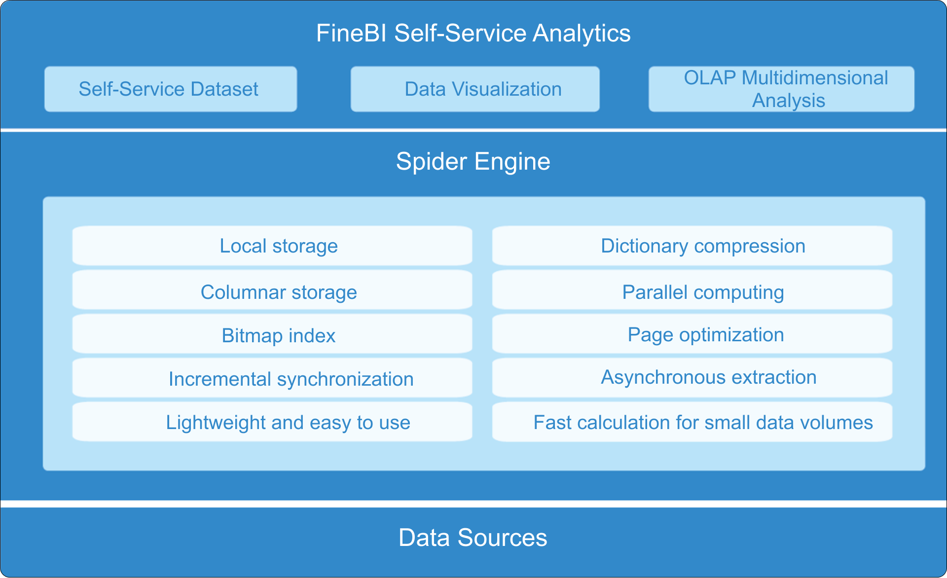
FineBI solves this gap by helping businesses move from dashboard ideas to a repeatable decision system. Instead of stitching together reports by hand, you can use ready-made templates, connect key data sources, standardize KPI logic, and automate the full workflow from refresh to sharing.
For small businesses and growing teams, FineBI makes it easier to:
Reduce spreadsheet dependency and manual prep work
Turn weekly reporting into a reliable management process
In practical terms, building this manually is complex; use FineBI to utilize ready-made templates and automate this entire workflow. That lets your team spend less time assembling numbers and more time acting on them.
If your goal is not just to create a dashboard but to build a weekly operating rhythm your team will actually follow, FineBI is the right enabler.
FAQs
A useful small business KPI dashboard should include a short set of metrics tied to weekly decisions, usually covering revenue, cash flow, customer performance, and operations. Each KPI should have a clear owner, a consistent definition, and an expected action if results move off target.
Most small businesses should track only a focused set of KPIs each week, often around 8 to 15 depending on complexity. Too many metrics create clutter and make it harder for teams to spot what actually needs attention.
Start with the recurring decisions your team needs to make, then choose metrics that directly support those choices. If a KPI does not influence pricing, sales effort, cash management, customer retention, or operations, it probably does not belong on the dashboard.
For a weekly management dashboard, data should refresh on a predictable schedule that matches your review rhythm, ideally before the team meeting. The right cadence is the one that keeps numbers timely enough to act on without creating noise from constant changes.
A dashboard becomes useful when it helps the team quickly see trends, compare results against targets, and decide what to do next. The best dashboards reduce spreadsheet debates and turn meetings into action-focused reviews instead of reporting sessions.
Product Trial
FineReport
Pixel-perfect reports · Interactive dashboards · Easy data entry · Digital twins