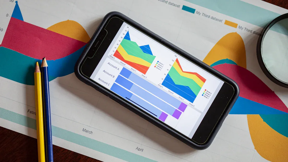
A business intelligence dashboard is a visual tool that helps you track, analyze, and display key information from across your organization in one place. You can connect data from different sources, create interactive charts, and view real-time updates to spot trends or issues quickly. With clear dashboards, you gain faster and more accurate decision-making, especially when your team trusts the information and receives proper training.
What Is a Business Intelligence Dashboard
A business intelligence dashboard is a data visualization tool that brings together information from different sources, turning complex data into clear, interactive visualizations for smarter business decisions.
Core Purpose and Function
You use a business intelligence dashboard to see your organization’s most important data in one place. This tool helps you track performance, spot trends, and make decisions based on facts instead of guesses. Business dashboards support your business intelligence strategy by making data easy to understand and share.
Here is a table showing the main functions and benefits of a business intelligence dashboard:
| Function/Benefit | Description |
|---|---|
| Data Visualization | Dashboards use visual formats to present metrics and statistics, making complex data clear. |
| Decision-Making Support | They help you make informed choices and strategic plans using real data insights. |
| Performance Tracking | BI dashboards let you spot trends, find opportunities, and address problems quickly. |
| AI Integration | They use AI to process large data sets and reveal patterns in consumer behavior. |
| Self-Service BI | You can explore and analyze data without needing advanced analytical skills. |
| Collaborative Analysis | Dashboards make it easy to share information and work together on decisions. |
| Automation | They automate reporting and dashboard creation, saving you time and effort. |
A business analytics dashboard also helps you build a data-driven culture. You and your team get the right data at the right time. Self-service BI empowers everyone to use analytics, not just experts. This approach removes barriers and helps everyone speak the same language about data.
How a BI Dashboard Works
A BI dashboard connects to many data sources, such as databases, cloud platforms, and even web APIs. You can pull in data from tools like Salesforce, Google Analytics, or your company’s warehouse. This central view means you do not need to jump between different systems. You see all your key metrics in one place.
The dashboard uses native connectors to gather and unify data. You can then create data visualizations like charts, graphs, and maps. These visualizations help you spot patterns and outliers quickly. For example, you might see sales trends, customer behavior, or inventory levels at a glance.
Data dashboards also support real-time updates. You get the latest information as soon as it is available. This feature is important for fast decision-making. You can filter, drill down, and interact with the visualizations to explore details.
Tip: A good dashboard makes it easy for you to switch between different views, compare time periods, and focus on what matters most.
However, connecting a BI dashboard to your existing systems can bring challenges. Here is a table showing some common integration issues:
| Challenge | Description | Business Impact |
|---|---|---|
| Underestimating system complexity | You may need data from more systems than you expect. | Delays, incomplete reports, frustrated stakeholders. |
| Real-time data requirements | Real-time updates can make integration harder. | Data sync issues, more complex architecture. |
| Security and compliance concerns | Keeping data safe and compliant adds extra steps. | Risk of breaches, possible penalties. |
| Poor data quality | Inconsistent data can block effective integration. | Inaccurate reports, bad decisions. |
| Incompatible data formats | Different systems may not "speak" the same language. | More time needed for data transformation. |
| Custom scripts/manual processes | Manual steps can break when systems change. | Higher costs, more errors. |
| Lack of error management | No error checks can lead to missing or wrong data in dashboards. | Delayed insights, missed opportunities. |
A strong BI dashboard helps you overcome these challenges by offering built-in tools for data cleaning, error management, and secure sharing.
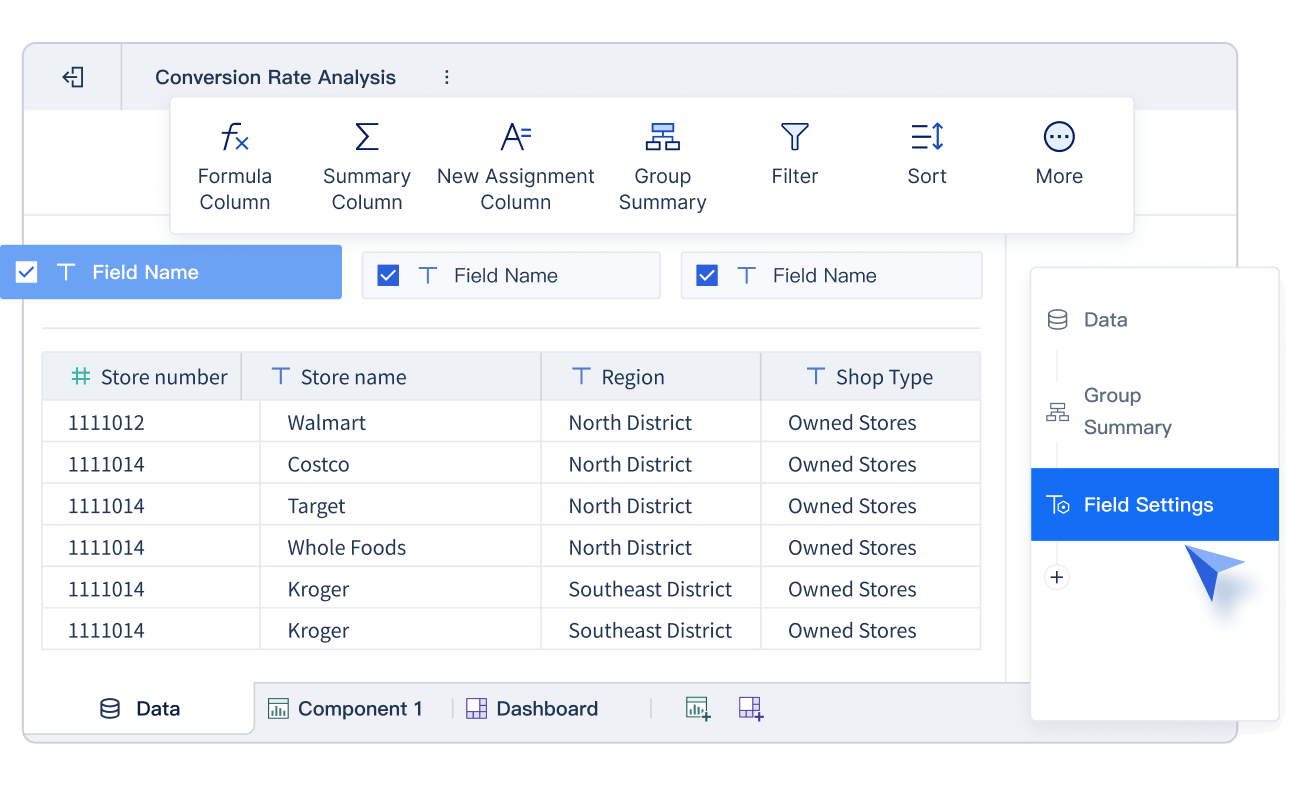
Key Features in FineBI
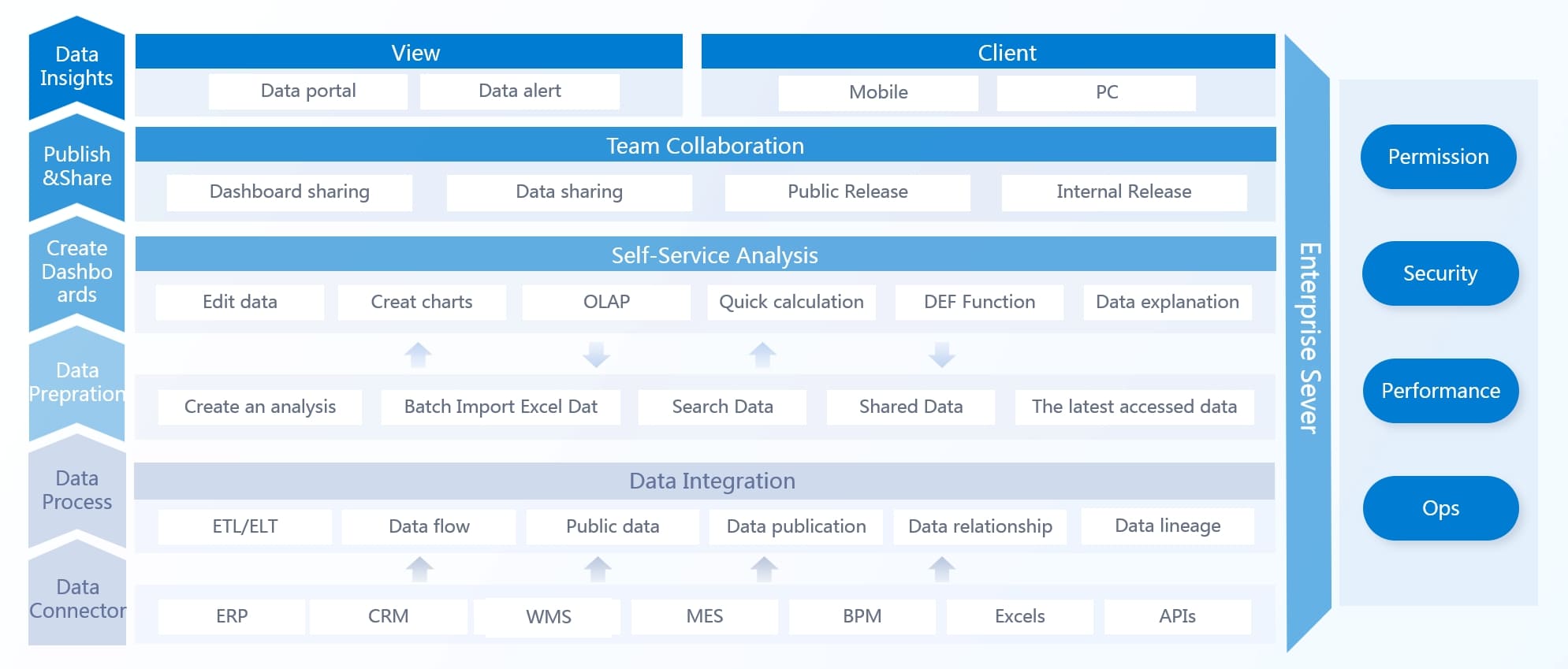
FineBI is a modern data visualization and analysis tool that makes building dashboards simple for everyone. You do not need coding skills to use it. FineBI stands out among business intelligence tools because it covers the full workflow:
- Data Integration: You connect to over 60 types of data sources, including databases, cloud warehouses, big data platforms, files, and APIs. FineBI supports both simple and complex environments, so you can bring all your data together.
- Data Processing: You prepare your data by joining tables, creating formulas, and cleaning up records. FineBI lets you build self-service datasets, merge data, and standardize values without writing code.
- Visual Exploration: You drag and drop fields to create charts, maps, and tables. FineBI offers over 60 chart types and 70 styles. You can filter, drill down, and link visualizations for deeper analysis.
- Publishing & Governance: You share dashboards securely with your team. FineBI provides role-based access, audit trails, and mobile access. You can publish dashboards for executives, analysts, or field teams.

FineBI also includes AI-powered features. You can ask questions in plain language and get instant answers with visualizations. This makes data dashboards even more accessible.
With FineBI, you turn raw data into clear, interactive visualizations. You can track KPIs, monitor trends, and predict outcomes. The platform supports real-time analysis and collaboration, helping you build a strong data-driven culture.
Note: FineBI’s self-service approach means you can create and update dashboards quickly, without waiting for IT support.
A business intelligence dashboard like FineBI gives you the power to make better decisions, faster. You get a unified view of your business, improved data quality, and the flexibility to adapt as your needs change. This is why many organizations choose FineBI as their main data visualization solution.

Types of Business Intelligence Dashboards and Use Cases
A business intelligence dashboard is a visual tool that lets you track, analyze, and share key data from different sources, helping you make better decisions quickly and confidently.
Operational, Analytical, and Strategic Dashboards
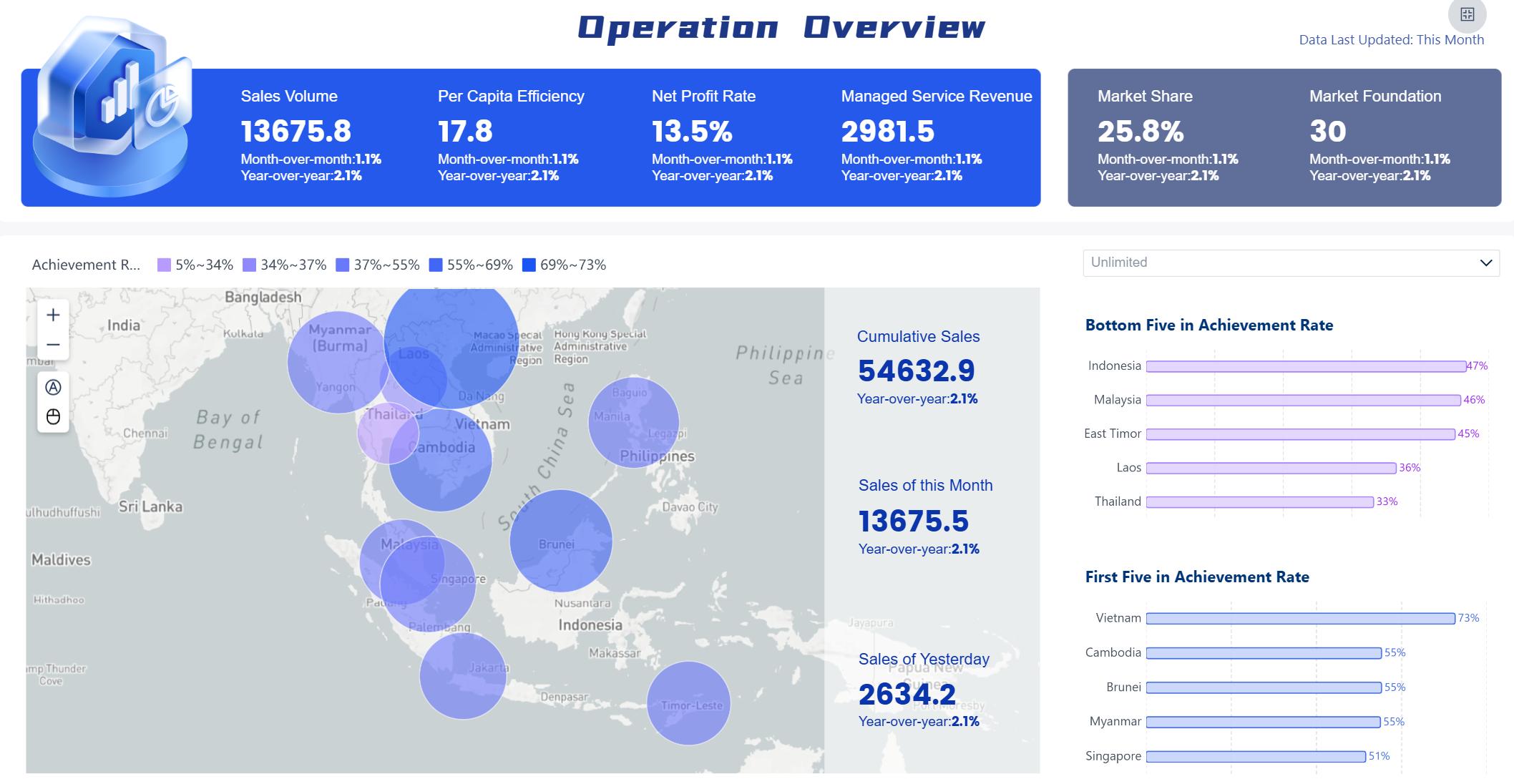
You will find three main types of BI dashboards, each serving a unique purpose. Operational dashboards focus on real-time performance monitoring. Analytical dashboards help you dive deep into complex data for detailed insights. Strategic dashboards give you a high-level overview to track long-term goals and KPIs.
Here is a table to help you compare these dashboard types:
| Dashboard Type | Focus | Purpose | Example Metrics |
|---|---|---|---|
| Operational | Performance monitoring | Real-time insights for departmental operations | Inventory, Shipments, Returns |
| Strategic | High-level overview | Aligning organizational goals and tracking KPIs | Average Contract Value, Annual Recurring Revenue |
| Analytical | In-depth analysis | Detailed insights for complex decision-making | Sales trends, Campaign performance |
- Operational dashboards update in real time and show granular details. You can act fast when you see unexpected results.
- Analytical dashboards help you analyze transactions and spot trends.
- Strategic dashboards guide your long-term planning and forecasting.
Industry Use Cases with FineBI
FineBI adapts to many industries and roles. You can use it for everything from inventory management in manufacturing to marketing strategy in retail. Here are some common use cases:
| Industry | Typical Use Cases |
|---|---|
| Manufacturing | User segmentation, inventory management |
| Healthcare | Financial analysis, user behavior |
| Retail | Marketing strategy development |
| Finance | Financial analysis, user behavior |
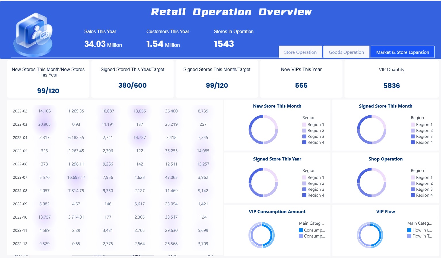
You can customize dashboards to fit your team’s needs, whether you work in operations, sales, or finance.
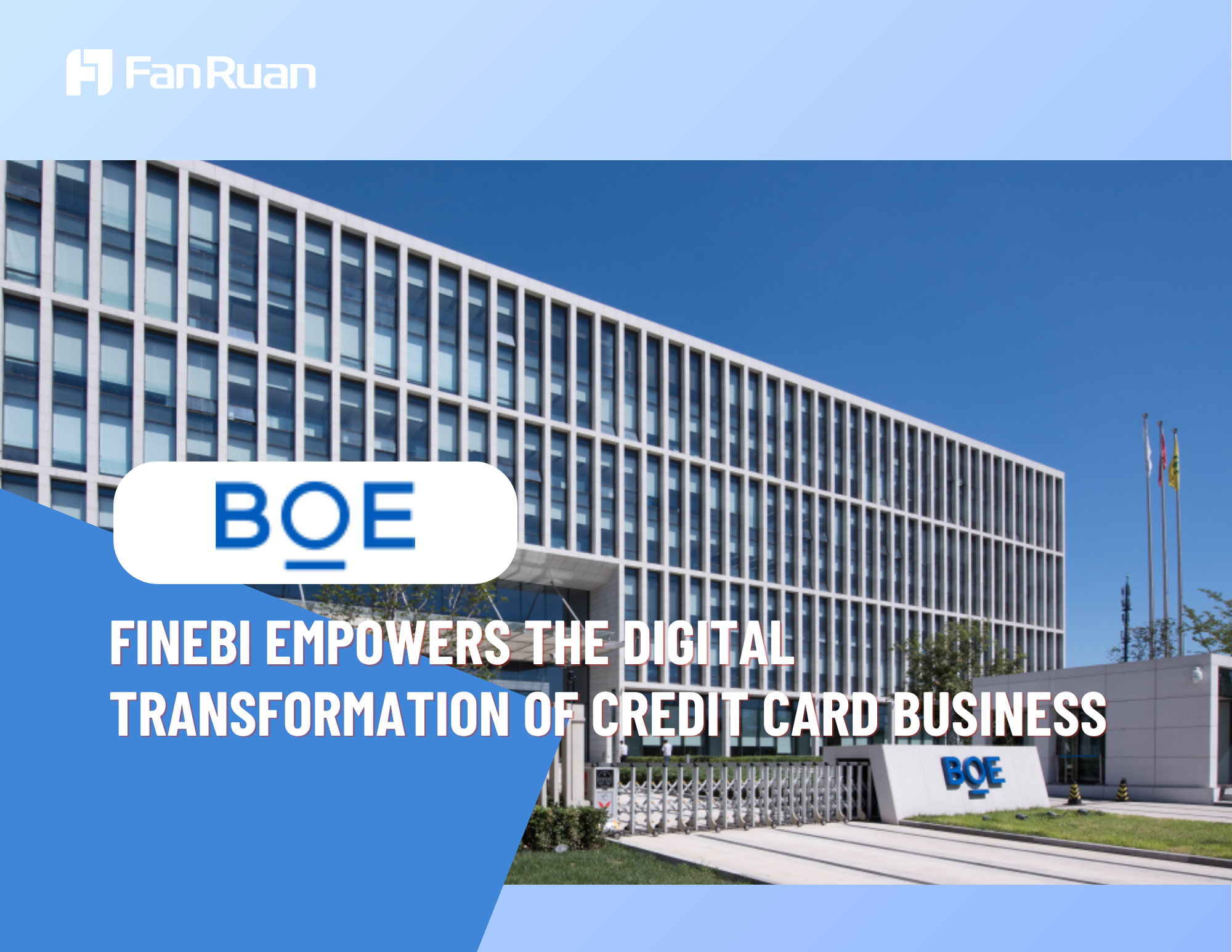
Customer Story: BOE’s Digital Transformation
BOE Technology Group faced challenges with fragmented data and inconsistent metrics. By using FineBI, BOE built a unified data warehouse and standardized metrics across departments. This transformation led to a 5% reduction in inventory costs and a 50% increase in operational efficiency. KPI dashboards and cross-factory benchmarking helped BOE make faster, data-driven decisions and accelerate digital transformation.
Business Intelligence Dashboard Benefits for Decision-Making
A business intelligence dashboard is a visual platform that brings together data from multiple sources, helping you track key performance indicators and make data-driven decisions with speed and clarity.
Real-Time Insights and Efficiency
You need to make decisions quickly in today’s business world. A bi dashboard gives you real-time insights by displaying up-to-date information from across your organization. You see sales numbers, operational metrics, and customer engagement as they happen. This immediate access to real-time data helps you spot weak areas and take action before problems grow.
- You view centralized key performance indicators, which lets you optimize strategies and respond to changes.
- Real-time dashboards show sales, operations, and financial performance, so you act fast.
- Teams align around shared metrics, improving collaboration and reducing confusion.
- Decision turnaround time improves because you do not wait for manual reports.
- Operational costs drop after you implement dashboard-driven data visualizations.
- Productivity rises when you use actionable insights from your dashboard.
Executives monitor performance and respond instantly to changes. You can correct supply chain issues or adjust marketing campaigns without delay. This efficiency leads to better business decisions and stronger results.
Tip: When you use a business intelligence dashboard, you gain continuous updates that support proactive decision-making and keep your organization ahead of the curve.
Collaboration and Self-Service with FineBI
FineBI makes collaboration and self-service analytics simple. You and your team can explore data independently, create interactive dashboards, and share actionable insights without waiting for IT support. FineBI’s intuitive design encourages everyone to participate in data-driven decision making.
| Collaboration Mode | Description |
|---|---|
| Subject collaboration | You work together on datasets, components, and dashboards, sharing viewing and editing permissions. |
| Data sharing | You publish self-service datasets after admin review, making data sharing smooth and secure. |
| Dashboard sharing | You create public links or request dashboard publication for easy access by others. |
FineBI helps you break down barriers between departments. You foster a data-driven culture by letting users from different teams access and analyze data. You build trust in business insights because everyone works from the same source of truth.
- You explore data on your own with self-service tools.
- You create powerful visualizations and interactive dashboards.
- You share insights across teams, driving collaboration and faster decision-making.

Note: FineBI’s self-service features empower you to make data-driven decisions without technical expertise, so your organization becomes more agile and responsive.
Overcoming Data Silos and Improving Data Quality
Data silos can slow down your business and block effective decision-making. When data is scattered across disconnected systems, you miss opportunities and lose trust in reports. A bi dashboard like FineBI unifies data access, giving you a single view of your organization’s information.
| Challenge | Description | How BI Dashboards Help |
|---|---|---|
| Siloed Data Across Teams and Tools | Data is scattered across disconnected systems, making it hard for teams to access and share information. | BI dashboards unify data access, providing a single view of data regardless of its source. |
| Constant Delays or Lost Insights | Legacy systems lead to outdated data, causing missed opportunities. | BI dashboards provide real-time insights, enabling timely decision-making. |
| Inconsistent Business Definitions | Different meanings for terms lead to unreliable data. | BI dashboards standardize definitions, ensuring consistent metrics across tools. |
| Data Security Without Usability | Poorly implemented security can lock users out of workflows. | BI dashboards maintain security while ensuring usability, preventing risky workarounds. |
| Loss of Trust in Reports and Dashboards | Siloed and inconsistent data leads to decision paralysis and inefficiency. | BI dashboards enhance trust by providing consistent and reliable insights, turning data into an asset. |
FineBI improves data quality by standardizing definitions and ensuring accuracy. You gain confidence in your data, which leads to faster decision-making and reliable business insights.
| Improvement Type | Description |
|---|---|
| 100% error-free regulatory reporting | You ensure compliance and accuracy in reporting. |
| Enhanced data trust | You build confidence among compliance and finance teams. |
| Faster decision-making | You reduce last-minute reporting stress. |
| Strengthened confidence in data integrity | You increase reliability of financial data. |
You transform fragmented information into actionable insights. You make data-driven decisions with speed and confidence. FineBI helps you overcome data silos, improve data quality, and unlock the full value of your business intelligence dashboard.
Tip: When you break down silos and improve data quality, you empower your team to make smarter, faster business decisions and drive growth.
Business Intelligence Dashboard vs. Reports
A business intelligence dashboard is a digital tool that gives you a visual summary of your organization’s key metrics, helping you monitor performance and make quick decisions by bringing together data from multiple sources in one interactive view.
Key Differences
You might wonder how a dashboard differs from a traditional report. The main difference lies in how you interact with information and how you use it. Dashboards give you a visual overview, while reports provide detailed analysis. The table below highlights the main differences:
| Aspect | Reports | Dashboards |
|---|---|---|
| Purpose | In-depth data analysis and details | Visual summary for quick insights |
| Format | Tables or written summaries | Charts, graphs, and gauges |
| Interactivity | Usually static, sometimes with filters | Highly interactive with drill-downs and filters |
| Level of Detail | Comprehensive and detailed | High-level overview of KPIs |
| Use Case | Audits, historical reviews, complex analysis | Real-time monitoring, performance tracking |
| Frequency | Generated as needed or on schedule | Updated in real time or near real time |
| Audience | Analysts, department leads, auditors | Executives, managers, front-line decision-makers |
| Customization | Custom queries or layouts | Custom widgets and layouts for fast visualization |
Dashboards use visuals like charts and graphs to help you spot trends quickly. Reports give you structured information, often with background data and explanations.
Tip: Use dashboards when you need a fast overview. Use reports when you need to dig deep into the details.
When to Use Each
You should choose a bi dashboard when you want to monitor key metrics, track performance, or get real-time updates. Dashboards work best for executives and managers who need to make quick decisions. You can interact with the data, filter results, and drill down for more details.
On the other hand, use reports when you need to analyze data in depth, review historical trends, or prepare for audits. Reports are better for analysts who need to see all the numbers behind the metrics.
Here is a quick comparison:
| Feature | Dashboards | Reports |
|---|---|---|
| Focus | Summary-focused | Data-focused |
| Visualization | Visual (charts, KPIs) | Tabular, detailed |
| Understanding | Brief overview | In-depth analysis |
| Consumption | Web, interactive | Paper or web, less interactive |
FineBI gives you the flexibility to create both dashboards and reports. You can switch between high-level views and detailed analysis as your needs change. This helps you stay informed and make better decisions every day.

Choosing Business Intelligence Dashboard Software
A business intelligence dashboard is a tool that lets you see, analyze, and act on your organization’s most important data in one interactive view, helping you make smarter decisions with real-time data and clear visualizations.
Choosing Business Intelligence Dashboard Software
Key Features to Look For
When you start choosing a business intelligence dashboard software, you need to focus on features that support your goals and make your work easier. The table below highlights the most important features to consider:
| Feature | Description |
|---|---|
| Seamless Data Integration | Connects to many data sources for reliable, unified analysis. |
| AI-Powered Analytics | Uses advanced algorithms for deeper insights. |
| Intuitive Dashboards | Offers easy navigation and clear visualizations for all users. |
| Real-Time Processing | Updates data instantly for timely decisions. |
| Custom Reporting | Lets you create reports tailored to your needs. |
| Scalability | Grows with your business and handles more users or data. |
| Mobile Accessibility | Allows you to check dashboards on any device, anywhere. |
| Data Security | Protects sensitive information and meets regulations. |
| Advanced Analytics | Provides tools for detailed exploration and forecasting. |
You should also check if the software supports compliance with rules like GDPR and CCPA. Data security is essential for protecting your business.
Why Choose FineBI
FineBI stands out as a business intelligence dashboard software because it combines ease of use with powerful features. You get a user-friendly interface that supports both beginners and advanced users. FineBI offers seamless data integration, real-time data processing, and AI-powered analytics. You can access dashboards on any device, which helps you stay flexible. FineBI’s pricing model is budget-friendly and scales with your needs, making it a smart choice for organizations of any size. You also benefit from strong data security and compliance features.
FineBI supports collaboration by letting you share dashboards easily. You can embed dashboards or use public links to work with your team. The platform serves as a single source of truth, making it simple to join and analyze data from multiple sources in real time.
Best Practices for Implementation
To get the most from your business intelligence dashboard software, follow these best practices:
- Define clear goals and objectives that match your business priorities.
- Evaluate your current data setup to find strengths and gaps.
- Plan for training and support using resources like learning paths, certification programs, and demo platforms.
- Involve end users early to make sure the dashboard fits their needs.
- Keep dashboards simple and organized. Start with high-level summaries and let users drill down for details.
- Use color and layout wisely to highlight important information.
- Set up feedback loops so users can suggest improvements.
Tip: Active engagement from leaders and regular workshops help keep your BI dashboard project on track.
By following these steps, you avoid common pitfalls like overcomplicated dashboards or poor user engagement. You create a tool that supports everyone in making better, faster decisions.
A business intelligence dashboard is a tool that brings your data together in one place, helping you see trends and make smart choices quickly.
You gain real-time insights, collaborate easily, and explore information on your own.
- Dashboards combine data from many sources, making it simple to track progress and spot trends.
- You can analyze information as it arrives, share findings, and use interactive dashboards for deeper understanding.
FineBI lets you work faster, reduce reporting time, and empower your team to make better decisions. Consider your needs and try FineBI to start your journey.
Continue Reading About dashboard
What is a Digital Dashboard and How Does It Work
Top Tips for Effective Dashboard Design
Dashboard Anywhere Made Easy for Chrysler Employees


FAQ

The Author
Lewis
Senior Data Analyst at FanRuan
Related Articles

How to Build an Investment Portfolio Reporting Dashboard for Executives: KPIs, Benchmarks, and Drill-Down Views
Investment portfolio reporting for executives is not about showing every holding, transaction, and chart your investment team can produce. It is about giving CEOs, CFOs, CIOs, boards, and investment committees a fast, re
Yida YIn
Jun 25, 2026

12 KPI Reporting Examples for Executive Dashboards: What to Show in Weekly, Monthly, and Quarterly Reviews
Executive leaders do not need more data. They need decision ready $1 examples that match how often they review the business and what actions they are expected to take. A weekly $1 should surface fast moving risks and per
Yida YIn
Jun 25, 2026

How to Build a Digital Marketing Reports Dashboard: Executive Examples, KPIs, and Templates
A $1 is the control layer that helps executives and marketing leaders turn scattered channel data into fast, confident decisions. If you are a CEO, CMO, operations director, or marketing analytics lead, the real problem
Yida Yin
May 07, 2026