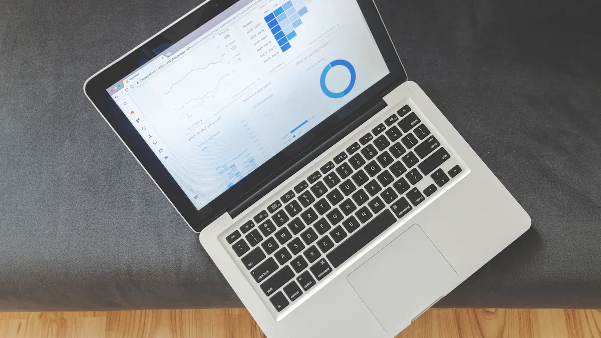
A dashboard website gives you a single place to see your most important data and tools. A website dashboard is a page that shows information clearly, so you can make quick decisions. You can track sales, monitor business operations, or manage projects without switching between different systems.
Many people and companies use dashboards for daily tasks. For example, you might find dashboards in marketing, sales, retail, healthcare, and operations. Small businesses rely on high-quality data and automation to keep their dashboards accurate and useful. When you use a dashboard website, you get higher ease of use and satisfaction compared to traditional websites.
| Aspect | Traditional Websites | Dashboard Websites |
|---|---|---|
| Ease-of-Use Impact | Lower | Higher |
| Sensorial Qualities | Higher | Lower |
| Satisfaction Payoff | Significant | Minimal |
You can use a dashboard to stay organized, save time, and make better choices every day.
Dashboard Website Basics
What is a Dashboard Website?
A dashboard website gives you a single, interactive page where you can see and manage your most important data. You use a dashboard website to track key information, view charts, and make decisions quickly. This type of website brings together data from different sources and shows it in a way that is easy to understand.
A website dashboard is the main page or control panel you see when you log in. It displays real-time updates, graphs, and tables. You can check trends, monitor performance, and manage users or content from one place. The goal is to help you find answers fast and act on them without searching through many pages.
Here is a table that highlights the main features and benefits of a dashboard website:
| Feature/Benefit | Description |
|---|---|
| Data Visualization | Shows trends and performance with charts and graphs. |
| Real-Time Updates | Gives you the latest information instantly. |
| User Management | Lets you control who can see or change data. |
| Content Management | Helps you create, edit, and schedule content easily. |
| Analytics and Reporting | Tracks website traffic and key performance indicators (KPIs). |
| Centralized Control | Puts all your tools and data in one place for easy access. |
| Enhanced Decision-Making | Makes it easier to choose the right action based on clear data. |
| Improved Productivity | Automates tasks and saves you time. |
Website Dashboard vs. Regular Website
You might wonder how a dashboard website is different from a regular website. The main difference is the purpose and design. A regular website acts as a gateway for visitors. It helps people find information, navigate to other pages, or learn about your business.
A dashboard website, on the other hand, focuses on showing analytics and key performance data. It is built for decision support. You use it to view important numbers, spot trends, and manage your work. Here are some key differences:
- Purpose: Dashboard websites help you analyze data and make decisions. Regular websites help you navigate and find information.
- Content Aggregation: Dashboard websites show key metrics and analytics. Regular websites show content based on user roles or interests.
- Design Intent: Dashboard websites support decision-making with clear visuals. Regular websites focus on navigation and information sharing.
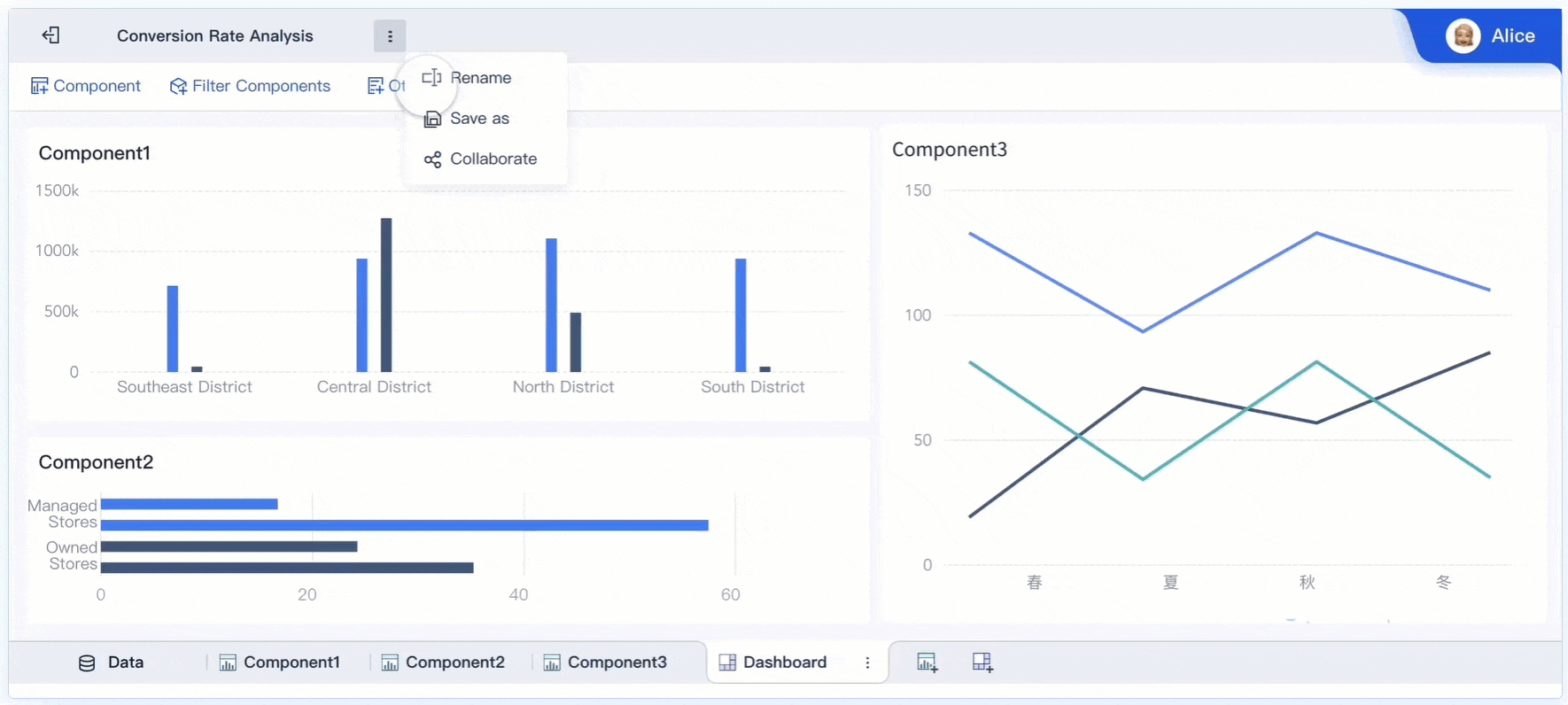
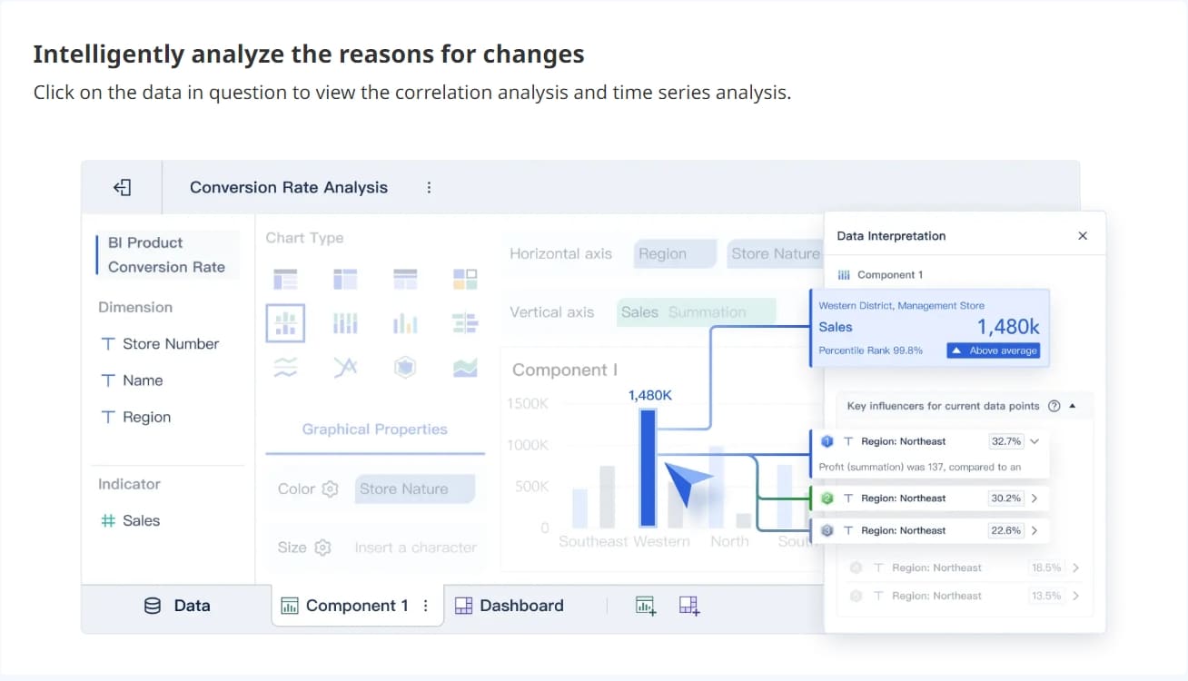
FineBI is a leading example of a dashboard website platform. You can use FineBI to connect to many data sources, create interactive dashboards, and share insights with your team. FineBI makes it easy for anyone to build a website dashboard, even if you do not have technical skills. This platform helps you turn raw data into useful information for better decisions.
How Dashboard Website Works
A dashboard website gives you a central place to manage and view your most important information. You use a dashboard website to track data, monitor progress, and make decisions based on real-time updates. This type of website brings together data from different sources, showing you clear data visualizations and key metrics. You can see trends, check KPIs, and share insights with your team, all from one page.
Key Features of Website Dashboards
When you use a dashboard, you get access to many helpful tools. Here are the key dashboard features you will find in most data dashboards:
- Customizable dashboards let you choose what information to display.
- Interactive dashboards allow you to explore data and drill down for details.
- Real-time data processing keeps your information up to date.
- Ease of use means you can manage data without technical skills.
- Flexible sharing lets you send reports to others.
- You can export data as a report for further analysis.
- Drill-downs help you investigate specific data points.
- Integration flexibility connects to many data sources.
- Progress checking tracks your goals and milestones.
- Device cross-compatibility ensures you can use dashboards on any device.
These features make dashboard reporting simple and effective for daily tasks.
Data Integration and Visualization
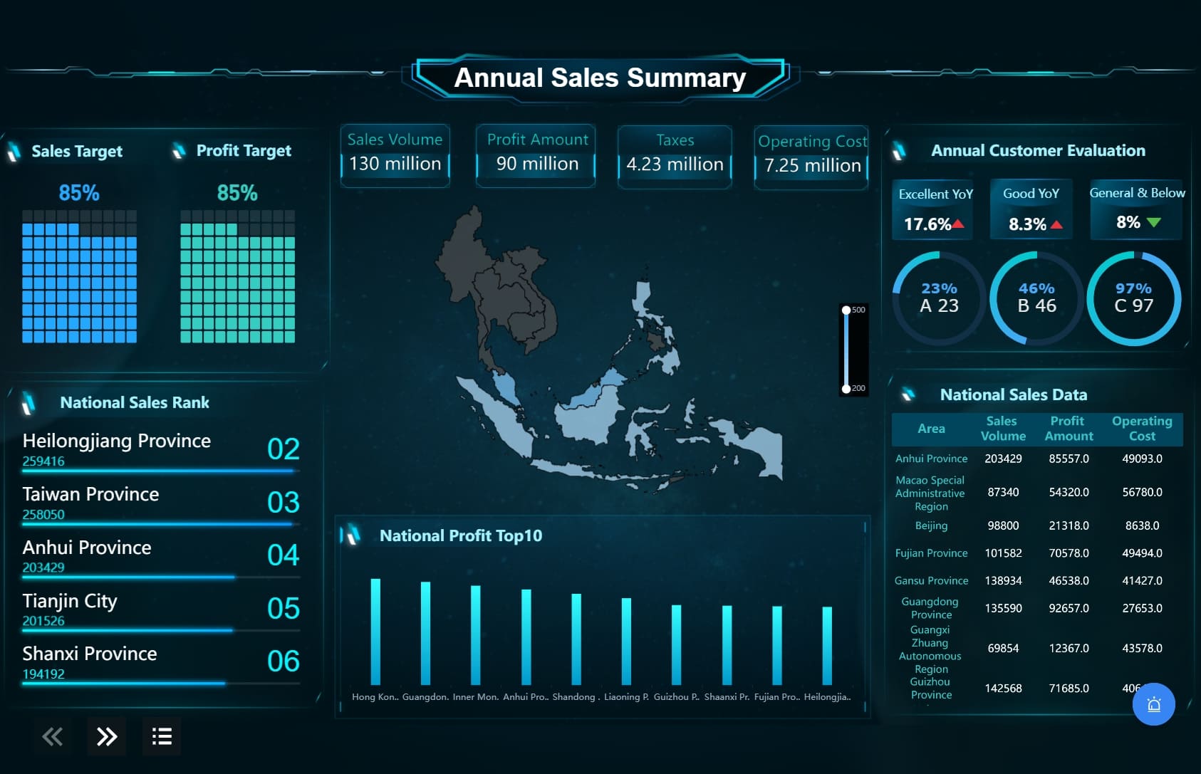
A dashboard website connects to many data sources, such as databases, spreadsheets, and cloud services. You can see all your information in one place. For example, platforms like ClicData and Datylon allow you to combine CRM, web analytics, and accounting data into a single dashboard. This helps you track KPIs and monitor progress easily.
Data visualizations play a big role in making information clear. You can use bar charts to compare categories, pie charts to show proportions, and line charts to display trends over time. Scatter plots help you find relationships between variables, while heat maps show patterns in large data sets. When you match visuals to your data type, you get better insights and make faster decisions.
| Chart Type | Description |
|---|---|
| Bar/Column | Compare categories or track changes over time |
| Pie | Show proportions of a whole, best for fewer data points |
| Line | Display trends over time, useful for tracking sales or website traffic |
| Scatter | Find relationships between two variables |
| Heat Map | Visualize large data sets using colors |
| Histogram | Show distribution of a single variable |
| Box Plot | Compare distributions between categories |
| Area Chart | Represent values over time, compare multiple categories |
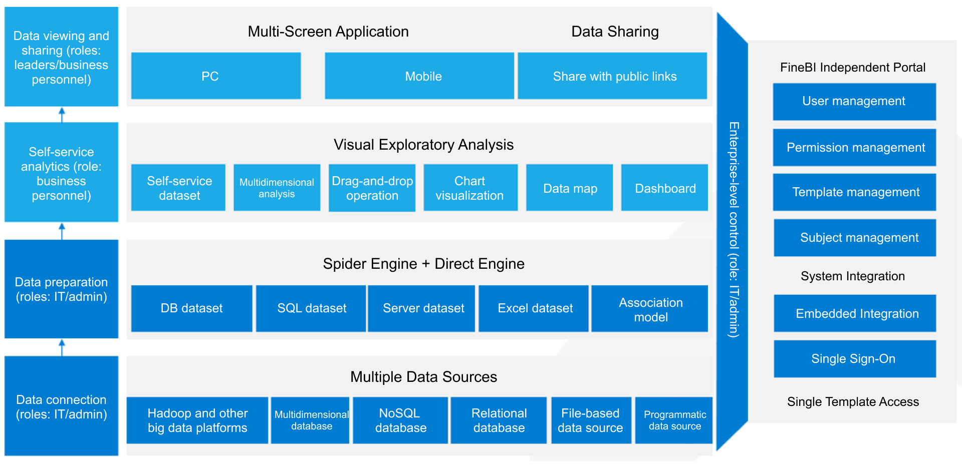
FineBI Workflow Overview
FineBI makes it easy for you to create and manage data dashboards. The workflow includes these steps:
- Data connection: Link to your data sources, such as databases or files.
- Data modeling: Organize and structure your data for analysis.
- Data editing: Clean and refine your data to ensure accuracy.
- Data visualization: Build interactive dashboards using drag-and-drop tools.
- Dashboard sharing: Publish dashboards and share insights securely with your team.
FineBI supports real-time updates, so you always see the latest information. You can use self-service tools to build dashboards without coding. The platform works on desktops, tablets, and smartphones, making it easy to access data dashboards anywhere. You can monitor remote workforces, check application performance, and get real-time insights into user experiences. FineBI helps you optimize productivity and make informed decisions with clear data visualizations.
Benefits of Dashboard Website
A dashboard website gives you a powerful way to manage and understand your data. When you use a dashboard website, you see all your important information in one place. This makes it easier to track KPIs, spot trends, and make data-driven decisions. You can use a dashboard website to improve decision making, save time, and work better with your team. The dashboard benefits you gain include faster access to insights, more efficient reporting, and stronger collaboration.
Recent studies show that data dashboards help you make better choices and work more efficiently. You get real-time data monitoring, which lets you spot trends and problems early. You can manage data from different sources in one dashboard, making analysis more focused. Teams communicate better because everyone sees the same information. Complex data becomes simple, so you get insights quickly. You also share findings more clearly, which helps with dashboard reporting and transparency.
Centralized Data Access
A dashboard website brings all your data together. You do not need to search through different systems or spreadsheets. You connect databases, cloud services, and files to one dashboard. This centralized access means you always see the latest information. You can track KPIs, monitor sales, and check project progress without switching between tools.
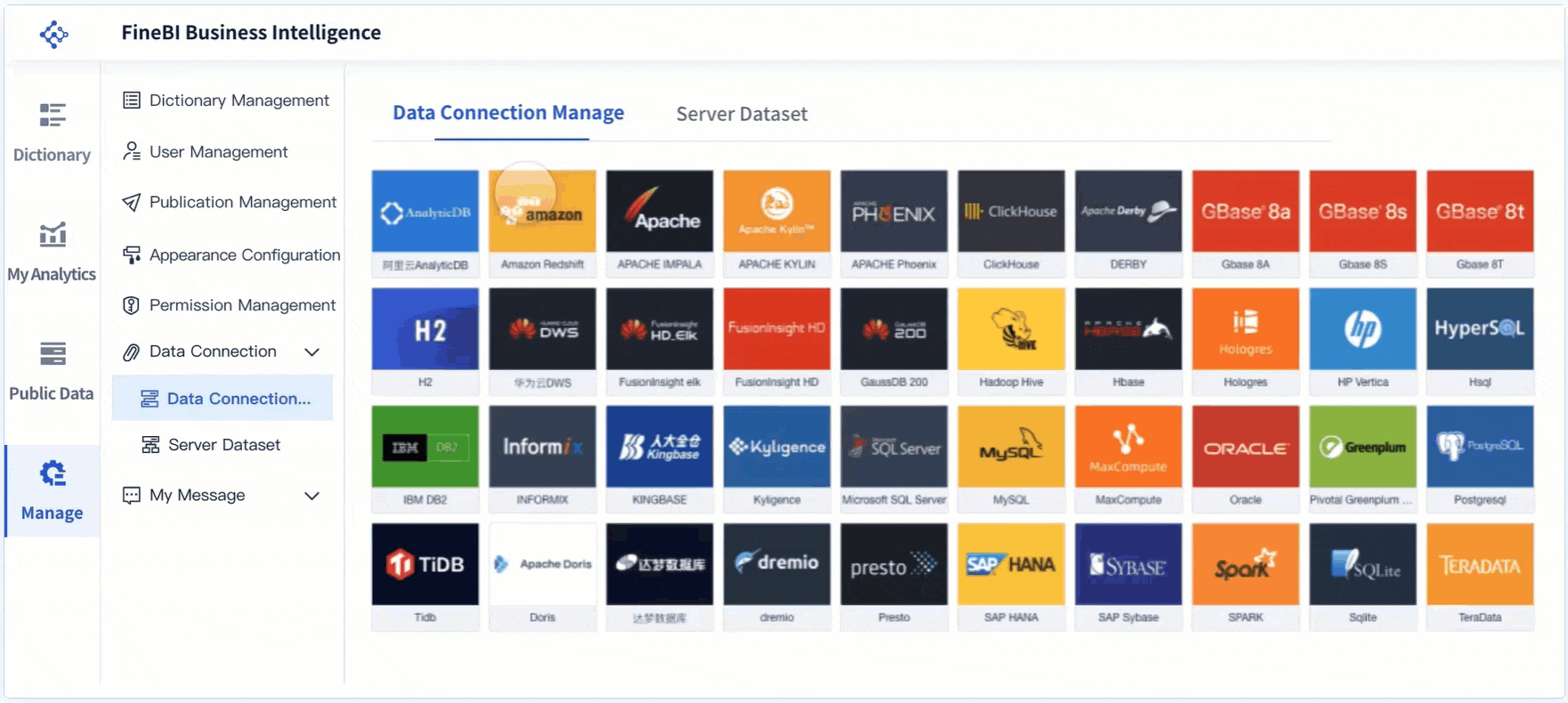
FineBI makes centralized data access simple. You connect to over 60 data sources, including relational databases, big data platforms, and APIs. You upload files or fetch data from web services. FineBI lets you create self-service datasets, join tables, and apply filters. You see all your data in one dashboard, ready for analysis.
Tip: Centralized data access helps you avoid mistakes and saves you time. You get a clear view of your business, which supports data-driven decision making.
Real-Time Insights and Efficiency
Real-time data is one of the biggest dashboard benefits. You see updates instantly, so you always work with the most current information. Real-time dashboards help you spot changes, track KPIs, and respond quickly to new trends. You do not wait for reports or manual updates. This speed improves decision making and keeps your business agile.
FineBI gives you real-time analysis with its high-performance data engine. You can set up automatic data refreshes and alerts for important metrics. The drag-and-drop dashboard builder lets you create visualizations that update in real time. You explore data, apply filters, and drill down for details without coding. FineBI supports mobile devices, so you access real-time dashboards anywhere.
According to a survey of senior marketing managers, 77% use dashboards to track business metrics. This shows how important real-time insights are for informed decision making and business success.

Enhanced Collaboration and Security
A dashboard website improves teamwork and keeps your data safe. You share dashboards with your team, so everyone sees the same information. Real-time data sharing means all team members work with up-to-date insights. Annotation and commenting features let you give feedback and discuss findings directly in the dashboard. This interactive feedback helps teams exchange ideas and make better decisions.
FineBI supports enhanced collaboration with role-based access control. You assign permissions based on department, position, or user role. Sensitive data stays protected, and only authorized users can view or edit dashboards. FineBI’s security model ensures that your data remains safe while supporting teamwork.
| Aspect | Description |
|---|---|
| Allocation | Permissions are allocated based on department, position, role, and user. |
| Priority | User permissions take precedence over department/position/role permissions. |
| Final Permission | The final permission is the union of settings across department, position, and role dimensions. |
Real-world examples show the impact of dashboard websites. In manufacturing, FineReport’s quality control dashboards help companies monitor product qualification rates and defect trends. Managers use real-time dashboards to find problems early and improve production efficiency. In logistics, Kintetsu World Express uses FineReport to integrate customer data and cargo volumes. Their sales teams now access real-time dashboards for better information management and faster decision making.
FineBI stands out among dashboard platforms. It offers self-service analytics, role-based access, and real-time analysis. You create dashboards without technical skills, share insights securely, and support data-driven decisions across your organization. FineBI’s dashboard website helps you unlock the full value of your data.
Types of Dashboard Website
You use a dashboard website to organize, analyze, and act on your most important information. Different types of data dashboards help you focus on what matters most for your role or industry. Each dashboard gives you a unique way to track KPIs, monitor trends, and support data-driven decisions.
Business Intelligence Dashboards
Business intelligence dashboards help you turn complex data into clear insights. You can use these dashboards to track performance, spot trends, and make better decisions. FineBI stands out as a leading platform for business intelligence dashboards. It connects to many data sources, supports real-time updates, and lets you build dashboards with drag-and-drop tools. You can use features like AI-powered insights, a unified metrics hub, and conversational analytics with ChatBI. These tools make dashboard reporting simple and effective for your team.
| Type of Dashboard | Purpose | Target Users |
|---|---|---|
| Strategic BI dashboards | Visualize high-level metrics for long-term planning | Senior management |
| Operational BI dashboards | Focus on real-time data metrics and KPIs for day-to-day decision-making | All operational staff |
| Analytical BI dashboards | Collate large amounts of data for specialists to identify trends | Data analysts |
| Tactical BI dashboards | Track a blend of operational and strategic metrics | Mid-management |
You can connect internal databases, cloud services, CRM systems, and web analytics to your business intelligence dashboard.
Website Analytics Dashboards
Website analytics dashboards help you measure and improve your online presence. You use these dashboards to track website traffic, user behavior, and marketing campaign results. Real-time data lets you see how visitors interact with your site and adjust your strategy quickly. You can monitor KPIs like page views, bounce rates, and conversion rates. These dashboards help you make fast decisions and improve your website’s performance.
Industry-Specific Dashboards
Industry-specific dashboards address unique challenges in fields like manufacturing, logistics, healthcare, and finance. You use these dashboards to monitor key metrics and get real-time insights tailored to your sector. For example, in manufacturing, dashboards track production output, defect rates, and machine downtime. In logistics, you can monitor inventory turnover, on-time delivery, and transportation costs. These dashboards help you solve industry problems and improve efficiency.
| Industry | Unique Features | Key Metrics to Track |
|---|---|---|
| Manufacturing | Real-time quality control, production monitoring | Output rates, Defect rates, Machine downtime |
| Logistics | Supply chain tracking, delivery performance | Inventory turnover, On-time delivery, Transportation costs |
| Healthcare | Compliance, secure data integration | Patient outcomes, Regulatory compliance |
| Financial | Fiscal health, budget analysis | Profit margins, Cash flow, Expenses |
You can use a data dashboard to bring all your information together, support real-time monitoring, and drive better results in any industry.
A dashboard simplifies how you manage data and make every decision. You see real-time updates, track KPIs, and use dashboard reporting to spot trends quickly. Teams benefit from a safe climate, trust, and strong leadership, which improve data use. You get clear, visual information and real-time monitoring, leading to better results. Experts recommend choosing solutions with real-time integration, customization, and mobile access. As dashboards evolve, you will see more AI-driven insights and real-time features that make your work easier.

Continue Reading About Dashboard Website
Best Dashboard Apps for Business Insights
What is a Call Center Dashboard and Why Does It Matter
What is a Reporting Dashboard and How Does it Work
What is An Interactive Dashboard and How Does It Work
What is a Call Center Metrics Dashboard and How Does It Work


FAQ

The Author
Lewis
Senior Data Analyst at FanRuan
Related Articles

How to Build an Investment Portfolio Reporting Dashboard for Executives: KPIs, Benchmarks, and Drill-Down Views
Investment portfolio reporting for executives is not about showing every holding, transaction, and chart your investment team can produce. It is about giving CEOs, CFOs, CIOs, boards, and investment committees a fast, re
Yida YIn
Jun 25, 2026

12 KPI Reporting Examples for Executive Dashboards: What to Show in Weekly, Monthly, and Quarterly Reviews
Executive leaders do not need more data. They need decision ready $1 examples that match how often they review the business and what actions they are expected to take. A weekly $1 should surface fast moving risks and per
Yida YIn
Jun 25, 2026

How to Build a Digital Marketing Reports Dashboard: Executive Examples, KPIs, and Templates
A $1 is the control layer that helps executives and marketing leaders turn scattered channel data into fast, confident decisions. If you are a CEO, CMO, operations director, or marketing analytics lead, the real problem
Yida Yin
May 07, 2026